

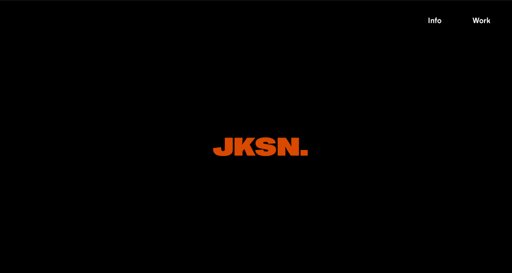
Firstly, I created a logo for myself which would play a strong part in the website. I went with JKSN. rather than Jackson because its much more straight to the point and ultimately looks more visually appealing, I went with the typeface ‘right grotesque’ because its very bold and standout, so sums up much of my work in itself.
I used the typeface ‘Fabric’, a sans serif font based on Moderat, except some of its letterforms have cut off sections which make it a bit different, a bit quirky.
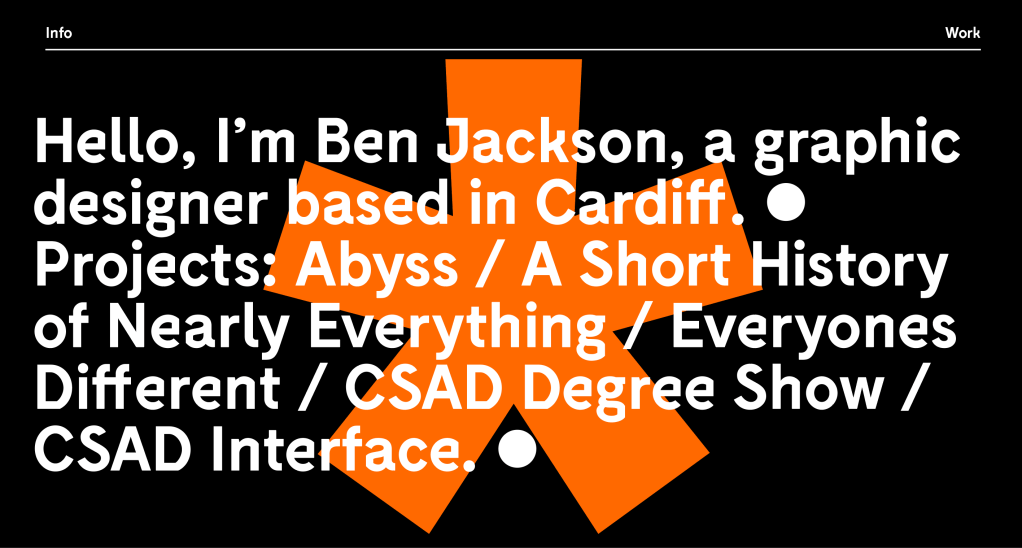
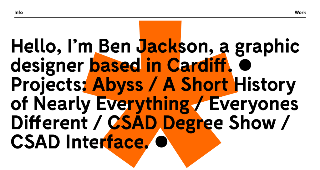
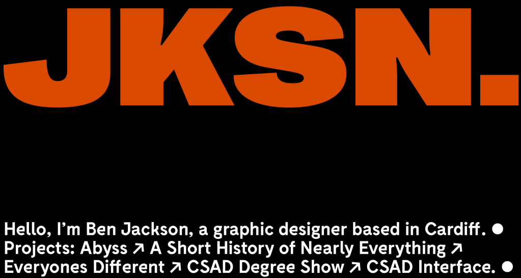
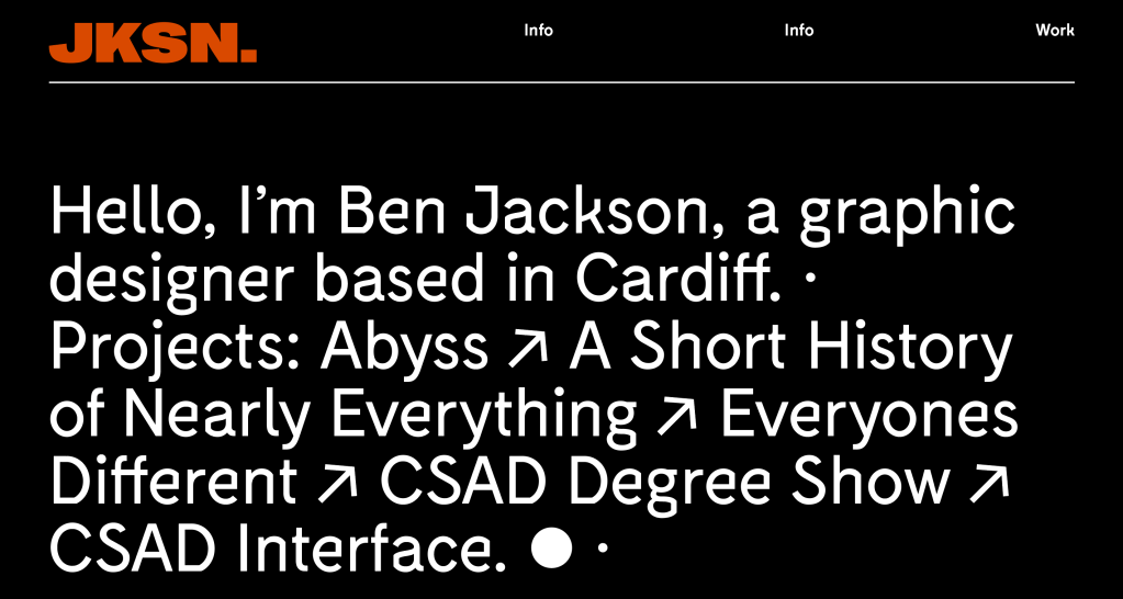
I played around with a few designs, I wanted to keep the home page full of typography and not images as I wanted to illustrate a fact that there’s a strong sense of typography in my work. I liked the white black and orange colours as they’re bold and very striking without being too overwhelming. Overall they all had aspects which I liked, from the menus to colour ways, but I decided to go with the last style, using a typographic approach to outline a bit about me, as well as link the viewer to some of my projects.
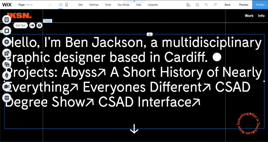
I used the Wix website maker to make the site, I think it leaves you with a lot of room to be artistic and playful but also does the basics really well.
I took the style from my ideation, showing a bit about me as well as some of my projects, I also added some other elements on the page, an image to make it clear that im available to do work, which also acts as a link to my information page. I also added an arrow to make it clear that more lies below that main imagery on the home page.

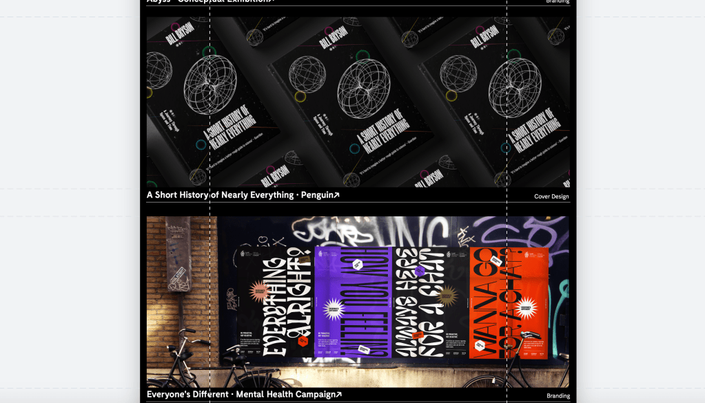
as well as there being links to each projects page through the typography at the top of the page, I also wanted some strong imagery from each of the projects on display to give the viewer a sense of what each project is about.
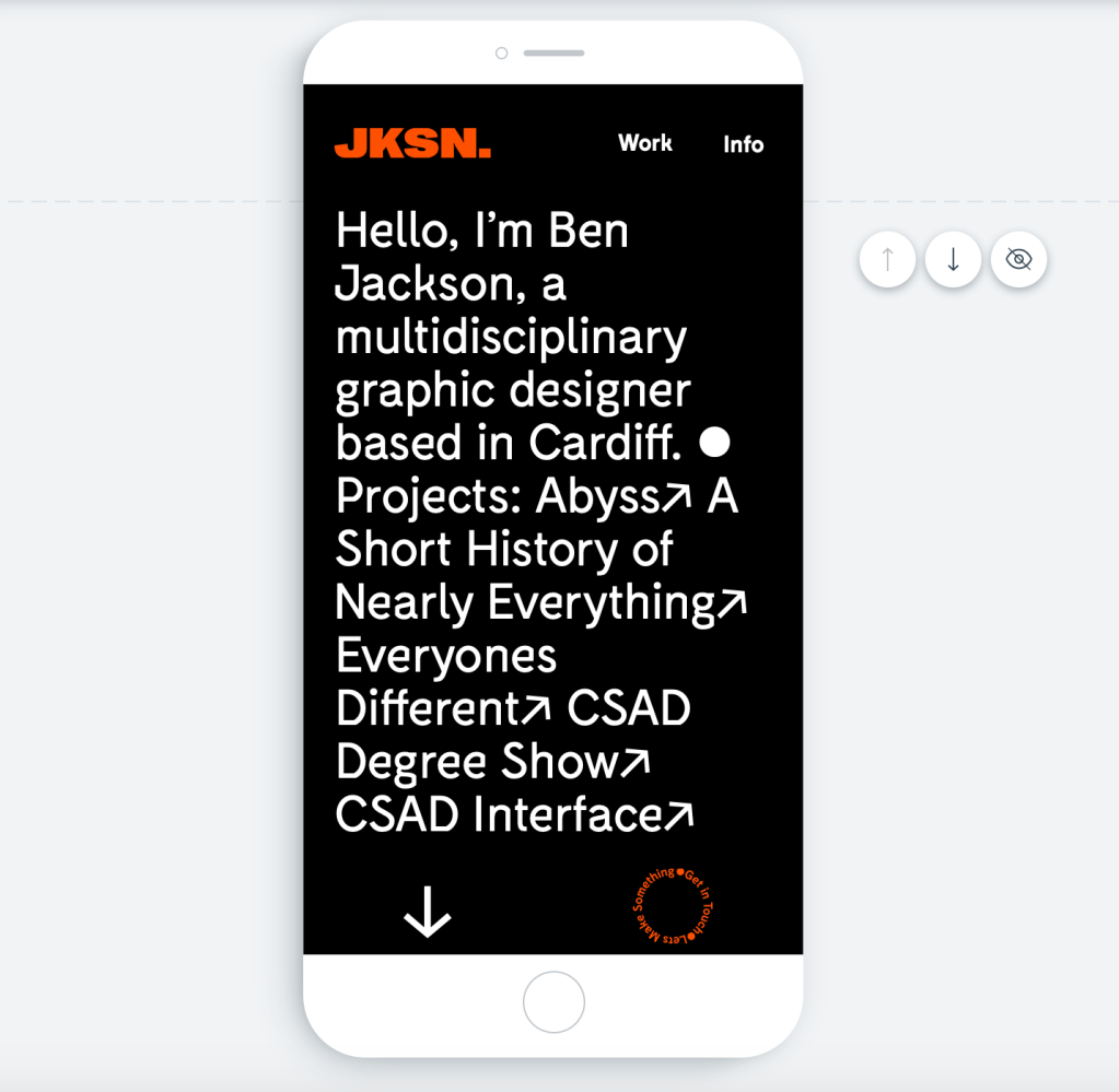
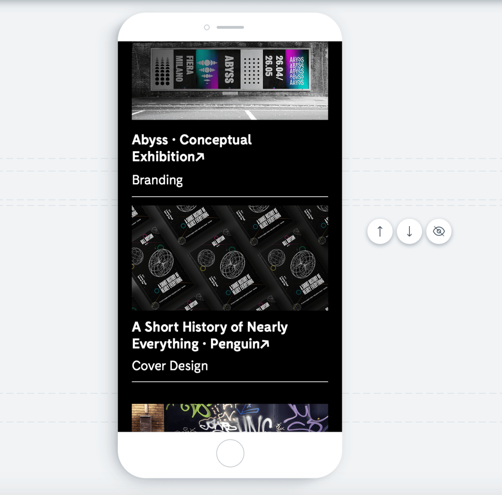
I also added the same house style to the phone website design, keeping the first page purely typographic with images below the fold.

I then looked at each of the projects pages. I wanted to start each off with a hero image to capture the attention of the viewer
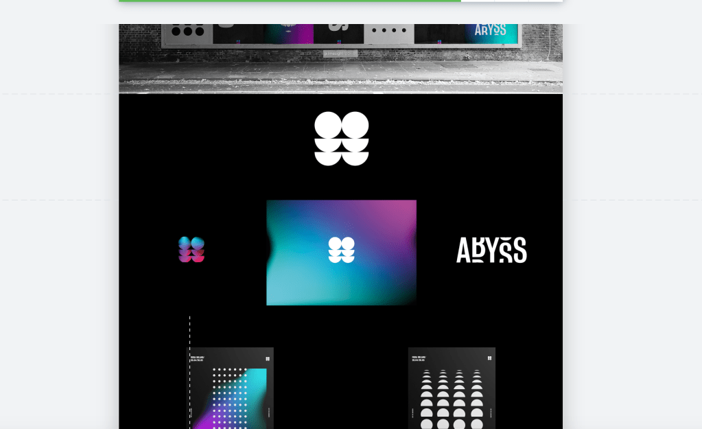
Followed by the logos/brand guidelines and some examples of it on printed media.
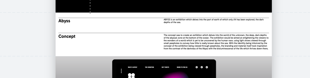
It needed to have some sort of explanation, so I added a simple typographic element which talks about the brief and the concept behind the work.
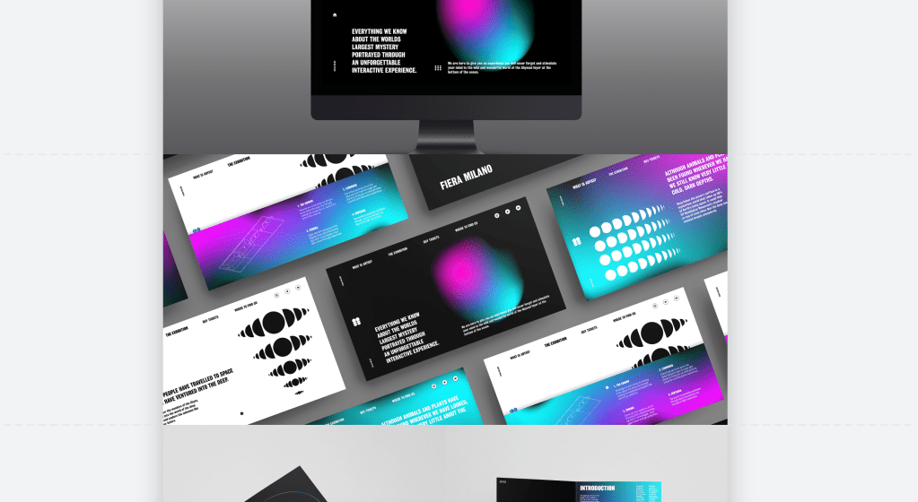
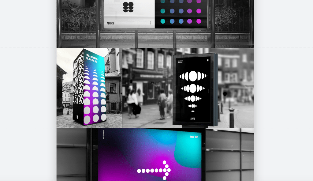
I then added all the photos from the project, although very image based, I played around with the still and parallax scrolling to ensure each page had a sense of pace and wasn’t just photo after photo.
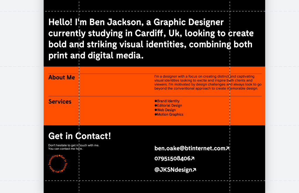
Finally I added the about me page. Although very simple, I wanted it to look clean and professional, talking a bit about myself and my approach to design, and leaving links to get into contact with me.
