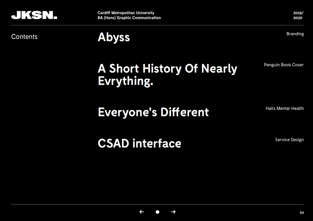
I then looked to focus my attention on the pdf portfolio. I wanted to continue the house style of my website over to the pdf to keep the visual style.
I kept the lines on the page, similarly to the website, to keep that house style, and in this case to separate the header and footer from the content in the middle of the page.
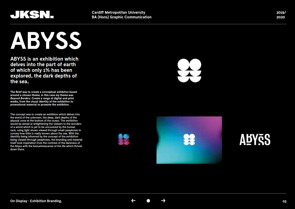
I decided to go with a white logo instead of orange in this case, due to the logo and work im showcasing. being so close together, I didn’t want the logo interfering with the work.

I included useful information along the header, such as my email, the course and year the work was made.
I wanted a simple approach, using just a column to explain the project and my concept with the other 2 to display the work.