After creating 3 different concepts, it was clear the strongest was the first, using metaphor to illustrate and create the visual language for the design. I wanted to follow on from the idea of the balls being overwhelming, however I didn’t think the initial design was working to deliver the message I wanted to put across.
- It needed much more of an overwhelming feel than the initial concept idea – more balls? or bigger balls?
- Maybe experimentation with some different colours, some softer colours steering clear of the neon, might be more aimed at the mental health target.
- How might work across different media, poster, booklets etc.

Looking at the general visual language, colours, styles, how the typography might work on the page, how the balls will interact with the page and inform the design.
- Black definitely doesn’t work, far too dark for both mental health and sport design.
- The balls on the second poster which are more random works much better, it has a better sense of movement and motion and is much less uniform, the size of the balls also works better and feels more ‘overwhelming’.
- Split posters work well, I like the colours, particularly yellow, but I think too many colours starts to look too soft and ‘nice’ and takes some of the focus away from the sport. As I found out in my research using only one colour is often the way in sports branding and maybe that might work?
- Still needs more of a ‘story’ (this is how someone with a mental health disorder might feel, this is how the guidelines might help)

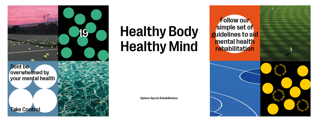
I wanted to see how the visuals developed in the posters could be used in some different ways, creating more simple visuals to convey information. I also looked at the addition of photography alongside strong graphic visuals.
- Like the idea of the smaller squares, allows more information to be conveyed, could be useful when it comes to communicating the guidelines? Doing a poster series/billboard instead of individual posters.
- Photography works well but there might be too many colours going on with the photography, again thinking about toning it down to just one or two colours to keep it more simple and not overcomplicate it.
- Again, still needs more of a ‘story’.

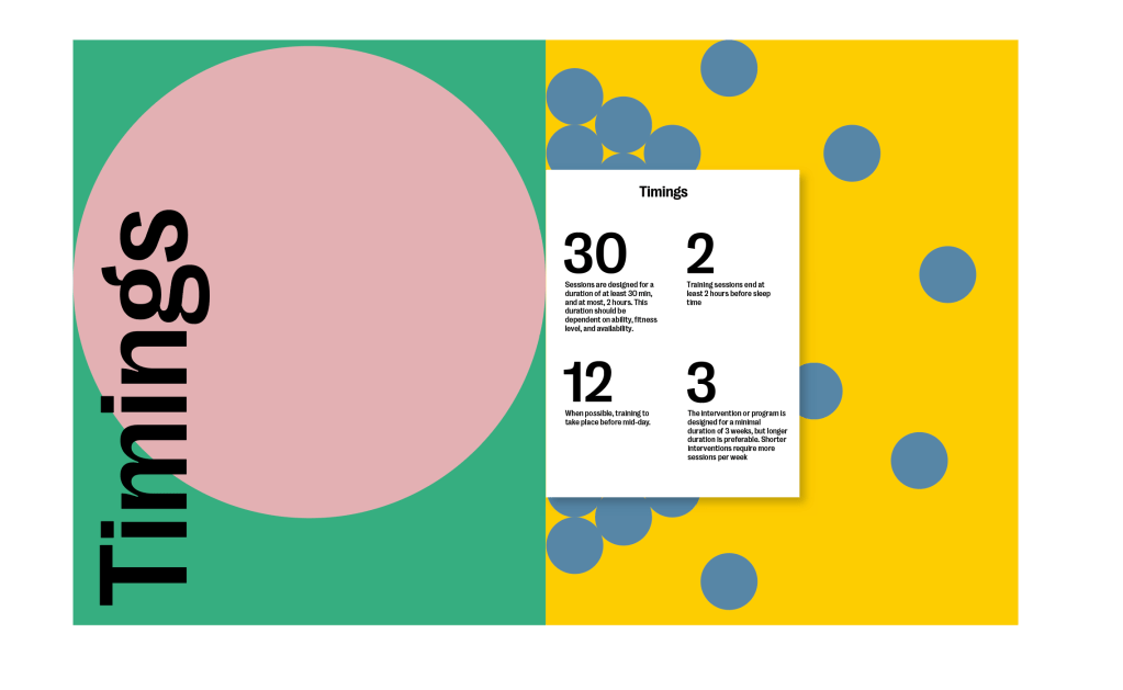
How might the guidelines be put across within a booklet in this certain style, taking the same designs from the posters and adding it to a booklet, with a smaller foldout page inside containing the guidelines or information.
- Only a first, simple draft but I just think it’s boring. There needs to be more on the pages themselves but I’m worried that adding too much information with pages which are already quite loud with visual language and colours won’t work.
- Fold out page doesn’t work and isn’t an interesting enough way of conveying the information of the guidelines, maybe making use of the numbers more might work? Or looking further down the route of icons.
Feedback and Take Aways
It’s strong progress from the initial idea and I definitely think the sense of being overwhelmed and taken over is stronger in this development than it was in the first draft, but I still think there’s a long way to go in terms of visual language itself.
- Feedback was that they agreed that a more simple colour pallet of maybe just white black and a bright colour could work, I suggested yellow or red or something along those lines and they agreed.
- Agreed that it needs a stronger sense of a story, like I said, about what the problem is and how the guidelines can help.
- Needs a stronger sense of the guidelines, so more of the posters need to contain information about the guidelines. The star from my 3rd concept springs to mind, its a way to get the guidelines more involved in all of the designs.
- Needs more information design, or just more interesting data visualisation. Within the brief there isn’t a whole lot of facts and figures, its mostly longer statements, like the guidelines themselves, so finding a way to visualise these using the style will be important. Again maybe the use of icons will really help.
