
Before ideating and coming up with my 3 concepts I wanted to carry out some contemporary research into examples of graphic design within the mental health, sport and medical fields to get a sense of the kind of visuals, colours, typefaces etc and what the tone of voice is. I also wanted to look into some examples of information design, what sort of information design is used to visualise data and how might I be able to do this for this brief in particular.
Mental Health
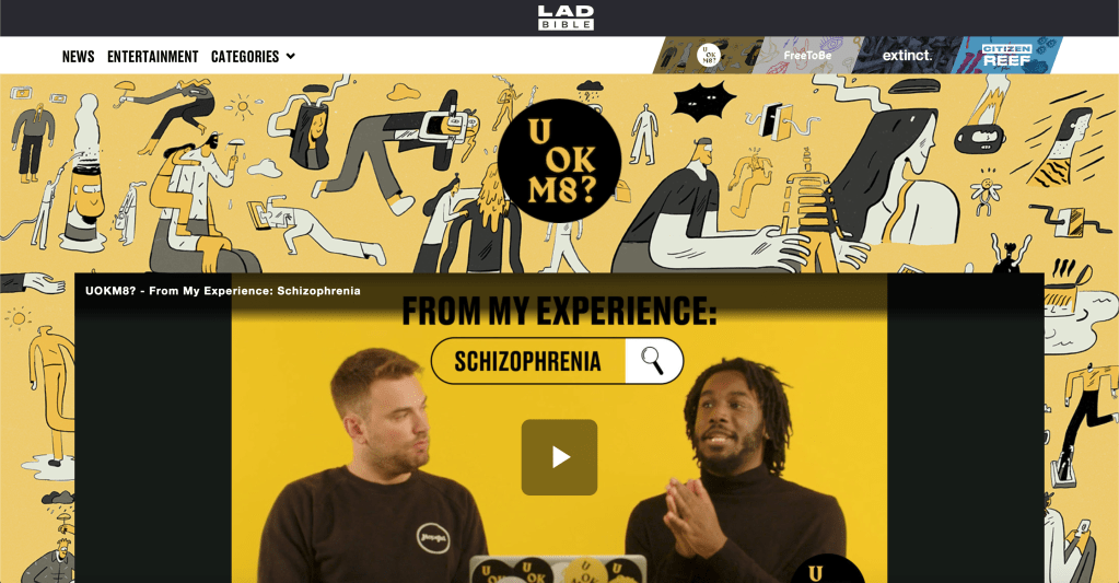
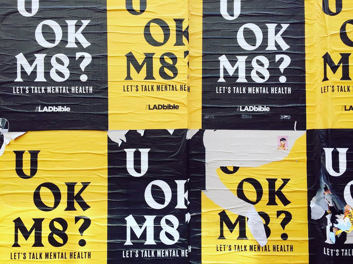
U OK M8?
The social media page LADbible recently launched their campaign ‘U OK M8?’, a campaign aimed towards the mental health of young men.
‘UOKM8?’ aims to develop the broadest understanding of mental health and suicide risk in the UK by gathering quantitative and behavioural data from the LadBible audience through the use of questionnaires that sit alongside stories on mental health issues.
Although the campaign visual style is very simple, using only the black and yellow pallets and the same slogan across all of its media, the style is one which really stands out and is definitely aimed towards its target of young people. I also like the way the campaign is very straightforward and to the point. Theres no imagery or major metaphorical language, its simple and tells the viewer all they need to know. Whilst the design might be very stand out and in your face, possibly a bit to harsh for the overall audience, however the idea of stand out colours like yellow is one which I think works really well, possibly maybe more so if its a bit more toned down.
There is also a strong sense of typography within the design, while there has to be a limit, being expressive with type is something which could really work in order to convey some sort of idea, especially within the realm of physical activity, type could allude to motion and movement quite nicely. The typefaces used within the “U OK M8?” campaign are both very bold in comparison with many other mental health campaigns which might be a bit more soft, but I like the boldness of it, its much more standout and really relates to the correct target audience.
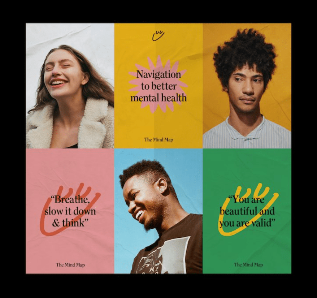
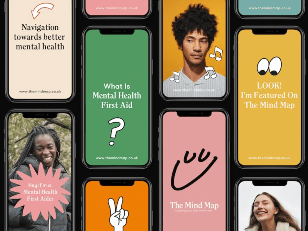
The Mind Map is a new initiative that seeks to “promote a new normal” in an age of increasing mental health problems across the United Kingdom.
Described by its founders as an “innovative mental health hub”, Liverpool-based Mind Map offers practical advice on how young people (defined as those between 16-30) can get access to subsidised counselling and free mental health support services, as well as an online publication which shares the stories of musicians and athletes who have been affected by mental health problems in their lives and careers.
Similarly to the LADbibles campaign, The Mind Map is aimed at young people (16-30) and its aim again is to allow them to connect with any forms of mental health they may need through the use of an app.
The visual style is great and uses a variety of stand out colour combinations along with some simple vectors and images to create a light hearted and friendly but also stand out approach to tackling mental health. I think the style really stands out to its audience and feels very relatable and personal whilst also ensuring its contemporary and modern feel. The designs use great colours and combinations which make them feel much less cliche in terms of the usual colours which mental health campaigns use.
Another aspect of the campaign I really like is the way it uses photography alongside graphic visuals, the colours contrast very nicely with the photos themselves and overall creates good pace throughout it and stops it being too overwhelmed with bright graphics.
On the informations design front, The Mind Map uses simple icons around the designs alongside type and image. Although they’re very simple and not communicating a whole lot of information, the idea of using icons similar to these is one which could work very well to communicate the guidelines or other information.
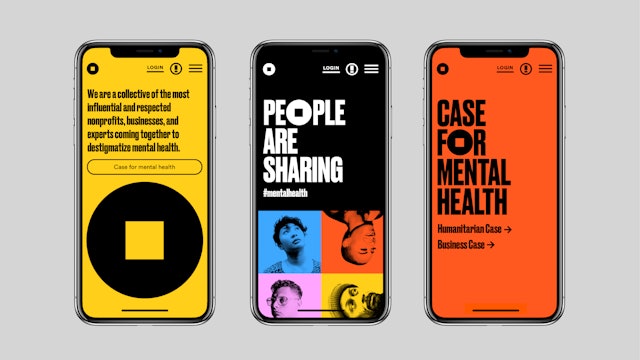
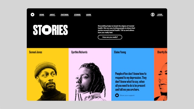
Pentagram has created a brand identity for the Mental Health Coalition that centers on a “square peg in a round hole” to represent that there is no “normal” when it comes to mental health and that everybody fits. The Coalition is introducing the icon in the hopes that it will become the global symbol for mental health. The mark also appears in the branding Pentagram created for “How Are You, Really?,”a digital storytelling platform that encourages individuals to share their experiences, start conversations and open up about their issues. The online platform is a place where those seeking help or guidance can easily navigate the mental health space.
Firstly, the thing that stands out to me is the boldness of it, the colours, typography etc is all very contemporary and is something which is definitely very loud and in your face. What I like is that they use the sort of bright colours a mental health campaign might look to use, but they do it in a much bolder and stand-out way. Another thing which jumps out to me again is the use of the icon in the ). Although in this campaign its only one O, its still something which can be used all around the campaign, including on its own and they viewer will recognise it and know the information behind it.
Pentagram partner Paula Scher is known for her bold and attention-grabbing graphic design, so her arrival in the mental health sphere is not only unexpected, it’s an exciting and powerful call to action. In contrast to its peers in the sector – largely summed up by soft tones and a gentler visual approach – new charitable initiative the Mental Health Coalition has gone for a striking identity by Scher, that features an icon she hopes will become a global symbol for mental health, plus unapologetically shouty typography and a vivid colour scheme. “It’s an anti-sanitarium design,” she tells It’s Nice That.
She also goes on to talk about the branding for The Mental Health Coalition and how she hopes to promote a cultural shift in how mental health is spoken about. I like the way the campaign looks to surpass the ordinary in order to create something different and stand out. Why was it that mental health is always seen as something which needs to use soft and gentle visual language, when mental health is something that affects so many people nowadays that gentle and soft approaches may not be relevant to the target audience anymore. I think this is something which is relevant to my current brief, it needs to allude to mental health but the target audience may not be suited for a soft and gentle approach.

Sport
I then looked at some examples of sport campaigns and how they use colour and typography within their designs and visual styles. I didn’t look at as many whole campaigns, more individual examples which I could pull apart.
Firstly, in terms of colour palette, most of the examples I found tend to use one bold colour alongside white and black, as well as using a lot of imagery to add an extra aspect to the palette whether that be blackened white or coloured photos. The colours ensure that the designs are bold and stand out, which is exactly what a sports person or athlete would want so it reflects that well.
The typography, similarly to the colours is very bold on all examples, usually using thick sans serif fonts which stand out as much as the imagery and photography does.
Like I said previously, the bold style definitely works for sports campaign as it works in unison with the companies, sports or athletes it represents and therefor works well for the target audience. For example the boxing campaign uses the colour red with a condensed, thick sans serif font which emulates the aggressive nature of boxing, and will probably grab the attention of viewers for the same reason.
Another thing I noticed about a lot of the typography is that the way many of the campaigns use type as imagery is interesting, particularly using it to allude to movement. The boxing campaign contains text which looks as if its swinging and emulates the path of a punch, which in itself makes the viewer think about motion and movement. The Nike Mercurial campaign also uses typography to imply movement and in this case speed, which is what the mercurial boot stands for.


Medical
Finally, I wanted to look into medical design and branding to see what that entails. The first thing I noticed was the colours, They tend to be quite bright and stand out, without being too in your face, usually colours like blues and greens.
The typography is all very clear and laid out, the campaigns tend to have some sort of imagery or photography, with a simple explanation or typographic element to accompany it, many of them using a poster series instead of individual posters in order to get more information over to the target audience.
I also noticed a lot of medical branding or campaigns use iconography for lots of their information design, there tends to be lots of information which needs to be explained so using icons is a good way to do this without overwhelming the viewer with loads of information.


Take-Aways
- All three examples contain uses of bright colours which is definitely something the campaign needs, however experimentation needs to happen to determine what colours and whether it needs just one colour alongside black and white or multiple. Another element is photography which works well alongside block colours, so choosing one bright colour alongside some bright photography could also be a possibility.
- Typographically speaking, the difference between the 3 is quite large so finding there middle ground is important. I liked the idea of using fluent and motion-like typography in terms of communicating the idea of physical education, but it could also be worth taking note of the typography within medical campaigns and looking at the way it clearly conveys information alongside visuals.
- Finally, one of the things very evident in some of the examples of mental health and medical campaigns is the use of iconography to convey information. One of the things noticeable from the sphere guidelines and background science is that there’s a lot of information looking to be conveyed, some of which doesn’t contain stats or figures. Using icons is a good way of communicating information and stopping the page being cluttered and overwhelming.
