
From much of my research into information design, as well as research into contemporary design, it became apparent that many campaigns use iconography as their information design systems in order to process a lot of information at once without overwhelming the viewer with too much text.
The usage of image like icons increases engagement to 94% compared to text alone whilst improve retention by 42% and allows humans to process information 60% faster. These icons will allow users to grasp the information and hopefully increase how much they retain.
It was clear from the offset that information design was needed within the campaign due to the amount of information needing to be conveyed, however the guidelines aren’t saturated with facts and figures, therefor it would be hard to design any sort of infographic using numbers and statistics. Instead, I went down the route of using iconography to narrate the guidelines.
The guidelines are all fairly wordy, so fitting them all into a single set of icons makes it much easier not only to fit them all onto a single page, but also to retain the information and undertsand it. The icons will allow the users to grasp the information being given to them easier than readin a full page of 19 guidelines.
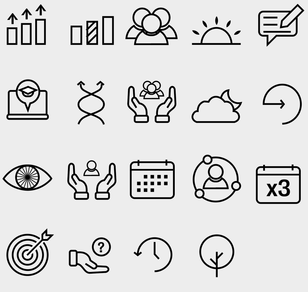
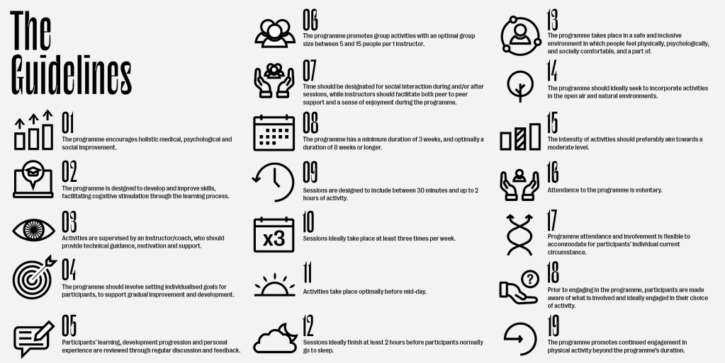
Although all the icons and guidelines can be added onto a single page to give all the information, sometimes the icons could be used by themselves on posters or any other media, with the page above as a key.
