
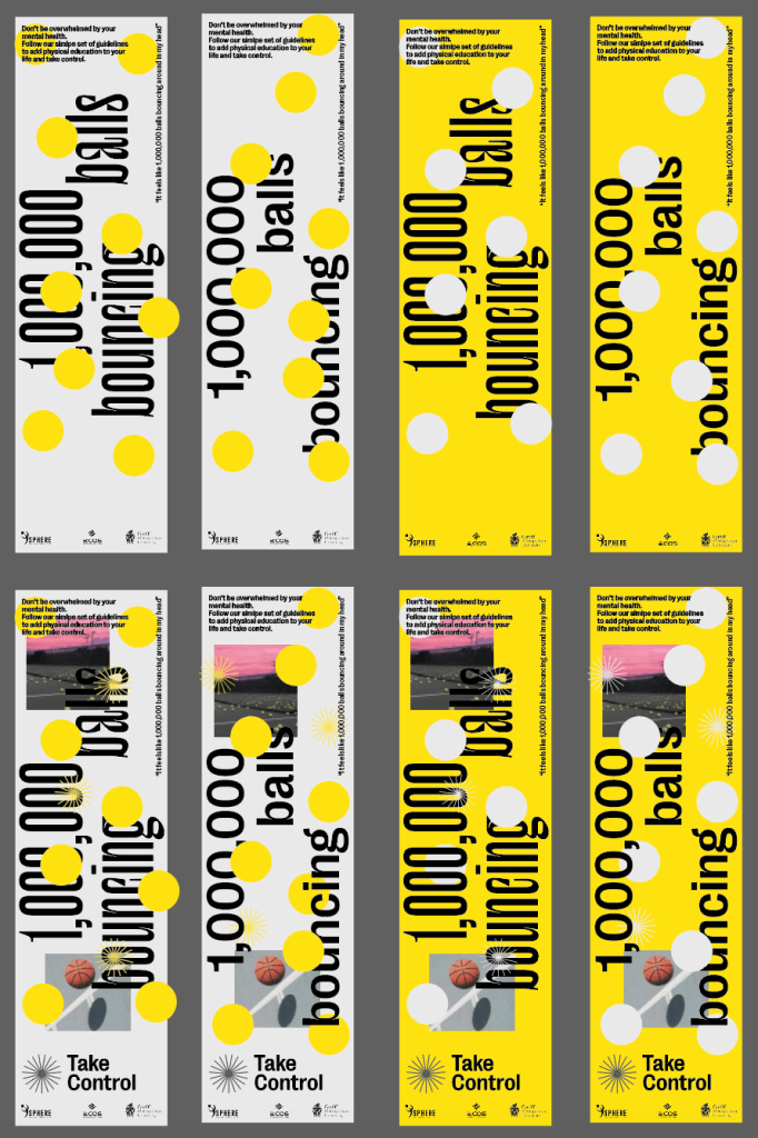


I started designing some banners making use of the visual identity to get a sense of how they could be used to explain the metaphor and why the guidelines can help, followed by some more promotional examples. I looked at how the colour palette and the different typefaces could be used and which is more effective in terms of communicating the message.
I think using both the yellow and grey both work interchangeably and could be useful to ensure a good pace within the project, however I think the typeface Le Murmure should be used for the main messages on banners and posters, its much more playful and eye-catching.
Overall the designs showed a clear sense of progression from earlier posters and showed how the visual identity can be applied to different touchpoint within the campaign, but I don’t think any of the posters currently show enough of the information needing to be communicated to the audience.
I discussed in an earlier feedback session that using a billboard or poster series might be a better way of creating print media. It allows me to get more information onto one billboard or poster series instead of just a single poster with one piece of information.


The most important part for me was to ensure there was some sort of text to describe what the point of the guidelines was, alongside a visual representation of this.
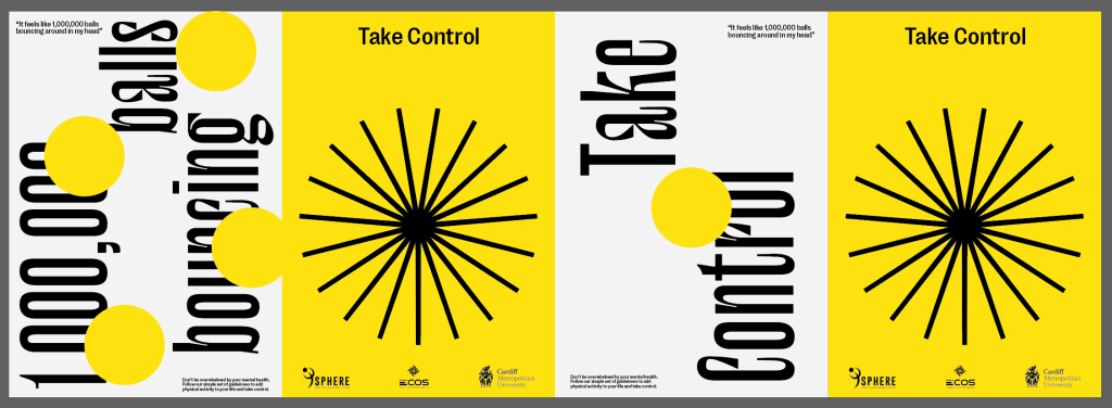
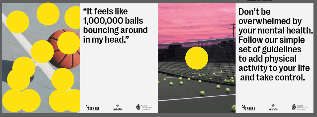
Final Design 1
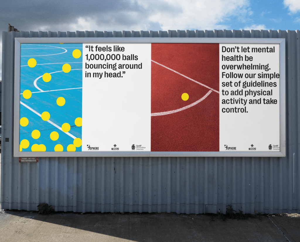
I think it was important to tell the story of the campaign, this is how it may feel to have a mental health disorder, and this is how the guidelines can help, so they can help you take control through the use of physical activity. It explains the metaphor but also gives the target audience a sense of what they’re doing and the good it can do. Again I used the balls with lots on one side and only one on the other to demonstrate the idea of taking control.
I used the visual style of the project, alongside bold photography of sports courts and pitches which stand out and contrast nicely with the colour scheme. The client made it clear that they didn’t want images of professional athletes in it, so I thought using images which allude to sport and activity works well and creates some strong visuals.
Final Design 2
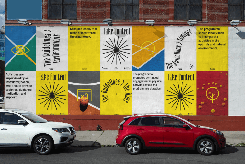
Following on from the previous poster series which looks at the reasoning for the guidelines and how they can help, I wanted to demonstrate the guidelines themselves, and talk about them individually and what the stand for. It’s a strong way to get the guideline icons and descriptions across the the audience and give them a sense of what the Sphere guidelines really stand for.
I made icons for each of the guidelines because I think as you can see on this mockup, the guidelines can work well by themselves with a key or the description underneath, it stops everything being too overwhelmed with information. It could also be just all the icons and their accompanying guidelines underneath as a poster or infographic, but this gives the sense of how these icons can work.
