
Before starting to create the final visual language and decide on exact colours, typefaces, specific visuals etc I created 3 possible concepts to be discussed during our lecture with Paul. All of them were purely conceptual and I knew the visuals were going to be developed from the starting point, but I wanted to get initial ideas onto paper to give them initial visuals and in order to get feedback from Paul and the rest of my group.
Concept 1
The idea stemmed from my research, I was looking into mental health disorders and background research into it, and in particular I was looking at how some people might feel when they have a mental health disorder and the way they describe it. I found a variety of different descriptions all relating to this feeling of feeling slightly overwhelmed. I also spoke to a few friends who I know have been through some things in the past or are still going through things now, and one of them really stood out to me. He said “it feels like I have 1,000,000 balls bouncing around in my head” and sometimes I can’t even think or feel. He said he wishes that he could grab them and stop them and take control of it. This together with the idea from my research about feeling overwhelmed formed this first idea, making use of shapes and the ‘balls’ mentioned above to create a sense of being overwhelmed.
I used bright colours and tried to use some photography, as well as bold, standout typefaces, taking influence from my research.
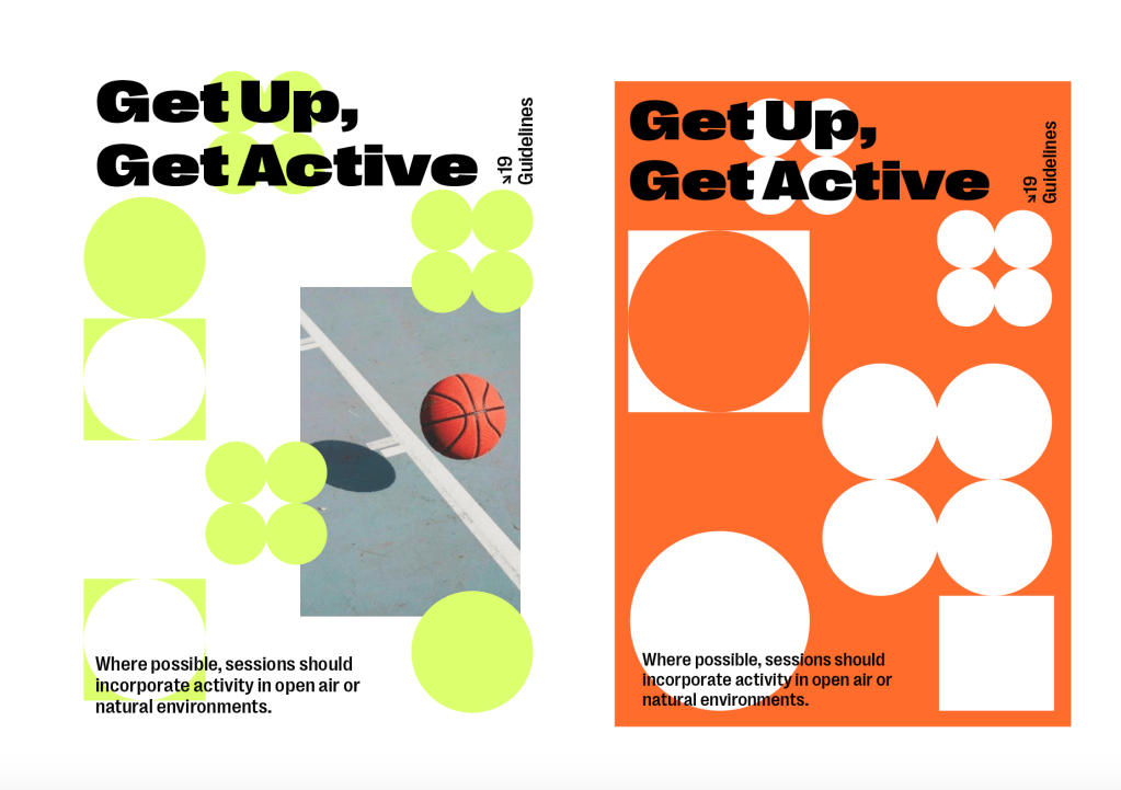
I think the idea of using a metaphor which informs the visuals and alludes to mental health as well as physical activity could be really successful, but it needs to feel more overwhelming, and it needs to show how the guidelines can help that feeling of being overwhelmed.
Concept 2
The next concept was all about the idea of many mental health disorders being hidden and not widely known about. The idea was to use this idea of the mental disorders having a light shone on them. Again I used some bright, pastel colours similar to what is used in a lot of mental health campaigns.
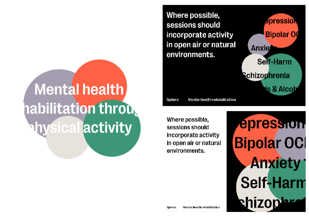
I don’t think the concept works at all in response to the brief. The brief is about raising awareness for the guidelines and explaining them and some of the science behind it, not necessarily raising awareness for the disorders themselves. I also don’t think the colours work overall, especially in term of sport design.
Concept 3
The final idea was purely around the star shape, which was influenced by research into medical campaign designs which in a lot of cases contain iconography. I though about using a star with 19 points, one for every guideline to visualise the guidelines and ensure that they’re on every page within the campaign. It also stops the page becoming overcrowded.
After the previous 2 concepts used block colours, I wanted to try photography in this one to get a feel for how it might look.
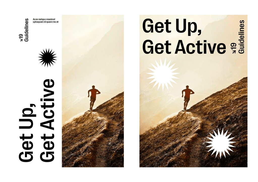
Overall I think the idea of using the star icon as a representation of the guidelines is one which could definitely work on the information design front, and could possibly be mixed with another one of the ideas?
Feedback
I took the concepts to the tutorial and got a range of feedback from Paul and my group.
Concept 1
- Idea/metaphor of the balls is interesting and could work, but definitely needs to feel more overwhelming and needs to have some more explanation.
- Could definitely work with bright colours and photography.
- Need to show the idea of being overwhelmed and how the guidelines might help calm this down and help take control.
- ‘Get Up, Get Active’ could be changed to something which goes along better with the metaphor itself.
Concept 2
- Unfortunately nothing of interest, agreed with me that it doesn’t suit the campaign and target audience. It was a good experiment and looked to go down a different route with a different perspective but unfortunately didn’t work.
Concept 3
- Liked the idea of using 19 points for the guidelines and taking influence from some medical campaigns for that, thought it could maybe work nicely alongside the first concept as an additional part, maybe a logo/marque?
- The photography works well and makes it feel professional, but adding a brightly coloured, graphic shape or shapes would really work as well.
- Taking the idea of iconography even further and making one for each guideline? Fits in with the idea of information design and the concept well.
