
As I said before, the idea stemmed from my research, I was looking into mental health disorders and background research into it, and in particular I was looking at how some people might feel when they have a mental health disorder and the way they describe it. I found a variety of different descriptions all relating to this feeling of feeling slightly overwhelmed. I also spoke to a few friends who I know have been through some things in the past or are still going through things now, and one of them really stood out to me. He said “it feels like I have 1,000,000 balls bouncing around in my head” and sometimes I can’t even think or feel. He said he wishes that he could grab them and stop them and take control of it.
First off I just wanted to use this metaphor of the balls bouncing and the feeling of being overwhelmed, but the more I though about the feedback from the previous design, I wanted to add a tagline which worked alongside that idea and looked to explain it.
Take Control
Whilst describing to me the feelings inside his head, the idea of ‘taking control’ of it was something he expressed, and to me this was the perfect description of what the guidelines were there to do, to help anyone suffering with a psychiatric disorder to take control of it.

First off, I think the campaign needed some sort of logo or marque, something which identifies it as being part of the project, to go alongside ‘Take Control’ and whilst the ideas of the balls was obviously in my head from the start, having a marque which is based around that concept might be too much with the rest of the visual language also being all about that.
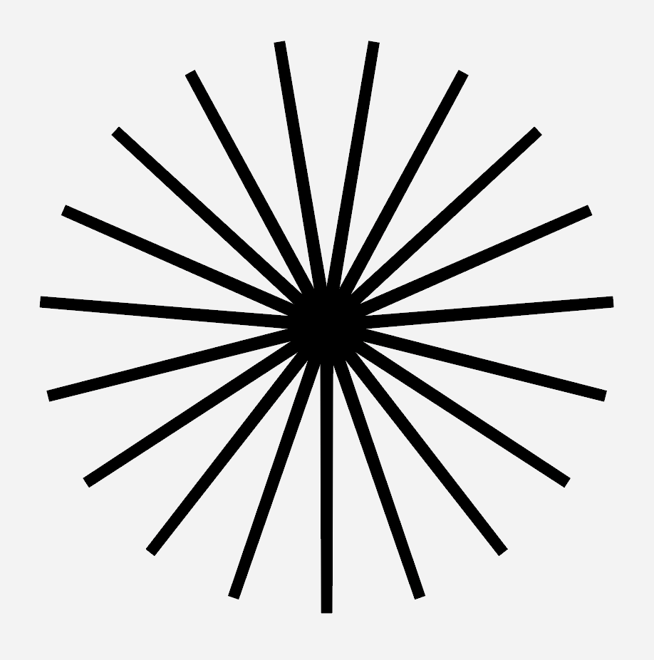
I looked back on some of my research, as well as ideation and the idea of using icons came up a lot, and the idea of using an icon for the guidelines was also mentioned, so I thought using a shape with 19 points to represent each of the guidelines would be something very simple which could work for that.
Whilst describing to me the feelings inside his head, the idea of ‘taking control’ of it was something he expressed, and to me this was the perfect description of what the guidelines were there to do, to help anyone suffering with a psychiatric disorder to take control of it.

I also discussed that I don’t think using too many colours works, that paired with photography and a lot of information is a bit much, I wanted to focus more on a single colour alongside black and white. I looked at a few different colours which are all bright and stand out enough, but not too in your face.
Yellow was the one which stood out to me the most overall, although very cliche it is a very warm colour and alludes to mental health and similar themes quite nicely so I think it works well.

I also looked at a few type variations. I wanted to keep the typeface on the left, right grotesk as a base typeface, to use for text and some headings as its more functional in terms of legibility. Its a bold typeface but also feels very approachable which is something which is important for this brief. However, I wanted another typeface alongside it, one which could take the reigns in terms of using it for the main slogan, or main headings. ‘Misto’ in the middle and ‘Le Murmure’ on the right, both beautiful, bold typeface which are both very playful in their design, however I think the design of Le Murmure (right) seems to flow from letter to letter and to me it suggests movement through its expressive features.
The Visual Identity
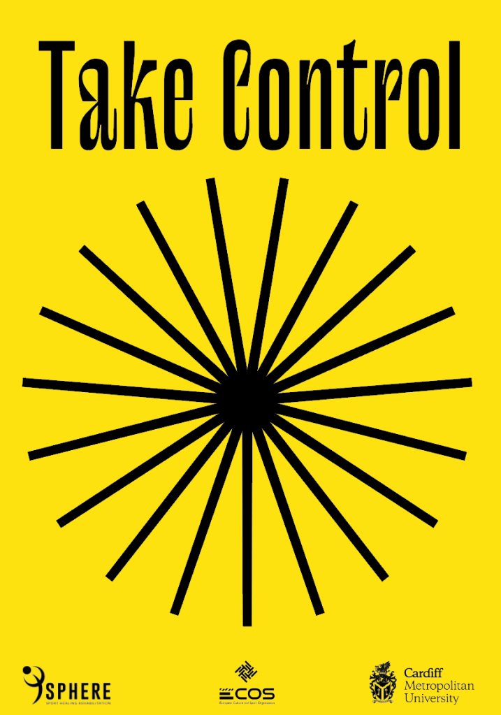
The star shapes correlate with the guidelines themselves and summarise them in a visual, iconography sense. Each line within the star represents a guideline, a way of incorporating the guidelines into every piece of design within the campaign, so that they remain the forefront of what is being communicated.
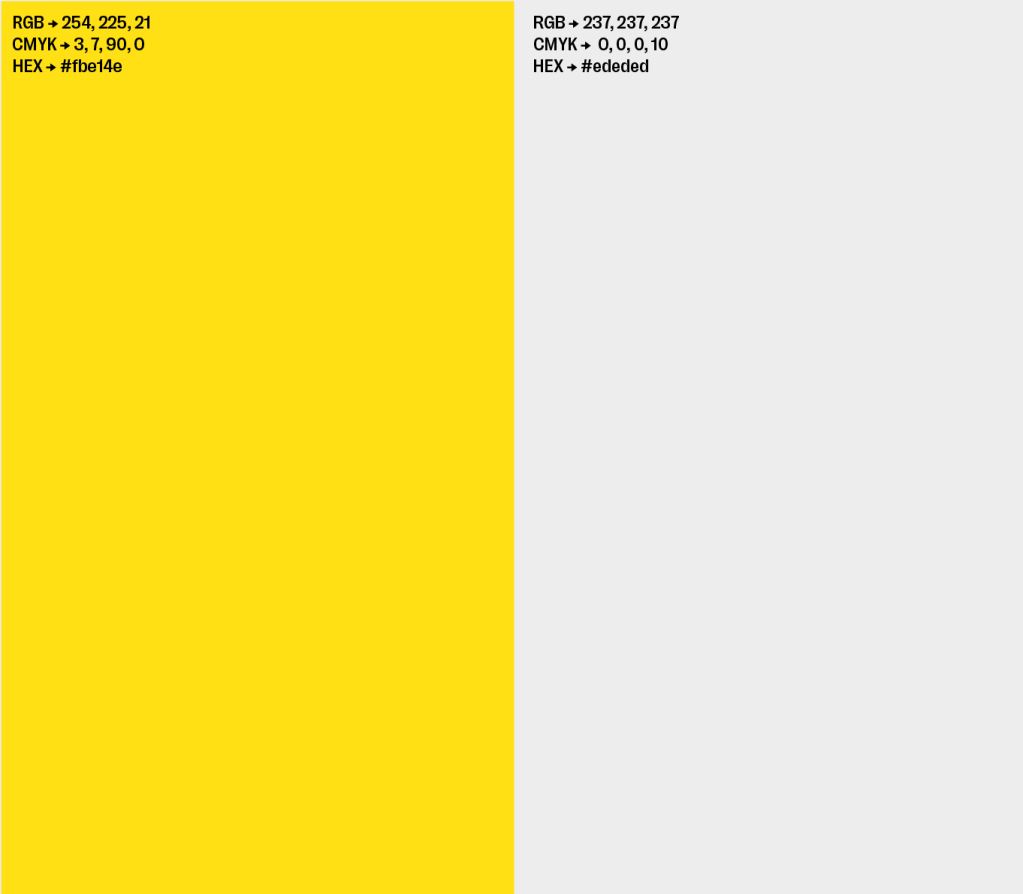
The colour is bold and striking but also quite soft in its appeal, it implies warmth and works within the mental health field. Its also suggestive of sport campaigns, using the single bright colour. I think the yellow itself alongside photography has enough connotations with happiness and pleasure to allude to mental health. It’s bold and stand out, but not too much.
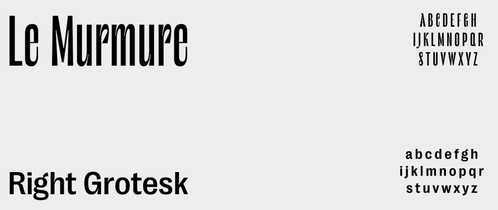
The typefaces are very bold and striking, without being overwhelming and too in your face. They are both legible and easy to read/understand. Le Murmure is a typeface which makes use of flowy features which create a rythm within words which seem to glide from letter to letter. It’s rhythm, to me, alludes to movement and activity and therefor alongside being a stand-out and bold typeface to draw in the reader, it also has connotations with sport and physical activity through its movement-like structure.
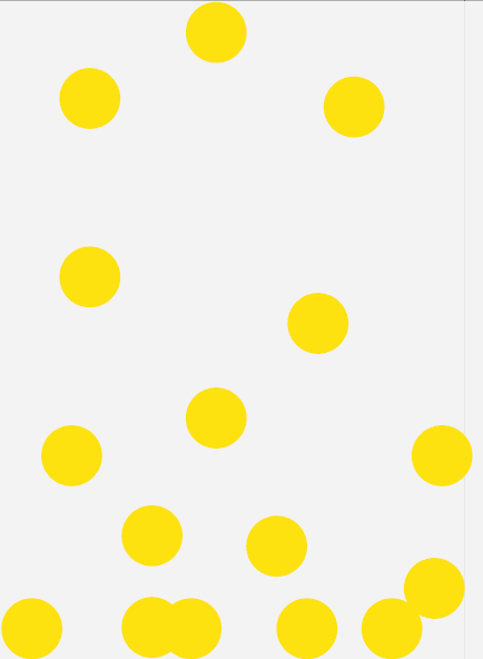
The balls bouncing, as stated previously, was an integral part of the visual identity when it came to describing the metaphor and story of the campaign, as well as describing how the guidelines can help someone suffering with a mental health disorder. The balls symbolise the chaos and overwhelming thoughts which could be present in someones head.
Potential Outcomes
Posters/Banners
Poster Series
Booklet
Leaflet
Website
Social Media
