
After deciding on the idea and the shape the project will take, I wanted to carry out some visual research into some contemporary brands, specifically those aimed at 20-30 year olds in order to ensure the visual identity of the brand is aimed at the correct age group.
First and foremost, the brand at face value is all about being bold and striking at first glance, it needs to draw viewers in and encourage them to engage with the brand, so the first research I wanted to carry out is the sort of brands and design which is aimed at being instantly noticeable and eye-catching.
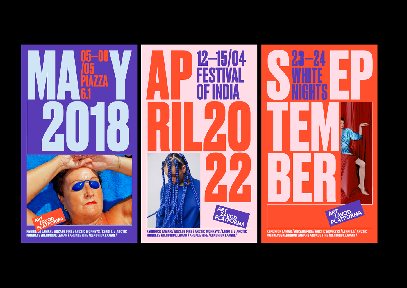
IDENTITY FOR ART-ZAVOD PLATFORMA
Art-zavod Platforma is a creative and cultural campus in Ukraine based in a former silk factory. The story was started in 2014, when the first festival of street food, Ulichnaya Eda, was held.
The branding is aimed as standing out towards a younger audience in order to convince them to attend the festival which is a creative and cultural hub. Everything about the brand is based around being as bold and as strong visuals as it can be. The colour combinations, typeface, imagery all allows it to be instantly stand-out and also instantly recognisable among other brands. The brand is so effective in being striking at first glance, it would be hard to ignore the visuals if you walked past it. It’s also so effective in being unique enough that it is instantly recognisable among everything else out there. Being noticeable is something which my brand needs to be, it needs to stand out to everyone within my target audience as it’s important for everyone to find out the information im looking to give.
The colours and strong typeface are the main two thins I’ve taken away from the brand, not only using bold colours but the colour combinations work so well together. It will be important to use strong colours and a strong typeface.


OBERLO – DesignStudio
“a one-stop-shop for entrepreneurs offering tuition, teaching and tools for young businesses”
Again, another brand looking to reach out to a younger audience which makes use of bold colours and typefaces to stand out. The way the project combines the professionalism needed from cel’s and businessmen and the illustrative and playfulness and it mixes the two perfectly to create a strong brand which sits well over all the touchpoint, from print to digital. The way the brand uses imagery alongside strong graphic visuals and illustrations is really strong, and as strong imagery is something I want to use within the brand it’s interesting to see how the brand uses images alongside the rest of the identity so effectively.
Another strong point about the brand is the way the promotional media, the billboards and social media use strong statements based purely on just being striking and drawing the viewer in. This is what Im aiming for the brand to do, use strong statements and visuals to draw the viewer into the more informational touchpoints such as the website, app etc.


East London Liquor Co. – Ragged Edge
A fresh, new take on a London alcohol distillery aimed to bring a new audience to affordable alcohol.
The important thing to note about the brand is that it is all about bringing a new audience to the brand and reaching out to a slightly different audience, so it really jumped out to me as my brand is similar in that it is aimed at drawing attention and bringing in a different audience. The brand is so good at mixing a strong typeface with the handmade/hand lettered typographic style which stands for the hands on notion of the brand. Similar to Oberlo, the visual identity also mixes imagery, typography and graphic style so well to create an identity which all works perfectly together without being too repetitive. The stickers/smiley faces also work really well to add another dimension to the promotional branding, allowing the brand to add the E L marque onto everything without it being too heavily branded. The sticker idea is one which could be really strong to add extra information without filling the page with too much text.
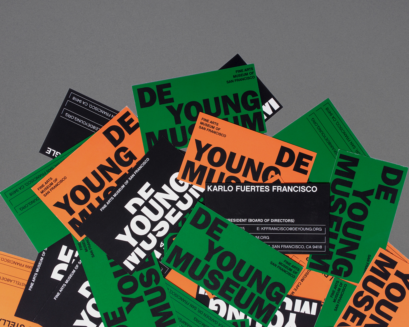
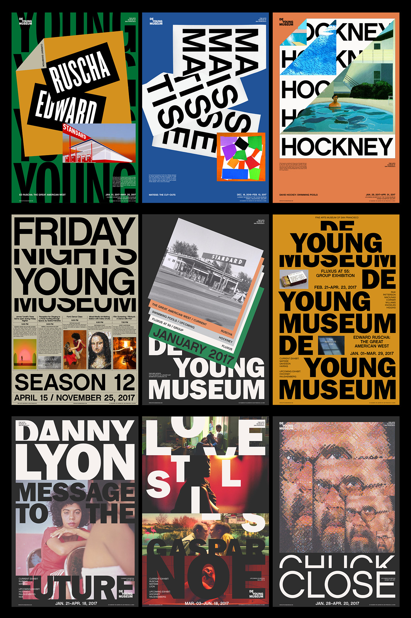
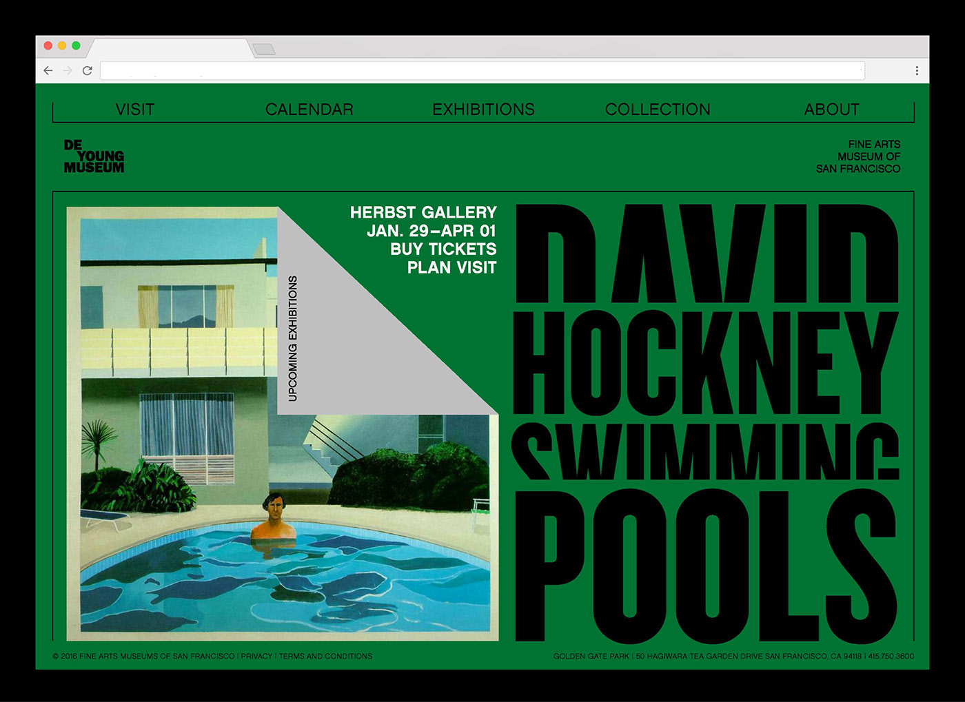
De Young Museum – Visual Identity
Another example of a piece of brand design which is really strong is De Young Museum. I noticed I was definitely steering towards more colourful brand design purely for the fact that if done well it can be so useful as a tool for being striking and instantly noticeable.
De Young Museum is colourful but it feels slightly more sophisticated with more muted colours, however it still feels playful enough and a good representation of the museum and what lives inside it. The thing I love about the branding is the way something as simple as the typesetting in the logo sets up the style of the whole identity and everything follows on from that. It’s simple but so effective, using typesetting to create a system which just shows how important small details are.

As well as a few brands themselves and how their visual language has inspired me, I also wanted to take a look into a few other visuals which follow similar design styles, using bold colours, elements, imagery etc in a sophisticated way, all aimed at being bold and eye catching looking to draw viewers into the brand.


