
I used research of some contemporary brands in order to start to draft some designs which start to shape how the visual identity might look. Although at this point I am still not sure what face the brand will take, whether it be sports, leisure, art etc. I was still able to play around with the design and specifically the aspects of the visual identity which I wanted to link back to the pandemic and the governments response. Although at face value the brand needs to be about something specific in order to make the ‘disguise’ believable, at this point it was more important to use my research to build up the side of the brand which is concerned with the governments response and the rest can follow from there.
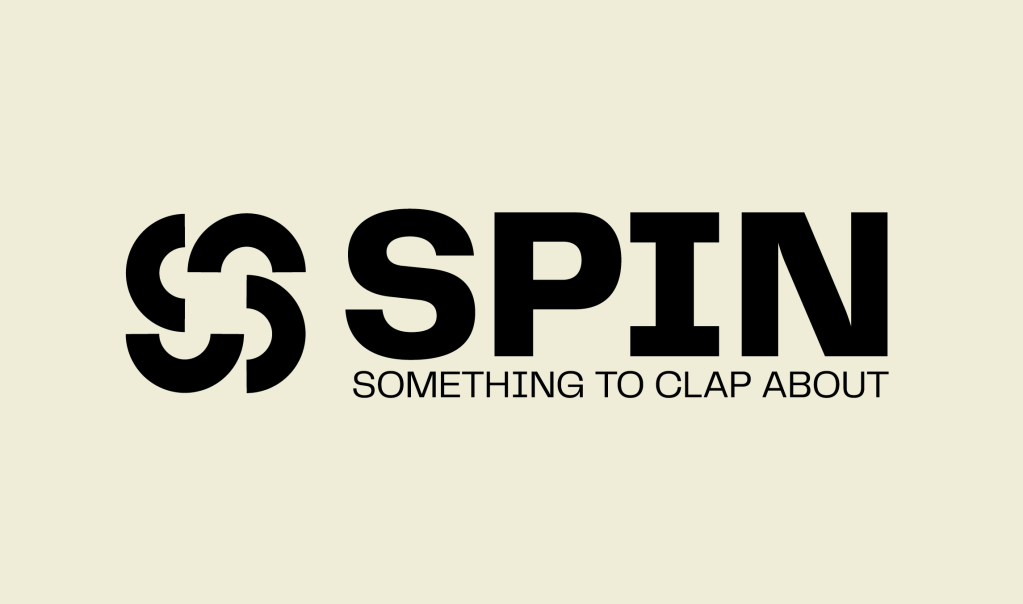
After deliberating with the idea of propaganda and the pandemic response, one of the things which kept being brought up by myself, David and peers when talking about the project was this idea of the government ‘spinning’ their communications to the public and how I wanted to use this idea to inform the brand being spun so it isn’t about what it looks like at face value. Initially I was going to tailor the name to whatever brand it ended cup being, however I decided in the end that ‘SPIN’ is enough, it links back to the idea behind the brand as well as the government side of things, and the face value brand can tailor itself to the name.
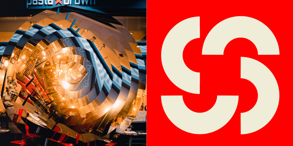
The logo was based off the same idea, relating back to the idea of spinning, however feedback within the tutorial was that it isn’t overly effective. I like the way it looks, however the fact that it doesn’t necessarily link back to Covid means it’s sort of irrelevant and doesn’t work well enough. I think it still needs to link the the name spin, however I think its important to make sure it is another link to Covid and the Government.
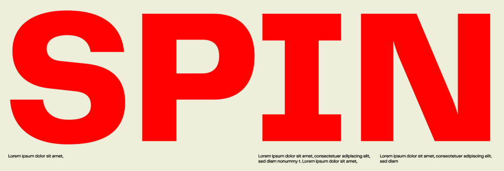
The typeface is Telegraf, a bold typeface which still comes across as sophisticated and legible, so it fits in with being exactly what I was looking for after visual language, something which jumps out and is striking enough to be seen and noticed everywhere.
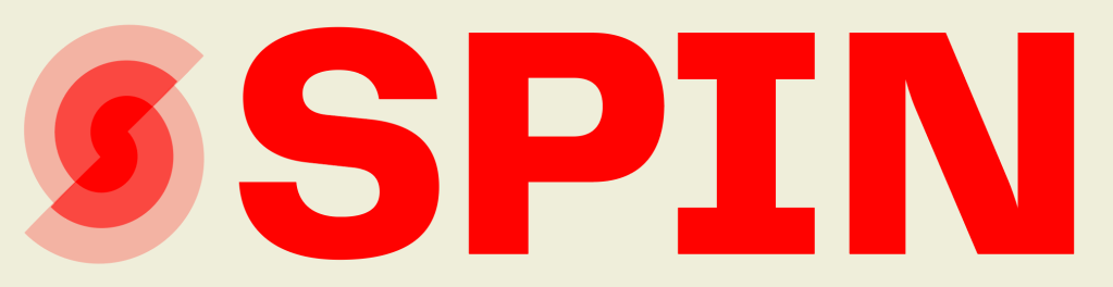
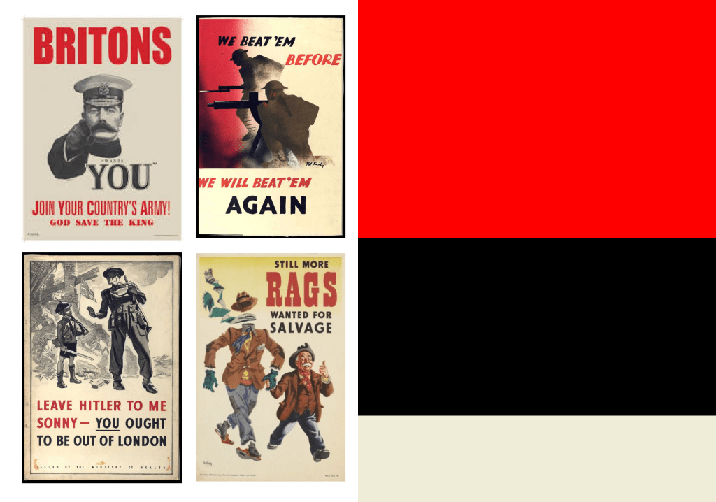
As the propaganda side of the brand was one which really stood out to me, it was important to ensure that a hint to propaganda was in there somewhere, and all I could think about when thinking about propaganda was wartime posters which primarily use an off white, black and red and are always based on being striking to the public, so the fact that the colours are recognisable with propaganda and also work well to be bold and noticeable as seen throughout my visual research works really well.
As I said in my visual research, I wanted my imagery to be strong alongside graphic aspects of the brand and I thought treating the images as visual tools rather than just images could be really strong. Not only does the fact that the images are edited and ‘spun’ fit in with the idea of the brand name, it also allows for animation to be used within the brand with the images moving, and also possibly information being shown as gather images spin. Maybe more hints to what the brand it really about, or even using the images spinning as a way to reveal what the brand is actually about.
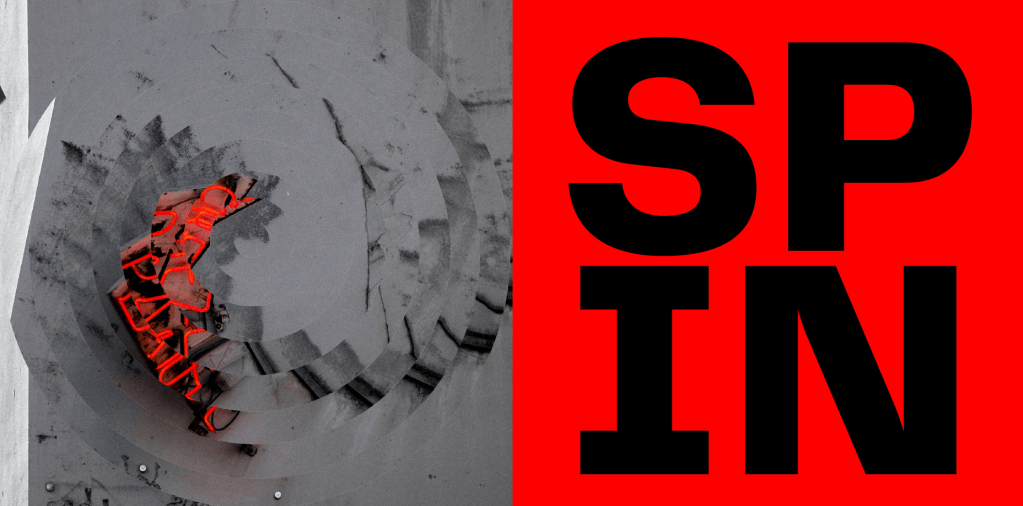
Overall I like the initial direction the brand has taken. The colours alongside the bold typography and strong visuals work well alongside each other and are starting to build a distinctive identity which does exactly what I’m looking for, to be striking and noticeable at first glance but still allude to the governments response throughout.
FEEDBACK/WHAT’S NEXT
Firstly, David discussed the fact that the brand needs to start to take the face of something in order for the brand to develop to the next levels it is its just simple visuals, colours, typographic elements etc but to take it to the next level I need to decide on a brand.
There was also feedback regarding changes to the logo as I stated. The logo doesn’t work effectively in terms of alluding to the government so something which does that needs to be created. I also though about the fact that with strong imagery, colours and a strong logotype, a logo may not even be needed as the logo itself could just be ‘SPIN’. A logo or mark could however be used in a similar way that is used for East London Liquor Co. where they use a sticker mark within the identity to ensure nothing is too strongly branded. This could work well, creating a system allowing me to use both the logotype and logomark without it being too much.
Next, I need to decide upon a topic for the brand and start to create more of the visual language, using the governments response to influence that. It’s vital that nothing in the visual language is designed without a meaning behind it, of course it needs to look captivating but if it doesn’t link back to the pandemic it is essentially useless.
