
Although I was happy with the overall visual identity and the elements that make it up, there were some aspects of the brand overall which waste sitting right with me. Maybe it was me being too much of a perfectionist or coming to revisit it after a bit of a break over easter, but I thought there was a bit of opportunity to develop each touchpoint a little bit more. I also hadn’t done as much initial development as usual purely due to the fact I was happy with the designs at quite an early stage, so I wanted to experiment slightly more and hopefully take it to the next level.
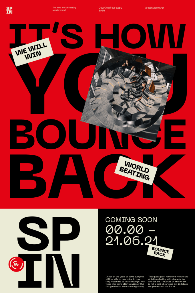
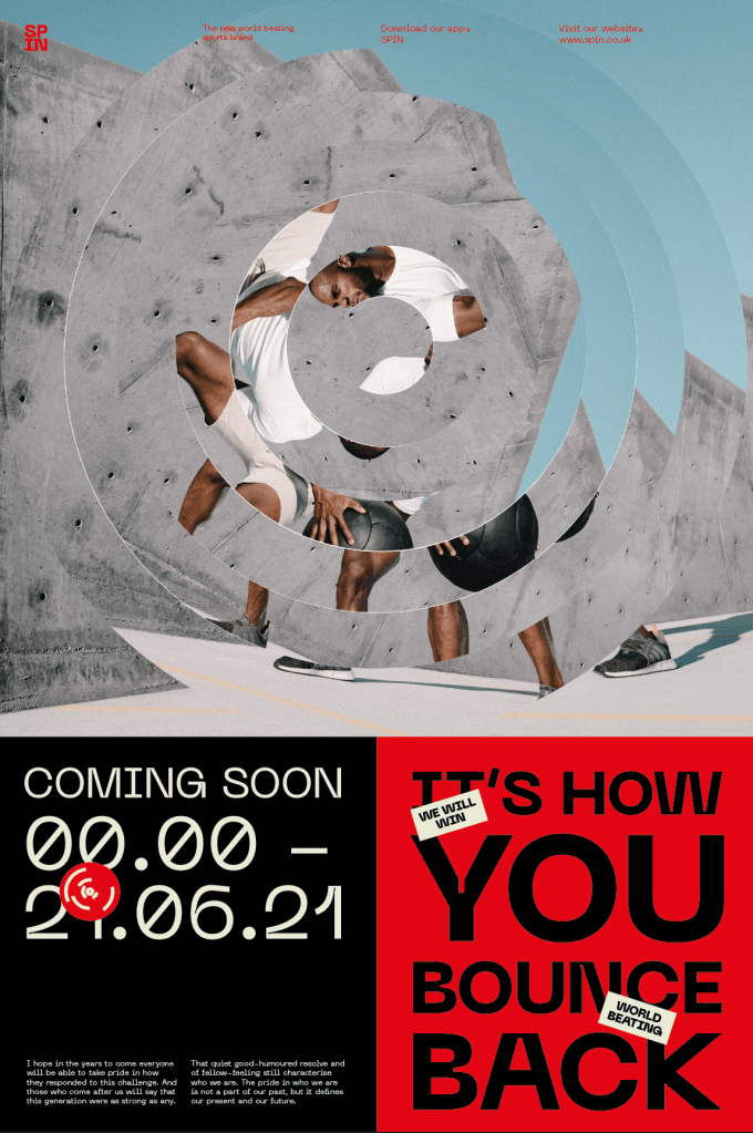
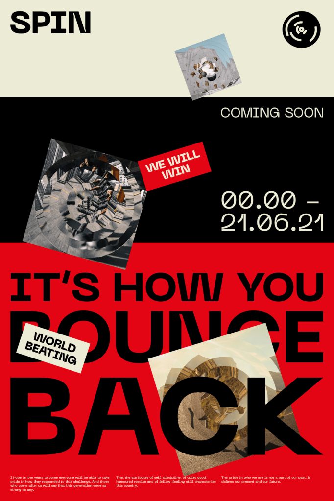
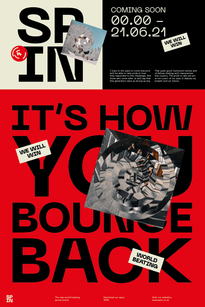
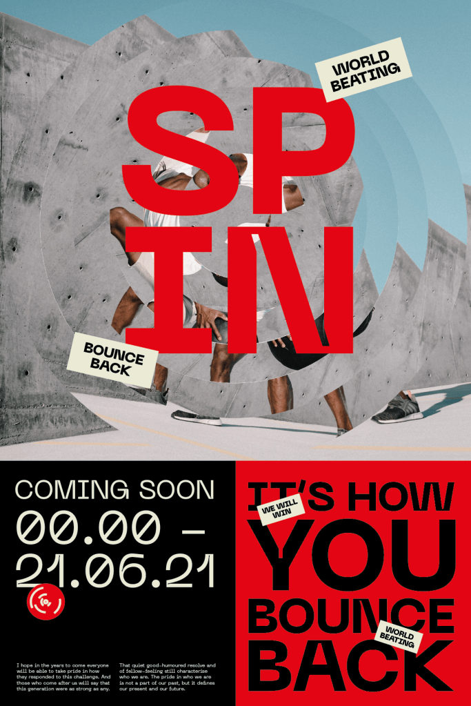
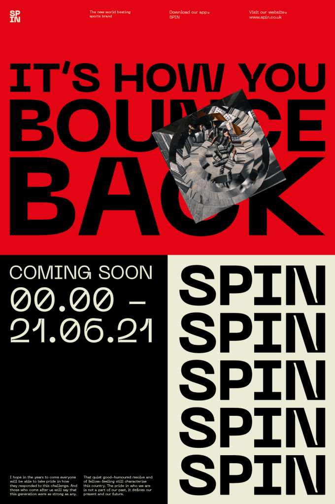
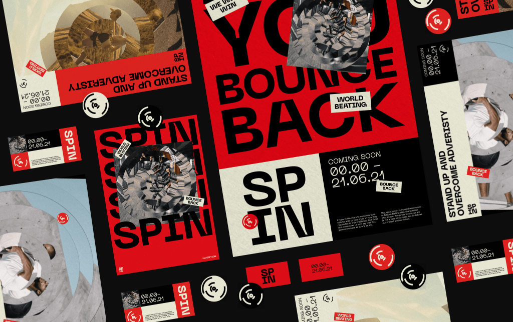
After the initial designs seemed like they were lacking something, I went back to the drawing board and looked to create a slightly different system which would incorporate more of the visual identity within each touchpoint. It was important that as much information about Covid and the governments response was being put across as possible so I designed a new layout which would allow me to add more onto each poster, billboard, social media post etc.
Ultimately I think all of the posters could work as they all follow a similar system of breaking the information up into multiple sections and I think the direction is much stronger than it was initially.

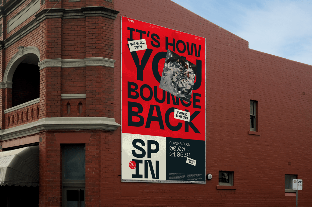
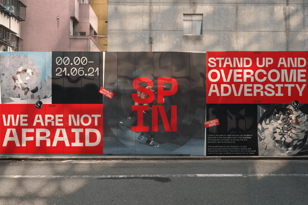
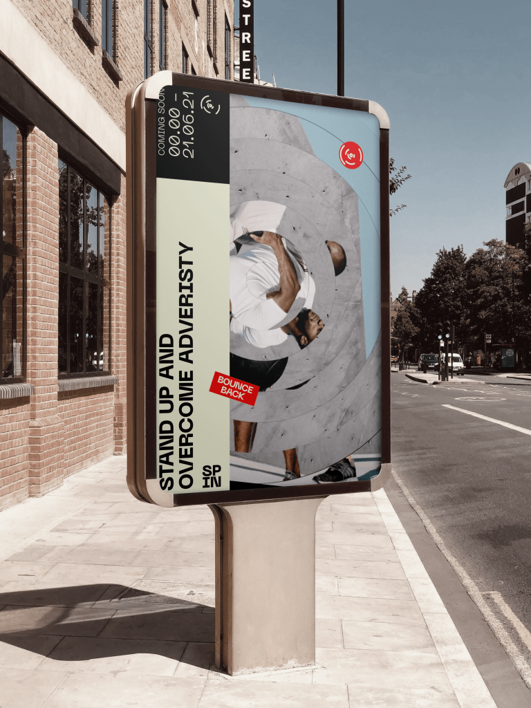
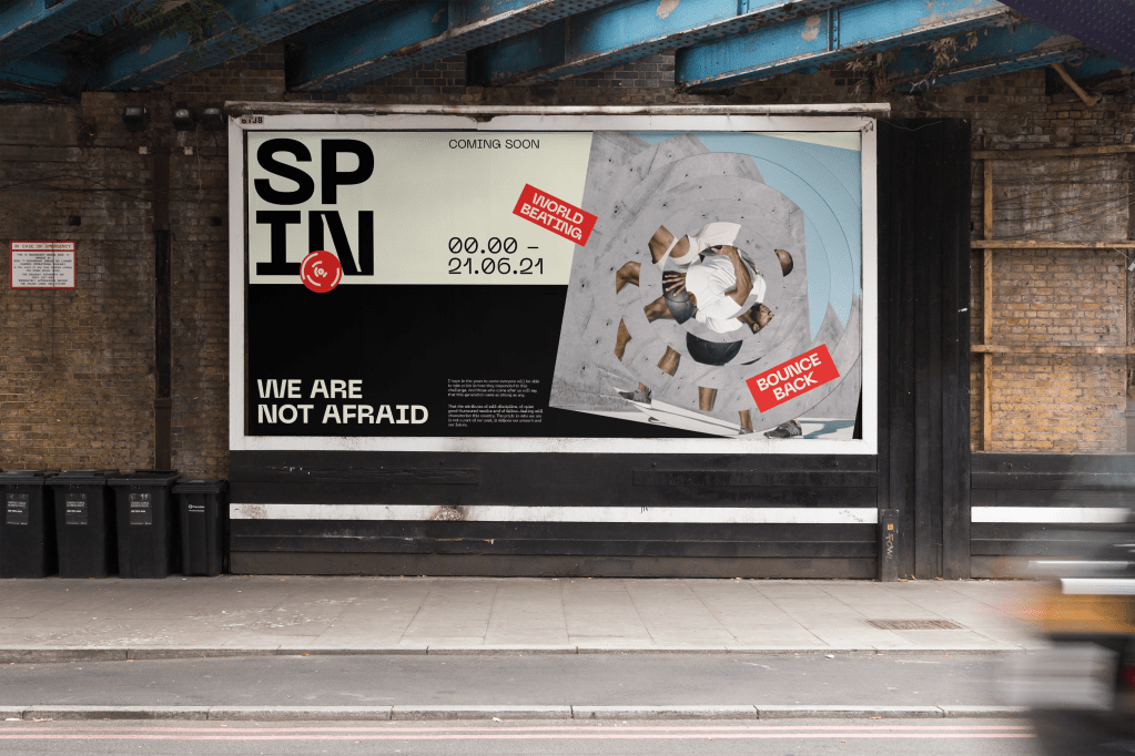
I think the new direction is much stronger and has allowed me to create more space for the identity and visual language to be shown on each piece. I also think the visual aesthetic is much stronger and more dynamic.
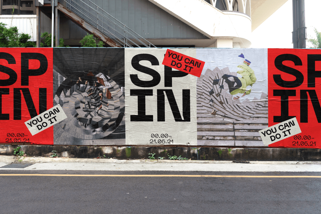
As well as improving the posters and billboards, I also wanted to take the time to develop a few other examples of printed media used for both promotional material and just extra information to make it a more complete brand rather than just the more traditional touchpoints. it was all based off there poster and billboard designs, but just shows how the brand can be taken further in showing editorial designs, as well as showing what business cards and other handouts might look like, as well as examples of the stickers, bringing them to life as real stickers rather than just elements on the page. The touchpoints I felt were important for the larger sense of the brand but also allowed me to do a bit of work on things like editorial design which I don’t often get the chance to.
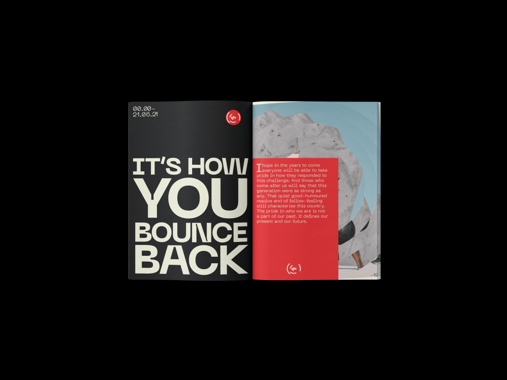
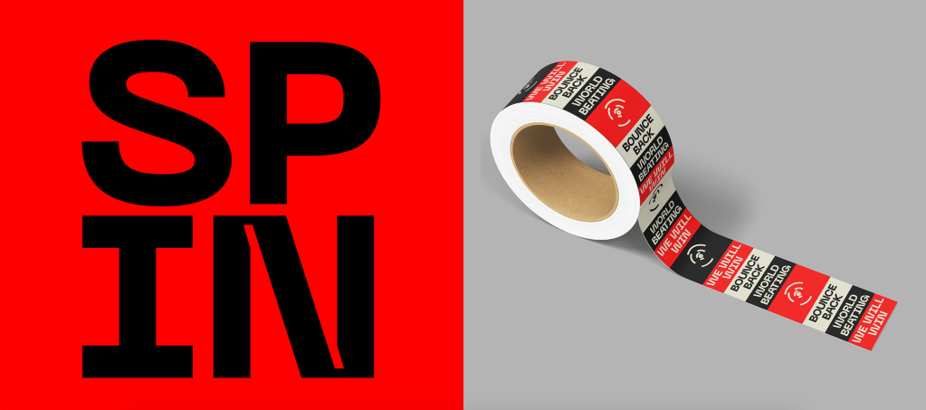
Whilst not essential, as I said it was important for the brand to feel like a full brand and it was great to be able to design more of the sort of things a normal branding project would have.
