One of the most crucial aspects of design for both aspiring designers and senior designers alike, is to ensure that a design carries out a particular function and communicates the correct concept and emotion to the viewer regardless of its the way it may look. In my dissertation, I looked to investigate the communication of meaning within typographic design in order to determine what the differences are between using the rules or not using them on the overall transmission of messages through design to the viewer. Therefor, by experimenting with the guidelines and how they change designs visually, altering our perception of them, the focus is to transmit an understanding of the rues and their counterpart in terms of their specific purpose in the face of design.
As a designer, when to follow the rules of typography and when to push them is something I constantly ask myself in order to create design which accurately communicates the correct message to the viewer, so the dissertation was my way to find out more on the topic and create a broader understanding of it.
The dissertation was accompanied by an editorial which looks to investigate and encapsulate many of the ideas discussed throughout the essay, based around both illustrating many of the points outlined through my research and also experimenting further with the concept of following and breaking the rules. The aim would be for designers to see the publication alongside the essay and use it as a visual encapsulation of the ways in which the rules may be used, as well as the ways the rules may be pushed and notice the differences the two approaches may have in order to better understand them and better appreciate that they aren’t a set of authoritative guidelines which much be followed at all costs.
The concept behind the editorial was to take many of the ideas researched within the dissertation and visualise them. Following and pushing the rules to create an editorial which uses many of the guidelines to editorial design such as grid systems and hierarchy, whilst pushing them and tweaking them slightly to illustrate the fact that it can be done as long as it’s done for a reason, for example to draw attention to something or away from something. I also wanted to ensure I add my artefact into the design in some way shape or form.
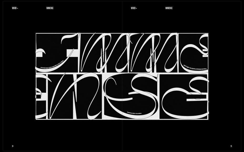
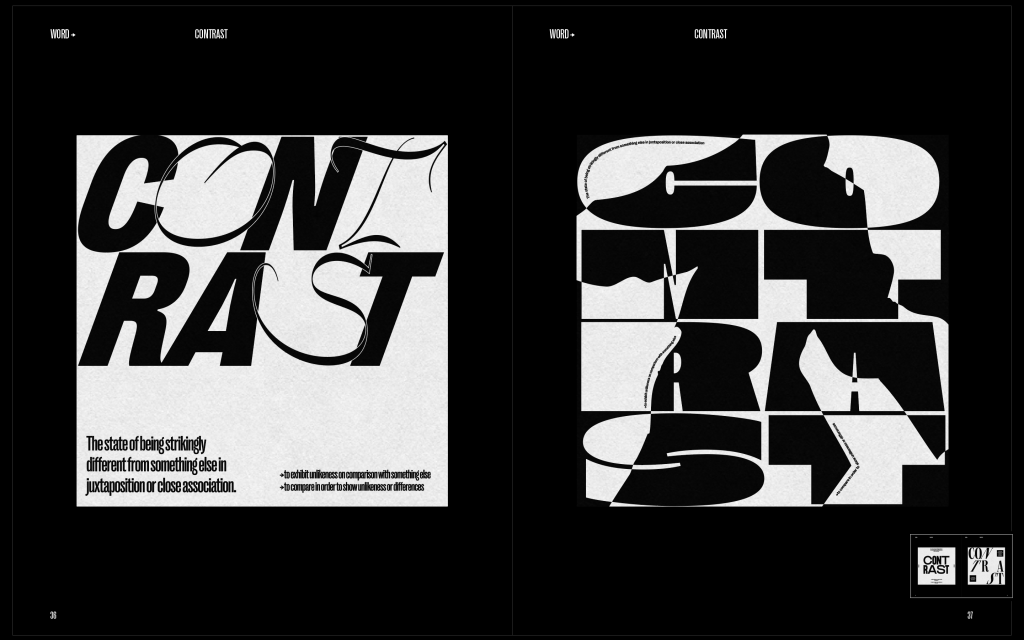
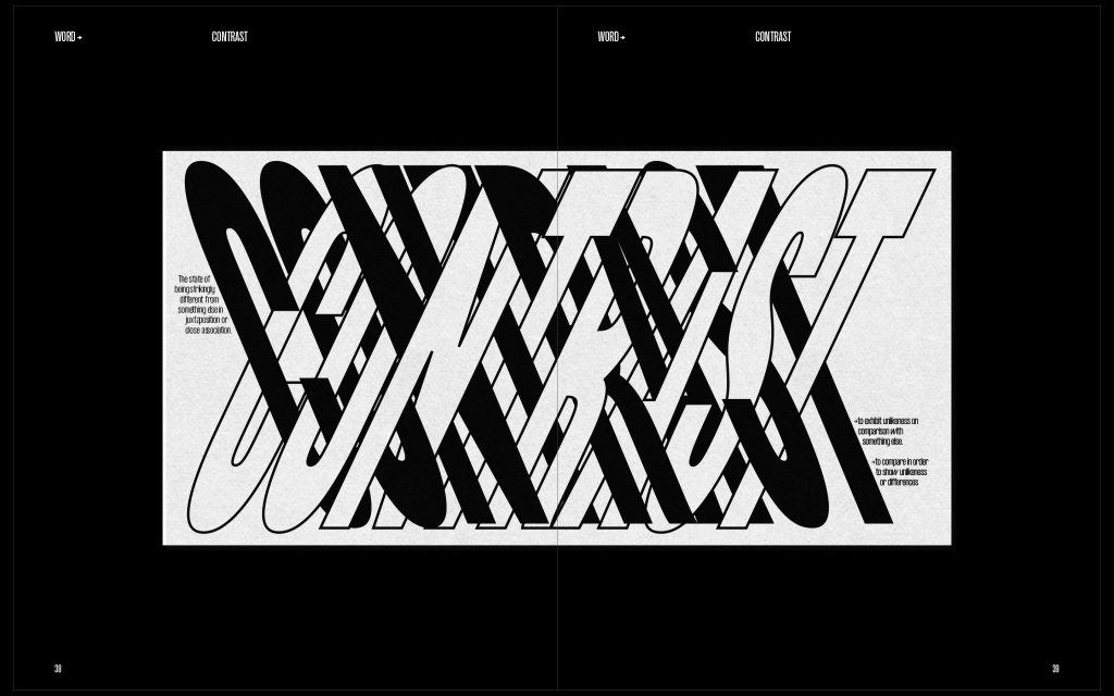
The good thing about having an artefact already made was that I already had a basic idea of the style, very simplistic, most black and white but with some strong elements to go alongside.
Inspiration
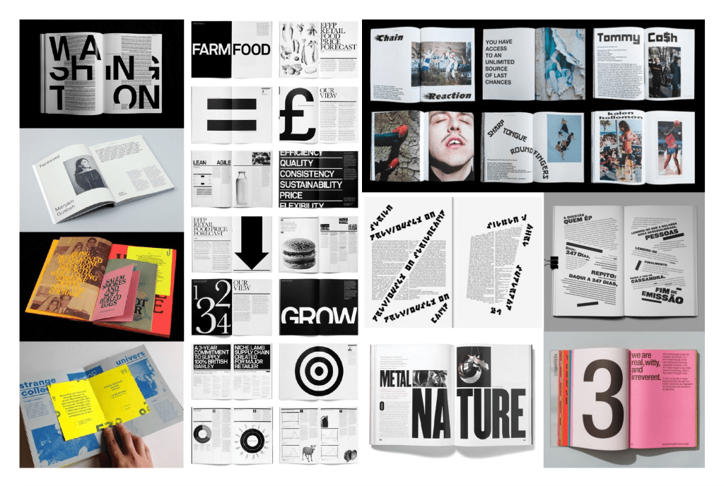
For my inspiration, I wanted to take a look at some examples of editorials which use very strong layouts and have a strong sense of typography throughout. The base of the editorial would be quality design which follows most of if not all of the rules, so the designs had to be solid technically, especially from first glance. The editorials particularly on the left are examples of editorials which are. very strong layout wise, following grid systems and particular layouts so it was important I took everything I could from them.
I also had a look into some design which pushes the boundaries a bit more, mostly shown on the right. The designs play around with legibility and grid systems to create something a bit more experimental, but the interesting thing I noticed was the way the type which tends break the rules tends to be some of the more important aspects of the page, headings, subheadings, pullout quotes etc and helps with the hierarchy of the spreads. It was interesting seeing editorials using ‘rule-breaking’ design to draw attention to parts of the page which are more important.
First Draft
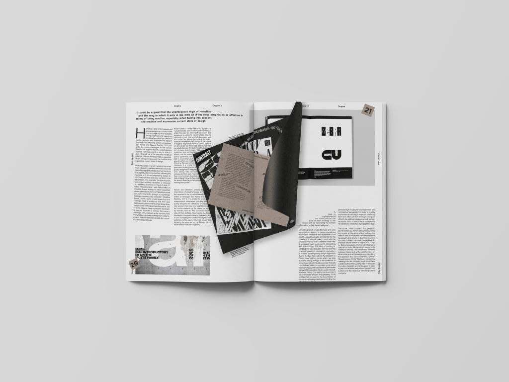
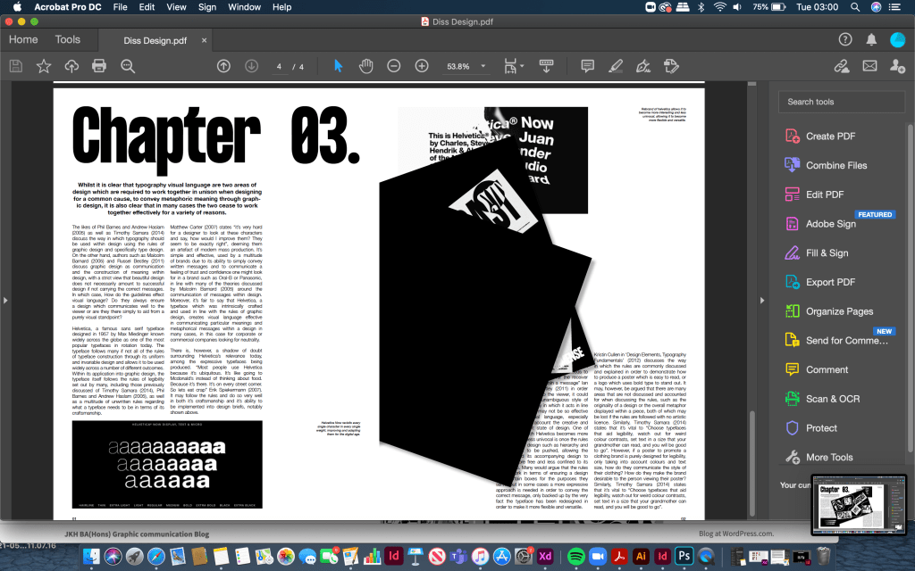
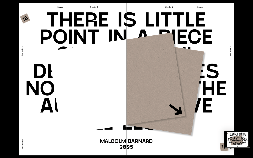
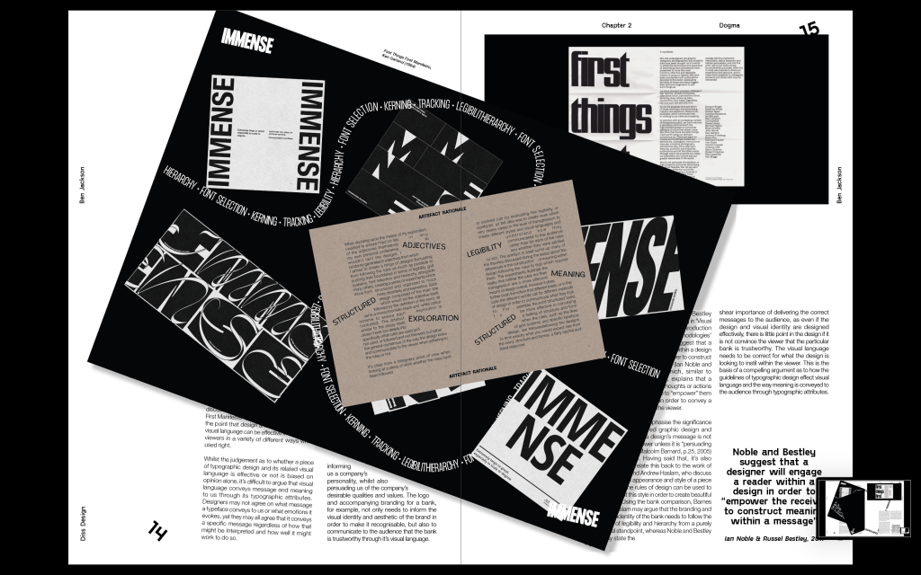
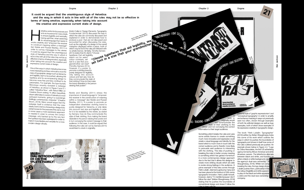
The first draft was a very basic idea, but I wanted to show David the basic principle of solid editorial design, following the rules creating a strong spread, but with the application of the artefact, the rules start to be pushed slightly. The artefact would be added as a separate page within the spread, but on an angle to draw attention to it and ensure its place as the most important part of the page.
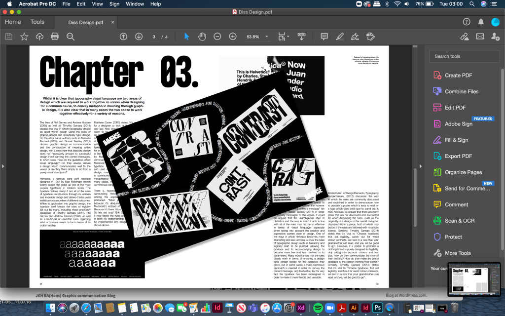
The artefact page would turn over to show the rest of the spread underneath it.
FEEDBACK –
David liked the idea of the strong editorial mixed with areas of slight chaos, but he mentioned that I could push it slightly further than I did in the initial draft. He mentioned moving captions around to fit around the artefact rather than the grid system, and even moving some other elements on the page to do the same sort of thing. Ultimately the idea is there but it definitely could be pushed further to make it stronger.
Second Draft
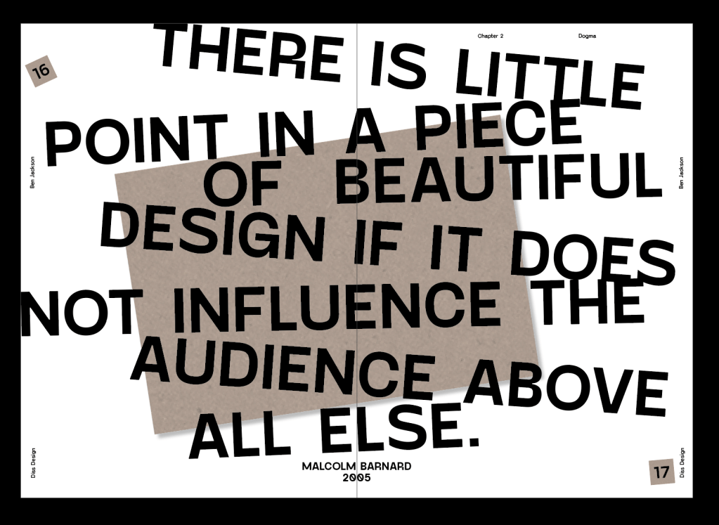
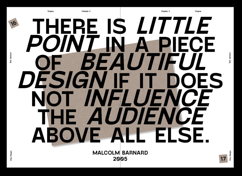
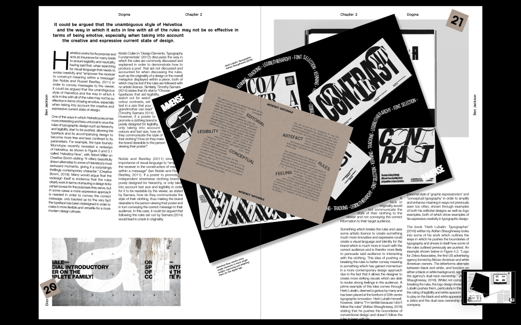
My second draft took the idea of the first spread I designed but definitely took the general design up a level. I changed the main typeface, first off I was using Helvetica Neue due to the fact the spread was about Helvetica and it’s uses in following the rules of typographic design. However, it didn’t feel strong enough and I didn’t like the slightly condensed look of it, I wanted to go for something which was still a very structured and well formed sans serif, but with a bit more character. Again this was one of the things I researched into within my dissertation, that pushing the rules slightly at the right times, in this case some of the quirky letterforms within the typeface, it draws the viewers attention to those details more, and if the idea is to be expressive that can work really well.
I kept the style of the first spread very much the same, just changing some minor things to make it look more polished. Changing some of the imagery because I think they just fit much nicer on the page and adding a few details like a drop. cap, turning some of the captions to fit in with the artefact etc. I also adding in a few more details like the bottom body copy hanging off the page, the shape of the artefact cutting into the body copy on the left page etc. Just to really hit hime with the idea of the rules being pushed and broken to some extent.
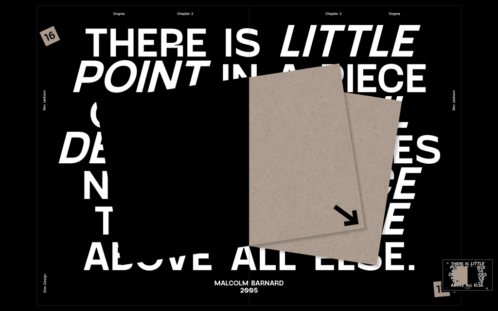
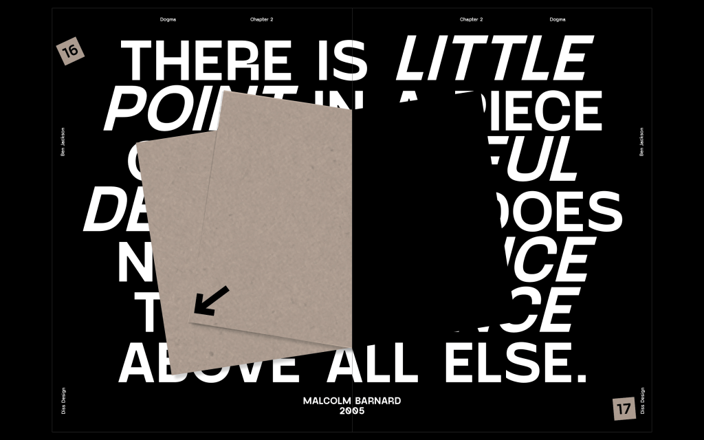
Also adding pull out quotes to the inside of the artefact page to make it feel slightly more involved with the spread itself. I also added an extra page for the explanation of the artefact as another extra page within the spread. Although I wanted to keep the page black and white, I added the brown colour of the page, again just to draw that little bit of attention to it. The brown was to add a colour but still keep it fairly neutral, matching the style of the artefact.
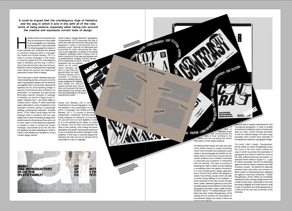
Feedback – Add some other elements around the page to fill it in a bit more, folio etc. Maybe add a few more ‘quirky’ elements on the page, if Im going by the idea that some areas which push the rules are done so to draw attention to them, make sure I do so for the first paragraph on each page, and pull out quotes etc to ensure that it draws attention to some important parts.
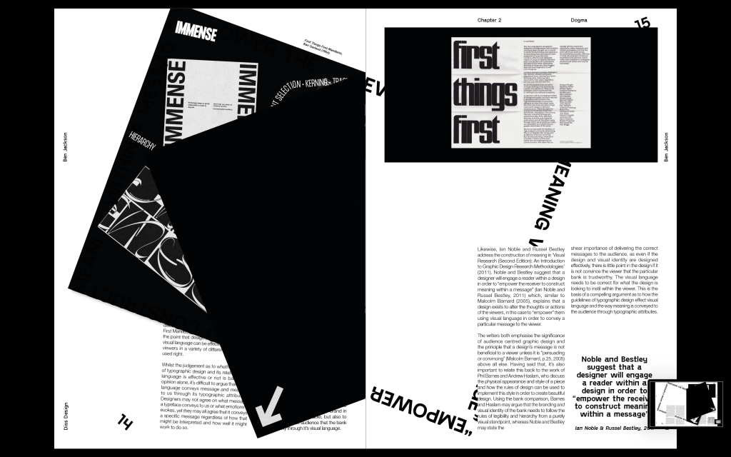
After feedback from the previous spread, I started adding a page numbers, spreading them around the page so they aren’t all uniform and what you would expect to see. Again, as seen on the previous spread I left the body copy on the left to hang over its borders, again just to draw attention to that first paragraph. I also added a split mid way through a sentence on the right side, not necessarily to draw attention to it but just to further the feeling of not everything being perfect.
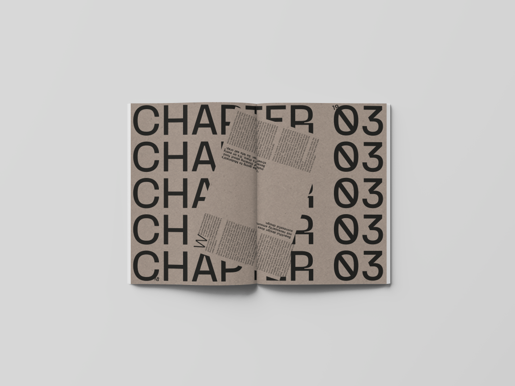
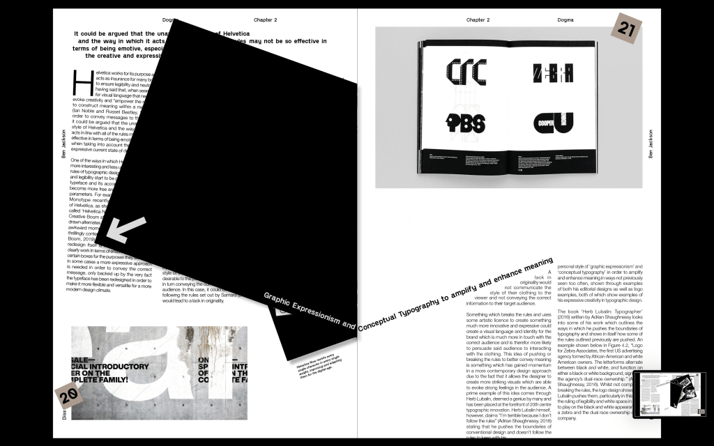
Feedback – David liked the spread and just had a few things about typesetting etc which I could improve on. After showing Joe and Jez they had the idea to push it a step further and have the whole spread sitting landscape instead of portrait just to change it up a bit, this was something I would only be able to do on one spread but I felt like its important for the chapter page to stand out, so having it landscape would help with this.
I designed a 3rd spread to sit mostly in line with the first spread, something similar but with a slight change I layout and overall design. After using the artefact page in the first spread to change some of the body copy shapes, I also wanted to use the shape again with this spread, and I though adding a pullout quote in the shape of it would be really strong.
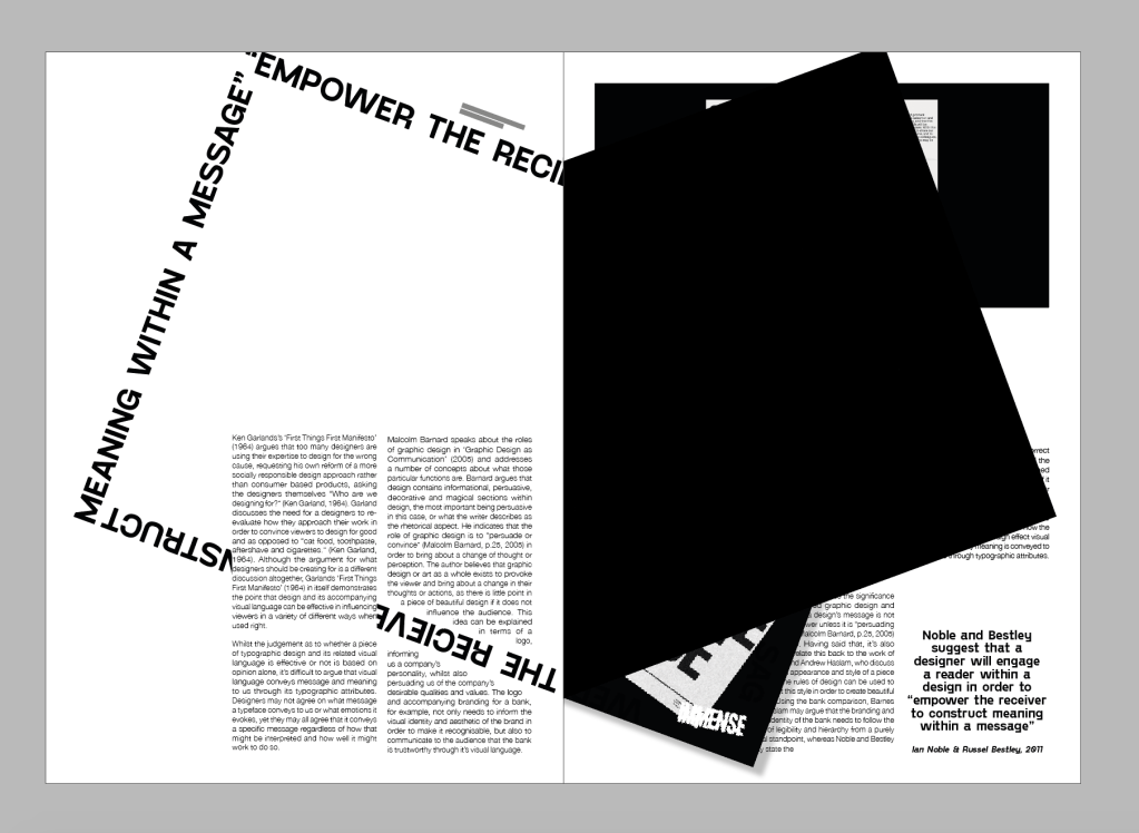
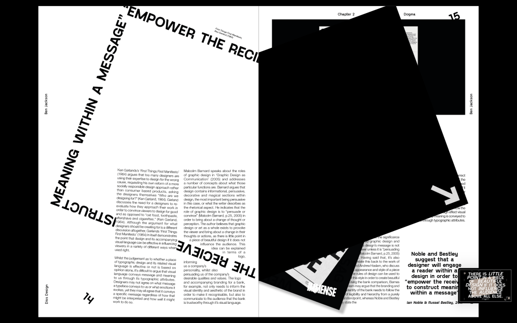
Feedback – Strong spread, but definitely needs some other elements on the page, particularly on the left side as it’s definitely a bit too white and empty. The base is there, but it isn’t as strong and developed as the previous two so I need to to a bit of work to get it up to scratch. The artefact page also needs an arrow on the inside. I think it also needs something on the first paragraph. I think it’s fairly clear that that is where the reading starts, however a little rotation or something a bit different would draw attention to it.
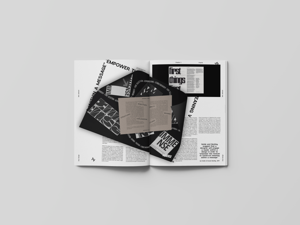
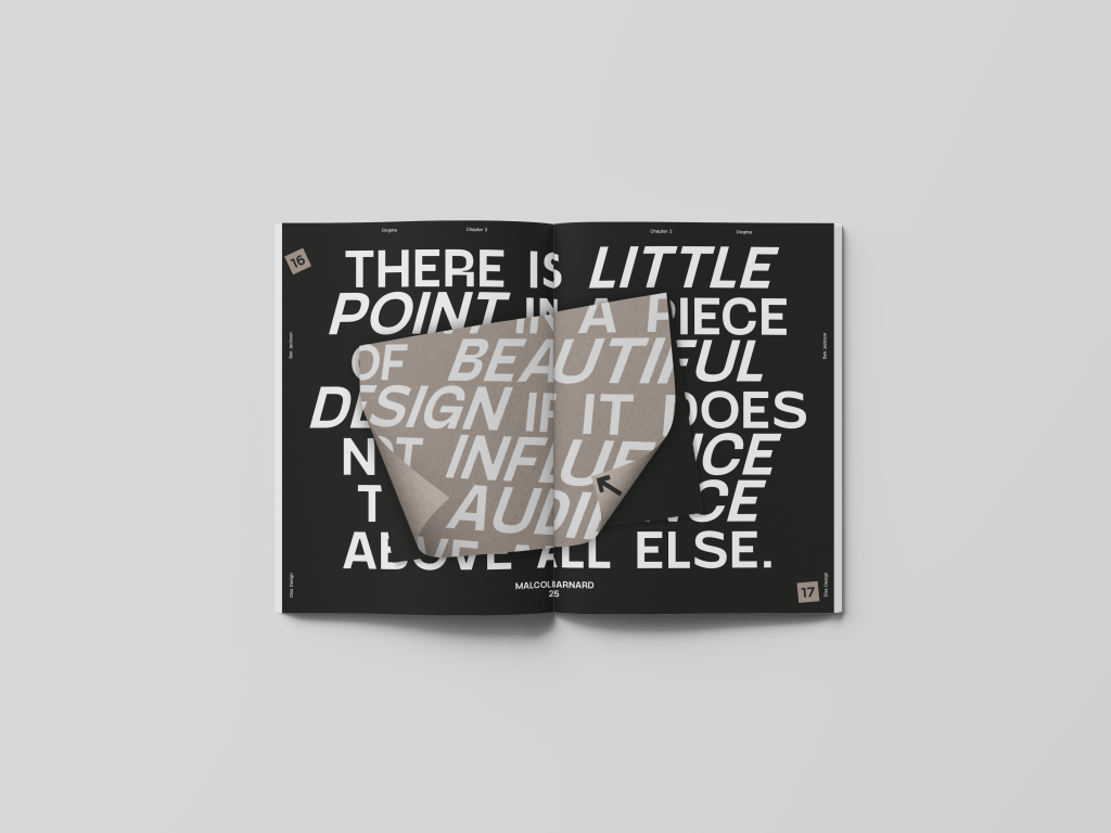
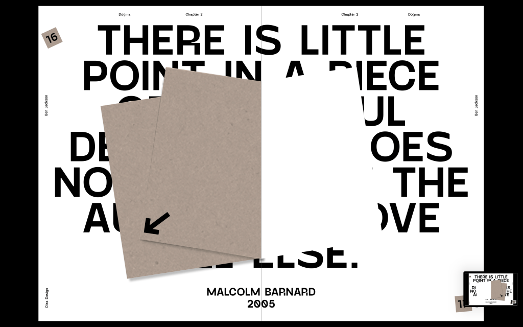
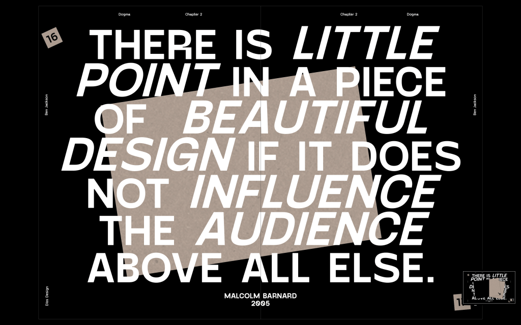
The idea behind the 4th spread was to break up the pace a bit and ensure not every page is just body copy. I used a pull out quote from the previous spread and filled the page with it, making use of the inside pages to change to add another feature to the spread. The idea is that the quote is about beautiful design being influential, so the influential part is to convince the viewer to turn the inside pages, revealing that there isn’t actually anything there, but the design was strong enough to get them to do it in the first place. I also added some elements around the page, including the folio, name of the book, chapter number and my name.
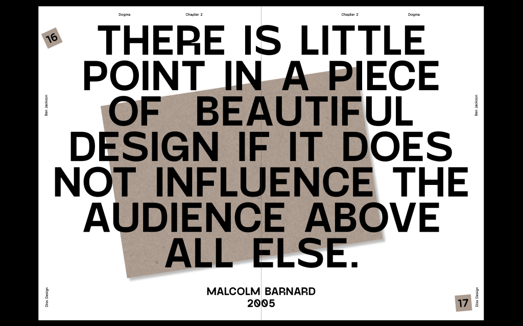
Feedback – David liked the spread a lot and though it was strong, but asked a few questions about making the sense of typography stronger, maybe pulling out some words and making them bigger or bolder to really hit home with the idea. he also though the elements around the page were strong and would elevate the previous spreads.
I experimented with a few ideas playing around with the layout and I think the spread on the right works the best out pf what I tried, it feels much stronger than the first spread in pulling out some aspects of the quote. It needs a bit of work on some of the spacing but it is much stronger than the original spread.
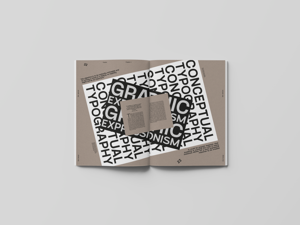
The final spread I attempted to design something using this idea of graphic expressionism and conceptual typography which I speak about within the dissertation. The idea was to give the body copy and explanation alongside a graphic behind it which gives a sense of expressionism through typography. Overall I like the idea of it, but it needs a lot of work if I want to show the idea of expressionism, at the minute it really isn’t showing that. I also need to play around with the pullout quotes a bit more.
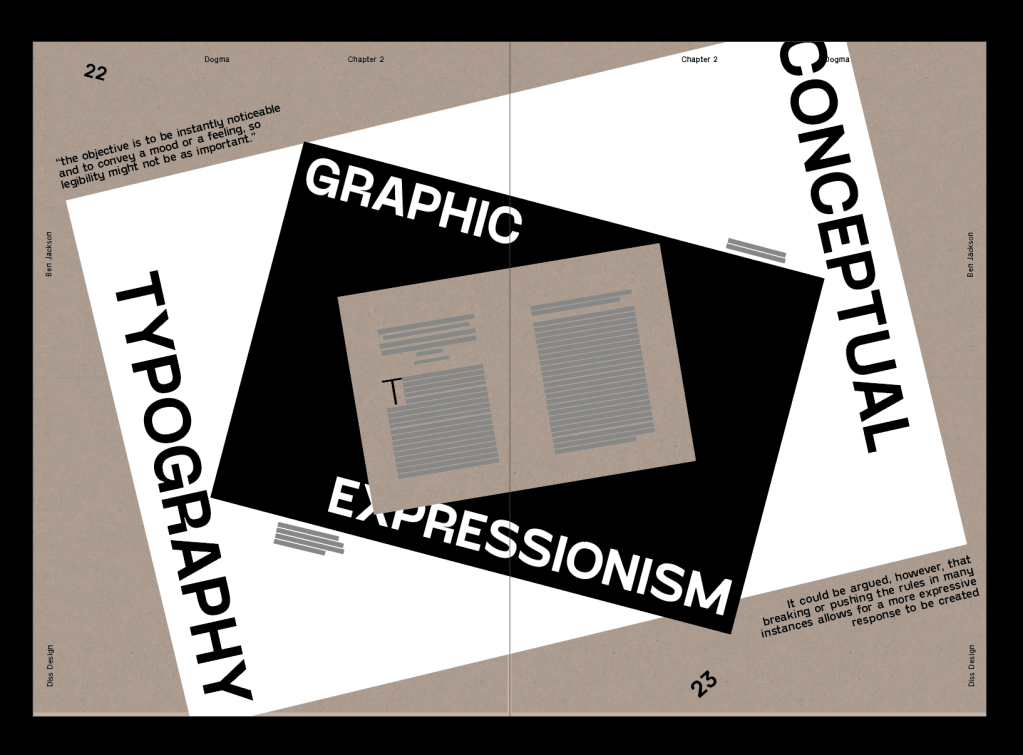
The spreads all need a little bit of development on the typesetting part as well, a few too many rivers in the justified text.
Final Designs
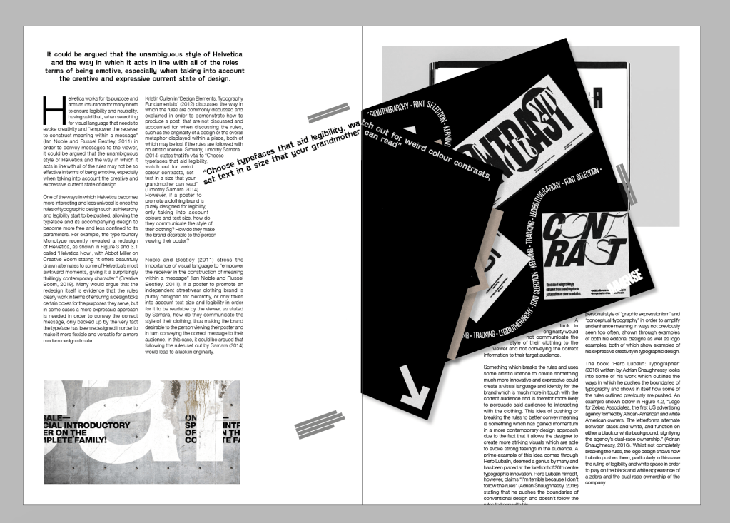
Added elements around the page which really fill it out, specifically the left page which now doesn’t feel so empty. I also slightly rotated the first paragraph in order to draw attention to it in a slightly different way than a drop cap or pull out quote. I also sorted out some of the body copy and got rid of some rivers.
I used the development of the previous spread and changed it slightly more on the spacing side. I also changed the colour to black because I thought the pace needed a bit of a change in colour.
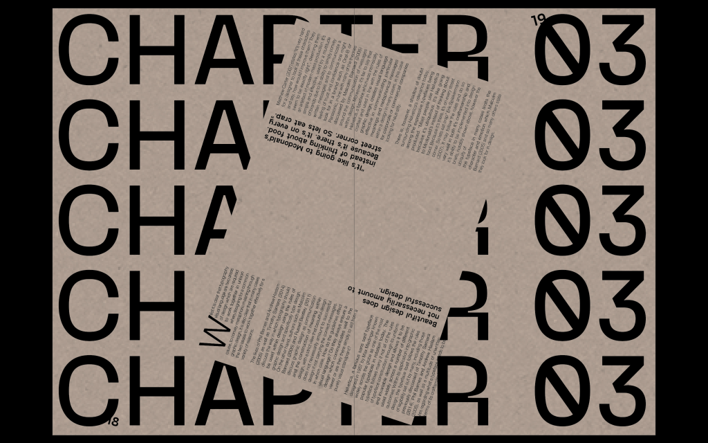
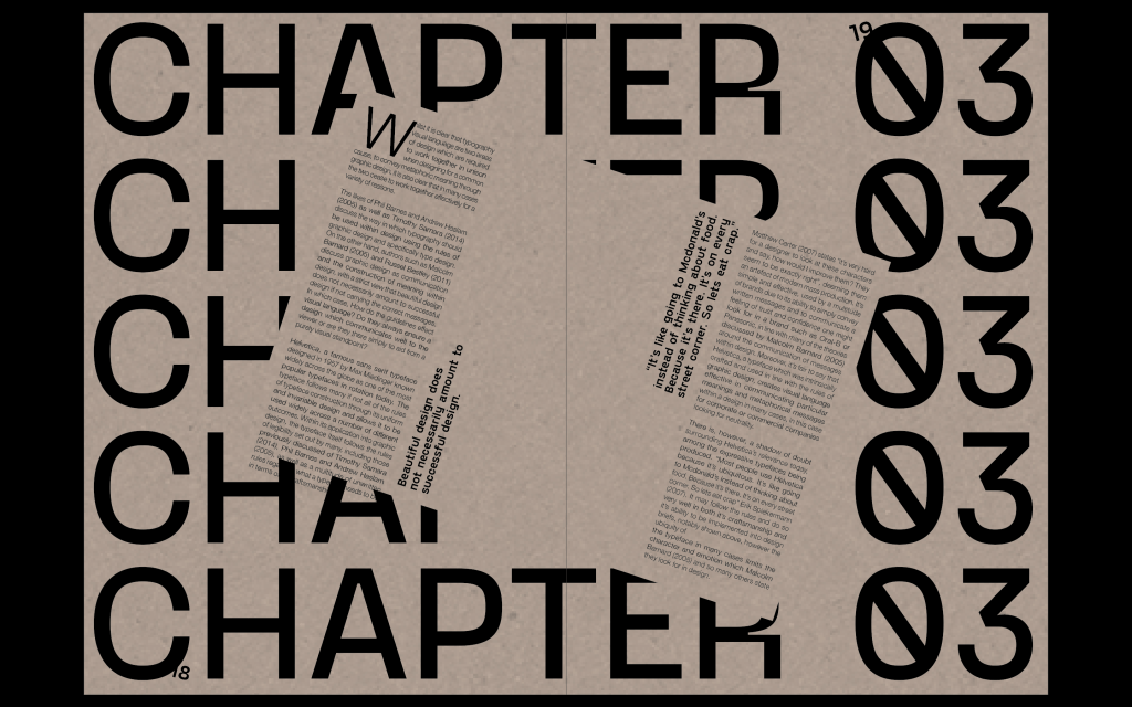
I turned the spread sideways and I think it is much more effective this way, the spread is important as it is the change of chapter so having it sideways really draws attention to that change. I think is much stronger when in landscape.
Again adding elements around the page which really fill it out. I rotated the first paragraph, again to draw attention to it and add to that sense of hierarchy. I improved some of the justification, particularly on the paragraphs which are cut off by the artefact page. I also added arrows to the inside of the artefact page.

this spread has improved a lot from the beginning, just using a bit of license to be much more expressive with the typography has allowed it to improve leaps and bounds from the start. Im much happier with it and how everything sits on the page. (Black box was a glitch on indesign, it’s gone now)
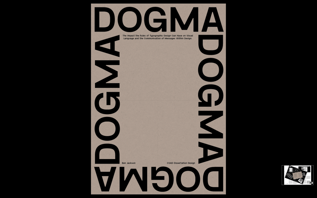
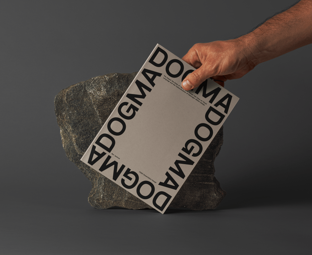
Finally, I designed the front cover. I wanted it to be very simple, with such a strong name as dogma all I wanted to do was draw attention to the name and celebrate it, alongside giving the name of the dissertation itself, with my name and CSAD.
FInal Mockups