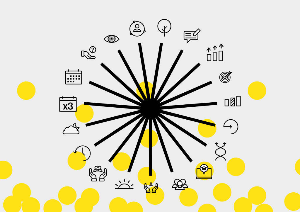
Branding – Star Graphic
The feedback I received in terms of the star graphic was that it didn’t make enough sense in terms of the brand. It was too disconnected from the icons and guidelines themselves and the link needed to be stronger. This was the first thing that needed amending.
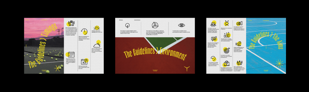
After deliberating about the star graphic and how I could incorporate it further into the branding of the project, I tried changing the logo itself, however in the end I think the most effective way to change it was not by changing the logo or icons themselves, but instead changing the way I incorporate them into the designs. Instead of using the logo and icons separately, I decided to ensure I used them together to clearly illustrate the fact that each icon is equal to one line.
The star graphic is designed in a way that it can be small or large, centred to the page or used along the outside of it with only a few lines showing, it allows me to incorporate the icons much more effectively which not only allows me to incorporate the logo to the brand more, but also allows the icons to become more prominent on the page.
Billboards/Posters
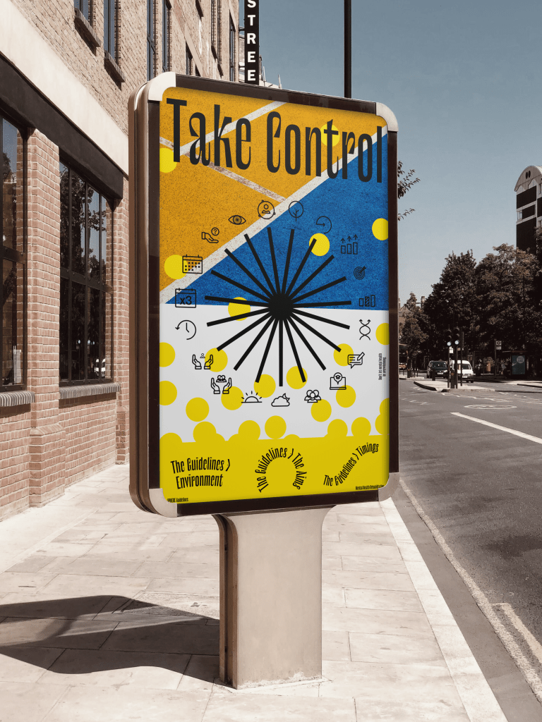
One of the other aspects of the campaign mentioned in my feedback was the clarity of the guidelines across my deliverables. Personally I was happy that the booklet, leaflet and website had a good balance between the visual style and the guidelines, however the second billboard to me seems more decorative than informative at first glance and doesn’t add anything to the campaign, so new billboards and posters were needed which show more about the guidelines and their link to the logo, making use of the icons. I do however think the first billboard is vital to the campaign, as although it doesn’t specifically show the guidelines it sets up the metaphor for the visual style and explains why the guidelines may be useful for a lot of people.
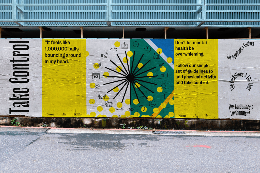
Taking the updated logo and icons I developed, I created new billboards which make much better use of all the icons and guidelines rather than a select few as shown in my earlier poster series. I think it’s much clearer to see what the billboard is about than previously and links the logo to the brand much more effectively. I kept the balls explanation because I think it acts as an important reminder of what the guidelines are all about and what they stand for, as well as why they are important to get involved with.
I attempted billboards and posters with more information about the guidelines however ultimately they were too clustered and actually added more information than was needed. The icons were designed to be visual representations of the guidelines so I think they were enough in the end.
The feedback was to cut down the noise to what really matters and go for purpose over decoration. I think the new billboard and poster style does just that in giving more information and insight into the cause and the guidelines, whilst insuring the design is still bold and eye-catching to viewers.
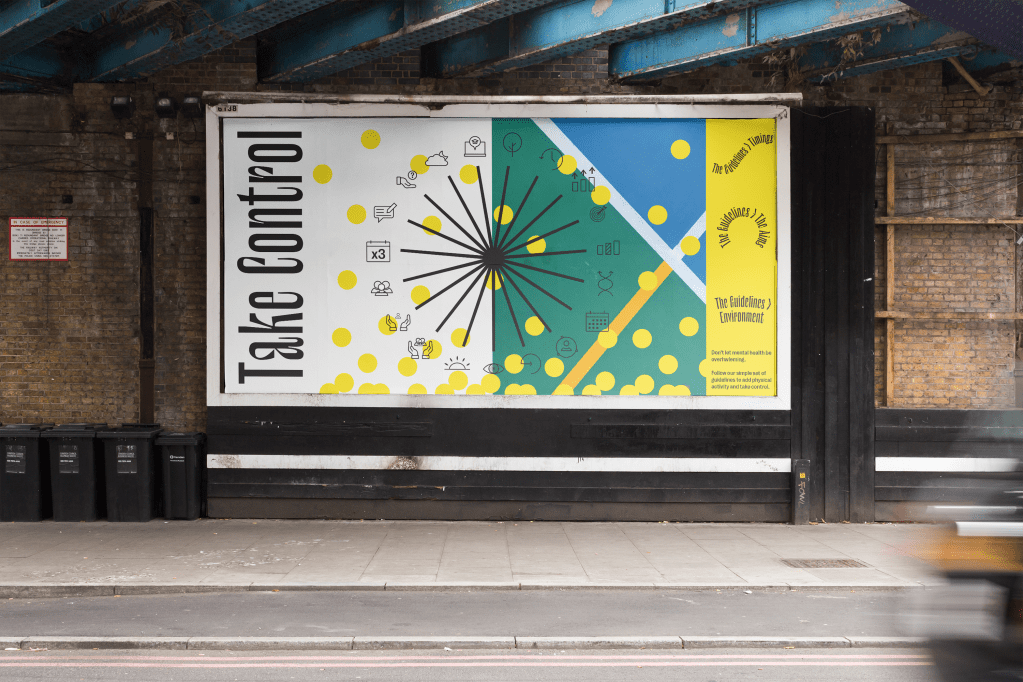
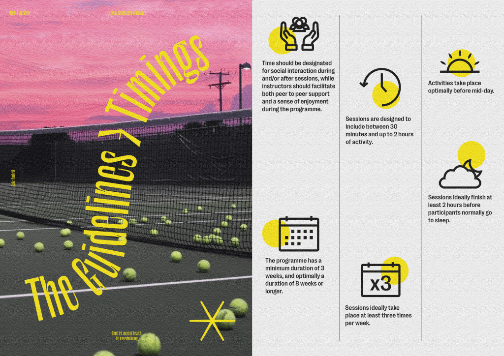
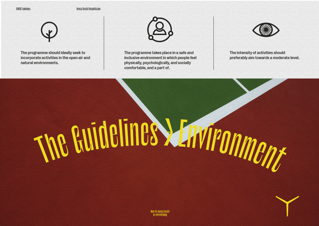
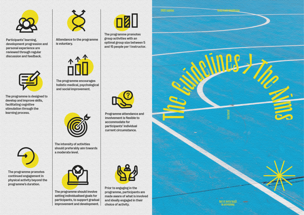
The feedback was that the leaflet and booklet both worked effectively to communicate the guidelines and some more information about the cause, therefor I decided to create posters similar to the spreads in the leaflet which can be handed out alongside other printed media to give a run down of all of the guidelines and exactly what each of them do.
I think it’s effective in terms of information design, giving the viewer exactly what they are looking for, without too much distraction from decorative design, if they want to find out more or use the guidelines. The posters can also be used within hospitals and sports centres on walls or as hand outs which was another important part of the brief, especially for an older audience who may not be as accustomed to digital media.
Animation
One of the touchpoints the clients mentioned was a video or animation explaining the guidelines and why they are useful. I don’t think the idea of a long-winded video explaining all the guidelines would be useful due to the amount of information, I think it would be useful to create a short animated video for the campaign.
One of the designs the clients were looking for initially was an animation, which unfortunately I wasn’t able to complete the first time around, so I decided to add a short animation to act as advertisement for the guidelines.
I created a storyboard and attempted to create an animation running through all of the guidelines, but ultimately the video was far too long and boring to be used. I instead went for a much more simple, short and quick animation which runs through the balls metaphor and how the guidelines can help to take control, followed by the logo and icons to give the user a glimpse of them. The animation also gives the link to the website where the user can find the in depth guidelines alongside the research.
App
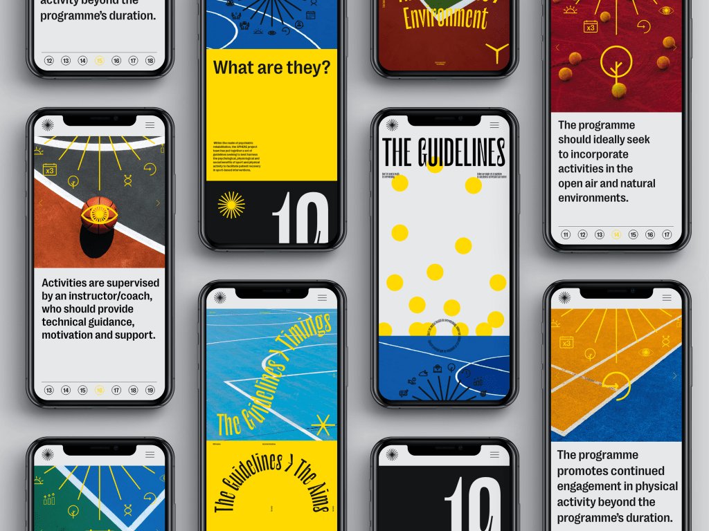
The website was an important and useful feature of the campaign in order to reach a younger audience, so I think an app which is similar and runs through information about Sphere and the guidelines would be useful.
The website received good feedback due to it being a great place for a younger target audience to read up about the guidelines and accompanying research. The website works because it allows the viewer to read extensively into the guidelines after being drawn into the campaign through promotional media, so I thought a more portable version of the website would also work well for the campaign.
The app is similar to the website in that it gives background information as to what the guidelines are, as well as individual pages for each of theguidelines, so the viewer can read them exactly like a guide. Again, I made use of the star graphic which is used as a wheel which spins to present each new guideline, allowing the logo to be incorporate into the design system.