The Uninhabitable Earth: A Story of the Future by David Wallace-Wells
The brief – Timely and provocative, this New York Times and Sunday Times bestselling book has helped climate change to take centre-stage in our everyday news, coinciding with new green movements lead by Extinction Rebellion and Greta Thunberg. The cover design needs to reflect the themes and message of the book in a clear and engaging way and appeal to the broadest possible audience.
The book is about Climate Change and Global Warming. The author states “It is worse, much worse, than you think”, After reading the book its very clear that everything coming to us is very scary, almost like something out of a horror book. The book goes into how much of the earth will be uninhabitable by the end of the century if we don’t sort it out.


As you can imagine, 90% of book covers out there about climate change all follow the same theme. Fire, the earth melting, pollution etc and are all very obvious representations of the issue. Although they clearly work well and explain the problem, I wanted my cover design to still contain the sense of heat and warming but be much less obvious and cliche.
The Idea
The uninhabitable Earth is a terrifying rundown of the horrors which await in an ever-warming world. Wallace- Wells draws from the latest research in climate science to give us a final warning. Runaway wildfires, submerged cities, polluted air and global pandemics – these and other climate-induced catastrophes not only await in the very near future but in some cases have already arrived.
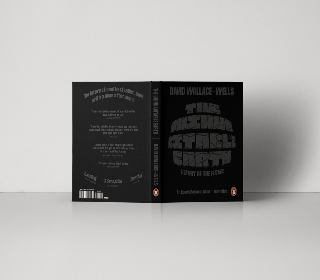
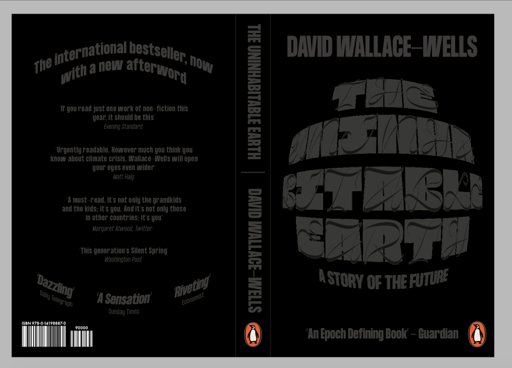
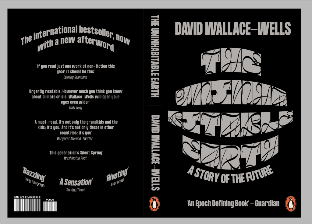
The book holds nothing back in shocking the reader through horrifying facts figures, as well as giving very worrying warnings as to what could happen in the very The concept behind the book cover was to create something which was as dark as the book itself. I wanted to ensure the cover was an illustration of a gloomy life which awaits us if we carry on how we are going, without living up to cliche’s of fire and ice caps which have already been overdone. The cover uses typography, featuring a dual typeface which looks at the duality between the beautiful serenity which nature can be, coupled with the daunting, scary side of nature which we are starting to bring out through climate change.
As well as the book cover itself being a metaphor for nature and climate change, the book boasts a heat sensitive cover which changes to a thermal imagery when heated by touch, the idea is to allude to heat and global warming in a subtle way without using the cliche of fire.
First Draft
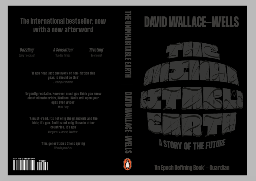
The first draft was a very simple version of was I was looking for, I didn’t have time to properly experiment with the back of the cover so it ended up being fairly simple and boring.


Experimenting with creating the look of a heat sensitive book. I tried using hand prints and fingerprints to get the desired effect but I think it looks a little too edited, so I think the first example works better to give a sense of it.

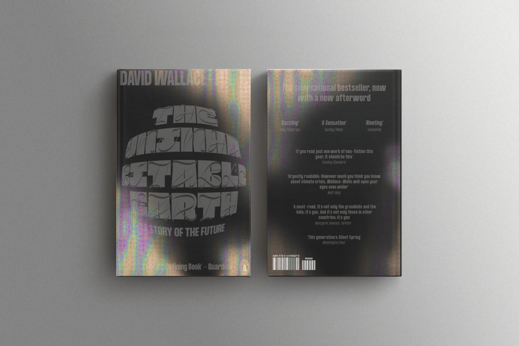
Feedback – The idea is strong, they liked the idea of the heat sensitive cover and how it alludes to heat and global warming without showing fire. The feedback was more about typesetting etc in order to make the design stronger.
Change size of the authors name ensure it doesn’t cut off and doesn’t fill too much of the page
Change the back spread to fit in better with the font, it looks too disconnected at the moment.
Development
I changed the sizing of the authors name just to make it slightly smaller and ensure it doesn’t take cup too much space on the page, or hang off the ends.
I then looks to change the back of the spread, I didn’t want to bring too much the front cover design onto the back and I liked the simplicity of thew from so I dint want to add anymore elements which flow from front to back covers. I thought the best way to add a bit more synergy between front and back was by using the curve of the main title on the front, just to show they’re part of the same cover and make them fit slightly together. I think it keeps it simple but also ensures both sides of the cover work together.
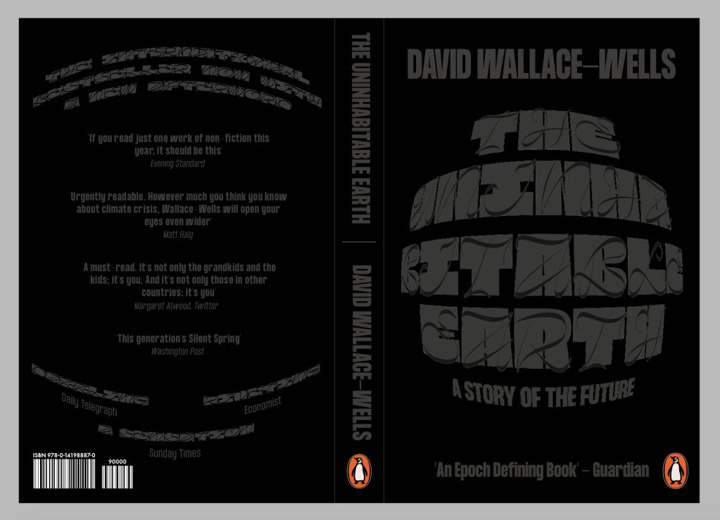
First idea didn’t work, the typeface doesn’t work at smaller sizes and isn’t legible at all.
Much better using the body copy typeface, is much more legible and stronger overall.
I also tried to change the colour to be slightly lighter, but I don’t like the way it looks and I also think it takes away from the original idea of the cover being dark and gloomy to reflect the aura of the book.
I decided to go with the second idea. Using mostly the same attributes, with a bit of resizing of some elements on the page and adding a curve to the top and bottom of the blurb to ensure the front and back both follow the same system. It hasn’t changed a large amount, but I think it is enough to take it up a level and make it more effective as a book cover.