End Of Field 4 Evaluation

What went well? – I think my group and I spent a lot of time discussing ideas in both projects and everyone came to the majority of the sessions meaning it was easy for us all to have a group understanding of the work we were carrying out. We also had no real disagreements about any decisions in either project.

What did I learn? – I learnt a lot about how differently people work within a group and that not everyone is as loud and as opinionated as me and that speaking to people and asking them what they think instead of expecting a response straight away was needed. I also learnt that sometimes within a group the best way to come up with an amazing idea is instead of coming up with one or two really good ideas, just to keep coming up with as many ideas as you can even even if some are useless, and other group members will speak out about their favourites and help to chose one.

What didn’t go as well as expected? – I think the thing my group struggled with in both projects was that after we came up with an idea and decided on the style of what we wanted to do, we struggled to all end up using the same style and idea.

What would I do differently next time? – I think next time i would definitely focus more on creating more pieces that were a combination of everyones work. Although we did this many times, I would have liked to try it out more, especially with the illustrators. Although we often created collaborative pieces they would often be someone would create something with other peoples guidance and ideas instead of everyone directly contributing.

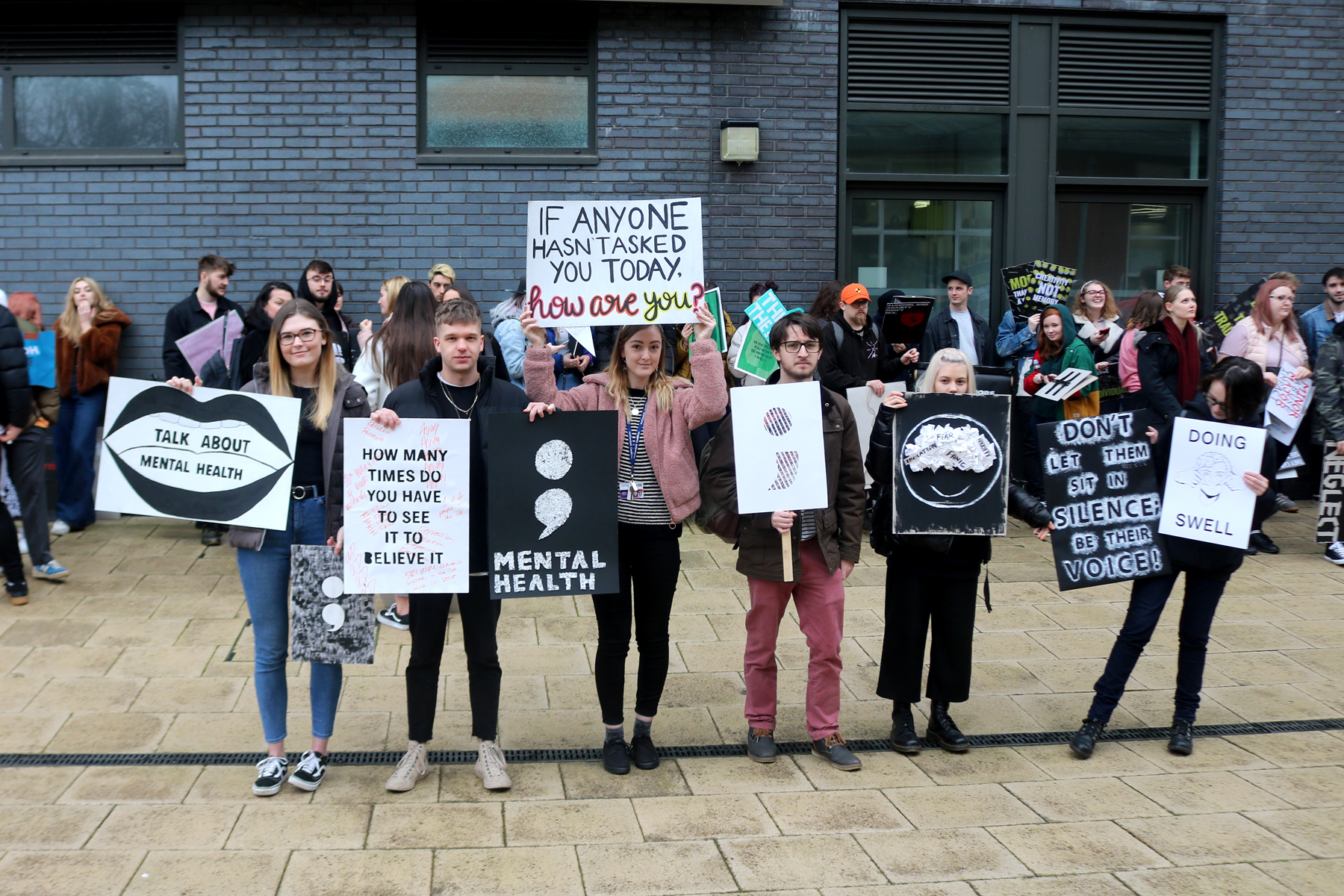
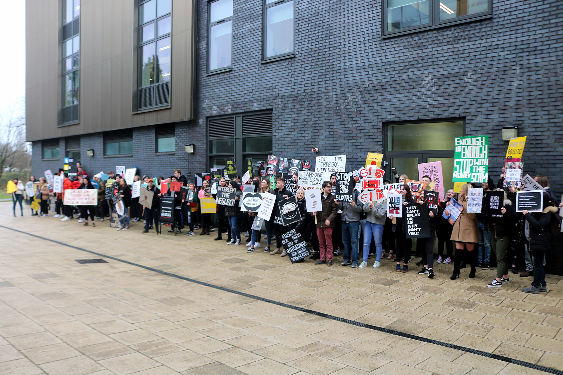
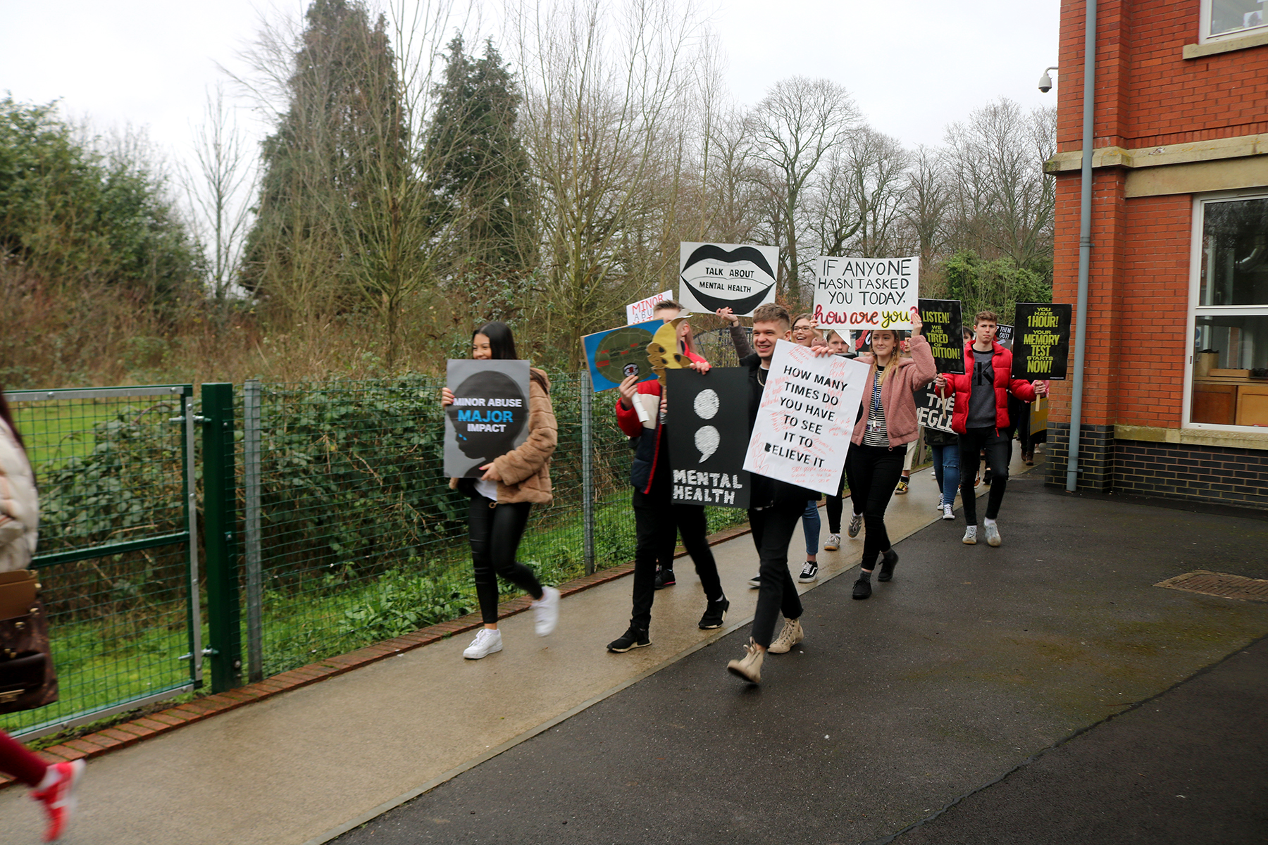
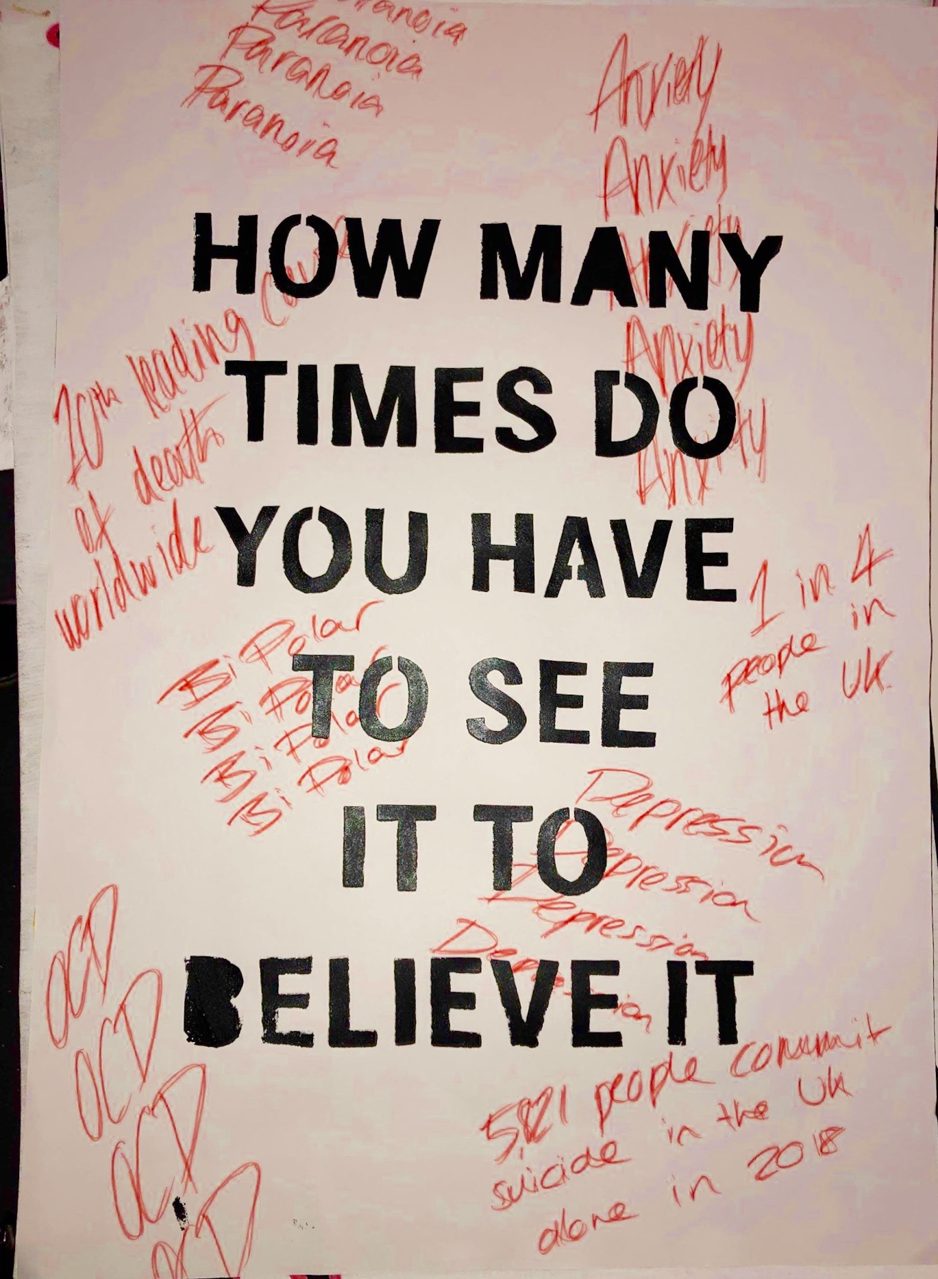
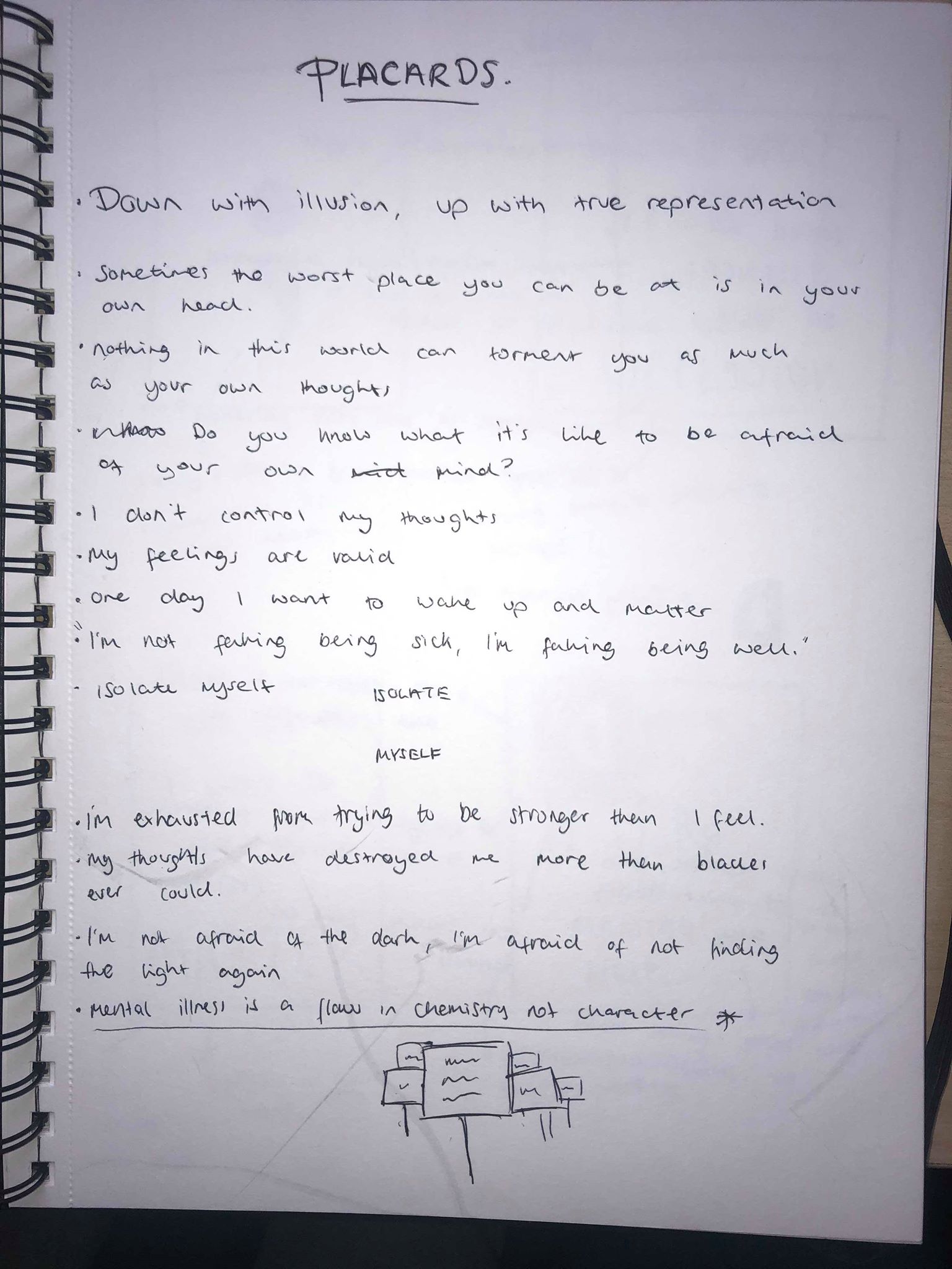
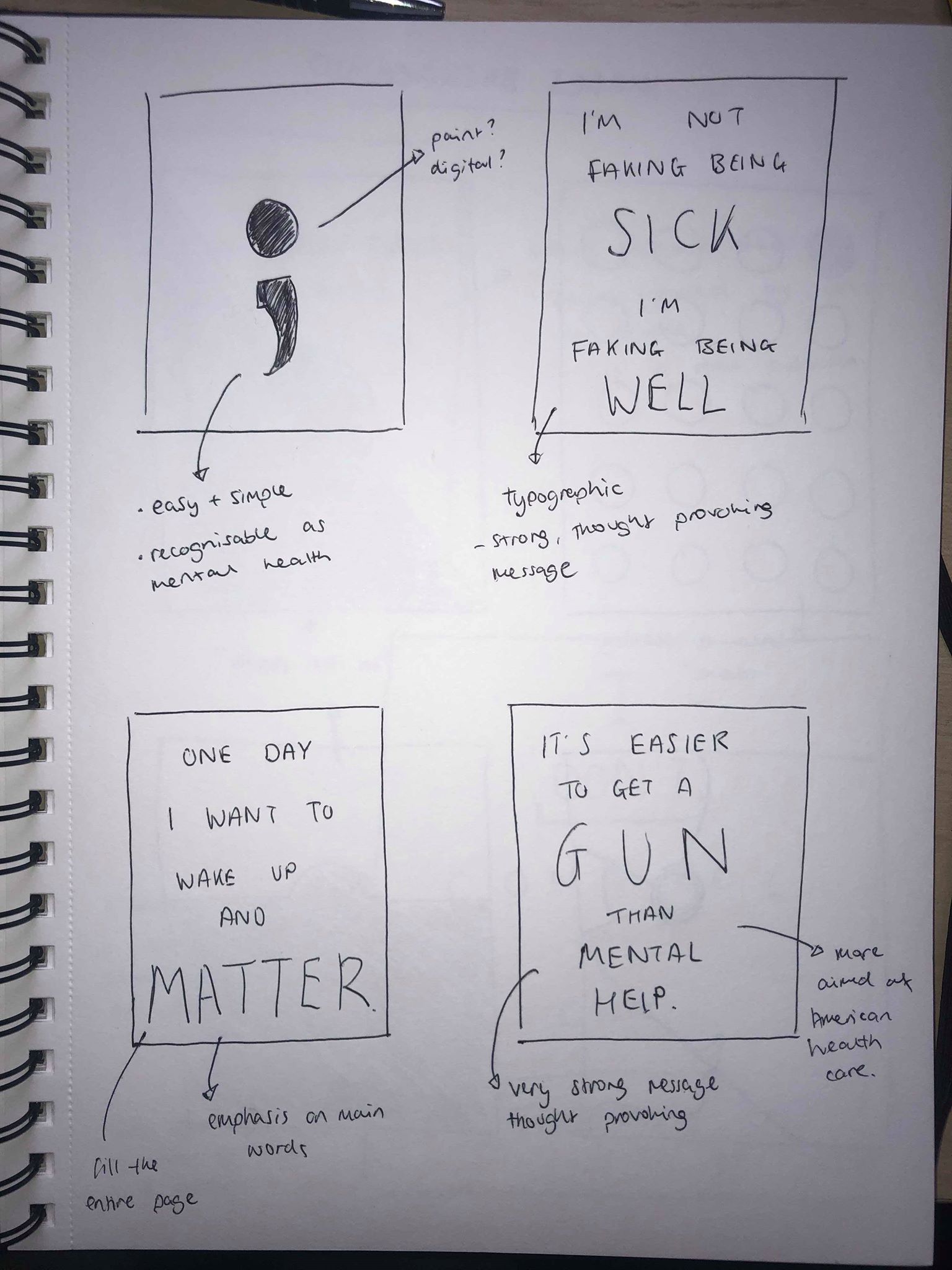
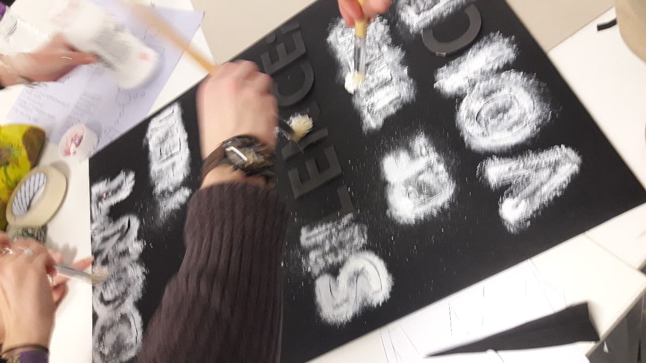
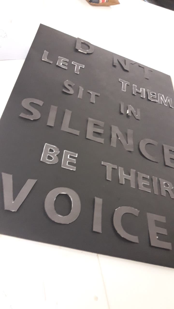
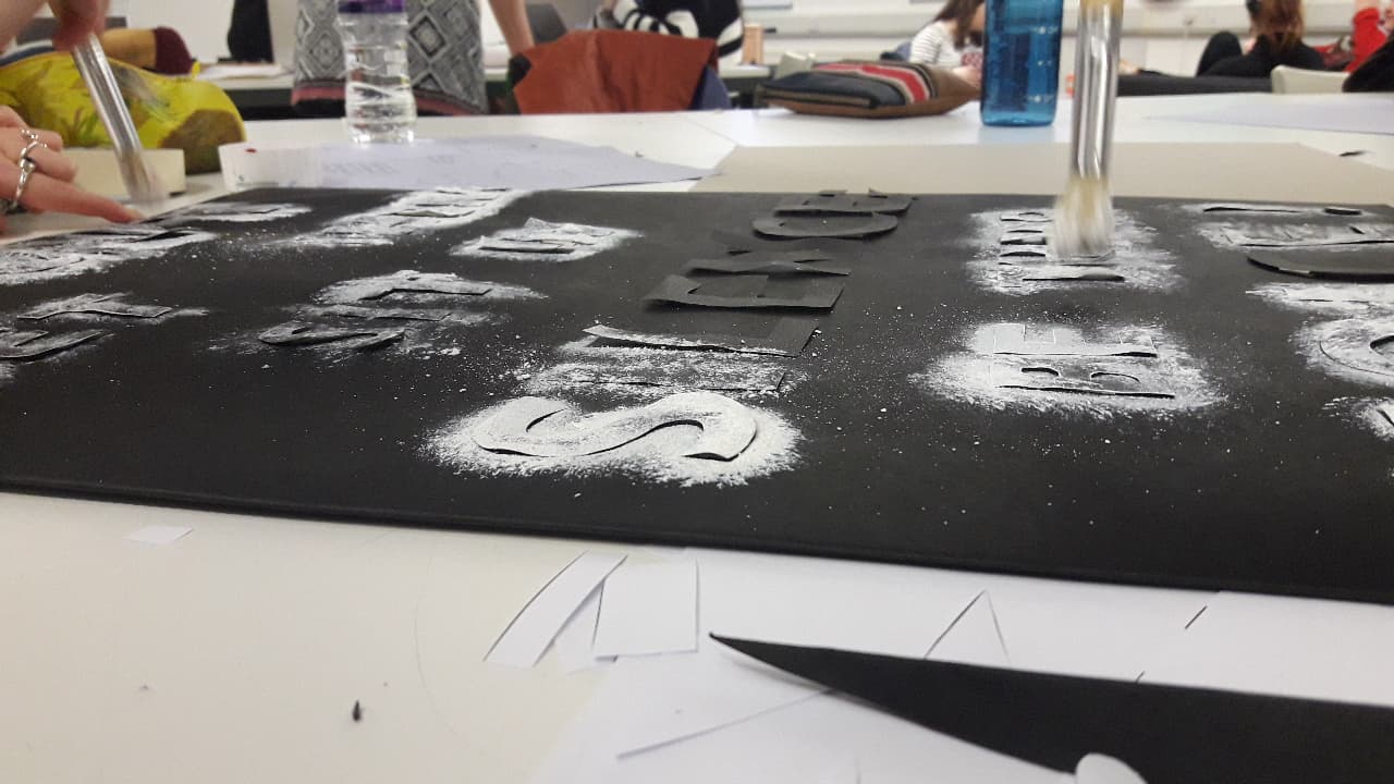
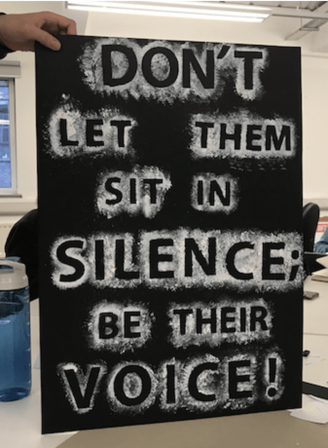
How did I use my skills to contribute? – I made sure that no matter what we were making, wether it be an illustration or painting, or a poster I always tried to contribute in some way, wether it was me giving advice to someone else about how they should lay something out, or me using knowledge on typography and hierarchy etc to design my placards.

Did I attend, engage and commit fully to my project? – I think the most important thing for me in this project was feeling like I had done enough each week so that our work as a group was good enough so I always made sure I attended every time my group wanted to meet so that I could produce the best work I could.

How has the process helped me to develop as a graphic designer? – I think the main thing it has taught me is to be open about trying anything, for example I never usually would’ve tried illustration but have done because of the brief. It’s also taught me a lot about the process of working in a group and how to get from initial ideas to a final product in a group scenario.

How did I consider the audience, tone and communication of the project? Did it change or evolve during the project? – We struggled at the start of our second project to decide who our audience would be as I think initially our idea was very broad, but through more group discussions and initial ideas we were able to narrow it down and decide on our audience. Throughout the whole process of both projects I think the both of my groups were very conscious of the target audience and everything we created took the audience into account. Our tone and communication did change in both projects as I think the more we thought about each of our ideas the more we came up with extra ideas to add in and slightly swayed from where our outcomes were initially, but I think that was all about thinking what was best for the outcome.

Placard – Live Protest

The live protest was the first chance my group had to look at all of our work together. I think you can see consistency in all of our placards, from the use of sans serif fonts for the majority, to using hand written fonts as well. We also all used very similar colours, mainly black and white with aspects of colours being added in a few. We also all made handmade placards which was something we spoke about a lot as we thought this would be much more moving and more like a traditional protest.

After looking at the images I would say as a whole our groups placards were very effective and all followed the same style so fit in as one protest, it was also all very easy to work out what they were about just by reading them.

After seeing my placard in the live protest, although I am glad I hand made my placard, after looking at my designs from slightly further away, the only thing I would change is the writing in red. If I was to do it again or improve it I would use either a bigger pen or in paint to make it stand out more and be much more vibrant and visible against the white background.

Placard – Final Development

I decided I wanted my placard to be hand made to make it more personal and to give it a sort of rough look. I screen printed the main text onto the poster and then used a red pen to write over the top of it. Although I didn’t use my digital placards I used them as a guide for how i wanted my final outcome to look.


I went with the white background because I wanted to red to stand out and pop off the page and felt like it wasn’t as bright and vibrant when on the black background. I kept the main text in sans serif as I wanted it to be bold and stand out in the centre of the page and be easy to read. I also kept the black text above the red writing as I thought it was a way to show that mental illnesses can be beaten and overcome. I then used the previous digital placard I made as a guide for the font and what to write in the text, using sort of scribbly and rough writing in seemingly random places on the page. I think it gives an essence of how rough and messy a mental illness can be.

Overall the placard is not as visually pleasing as some the digital placards I have made, however i think the message behind this one is the strongest of them all and explains our protest better than the others. Our whole protest is about making people aware that mental health is a real thing and should be taken seriously and I think the placard says that. The handmade nature of it, although again may not look as clean, makes it feel more personal and bold and as if someone actually cares enough to make it and not just type on a computer.

Placard – Final developments

I wanted to carry on with the ‘how many times do you have to see it to believe it’ placard, but I wanted to experiment more with different colours and mediums. The first experiments I did were very similar to my previous ones, expect instead of writing ‘mental illness’ I wanted to write actual illnesses such as Ocd and Depression on to give more of an insight into some of the mental health diseases. I also found some facts about mental illnesses and suicide to further add to the message and show how serious it really is.

I wanted the main text in a sans serif font in the centre of the page as this is the most important statement and i wanted it to be large and important, I then added the text in red in the background, in a the font ‘brush script’ to make it look like it has been roughly drawn on to give contrast against the text in the centre.

I think they work well to convey the message but after my research into protests I thought that the most effective and moving placards were handmade and add much more meaning to it. So I wanted to either paint or use screen printing to create my final outcome.

Placard – Initial Ideas

I started off by thinking about phrases i wanted to use on my placard. Initially I was open to any ideas, I thought using a statement about mental health such as “Mental illness is a flaw in chemistry not character” as I think it’s effective to make people think more about it and understand what our protest is about. I also thought about using quotes from people with mental illnesses, such as “I’m not faking being sick, I’m faking being well” as I think quotes from the point of view of the people with the illnesses will be moving and thought provoking to the viewers.

I sketched out some ideas for possible placards. Within my group we spoke about using the semi-colon as a symbol for mental health awareness. I also wanted to sketch out some purely typographic ideas using hierarchy by making the important words larger than the rest. I used phrases which had a strong message and would be very thought provoking to the audience.


I then looked into using imagery to convey a message, I wanted to keep it simple so it would be easy for the viewer to see and understand what the message is.

Overall I think the visuals in both placards work really well, however to me they just look too much like posters and are the kind of things you would expect to find in a protest. The idea on the right has a good message behind it, but the text is far too small for a placard. The image of the right again has a strong message behind the visual which i think works well, however I struggled to figure out a way to add text to it without it behind hidden away underneath the image, which meant the text would still be too small.

I then used my illustrations which I created last week to use as a base for a placard, and added text over the top of it. I made the text slightly transparent so you can see the image underneath, and I gave the text a thick, brush outline to make it look hand drawn.

Overall I think they both work well and are visually appealing, however although the text is large enough for the audience to see, I now don’t think the illustrations are overly visible underneath the text. I decided not to use either of these for my final placard because of these reasons, but I do like the way the text looks hand drawn and think it looks much more personal.

Placard – Stanley Green

We were told one of our placards had to be in the style of Stanley Green’s in his work for ‘Protein Man’. The placards were simple but effective, using all white type n a black background, filling the majority of the space with large, bold, sans serif letters which make it look important and authoritative.

We met as a group to complete our Stanley Green placard and decided on the phrase ‘DON’T LET THEM SIT IN SILENCE, BE THEIR VOICE’. I think the phrase overall sums up what our whole idea was about. It was about creating designs which making people understand and realise what people with mental health are going through, and helping to do something about it.

We spoke about the size of each word and decided to make certain words bigger then others to create a feeling of hierarchy and give the more important words more emphasis. We wanted ‘don’t’, ‘silence’ and ‘voice’ to be larger than the rest of the words as we thought they were the most important. We cut the letter out and painted around them in white paint on a black background to create a splattered and messy effect, similar to the effect we wanted in our illustrations, to show the messy and almost confusing feel that people with mental health issues might go through. Similar to our illustrations, we also wanted the idea of the words moving out of the dark and into the light.

Placards – Placard Research

We were introduced to the brief for our last week which was to create placards to use during out protest. They could be printed, hand drawn or painted, sculpted etc and one had to be in the style of Stanley Green’s ‘Protein Man’ which was made using only tape and paint.

Our initial research was to look into protests and the sort of placards they use. One of the main taking points in our group was the the majority of the posters were hand made or hand drawn, and although they may not look as perfect and as ‘slick’ as a digitally made placard, they feel much more personal and moving, and for me it makes me think that the fact they are willing to put time and effort into hand painting it shows that it’s something which effects them personally, which is a very moving thought for the person viewing the protest. For me, the most effective placards feature a plain white or black background with a phrase or quote written on them. The fonts used are often very important, and the majority of the placards, as seen above, are in sans serif which I think gives a much more authoritative feel to it, it feels much more like they are demanding something as opposed to asking politely. The colours are also very important, often they relate to what the protest is about, but they all use bold, bright colours which stand out on the page and draw the eye of everyone watching.

One other thing I noticed is the phrases written on the placards are all aimed at someone, they are messages or statements directed at someone at something, as opposed to just quotes or meaningless phrases.

http://www.bbc.co.uk/newsbeat/article/34386451/junior-doctors-protest-explained-in-placards

Illustration – My Outcomes

Following on from my initial experiments I took influence from Michal Mozolewski. I wanted to create some slightly darker illustrations using touches of colour to make them stand out a bit more. I tried to paint realistic and accurate paintings whilst also using thick brush strokes throughout both illustrations to keep the slightly messy effect and give the sense of a ‘storm’. I then used a thin white pen to draw over them, using a very messy and scribbly style to add more features to both of them, and also to reiterate the idea of the confusing, storm going on inside their heads, or the head of someone with a mental health illness. Both illustrations are more subtle versions of a ‘Quiet Storm’ than some of my other work, however I think aspects of them make them work more effectively. For example, as I said the thick brush strokes add features to the faces, but still keep the work from looking perfect and clean, it keeps it slightly messy which fits in with our idea for all of our group illustrations. I also wanted the face to appear to be emerging out of the darkness as if they are moving towards the light as I thought this would be a moving message for someone suffering from mental health illnesses. I also wanted to add touches of colour to both, I think it makes both pieces stand out much more and almost add feelings the each of them, for example the blue could make you think of sadness, or even calmness, both of which have connotations with mental health.

Following on from a discussion within my group, the idea of covering the mouths of each illustration with something came up. This was partly to do with the ‘quiet’ part of our oxymoron, but we also thought this could be to give the idea that someone with a mental health illness is almost being stopped or held back from speaking up about it because of a variety of different reasons. I think it works very well within the piece and makes it much more moving. The idea of our initial manifesto was to show people how destructive and horrible mental health illnesses can be and I think covering the mouth in the illustration is a way of making the viewer think why do people with mental health illnesses feel like they can’t talk out about their issues and how to go about changing it.

Overall I think the illustration works well and is a moving image to look at. I used the covering of the mouth and closed eyes (in the first example) to give the idea of silence of ‘Quiet’, as well as using a rough and messy way of painting and drawing to create a sense of a ‘Storm’ to fit with our oxymoron of a ‘Quiet Storm’. It also fits in with our theme of mental health through the colours used and our interpretation of a quite storm being all about the confusing and scary thoughts going on inside the head of someone with mental health, as well as the idea of them being in darkness.

Illustration – Image Development

I decided to create some outcomes using photoshop to paint. I experimented with hand drawn outcomes earlier in the project but thought painting digitally on photoshop creates an outcome which is much bolder and stands out.

My first outcomes was more about using practicing with the sketchy/scribbled idea, I used a thin pen on photoshop to create a rough outline of a face, using lots of short strokes to create the rough and messy feel. I also used a slightly transparent brush to create some darker areas within the it. It was only an experiment with the drawing tablet of photoshop to see how the effect would look, but I think it is very effective to portray a dark, stormy and messy feel.

I then took my initial experiment and expanded on it to create a piece more relevant to our them and our oxymoron. I used more thick brushes to create a darker feel, using a thin black brush to add details to certain areas. As spoken about previously, I kept the mouth closes to show the quiet or silence, and I used lots of dark, thick brush strokes around the head to give the idea of a storm going on inside their head, followed by thinner brush strokes to add even more of a confusion.

Overall I think the use of the thick and thin brushes are very effective to give a very confusing and messy style which my group is looking for. However, I think my final outcome needs a little more colour to show the feelings of sadness someone with a mental illness might be feeling. I also think as much as i like the idea of a confusion going on inside their head, I want to experiment more with a more subtle way of showing this through the use of thicker and more textured brushes, possibly using a thinner pen to draw over the top.

Illustration – Group Input

After carrying out some research into possible ideas for my work, all of our group brainstormed a few of our ideas and we all spoke about the styles and colours we wanted to use. We all shared our individual ideas and work which we had created in response to the piece we discussed by Agnes Cecile, a few were hand drawn, a few were painted and a few were gifs but all followed a very similar theme and style. We all wanted to create our own illustrations as we felt although we had the same understanding of our oxymoron, we all had our own interpretations of mental health and the way we wanted to portray the oxymoron. We thought although we would be producing our own individual outcomes, they would be based off a variety of sketches and ideas which we had come up with as a group to come up with our overall idea.

Design a site like this with WordPress.com
Get started