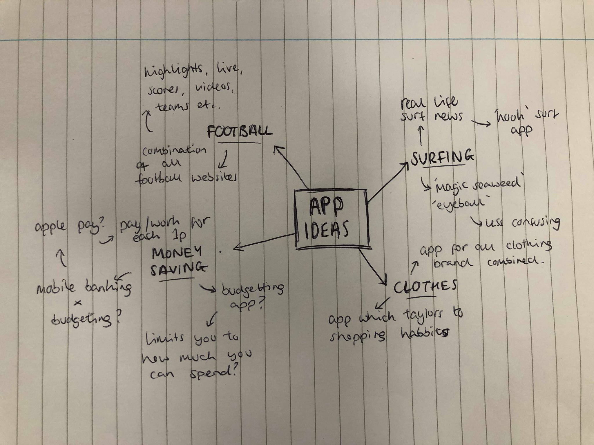
After receiving the brief for our UX/UI project I looked into generating a few possible ideas and mind-mapped a few. I thought the best ideas to come up with would be based around apps I would use and would find interesting
I started off by listing some things I’m interested in and thinking about how I could create an app off those ideas. After thinking about the individual ideas I narrowed it down to 2 of my favourite ideas which I didn’t think already existed.
The first idea was based around surfing. As a surfer myself I have surfing apps which are based around informing the user of the size of the waves, temperature, wind etc. The problem with a lot of these apps from a beginners view point is that it can be too confusing and not be as clear as it could be, using things like swell, wind, tides etc instead of just the wave size. The idea of my app would be to design a ‘kooks’ guide to surfing which makes it as simple as possible to judge the size of the waves. It would tell the user what size the waves would be, what board style to use, what thickness of wetsuit etc to make it as straight forward as possible.
My second idea was to create a money saving app, especially aimed at students. A problem I tend to have a lot of the time, as a student, is that spending small amounts of money here and there eventually add up to large amounts of money. The idea behind the app is for the user to have to physically tap or swipe each penny into their wallet to make them aware of the money they are spending. Not only to make the user aware of the money they spend, but also to help them save money at the same time.
Group tutorial
After speaking with Theo in our group tutorial, we decided the money saving app was the better and more original idea. Although the idea is very simple we agreed the idea behind it is strong and can be kept simple but be very effective. We agreed it should be relatively simple to layout and design as it will only need a small amount of frames to interact with, however we discussed that I would need to make sure each of these parts was clear and effective. For example, swiping or tapping each coin into the ‘wallet’ will will the main feature of the app, it will only be one page so needs to be simple but easy to use.
We also discussed the idea of each coin being only 1p. We spoke and realised that even something like a can of drink or chocolate bar, for example, would take too long to be able to afford, so we decided 10p each time would be much more achievable.
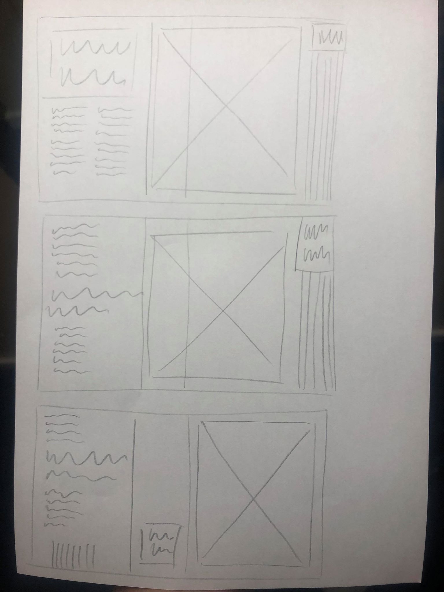
I wanted to print the article out in full so I could see it all laid out in front of me and not on a computer screen. I thought this would give me a better sense of whether the text or images are too small, if each spread fits in with each other nicely and if there is anything lined up wrong which I hadn’t noticed on the computer.
Overall, I think the design was strong and definitely stood out and had the effect I wanted it to have. I think all of the images are the perfect size, they don’t overpower anything else on the page but they definitely stand out enough to be the standout pieces on each page. I think the distorted lines down the side work well and pair with the images nicely, however I think there needs to be a stronger sense of distortion from the first page to the last.
The body text size was too big at 10pt so I changed it to 8pt. I also made the pullout quotes incorporated into the text slightly smaller so it doesn’t overpower the body text. However I kept the pullout quotes in the distorted lines the same size, as I said previously I wanted these to act as a subheading and caption for the image, so I wanted them to be clear and stand out on the page so the viewer reads that before the rest of the text. I also want to change the pullout quotes on the second and third spread to being centre aligned to match with the centre aligned heading and pullout quote on the first spread.
The one thing I did have a problem with was the fact that when each spread was laid out, there was too many similarities on the page. In the photo above the distorted lines all flow straight down on the right side of each page which looks too structured considering the lines were supposed to show the chaos and fear on each page. I also tried switching the bottom two pages to get rid of this but ended up with the same problem where I has 3 pages of text on the far left of each spread. This wasn’t a huge problem but for me it made it too structured.
I used InDesign to move certain elements around the page in order to get rid of the elements which I thought were too structured throughout the page. Although I think this layout works much better without the distorted lines being in a line, and without all the text being in a line, I still don’t like how each of the pages on the left contain black as I think this still looks a bit too similar. However, I like how the text and images are positioned differently on each page, as well as the lines so I think this update is strong. Overall when printed, I don’t think the 3 black pages in a row will be a problem, as the viewer turns the pages they won’t realise this.
I also made a few changes from what I noticed from the printout. I changed all the pullout quotes to centre aligned, not only does this fit better with the heading on the first spread but I think it also suits each page better because of the square size. I added some small page numbers on to each spread, I only added them to the pages with text as I thought it would over complicate the other pages if I add them to that as well. I added them in the centre of the text box down the bottom, I think this sticks to the minimal theme of the body text design and doesn’t take anything away from the rest of the design. Although I know it isn’t central on the page, I wanted it to be central only to the text box, as I think it looks odd and out of place in the centre of the page.
After my feedback I wanted to make some adjustments to the layout. Firstly I wanted to see what my second image would like like on a black background.
Although the other 2 images both look good on a white background which makes them look bolder, I think this one inverted makes it much more effective and gives more of a sense of a literal black hole. I think the white makes it stand out much more than it did on the black background and makes it look much more effective, it adds a strong sense of hierarchy as it’s the first thing that draws the eye.
I also took it out of the border and used it by itself but enlarged on the page. I think having it larger gives a much stronger sense of hierarchy and the image will always be the first thing that draws the eye, which is just want I want from the image. As well as adding to this particular page, I think it also changes the pace of the article as a whole and stops each spread from being too similar.
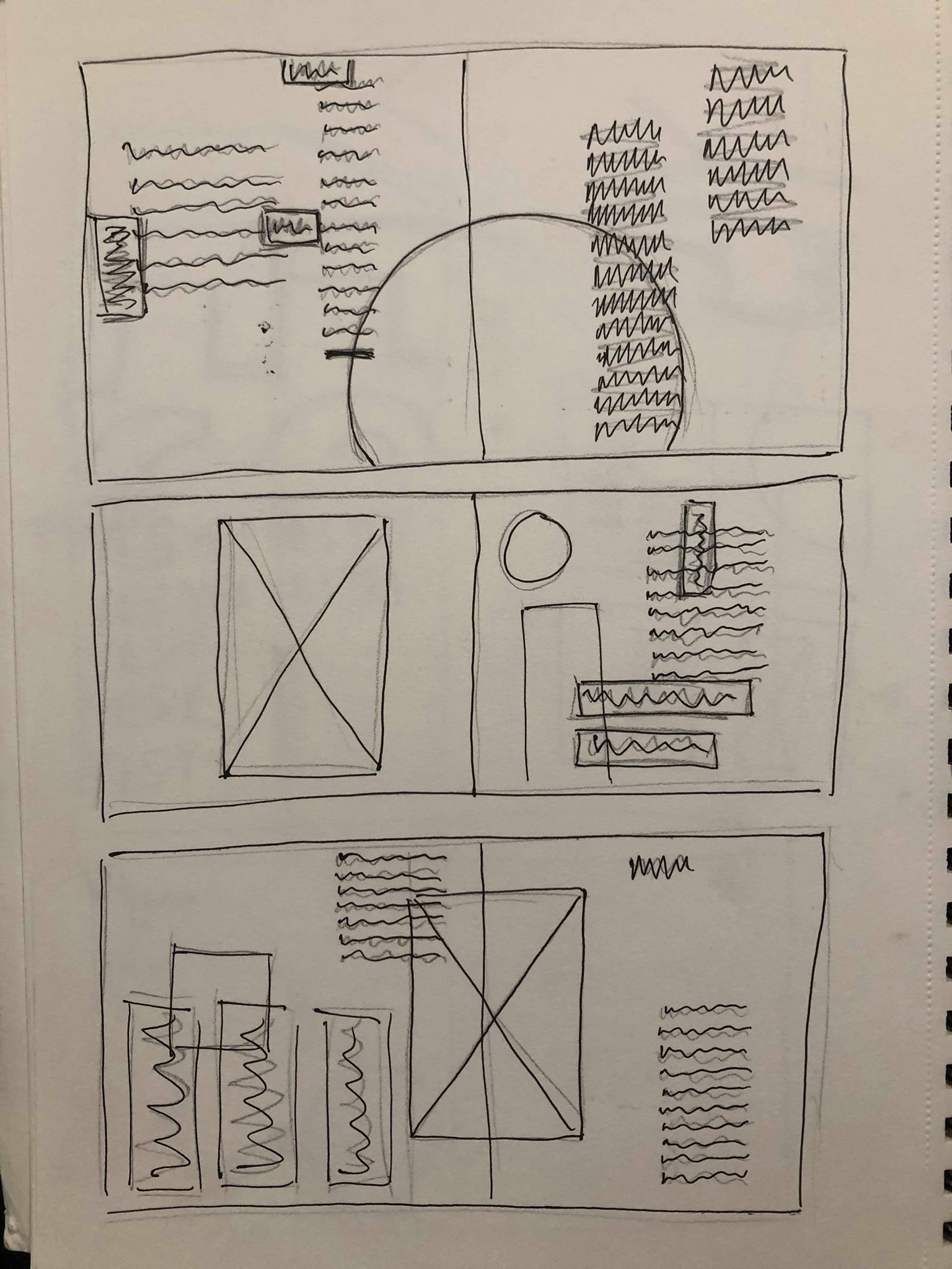
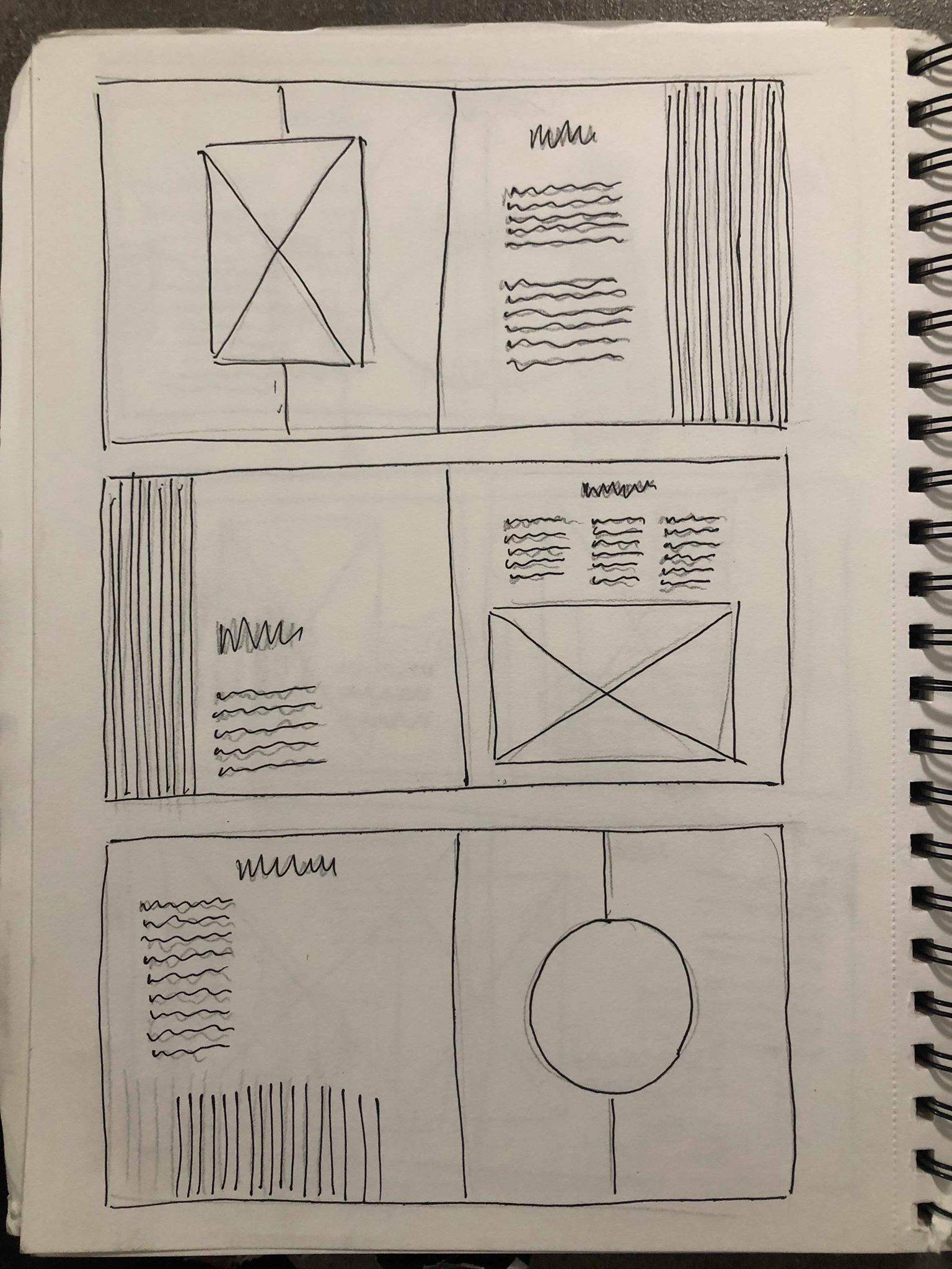
I then went back to my sketchbook to sketch out some new possible ideas. the first page was just some quick initial ideas, moving the images around on the page to be more playful and experimental, placing it in the centre of the spread or larger on one page so it overlaps onto the second. I liked the idea of this more experimental layout but wanted to make sure there was a clear break between the images and the body text to stop any confusion. After getting all of the ideas out my head I chose my favourite and sketched out a rough layout to follow when designing it digitally.
I really like how the image is placed over both pages instead of being limited to one, it makes the page slightly less structured and classic and makes it slightly more contemporary, as well as making it the first thing you’d see when opening the page as it’s closer to the middle. I also think the article title along with the text on the black background makes it pop off the page. I wanted the title to be the most important thing on the page so it had to stand out over the image, and I think using a bold typeface on a black background helps it do that.
As I said previously I think the white image on a black background is much more effective. I also enlarged it and placed it in the centre of the page so the middle is in the centre of the page and gives a strong sense of ‘falling into it’ as soon as you open the page. I used the white background in contrast to the black to make it stand out, with so much text and so many lines on the page I though white text on a black background would be drowned out by everything else going on.
I used a very similar layout to the first spread but kept the image on it’s own page in this spread, I think it makes the two spreads slightly different so it doesn’t all look the same, and I think having it on a page by itself works well because its such a strong image. There is also a lot going on, especially at the bottom of it so I didn’t want it to blend in with the text and the rest of the lines on the page. Although the idea of the lines being at the bottom on this page, I don’t think it fits in with the layout.
Instantly I think it fits in with the other 2 spreads much more and doesn’t take up unnecessary space around the text.
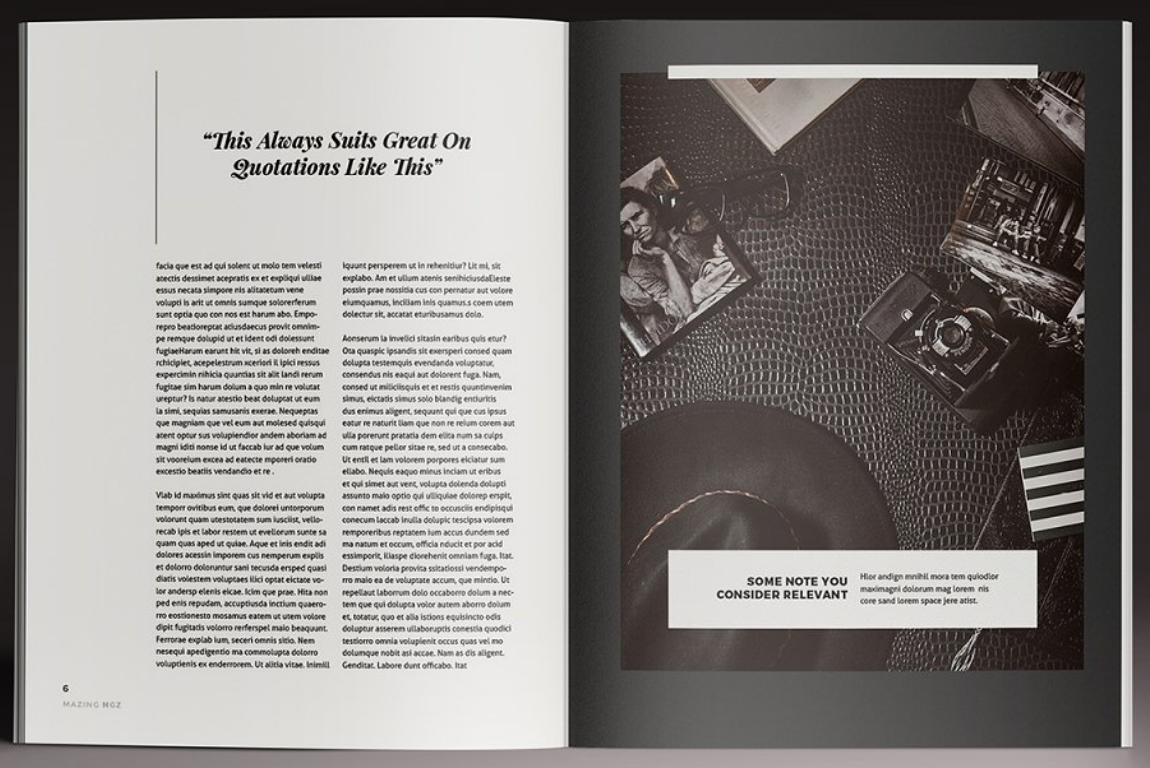
Overall I think the layout is definitely getting there, it already seems to fill much more of the space and leaves less negative space, it also seems much less structured which fits well with the images. Next to each image I placed the quite from the article next to it which describes the image and the idea of “YES, FEAR AND NO” which works well as a subheading to describe what the image is saying. I wanted this to be slightly larger than the other pullout quote to add a sense of hierarchy above the rest of the text.
The layout and body text both work well but needs work. Although there is an overall sense of everything deteriorating as the article goes on, I don’t think this idea is strong enough. While I don’t want to distort any text or backgrounds, one of the ideas I spoke about with David was to make the striped lines down the side of the page slightly warped and jagged, getting more and more so as the article goes on.
I think this works well and pairs well with the images, while also emphasising the idea even more. I think the warped lines also give a bit of contrast with the text which is all perfectly aligned.
I then spent some time looking at the text on each spreads to try and move it around to get rid of the negative space and just to experiment, but found it hard only having 2 columns to play with. This led me to think of how to find a way to get a 3 column grid which meant I could do more with the layout of the text and type detailing. I liked the overall layout I had and didn’t want to change it or make anything else smaller to accommodate the text, so I decided to change the size of each page from A3 to 297mm by 297mm in order to stay within the minimum size but use a square layout, allowing me to add extra columns in.
I think changing the size of the paper will work to give me more room to place text and experiment a bit more with it. I also think due to the size of all the images, they all fit better within this size and fill the page a lot more. I think this adds to the hierarchy and means you can’t miss the images when you look at each of the spreads. The wider pages meant I could keep the same style but add the text in using either a 3 or 4 column grid, depending on what I prefer.
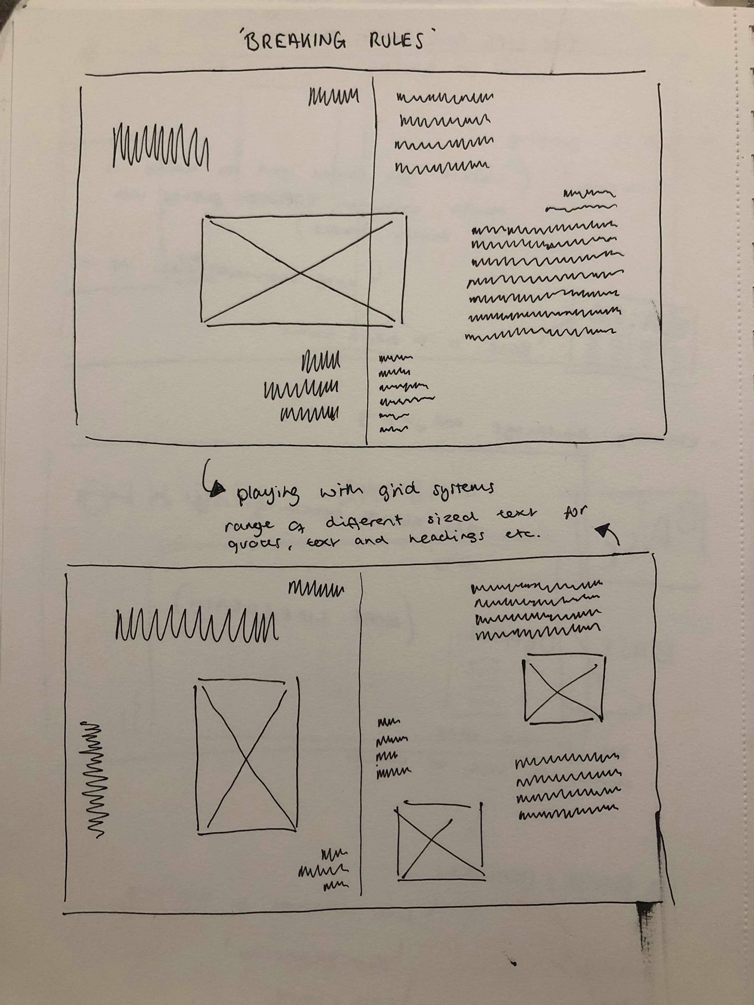
I then sketched out some ideas for the text using a range of different grid systems. I wanted the base of the page, the body text to be in line and uniformed with the pullout quotes and headers complimenting the text by being placed above or to the side. I think this maintains a structured layout but adds some asymmetry and goe’s with the design of the 3 spreads.
After much experimenting I came up with the following layout, using 6 columns along the area where I wanted to fit my text. I wanted to make sure the text was kept to itself and didn’t interfere with any of the images on the page to stop it getting over complicated. I also wanted the text on each page to be slightly different whilst keeping the same idea so it’s still recognisable as the same article. I also tested a few other fonts during my experiments and decided to stick with the same font which is ‘Bureau Grot’ which has a variety of different typefaces to use. The font is sans serif so it all stands out, especially the title which is in the bold version of the font. The sans serif also adds to the contemporary and modern feel to the magazine as I thought a serif wouldn’t fit with the tone and the design of the spreads.
As the pages were all square, I wanted to sort of keep with that style with the text, keeping all the text in the middle columns, in the centre to add to the square feel and give a blank border around the outside of it, making it clearer to read and giving it it’s own section on the page so that the there is a clear sense of hierarchy between the image and the text.
Overall I think it works very well in the layout it’s in, I like how on the first spread there is a clear hierarchy between the title, pullout quote and body text. I think this works well with the rest of the page to create a strong path for the eye, from the image, which I wanted to be the first thing the viewer looks at, to the title of the article, and then on to the body text. I like how the text on each page is layout slightly different, however it is still obvious that the 3 layouts come from the same article.
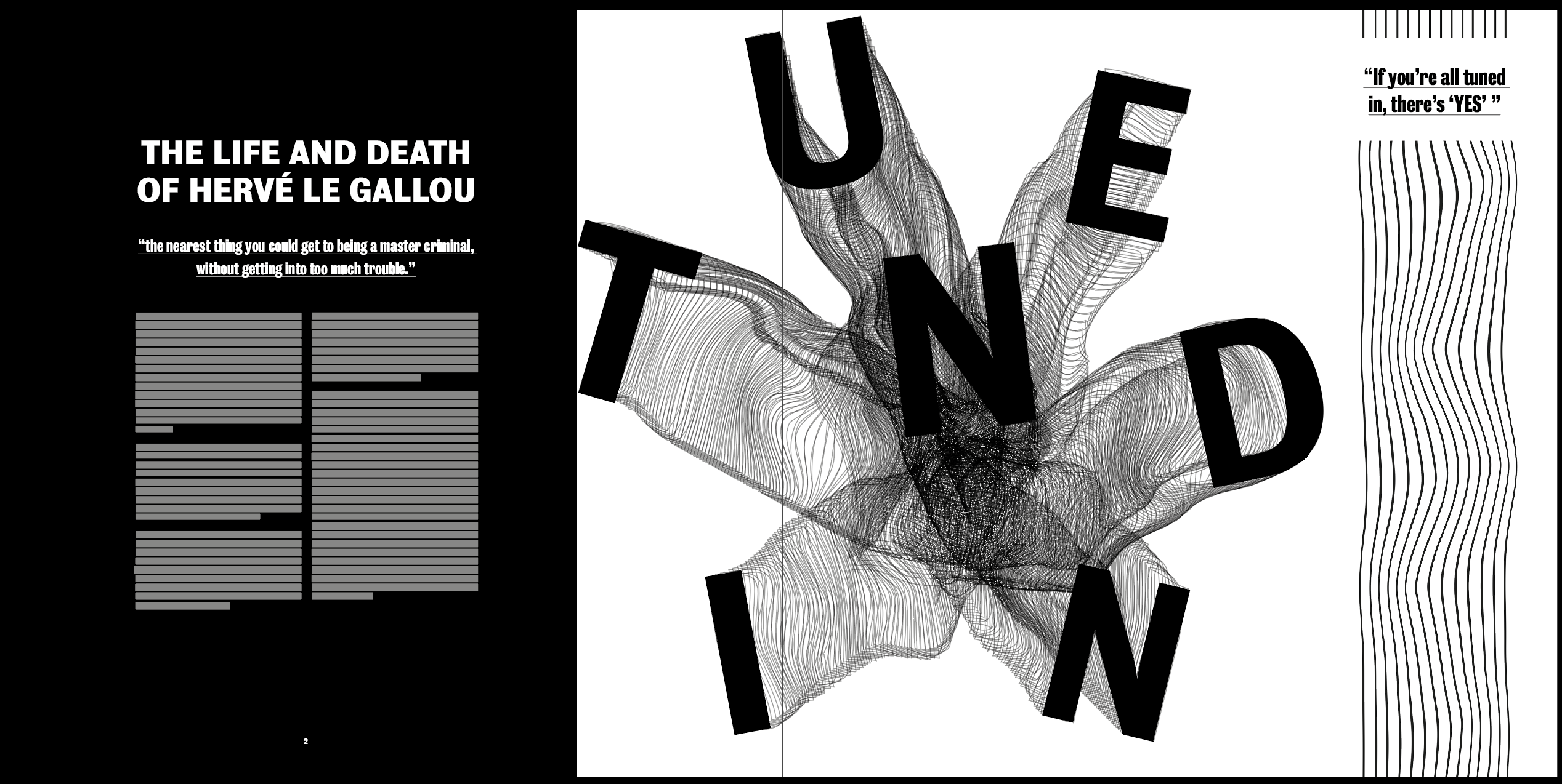
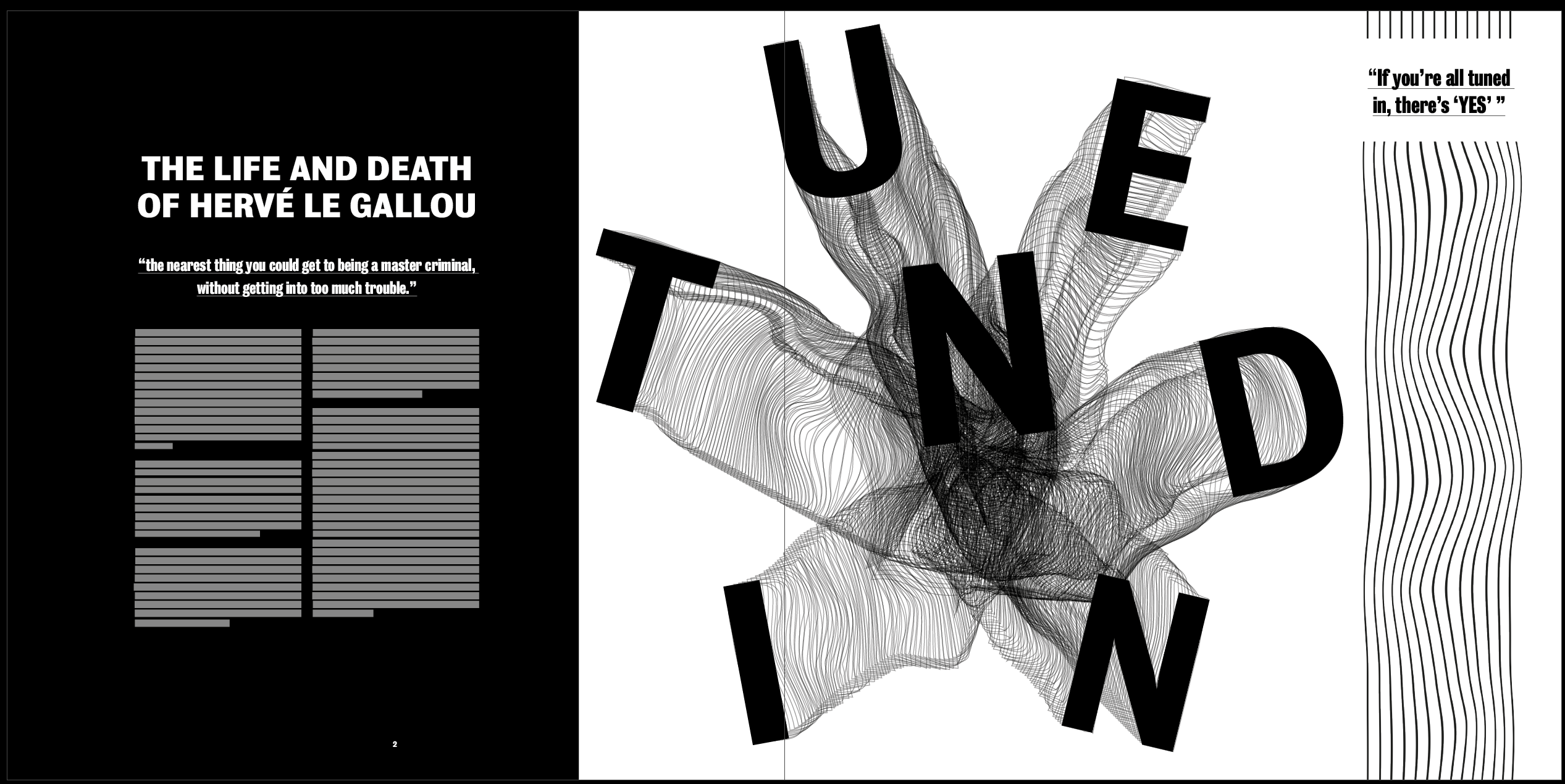
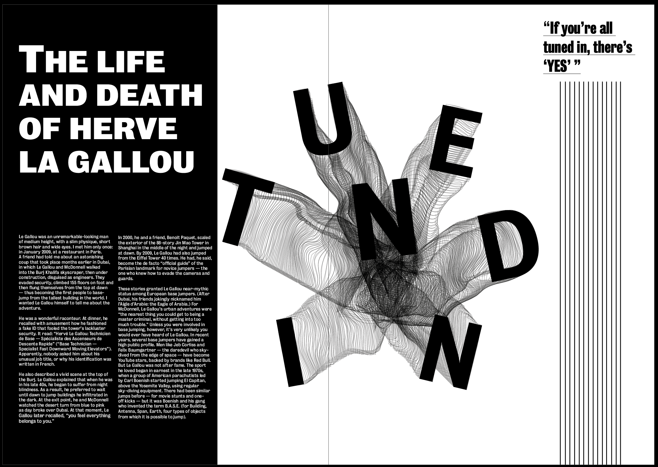
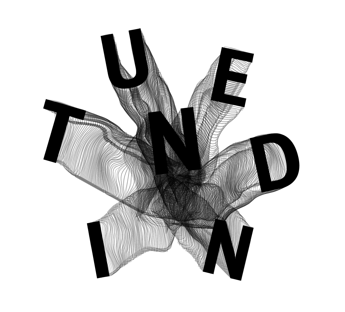
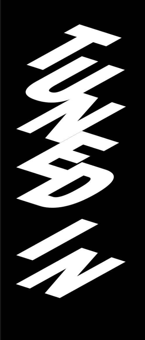
After feedback from David, the first changes I wanted to make were to the images, the first change being to the image on the first spread. I didn’t think the “TUNED IN” image was strong enough and gave the tone I was looking for so I wanted to change it to something which matched more with the theme of the other 2 images, something which draws the viewer in and gives a sense of movement and falling.
Something which was so strong about the second image is how it has one point on the page which everything seems to originate from and come out of which is what give the feeling of being sucked into it. I wanted to experiment with this to give the same effect.
I referred back to my initial sketches and although I initially thought I could use them for the second image, I decided it could still work with any of the images as they all follow the same sort of idea. I think the top 2 sketches are the strongest in showing the essence of falling, especially giving a trail behind them helps to show the movement.
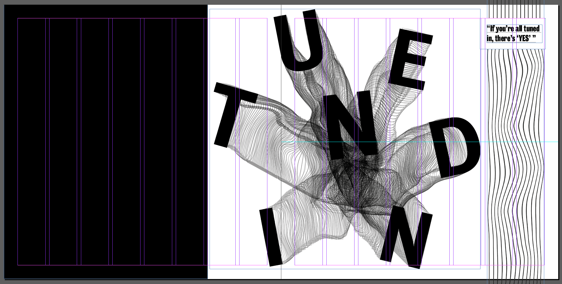
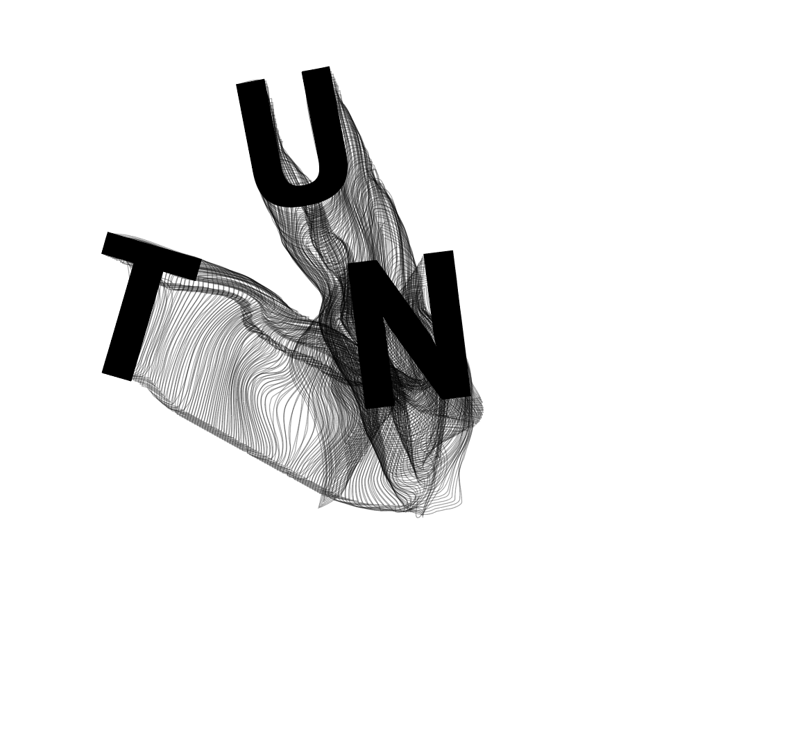
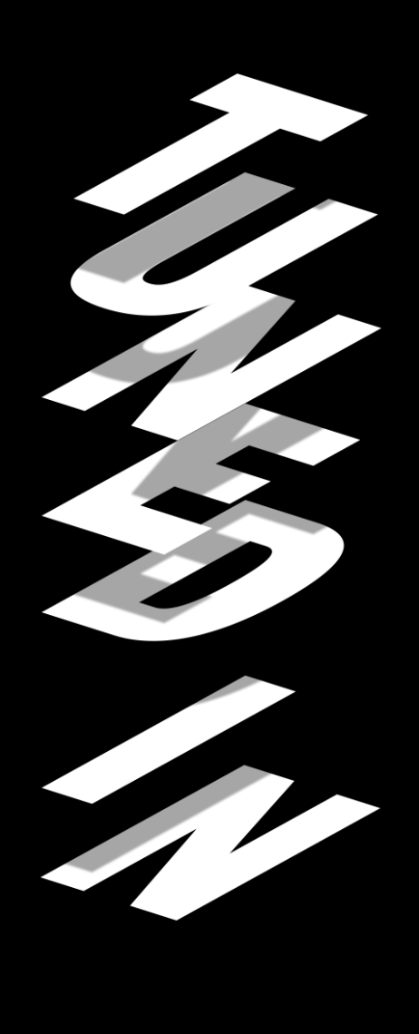
I used tuned in to spell out “TUNED IN”, using the same font as the other two images. I wanted each letter to be a slightly different size and rotated them all slightly. I then duplicated each latter a number of times with no fill, just a black outline to make it look like a trail leading from the centre of the image to each letter. After doing so I then used the warp tool to slightly warp each of the ‘trails’ so they weren’t all straight lines. Even though I wanted this image to be fairly clean and structured, I thought about how someone skydiving and how their trail would be unpredictable and all over the place, so I wanted to capture this within the image.
Overall I think the image works well and gives a much better idea about the tone of the article, personally I think there is a strong sense of movement and distortion whilst also keeping the image clean and structured. I think the words are easy to read and the trails definitely add to the overall aesthetic and clearly shows movement and falling. I think the centre of the image where the lines cross over the most to create a black mass definitely give a sense of fear.
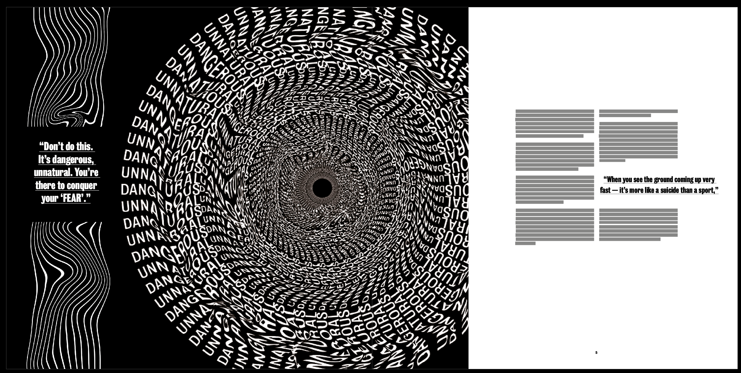
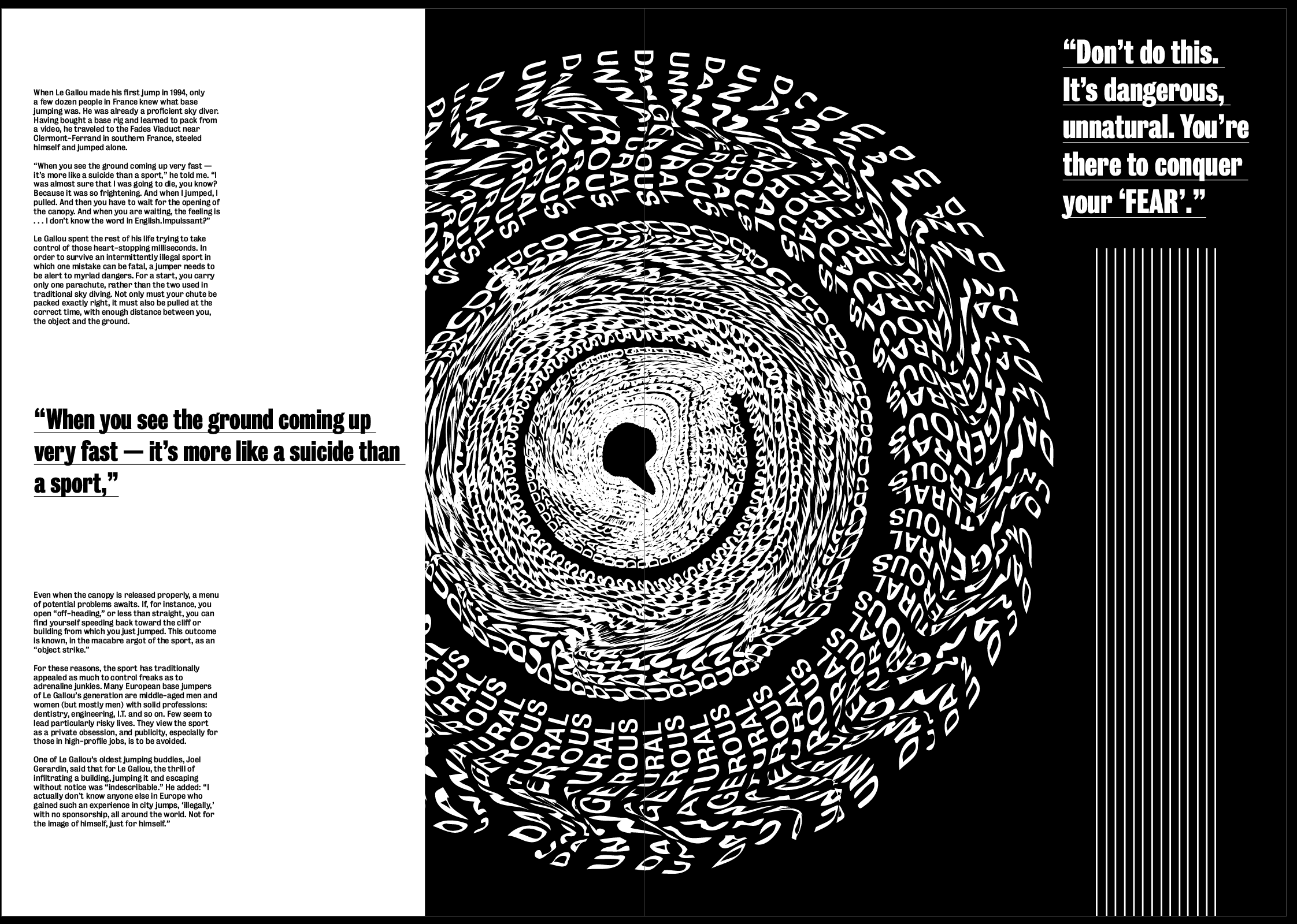
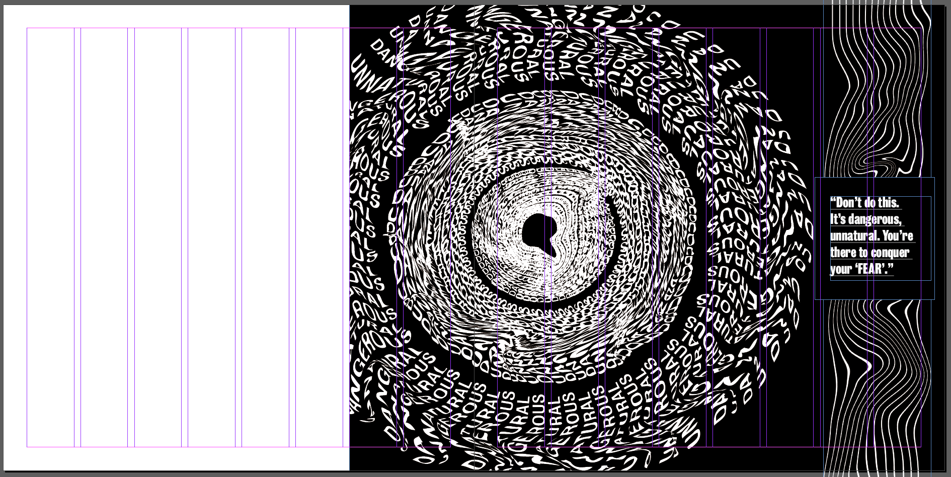
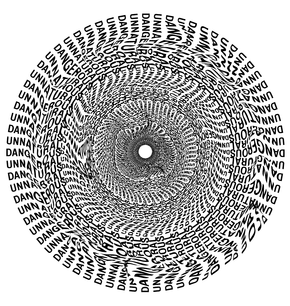
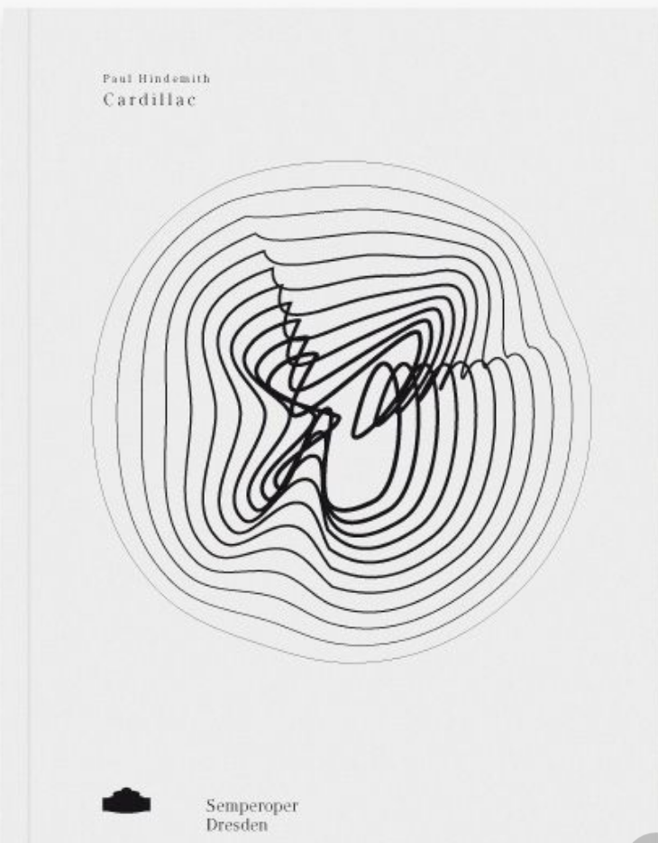
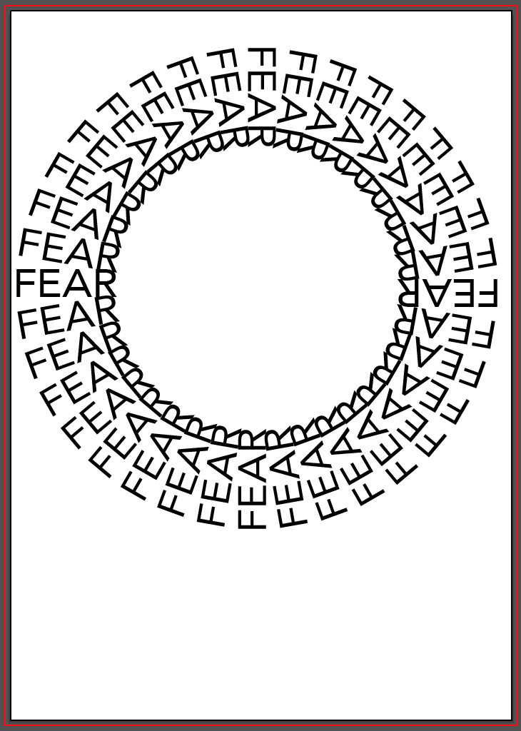
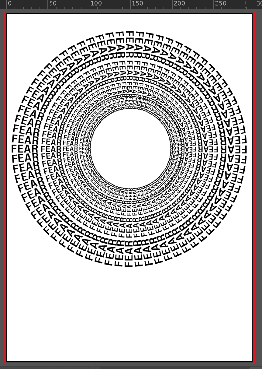
Next, I decided the image below also needed a little more work. I really like how it is currently and the way it sucks you in, it definitely gives a sense or falling into the unknown. However, I see 3 distinct rings within in which don’t give the feeling of ‘falling forever’ which i was hoping for. I also think it looks too structured for something which is supposed to show fear, I want it to be slightly more warped and distorted to add to the scary tone of it.
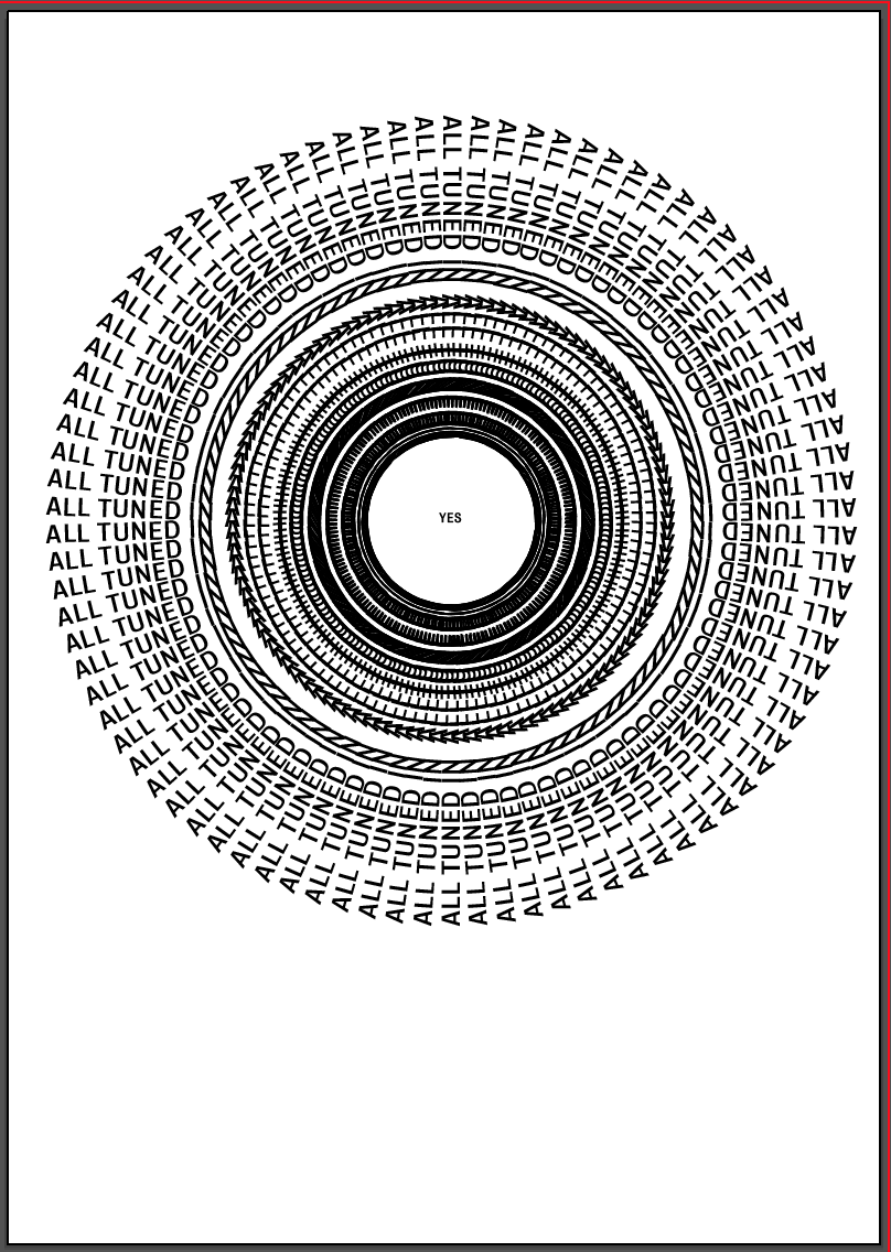
I used the same image as shown above, but simply just took the outside ring and decreased the size of it multiple times. I think it gives more of a tunnel effect and definitely sucks you in more and instantly feels more like ‘falling forever’.
However, the way the text overlaps between each layer and creates shapes between each word looks too perfect and creates a pattern which looks too structured. I want the image to be more disjointed and warped to give it a more ‘scary’ look. Because of this, I used a few different warp tools on illustrator as well as the liquify tool on photoshop to add different looks to it until I got the desired effect.
Although the first 2 definitely do what I was looking for, they add extra character and make it look distorted, however I decided in this case less was more, I wanted it to look warped but only slightly, I only added a slight distortion to each layer which just makes it look much more ‘flowy’ and almost adds swirls in each layer, which in turn makes it look much more scary and more what I would imagine a black hole would be like.
I showed David my first draft to get some feedback from him into what works well and what doesn’t. The most important feedback I received was that the individual elements such as images and the overall tone, for the most part, was good and just needed some tweaks and changes to the layout.
We agreed that the image on the first spread was not strong enough, although it looks ‘nice’ it doesn’t fit in with the article or other 2 images in giving a sense of the perspective of Le Gallou. This was something I wanted to experiment with to find a more fitting image. I also realised I needed to add the heading for the article on this page somewhere so this also needed some work. After discussing the idea that I wanted each image to be less and less structured as each page goes on, I also decided I wanted to play around with the second image more to distort it slightly so it doesn’t look as clean.
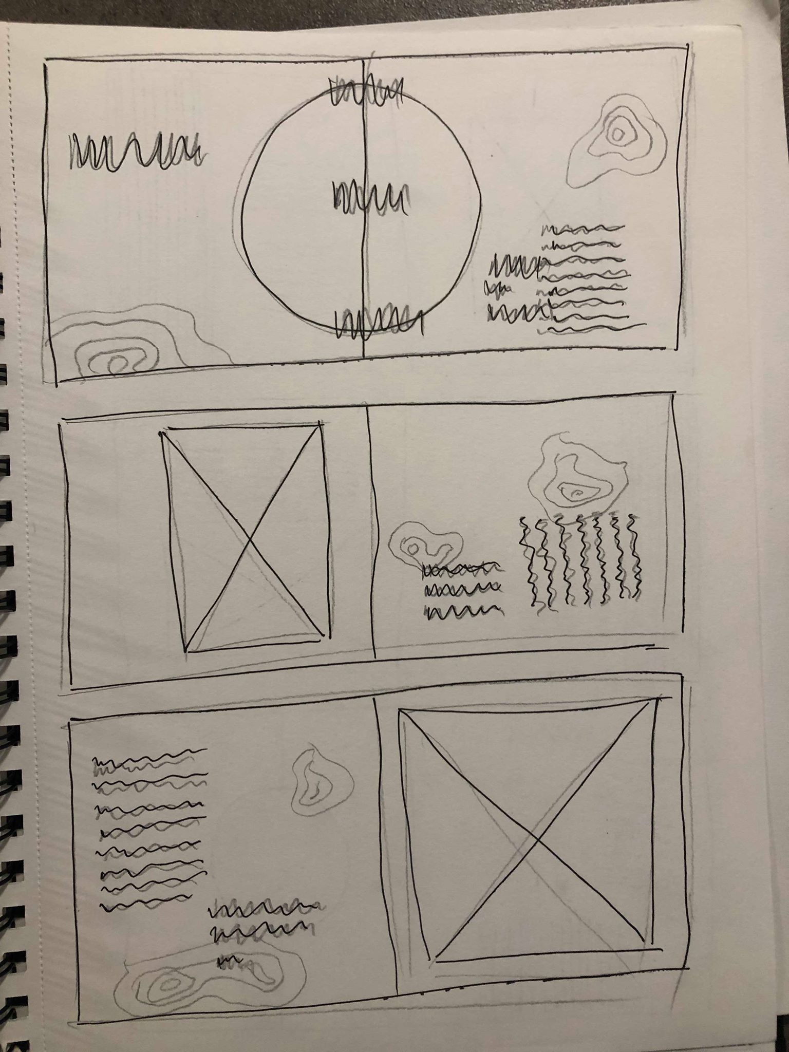
I decided I wanted to be slightly more experimental with the layout, particularly with the images and where they are placed. Because I decided I wanted the images to act as the headers for each page, I thought it would be more fitting to have them much larger on the page to be much more stand out. I could also play around with where on the page I placed them, especially on the second spread where the image is circular, it might be interesting to enlarge it and have it in the middle of the page, or just much larger on a single page.
Although the striped lines on the side and bottom of the pages were a feature which I wanted to keep, David advised me that I should play around more with distorting them to fit in more with the images, and I also decided that having the lines at the bottom of the page in the final spread, although it has a meaning, is not necessary and almost makes it stand out too much from the other spreads, the idea behind it is strong enough to keep it running down the side of the page, not at the bottom. We also decided that the split white and black pages on the first and second spread gives the viewer too much to look at and takes away from the images on the pages. Splitting the pages into black and white ‘sections’ is still an idea I’d like to continue to experiment with, I just need to ensure they don’t interfere with the images.
I also decided there is no sense of hierarchy, everything seems to be a similar size so there is no path for the eye. I think enlarging the images and adding larger pullout quotes will help to aid with this.
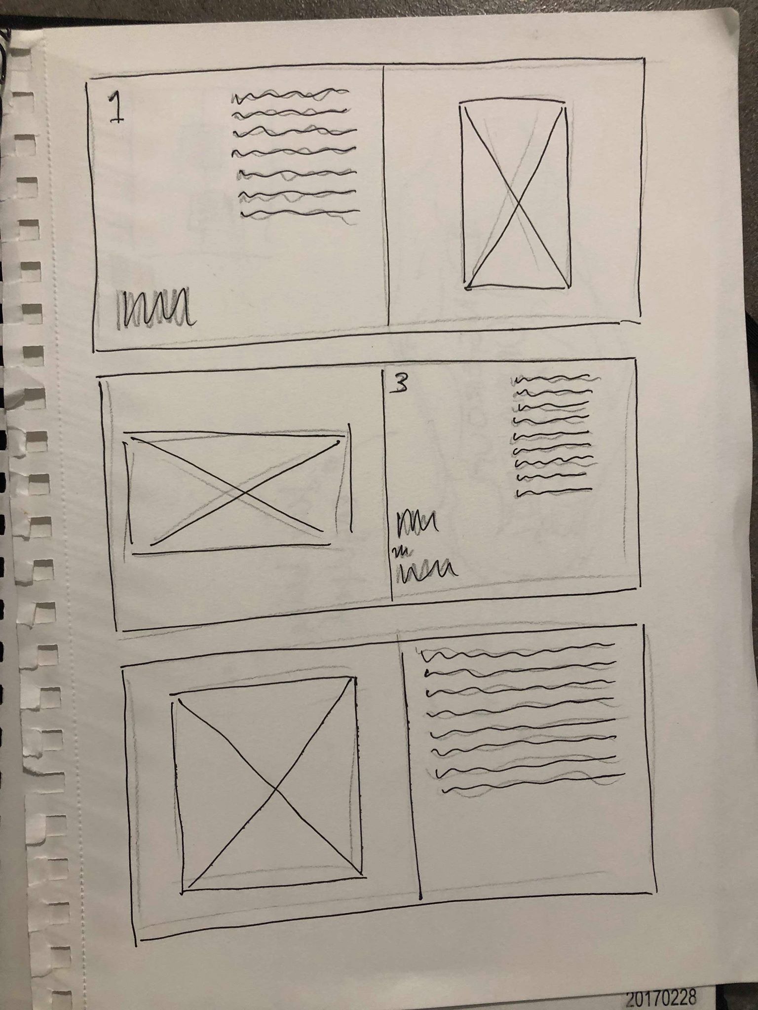
After sketching out some possible ideas I took to InDesign to make some rough layouts to get an idea of what they look like digitally.
This was the first layout I attempted, the text would still need a lot of work but was added in just to get a feel of how the layout as a whole would look. Instantly I noticed my initial image for the first page wouldn’t be suitable and would stand out far too much in comparison to the other two spreads so I replaced it with another image, again just to get a feel for the design. Although it has lots of the elements I was looking for when i sketched it out, I still don’t think the overall tone is what I’m looking for. The red does work well to frame the image on the last spread it really draws the viewers eye to it. However, I think in terms of the text and the first 2 images the red almost drowns out the text and makes it much harder to see so does the opposite of what I had hoped. I also think there is too much negative space on the pages and does not feel contemporary enough. Overall I don’t think it gives the feel I’m looking for, the images individually give a strong sense of the fear as well as falling that I’m looking for, however when placed into this design I think the feeling is taken away.
For my next idea I went more down the illusion route. I used all black and white to contrast with my previous idea to see which I thought was more effective. All my images are very experimental and have elements of movement and I wanted to show this through the design. I wanted to have a large amount of vertical lines going down the page using the text and stripes on the side of the page to give a sense of falling from the top of the page to the bottom. I also added a few added features such as the split white and black page and border around the image on my second spread, I think this helps to draw the eye towards the page well and focus in on the image, as well as keeping with the theme of illusions.
Overall I think the style of the layout all fits relatively well with the theme and the black and white compliments the images and tone of the article quite well. I have decided not to use any colour in the layout after the previous experiment showed that the colour could take away from the images because they are all text based. It still needs some extra experimentation as there is too much negative space on the page, but the over all aesthetic is a strong base to take forward.
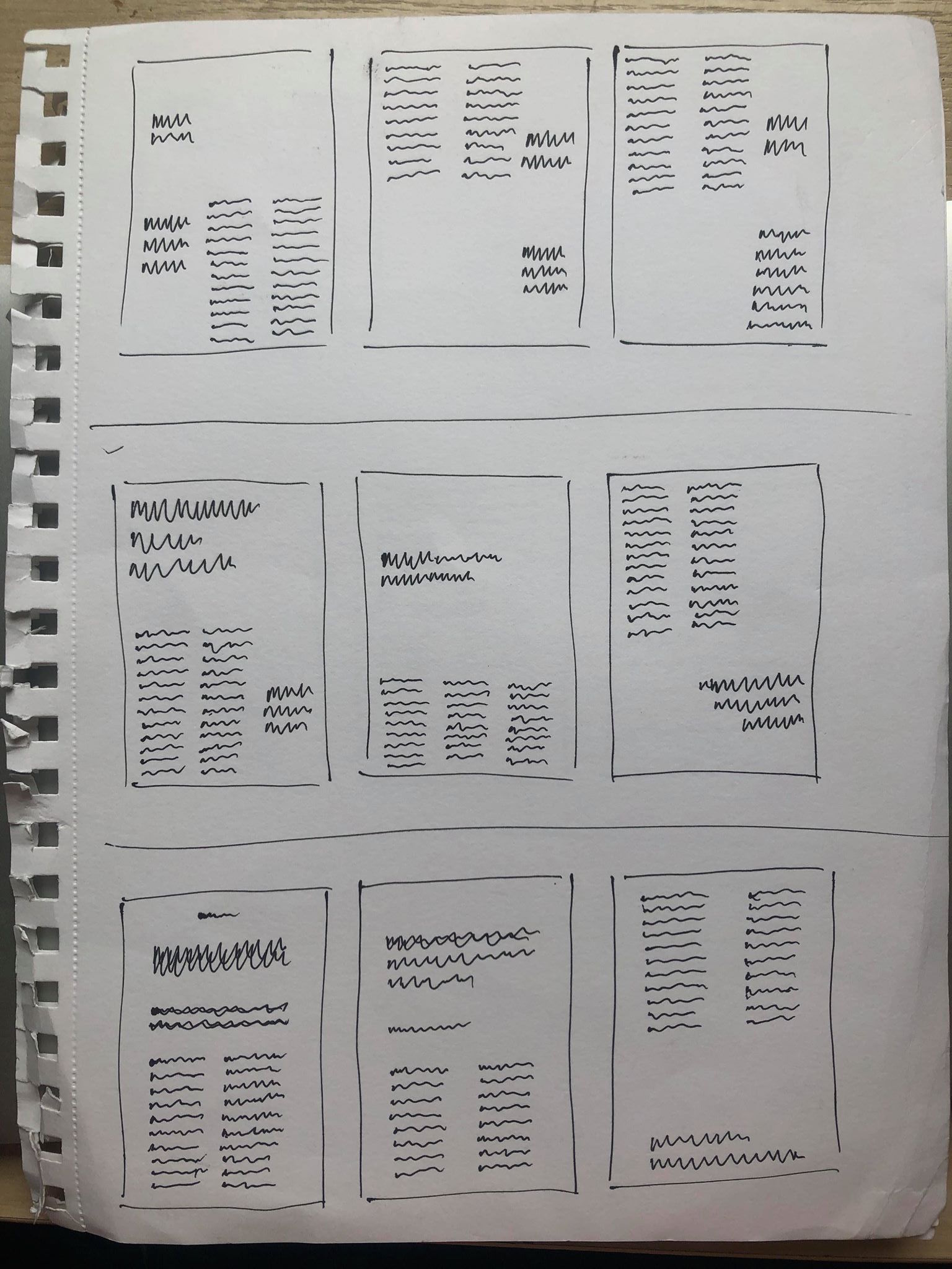
I took influence from my research into editorial design and sketched out a variety of different designs onto paper to get a better understanding of the look I wanted to go for.
Overall I decided none of these designs were suited to the tone I was looking to create within the spreads, but was a good exercise to get all of my ideas on to paper to make it easier to determine which ideas I liked and don’t like. I noticed many of them with too much text or too many images over complicated the page too much, especially as my images are text based so I wouldn’t be able to overlap them with any text. I also decided I wanted to stick to keeping one image on each page to keep a strong sense of hierarchy with that image and not draw any attention away from it. The others were then on the opposite end of the spectrum with not enough going on. I don’t want to overcrowd the page but also think with the images being slightly illusion based there needs to be some a few extra added details like some simple lines or colour overlays which will go with the images. I attempted to make a few of them quite experimental and playful. However, while I still wanted to keep a sense of this to show how the sport of base jumping is still enjoyable and full of adrenaline, there is a lot in the article about how jumpers do have to be very controlled in the way they do things, from packing the parachute to the actual jump. It is said in the article that base jumping appeals to “control freaks” because of the nature of it, so I wanted the layout to reflect this whilst still keeping a slightly experimental layout.
After rough sketches of a variety of designs I narrowed it down to a handful of designs which I felt were the strongest and conveyed the idea I was going for the most. Although on both ideas I wanted to play around more with the text, they gave me a good overall view of the general aesthetic.
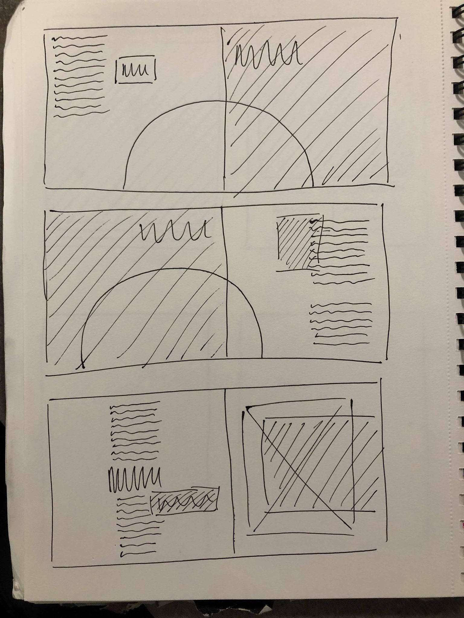
My first design took influence from my research into using boxes of colour. I wanted to use red to give the idea of danger to go with the theme of the fear and scariness of skydiving and base-jumping. As I decided each image would act as a header for the spread, I think the red boxes will frame the images on each page to draw the eye to them so they will be the first thing the viewer see’s on the page. I also thought I could use some smaller coloured shapes to around the body text and pull out quotes to draw the eye to them and to create a clear path for the eye by outlining where the text starts.
My second idea was sticking more to the black and white theme. I think keeping the images by themselves with nothing over the top of them will make them stand out more and give a sense of hierarchy, I also had the idea to create a half white, half black background for the first and last page to go with the theme of the illusions. I wanted to experiment with adding black and white striped lines down the side of the pages, the idea behind this was to create a sense of falling by having them vertical on the first 2 and flat on the final page to show he has stopped falling. I think they might compliment the images by having them on the opposite page.
After choosing my images I carried out some more research into editorial designs, looking at both minimalist designs as well some experimental. I looked on a variety of different sites to find examples of a variety of different magazine designs, because although I had an idea in my head of what path I wanted to explore, I was also keen to look down other avenues to see what I could find.
The thing that interest me about the images above is the way they use a box of colour over the top of the page. It hasn’t been used as a border or outline for an image, but it could be used to to create emotion in an otherwise black and white page. For example if the box was red it could give an essence of danger or death which could be useful in my work. It also makes the page stand out to the eye, instantly when you see colour on a page it makes you look at it and has a strong sense of hierarchy. For this reason I think it could also be a good way to add a border to an image, if the colour is bright and stand out enough it would draw the viewers eye towards the image.
I then found 2 examples which both have a similar contemporary layout. They are both slightly different but I like the way the images and text have been placed on the page to give it a more minimal and almost playful look, instead of all being symmetrical. I think it gives it a very modern, contemporary feel to it without losing the clean, minimal feel. I think this idea could pair nicely with my idea of each of my images being symmetrical but with touches or playfulness, just like these designs have a very clean base with some more playful elements. I also like the way the text on the right spread is much bolder and stands out through the use of colour, I think this could work well with a pull out quote to give a sense of hierarchy and make it stand out to the viewer.
The final images I looked at were examples of black and white designs, both with simple but very effective layouts. I love how both examples use the black pages the frame the imagery and make it instantly stand out. The black and white also adds a very contemporary feel which i’m going for and fits well with the colours of my images as well as the tone of the majority of the article
Overall it’s all given me a lot of ideas and inspiration into how to design my spreads to make the most out of my images, as well as the text and pull out quotes. It’s showed me how different layouts can add a different feel and tone to the design which will help me when designing my spreads.
After speaking with David he agreed that the idea of the black hole showing falling and fear, as well as using the style of illusions and expressive typography to do this. He advised me to continue looking into my ideas and carry out some research into similar styles, looking at the feelings they bring about and how they do this through their style and colours.
First off I carried out some research to gain some influence on how to design my images. All the images I chose below are the style of work I am looking for and all portray similar feelings. Each of the images I found gave some sense of falling, whether it’s falling from the top of the page to the bottom, or falling and fading into the centre of the page. Not only does it give a sense of falling but also the thoughts and feelings one my have when falling from thousands of feet in the air. They all have a feeling of movement which is brought about by either just changing the scale or in some cases changing the opacity to give the feeling of fading away. The majority of the examples I could find were in black and white which gives them all a very clean modern aesthetic, it also gives it a feel or darkness or fear which I want to portray in the article. I noticed that lots of examples I could find use text as the images as opposed to lines or shapes, not only does this illustrate the point but it also means I can easily add text from important words or quotes from the article.
I decided to design a series of images taking influence from my research, creating one large image to be the centre piece of each page. I reviewed the article and looked at the paragraph in which I took the influence for my layout to take the most important quotes to sum up “yes, fear and no”.
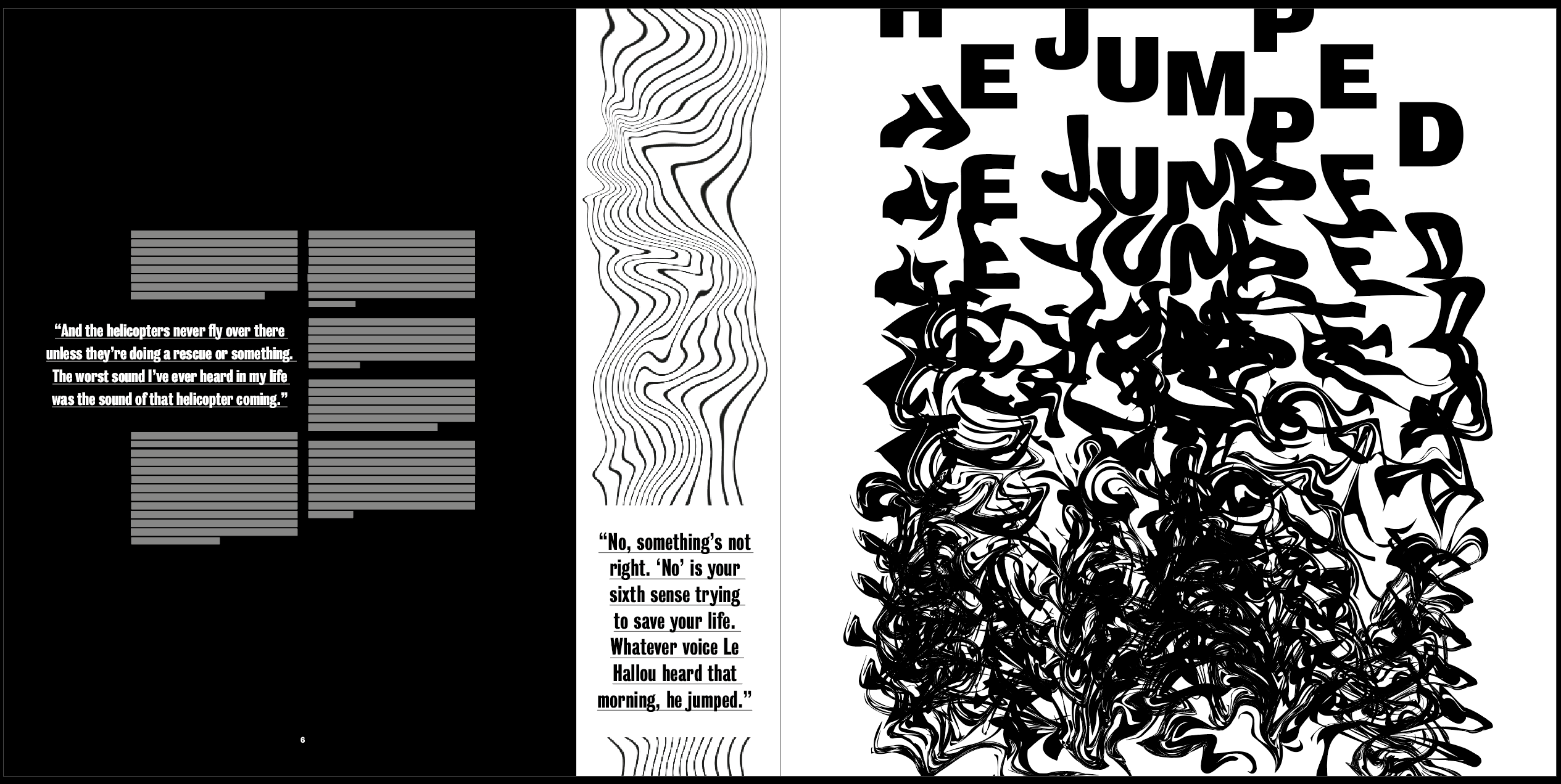
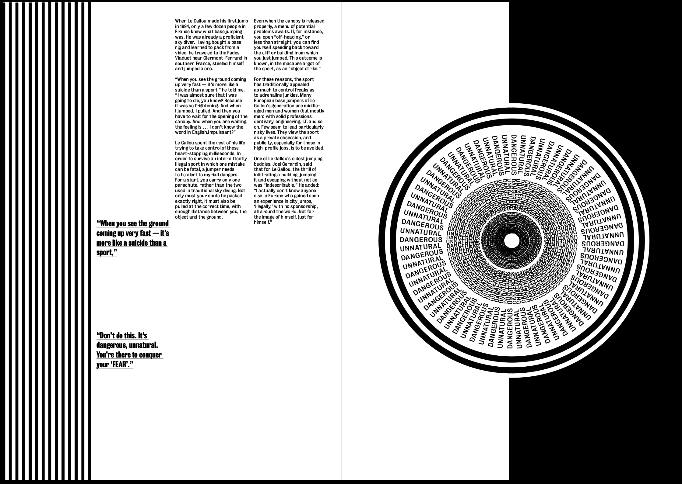
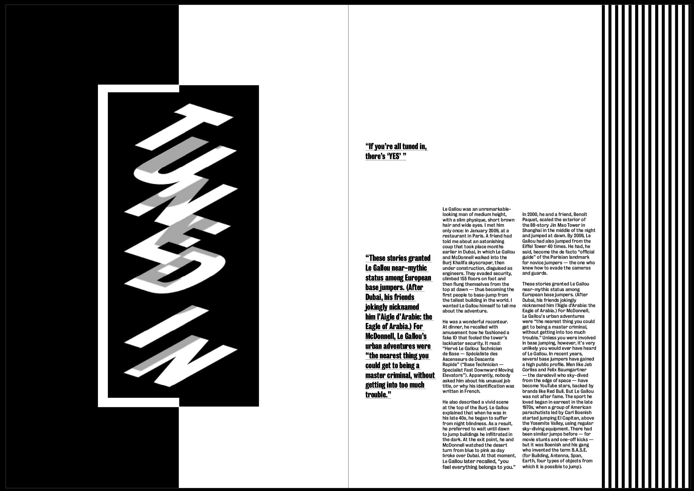
Dave McDonnell, an English friend of Le Gallou’s, said that before he quit base jumping, he used to hear three distinct internal voices at the exit point, which he called “Yes,” “Fear” and “No.” “If you’re all tuned in, there’s ‘Yes,’ ” he said. “On the mediocre days, there are two other voices. One’s ‘Fear.’ Your body is screaming out at you, ‘Don’t do this,’ because it’s dangerous, unnatural. You’re there to conquer your fear. But there’s another voice that hangs around every now and again, and that’s called ‘No.’ Something’s not right. You can never put your finger on it — it could be something in your pack job, or the weather, or the people you’re jumping with, or your mind-set. It’s just, ‘Walk away, don’t go jumping today.’ The difficulty is trying to discern between ‘Fear’ and ‘No,’ because they’re both telling you the same thing. ‘No’ is your sixth sense that’s trying to save your life.” Whatever voice Le Gallou heard that morning, he jumped.
I chose a phrase for each page which I thought encapsulated the feeling i wanted to convey within each page an each image. I thought i could use the phrase or words from the phrase within the image and could therefor also use the images and headers for each spread.
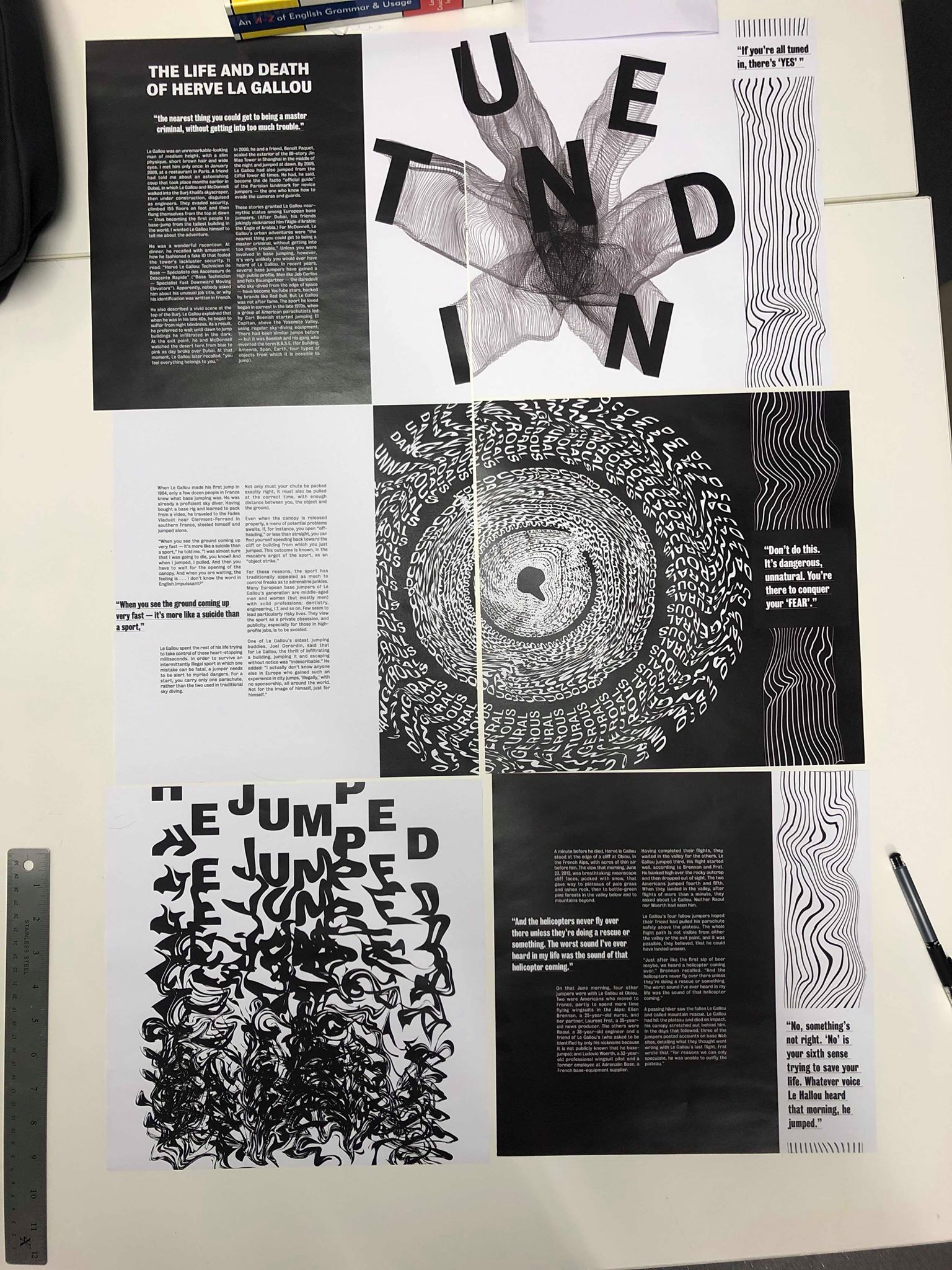
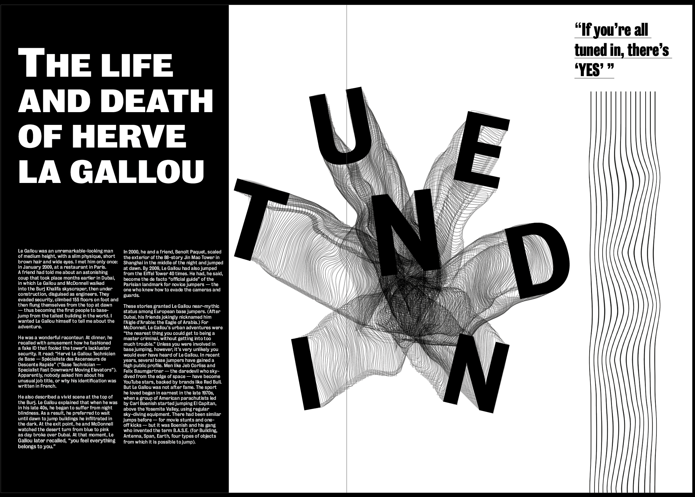
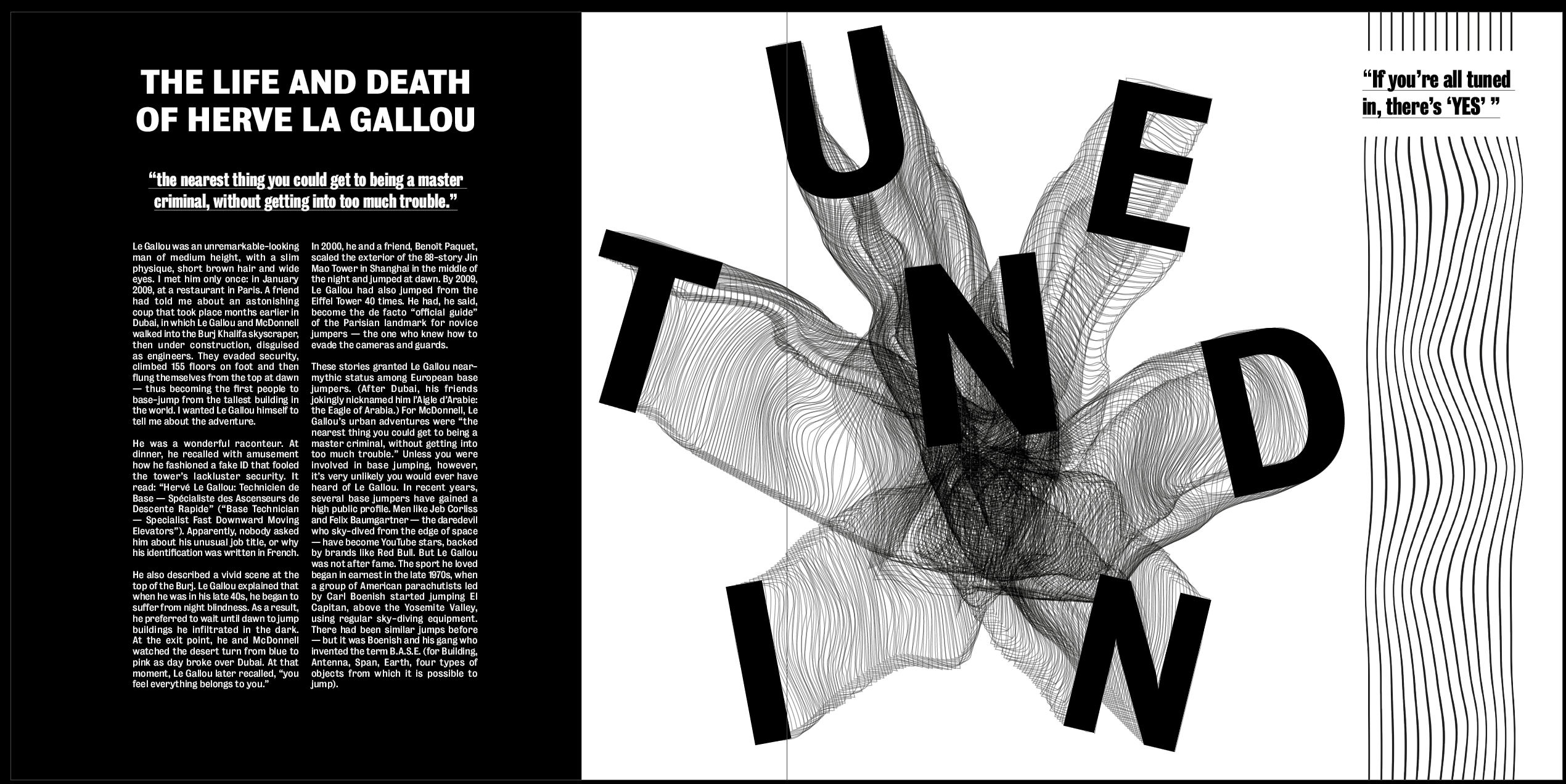
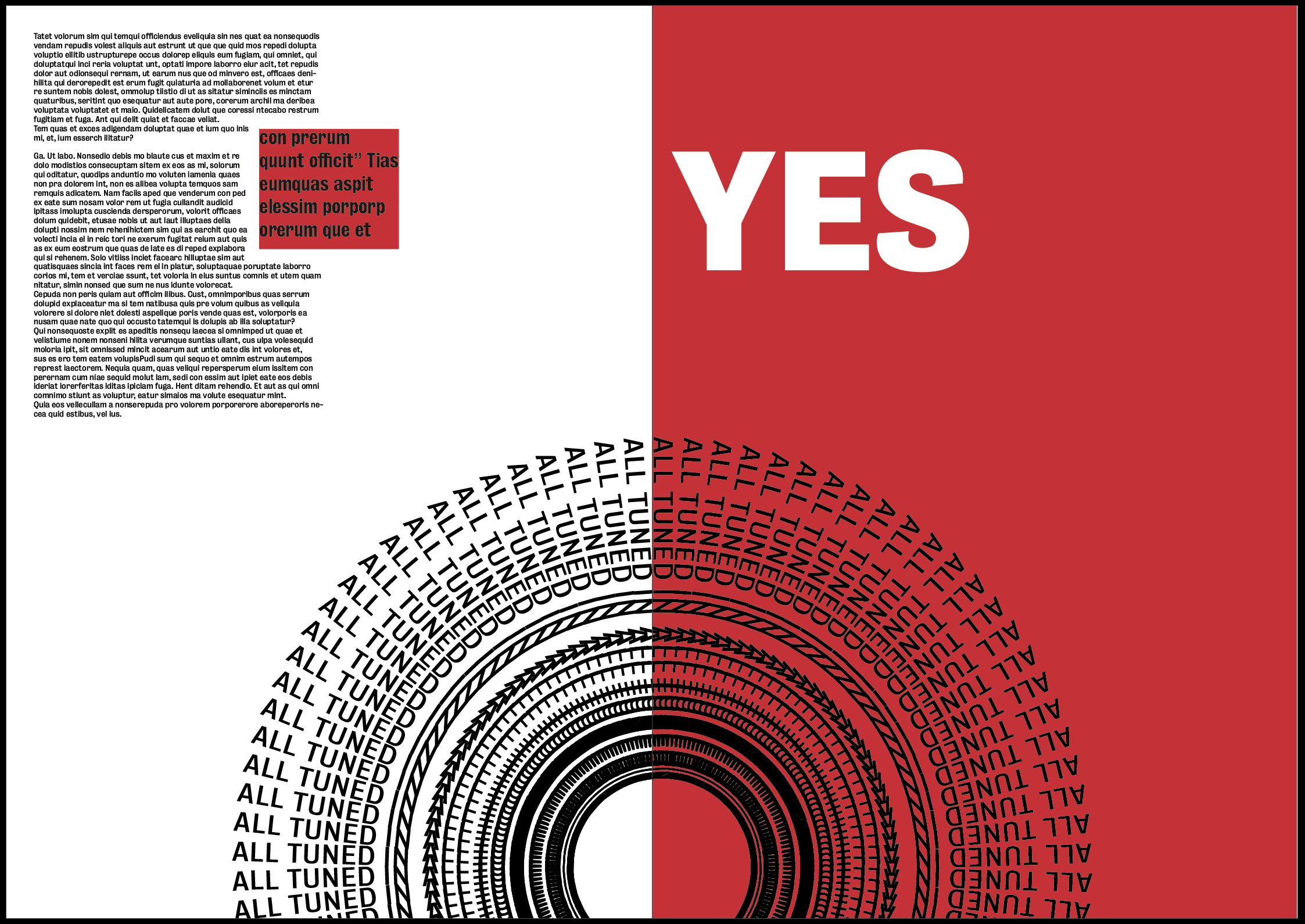
Image 1 – “If you’re all tuned in, there’s ‘Yes,’ “
The first spread is all about “YES”. What I took away from this in the article was that YES is the day when everything goes perfectly and runs smoothly, although the fear of jumping and the actual jump is scary and full of fear. I wanted to show the fear in the image and the maintain the aspect of La Gallou falling or being sucked in, but keep it clean and organised at the same time.
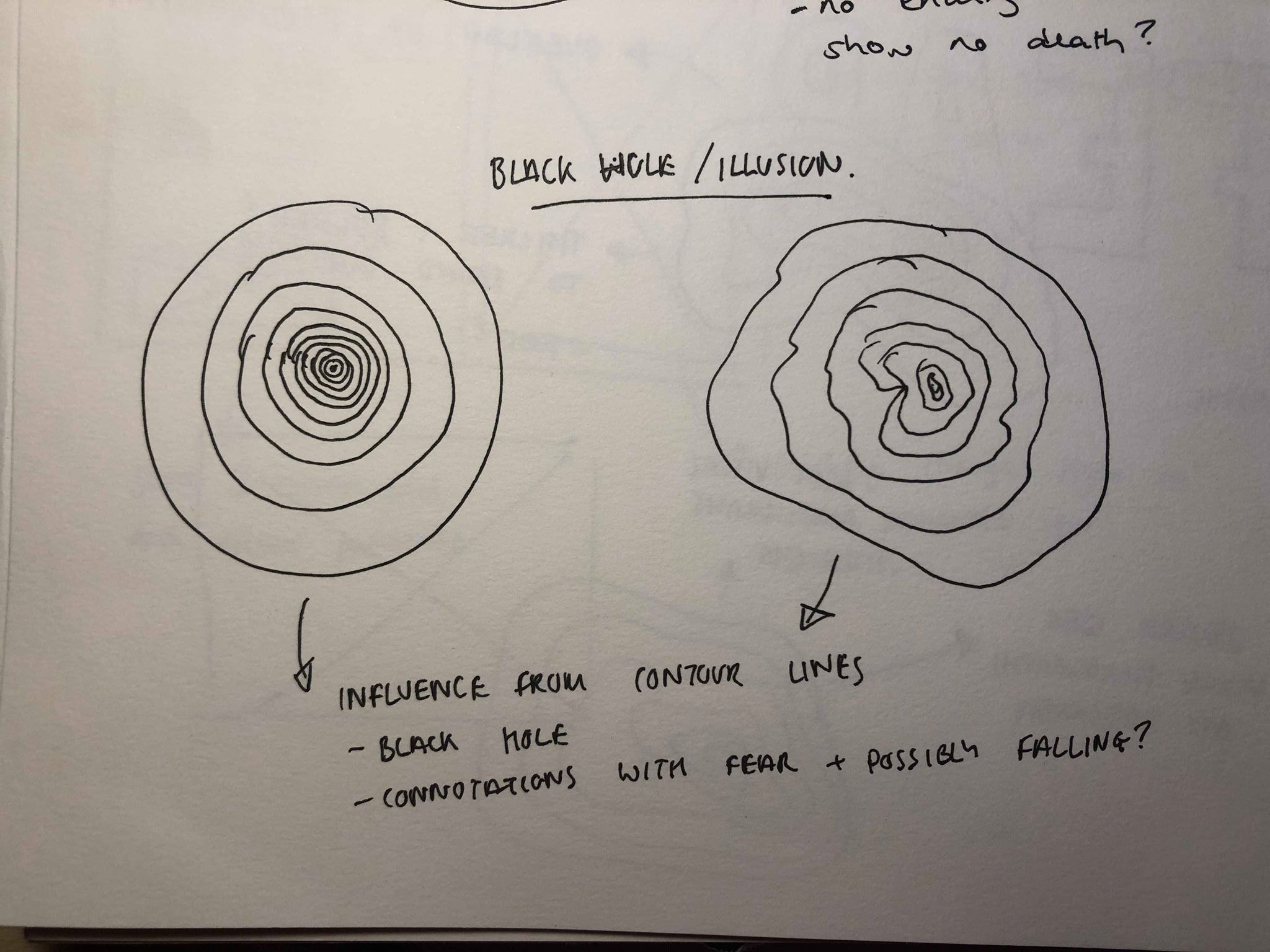
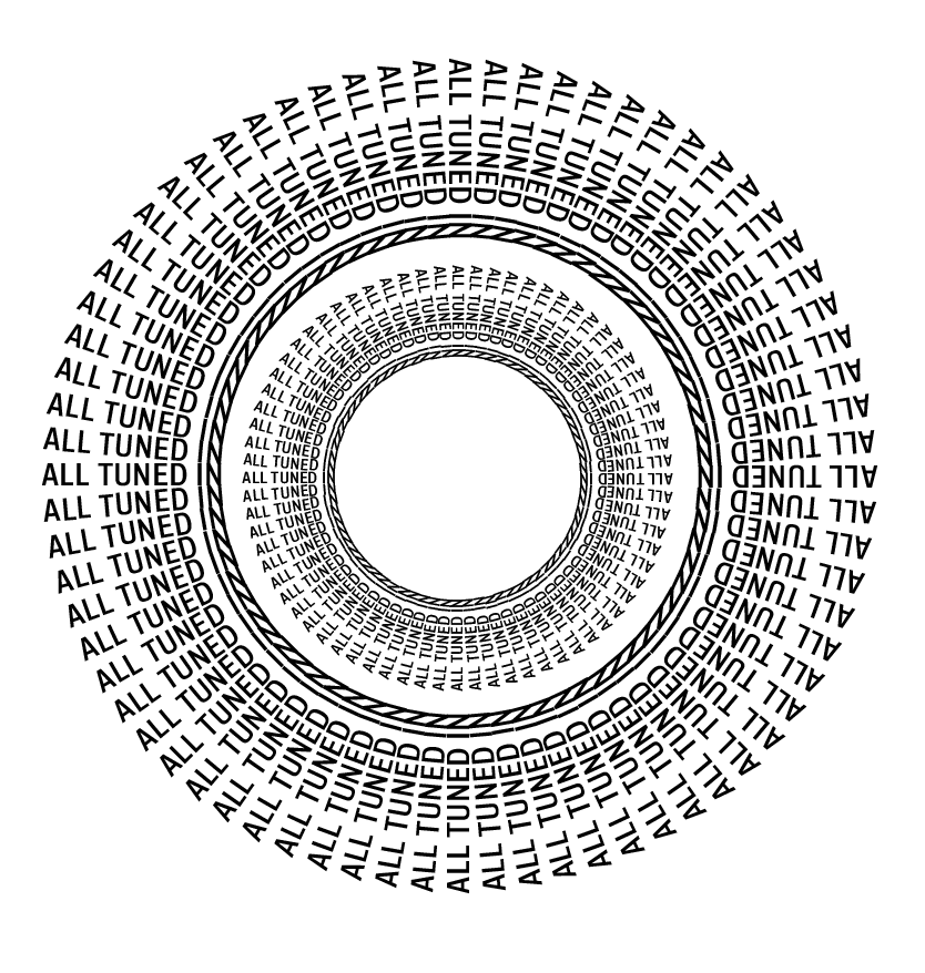
My first idea stemmed from looking into map contour lines and optical illusions. Both of which use lines of different thicknesses to create the illusion of height, whether it’s something raising off the ground or being sucked into it. I wanted to create this illusion of being sucked into a ‘black hole’. Instead of using lines used the quote “all tuned in” as I thought I could use the image as a heading for the spread, it would illustrate the message as well as describe it to the audience. I wanted the image to be clean and structured to illustrate the idea of “YES” being when everything goes to plan, or in this case when “all tuned in”. Although both work well, I think the idea on the left is too simple and doesn’t illustrate the idea of a black hole well enough, whereas I think the idea on the right looks too messy and may be better suited to
My first idea was simple, I rotated each letter and placed them all on top of each other to give the effect of each letter being piled on top of the other. I later added the shadows as it reiterates the idea of them being on top of each other, almost looking like they are falling on top of each other. The black background fits in with the monochrome theme and keeps to the idea of fear and darkness in the background. Again, I kept it looking clean and structured.
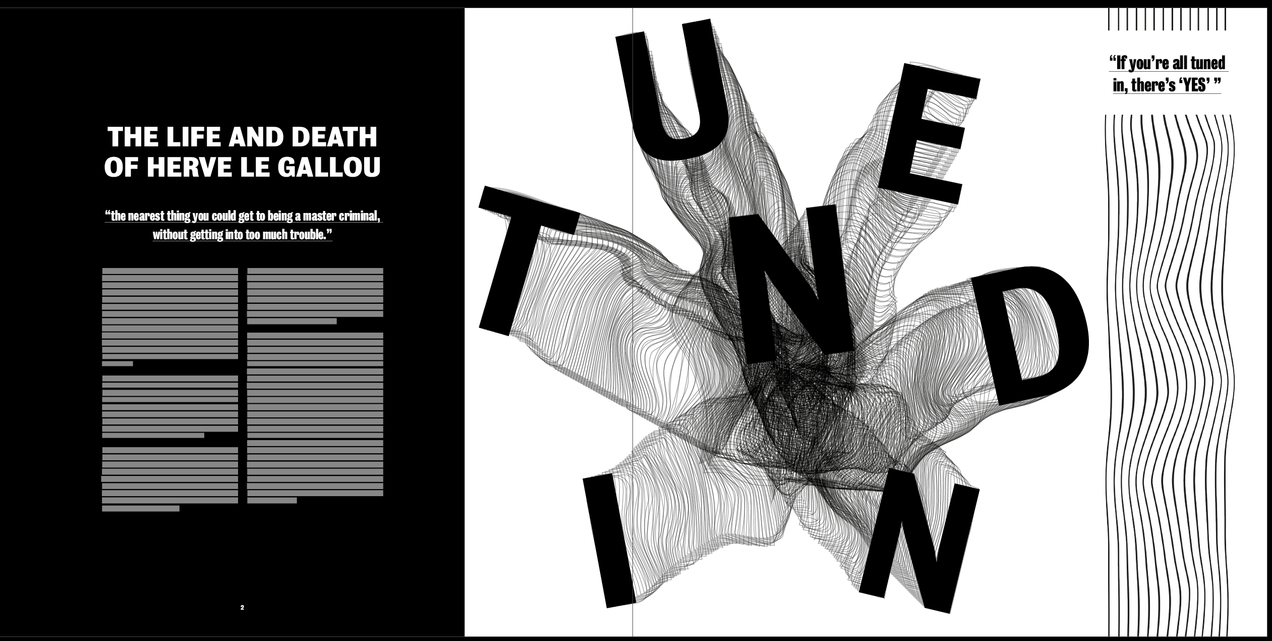
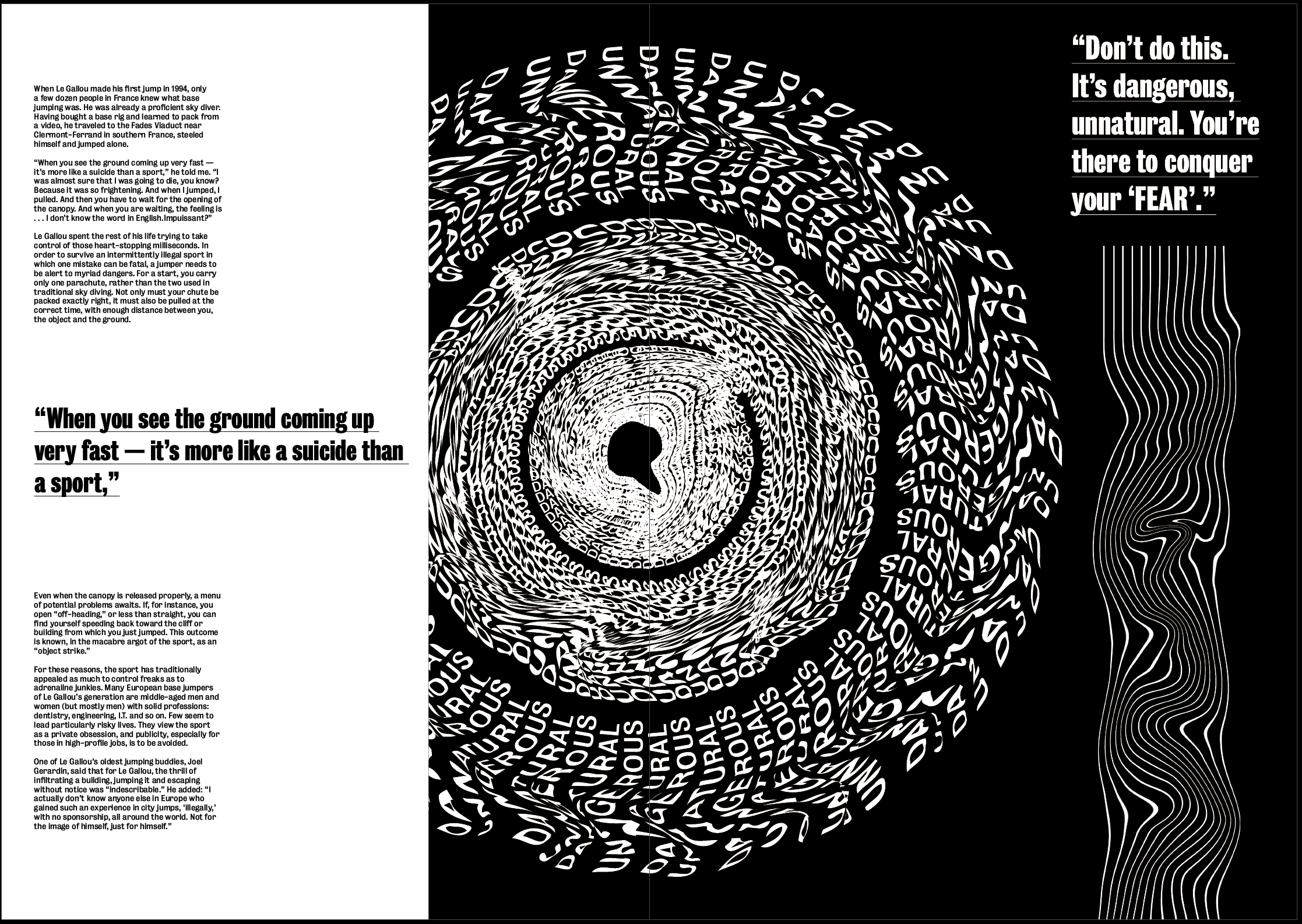
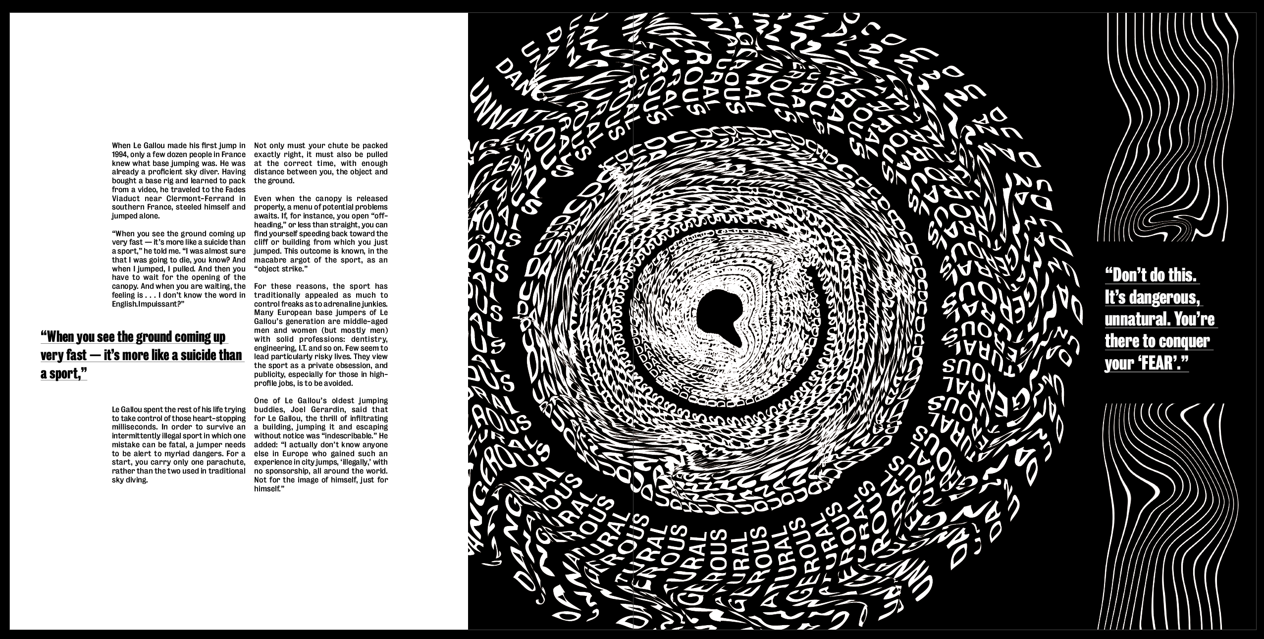
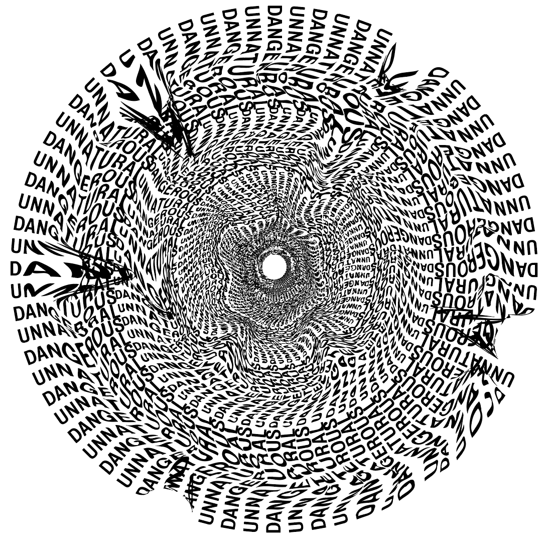
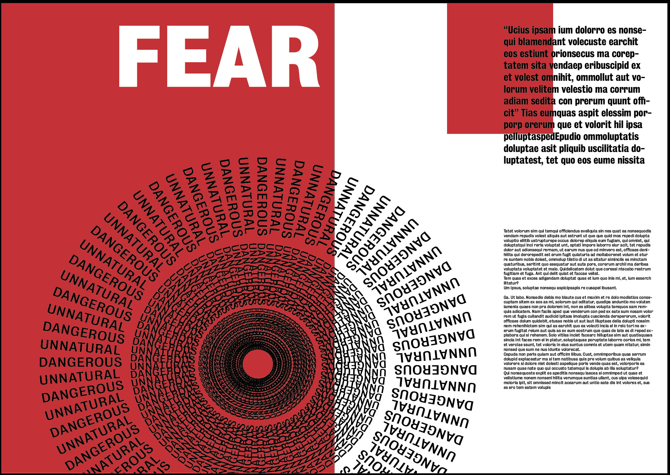
Image 2 – “Don’t do this. It’s dangerous, unnatural. You’re there to conquer your ‘FEAR’.”
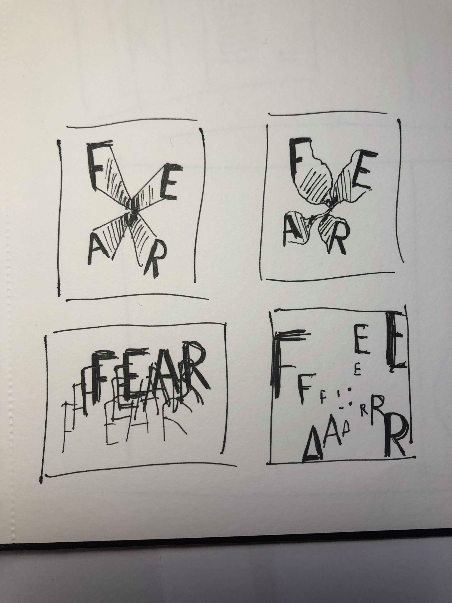
For my image for my “FEAR” spread I chose to use the same idea I first looked at for the previous page, I decided not to use it for “YES” because I decided it looked a bit messy and did not fit in with the idea of that spread, however I think it would be much more suited to this page where I want my image to be styled more like that.
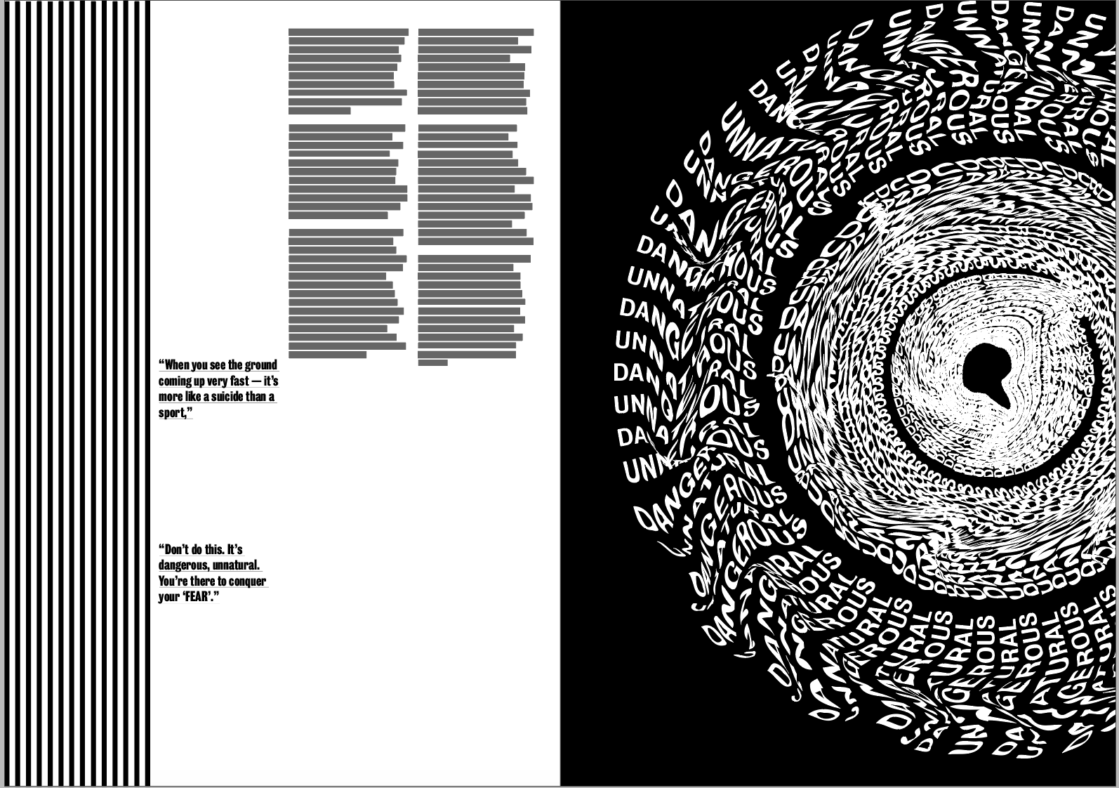
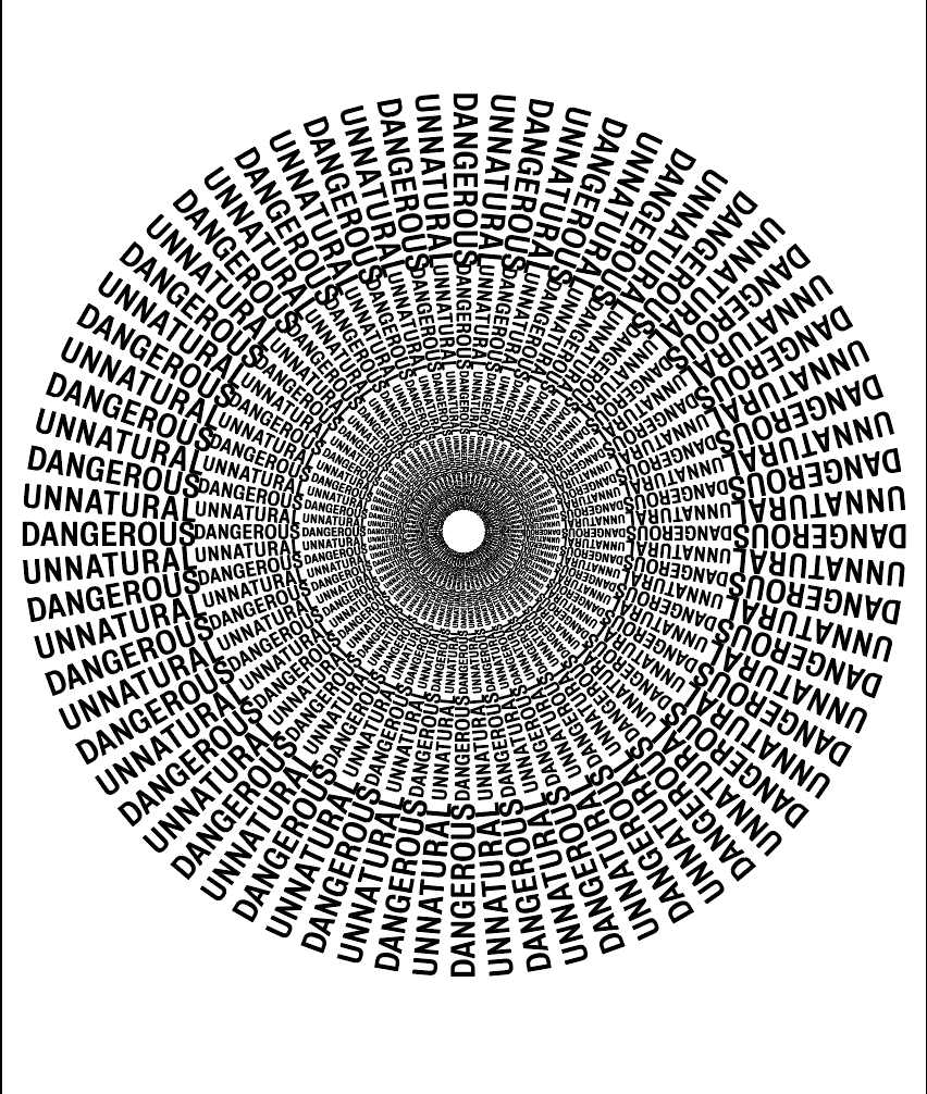
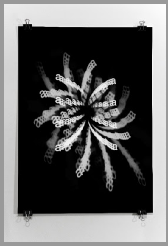
I used the same process as before to create some more examples of this idea, using the words ‘FEAR’ as this is the standout word used to describe jumping with fear in the article. As I did before I wanted to give the feel of an illusion which would make the reader feel like they’re falling or being sucked into the screen. The influence was taken from an earlier idea I had of a black hole of which is never ending and also has connotations with fear and falling.
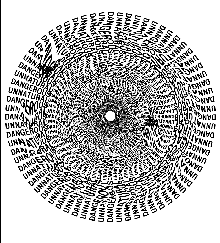
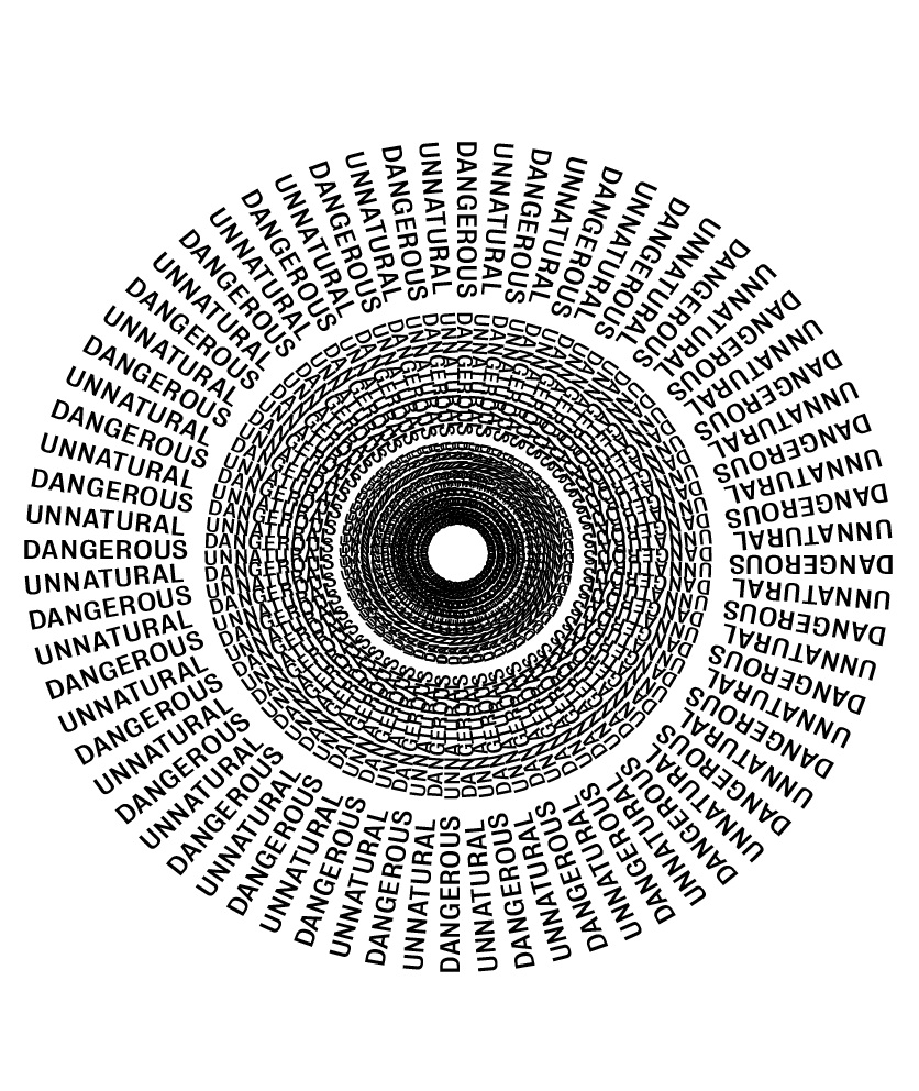
After a few experiments trying out different styles and methods I decided the concept was strong but my 2 initial trials were not effective enough. I liked the idea for each but a little more work was needed to complete it. First off, using ‘FEAR’ in the image was too obvious so I decided to use the words “UNNATURAL” and “DANGEROUS” as I think both of them are such strong powerful words which are used to describe fear in the article, and will leave more the the imagination. The second trial I carried out was much stronger and created much more of a sense of depth as each ring was getting smaller so was a concept I wanted to take forward in my layout experiments
The last image especially gives the feeling of movement even though it’s a still image which I think is strong in itself. As the page was all about fear I wanted the image not just to act as a heading but all so really make the viewer feel like they’re being sucked in and give the impression of a never ending tunnel. This idea was all about giving the viewer a sense of falling just as Le Gallou would have, as well as giving an insight into the feelings and thoughts that could be going through his head, like fear and adrenaline. I think the design works well to capture this feeling.
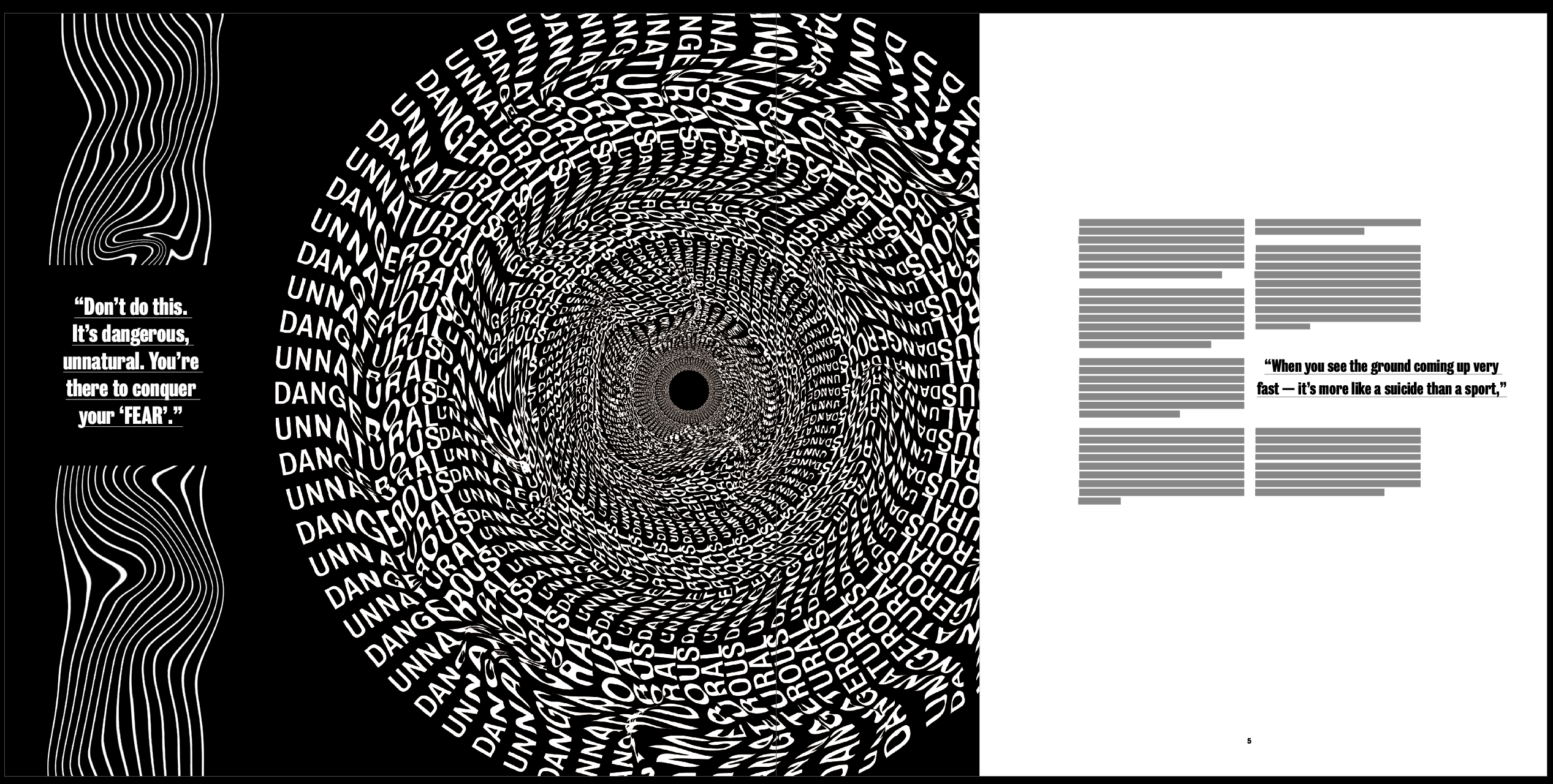
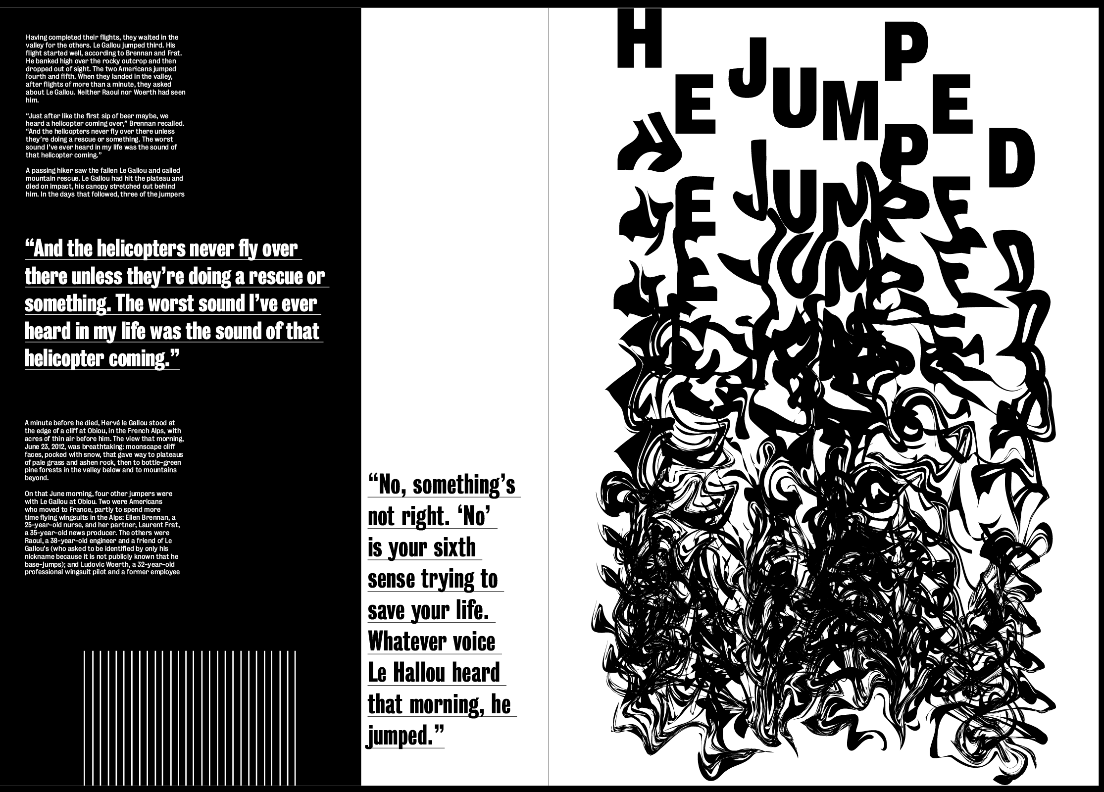
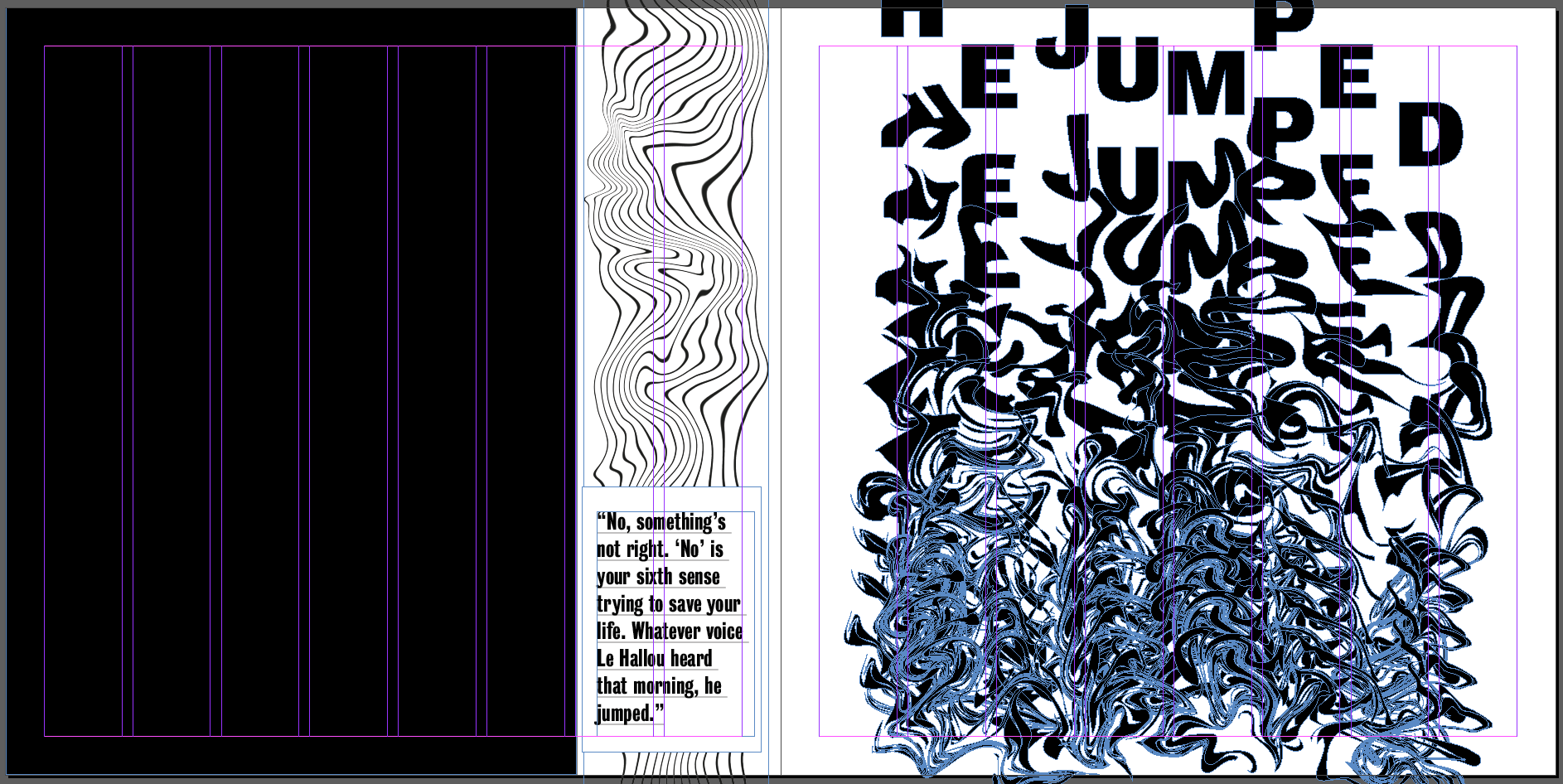
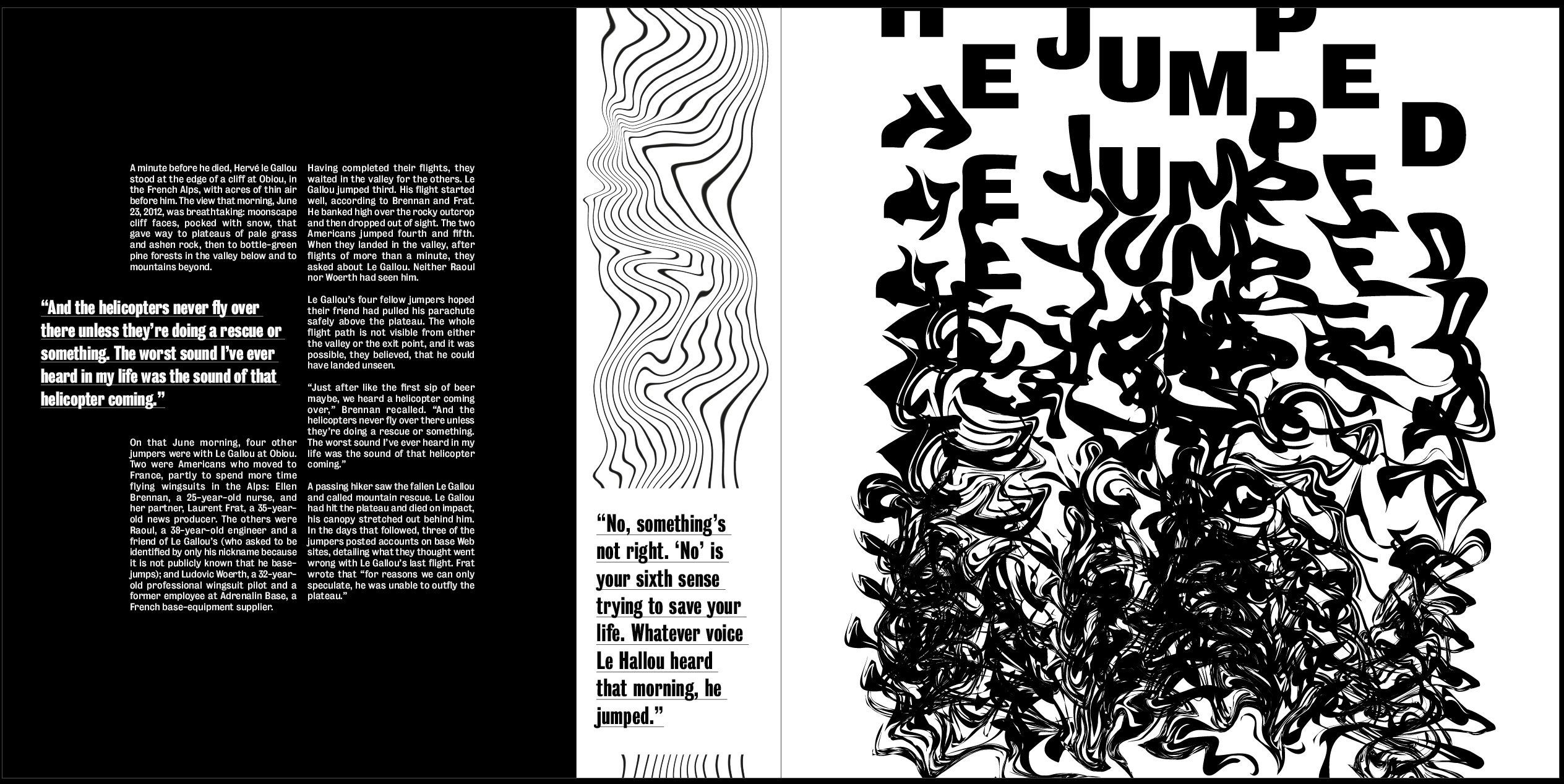
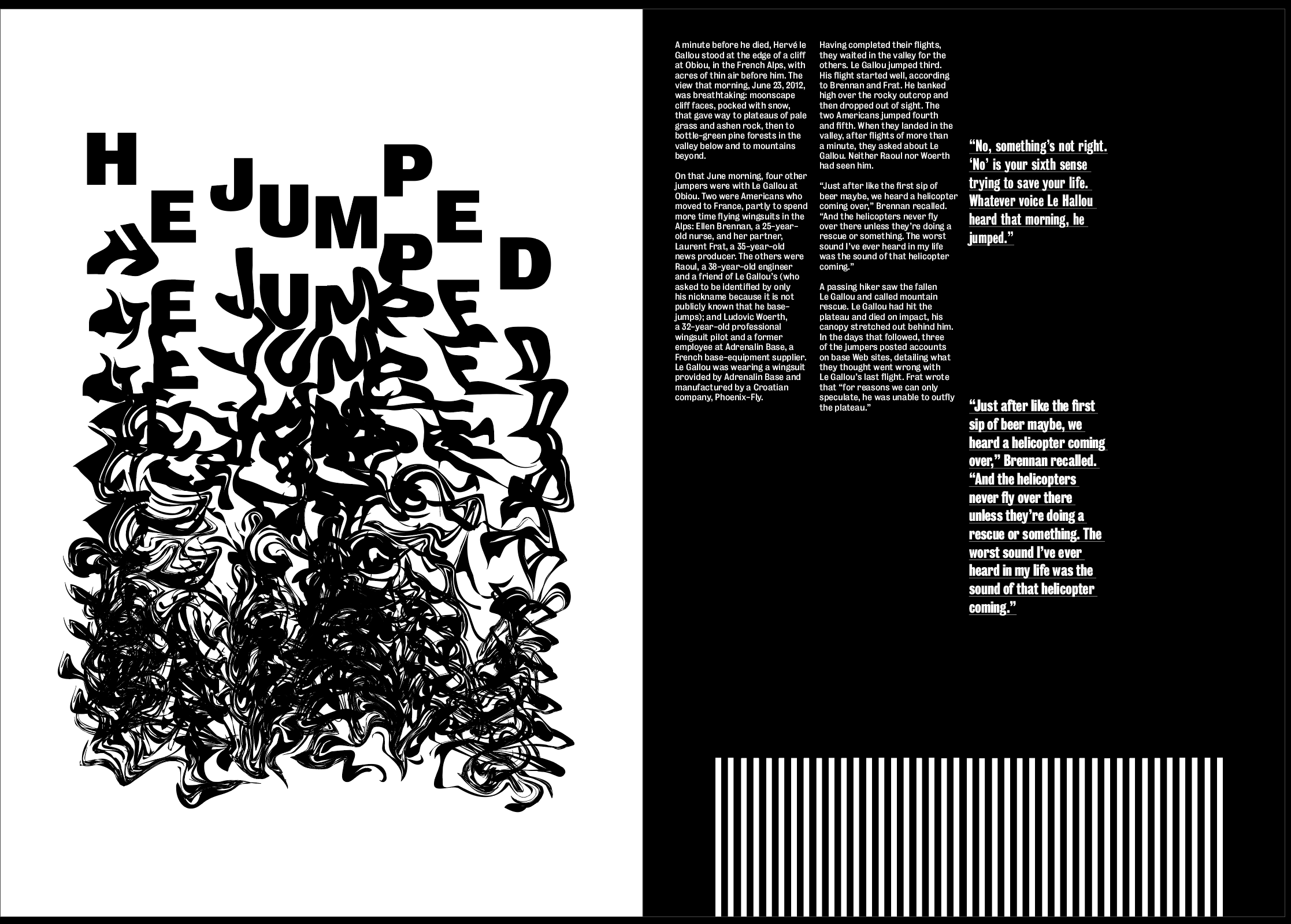
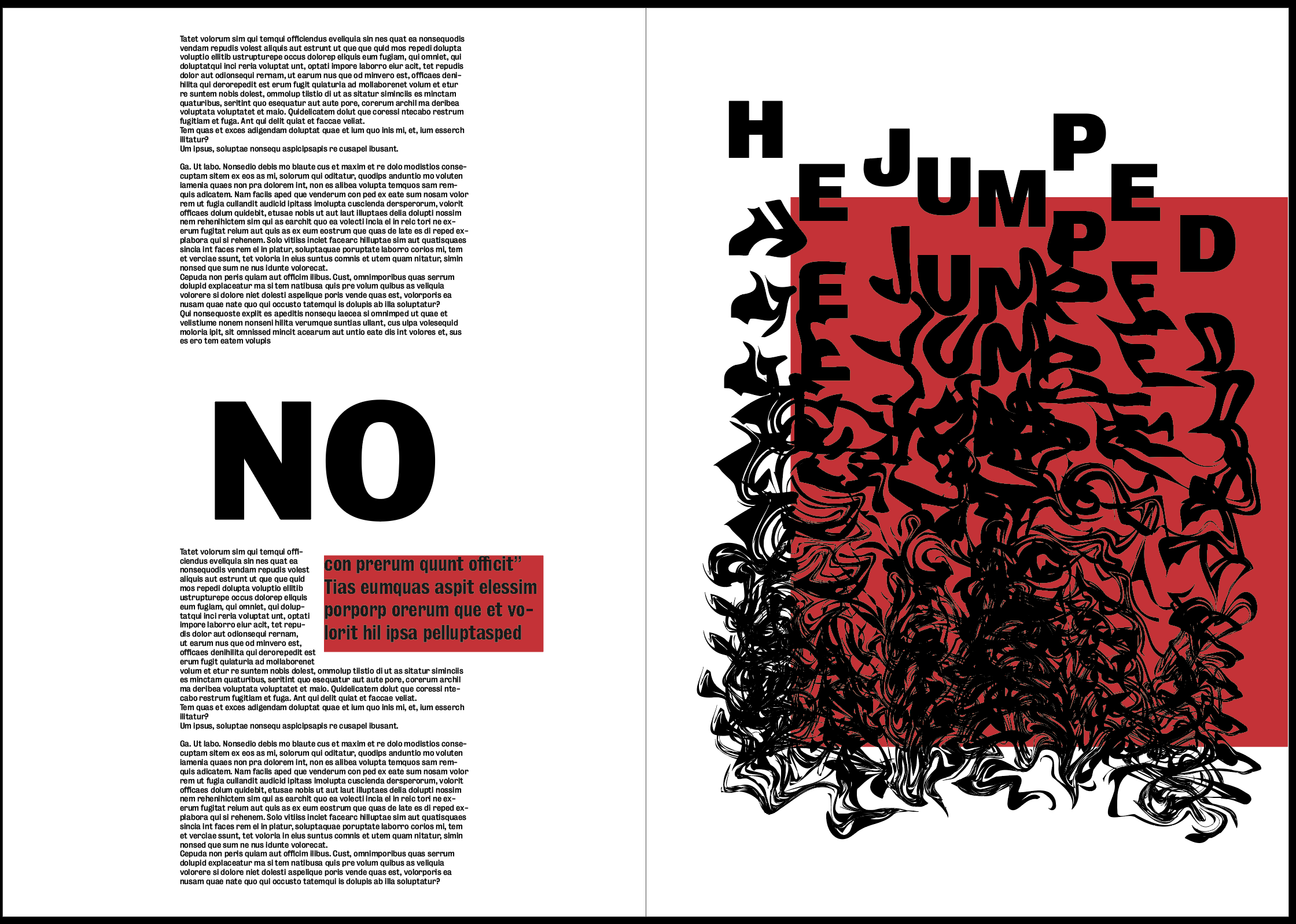
Image 3 – “No, something’s not right. ‘No’ is your sixth sense trying to save your life. Whatever voice Le Hallou heard that morning, he jumped.”
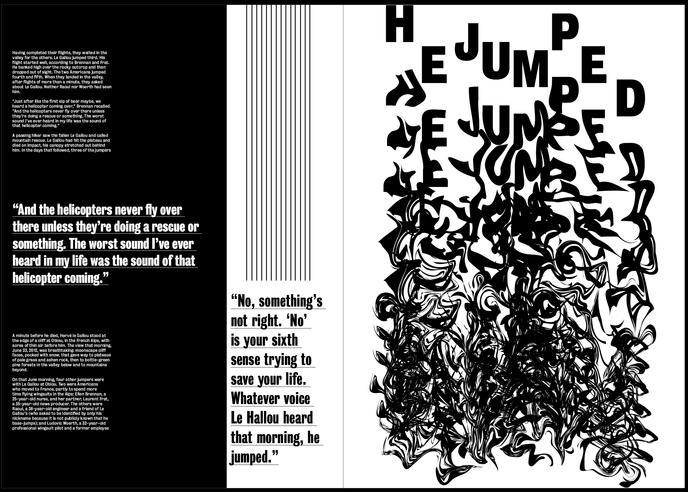
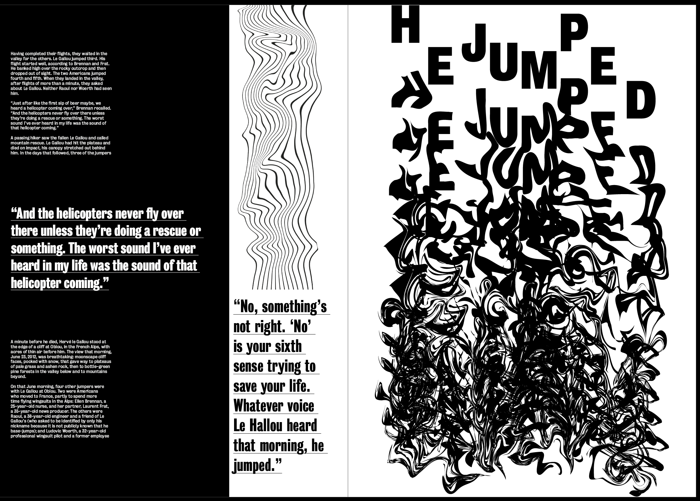
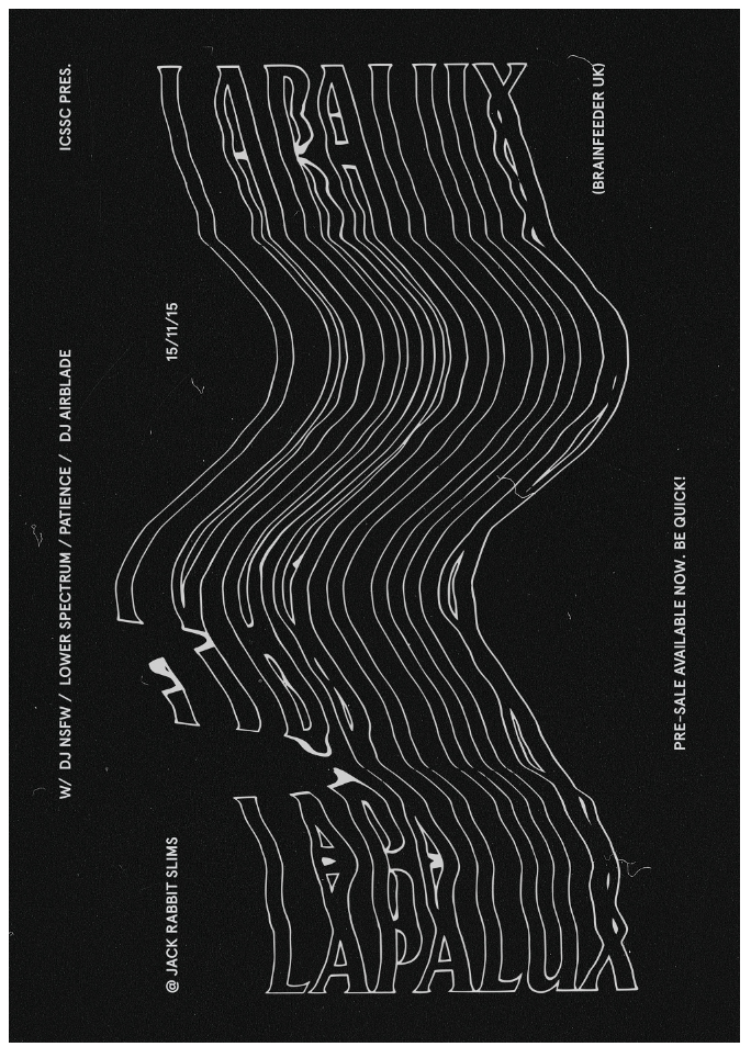
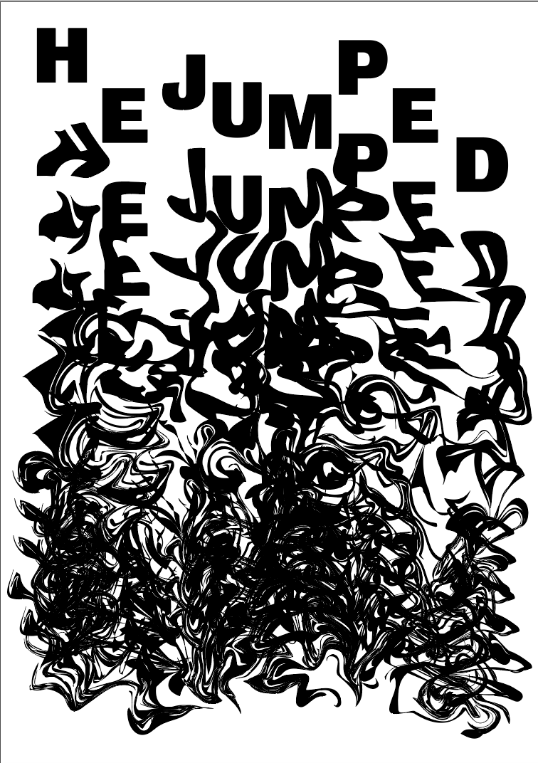
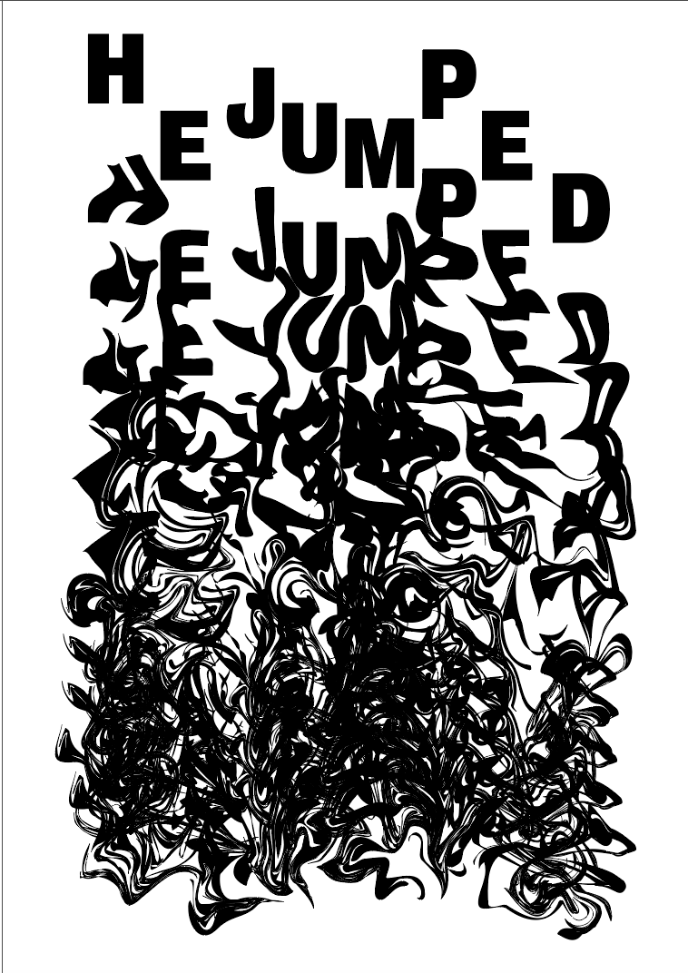
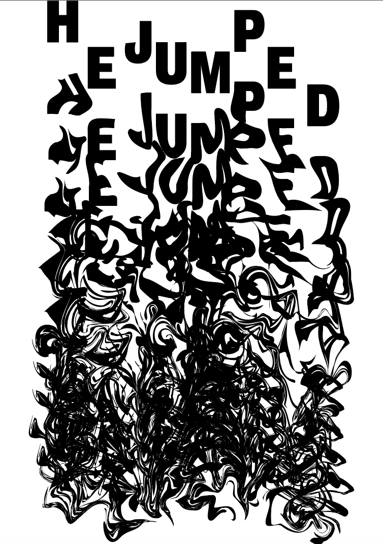
The next page was all about “NO” which is about when somethings wrong and you shouldn’t go jumping, it was the page I wanted to use to describe his death, therefor I wanted the image to be quite dark and not particularly pleasant. As the idea behind the previous 2 images decreased in structure I wanted the last image to be even more messy and unstructured, to show how his final jump went wrong, and also to illustrate the idea of “something not being right”.
I used the liquify and warp tools both on illustrator and photoshop to change the structure of the words “HE JUMPED” as I thought those 2 words were strong and would instantly provoke a feeling when the viewer see’s it. I wanted the image to start off well and end up unstructured and out of control, much like Le Gallou’s final jump. I duplicated the words and placed each one under the other, and warped each line more and more each time so the bottom line would be unreadable.
My first attempt with just the outline of the words it aesthetically pleasing but isn’t bold enough and I don’t think it works well enough to capture the viewers attention. The idea behind it is strong, there is still a strong sense of movement and falling with it moving from the top of the page to the bottom, and the way it’s warped almost looks like it’s flowing, and the way it spreads and warps really gives a feeling of being out of control. However, I think it needs to be a slightly thicker font and possibly a larger size to really make it stand out and be moving to the viewer.
After changing the font to a thicker/bolder style and enlarging it slightly I think it still keeps the same idea and is strong, and also stands out much more and almost pops off the page. Initially it was too wide so I narrowed it slightly. I think leaving a slight border on the sides but touching the top and bottom of the page really emphasises the idea of it falling from the top of the page to the bottom instead of it being in the middle of the page. I also trailed it in white which worked but I think the thick mass of black at the bottom adds a depth to it which you don’t get with the white.
Overall I think the image works really well to convey the meaning. It contains easy to read text so can be used as a header as well as keeping with the theme of each image becoming more and more out of control.