Editorial – Image initial Ideas

After choosing my layout and deciding what text to use on each page, I looked into the visuals and images I could use within the double page spreads.

The first idea I had was to use photographs of mountains or tall buildings, depending on which page, as the images on each page, using 2/3 on each spread. Although I have access to photos of both of these things, I felt this would be far too cliche and would illustrate exactly what was being said in the article too much, it would lead nothing to the imagination of the reader, especially as the brief is to design the article for young designers. There was also a large amount of quotes containing metaphors and amazing visuals which I felt would be much more effective.

The first idea I looked into was the idea of using typography instead of images to illustrate the article. There are some standout quotes and words within the article which I decided I could use to good effect such as BASE, and “YES, FEAR, NO” which are used in one of the quotes within the article. I wanted the words to be large on the page and take up as much space as a photo or other image would, they would also be used as a header on each spread.

I then looked into the idea of contour lines and cartography on a map. I was interested with the way maps use contour lines to show the height of hills or mountains and think it would be a good way to show mountains or cliffs without having to include photographs. It would also be a good visual to add and could overlay with other images or photographs to create more visuals. After looking at a variety of examples of contour lines, I noticed that although they look like a raised surface, it could also be seen as the opposite, which links in with my idea of a black hole or illusion of something being sucked into or falling into the page.

I then took influence from the idea of the contour lines as well as the illustration to give a sense of the viewer being sucked into the page, or into the ‘black hole’. I wanted to give the viewer a sense how La Gallou would feel when jumping off a cliff or building, in terms of giving a feeling of falling as well as the feeling and adrenaline going on inside his head. I wanted to experiment with this idea using illusions and expressive typography.

The plan was to create 3 images, 1 for each page using ideas from above, which all give a sense of falling that will make the viewer feel as if they’re falling or being sucked into the page.

Following on from my idea to use “YES, FEAR, AND NO” as my 3 spreads, I wanted to create an image for each spread which give a feeling of each of the emotions. “YES” was described as “when you’re all tuned in”, therefor I want the image for it to be clean and all in proportion, whilst still giving a sense of illusion and a sense of falling. “FEAR” was described in the article as “Don’t do this. It’s dangerous, unnatural. You’re there to conquer your ‘FEAR’.”, so I wanted the image on the ‘fear’ page to have a strong sense of fear using the idea of being sucked into a black hole and falling into the page, I want it to make the viewer to understand and feel how La Gallou would feel. As opposed to “YES” I don’t want the image to be as clean and in proportion, I think it would be more effective with a slightly distorted look as it gives a feel of the FEAR and shows how skydiving can be scary and unpredictable. Finally, in the article when describing “NO”, it says “No, something’s not right. ‘No’ is your sixth sense trying to save your life. Whatever voice Le Hallou heard that morning, he jumped.” For this image I want it to be the most moving of all and really illustrate La Gallou’s last jump going from an amazing morning and amazing views to a disastrous jump.

Editorial – The Article

The brief is about taken one of 10 given articles and creating a contemporary piece of editorial design for it. I initially skimmed through all 10 articles to find any which stood out to me and seemed interesting to read as I thought the articles which were the most interesting to read would also be the most interesting visually. After reading the majority of them, I focused in on ‘The life and death of Herve La Gallou’ and ‘The class pay gap’. Although initially the article about the class pay gap stood out to me the most due to how interesting the facts are within it, ‘The life and death of Herve La Gallou’ to me had so many more interesting metaphors and amazing imagery within it that I decided to go choose it.

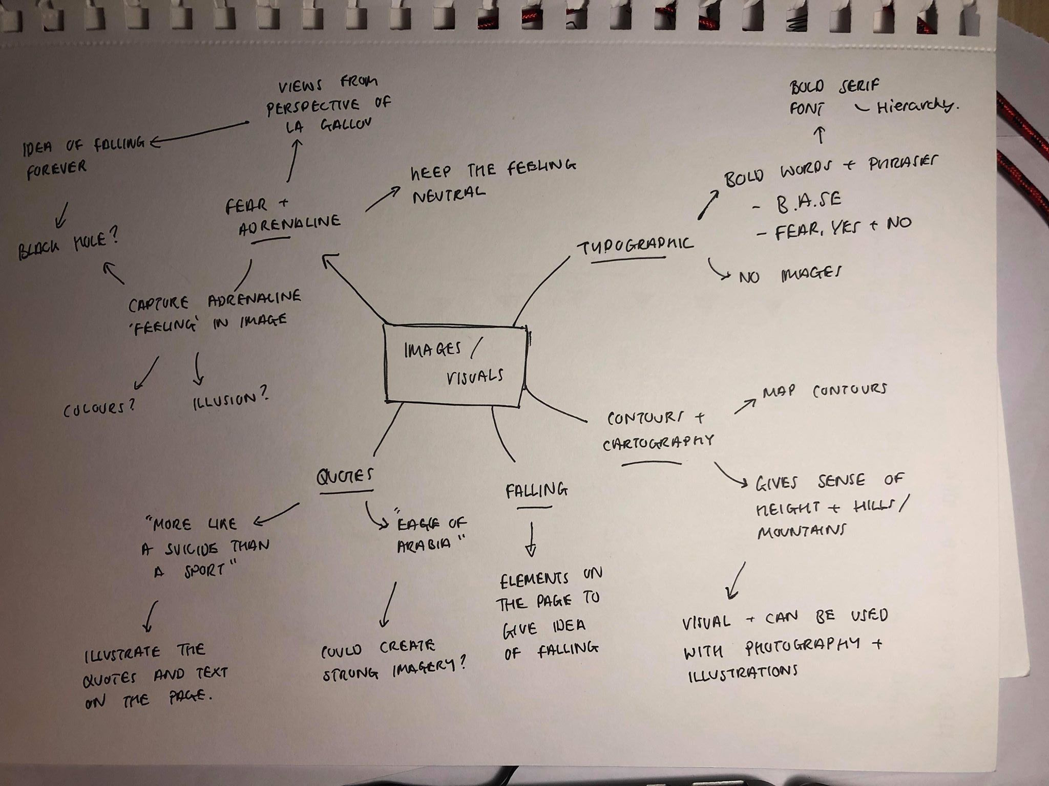
After reading the article it was made clear that there already seemed to be 3/4 different ‘chapters’ within the article which I could use to separate into each double page spread. The beginning was all about his life and his base jumps and skydives, around the middle was a lot of information about how he feels when he jumps and the reasons he does it, and the end of the article was all about the day of his death and the events following on from his death. Due to this, I decided to separate the text into these 3 sections, using one of them on each double page spread.

PAGE 1-2 = HIS LIFE AND HIS BASE JUMPS

Le Gallou was an unremarkable-looking man of medium height, with a slim physique, short brown hair and wide eyes. I met him only once: in January 2009, at a restaurant in Paris. A friend had told me about an astonishing coup that took place months earlier in Dubai, in which Le Gallou and McDonnell walked into the Burj Khalifa skyscraper, then under construction, disguised as engineers. They evaded security, climbed 155 floors on foot and then flung themselves from the top at dawn — thus becoming the first people to base-jump from the tallest building in the world. I wanted Le Gallou himself to tell me about the adventure.

He also described a vivid scene at the top of the Burj. Le Gallou explained that when he was in his late 40s, he began to suffer from night blindness. As a result, he preferred to wait until dawn to jump buildings he infiltrated in the dark. At the exit point, he and McDonnell watched the desert turn from blue to pink as day broke over Dubai. At that moment, Le Gallou later recalled, “you feel everything belongs to you.”

We spoke too of his other notable coups. In 2000, he and a friend, Benoît Paquet, scaled the exterior of the 88-story Jin Mao Tower in Shanghai in the middle of the night and jumped at dawn. By 2009, Le Gallou had also jumped from the Eiffel Tower 40 times. He had, he said, become the de facto “official guide” of the Parisian landmark for novice jumpers — the one who knew how to evade the cameras and guards.

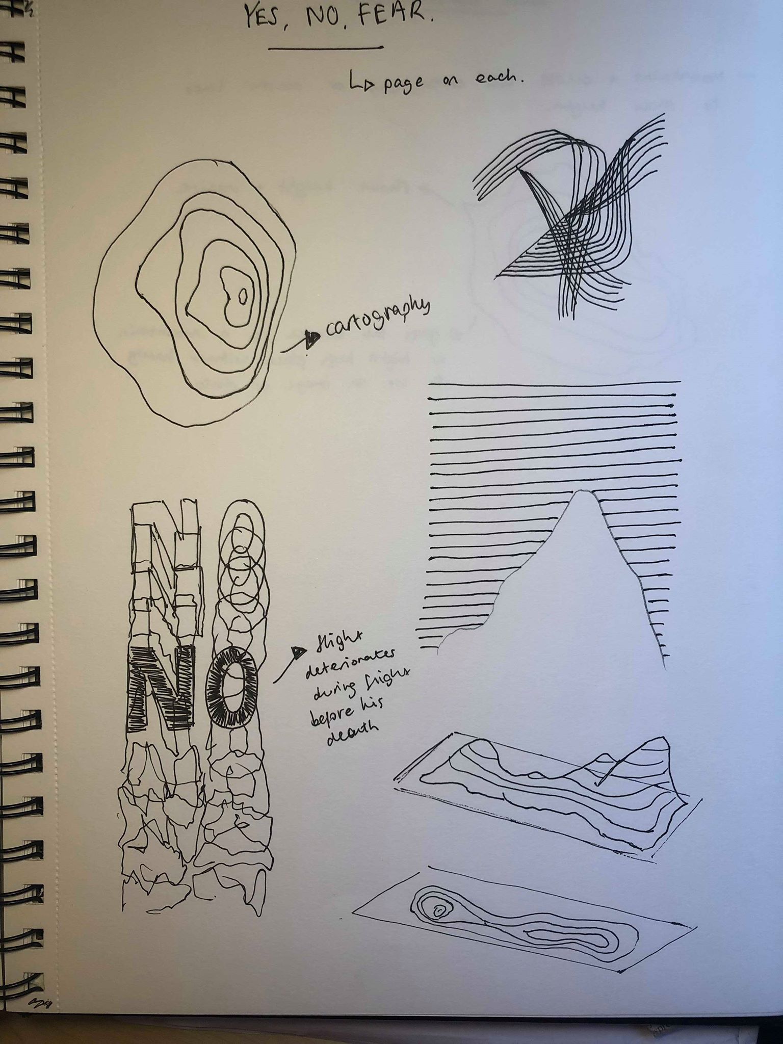
These stories granted Le Gallou near-mythic status among European base jumpers. (After Dubai, his friends jokingly nicknamed him l’Aigle d’Arabie: the Eagle of Arabia.) For McDonnell, Le Gallou’s urban adventures were “the nearest thing you could get to being a master criminal, without getting into too much trouble.” Unless you were involved in base jumping, however, it’s very unlikely you would ever have heard of Le Gallou. In recent years, several base jumpers have gained a high public profile. Men like Jeb Corliss and Felix Baumgartner — the daredevil who sky-dived from the edge of space — have become YouTube stars, backed by brands like Red Bull. But Le Gallou was not after fame. He maintained a Web site, but it was rudimentary; he preferred to share stories face to face.

The sport he loved began in earnest in the late 1970s, when a group of American parachutists led by Carl Boenish started jumping El Capitan, above the Yosemite Valley, using regular sky-diving equipment. There had been similar jumps before — for movie stunts and one-off kicks — but it was Boenish and his gang who invented the term B.A.S.E. (for Building, Antenna, Span, Earth, four types of objects from which it is possible to jump).

One of Le Gallou’s oldest jumping buddies, Joel Gerardin, said that for Le Gallou, the thrill of infiltrating a building, jumping it and escaping without notice was “indescribable.” He added: “I actually don’t know anyone else in Europe who gained such an experience in city jumps, ‘illegally,’ with no sponsorship, all around the world. Not for the image of himself, just for himself.”

PAGE 3 -4 = HIS FEAR AND HOW HE FEELS WHEN HE JUMPS

When Le Gallou made his first jump in 1994, only a few dozen people in France knew what base jumping was. He was already a proficient sky diver. Having bought a base rig and learned to pack from a video, he traveled to the Fades Viaduct near Clermont-Ferrand in southern France, steeled himself and jumped alone. The experience was a revelation.

“When you see the ground coming up very fast — it’s more like a suicide than a sport,” he told me. “I was almost sure that I was going to die, you know? Because it was so frightening. And when I jumped, I pulled. And then you have to wait for the opening of the canopy. And when you are waiting, the feeling is . . . I don’t know the word in English.Impuissant?”

Powerless. Le Gallou spent the rest of his life trying to take control of those heart-stopping milliseconds. In order to survive an intermittently illegal sport in which one mistake can be fatal, a jumper needs to be alert to myriad dangers. For a start, you carry only one parachute, rather than the two used in traditional sky diving. Not only must your chute be packed exactly right, it must also be pulled at the correct time, with enough distance between you, the object and the ground. Even when the canopy is released properly, a menu of potential problems awaits. If, for instance, you open “off-heading,” or less than straight, you can find yourself speeding back toward the cliff or building from which you just jumped. This outcome is known, in the macabre argot of the sport, as an “object strike.”

For these reasons, the sport has traditionally appealed as much to control freaks as to adrenaline junkies. Many European base jumpers of Le Gallou’s generation are middle-aged men and women (but mostly men) with solid professions: dentistry, engineering, I.T. and so on. Few seem to lead particularly risky lives. They view the sport as a private obsession, and publicity, especially for those in high-profile jobs, is to be avoided.

PAGE 5-6 = THE DAY OF HIS DEATH

A minute before he died, Hervé le Gallou stood at the edge of a cliff at Obiou, in the French Alps, with acres of thin air before him. The view that morning, June 23, 2012, was breathtaking: moonscape cliff faces, pocked with snow, that gave way to plateaus of pale grass and ashen rock, then to bottle-green pine forests in the valley below and to mountains beyond.

“I know exactly what I’m doing,” he said. “I just go for pleasure. There is still some stress, some fear, because there is some danger. But I know exactly what I can do. I know where is my limit.”

At 51, Le Gallou was a veteran of thousands of base jumps. But he had never flown from the exit point at Obiou before. In order to execute his intended flight, he needed to guide himself away from the cliff face, and then sharply to the right, over a rocky outcrop. For an experienced pilot, this maneuver was relatively straightforward. The next period of the flight, however, was tricky. Le Gallou would need to glide over a long, moderately inclined plateau. In order to do so, it was imperative that he pay attention to what French wingsuit pilots call la finesse: the ratio of forward to downward movement. (To maximize lift and finesse, a pilot needs to find the perfect “angle of attack” — the best position of the wings in relation to the wind.)

If he couldn’t maintain an adequate glide in this part of the flight, he had an escape: he could pull his parachute and land on the plateau. This plan would work as long as he made the decision early enough. But if he bailed too late, he would crash before his chute could fill with air. The best case would be the simplest: to fly with “une bonne finesse,” continue over the inclined plateau and the pine trees and eventually pull his chute above the valley floor.

On the morning of June 23, the chances of a long, birdlike flight in perfect conditions seemed good. Nonetheless, dark thoughts may have assailed Le Gallou. He was fatigued, short on practice and unhappy with his equipment. The previous day, moreover, he received news that his mother was involved in a car accident in Paris, the latest in a string of misfortunes that had bedeviled his family in recent months.

On that June morning, four other jumpers were with Le Gallou at Obiou. Two were Americans who moved to France, partly to spend more time flying wingsuits in the Alps: Ellen Brennan, a 25-year-old nurse, and her partner, Laurent Frat, a 35-year-old news producer. The others were Raoul, a 38-year-old engineer and a friend of Le Gallou’s (who asked to be identified by only his nickname because it is not publicly known that he base-jumps); and Ludovic Woerth, a 32-year-old professional wingsuit pilot and a former employee at Adrenalin Base, a French base-equipment supplier. Le Gallou was wearing a wingsuit provided by Adrenalin Base and manufactured by a Croatian company, Phoenix-Fly.

Raoul jumped first, and then Woerth. Having completed their flights, they waited in the valley for the others. Le Gallou jumped third. His flight started well, according to Brennan and Frat. He banked high over the rocky outcrop and then dropped out of sight. The two Americans jumped fourth and fifth. When they landed in the valley, after flights of more than a minute, they asked about Le Gallou. Neither Raoul nor Woerth had seen him.

Le Gallou’s four fellow jumpers hoped their friend had pulled his parachute safely above the plateau. The whole flight path is not visible from either the valley or the exit point, and it was possible, they believed, that he could have landed unseen. After hiking for a while to get better phone reception, they tried to call Le Gallou. Nothing. Brennan remembers the group opening beers to celebrate their successful jumps while they waited for news.

“Just after like the first sip of beer maybe, we heard a helicopter coming over,” Brennan recalled. “And the helicopters never fly over there unless they’re doing a rescue or something. . . . The worst sound I’ve ever heard in my life was the sound of that helicopter coming.”

A passing hiker saw the fallen Le Gallou and called mountain rescue. Le Gallou had hit the plateau and died on impact, his canopy stretched out behind him. In the days that followed, three of the jumpers posted accounts on base Web sites, detailing what they thought went wrong with Le Gallou’s last flight. Frat wrote that “for reasons we can only speculate, he was unable to outfly the plateau.”

Editorial – Introduction and workshop

In todays lecture we were given our brief for our editorial project and were given a short lecture on layouts and grid systems, hierarchy, type elements and detailing within an editorial piece as well as the use of pace throughout an article or magazine.

For our short workshop task, we were split into groups and had to create a double page spread each using a given topic. My grouped picked out the topic of ‘Coachella’ and had to crete an article all about the festival. We each designed a page each but had to use all the elements taught to us in the morning to make the article look professional and as if they had all been made by the same person, for the same article. We decided that we first needed to come up with a visual identity that would be similar across the whole article but would also not look exactly the same to create a sense of pace. We decided on things like the colours we wanted to use, the type, layout (grid system), and how we wanted our paragraphs to be laid out.

As a group we spoke about the things we discussed with David in our tutorial about how we wanted the article to make the reader feel, and after discussing this and carrying out some research into the festival we we ultimately decided that Coachella has had criticism recently for being more about the ‘vibes’ it creates and less about the actual music. We wanted our article to show this and so decided that the images within our article would be the most prominent aspect and would take up the majority of the page. Coachella is always at the very peak of what is currently going on, with the music, fashion and style of the festival all being very modern, we wanted to convey this in our article using a very modern and contemporary feel.

I wanted to use the image as the first thing that draws the eye to create a sense of hierarchy, followed by the ‘Coachella’ heading, then the body text, then the caption. I didn’t want the article to be too informative as as I said previously the festival has become more about the idea of going to the festival and less about the music and the actual festival itself, therefor I wanted to portray this within the article. Overall after only having a short amount of time to create it, I think it works well and uses a lot of the elements we spoke about in the tutorial to create a strong double page spread.

Movement – final scene

The final scene is simply telling the viewers what the movement or ‘ism’ is and giving a short description of what it is, i used ‘just stop waiting’ as I think its a short and snappy, simple way of describing the whole idea of Bufferism and the video. 

I used a glitch effect by creating multiple masks of the layers above the text and using it to distort the original image. I think the glitch effect shows Bufferism itself is all about a computer and the way it freezes and glitches. 

I also used a digital looking font which looks very computer generated, and had each letter being typed out like it would be on a computer.

Movement – text

Finally I had to add two more scenes which both consist of just text. The first says ‘you can do amazing things in 10 seconds’ I have looked at lots of examples of kinetic typography where the camera follows the text as it’s typed on the page as I think it looks very playful and can be done with different effects and colours. The example shown above was a test to see how it works and looks with different layouts. 

During our expressive type workshop with David previously, we heard phrases said in different accents and we had to write or draw the phrases in the way they are said, using different scales and fonts to create it. I used a similar idea for this, the words like ‘you’ and ‘amazing’ were said much louder and sharper than the rest of the phrase, so i’ve made them bigger and bolder. I used sans serif typefaces for both to keep it simple, just using different thicknesses.

I then tried to lay it out, using the voiceover to make each word appear as it’s said in the voiceover.  I used the same idea of kinetic typography where it zooms in on each word as it’s said in the voiceover. 

The next scene after this has an all white background, so I tried using blue and then white boxes moving across the page to transition between the two scenes. I think it works well to lead from the first scene into the second, however i don’t like the way the text is played out.

I changed the format of the words so it reflects how each word is said, for example the ‘AMA’ is much louder then ‘ZING’ and was the loudest work said so I’ve had it central and very large. ‘YOU’ and ’10’ were also said loudly so are in a thicker font and are much larger on the page, this meant the 3 most important words stand out the most. ‘can do’ and ‘things in’ were both said slightly quieter, hence why they’re smaller and ‘seconds’ was said very quickly after 10 almost in one motion, so I’ve added them directly below it. 

Although at first glance is can be hard to read the words, because of the voiceover I don’t think it’s essential to be able to read it as it is said very clearly, the kinetic typography just gives a fun style to the typography.

I then used the same idea as I showed previously of the boxes to transition between scenes.

I then used the same idea to create another scene which says ‘what will you do in 10 seconds’. The ‘YOU’ is the loudest and sharpest word in the voiceover so I made it the largest word on the screen, and again similar to the last one ‘seconds’ is said very quickly after 10, so they are put together.

Although in the first scene I have transitioned it into the second, I haven’t done that in this one. Thats because the next scene on is the scene with the frozen computer, so I wanted a blunt transition between the two and I didn’t want it to be seamlessly transitioned.

Movement – text development and sound effects

too much text, takes away from the look of the animation 
can’t see the animation moving behind
text too hard to read, will be especially hard when the numbers come on
good idea, but only works with this animation as some of the others have no where to add them on the screen

Using the bobsleigh animation for to test it out, I added the text onto the animation in multiple different ways, layering it over the top, underneath and side by side, but overall i don’t think any of them are effective enough, each of them have their downsides and i don’t like the way ay of them look.

My next idea was for each animation, to have 5 seconds of text and 5 seconds of animation for each. Each body of text would pop up on the screen to give the information and then the animation would transition in after the 5 seconds. This was more effective than the previous idea of having text and animations on the same screen, however the whole idea of my video is to have a series of animations to show what you can do in 10 seconds, so I think the animations themselves need to last 10 seconds each.

This led me to thinking about using a voiceover, which meant I wouldn’t have to add any text on the page, the viewer could just listen to the voiceover instead, this means nothing would be in the way of the animations and the video as a whole will look much cleaner.

I added a voiceover to each animation which lasted about 7/8 seconds each so it was a second or 2 inside the animation on either side. I mad sure the voiceover was upbeat and very over the top to fit in with the rest of the animation.

After doing the voiceover I watched the whole thing through and even with the voiceover it still sounded relatively dull and did not match the style of the animations, i think partly because the sound effects added to it make it seem too serious. Due to this I looked online for a soundtrack to add to the background instead of using sound effects, I looked for an up beat, happy song which I could add to the background behind the voiceover. I found a site called ‘bensound.com’ which is a site that you can download soundtracks from. I found one called ‘buddy’ which I think fits my animation perfectly.


Movement – text

Before adde text I did some more research into each of my animation ideas to find out exactly how far and how fast each of them could move in 5 seconds. I decided to show how far in meters or miles each could go, to show the speed and shock or ‘wow’ the audience.

Bobsleigh

Bobsleighs can attain speeds of 150 km/h (93 mph), with the reported world record being 201 km/h (125 mph).
125/60=2.08
2.08/6=0.35 miles in 10 seconds,
The world record for the highest speed ever recorded for a bobsleigh in a legitimate competition was made by the 4 men Latvian bobsleigh team at the Bob & Skeleton World Cup, the bobsleigh reached a speed of 153 km/h (95,06 m/h).

Racing down a narrow, twisting, ice tracks
4 Latvian men attained a speed of 125mph
thats 0.35 miles in 10 seconds

Skydive

The highest speed ever reached in a speed skydiving competition is 601.26 km/h (373.6 mph) by Henrik Raimer (Sweden) in the FAI World Championships in Chicago, Illinois, USA.
373/60=6.22
6.22/6=1.01 miles in 10 seconds

jumping from 18,000 feet
Henrik Raimer reached a speed of 373mph
thats 1 mile every 10 seconds

Rocket

Apollo 10. On their way back from a lap around the Moon in 1969, the astronauts’ capsule hit a peak of 24,790mph.
24,790/60=413.15
413.15/6=68.9 miles in 10 seconds

on the way back from the moon
the Apollo 10 spacecraft hit a peak of 24,790mph
thats 68.9 miles in 10 seconds

Swimming

The fastest speed reached by a human in swimming is 2.29 m/s. This record was set by Tom Jager in a 50 meter race,  on March 24, 1990
2.29×10=22.9meters in 10 seconds

in a 50 meter race Tom Jager swam at 2.29m/s
using only shear strength and skill
thats 22.9 meters in 10 seconds

Cycling

On land, the speed record is 133.28 km/h (82.82 mph), set by the Canadian Sam Whittingham riding the Varna Tempest, a streamliner recumbent bicycle in 2009. at Battle Mountain, Nevada.
82.82mph=37m/s
37m/sx10=370m in 10 seconds

Sam Whittingham registered a speed of 82.82mph
using only the power of his legs and a bicycle
thats 310 meters in 10 seconds

Movement – computer animation

Originally i had the idea to create and animation of a computer by having different pop ups on the screen moving round, eventually freezing and causing a loading icon to pop up on the screen. I created it using white boxes with coloured elements on a black background and think it works well to show pop ups or tabs on a computer, however I felt that it didn’t fit overly well with the theme, and it looks too interesting, whereas i want the last scene to contain only a boring computer screen and the loading icon, to show how boring waiting is in comparison to my other animations.

I decided instead to have a scene where a man is sat at his computer, looking tired with the over exaggerated bags under his eyes and the stress lines between his forehead. I added subtle movements like his hair moving slightly, as well as the eyes closing slowly with the bags under his eyes to show the tiredness, and the stress lines extend as the eyes close. I also added his mouth opening and closing.

To show the light on his computer I added a slightly transparent box to show the light from the computer, and i added an effect to it to make it flicker slightly at the beginning of the animation, but with about 3 seconds left it stops flickering to show things are no longer moving on the screen as it’s frozen. After this, the camera will pan round and his view on the computer will be shown.

I designed the computer using the same background and desk colour as the previous animation to keep it the same. I added a simple website or search engine design to the computer as that page is something which is recognisable to everyone. 

I created my own simple loading icon using block colours and added this to after effects along with my illustrations.

As the camera pans round to the computer screen the icon is already spinning which shows the computer is loading or buffering. The view of the computer pans into the screen so only the webpage can be seen and the loading icon spins alone on the page for 10 seconds. Although this makes the final animation very boring, it shows the contrast well between the moving illustrations and an empty computer screen. The 10 seconds goes very slowly for this animation whereas the others goes very quickly, which proves the point of my movement that you shouldn’t just sit waiting around for your computer to load.

Finally it ends with the computer shutting down and the screen turning black, which transitions into the last clip of the title of the movement.

Movement – swimming animation

I decided with the swimming animation would keep it very similar to the style of a motion graphic, using a very unrealistic body shape and over exaggerated movements. I made the drawing as simple as it could be, giving no hands or definition to the body parts and using only a green semi circle as a swimming hat. 

I added the image to after effects and used a plain blue background to give a simple but affective sense of a swimming pool. Using only the top half of the body, I added both arms to a continuous cycle of spinning 360 degrees clockwise at opposite times to give the effect of the swimming. However the image looked too static, so I made the body bob up and down with each stroke to look like the swimmer is coming out of the water, and I made the head pop up with the body only every other stroke. 

I then added a splash animation to it to make it 100% clear the swimmer is in water. The large splashes also show the swimmer is moving fast and using a lot of force. I used 3 thick white lines for the splashes, as the arm initially touches the water, the first white line pops up out the water, followed almost instantly by the next 2. I made sure it happened quickly so it would only look like a splash and wouldn’t get int he way of the rest of the animation. I also decided the swimmer didn’t look as if he was moving enough, so I added a white line which extends out from behind following each splash, it’s simple but gives the sense of the swimmer moving forward.

Movement – cyclist animation

Using illustrator again, I created a simple cyclist design fitting with the design of the rest of my animations, and added all the different body parts to a separate layer. This was so i could move all the parts in different directions to give an over exaggerated  style. The main animation consists of the legs moving up and down and the bike moving side to side, which ultimately means the arms move up and down slightly as the bike moves, and the upper torso along with the head rotates slightly with the arms. I then jus repeated this movement throughout the 10 seconds. This created a simple yet slightly over the top animation which fits well with the motion graphic style.

I then added a background with a shadow of a cityscape in the background as the image looked very static with the plain colour backdrop, so adding a cityscape which slightly decreased in size over time gave the sense that the cyclist was moving forwards. I also knew I wanted to add tress to the animation but didn’t want too many colours in the background so I changed the background colour to green and the cyclist to blue so it would stick out on the screen.

I added some simple and minimal looking trees to the background around the edges to give the impression the trees are following the road that cyclist is travelling down. I changed the anchor point on the tree layers so as they got smaller and smaller they disappear just at the corners of the cityscape and looped this over for the duration of the 10 seconds to look like he’s constantly travelling. 

Overall i think the cyclist was the most challenging animation to get every part of the body to move, and although i could’ve possibly made it look slightly more lifelike or make it move slightly more, i think it goes with the simple style of the rest of the animations.

Design a site like this with WordPress.com
Get started