Hybography

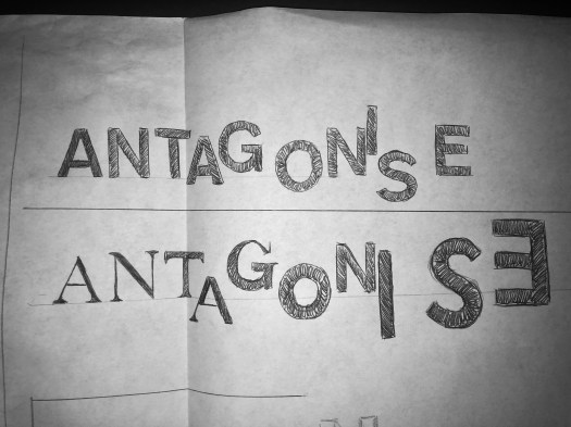
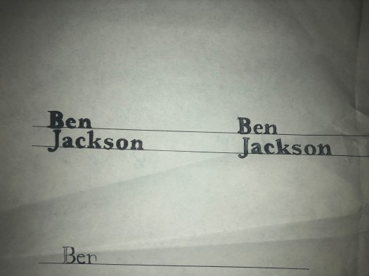
The process of hybography or taking two or more typefaces them and merging in to one was something i had never heard of before or never really thought about. It is however something that interests me as it gives you the chance to create words from two typefaces and give the word more meaning that it had before, it also make the word look more like and image and less like just a few words on a page.

It gives you chance to be able to create words which convey the meaning of what they’re trying to describe before even having to read the word, whether its though the shape of the letters and typefaces, the spacing between the words or the size of each individual letter, using hybography makes each word look much more meaningful.

As well as its practical uses for book design,posters,magazine design etc its also so enjoyable and interesting to play with the letters and see what you can come up with. It looks great and teaches me more and more about the letterforms and typefaces each time I do it.

IMG_E0676

Wall Art

cropped-img_0638-1.jpg

After our trip around Cardiff looking for typefaces around the city centre, we cut out individual letterforms to display in the main entrance to the studio. As a group we placed all the letterforms randomly onto a white background which produced a great outcome.

Although the layout of the letters could have been more organised, i think the randomness of everyone placing them on individually gave it a homemade feel and ensured that it didn’t feel too uniform.

Overall the experience showed me that graphic design doesn’t have to be created on an Apple Mac with specialist software to look professional, paper and scissors do the job and produce something just as interesting.

Typography in Cardiff

Walking around Cardiff looking for letterforms opened my eyes to the amount of times different typefaces of different varieties are used in real life context, like shop signs.

It was interesting to be able to go around and observe all the different shop signs and look at whether or not the typeface is suitable for the style or type of shop. It was interesting to identify all the typefaces that we had recently researched, however I did get confused between a few typefaces which are very similar.

Overall I would say I need to carry out more research into it so I’m able to identify different styles and typefaces with ease, so that I will be able to apply them to my work more efficiently.

IMG_0628

Introduction to Typography

IMG_0673

After our introduction to typography I have already gained an understanding of letterforms and how they are made and out together and I’m continuing to learn about the terminology. This has helped me understand how type and letterforms are used in design.

Our exercise of tracing letterforms out and spelling our names has outlines how important it is to ensure all the factors of the font are perfect, as if any factor is slightly off it ruins the word or phrase completely. I learnt how easy it is to leave a space too big between two letters, and how big an impact it makes to the type when it happens.

I think learning more and more about typography with continued research will be vital as letterforms are often the centrepiece of a piece of work, especially editorial. I feel that I’ve developed a strong understanding of typography and I can continue to build on my knowledge to become a better designer.

Design a site like this with WordPress.com
Get started