Whats The Story?

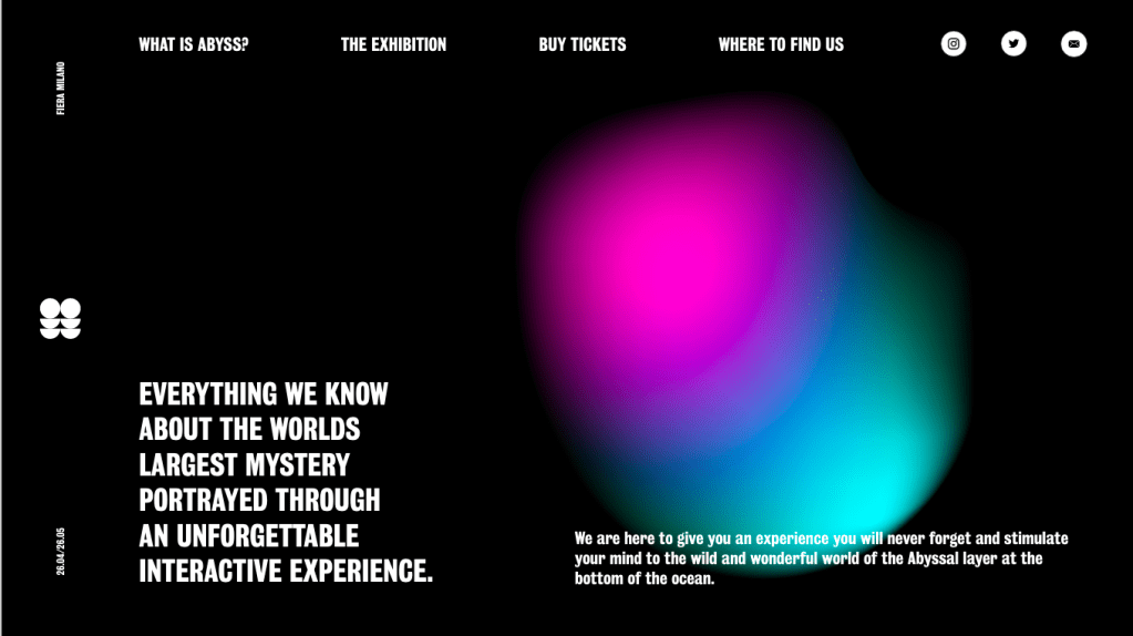
What are the stories that define your era?

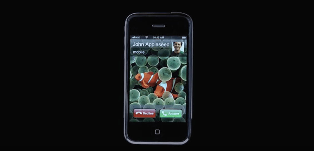
The first story I researched into was the introduction of Apple’s iPhone in 2007. Although it may not be openly classed as being a definitive moment in the 21st century, the iPhone was the first of a new generation of smartphones which really did change how we interact with phones forever. The iPhone was classed as ‘a revolutionary mobile phone, a widescreen iPod with touch controls, and a breakthrough Internet communications device with desktop-class email, Web browsing, searching and maps — into one small and lightweight handheld device.’  The iPhone really was the start of a revolution of smartphones which changed everything, for better or worse. 

Examples of persuasive media 

apple ad hello

Who is the audience?

Nowadays the iPhone is something which is widely accessible for a large amount of people, however back when the iPhone was first made and released to the public, it was a very high profile product and coast almost $600 which meant the audience for the iPhone was very different to what it is today. In a document released by apple, the iPhone 1 and its advertisement was particularly targeted at 20-45 year old ‘high earners’ and in particular professionals, managers and executives. Although this was their ideal demographic for the original iPhone, what we know now is that the due to the introduction of the iPhone 1, smartphones from Apple iPhones are now very much the norm in the phone territory. Although the original iPhone wasn’t for everyone due to its price and availability, its overall design and promise meant that in the years to follow, the iPhone would become more accessible for everyone.

The message?

The persuasive media for the iPhone 1, as with many of apples releases was fairly limited to 1 or 2 videos or posters, mainly due to apples large scale releases with Steve Jobs. Apple tend to leave the large reveals and stats to their final reveals and their advertising really reflects this, offering no information about the in’s and out’s of the iPhone.

Apples first advert for their iPhone 1 was called ‘Hello’ and featured a montage or famous actors throughout the years pacing up a telephone to say ‘hello’ ending with a shot of a ringing iPhone. By using so many great films ranging from historical to modern, Apple tried to give a sense of the historical importance of one of the first touch-screen smartphones, which would quickly start to dominate the market.

The message is carried using digital media, using their ‘Hello’ advert and a small amount or posters to go alongside it. The main force for their advertising was the use of the advert and any printed or still media was more to guide the viewer to that advert more than advertising the iPhone.

Overall, although a very questionable method of using only a small amount of advertising, apple very successfully cemented the iPhone into our culture and got the iPhone where it is today.

Penguin Book Cover – Research

For the penguin cover competition, I decided to design the cover for ‘A Short History of Nearly Everything’ by Bill Bryson. I think the book was the one that really jumped out to me, more so than the other 2. It jumped out to me due to the nature of it, it was about science which is something I’m interested in anyway, but more so that it’s written using a tone of voice which is rarely used in science books. He writes very informatively but also in a very friendly way which jumps out to everyone and makes it much more friendly to readers who’s science knowledge isn’t 100%. Bryson looks to explain many of the questions we have around the concept of the world we live in, and makes many references to space and the galaxy and how we came to be in it.

A Short History of Nearly Everything (Bryson): Amazon.co.uk ...
A Grain Of Sand In A Pool – Investment Philosophy — Steemit

I took a look at some of the previous covers to take a look at what was done previously. One of the first things I noticed was the fact that Bill Bryson is the same size or even bigger than the name of the book itself, a common them in his books, which shows how much the name sells in itself.

From looking at these 2 alone, its very clear that the earth as well as space is a common them which the book wants to show off. The idea of space and the earth are both clearly very popular in terms of the book design and they both definitely sum the book up well, but I think going down exactly the same road is not the route im looking to take, the book to me is a modern and contemporary twist on a science book, so I think it definitely needs a more contemporary design approach.

WIN A SIGNED COPY OF STEPHEN & LUCY HAWKING'S NEW BOOK! | Space Rocks
The Grand Design: Amazon.co.uk: Mlodinow, Leonard, Hawking ...

I then took a look at a variety of other science books to take a look at how they attack the issue of science books and space. Upon reflection of many of the covers, its clear that there’s a cliche, especially when it comes to space, of using ‘science-looking’ images along with a dark background, or a photo/illustration of the earth and stars. Although these designs clearly work, as I stated before I wanted to ensure my book cover took a more modern approach to the design.

The Best "Art Meets Science" Books of 2016 | Arts & Culture ...

I then took a look at some science books which don’t look into space and the earth to take a look at the styles they work with. They tend to use sans serif fonts, possibly due to them trying to look more modern, and in many cases have moved away from using photographs as the covers and look to use some more artistic imagery instead.

On Display – Signage and Wayfinding

As shown earlier, my exhibition consists of 4 rooms joined together which lead from one into the other, taking the viewer on a journey through the exhibition. 

This meant I there was no need for a vast array of wayfinding within the exhibition other than a few installations around the room to show where each door to the next room is. I decided I didn’t want much inside the exhibition which would take away from the work.

This meant over all that more wayfinding was needed outside the exhibition space but inside the Fiera Milano to direct the user to the exhibition itself.

I wanted to ensure the wayfinding within the space stood out above all the other things going on within the exhibition to make it easily recognisable so I used the brightly coloured gradient designs for the majority of my wayfinding. 

The top 2 are both examples of wayfnding within the exhibition, the lightbox being placed above each room to go along with the map and make the viewer aware of which room they are entering.

The other 2 ideas are examples of wayfinding in the Fiera Milano but outside the exhibition space, pointing viewers in the right direction towards the exhibition.

On Display – Promotional Installation

As part of my promotional installation portfolio page I wanted to mock up a variety of billboards and other installations to act as signage and wayfinding outside the exhibition, with information about what the exhibition is called, where and when it is and an insight into the branding and identity of ABYSS.

I wanted the designs to take after my posters, using the same minimal design and similar visuals, and although I wanted to keep the coherence I was aiming to make the billboards slightly different to stop the branding becoming all too similar.

On Display – Social Media Advert

As an example of a digital example of my brand I wanted to create a mock-up instagram page containing photos based around the exhibition. The exhibition is aimed at people of all ages and I think an instagram advert is a good way to reach a large amount of a particular age group.

On Display – Moving Identity

I wanted the gradient to be a large part of my moving identity and keep the idea of the movement of it fitting in with the light shows within my exhibition. I also wanted a smooth transition between that and the logo so I planned to use the circles, which are present throughout, to create a blank white screen for my logo to appear on.

I used after effects to make the gradient layer look almost alien in the way it moves around, before using my visuals to transition into a white page which I could then put my logo and information on. 

I didn’t want to overcomplicate it with too many moving parts and as the moving background was a vital part, I wanted to limit my logo to it’s animation by making it simply appear onto the page.

On Display – Website Ideation and design

I carried out research into website design before designing a web-page for my exhibition. I wanted to keep the coherent minimal design in the website. I looked into overlapping designs with text overlapping images in order for me to be experimental with my visuals and bold typeface. One of the main things I noticed about the websites in my research was that the menus are all located around the edges of the page anyway, which fits in to the rest of my branding so far so this was definitely a feature I wanted to keep the same. The more effective websites, especially the more experimental designs use large, bold text on the page for the more important text, similar to how an editorial would use hierarchy.

I also want to make sure I keep the minimal them with text placement along the side of the web-page, keeping lots of negative space in the centre of the page.

I sketched out a variety of website designs, taking inspiration from my research to create a minimal design utilising negative space to continue with the theme of the ABYSS and the unknown. I wanted to use the idea of hierarchy which I noticed within the website designs and used within my booklet deigns, I wanted my visuals and important information to be the largest things on each of the page, followed by the menu which will fit around the edges of the page. I didn’t want to overcomplicate the website design by adding lots of different pages of information into the mix so decided to design 3 separate pages which would show how the website would work to display information. I wanted to ensure the social media links were on the page, as well as the logo design. Although the visuals are the largest thing on the page, I think the most recognisable aspect of the website, as it was with the poster and booklet, will be the colour scheme as this is something which will jump off the page at the viewer as soon as they see it. Similar to the booklet, I wanted to keep a good level of pace and not be too repetitive with the colours and although I wanted the blue and pink gradient design to be a feature within each page, I didn’t want to overdo it and make it too standout.

Although at this point I was very happy with the overall design of the website I thought there was still some information missing, such as where the exhibition was being held, the map etc so I wanted a way of this information to be accessible on the page without the viewer having to be directed to a different page entirely. Because of this, I added 2 pop ups onto the two pages, the map as well as date and placement of the exhibition would pop up from the bottom of the page with a small amount of information.

On Display – Booklet research and ideation

I carried out research into booklet design and what worked/didn’t work in terms of layout. I decided, as I did with my posters, that I wanted to keep the minimal and experimental design that I had in the posters throughout my booklet to fit in with the style of the rest of my branding.

Many of the booklets utilised the grid system very well to portray a minimal style by adding captions and running heads etc alongside the main headers and main body of texts. I think many of the booklets and editorials use these small details, alongside things like page numbers and header/footers to frame the images within the page and add a sense of hierarchy. I noticed when looking specifically into exhibition booklets that many of them didn’t use a large amount of features that would be seen on some editorials such as running heads, pull quotes, sub-heads etc because very often exhibition booklets are much smaller and would become too cluttered. Although I wanted to stick to this to ensure my booklet didn’t become too cluttered, I wanted to make use of many of the facts I found out in my research about the sea within the booklet and therefor decided these could take the place of the full quotes and subheadings.

I wanted to play around with grid systems and the way text sits within it, utilising negative space to create a sense of depth and the ABYSS. Although I knew I wanted to use a minimal style, utilising the grid system, I knew this sort of design was one which was difficult to get right with lots of negative space involved, so sketching ideas was really important to get an idea of what it would look like on the page.

The majority of my designs were initially designed to be very minimal and as it said previously, to keep the negative space and go along with the them of t darkness and the abyss. I wanted to keep the black space and minimal theme whilst also fitting lots of information into the booklet so I decided a long but thin booklet would be a good way of doing this, as I could fit lots of text onto the page whilst still keeping negative space in the middle of the page. I wanted to use a 6 column grid as I knew if I wanted to add small bits of text including information and facts, I wouldn’t want these taking up lots of space and using 6 columns allowed me to use 2 columns for main body text and only one for less important information, keeping a good sense of scale and hierarchy. Again I wanted to keep the logo and my visuals present throughout whilst also adding colour through gradient shapes to keep with the luminous theme. The colour could be implemented throughout the booklet, however I wanted to keep a good sense of pace and not over-do the colour. I did however want the visuals and colours to be a large part on every page and be the first thing the viewer notices, as the visuals and the colour act as a visual metaphor for what the exhibition will be about.

The main thing I took away from my initial sketches is that the tall and thin booklet style to keep a minimal design, as well as the large visuals on the page works well to ensure good pace between the booklet and the posters, so I experimented more and finally sketched out some final designs, taking many aspects from my initial sketches and also adding in some finer details.

Taking influence from my research I created a minimal style booklet design using the grid system to aid it. I wanted to keep the booklet dark with touches of colour to stick with the theme, implementing my visuals while still keeping a good pace throughout the booklet.

I didn’t want either page on each spread to be filled with text or images, and I thought utilising a similar grid system as many booklets and editorials within my research would work well to keep the negative space on the page. I still wanted the dark and minimal theme to create an almost uneasy and ‘unknown’ feeling about the design, similar to my poster and how I envision the rest of my portfolio looking. Overall I’m very happy with the way it came out and think it definitely has a good sense of pace throughout which was one of the things I was most worried about. I kept the minimal bits of text around the page just adding more facts from my research and about the exhibition. I also wanted to make sure although I was being experimental with the designs that they still had a hierarchy within the designs.

On Display – Visuals

After designing my posters I decided to design a variety of visuals which suit my brand to add into different elements of my designs. I wanted the visuals to all be slightly different but still be coherent and recognisable as being part of the same brand.

I carried out research into visuals similar to the vision I had and used those influences to create a small array of visuals which fit in with the theme well and would be recognisable within the brand, for use within other posters, billboard, websites etc. I made sure, much like the rest of my designs so far, that each visual would work in black, white or in a gradient overlay so that I could use it effectively in different formats.

Design a site like this with WordPress.com
Get started