Editorial Touch-ups

After receiving my feedback from David on my editorial, I had to make some minor changes to certain aspects of the design.

In terms of the format and detailing the main issues I had were based around the text, as well as the pace of the outcome overall. The first issue I looked at changing was the text, David had pointed out that the body text in particular was too heavy and slightly too small on the page. I looked at changing the thickness of the font to make the body text slightly thinner so it wouldn’t look as heavy, however I couldn’t find one any smaller in the original typeface which was Bureau Grot. I wanted to stick to a sans serif font but find one slightly thinner so the body copy wouldn’t look as heavy.

After looking through a few sans serif fonts I noticed many of them are too round which I think makes them look too big on the page, so I aimed for a more compressed font, similar to Bureau Grot. I found Helvetica Neue has a compressed typeface in different thicknesses which I could use for the headings and subheadings as well as the body copy. It looks much thinner and less heavy on the page, I also increased the point size to 10 to make it more readable.

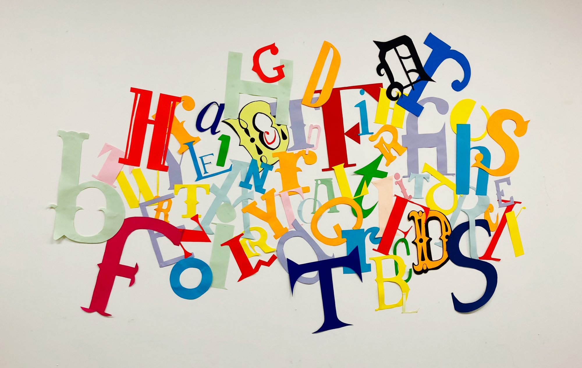
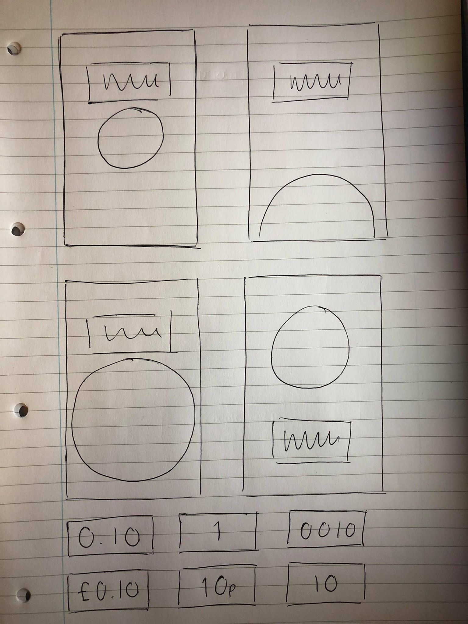
David also pointed out that the pace of the editorial was good but was a bit repetitive, so I wanted to change the middle spread to be slightly more experimental while still keeping the same theme. I still wanted to keep the same black and white theme, as well as the images because I think without those elements it would stray too far from the original design. The first and third spread both have a half black, half white layout so I wanted to experiment more with keeping the black and white shapes in the background but in different ways which aren’t so repetitive.

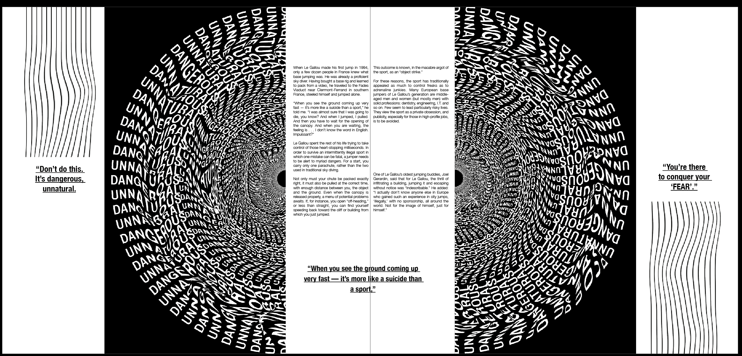
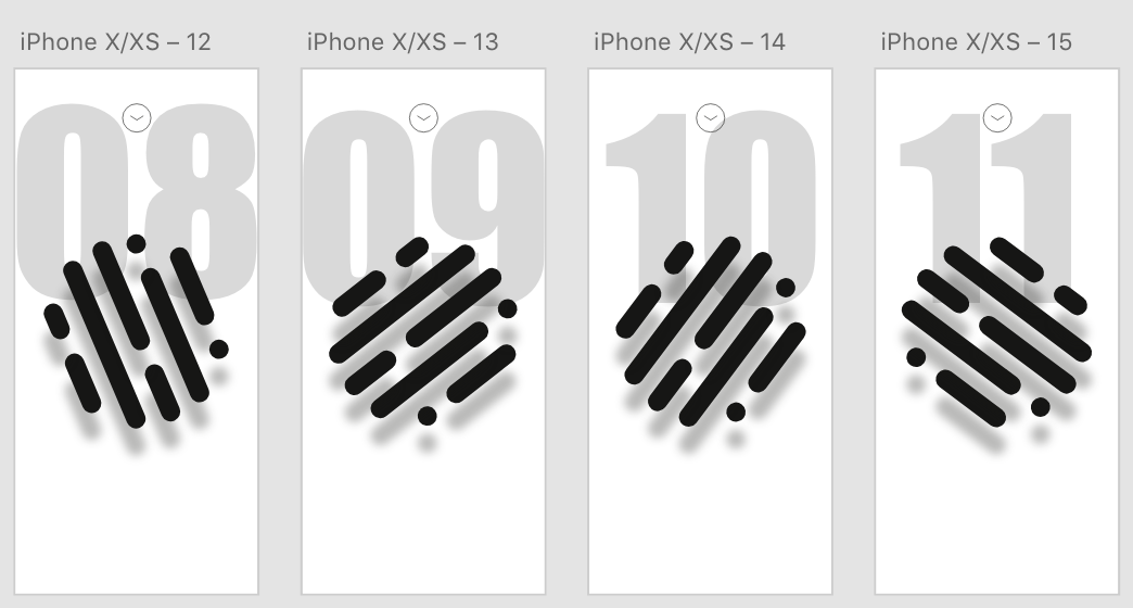
I looked at the idea of splitting the image into 2 and placing the text inside. I think it works well to slightly change the pace but keep the overall essence of the other 2 spreads. However I think splitting the image into 2 means it’s much less effective for the feeling I wanted the image to convey, I think keeping the image in one makes it much more effective and keeps the idea of being ‘sucked in’ or falling, which was the original idea.

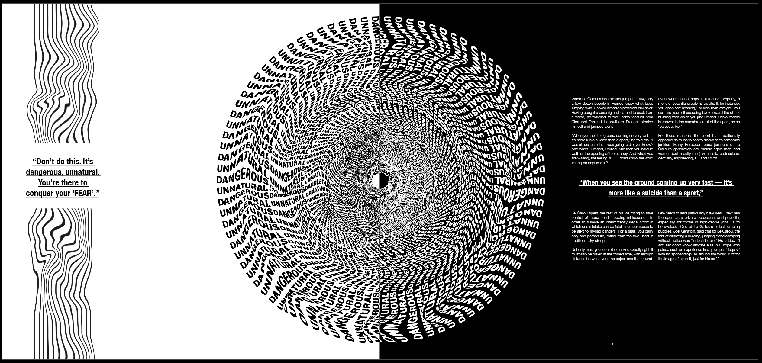
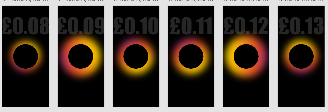
I liked the previous idea of having more of a split screen so wanted to experiment further with splitting the colour of the image in half to make it slightly more experimental. Initially I split the page straight down the middle with black and white but think this is still too similar to what it was previously.

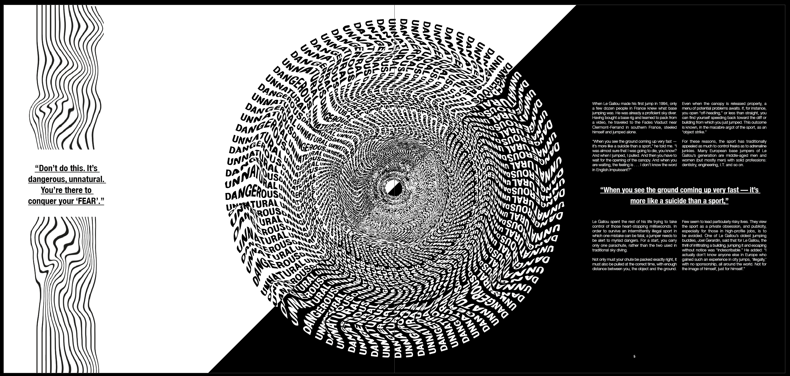
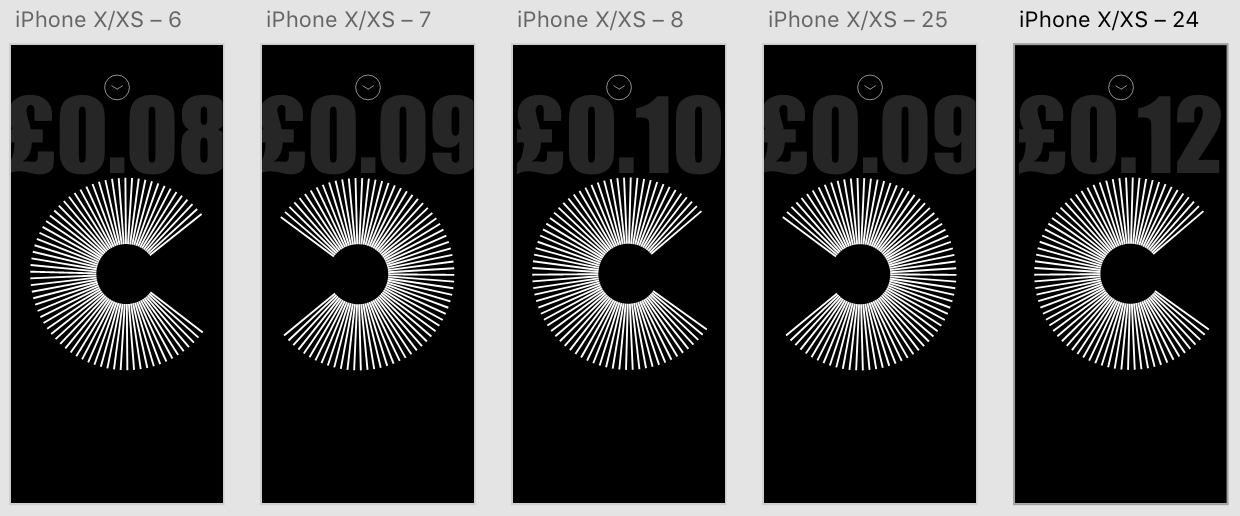
I split it diagonally and think it’s much more effective and looks much more experimental. I think it still has the same overall feel as I was looking for previously, however the page being split diagonally just slightly changes the pace a little and stops it becoming too repetitive.

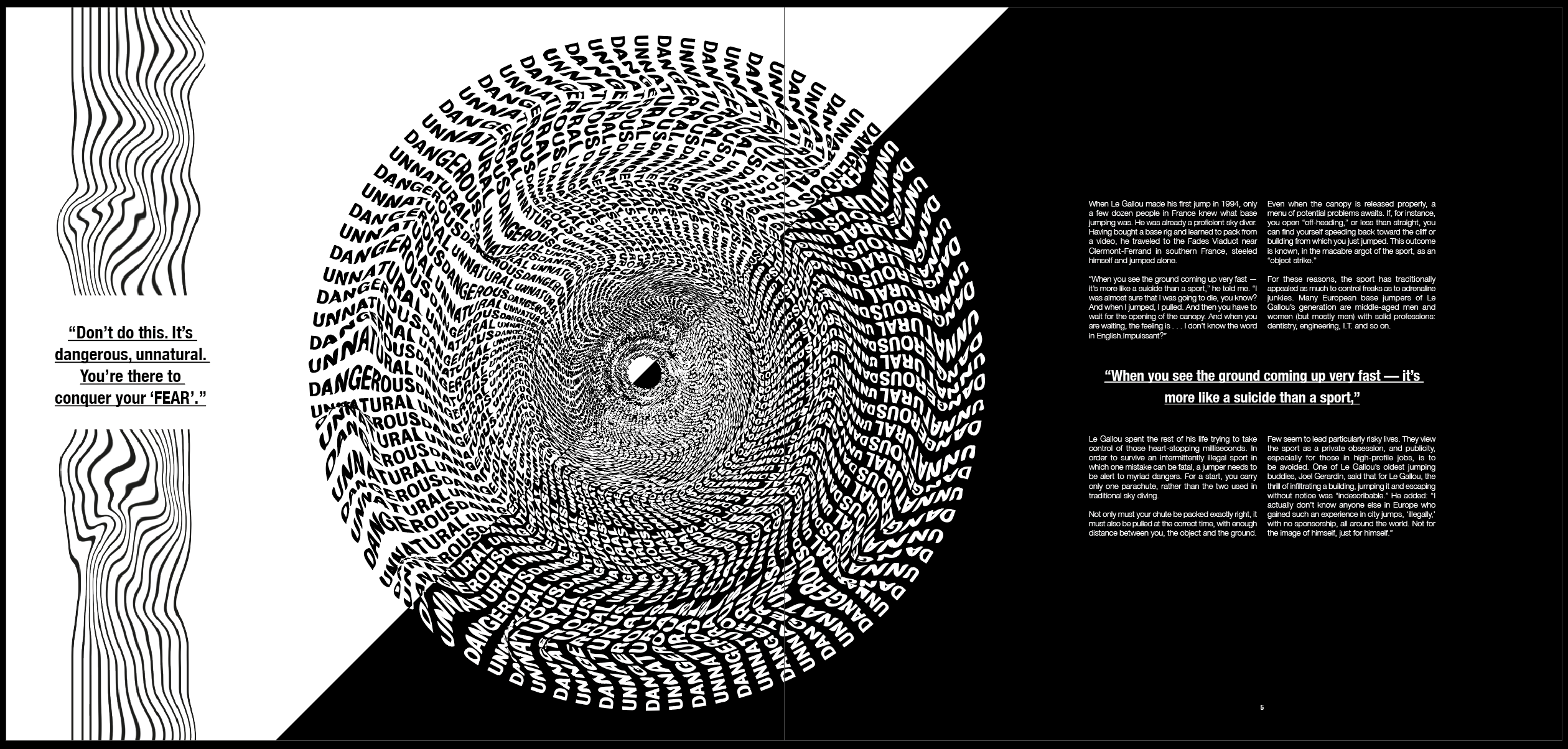
Finally, although I was relatively happy with the previous spread, I thought the page looked unbalanced with the image in the middle. I wanted the page to be more balanced on either side of the image so moved it over slightly to achieve this.

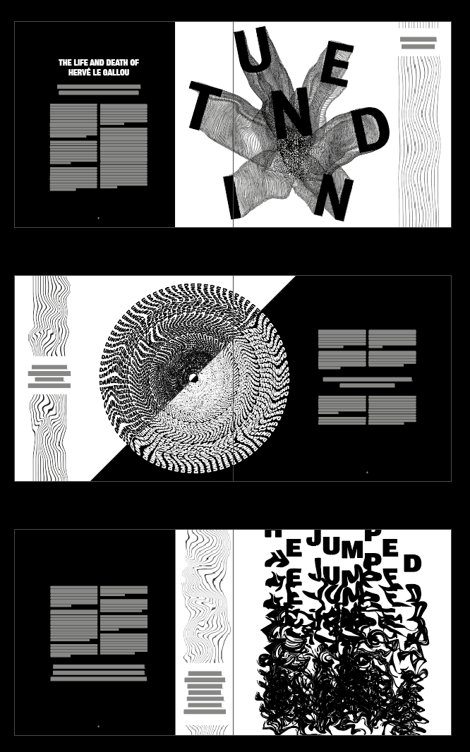
Overall I kept the majority of the 3 spreads the same, just slightly changing the layout of the second spread. I think it works well to improve the pace and stop the spreads looking too similar. It breaks up the spreads and gives the viewer something different and more experimental to look at in the second spread.

UX/UI – Final Touches

Finally, I added all the final links and triggers from each page. I made sure that every page had a link to the home screen as well as a back button to take it back to the previous screen.

Overall I’m happy with the result and the way the app came out. Although a simple design, I think the minimal, contemporary style of the app works well to create a very simple but seamless journey from the beginning to the end. I think the app is intuitive and something everyone could easily use and navigate their way through.

UX/UI – Menu/Navigation

As I stated in the previous post, a navigation bar was something I was planning to add anyway, however lots of the feedback helped me make a decision about the aesthetic of it. The majority of people I spoke to said it should be a separate menu which opens when the app opens up, instead of a navigation bar. The home button on each page would lead back to this screen.

This was a chance for me to be slightly more experimental with my design and create an innovative menu bar.

I wanted to use the same idea for my menu as I did for the Deposit page, using the 3 different coloured circles and the colours for each different page. I only had three main pages to navigate to and from so I wanted each option to be stand out on the page, with no other elements or icons involved. I used https://www.xdguru.com/ to find some icons to use in the menu. I had the same issue when designing this as I did when designing the ‘Choose Card’ page. The first design uses the space well and makes it clear what the options are, however the page selected or chosen doesn’t appear any larger or different so it isn’t clear. The remaining 2 ideas both use a scroll mechanism similar to that used in the choose card page. I think both of them work, however the central design is much more prominent and obvious and I think it works better, I also had lots of positive feedback on the drag system within the Choose Card page. I think it works well to break up the pace of the app and adds something a bit different to look at.


I added the same drag sequence as I did previously with the cards, so that each line becomes bigger as it is pulled onto the centre of the screen. I also added an extra feature with the icons but adding a timer effect to each page. As the menu bar is dragged across and each line moves into the centre, the coloured glow behind each icon enlarges. I think It’s a nice feature to add to give a bit more colour and stick with the colour changing theme.

UX/UI – Testing

At this stage I carried out some testing with a variety of people, ranging from peers to parents. I showed them the prototype for my app, to get some feedback on wether it’s intuitive and see what else they all though I should add. the feedback I received was mostly positive, with everyone saying the app was easy to use and very intuitive as a whole. A few people pointed out some very minor details to add as folows

Add a menu for navigation – This was something I was already planning to do before some user testing, but it was great to get some feedback regarding what sort of menu would be best.

Add name/details of card on the choose card screen – I added the name of each card in small just above each card.

Add an enter manually option when scanning card – Another easy fix in which I just had to add a small bottom at the bottom of the page for the user to enter their card details manually.

Add card name on the deposit screen so the user is sure of which card they are depositing money with – This was another easy fix, however I wanted to take this one further and add an icon underneath the text so the user could switch between cards on this page instead of having to navigate their way back to the ‘Choose Card’ screen

UX/UI – Pay Page

Related image

The idea behind the ‘Pay’ part of the app would be that it would use the same system as apple pay on the phone to pay. Because of this, I looked at what the apple pay interaction is like and found that it’s just a simple page which displays the card the user is paying, along with a few icons.

I wanted it to be clear to the user that it works the same way as apple pay does, as apple pay is a function most apple users are aware of. Because of this i kept the design very similar. I used a black background instead of a light one, not only as this slightly contrasts from apple pay, but also from the aesthetic of my app, so it makes it clear to the user that they are on the pay screen.

My 2 options when designing this aspect of the app we to create a pop up which moves up from the bottom of the screen to pay, and moves back down after payment, or to create a new page which pops up to pay. Overall I think the top design is much more effective and doesn’t overuse the space as the bottom design does. Using auto animate I could also create a seamless transition where the payment page slides up, the user pays and it can be slid back down again.

UX/UI – Card Selection

After my research into other app designs and looking into the way they manage their card settings, I wanted to take a modern approach and show a vector image of a card instead of just the details.

I used the previous page as a bade and used the same page attributes. For example the icons at the top of the page are all the same for easy navigation and ‘Deposit Coins’ has just been changed for ‘Choose Card’. I also kept the button in the same place as on the previous page in all of the designs, however I changed it to ‘Deposit’ because I wanted to give the user the option to go to the Deposit Coins screen as soon as their card is chosen.

Overall I think all the designs work to a certain extend. The far left gives a clear list and shows clearly all the cards which the user could use, however it isn’t obvious which card the user has chosen due to no change in scale. The middle option eradicates this and makes it clear to the user which card they are choosing, however it doesn’t use the space as well as the 3rd option does. I also added another icon to the page to add a new card.

After I had chosen the design, I created 3 screens all with different cards that have been chosen, I added a drag trigger on auto animate again so the user could drag between the cards and each one would expand as it drags accross.

I then added a link from the the icon to add a new card, I opted to add a ‘scan card’ page as this is what most apps use nowadays to take card details.

UX/UI – Main Page Development

After previously designing the base for my main page, I looked more into the money counter situated above it.

I think overall the money counter above the logo is much stronger and makes it look much more authoritative, whereas it being situated below almost makes it look less important. I was first drawn to the thicker, larger style, however after looking at these I decided the thin, slightly smaller style is more more effective. It is still clear and stand out on the page but looks much more modern and fits more with the aesthetic

As I stated in my research, I found that the majority of app designs used sleek and minimal icons to navigate throughout the pages and I wanted to take a similar approach. As the app isn’t going to be overly large and complicated I thought back and home icons would suffice. I wanted to keep the page with a minimal feel and have as little on the page as possible. I didn’t want to overcrowd the page and because of this i kept the amount of items on the page to a few. Firstly, although I like the look of the examples with just the central home screen, it would be impractical for the user to only have a home button and not a back button for navigation purposes. I also think overall the far right is the most appealing to me, I think the round ‘purchase’ button really stands out over the rectangular one, partly as it’s larger in size but mostly because I think it goes well with the circular logo and they both compliment each-other well. I also like the ‘Deposit Coins’ header, although I am still unsure if a menu or home screen will feature, I wanted to give the page a name and function.

After taking influence from my research to add a coloured ring around the logo, I then extended this and added several colours of different sizes. I also added a ‘tap’ on the logo to trigger auto animate into the next page, meaning each time the ‘COIN’ is tapped to add 10p, the colour ring changes colour and size each time. Not only do I think it adds to the screen and makes it more bright and vibrant, but it also lets the user know that they’ve added 10p to their wallet.

UX/UI – Design Development

After designing what the basic plan would be for the layout, I next wanted to focus on the design of the app, starting with the name and a logo to go alongside it. During a discussion with Theo we were talking about possible names for the app and we decided it needed a simple name to go alongside the simple idea. During the numerous times I had described the app to many different people, the one way I kept describing the idea of depositing money was ‘swiping a coin’ into the users wallet. I though ‘COIN’ could work extremely well as a simple name for the app, but also as a way of describing money deposited by tapping or swiping as ‘depositing coins’. Theo agreed that the name worked really well to keep a simplistic feel to the app.

Next I looked into choosing a logo. The initial ideas I had for the logo used the name ‘COIN’ as the basis. I sketched out a variety of different designs, using circles, c’s as well as actual coins as influence.

Most of the designs took the shape of a ‘C’ due to the name. I wanted to keep each design simple using only lines, as although I wanted the app to involve colour, I wanted to incorporate the logo into the ‘deposit’ screen and decided using a logo too colourful or too confusing would overcomplicate the page. I also looked at using ‘fingerprint’ design to reiterate the fact that the app is a very personal experience of budgeting and depositing/spending money.

After designing a variety of logos I wanted to test a few of them out within the app design to test out what which would work best, as well as trialling out a variety of different background colours and ‘coin counters’. I thought as the ‘deposit coins’ page is the most important page within the app, this would be the best one to trial to attempt to figure out the visual identity for the rest of the app.

I trialled different logos on white and black backgrounds with 4 different styles of ‘coin counters’. After working on Adobe XD I noticed that using the auto animate transition, the images on the page will animate from one to the other between each artboard, so I also experimented with rotating the logos so they spin with each tap, as well as changing the size of the coloured circles so they get larger and smaller each time. Overall I think the design with the white background and the coloured border works the best and looks the has the most modern and clean aesthetic. Although I still need to experiment with the rest of the design, I think the logo and rest of the screen is very strong and is a good base for the rest of the design.

UX/UI – Research

Before looking any further into the design of my app I wanted to do some research into existing app designs, ranging from apps such as mobile banking which would be helpful in the process of designing my app, to examples of modern and contemporary design to get a feel of how I want my app to look.

Firstly, I looked into mobile banking apps as I think the base of these apps is fairly similar to how Coin will work. The first thing I noticed was that these apps weren’t exactly easy on the eye and I wanted Coin to be much more of a modern, eye catching aesthetic. However, I did take some positives looking at the apps. One of the main things I noticed was how secure the apps are, as they deal with money and the users credit cards they have to be secure and only accessible by the user, meaning my app will need to include a face ID (or touch ID) sequence to open it up, with a passcode as back up. Although mobile banking apps have a lot of features which won’t be necessary in my app, something which I did notice was that the credit cards were pivotal in the majority of these features as all the money runs through them. This was a feature which would also need to be pivotal in my app, as the user will need to select his card he would be depositing money from, and paying with. This needs to be a feature which is easy to navigate.

Image result for budgeting app design
Related image
Related image

I then looked into some modern examples of budgeting apps, and although they still work in different ways to how my app will, the way they show how to choose cards and navigate between them is my more aesthetically pleasing that the mobile banking apps. They all physically show the cards and have a much nicer looking swipe or scroll to navigate between cards. I also noticed whilst looking at these apps that the majority of them contain a page which the user can view their transactions. This was a feature I was thinking about using, however I decided I wanted Coin to be an app which the user can quickly log into, deposit money and pay without hassle, a transactions page is one which I think most users wouldn’t use.

Next, I turned my research to examples of minimal and contemporary app design to take influence from. I found overall that the majority of app designs currently use a plain black or white background, with the source of the colour coming from images or features within the design which make the page pop. Some app designs which are more experimental use other colours and styles, however thinking about the app having to be relatively serious and safe due to dealing with money, I decided not to look down the experimental side.

I also noticed that very few of the apps have thick navigation bars and the top or sides of the screen, like many of the mobile banking apps did, and instead leave the screen very open. They all contain icons to go back and/or go to the home page but they are all very small, minimal icons which don’t interfere with the main design. I think this looks a lot more modern than having a thick, coloured bar on the screen. They also use lots of circles or buttons with rounded edges as opposed to boxes, I think this fits better with the shape of the phone being curved, and keeps the design looking very sleek and modern.

I wanted the main design of my app to be based around the main page which is where the user will deposit ‘COINS’. I wanted this page to stand out and the rest of the app would be based around this page, so I payed particular attention to apps which have round button or icon in the centre of the screen. I noticed that many of them have colour around the outside of them which makes them stand out off the page. They also have very a very minimal amount going on around them to instantly draw the eye to the centre piece and nothing else.

UX/UI – Plan

After carrying out research into other money saving apps as well as mobile banking apps, I realised that as mine is a much more simplified version, it doesn’t need to have quite so many functions and can therefor be much simpler.

The main base for the functionality of the app is to have 3 main pages which can be accessed from the home screen.

Deposit – would be the page where the user would be able to deposit money into their account. This would be the main page of the app and the one which the user would use the most, so it will have to be very functional and easy to use

Payment – this is the page the user would be directed to after depositing coins and wanting to pay for something, it will run the same was as apple pay with the user scanning their fingerprint just like they would when using apple pay on the phone.

Choose Card – after my research into mobile banking apps, or any other apps using credit or debit cards as forms of payment, I noticed each app had a way to upload a card to the app, as well as giving the user a choice about which card to use.

The user would be able to navigate to each page as well as the main menu very easily, however I also wanted to add a clear path from ‘Choose Card, to Deposit, and then to Payment’ to make the user experience as easy as possible.

Design a site like this with WordPress.com
Get started