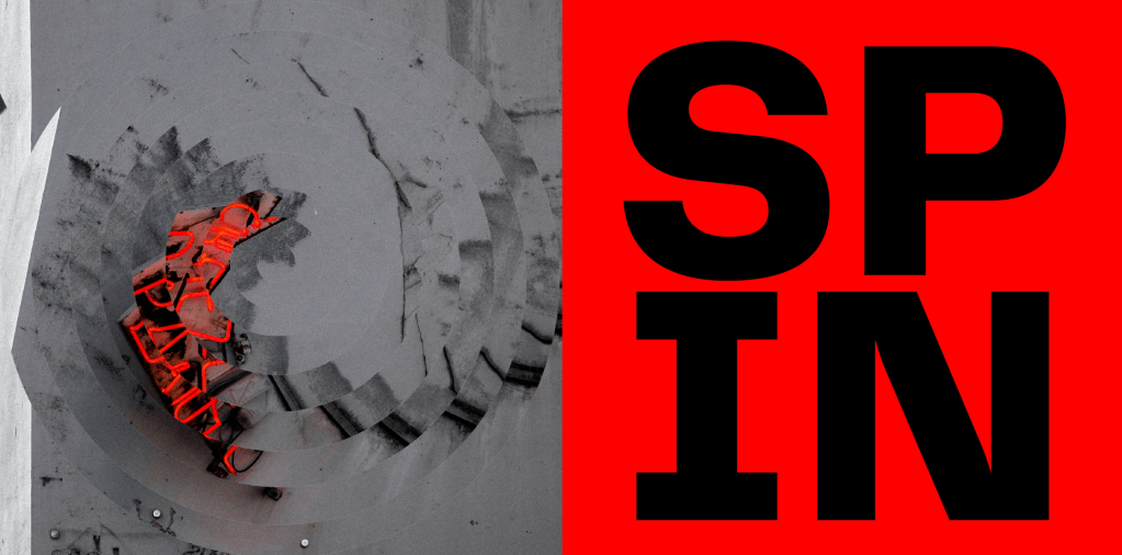
Before starting to develop the identity further, I first decided on a face for the brand. I looked into many different avenues from lifestyle/blog style brands, to sports brands, to clothing brands but ultimately ended up coming to the realisation that a sports brand would fit nicely with the style I’m looking for. Something bold striking, particularly with the colours I identified and the strong typeface, works well in line with what you would usually see from sports brands. Another thing which lined up nicely was the idea of propaganda within the governments response being largely based on motivational comments looking to strive the public forward, which again works well alongside the idea of a sports brand. Finally, the name ‘SPIN’ clearly alludes to movement in itself, and with this alongside the edited images which also look as though they’re spinning, the idea of sports also fits in with this very well.
Ultimately the idea was to create a sports brand which looks great and draws viewers in to find out more, whether that be on a website, app, social media etc so the brand didn’t need to be too specific, I also thought if I made the sports side of the brand too complicated and specific it would overcomplicate the whole idea. I therefor decided to keep the brand as simply a sports lifestyle brand, which looks to motivate viewers in their sporting endeavours alongside releasing blogs and tips about exercise, sports etc and selling branded equipment.
I used research of some contemporary brands in order to start to draft some designs which start to shape how the visual identity might look. Although at this point I am still not sure what face the brand will take, whether it be sports, leisure, art etc. I was still able to play around with the design and specifically the aspects of the visual identity which I wanted to link back to the pandemic and the governments response. Although at face value the brand needs to be about something specific in order to make the ‘disguise’ believable, at this point it was more important to use my research to build up the side of the brand which is concerned with the governments response and the rest can follow from there.
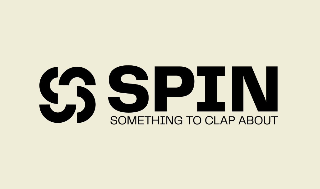
After deliberating with the idea of propaganda and the pandemic response, one of the things which kept being brought up by myself, David and peers when talking about the project was this idea of the government ‘spinning’ their communications to the public and how I wanted to use this idea to inform the brand being spun so it isn’t about what it looks like at face value. Initially I was going to tailor the name to whatever brand it ended cup being, however I decided in the end that ‘SPIN’ is enough, it links back to the idea behind the brand as well as the government side of things, and the face value brand can tailor itself to the name.
The logo was based off the same idea, relating back to the idea of spinning, however feedback within the tutorial was that it isn’t overly effective. I like the way it looks, however the fact that it doesn’t necessarily link back to Covid means it’s sort of irrelevant and doesn’t work well enough. I think it still needs to link the the name spin, however I think its important to make sure it is another link to Covid and the Government.
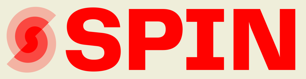
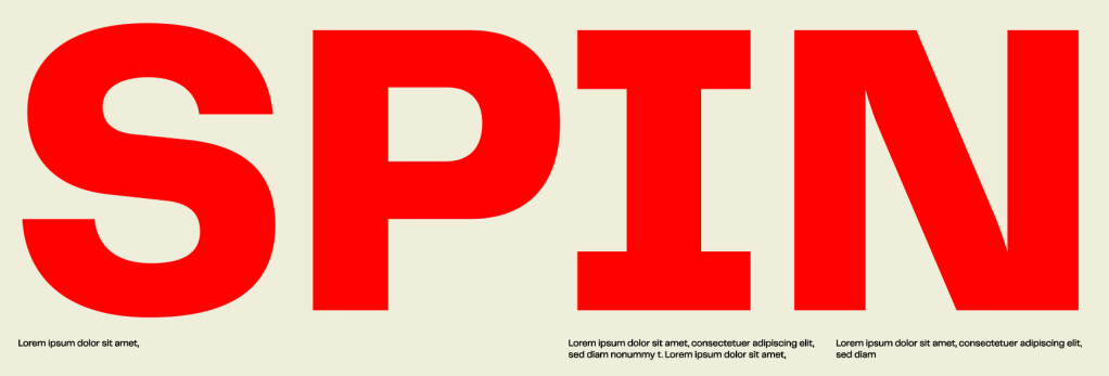
The typeface is Telegraf, a bold typeface which still comes across as sophisticated and legible, so it fits in with being exactly what I was looking for after visual language, something which jumps out and is striking enough to be seen and noticed everywhere.
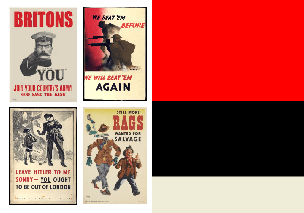
As the propaganda side of the brand was one which really stood out to me, it was important to ensure that a hint to propaganda was in there somewhere, and all I could think about when thinking about propaganda was wartime posters which primarily use an off white, black and red and are always based on being striking to the public, so the fact that the colours are recognisable with propaganda and also work well to be bold and noticeable as seen throughout my visual research works really well.
As I said in my visual research, I wanted my imagery to be strong alongside graphic aspects of the brand and I thought treating the images as visual tools rather than just images could be really strong. Not only does the fact that the images are edited and ‘spun’ fit in with the idea of the brand name, it also allows for animation to be used within the brand with the images moving, and also possibly information being shown as gather images spin. Maybe more hints to what the brand it really about, or even using the images spinning as a way to reveal what the brand is actually about.
Overall I like the initial direction the brand has taken. The colours alongside the bold typography and strong visuals work well alongside each other and are starting to build a distinctive identity which does exactly what I’m looking for, to be striking and noticeable at first glance but still allude to the governments response throughout.
FEEDBACK/WHAT’S NEXT
Firstly, David discussed the fact that the brand needs to start to take the face of something in order for the brand to develop to the next levels it is its just simple visuals, colours, typographic elements etc but to take it to the next level I need to decide on a brand.
There was also feedback regarding changes to the logo as I stated. The logo doesn’t work effectively in terms of alluding to the government so something which does that needs to be created. I also though about the fact that with strong imagery, colours and a strong logotype, a logo may not even be needed as the logo itself could just be ‘SPIN’. A logo or mark could however be used in a similar way that is used for East London Liquor Co. where they use a sticker mark within the identity to ensure nothing is too strongly branded. This could work well, creating a system allowing me to use both the logotype and logomark without it being too much.
Next, I need to decide upon a topic for the brand and start to create more of the visual language, using the governments response to influence that. It’s vital that nothing in the visual language is designed without a meaning behind it, of course it needs to look captivating but if it doesn’t link back to the pandemic it is essentially useless.
After deciding on the idea and the shape the project will take, I wanted to carry out some visual research into some contemporary brands, specifically those aimed at 20-30 year olds in order to ensure the visual identity of the brand is aimed at the correct age group.
First and foremost, the brand at face value is all about being bold and striking at first glance, it needs to draw viewers in and encourage them to engage with the brand, so the first research I wanted to carry out is the sort of brands and design which is aimed at being instantly noticeable and eye-catching.
IDENTITY FOR ART-ZAVOD PLATFORMA
Art-zavod Platforma is a creative and cultural campus in Ukraine based in a former silk factory. The story was started in 2014, when the first festival of street food, Ulichnaya Eda, was held.
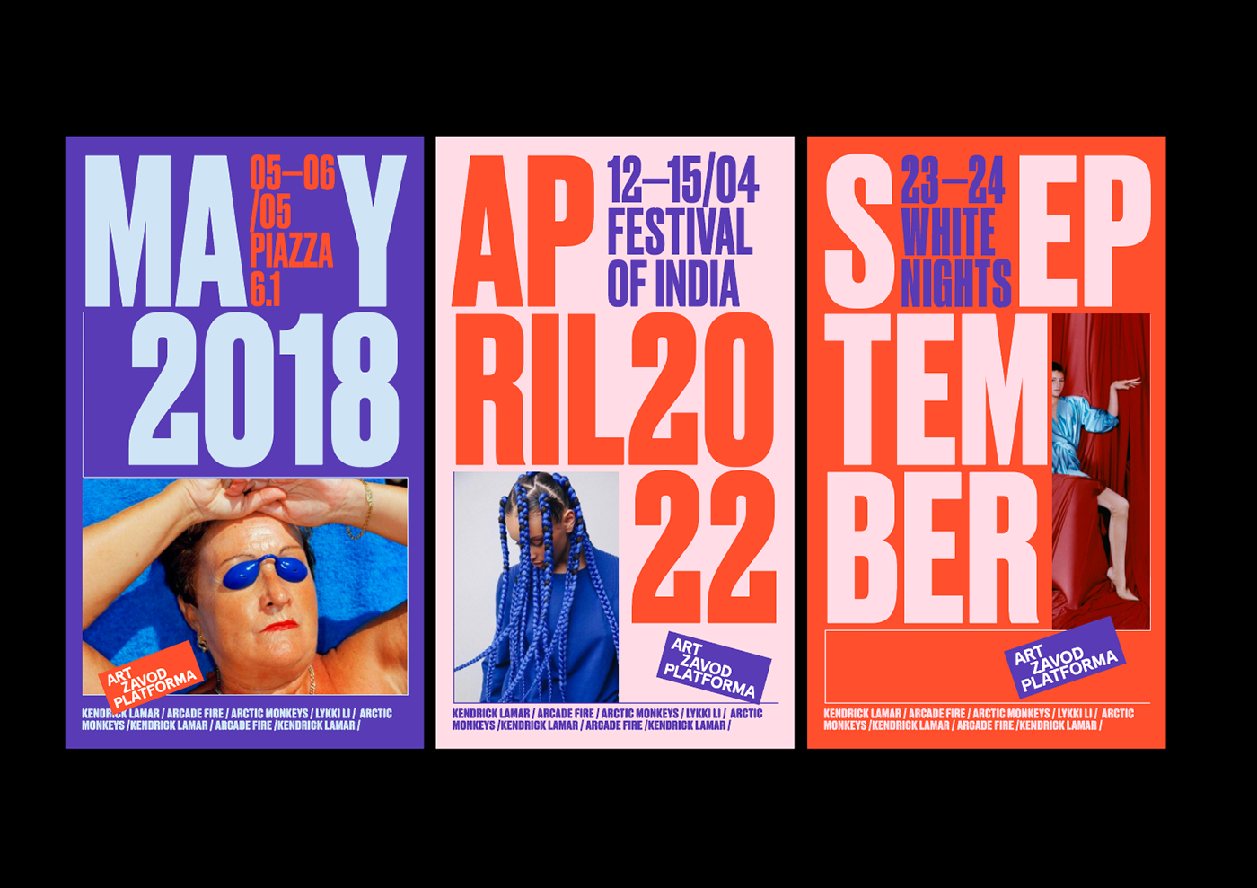
The branding is aimed as standing out towards a younger audience in order to convince them to attend the festival which is a creative and cultural hub. Everything about the brand is based around being as bold and as strong visuals as it can be. The colour combinations, typeface, imagery all allows it to be instantly stand-out and also instantly recognisable among other brands. The brand is so effective in being striking at first glance, it would be hard to ignore the visuals if you walked past it. It’s also so effective in being unique enough that it is instantly recognisable among everything else out there. Being noticeable is something which my brand needs to be, it needs to stand out to everyone within my target audience as it’s important for everyone to find out the information im looking to give.
The colours and strong typeface are the main two thins I’ve taken away from the brand, not only using bold colours but the colour combinations work so well together. It will be important to use strong colours and a strong typeface.
OBERLO – DesignStudio
“a one-stop-shop for entrepreneurs offering tuition, teaching and tools for young businesses”
Again, another brand looking to reach out to a younger audience which makes use of bold colours and typefaces to stand out. The way the project combines the professionalism needed from cel’s and businessmen and the illustrative and playfulness and it mixes the two perfectly to create a strong brand which sits well over all the touchpoint, from print to digital. The way the brand uses imagery alongside strong graphic visuals and illustrations is really strong, and as strong imagery is something I want to use within the brand it’s interesting to see how the brand uses images alongside the rest of the identity so effectively.
Another strong point about the brand is the way the promotional media, the billboards and social media use strong statements based purely on just being striking and drawing the viewer in. This is what Im aiming for the brand to do, use strong statements and visuals to draw the viewer into the more informational touchpoints such as the website, app etc.
East London Liquor Co. – Ragged Edge
A fresh, new take on a London alcohol distillery aimed to bring a new audience to affordable alcohol.
The important thing to note about the brand is that it is all about bringing a new audience to the brand and reaching out to a slightly different audience, so it really jumped out to me as my brand is similar in that it is aimed at drawing attention and bringing in a different audience. The brand is so good at mixing a strong typeface with the handmade/hand lettered typographic style which stands for the hands on notion of the brand. Similar to Oberlo, the visual identity also mixes imagery, typography and graphic style so well to create an identity which all works perfectly together without being too repetitive. The stickers/smiley faces also work really well to add another dimension to the promotional branding, allowing the brand to add the E L marque onto everything without it being too heavily branded. The sticker idea is one which could be really strong to add extra information without filling the page with too much text.
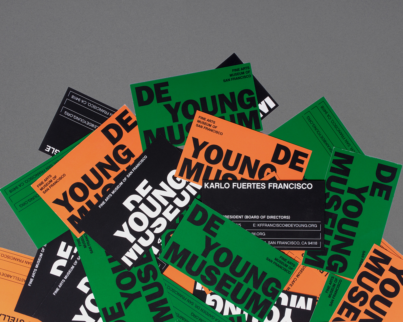
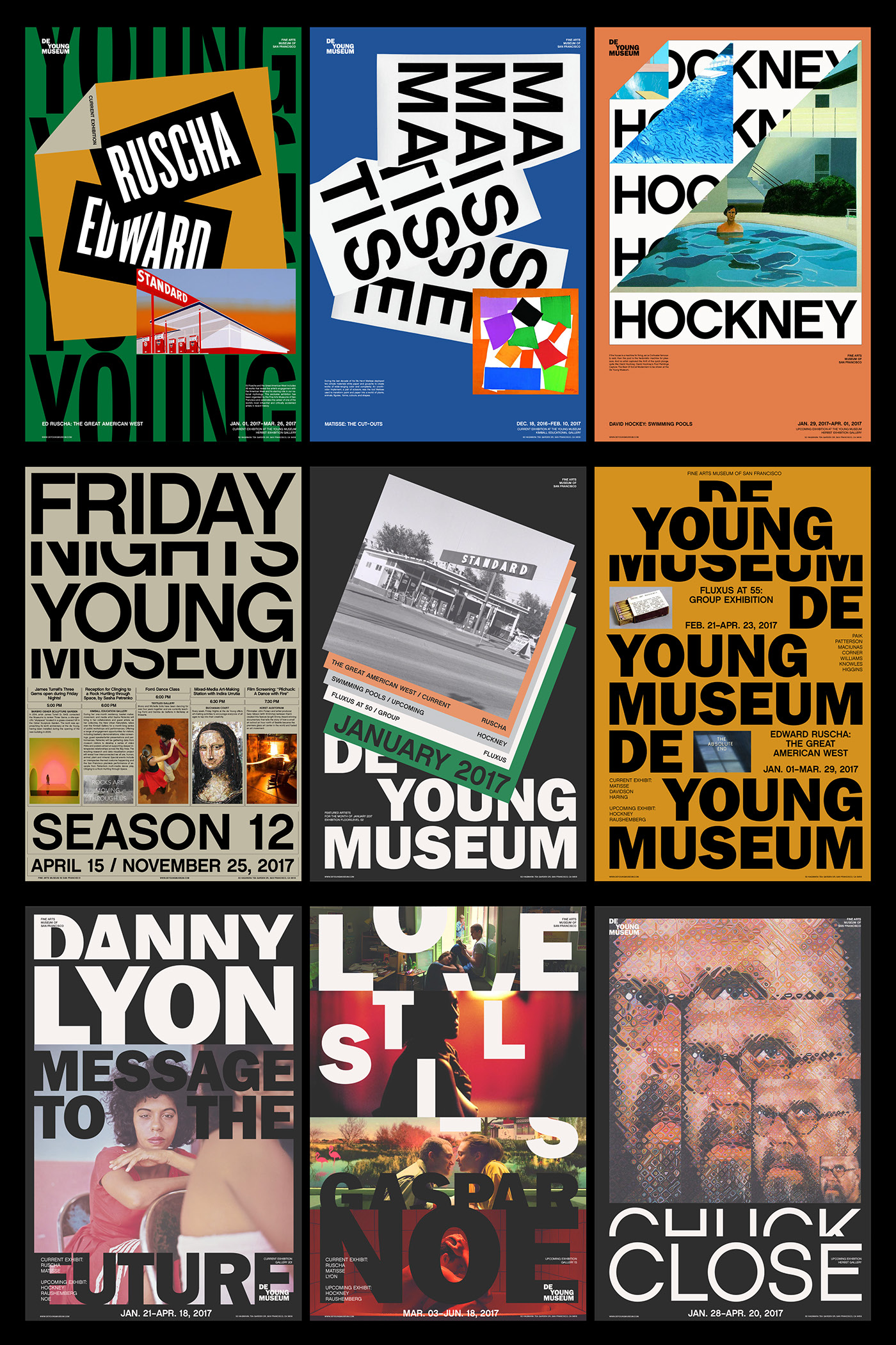
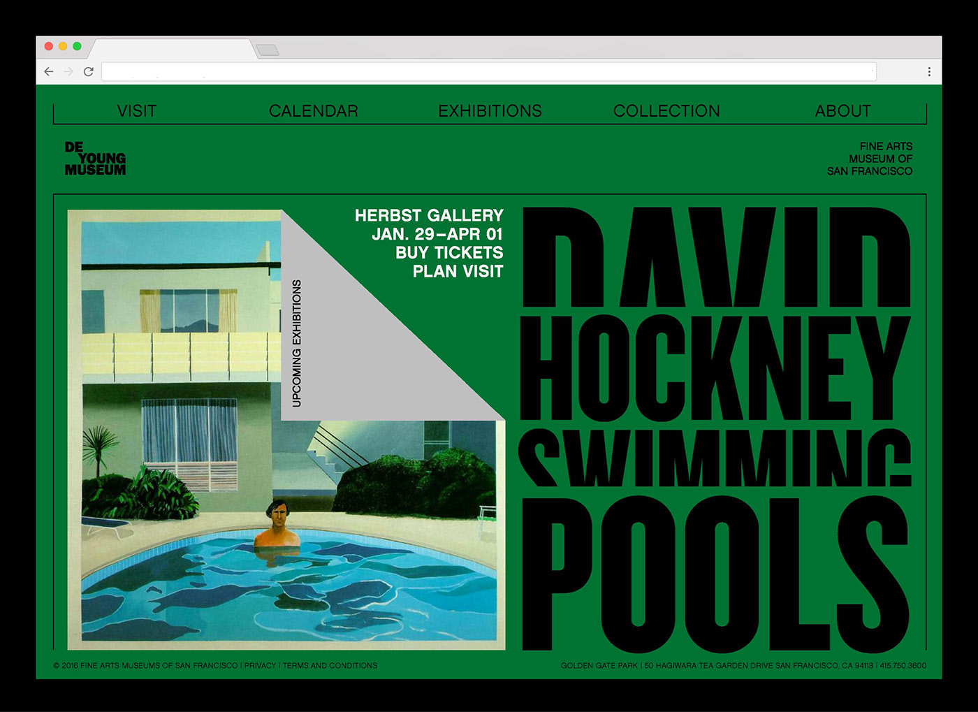
De Young Museum – Visual Identity
Another example of a piece of brand design which is really strong is De Young Museum. I noticed I was definitely steering towards more colourful brand design purely for the fact that if done well it can be so useful as a tool for being striking and instantly noticeable.
De Young Museum is colourful but it feels slightly more sophisticated with more muted colours, however it still feels playful enough and a good representation of the museum and what lives inside it. The thing I love about the branding is the way something as simple as the typesetting in the logo sets up the style of the whole identity and everything follows on from that. It’s simple but so effective, using typesetting to create a system which just shows how important small details are.
As well as a few brands themselves and how their visual language has inspired me, I also wanted to take a look into a few other visuals which follow similar design styles, using bold colours, elements, imagery etc in a sophisticated way, all aimed at being bold and eye catching looking to draw viewers into the brand.
After general research into the government and the way in which they responded to the pandemic, I started to build up an understanding of how I can attribute the things which characterise the response to a brand the same way many brands build their visual identities around values and attributes.
The 3 ideas I came up with all used this idea of building a brand but do so in slightly different ways, from simply building a brand, to changing aspects of a brand to show how it would change, to creating a more speculative brand design project.
Idea 1
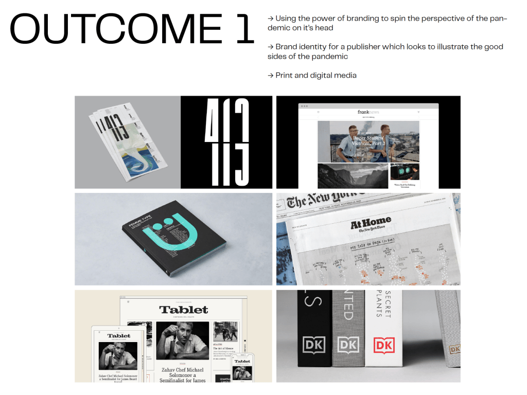
The idea behind the first outcome is more around showing some of the best parts of the response in an attempt to draw attention to it and, in turn, show how the real heroes of the pandemic have been the public, healthcare, frontline services and similar and not the government. As stated in the previous post, a brand and the way it goes around building up the visual identity around brand values is similar to the way I would look to build the branding around the values we have seen from the heroes of the pandemic.
The brand would be a publisher, both online and print, which would take aspects of the pandemic and use them to create a visual identity which is contemporary and also recognisable as being about Covid. Due to the fact that Covid forced many things online, the online side of the brand would be the most important and would allow me to create a website, app and other online branding tools, however it would also allow me to create a small amount of print media.
FEEDBACK
After feedback from David, although the brand would allow me to create a contemporary design which celebrates exactly the people who should b celebrated, we discussed that it isn’t overly ambitious and David wanted to see me push myself more than jus creating a simple branding project. Whilst the thought of having the license to create a brand from scratch, I did agree that it wasn’t overly challenging and wouldn’t push me enough. We also discussed that the brand celebrated the heroes more so than criticising the government, and whilst this isn’t necessarily as bad thing the aim of the project was to be provocative and critical of the government.
Idea 2
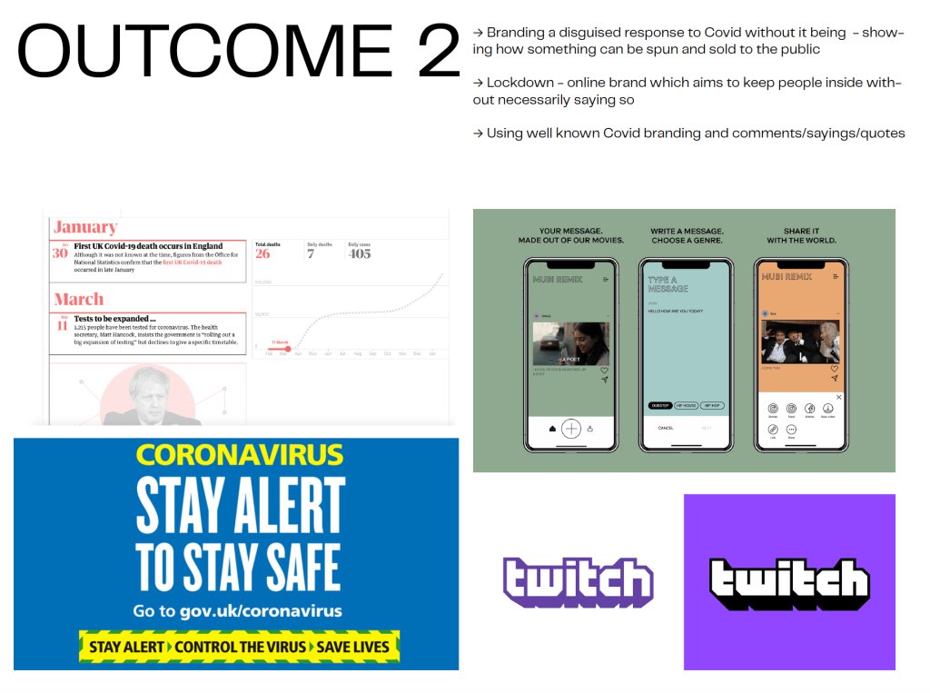
The second outcome was much more provocative and was aimed at being much more critical of the government. the idea is to create a speculative branding project which takes the form of a brand, however the identity will all be informed by the governments response to Covid. The idea is based more off the idea of propaganda and plays on the idea of spin doctors, so the brand would be a visual representation of how the government have ‘spun’ their communications in ensuring that the brand identity at first glance is spun so the viewer doesn’t know its about Covid. The concept would allow me to really play with the idea of propaganda but also be critical of the governments response at the same time, being a provocative way of drawing in the audience before feeding them information about what the brand really is and how the government failed us in their response.
FEEDBACK
The initial idea going into the meeting was to base it all around lockdown, the brand would be a visual representation of lockdown, taking the form of an online brand such as twitch which would encourage people to stay indoors without making that clear, therefor criticising the government. However after talking to David and other peers, I decided that whilst I like the idea of a brand which is spun and dint what it looks like at face value, using the lockdown idea may seem as though it is criticising the lockdown itself and not the way the government handled the lockdowns, which isn’t what I’m looking to do. Instead, we spoke about adapting the idea slightly so it is more about creating a lifestyle brand which doesn’t necessarily do anything other than feed information about Covid to the viewer. This would ensure that the idea of ‘spin’ alludes to the propaganda side and the content within the visual identity itself alludes to the response itself. I think this adaptation of the initial idea is much stronger and allows me to use critical thinking much more, it challenges me more than the previous idea whilst still allowing me to create a full brand.
Idea 3
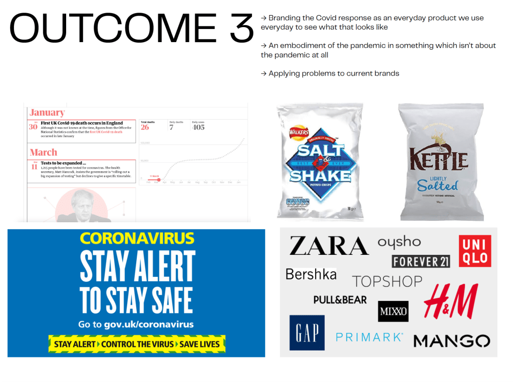
Outcome 3 is more similar to the previous idea than the first in that it is all about being critical of the government and how they responded to the pandemic. The idea is to change the rhetoric of brands we engage with everyday to hint at the government and the pandemic. I wanted to use well known brands and look at how chaining their colours or slogans using the characteristics of the governments response to see how they would effect the brand and what it communicates.
FEEDBACK
The idea itself was probably my least favourite of the 3, although it would be interesting to see if it would change current brands enough to reach the desired effect and allude to the government, however ultimately I didn’t think the idea wouldn’t be clear enough in terms of being critical of the government, it would be speculative but I’m unsure it would illustrate what I was looking for.
The Idea
The idea myself along with help from David chose to go with was idea 2. It needed some more work on the rhetoric and some of the details such as what the brand would be and how the ‘spin’ aspect would work, however I think the idea is there. As I said, it would be about creating a lifestyle brand which is a ‘disguise’ for what it really is, in order to draw the user in before revealing what the brand really stand for. The idea would use my research into propaganda within the pandemic, in the way the brand spins the governments response into something different and unrecognisable to illustrate how the government used strategic communications, whilst illustrating some of the many ways in which the government failed in their response by creating the visual identity around these failures.
As well as initial research into the pandemic and the way it was handled by the government, I wanted to go even further to continue to research into the topic in order to develop more of an understanding for different aspects of the failed response and how they might start to shape the project.
At the moment, the only idea set in stone for the project is that it is aimed at relaying information about the governments failed response to Covid to a younger audience, the way in which I do that I’m still unsure about, so hopefully more research can help me start to generate some ideas.
The first part of the initial research which stood out to me was the idea of the government using propaganda during the pandemic. I had discussed and spoken to David before carrying out the research about the idea of the Government provocative and more emotional language in their briefings and seemed as though they were trying to pull the wool over everyones eyes in an attempt to ensure the public, in many cases, don’t question their decisions. I carried out some research into this and discovered that propaganda during Covid was actually well documented and many of the things I was questioning were actual issues.
The public information briefings that occurred at about 5 pm each day from Downing Street during the first lockdown in spring and summer of 2020 were episodes in propaganda straight out of the wartime playbook. Rather than being ‘public information’ events as they were so described, they were in fact filled with ‘strategic communications’ intent on manipulating the public to the ends of the powerful. They were carefully staged, choreographed and scripted by spin doctors and other political communications professionals working for a government that is addicted to propaganda and cannot fathom engagement in public communications through any other prism.
Furthermore, the UK government’s approach to Coronavirus briefings in the first half of 2020 may harm the long-term trust of the public in governance and the various organs of state that are entwined with the crisis. Public Health England, for example. Indeed, Chris Witty, Patrick Valance, Jenny Harries et al – by standing next to the cabinet minister of the day – may end up tainted as manipulators-in-chief themselves through their (and the organisations that they represent) implicit endorsement of the government’s approach to public communications.
In propaganda studies we differentiate between ‘public information’ and ‘strategic communications’. Both are forms of propaganda: mass communications intended to persuade a target audience of whatever is the source’s objective. However, public information focuses on truth-telling, the broadcast of facts (albeit selective facts), without spin and without a desire to create overly emotional responses among the audience. There isn’t any violin or piano music in the background and it keeps poetic or rousing language to a minimum. It gives the audience information clearly and concisely. It refrains from slogans and jingoism and maybe even take a warts ‘n’ all approach to its selection of information. It respects the audience and asks that they do what is in theirs and the wider public’s best interest to do.
Strategic communications, on the other hand, is the form of propaganda that people are most familiar with and most afraid of. Here, there tends to be greater urgency and anxiety that a target audience be appropriately railroaded towards the source’s determined end. Strategic communications tend to involve more provocative language than public information approaches. It encourages the audience to make decisions based on emotive rather than rational thoughts. It will align with ready-held cultural symbols (flags, patriotism, the Royal Family, positive moments within collective memory – war victories, for example) in order to achieve its aims. It may use misinformation or disinformation techniques but not always. This is the type of propaganda that people worry about for it involves psychological manipulation, the so-called ‘dark arts’ and possibly even the defilement of the human soul into engaging in barbaric activities that are the culmination of skewed logic and are certainly against better or even more humane interests.
The author also goes on to list many of the things to look out for, the sort of techniques that might be used within the briefings.
To this end, here are ten war propaganda techniques to look out for as the November ‘shows’ continue:
Appeal to the instincts rather than the reason of the audience.
Discuss definite objects rather than large concepts.
Build around a slogan. Repeat. Repeat. Repeat.
Always consider the timing of the release of information.
Never be dull or offensive.
Direct communications solely to the masses. Do not talk about them.
Awaken the audience’s social conscience.
Make reference to episodes of gallantry and fellowship within cultural memory. E.g. Blitz spirit.
Encourage the notion that those on the frontline are national heroes.
Never deviate from the line that ‘victory will prevail’.
Dr. Colin Alexander is a senior lecturer in Political Communications and speaks extensively on the government and how they framed their communication during the pandemic. He states that the government used strategic communications within their briefings in order to reach the desired affect. It encourages the audience to make decisions based on emotive rather than rational thoughts. It will align with ready-held cultural symbols (flags, patriotism, the Royal Family, positive moments within collective memory – war victories, for example) in order to achieve its aims. The things I discussed previously about the governments clap for the NHS example where classic examples of this propaganda, they encouraged people in the UK to clap for the NHS using emotive language and cultural symbols to persuade them, whilst actually doing nothing to help the NHS over the course of the pandemic. Clap for NHS in itself uses many of the techniques to successful propaganda listed above, Appeal to the instincts rather than the reason of the audience, Build around a slogan. Repeat. Repeat. Repeat, Awaken the audience’s social conscience, Encourage the notion that those on the frontline are national heroes, and even more to further push this idea of the strategic communications. The more people thinking about how great the NHS is, the less people realise how little the government did to help them.
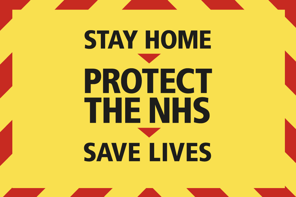
Another example was the lockdown, which as I discussed previously was guilty of being implemented too late. The government used the slogan ‘stay home, save lives’ and plastered it all over the place, everywhere they could possibly stick it. Again, the slogan itself follows most if not all of the techniques shown above, Appeal to the instincts rather than the reason of the audience, Build around a slogan. Repeat. Repeat. Repeat, Awaken the audience’s social conscience, Never be dull or offensive, Awaken the audience’s social conscience. The whole slogan was based around encouraging people to stay home during lockdown and used all of those techniques to encourage the audience to do so. And while the lockdown was definitely needed and by no means am I discrediting that, the whole idea of appealing to the audiences instincts and awakening their social conscience aims to convince people to move forward and accept the lockdown and in turn stops people from questioning that we should’ve gone into lockdown earlier, as Dr. Alexander states, filled with ‘strategic communications’ intent on manipulating the public to the ends of the powerful.
The whole idea behind the Covid propaganda is one which is really interesting to me, it questions the way the government communicate with us and in turn also questions the way they have responded to the pandemic, both things which are at the top of my ‘to do list’ for this project. The idea of pulling wool over the viewers eyes is one which definitely stands out to me, the way the government frame many parts of their communications to show the public what they want to see is definitely something which could be strong, maybe creating a speculative brand or campaign which covers up what its really about in order to illustrate what the government have done.
The Response
Lockdown
As well as the propaganda side of the response, the government has a multitude of things which people deemed they didn’t respond to in the way they should’ve, from lockdowns to improper funding of the NHS, to failed test and trace systems. It’s these mistakes the government made which is why the propaganda is such an issue in the first place, because it seems as though it is covering up for the mistakes made. I wanted to find out more about the mistakes and what characterises them, again in order to create a deeper understanding and hopefully use it to come up with ideas for the project.
He said the UK was served neither by “a very weak cabinet” nor Johnson’s character: “He’s not Trump, though there is something similar in their approaches, but in this kind of challenge you need to really work hard on details. He’s not a details person.”
Not assessing the details, facts and figures enough
Beyond Italy – where the Covid-19 death toll, which does not include suspected cases, is just over 29,000 – German commentators were also critical. Britain has emerged as Europe’s “problem child” of the Covid-19 crisis, the DPA news agency’s London correspondent Christoph Meyer wrote.
“Only a few weeks ago, Britain had the reputation of a country in which the coronavirus was only spreading cautiously,” Meyer wrote in an opinion piece published in several newspapers in Germany and Austria.“Politicians were already slapping each other on their backs and praising the health system, which was better prepared for the pandemic than any other country in the world. But that has quickly revealed itself to be a fallacy … There are now many signs that the government in London massively underestimated the pandemic.”
Underestimating the pandemic and assuming it would all just blow over with no big problems. Also no help for health care because it was assumed it was already prepared enough – again an issue with not assessing details and looking far enough into it, underestimating the damaging effect the pandemic might have.
In a piece this week drawing on the British prime minister’s frequent deployment of classical allusions, the London correspondent of Spain’s left-leaning El País queried suggestions that the prime minister was some latter-day Odysseus.“The conservative press tries to present Johnson as a man of reborn wisdom”, whose experience of Covid-19 had led him to “lash himself to the mast to resist the siren calls” of those demanding the lockdown be lifted soon, wrote Rafa de Miguel.
“In fact, it’s far from clear whether such determination is the fruit of careful calculation – or the result of simply closing one’s eyes when there’s no other option.”Officials in Greece, which has been widely praised for its handling of the pandemic, have watched London’s handling of the crisis with disbelief, with epidemiologists also criticising the UK government’s initial embrace of a “herd immunity” policy.
“Closing one’s eyes when there’s no other option” – leaving it rather than actively looking for a better option.
The progressive daily Ethnos described Johnson as “more dangerous than coronavirus”, saying one of the crisis’s greatest tragedies was that “incompetent leaders” such as Johnson and Donald Trump were “at the helm at a time of such emergency”.Before changing tack, Johnson “had gone out and essentially asked Britons … to accept death”, wrote the columnist Giorgos Skafidas.
Theres clearly many reasons for a late lockdown in the UK. There was calls for herd immunity which halted the calls for lockdown, incompetence from Boris in not realising what the consequences might be, even hoping that the infection rate and mortality rate would simply level out after countless deaths. Not only do the failings in terms of the late lockdowns show that the government wasn’t prepared enough to make strong decisions concerning lockdown, but it also shows that the government weren’t prepared enough the the pandemic overall. Ultimately there are so many failings on the governments part which I can take advantage of and use within the project, from specific comments to just ideas of how it was handled. Another idea which could work well is to take the response and the general aura of it and use that within a branding project, taking ideas like underestimating and not assessing details to show how that might look within a branding context, whether that be a new brand or changing aspects of existing brands to see how they might change.
The fact that the government clearly weren’t really sure what to do at all but acted as if everything they did followed a clear plan also falls in line with the idea of propaganda throughout the pandemic, misleading the public that everything is perfectly fine and accounted for, don’t worry about continuing to work, or going to the pub with your mates because you’re perfectly safe, when in reality the government were just hoping for the best.
Test and Trace
The government’s test-and-trace programme to combat Covid-19 in England has repeatedly failed to meet targets for delivering test results and contacting infected people despite costs escalating to £22bn, a damning official report has revealed.
The National Audit Office (NAO) has found that the centralised programme is contacting two out of every three people who have been close to someone who has tested positive, with about 40% of test results delivered within 24 hours, well below the government’s targets.
The report said a target to provide results within 24 hours of in-person testing deteriorated to a low of 14% in mid-October before rising to 38% in early November.
Government claims of contacting weren’t lived up to, meaning thousands of people received late or undetermined results.
Utilisation rates remained well below a target of 50% throughout September and for much of October. This means substantial public resources have been spent on staff who provided minimal services in return.
Jonathan Ashworth, the shadow health secretary, told the Guardian that the report has uncovered a gaping hole in the country’s defences against the disease.
“The £22bn test and trace now has a budget larger than policing and fire service combined, has seen multimillion pound contracts handed to big private outsourcing firms rather than mobilise experienced public health expertise, and failed to trace sufficient numbers of contacts or ensure those who are contacted have decent financial support to isolate,” he said.
The study from Whitehall’s spending watchdog found that up to the end of October, the scheme spent £2bn less than forecast due to underspending on laboratories, machines and mass testing. Of the £15bn of funding confirmed before the November Spending Review, about £12.8bn (85%) was assigned to testing and £1.3bn to tracing.
In total, 70% of early contracts by value were directly awarded without competition under emergency measures, the report said.
As well as lockdown, it’s clear that other areas of the response were flawed, in this case the test and trace system branded as being ‘world beating’ and ended up being nothing but. The money and contracts given to the test and trace system was questionable in itself, however the extent of its usefulness was even more questionable. The government, for whatever reason, clearly handed out the contract to a company under qualified and it came back to haunt them, with a budget bigger than policing and fire services combined, it still failed to trace and contact a sufficient amount of people and there was also questions asked about the support given after testing positive. None of which lived up to the standards set out by the government and was far behind the tracing systems in other countries.
Again, regardless of the specifics and facts/figures it’s clear to see that the government response in terms of the test and trace system was way below par and not only could’ve resulted in lives lost along the way, but also resulted in millions of pounds being lost. As I stated previously, using the characteristics of the failings by the government in a branding project is something which could be strong and could make use of the test and trace failings, from the use of money, to questionable contracts handed out to under qualified companies, to the way it was marketed as a world beating system (more evidence of propaganda/strategic communications looking to use good old British pride and arrogance to make the public feel assured).
NHS
NHS bosses have asked doctors and nurses to work without protective full-length gowns when treating Covid-19 patients, as hospitals came within hours of running out of supplies.
The guidance is a reversal of Public Health England (PHE) guidelines stipulating that full-length waterproof surgical gowns, designed to stop coronavirus droplets getting into someone’s mouth or nose, should be worn for all high-risk hospital procedures.
In a significant U-turn, PHE advised frontline staff to wear a flimsy plastic apron with coveralls when gowns ran out, in a move that doctors and nurses fear may lead to more of them contracting the virus and ultimately putting lives at risk. The PHE announcement on Friday evening came shortly after the planned move was revealed by the Guardian. Meanwhile:
Nearly 15,000 people were confirmed to have died from coronavirus in UK hospitals, with the total rising by 847 on Friday to 14,576. After a peak of 980, fewer than 900 deaths have been recorded in hospitals for six days in a row.
Only 21,000 tests were carried out – some of them duplicates – putting the government far short of its goal of 100,000 a day by the end of the month.
The health secretary said Britain would restart tracing the contacts of people with coronavirus symptoms, having stopped in early March.
The government set up a vaccines taskforce to help the development, rapid production and introduction of a vaccine.
The government confirmed that 1bn items of personal protective equipment (PPE) were to have been delivered across the UK by this weekend – but hospitals and care homes continued to suffer shortages, in particular of gowns. More than 50 frontline healthcare workers have died amid fears a lack of PPE is leaving them exposed.
Advising staff to use aprons instead of gowns carries the risk of a major confrontation with staff groups. The Royal College of Nursing last week made clear that nurses should refuse to treat patients if they were not happy that the level of PPE available would protect them properly. The British Medical Association, which represents doctors, has also warned that doctors’ lives are being put at risk by stocks of PPE having reached “dangerously low levels”.
Shortages of gowns in hospitals in England are far worse than Matt Hancock, the health secretary, has admitted, hospital bosses claim. “We are tight on gowns. That is the pressure point at the moment,” Hancock told MPs on the Commons health and social care select committee in an evidence session on Friday morning.
He said: “We have another 55,000 gowns arriving today and we’re working on the acquisition internationally of more gowns, but it is a challenge. This follows changing the guidance 10 days ago which increased the advice on the use of gowns but also said that they should be used for sessional use rather than for individual patient use … And it is a big challenge delivering against that new guidance and we’re doing everything we possibly can.”
He could not guarantee that every hospital would have the supplies needed to tide it over this weekend.
Hancock had sought to reassure MPs by stressing that 55,000 more gowns were due to arrive on Friday. However, those equate to about eight hours’ supply because the NHS is currently using 150,000 gowns a day.
There were only “several tens of thousands” left in the NHS’s reserve stockpile, sources said on Friday. “Gowns have in effect already run out,” one said. “The situation is so serious that some trusts will run out today and others over the weekend.”
The response in terms of running the NHS throughout the pandemic sums up the overall response, lack of correct funding, underestimating the impact the virus will have and not planning accordingly/hoping it would all just blow over, and lying about the amount of PPE and funding which the NHS was being supplied with. Similar to the other aspects of the response, it’s clear to see that even without looking into the specifics, the response was highly flawed and looks as though the government ultimately didn’t care enough. The same characteristics of the failed test and trace, lockdowns etc. are the same as the NHS in that certain phrases or features which allude to the governments response could be used within the project.
Again, the ideas themselves still need to be played around with however the goal is the same, to draw attention to the failed response of the government and give information to the audience allowing them to formulate their own opinions. I still want the project to be a branding project, and ultimately I think the way brands build up visual identities with recognisable features throughout could allow me to attribute characteristics of the governments response to a brand in order to sum it up within a brand, whether that be a new brand or an existing one.
Although all 3 initial ideas where all ideas which really jumped out to me as being instantly interesting, so much of a focus this year has been put on design for good rather than commercial work, and although commercial work is something which I am still interested in doing when I leave Uni, I want to take the opportunity to do something which may make a difference to someone in some aspect.
First off, I wanted to look into the governments response and the different aspects of it which have made up the last year in the UK to start to understand the way in which the project might take shape.
First of all I looked to list a few of the first things I think about when I consider the governments response, taking knowledge from criticality research and also some of what I’ve seen online about some of the vital parts.
Lockdown –
Mass gatherings are to be banned across the UK from next weekend, the government has announced after Boris Johnson’s cautious approach to the coronavirus outbreak was overtaken by care homes, sporting bodies and even the Queen taking matters into their own hands.
On Thursday, despite formally moving to the delay stage of the coronavirus action plan and warning that many more families would “lose loved onesbefore their time”, the prime minister stopped short of calling for mass events to be cancelled or schools to be closed. There was no specific advice for how older people should protect themselves, aside from avoiding going on cruises.
On Friday, the World Health Organization stressed the need for a range of measures to tackle the virus, which is thought to have infected up to 10,000 people in the UK, most of them unknowingly because they are not showing any symptoms.
The WHO director general, Dr Tedros Adhanom Ghebreyesus, said all possible action should be taken: “Not testing alone. Not contact tracing alone. Not quarantine alone. Not social distancing alone. Do it all.”
Hours later, in a significant change of track, Downing Street signalled it was preparing to stop large public events, including sports fixtures and concerts, to alleviate the pressure on police and the ambulance service. It did not specify what size of event would be affected, and the timing of the clampdown has yet to be decided, but it is expected to come into force in a week’s time.
there has been talk since the very first lockdown that the government took action far too slowly, lockdown was needed at a much earlier point to save lives and stop the virus from infecting too many people along the way. There was also talk of a second lockdown coming too slowly, although many people struggled throughout lockdown and didn’t necessarily want it to happen, when you look at facts and figures about infection rates and unfortunately death rates, it definitely seems as though the government allowed ‘normal’ life to continue for too long and although there will never be any way of officially proving this right or wrong, the way other countries such as New Zealand have handled lockdowns both local and global really shows what can happen when you act proactively.
Covid Briefings
Consider this rule of thumb: the more that “patriotism” is invoked by a country’s political elites, the less healthy its political culture will be. From McCarthyism in the US to the Chinese Cultural Revolution, the imperative to love one’s country has often been used as a pretext for persecution and submission. And in post-Brexit pandemic Britain, we have developed our own grammar of patriotic intimidation.
The Conservative government is well positioned to play this game. It is already high on the fumes of Brexit, which carried the Tories to a majority that would allow them to vanquish Europe, take back control and get the job done. The Vote Leave veterans in No 10 are already aware of how well the language of treachery and sabotage can turn a section of the public against its own judiciary and even elected representatives. The kind of war talk that helped secure Brexit is now proving useful in managing the government’s calamitous Covid strategy.Advertisementhttps://2f46c5f8c3905df324ffcfc330204cde.safeframe.googlesyndication.com/safeframe/1-0-38/html/container.html
Among the government’s many gambits for deflecting blame – in between the lies, scapegoating and occasional snarls of menace when questioned too closely – a sinister implication has begun to linger. It whispers: why don’t our critics love this country? Challenges to the government’s inept management of the crisis are depicted as nasty efforts to “politicise” the pandemic; worried northern mayors and MPs are “taking advantage” of a difficult situation to “score political points”. Public behaviour that obeys government instruction is a duty. Going to the pub is not a pastime, but an exercising of Britons’ “patriotic best”. Boris Johnson compares Covid-19 to all the other “alien invaders” that this country has “seen off” over a thousand years – positioning critique of his public health strategy as a traitorous undermining of a wartime government. Any criticism of the failing privatised test and trace programme has been hastily recast as an unpatriotic attack on “our NHS”.
The public information briefings that occurred at about 5 pm each day from Downing Street during the first lockdown in spring and summer of 2020 were episodes in propaganda straight out of the wartime playbook. Rather than being ‘public information’ events as they were so described, they were in fact filled with ‘strategic communications’ intent on manipulating the public to the ends of the powerful. They were carefully staged, choreographed and scripted by spin doctors and other political communications professionals working for a government that is addicted to propaganda and cannot fathom engagement in public communications through any other prism.
Furthermore, the UK government’s approach to Coronavirus briefings in the first half of 2020 may harm the long-term trust of the public in governance and the various organs of state that are entwined with the crisis. Public Health England, for example. Indeed, Chris Witty, Patrick Valance, Jenny Harries et al – by standing next to the cabinet minister of the day – may end up tainted as manipulators-in-chief themselves through their (and the organisations that they represent) implicit endorsement of the government’s approach to public communications.
The Covid briefings each week which happened most weeks throughout the majority of the pandemic were claimed to be public information briefings, however it was clear from the off that it was less about giving information and more about persuading the public that the choices they had made and everything they were doing was all the best way to handle the issue. They used motivation and in many cases patriotism to strive the public forward and stop them from discussing the governments actions. Was this seen as the best way to do things overall or was it more to steer the public eye away from their actions?
NHS
The government confirmed that 1bn items of personal protective equipment (PPE) were to have been delivered across the UK by this weekend – but hospitals and care homes continued to suffer shortages, in particular of gowns. More than 50 frontline healthcare workers have died amid fears a lack of PPE is leaving them exposed.
Prof Keith Willett, who has been leading NHS England’s response to the coronavirus crisis, helped formulate the new PHE guidance, which is being sent to all 217 trusts in England.
It sets out options for what frontline staff should do when they cannot access gowns. They include hospitals that still have gowns lending each other batches of them, wearing coveralls – one-piece items of personal protective equipment (PPE) that cover the whole body – and using plastic aprons as alternatives.
The NHS was a saving grace throughout the pandemics and the government openly showed their thanks through weekly NHS claps and constantly praising them, even using them within one of their many slogans. However, the difference between praising the NHS and helping them is a big one, and whilst Boris called for the NHS clap, it seems as though he didn’t offer much help other than that. This links back again to the idea of propaganda within the governments briefings, motivational speeches praising the NHS all to make it seem as though the problem was being solved, but was it?
Before starting to research into ideas and form decisions about what to base my final major project around, I wrote down some of the first things which really jumped out to me from the start. I wanted the project to be something important to me which I would be able to pour my heart and soul into.
Sports magazine
Sports like football and surfing are both activities I am extremely interested in getting involved with as much as I can. I want the project I undertake for FMP to be a passion of mine, allowing me to create something which mixes my passions. I also like the idea of an editorial design which I may be able to take further through digital or non traditional touchpoints allowing me to improve my editorial skills and possibly others at the same time.
I like the idea as a whole, however I am aware that FMP is about being ambitious and doing something completely new, and I am also aware that a sports magazine even with the help of non traditional media would still not be overly ambitious in terms of a final major project. The project feels like something I could carry out as a personal piece, just not a university project.
Modern day branding project
My passion is in branding and I love creating visual identity’s, so I though one way I could combine that with a more ambitious project is to brand a company while looking at how it might change in a modern environment, taking into account covid, climate change, pollution etc and how they might effect the branding of a commercial company. All of these issues make a huge difference for companies, how they use packaging, how much is printed media and how much is digital etc. So it would be interesting to experiment with some of the extreme ways of getting around these problems. The project would allow me to further improve my knowledge of branding while also allowing me to find issues such as packaging and come up with new ways to get around them. I’m unsure what the brand would be, however it would most likely be something commercial which would allow me to add something extra to my portfolio.
Covid-19 Branding
After criticality and my research into the issue of the government and how they responded to Covid, it’s something I became really interested in and quite surprised it hasn’t been spoken about more. I use twitter regularly and there are a few outraged users who talk about the incompetence of the government and their response to the pandemic, as well as a lot of users who are still completely unaware of the problems, particular 20-30 year olds. The idea is to create a project which aims to feed information to that age group to allow them to become more informed and form their own opinions on how the government have handled the pandemic. I’m unsure what sort of project it would be, however I’m not too keen on the idea of creating a project which just gives information and nothing else, I want to look deeper into the finer details and creating something which makes people think rather than just delivers facts to people.
Before ideating and coming up with my 3 concepts I wanted to carry out some contemporary research into examples of graphic design within the mental health, sport and medical fields to get a sense of the kind of visuals, colours, typefaces etc and what the tone of voice is. I also wanted to look into some examples of information design, what sort of information design is used to visualise data and how might I be able to do this for this brief in particular.
Mental Health
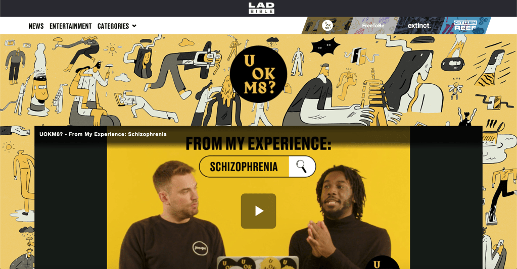
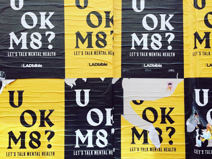
U OK M8?
The social media page LADbible recently launched their campaign ‘U OK M8?’, a campaign aimed towards the mental health of young men.
‘UOKM8?’ aims to develop the broadest understanding of mental health and suicide risk in the UK by gathering quantitative and behavioural data from the LadBible audience through the use of questionnaires that sit alongside stories on mental health issues.
Although the campaign visual style is very simple, using only the black and yellow pallets and the same slogan across all of its media, the style is one which really stands out and is definitely aimed towards its target of young people. I also like the way the campaign is very straightforward and to the point. Theres no imagery or major metaphorical language, its simple and tells the viewer all they need to know. Whilst the design might be very stand out and in your face, possibly a bit to harsh for the overall audience, however the idea of stand out colours like yellow is one which I think works really well, possibly maybe more so if its a bit more toned down.
There is also a strong sense of typography within the design, while there has to be a limit, being expressive with type is something which could really work in order to convey some sort of idea, especially within the realm of physical activity, type could allude to motion and movement quite nicely. The typefaces used within the “U OK M8?” campaign are both very bold in comparison with many other mental health campaigns which might be a bit more soft, but I like the boldness of it, its much more standout and really relates to the correct target audience.
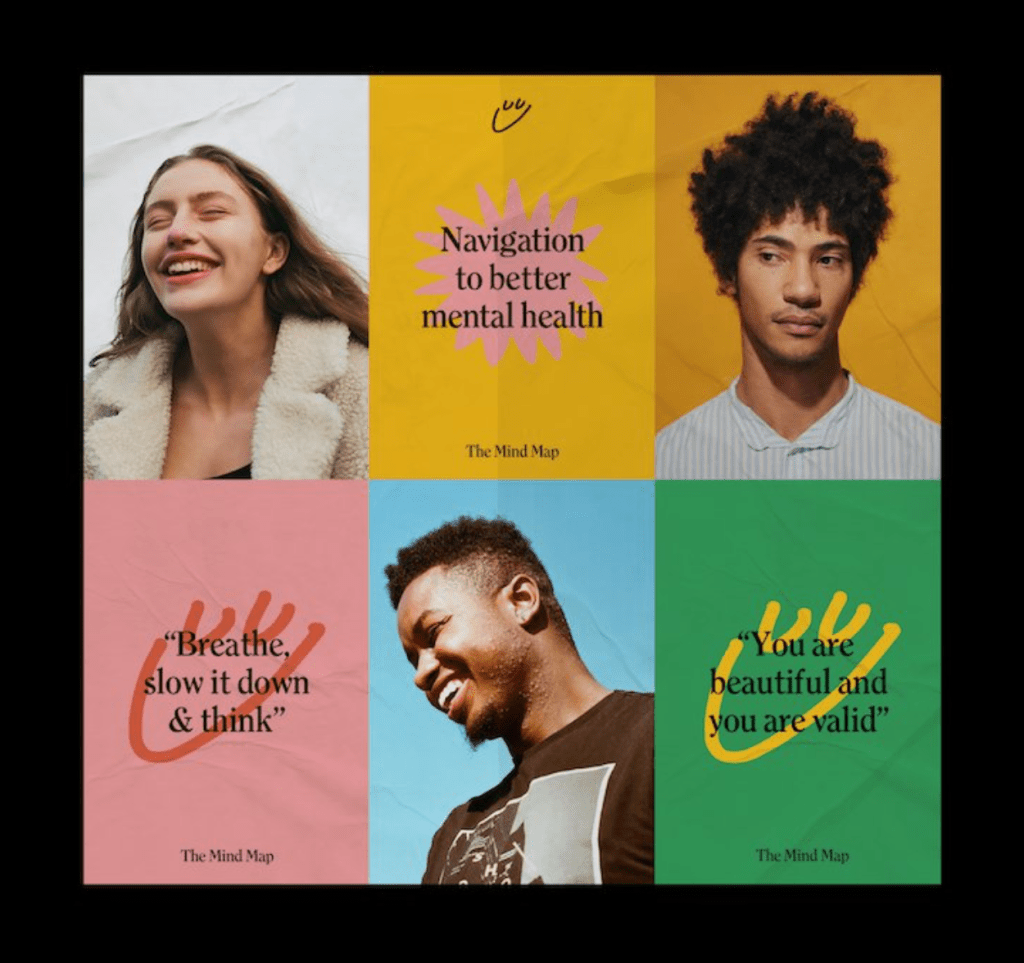
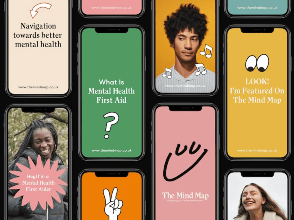
The Mind Map is a new initiative that seeks to “promote a new normal” in an age of increasing mental health problems across the United Kingdom.
Described by its founders as an “innovative mental health hub”, Liverpool-based Mind Map offers practical advice on how young people (defined as those between 16-30) can get access to subsidised counselling and free mental health support services, as well as an online publication which shares the stories of musicians and athletes who have been affected by mental health problems in their lives and careers.
Similarly to the LADbibles campaign, The Mind Map is aimed at young people (16-30) and its aim again is to allow them to connect with any forms of mental health they may need through the use of an app.
The visual style is great and uses a variety of stand out colour combinations along with some simple vectors and images to create a light hearted and friendly but also stand out approach to tackling mental health. I think the style really stands out to its audience and feels very relatable and personal whilst also ensuring its contemporary and modern feel. The designs use great colours and combinations which make them feel much less cliche in terms of the usual colours which mental health campaigns use.
Another aspect of the campaign I really like is the way it uses photography alongside graphic visuals, the colours contrast very nicely with the photos themselves and overall creates good pace throughout it and stops it being too overwhelmed with bright graphics.
On the informations design front, The Mind Map uses simple icons around the designs alongside type and image. Although they’re very simple and not communicating a whole lot of information, the idea of using icons similar to these is one which could work very well to communicate the guidelines or other information.
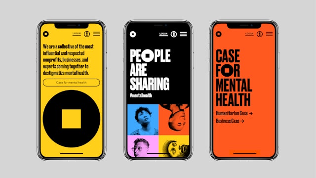
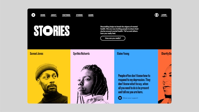
Pentagram has created a brand identity for the Mental Health Coalition that centers on a “square peg in a round hole” to represent that there is no “normal” when it comes to mental health and that everybody fits. The Coalition is introducing the icon in the hopes that it will become the global symbol for mental health. The mark also appears in the branding Pentagram created for “How Are You, Really?,”a digital storytelling platform that encourages individuals to share their experiences, start conversations and open up about their issues. The online platform is a place where those seeking help or guidance can easily navigate the mental health space.
Firstly, the thing that stands out to me is the boldness of it, the colours, typography etc is all very contemporary and is something which is definitely very loud and in your face. What I like is that they use the sort of bright colours a mental health campaign might look to use, but they do it in a much bolder and stand-out way. Another thing which jumps out to me again is the use of the icon in the ). Although in this campaign its only one O, its still something which can be used all around the campaign, including on its own and they viewer will recognise it and know the information behind it.
Pentagram partner Paula Scher is known for her bold and attention-grabbing graphic design, so her arrival in the mental health sphere is not only unexpected, it’s an exciting and powerful call to action. In contrast to its peers in the sector – largely summed up by soft tones and a gentler visual approach – new charitable initiative the Mental Health Coalition has gone for a striking identity by Scher, that features an icon she hopes will become a global symbol for mental health, plus unapologetically shouty typography and a vivid colour scheme. “It’s an anti-sanitarium design,” she tells It’s Nice That.
She also goes on to talk about the branding for The Mental Health Coalition and how she hopes to promote a cultural shift in how mental health is spoken about. I like the way the campaign looks to surpass the ordinary in order to create something different and stand out. Why was it that mental health is always seen as something which needs to use soft and gentle visual language, when mental health is something that affects so many people nowadays that gentle and soft approaches may not be relevant to the target audience anymore. I think this is something which is relevant to my current brief, it needs to allude to mental health but the target audience may not be suited for a soft and gentle approach.
Sport
I then looked at some examples of sport campaigns and how they use colour and typography within their designs and visual styles. I didn’t look at as many whole campaigns, more individual examples which I could pull apart.
Firstly, in terms of colour palette, most of the examples I found tend to use one bold colour alongside white and black, as well as using a lot of imagery to add an extra aspect to the palette whether that be blackened white or coloured photos. The colours ensure that the designs are bold and stand out, which is exactly what a sports person or athlete would want so it reflects that well.
The typography, similarly to the colours is very bold on all examples, usually using thick sans serif fonts which stand out as much as the imagery and photography does.
Like I said previously, the bold style definitely works for sports campaign as it works in unison with the companies, sports or athletes it represents and therefor works well for the target audience. For example the boxing campaign uses the colour red with a condensed, thick sans serif font which emulates the aggressive nature of boxing, and will probably grab the attention of viewers for the same reason.
Another thing I noticed about a lot of the typography is that the way many of the campaigns use type as imagery is interesting, particularly using it to allude to movement. The boxing campaign contains text which looks as if its swinging and emulates the path of a punch, which in itself makes the viewer think about motion and movement. The Nike Mercurial campaign also uses typography to imply movement and in this case speed, which is what the mercurial boot stands for.
Medical
Finally, I wanted to look into medical design and branding to see what that entails. The first thing I noticed was the colours, They tend to be quite bright and stand out, without being too in your face, usually colours like blues and greens.
The typography is all very clear and laid out, the campaigns tend to have some sort of imagery or photography, with a simple explanation or typographic element to accompany it, many of them using a poster series instead of individual posters in order to get more information over to the target audience.
I also noticed a lot of medical branding or campaigns use iconography for lots of their information design, there tends to be lots of information which needs to be explained so using icons is a good way to do this without overwhelming the viewer with loads of information.
Take-Aways
All three examples contain uses of bright colours which is definitely something the campaign needs, however experimentation needs to happen to determine what colours and whether it needs just one colour alongside black and white or multiple. Another element is photography which works well alongside block colours, so choosing one bright colour alongside some bright photography could also be a possibility.
Typographically speaking, the difference between the 3 is quite large so finding there middle ground is important. I liked the idea of using fluent and motion-like typography in terms of communicating the idea of physical education, but it could also be worth taking note of the typography within medical campaigns and looking at the way it clearly conveys information alongside visuals.
Finally, one of the things very evident in some of the examples of mental health and medical campaigns is the use of iconography to convey information. One of the things noticeable from the sphere guidelines and background science is that there’s a lot of information looking to be conveyed, some of which doesn’t contain stats or figures. Using icons is a good way of communicating information and stopping the page being cluttered and overwhelming.