Placard – Stanley Green

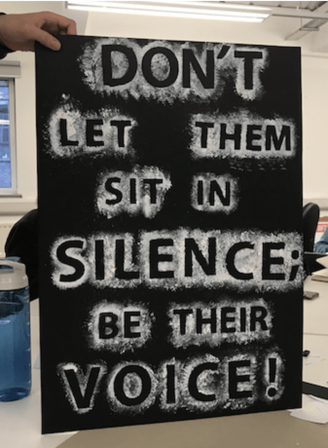
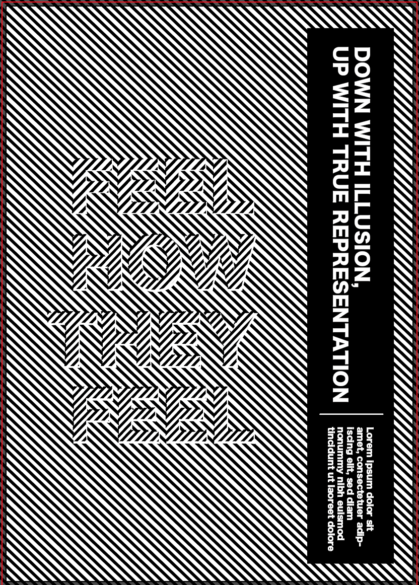
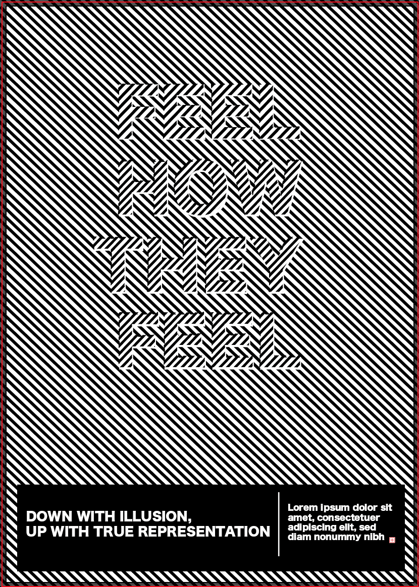
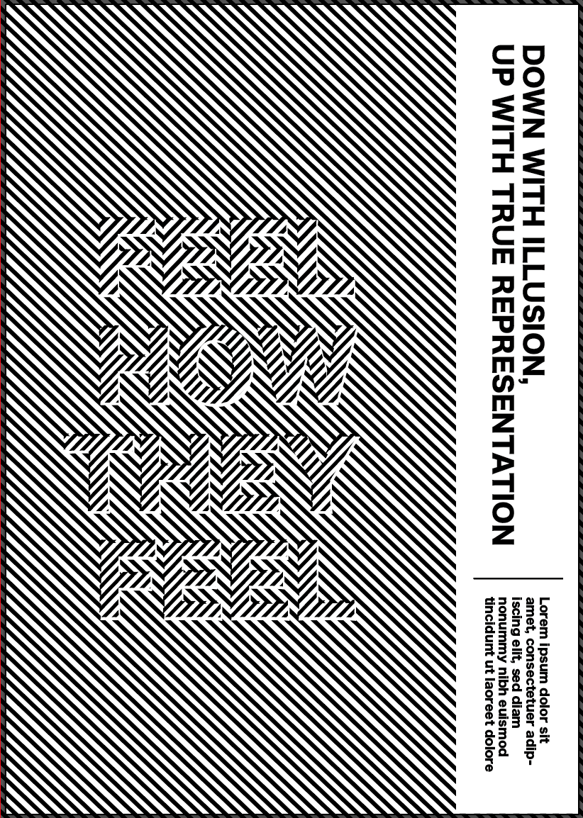
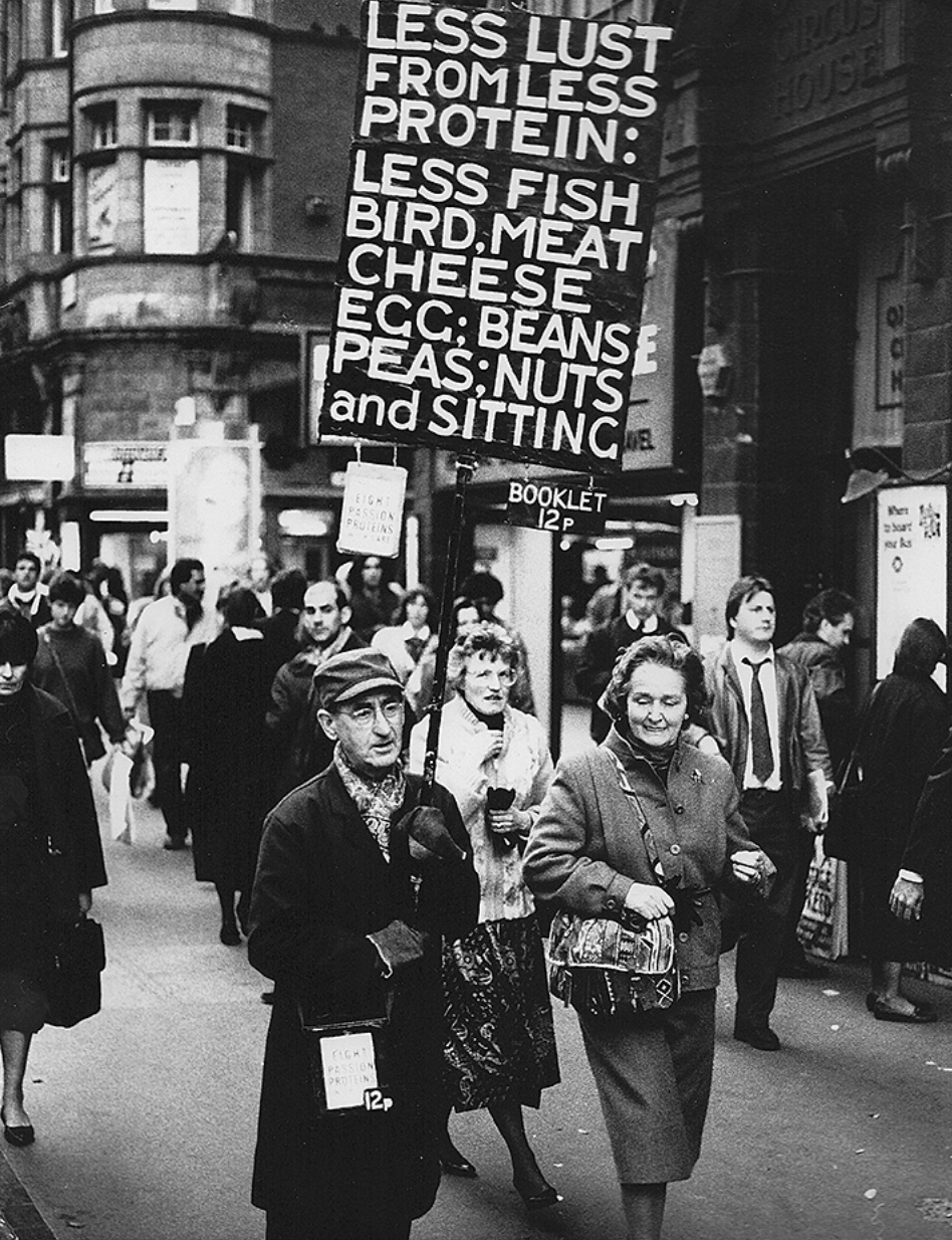
We were told one of our placards had to be in the style of Stanley Green’s in his work for ‘Protein Man’. The placards were simple but effective, using all white type n a black background, filling the majority of the space with large, bold, sans serif letters which make it look important and authoritative.

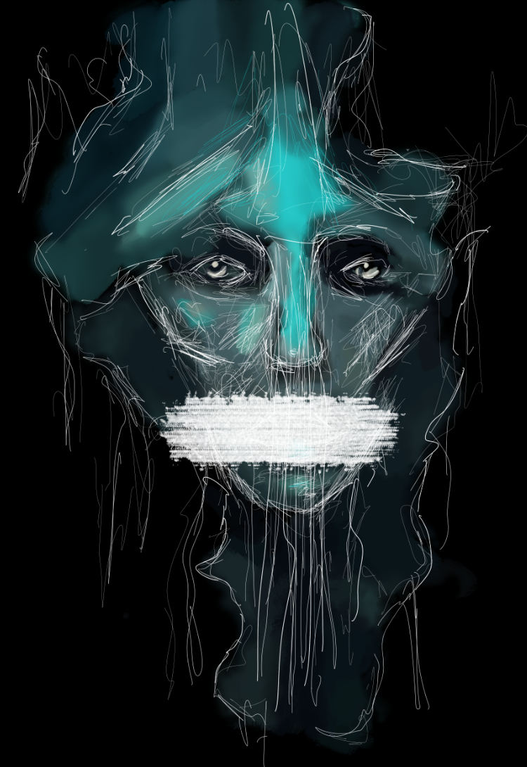
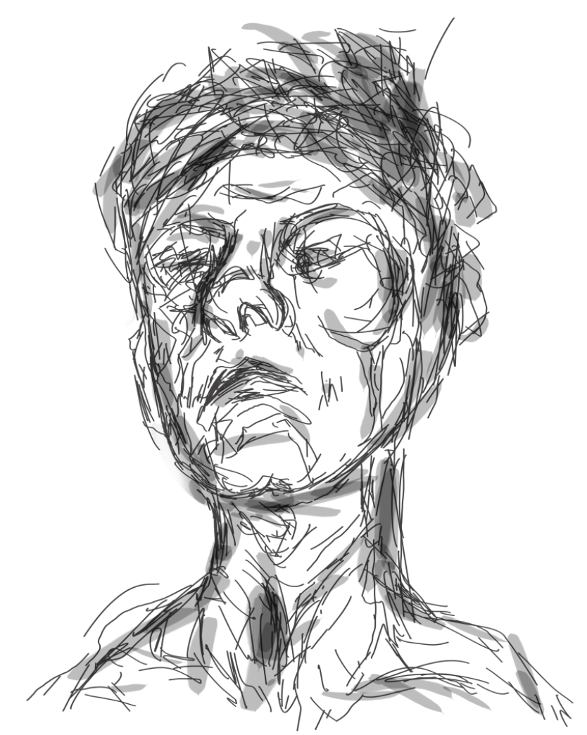
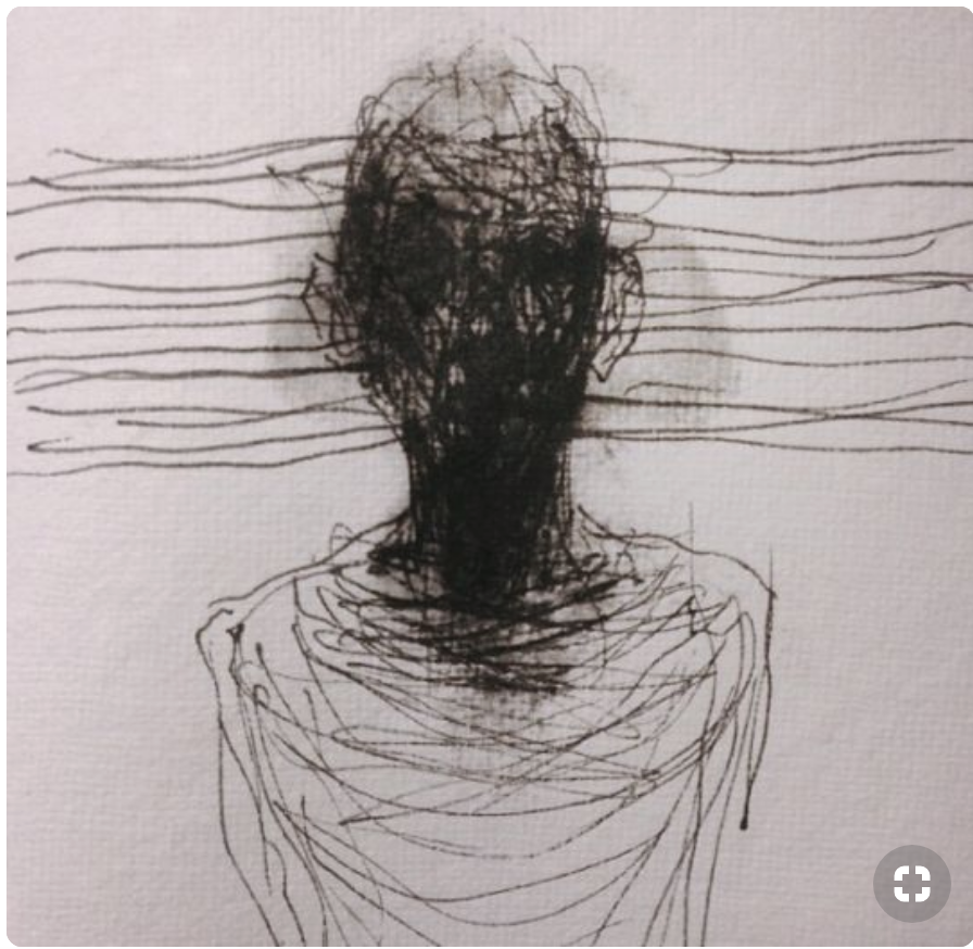
We met as a group to complete our Stanley Green placard and decided on the phrase ‘DON’T LET THEM SIT IN SILENCE, BE THEIR VOICE’. I think the phrase overall sums up what our whole idea was about. It was about creating designs which making people understand and realise what people with mental health are going through, and helping to do something about it.

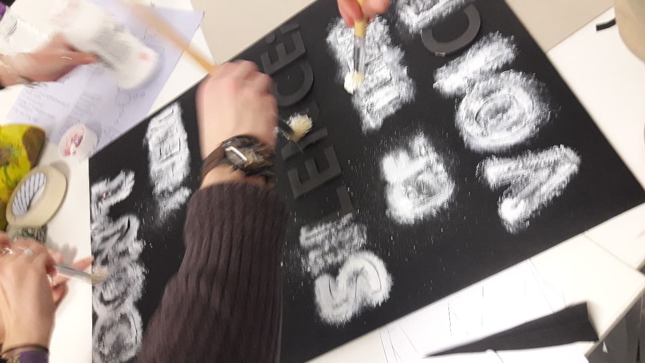
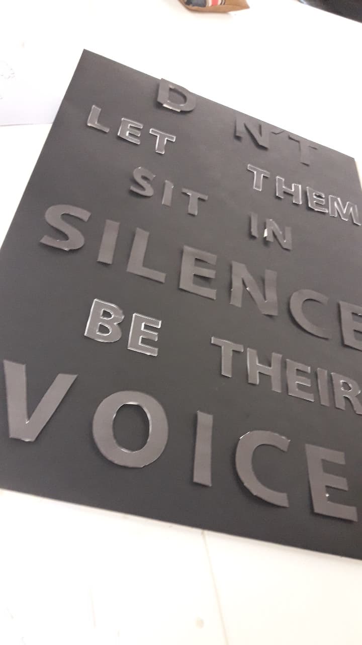
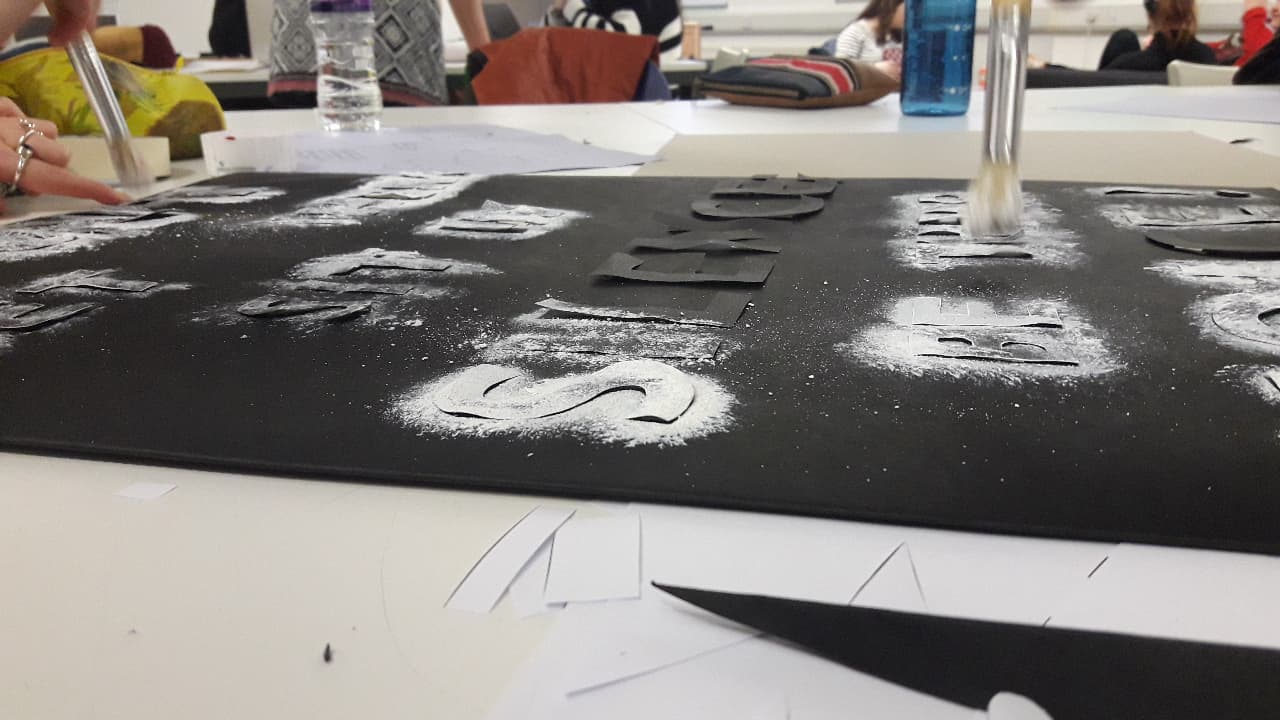
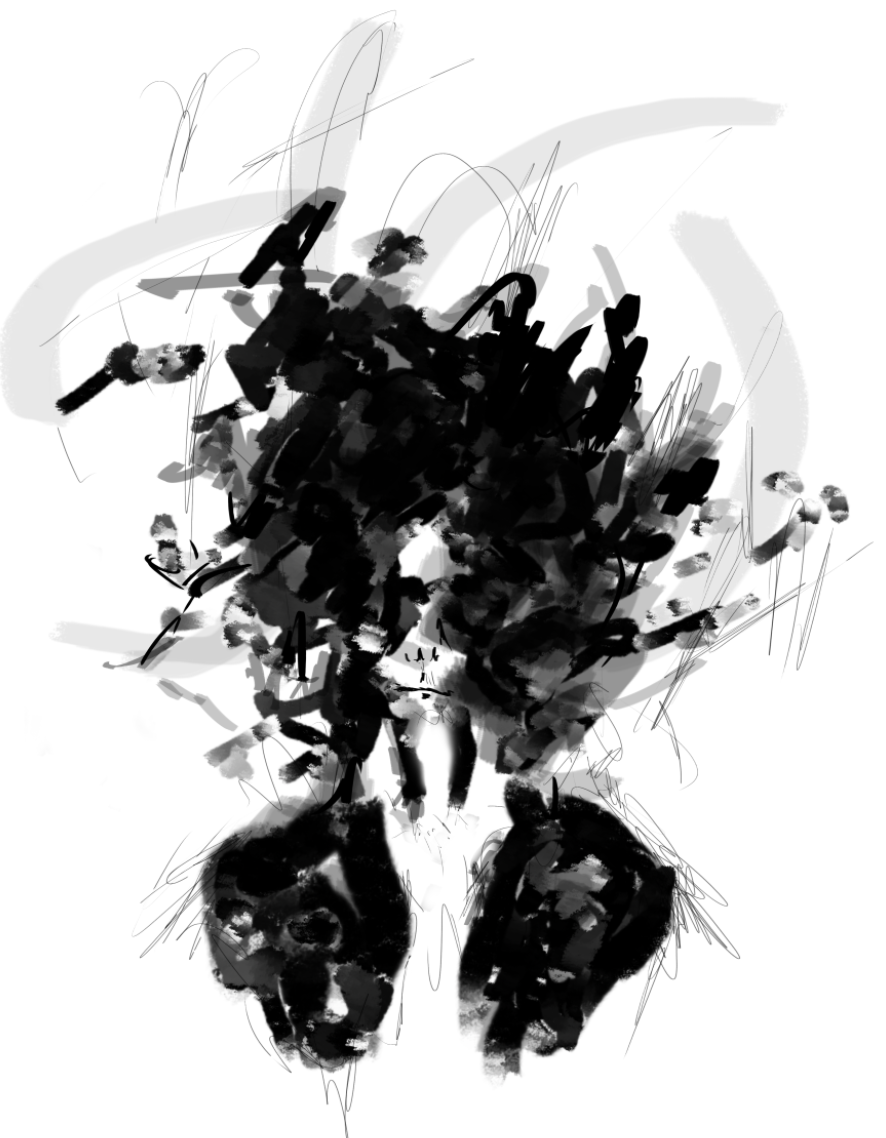
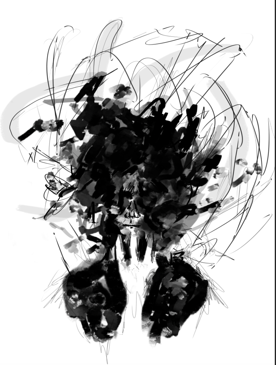
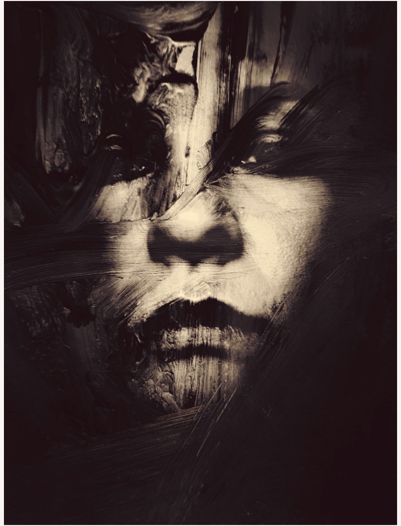
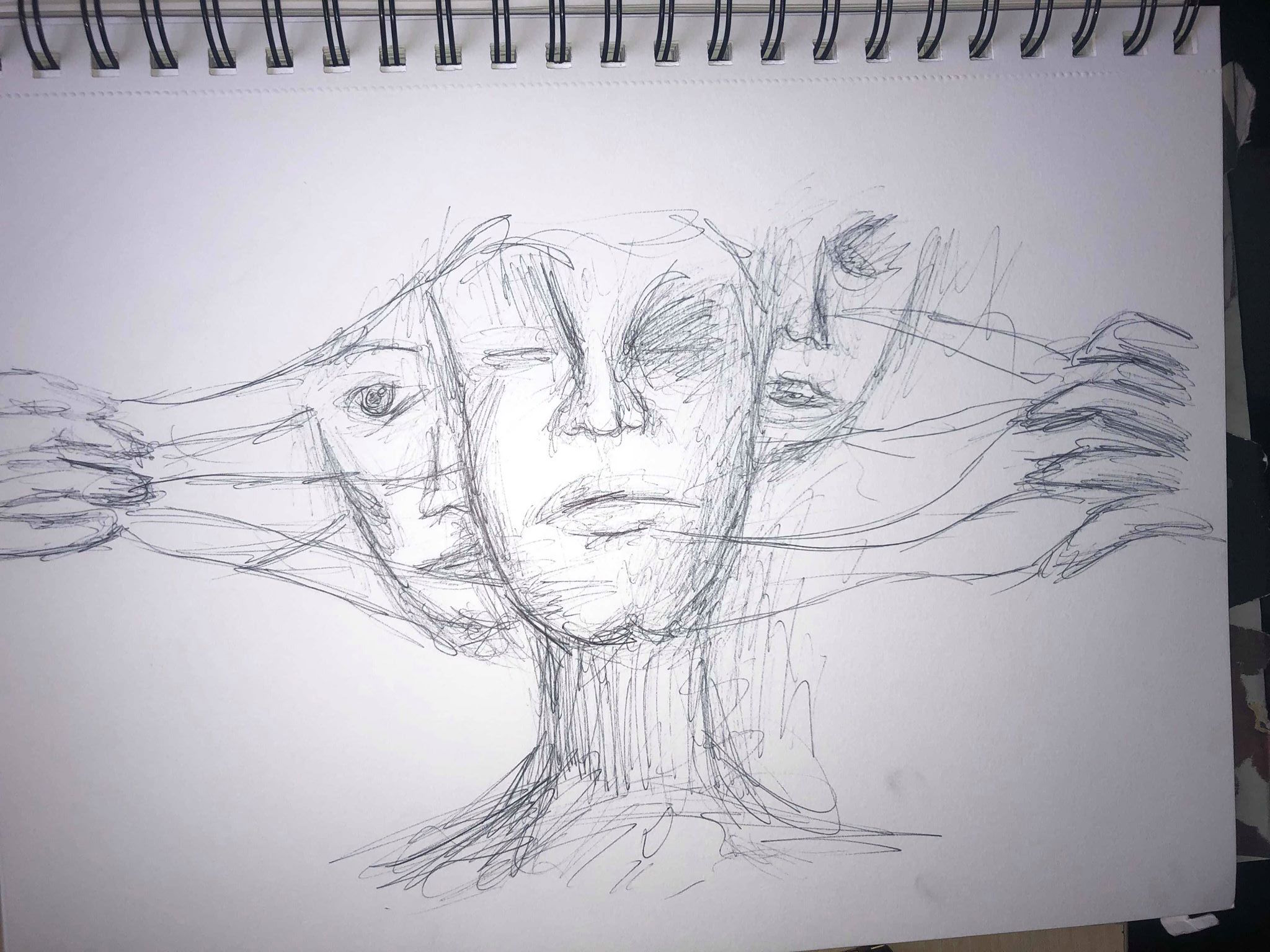
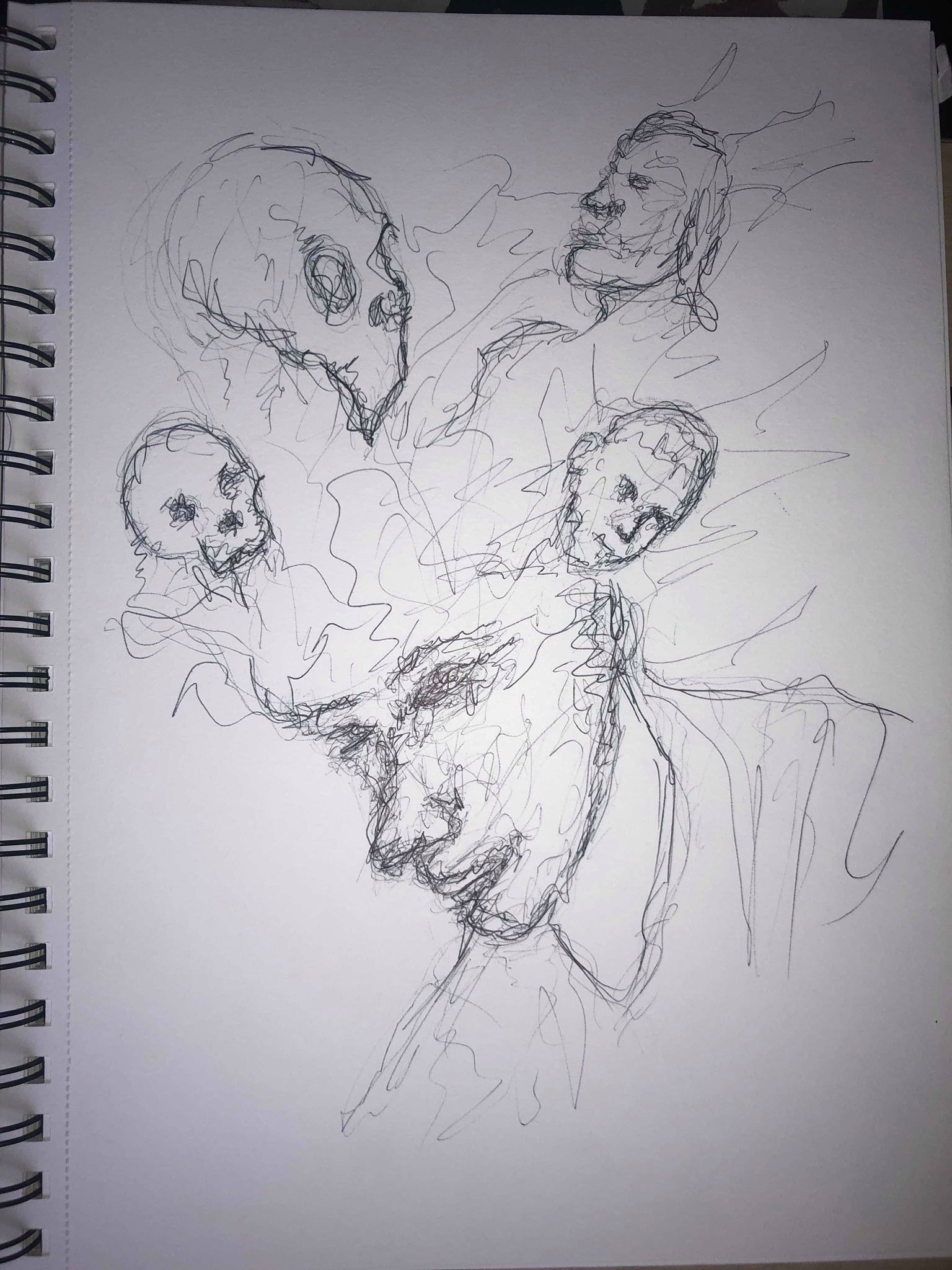
We spoke about the size of each word and decided to make certain words bigger then others to create a feeling of hierarchy and give the more important words more emphasis. We wanted ‘don’t’, ‘silence’ and ‘voice’ to be larger than the rest of the words as we thought they were the most important. We cut the letter out and painted around them in white paint on a black background to create a splattered and messy effect, similar to the effect we wanted in our illustrations, to show the messy and almost confusing feel that people with mental health issues might go through. Similar to our illustrations, we also wanted the idea of the words moving out of the dark and into the light.

Placards – Placard Research

We were introduced to the brief for our last week which was to create placards to use during out protest. They could be printed, hand drawn or painted, sculpted etc and one had to be in the style of Stanley Green’s ‘Protein Man’ which was made using only tape and paint.

Our initial research was to look into protests and the sort of placards they use. One of the main taking points in our group was the the majority of the posters were hand made or hand drawn, and although they may not look as perfect and as ‘slick’ as a digitally made placard, they feel much more personal and moving, and for me it makes me think that the fact they are willing to put time and effort into hand painting it shows that it’s something which effects them personally, which is a very moving thought for the person viewing the protest. For me, the most effective placards feature a plain white or black background with a phrase or quote written on them. The fonts used are often very important, and the majority of the placards, as seen above, are in sans serif which I think gives a much more authoritative feel to it, it feels much more like they are demanding something as opposed to asking politely. The colours are also very important, often they relate to what the protest is about, but they all use bold, bright colours which stand out on the page and draw the eye of everyone watching.

One other thing I noticed is the phrases written on the placards are all aimed at someone, they are messages or statements directed at someone at something, as opposed to just quotes or meaningless phrases.

http://www.bbc.co.uk/newsbeat/article/34386451/junior-doctors-protest-explained-in-placards

Illustration – My Outcomes

Following on from my initial experiments I took influence from Michal Mozolewski. I wanted to create some slightly darker illustrations using touches of colour to make them stand out a bit more. I tried to paint realistic and accurate paintings whilst also using thick brush strokes throughout both illustrations to keep the slightly messy effect and give the sense of a ‘storm’. I then used a thin white pen to draw over them, using a very messy and scribbly style to add more features to both of them, and also to reiterate the idea of the confusing, storm going on inside their heads, or the head of someone with a mental health illness. Both illustrations are more subtle versions of a ‘Quiet Storm’ than some of my other work, however I think aspects of them make them work more effectively. For example, as I said the thick brush strokes add features to the faces, but still keep the work from looking perfect and clean, it keeps it slightly messy which fits in with our idea for all of our group illustrations. I also wanted the face to appear to be emerging out of the darkness as if they are moving towards the light as I thought this would be a moving message for someone suffering from mental health illnesses. I also wanted to add touches of colour to both, I think it makes both pieces stand out much more and almost add feelings the each of them, for example the blue could make you think of sadness, or even calmness, both of which have connotations with mental health.

Following on from a discussion within my group, the idea of covering the mouths of each illustration with something came up. This was partly to do with the ‘quiet’ part of our oxymoron, but we also thought this could be to give the idea that someone with a mental health illness is almost being stopped or held back from speaking up about it because of a variety of different reasons. I think it works very well within the piece and makes it much more moving. The idea of our initial manifesto was to show people how destructive and horrible mental health illnesses can be and I think covering the mouth in the illustration is a way of making the viewer think why do people with mental health illnesses feel like they can’t talk out about their issues and how to go about changing it.

Overall I think the illustration works well and is a moving image to look at. I used the covering of the mouth and closed eyes (in the first example) to give the idea of silence of ‘Quiet’, as well as using a rough and messy way of painting and drawing to create a sense of a ‘Storm’ to fit with our oxymoron of a ‘Quiet Storm’. It also fits in with our theme of mental health through the colours used and our interpretation of a quite storm being all about the confusing and scary thoughts going on inside the head of someone with mental health, as well as the idea of them being in darkness.

Illustration – Image Development

I decided to create some outcomes using photoshop to paint. I experimented with hand drawn outcomes earlier in the project but thought painting digitally on photoshop creates an outcome which is much bolder and stands out.

My first outcomes was more about using practicing with the sketchy/scribbled idea, I used a thin pen on photoshop to create a rough outline of a face, using lots of short strokes to create the rough and messy feel. I also used a slightly transparent brush to create some darker areas within the it. It was only an experiment with the drawing tablet of photoshop to see how the effect would look, but I think it is very effective to portray a dark, stormy and messy feel.

I then took my initial experiment and expanded on it to create a piece more relevant to our them and our oxymoron. I used more thick brushes to create a darker feel, using a thin black brush to add details to certain areas. As spoken about previously, I kept the mouth closes to show the quiet or silence, and I used lots of dark, thick brush strokes around the head to give the idea of a storm going on inside their head, followed by thinner brush strokes to add even more of a confusion.

Overall I think the use of the thick and thin brushes are very effective to give a very confusing and messy style which my group is looking for. However, I think my final outcome needs a little more colour to show the feelings of sadness someone with a mental illness might be feeling. I also think as much as i like the idea of a confusion going on inside their head, I want to experiment more with a more subtle way of showing this through the use of thicker and more textured brushes, possibly using a thinner pen to draw over the top.

Illustration – Group Input

After carrying out some research into possible ideas for my work, all of our group brainstormed a few of our ideas and we all spoke about the styles and colours we wanted to use. We all shared our individual ideas and work which we had created in response to the piece we discussed by Agnes Cecile, a few were hand drawn, a few were painted and a few were gifs but all followed a very similar theme and style. We all wanted to create our own illustrations as we felt although we had the same understanding of our oxymoron, we all had our own interpretations of mental health and the way we wanted to portray the oxymoron. We thought although we would be producing our own individual outcomes, they would be based off a variety of sketches and ideas which we had come up with as a group to come up with our overall idea.

Illustration – Initial Outcomes

After deciding on the overall idea of our illustrations and what style we wanted to use, I researched online to find some artwork which resembled the sort of style we were going for.

I took influence from my sketches and searched to find some drawings which illustrated the sketchy and hand drawn style I wanted to achieve, the scribbles and rough lines give a sense of messiness and imperfectness, and just like mental health illnesses and the people suffering with them nothing can ever be perfect. I think the messiness backs up our idea of the ‘storm’ going on inside someones head, and can also go to show that something which doesn’t by any means look perfect can still be beautiful.

I also came across an artist called Michal Mozolewski who creates artwork using a mix of painting and photo-manipulation. Although the art is made through editing photos, the style of all of his pieces are very moving. He takes portraits and using illustrated lines or brush strokes and makes the beauty in the image imperfect. All his work has a very dark feeling, they all seem to be emerging from the darkness into the light which is a very moving thought and one which our protest aims for. Although we wanted to keep our colour palette very minimal with mainly just black and white, the addition of the blue draws the eye and I feel there is more of a feeling of sadness portrayed in the blue than black and white. The images all seem to have faces with the mouths closed which goes alone with the quite side of our oxymoron, and personally I think the way they all contain illustrative lines is a subtle way to make the piece look messy and as if there is a ‘storm’ going on inside their head.

http://agnes-cecile.tumblr.com/image/72086913656http://agnes-cecile.tumblr.com/image/72086913656

https://www.artstation.com/mozolek

Illustration – Idea Development

During out group discussion I also came across a sketch by artist Agnes Cecile and share it with the group along with my sketch of it. We all loved the art because it had different meanings to all of us and all had different interpretations of it. Personally the idea of the closed mouth and eyes of the middle head portrays quietness without having to physically silence someone, which to me is a great description of mental health, although no one is physically silencing someone with mental health, many people suffering feel as though they can’t speak out. The other heads could be seen as thoughts inside their head creating a storm of thoughts and feelings fighting to make their way out.

We all decided to create our own individual illustrations of our interpretations of this piece of art, we all have different styles and were interested in seeing what style would be most successful in conveying the feeling we wanted to show. taking influence from the art by Agnes Cecile who uses lots of dark tones, we decided on using mainly black and white with tints of blue and red which could possibly show more feelings and emotions, but we all decided the black and white nature would give the art works a slightly darker nature which is what we were going for, we didn’t want the illustrations to be light and happy, we wanted them to make the viewer think about what the message is. Mental health can be a very dark and scary world and certainly isn’t bright pretty colours and happy thoughts and to fit in with our manifesto we wanted our illustrations to be true representations of mental illnesses.

https://www.art.com/products/p43103112569-sa-i10143662/agnes-cecile-drawing-restraints.htm

Illustration – Initial Ideas

In our first session we were tasked with choosing an oxymoron from a given list and we had to create a quick illustration on our chosen oxymoron. We all sketched out a few ideas of the first things that came to our heads when we thought about our chosen words which were ‘Quiet Storm’. We had a variety of ideas in which we paired together things we thought about each of the two words. I started off with literal ideas of each word, for example someone sleeping and being quiet, birds chirping etc for ‘quiet’ and wind, rain and lightning for ‘storm’. I thought about these ideas but decided the literal approach was one which may not be as effective, and adding someone sleeping with rainstorm might not be as powerful as using a metaphorical interpretation.

We then had a discussion as a group and the most promising idea we could come up with was using a quiet storm to link back to our theme of mental health. Mental health illness are known to be ‘silent killers’ and we thought the main reason for the name is that many people with mental illnesses feel like they can’t talk about there problems for any reason. The ‘storm’ part we decided could be portrayed as the ‘storm’ or mass of thoughts going on inside their head. I drew a few illustrations to experiment with this idea.

My first sketch was playing around with the idea of a storm, I drew the body looking slightly uncomfortable, with dark clouds to represent the storm and dark thoughts which could be going on inside their head. I played with the idea of replacing the head with the clouds which could represent the ‘quiet’ part of the oxymoron as they are not able to speak out. For the second sketch I tried to take a different approach by making it look more ‘sketchy’ and messy. I think it portrays the overall mood of the drawing much more than clean lines would. I kept the mouth closed to give the impression that they can’t or don’t want to speak out, with the ‘voices’ inside his head trying to get out.

Manifesto – Final Outcome

Overall i think the piece is a good cover for our manifesto, giving a slight insight into our manifesto using imagery and a small amount of text. The illusion visual was to reiterate the idea how confusing mental health illnesses can be, and it isn’t until you get closer to someone with a mental illness that you start to realise and understand whats going on. The confusing background could also be used to explain how someone with a mental health issue might feel, they might not be able to explain it, or may even be scared to and so it gets covered up, or hidden, just like the text.

“Down with illusion, up with true representation” is the subheading for our design and is based around the idea that there is an illusion around mental health and lots of people struggle to understand it or see the picture, therefor the aim of our manifesto is to raise awareness of this and represent the ‘true representation’. The next text is just a brief description of our manifesto and is as follows, “The time has come for the reappraisal of how we feel mental health is portrayed. We, the undersigned have had enough of romanticised or miscommunicated presumptions of mental health. To many people have a distorted view of mental health and the issues surrounding it, this needs to stop.”

Although we used my design for the final outcome, the work that I created was a combination of everyones work throughout the process which contributed to the piece. Shannon and I worked very closely to create the effect of an illusion, using the same techniques and lots of critiquing each others work to create a visual design which is the main focus of our piece. I also took inspiration from Jack and Sophie who created designs incorporating text into the outcome which we did for our final design.

Manifesto – Refinement

i met up with the rest of the group to show them the work I had come up with and we all agreed this was the most effective of them all. We agreed that it was the piece which stuck to our theme and idea the best, it’s very simple yet it stands out and the words draw the eye instantly, drawing the viewer in to see what the manifesto is and what it stands for. The idea of the illusion is portrayed well and gives a distorted feel which we think stands as a strong visual metaphor for the ‘distorted view’ many people have on mental health. The idea of the text being incorporated into the background using the same style also works well as a metaphor for metal health, that you have to look further than how someone looks or acts as the inside can be a very different story. The use of the illusion background was to reiterate the fact that some outsiders to mental health issues don’t fully understand an individuals condition, they need to be closer to that person to fully understand.

Although the piece portrays our idea well, we discussed that you would be unable to tell it was for a mental health protest from from just looking at it. Because of this we wanted to make it more of a poster with a subtitle and some information. I drew out a few sketches of possible ways we could do this. I wanted to keep the design as the main focal point for the piece so mainly used simple boxes around the edges to keep the design at the centre.

I then took to InDesign and created some final designs, taking inspiration from my sketches and adding white and black boxes to the work to create some negative space where I could add text.

I experimented with a variety of different styles to create an outcome which looks sophisticated but doesn’t take up too much space in order for the design to be the main feature. I think instantly each design takes it from just being an illusion to a poster and gives more information about our manifesto. Overall as a group we decided the two with rectangles running down the right side of the page were the most effective due to the fact they make the most use of the space and leave space in the middle of the page for the illusion and title to be showcased. The text also flows well from the title to read the rest of the text.

Design a site like this with WordPress.com
Get started