After deciding on how to communicate out idea and designed our logo, we thought about the best ways to produce our outcomes. Although we knew we wanted to use the idea of a ‘clothing brand’ to create our outcomes we weren’t sure on the best way to put our idea across. We were unsure who was creating each outcome so i drew some sketches of initial ideas for each outcome.
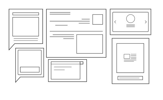
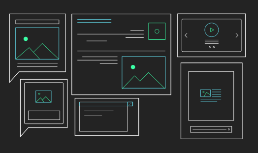
We wanted to use 2/3 images which would go on social media platforms as still images, these would be in different shapes to fit the social media platform, 2 video adverts and a gif.
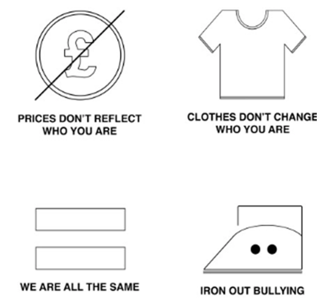
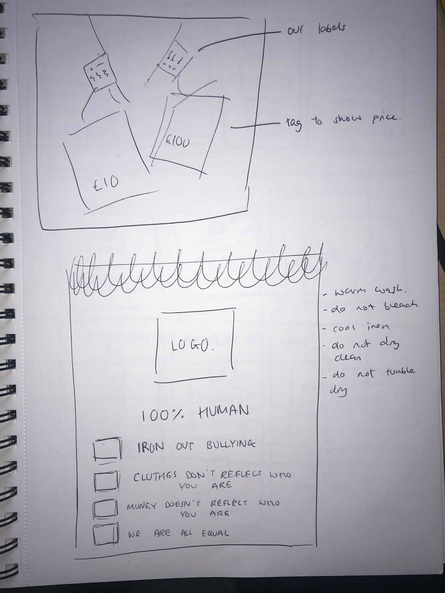
Digital images – we thought about how we wanted the image to make the viewers feel and decided instead of making the audience feel bad, we just wanted it to make them think, and realise that what they’re doing is wrong. Due to this, we wanted to make it clear on the image that it’s about clothing and thought the best way to do this was by making the image a clothing label, or a photograph of a label we have made stitched onto a piece of clothing. This then led us on to design simple symbols or icons similar to those that would be seen on a clothes label that would represent the main points of our campaign.
Videos – The ideas for our videos were both similar but were being produced by different people to get different outcomes. The idea behind both of them was to create videos which show 2 pieces of clothing side by side which look practically identical and show the audience that one is very expensive compared to the other which is very cheap. The videos would explain exactly what our campaign is about and would be easy to understand.
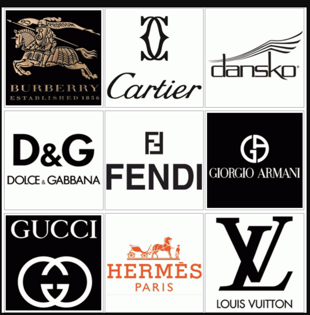
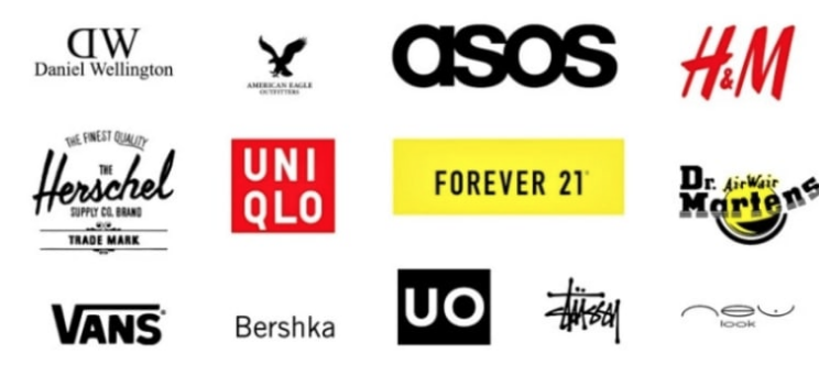
Before designing any posters or videos, we thought designing a logo would be the best way to start the process. I started off by looking at other clothing brand logos, ranging from designer brands such as gucci, Louis Vuitton etc which are very expensive to highstreet brands such as Asos, H&m etc which are much more affordable. the design elements in many of the logos are still very similar between the 2,for example the colours on them are very often just black and white. They are all relatively simple.
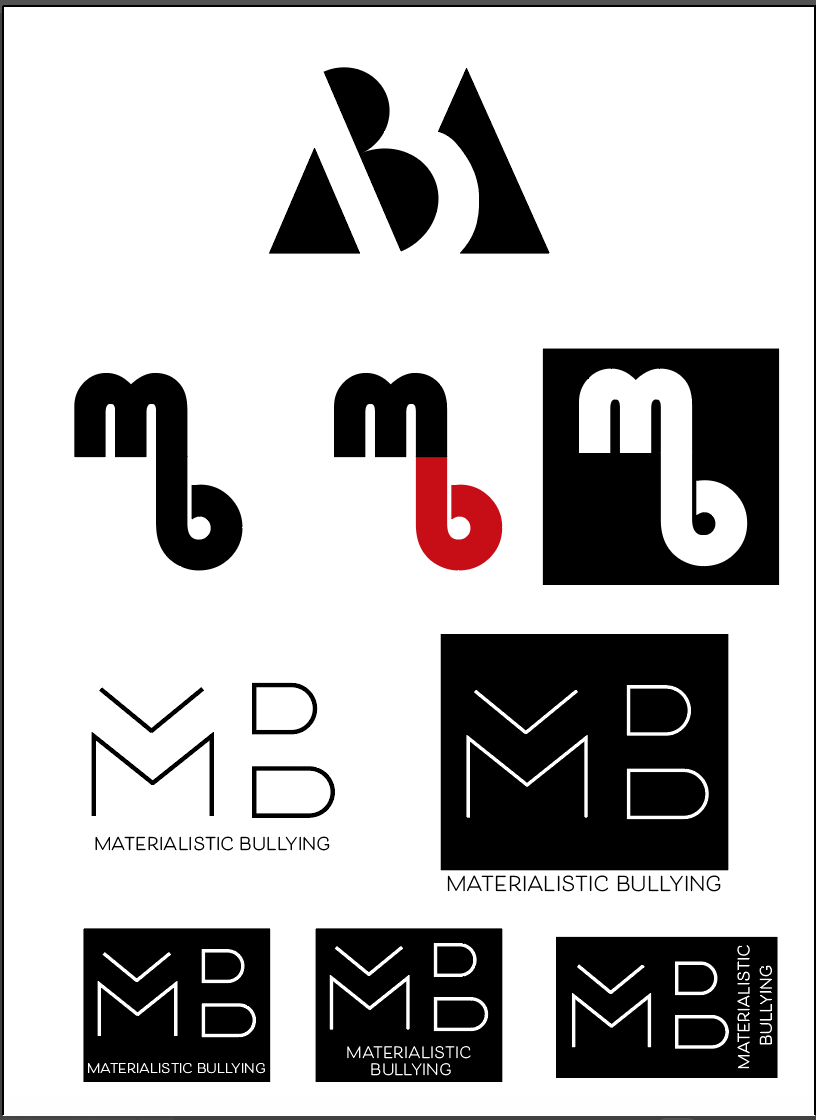
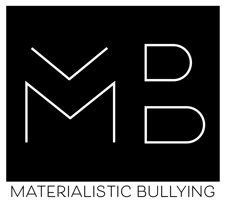
I designed some simple logos, keeping them all in black and white and adding a touch of red to one of them. I chose to keep the majority of them black and white to fit in with the colour scheme of our brand, and also because I think it looks much more modern. After showing everyone else in my group we decided the ‘MB’ on the logo at the top of the page was too hard to distinguish. We also decided the 3 ideas in the middle look much more like high street logos than the ideas at the bottom, and we thought our campaign would benefit more using the logo which looks much more like a designer brand, to give the idea that just because it looks expensive and designer, it’s the logo for an anti bullying campaign.
We then had to think about which one to use out of the 5 ideas. We initially ruled out the logo in the white as we though the black background can be seen in many of the designer logos such as Gucci and Giorgio Armani. We then ruled out the 3 variations at the bottom as we thought the black box being a rectangle doesn’t appeal to the eye as much as it does if it’s square.
After deciding on the logo, we also thought about a tagline or slogan and decided on ‘It’s Their Choice Not Yours’ as we thought it would be thought provoking for everyone involved in this type of bullying, and would make many people think more about things they say to people. We also looked back at our research and thought more about people dressing a certain way to fit in with their peers, and thought this tagline was a good way to make the ‘peers’ think twice before commenting on what others are wearing.
Following on from the last time we met we decided choose our theme, or what ideas we planned to make. After looking at our research, we decided one of the most promising ideas we could come up with was to design a ‘clothing brand’ and use it to create posters, videos and gifs. We wanted to use the platform of our ‘clothing brand’ to make it clear that it doesn’t matter if you can’t afford to wear designer clothes which cost much more money, because they are exactly the same as highstreet brands. We planned to use it as a slightly ironic way to make fashion style videos and posters which would reach our target audience and instead of selling them overpriced clothes, it would make them aware of the fact that clothes are the same no matter how much they cost.
We then decided the clothing brand needed a style, so we thought about how we wanted it to look, what colours, fonts etc. We decided we wanted our style to be quite contemporary, using lots of white for the backgrounds for all of our work, with all the text in black to keep the theme minimal and modern. We also decided to use slight touches of red in all our work to catch the eye of the audience and make them want to look at it and read more about it.
After deciding on our idea, I carried out some research into how much bullying really goes on over clothing, and I wanted to find out specifically how much it goes on in schools,and if it is taken seriously by teachers or people higher up within the school system. After discussions within my group, we spoke about how this type of bullying, from our experience, can tend to be seen as a joke, comments being made about the way someone dresses could be seen as comical by many people, even the person it’s directed towards, however others may find it much more hurtful.
In an article by The Guardian, which is titled “Teachers notice pupils are under pressure to buy certain brands and products to fit in with their peer groups”, teachers from schools were interviewed about bullying of this kind going on in schools. ‘Research from the teaching union, the Association of Teachers and Lecturers, says children are under heavy pressure to buy certain brands and products to fit in with their peer group.’ This backs up our point that whether many children realise it or not, even though they may not be getting bullied, they still feel the need to buy designer clothing to fit in with their peers. ‘Dr Mary Bousted, ATL general secretary said: “Bullying of this kind can be quite insidious, it can just be a look that a child is given, children feel under immense pressure to look right and having the key brands is part of that”.’ I think this in itself shows that teachers are noticing this issue going on, however the problem they are having is that it is extremely hard to protect students from commercial aspects, as many teachers are unable to bring about a change in how their students dress.
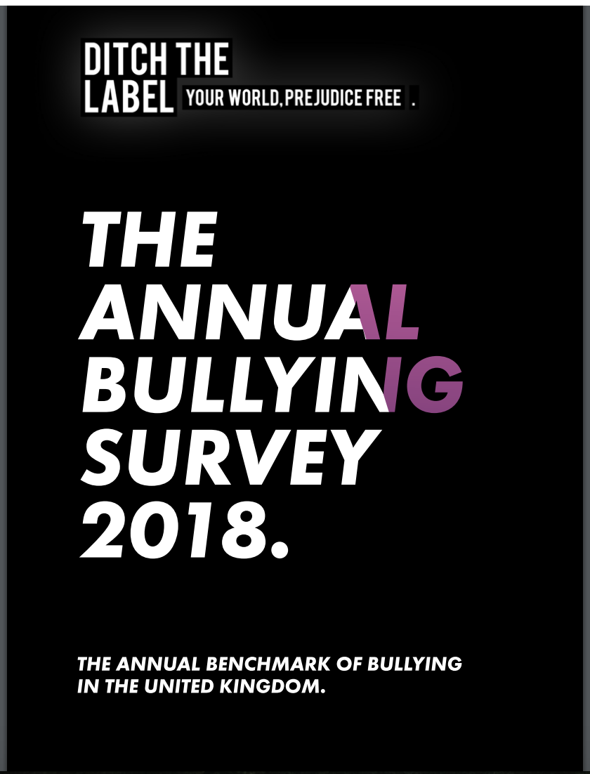
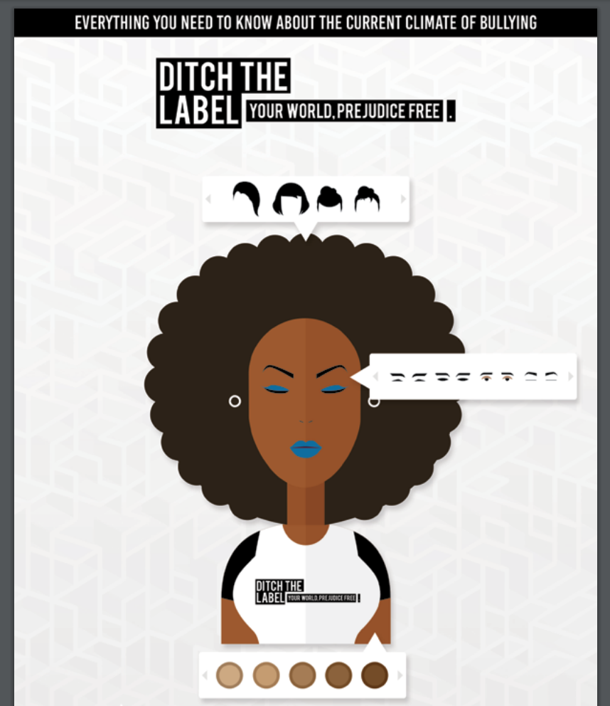
We also looked into a charity called ‘Ditch The Label’ who are an anti bullying charity who posted a bullying survey on their site. They found that 50% of young people have bullied another person, 30% of which do it at least once a week. They also concluded that appearance is cited as the number 1 aggressor of bullying, with 51% saying they were bullied because of attitudes towards how they look. We also looked at a few of their designs and how they tackled anti bullying campaigns.
These are both Front covers for their annual bullying surveys, although both of them are contemporary and have a modern feel to them, i don’t think they do enough to make it clear to the reader that the bullying going on is as serious as it is, and especially the example on the top in black, other than the words bullying in the title it doesn’t show any imagery which would make you think about bullying like the bottom one does.
This research backs up our ideas that it does go on in schools more than a lot of people realise, and even though it may come across as a joke, or people may not take it seriously enough to brand it as bullying, but the research shows that children and young adults are under immense pressure to fit in with friends by buying designer clothing. Teachers are at the forefront of this, seeing the children who this is happening to every day and I think if 85% of these teachers think “possession of fashionable goods is important to their pupils” then it is a much larger problem than a lot of people may realise.
After the research, me and my group concluded that our campaign shouldn’t be about banning designer good from schools but more about making people aware, whether it be young kids, young adults or parents, that more often than not, the difference between an expensive designer t shirt and a regular high street t shirt is very minimal, and that it doesn’t make you any different, just because you aren’t wearing designer clothing. We wanted to show that just because you may not be able to afford it, or simply don’t want to spend the money on it, it’s your choice what you wear and no one else’s.
After deliberating with my group about what campaigns to do, we looked at ideas such as mental health, bullying, hunting/poaching and pollution. Overall we decided that a bullying campaign was something we could relate to much more and a target audience of our age group was one we could go for, we also could think of a lot of different areas of bullying we could explore. After listing different ideas, we decided that bullying over the way someone dresses or the clothes people wear is something none of us had ever seen before, but was also something we had all seen or even been a part of multiple times. It’s an issue which goes on a lot, especially through years of education. The issue could be simply with what people chose to wear, but we thought the worst bullying takes place when people feel the need to spend a lot of money on designer clothing which more often than not, looks very similar to high street brands. This was the general idea of our campaign.
We thought the brand would be a way to show everyone, from people who wear all designer clothing to people who wear none, that it doesn’t matter what yuo wear, and that wearing a £200 t shirt instead of a £2 one doesn’t make you any better than anyone else.
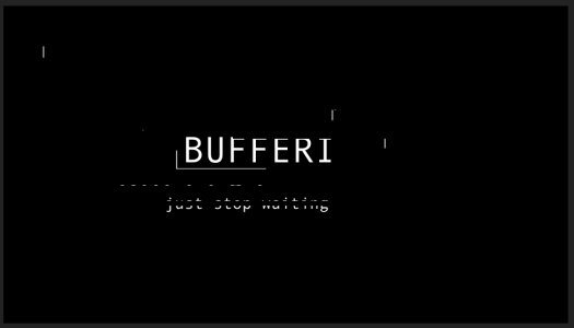
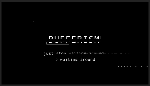
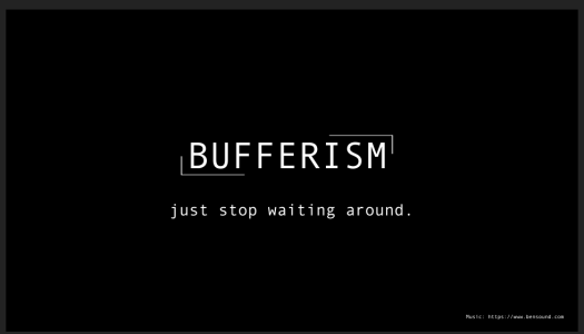
The final scene is simply telling the viewers what the movement or ‘ism’ is and giving a short description of what it is, i used ‘just stop waiting’ as I think its a short and snappy, simple way of describing the whole idea of Bufferism and the video.
I used a glitch effect by creating multiple masks of the layers above the text and using it to distort the original image. I think the glitch effect shows Bufferism itself is all about a computer and the way it freezes and glitches.
I also used a digital looking font which looks very computer generated, and had each letter being typed out like it would be on a computer.
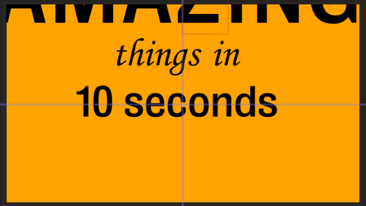
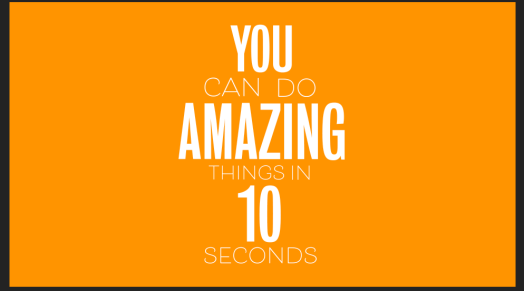
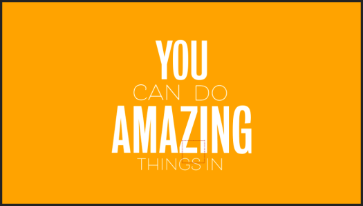
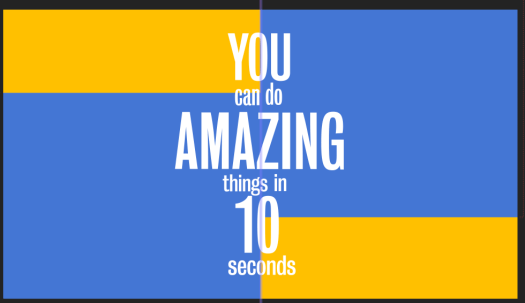
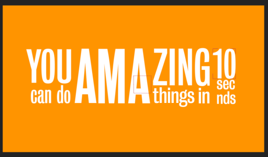
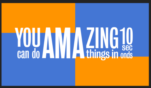
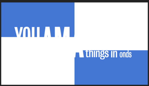
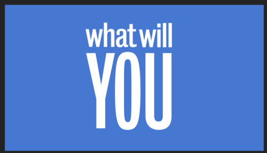
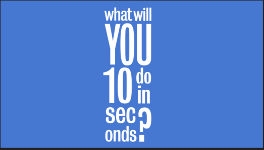
Finally I had to add two more scenes which both consist of just text. The first says ‘you can do amazing things in 10 seconds’ I have looked at lots of examples of kinetic typography where the camera follows the text as it’s typed on the page as I think it looks very playful and can be done with different effects and colours. The example shown above was a test to see how it works and looks with different layouts.
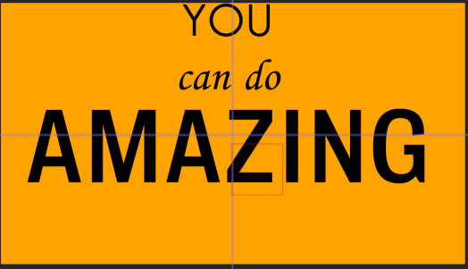
During our expressive type workshop with David previously, we heard phrases said in different accents and we had to write or draw the phrases in the way they are said, using different scales and fonts to create it. I used a similar idea for this, the words like ‘you’ and ‘amazing’ were said much louder and sharper than the rest of the phrase, so i’ve made them bigger and bolder. I used sans serif typefaces for both to keep it simple, just using different thicknesses.
I then tried to lay it out, using the voiceover to make each word appear as it’s said in the voiceover. I used the same idea of kinetic typography where it zooms in on each word as it’s said in the voiceover.
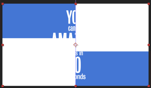
The next scene after this has an all white background, so I tried using blue and then white boxes moving across the page to transition between the two scenes. I think it works well to lead from the first scene into the second, however i don’t like the way the text is played out.
I changed the format of the words so it reflects how each word is said, for example the ‘AMA’ is much louder then ‘ZING’ and was the loudest work said so I’ve had it central and very large. ‘YOU’ and ’10’ were also said loudly so are in a thicker font and are much larger on the page, this meant the 3 most important words stand out the most. ‘can do’ and ‘things in’ were both said slightly quieter, hence why they’re smaller and ‘seconds’ was said very quickly after 10 almost in one motion, so I’ve added them directly below it.
Although at first glance is can be hard to read the words, because of the voiceover I don’t think it’s essential to be able to read it as it is said very clearly, the kinetic typography just gives a fun style to the typography.
I then used the same idea as I showed previously of the boxes to transition between scenes.
I then used the same idea to create another scene which says ‘what will you do in 10 seconds’. The ‘YOU’ is the loudest and sharpest word in the voiceover so I made it the largest word on the screen, and again similar to the last one ‘seconds’ is said very quickly after 10, so they are put together.
Although in the first scene I have transitioned it into the second, I haven’t done that in this one. Thats because the next scene on is the scene with the frozen computer, so I wanted a blunt transition between the two and I didn’t want it to be seamlessly transitioned.
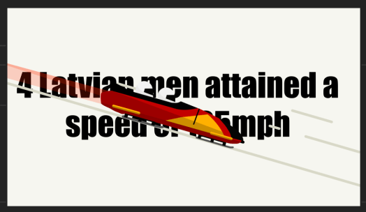
too much text, takes away from the look of the animation
can’t see the animation moving behind
text too hard to read, will be especially hard when the numbers come on
good idea, but only works with this animation as some of the others have no where to add them on the screen
Using the bobsleigh animation for to test it out, I added the text onto the animation in multiple different ways, layering it over the top, underneath and side by side, but overall i don’t think any of them are effective enough, each of them have their downsides and i don’t like the way ay of them look.
My next idea was for each animation, to have 5 seconds of text and 5 seconds of animation for each. Each body of text would pop up on the screen to give the information and then the animation would transition in after the 5 seconds. This was more effective than the previous idea of having text and animations on the same screen, however the whole idea of my video is to have a series of animations to show what you can do in 10 seconds, so I think the animations themselves need to last 10 seconds each.
This led me to thinking about using a voiceover, which meant I wouldn’t have to add any text on the page, the viewer could just listen to the voiceover instead, this means nothing would be in the way of the animations and the video as a whole will look much cleaner.
I added a voiceover to each animation which lasted about 7/8 seconds each so it was a second or 2 inside the animation on either side. I mad sure the voiceover was upbeat and very over the top to fit in with the rest of the animation.
After doing the voiceover I watched the whole thing through and even with the voiceover it still sounded relatively dull and did not match the style of the animations, i think partly because the sound effects added to it make it seem too serious. Due to this I looked online for a soundtrack to add to the background instead of using sound effects, I looked for an up beat, happy song which I could add to the background behind the voiceover. I found a site called ‘bensound.com’ which is a site that you can download soundtracks from. I found one called ‘buddy’ which I think fits my animation perfectly.
Before adde text I did some more research into each of my animation ideas to find out exactly how far and how fast each of them could move in 5 seconds. I decided to show how far in meters or miles each could go, to show the speed and shock or ‘wow’ the audience.
Bobsleigh
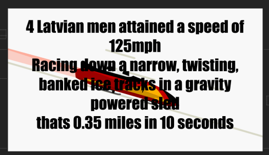
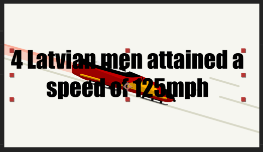
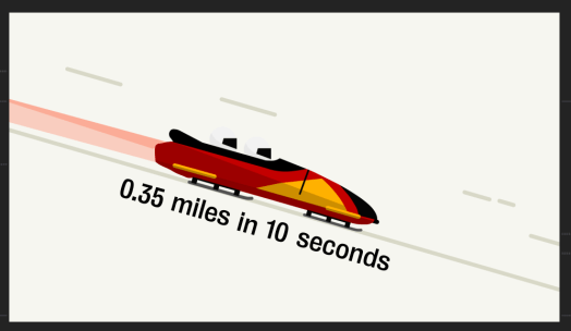
Bobsleighs can attain speeds of 150 km/h (93 mph), with the reported world record being 201 km/h (125 mph). 125/60=2.08 2.08/6=0.35 miles in 10 seconds, The world record for the highest speed ever recorded for a bobsleigh in a legitimate competition was made by the 4 men Latvian bobsleigh team at the Bob & Skeleton World Cup, the bobsleigh reached a speed of 153 km/h (95,06 m/h).
Racing down a narrow, twisting, ice tracks 4 Latvian men attained a speed of 125mph thats 0.35 miles in 10 seconds
Skydive
The highest speed ever reached in a speed skydiving competition is 601.26 km/h (373.6 mph) by Henrik Raimer (Sweden) in the FAI World Championships in Chicago, Illinois, USA. 373/60=6.22 6.22/6=1.01 miles in 10 seconds
jumping from 18,000 feet Henrik Raimer reached a speed of 373mph thats 1 mile every 10 seconds
Rocket
Apollo 10. On their way back from a lap around the Moon in 1969, the astronauts’ capsule hit a peak of 24,790mph. 24,790/60=413.15 413.15/6=68.9 miles in 10 seconds
on the way back from the moon the Apollo 10 spacecraft hit a peak of 24,790mph thats 68.9 miles in 10 seconds
Swimming
The fastest speed reached by a human in swimming is 2.29 m/s. This record was set by Tom Jager in a 50 meter race, on March 24, 1990 2.29×10=22.9meters in 10 seconds
in a 50 meter race Tom Jager swam at 2.29m/s using only shear strength and skill thats 22.9 meters in 10 seconds
Cycling
On land, the speed record is 133.28 km/h (82.82 mph), set by the Canadian Sam Whittingham riding the Varna Tempest, a streamliner recumbent bicycle in 2009. at Battle Mountain, Nevada. 82.82mph=37m/s 37m/sx10=370m in 10 seconds
Sam Whittingham registered a speed of 82.82mph using only the power of his legs and a bicycle thats 310 meters in 10 seconds
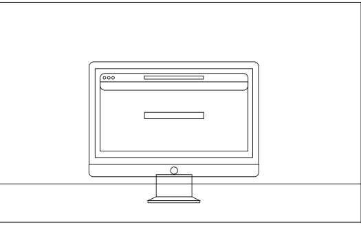
Originally i had the idea to create and animation of a computer by having different pop ups on the screen moving round, eventually freezing and causing a loading icon to pop up on the screen. I created it using white boxes with coloured elements on a black background and think it works well to show pop ups or tabs on a computer, however I felt that it didn’t fit overly well with the theme, and it looks too interesting, whereas i want the last scene to contain only a boring computer screen and the loading icon, to show how boring waiting is in comparison to my other animations.
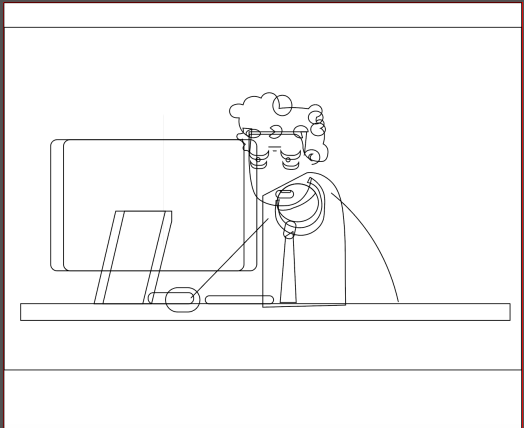
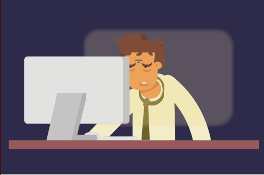
I decided instead to have a scene where a man is sat at his computer, looking tired with the over exaggerated bags under his eyes and the stress lines between his forehead. I added subtle movements like his hair moving slightly, as well as the eyes closing slowly with the bags under his eyes to show the tiredness, and the stress lines extend as the eyes close. I also added his mouth opening and closing.
To show the light on his computer I added a slightly transparent box to show the light from the computer, and i added an effect to it to make it flicker slightly at the beginning of the animation, but with about 3 seconds left it stops flickering to show things are no longer moving on the screen as it’s frozen. After this, the camera will pan round and his view on the computer will be shown.
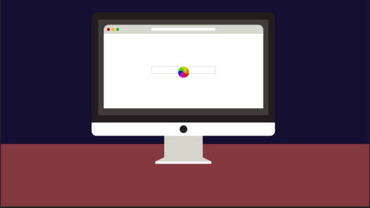
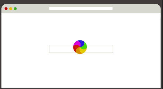
I designed the computer using the same background and desk colour as the previous animation to keep it the same. I added a simple website or search engine design to the computer as that page is something which is recognisable to everyone.
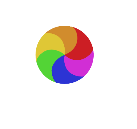
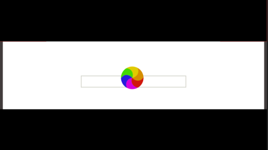
I created my own simple loading icon using block colours and added this to after effects along with my illustrations.
As the camera pans round to the computer screen the icon is already spinning which shows the computer is loading or buffering. The view of the computer pans into the screen so only the webpage can be seen and the loading icon spins alone on the page for 10 seconds. Although this makes the final animation very boring, it shows the contrast well between the moving illustrations and an empty computer screen. The 10 seconds goes very slowly for this animation whereas the others goes very quickly, which proves the point of my movement that you shouldn’t just sit waiting around for your computer to load.
Finally it ends with the computer shutting down and the screen turning black, which transitions into the last clip of the title of the movement.