Movement – Bufferism

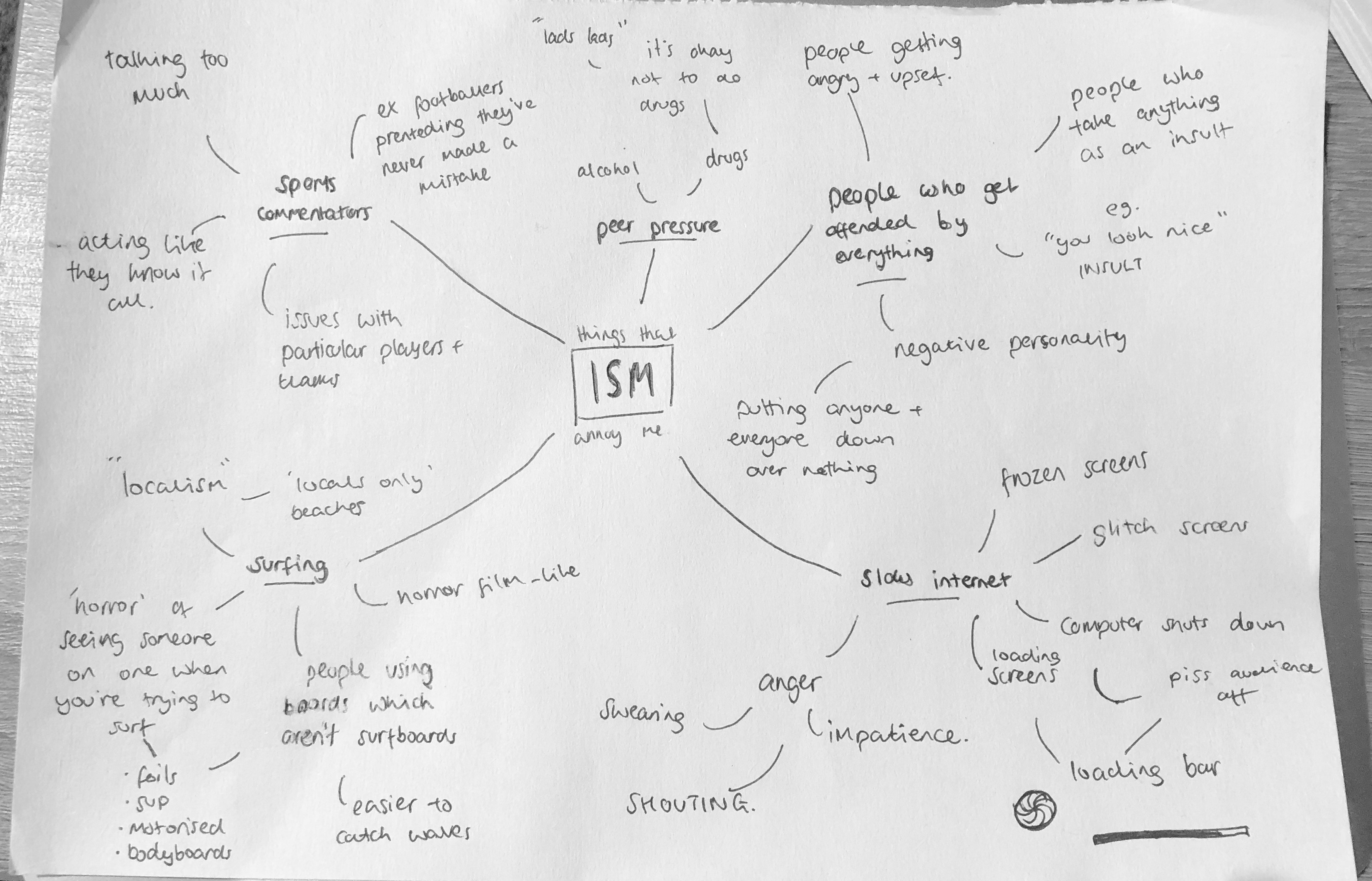
Overall out of the ideas I thought of I decided slow internet was an idea which is very relatable to a lot of people, and has a lot of visual signs such as the loading icons which will be recognisable. There is also lots of different roads I could go down into different aspects of slow internets.

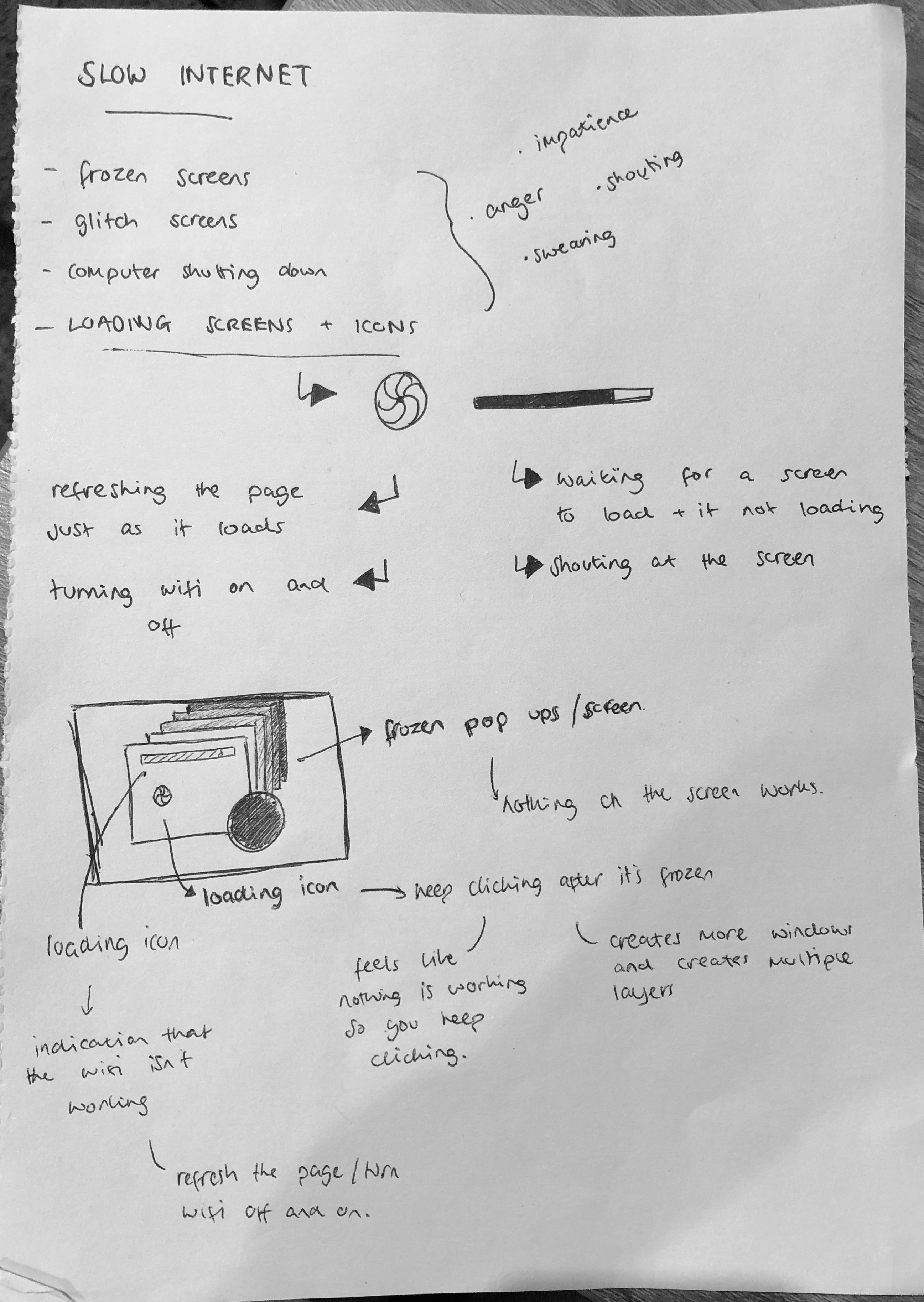
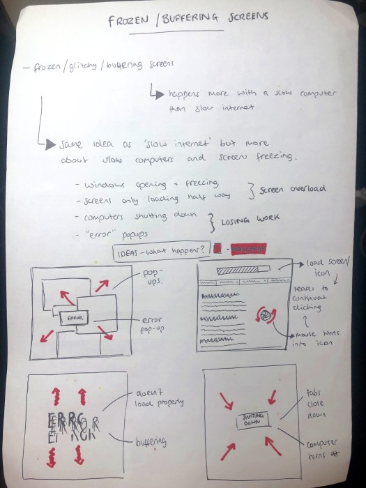
After looking into the idea of slow internet, I looked and thought more into the idea of frozen and buffering screens, as well as the loading icons and decided these aspects happen more with slow computers than slow internet, for example screens freezing or buffering because of slow or old computers, or having too many programs open in the background. I decided to call the movement ‘BUFFERISM’ which is a movement against screens buffering or freezing, and more specifically encouraging people not to just sit around and wait for their screen to unfreeze. After deciding the name and the general idea, I thought about the main visual language and the things I thought about when i think about Bufferism. 

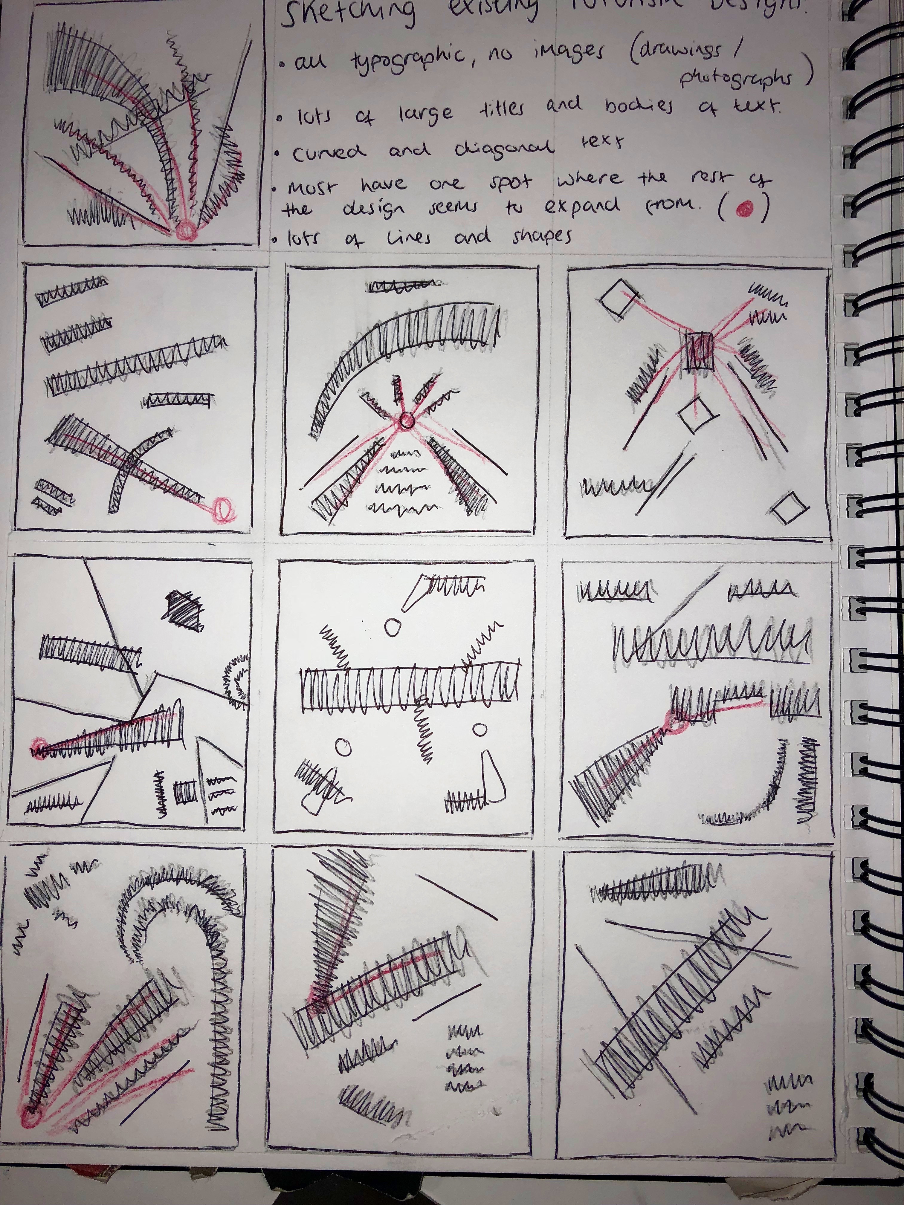
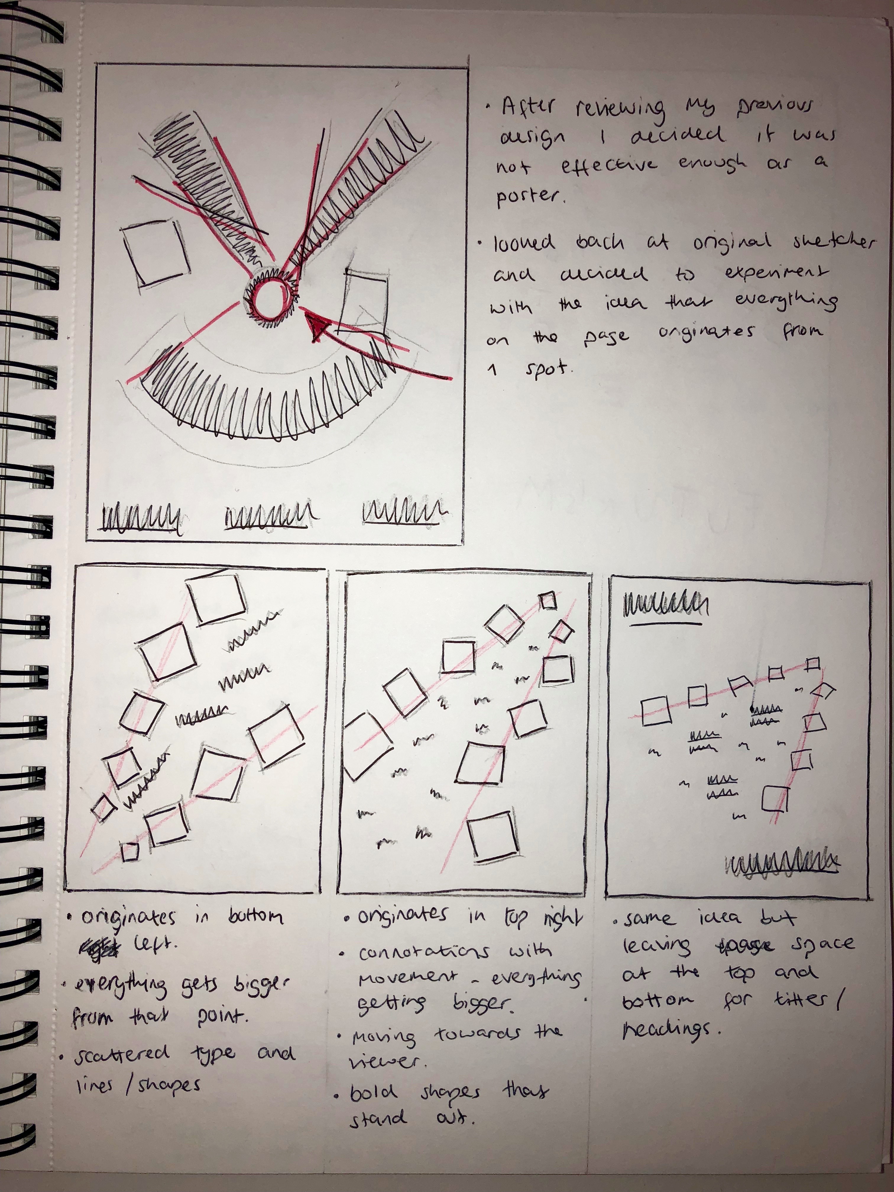
I thought about windows opening and freezing and screens loading half way and freezing, which could lead to the screen or computer overloading. I also thought about computers shutting down or error pop ups as extreme examples. I sketched them out and sketched in red the movement which occurs, such as th popups getting bigger or smaller, and the loading icon or ‘spinning wheel of death’ spinning and thought these could be vital ideas of how I could show the movement.

Movement – Idea Generation

For my initial ideas and idea generation I used a mind map to come up with ideas and the first things I thought about were ‘things that annoy me’.

As shown in the mindmap, I wasn’t short of things that annoyed me so had plenty of ideas. I wrote down some examples and pulled out those which I felt had the most ideas behind them, such as surfing, slow internet and peer pressure.

IMG_0894

I started off looking into surfing or ‘Surfism’. This was the idea that within surfing, new technologies are being made which make the sport easier. It would be a movement against the new technologies such as SUP’s, foils, motorised surfboards etc which make it harder for people who have surfed all their lives to find waves. I thought about how surfers feel when they see someone paddling out into the lineup on one of these boards and the best word I could think of to describe it was horror.

I then looked into the idea of peer pressure in relation to drugs and alcohol, and specifically some of the people who might try to pressure you into it. I thought of my own experiences in uni and beforehand and thought about the idea of ‘lads’ who try to push people into doing things, or egg each other on through being rowdy and loud to act ‘cool’.

IMG_0895

I thought about one of the things that annoyed and angers me the most and decided slow internet was up there with the most annoying. I thought about different aspects of slow internet which were most annoying such as the loading icons or frozen screens for more severe cases. I also thought about the different feelings associated with slow internet and thought of anger, impatience and lots of shouting and swearing.


Movement – Research

Before starting the project I did some research into existing adverts which were already out, to start with i looked at Instagram adverts to analyse. My first observation was that they only last between 15-20 seconds so are relatively short and to the point.

The first video i came across was this advert for a pair Reebok trainers branded as being retro, classic Reeboks. The colour or filter of the video along with the typeface gives a retro feel which links directly to the shoes. The advert is vey straight to the point in showing the shoe in an old or ‘classic’ style. The shoe is in almost every frame of the video and is the forefront of the advert, again showing its straight to the point in showing what its selling. The last frame of the video is a simple white background, making the Reebok logo stand out to the eye and gives a sense of hierarchy as the red text is the first thing you see when viewing it.

The next advert I came across was for YouTube music, showing off the new music and music videos which have been added. Similar to the Reebok ad, this one is straight to the point in telling you who’s music it is and what video it is playing, either showcasing the video in the background or an image of the artist/band. The typography is effective in showing the text looking as if it’s been typed just like someone had searched it, this could show the viewer how easy it would be to search within YouTube, or make the video more personal as its being typed onto the page. I also noticed repetition was used, ‘is here’ stays in it’s place for the entirety of the video and is used well to remind the viewer many times what the advert is for and specifically what it’s advertising.

After looking into these adverts, I intend to take influence from the way they draw your eye to make you watch it to make my own work using similar methods.

RDH – Poster development

Leading on from the previous design, I added some of the images I generated from my last poster design and added a few a them to this one. I changed the opacity so they wouldn’t interfere and get confusing with the rest of the text. I also added the text to it. I used a grid system to place the text in columns to ensure they fit in with the rest of the design and don’t look out of place. I think it all works well but more elements need to be added to make it more reminiscent of Futurism, such as more letters in between the text and heading, as well as more images.

Screen Shot 2018-10-16 at 16.52.46

I added more of the images from my original design to make it look more like a collage and less structured to fit with the Futurism era. I think they work well to add a background and fill the space more so the general idea of Futurism is easier to understand when looking at it. I then added more letters in and around the text, with the letters getting bigger, looking like they’re moving from one side of the poster to the other. This makes the design look slightly more chaotic and could show noise within the piece.

Screen Shot 2018-10-18 at 14.08.58

I then took my design and started to add the finer details and add some colour. I used red  because it’s a colour used widely in the Futurism movement. It also makes the central design pop out of the page and draws the eye using hierarchy. I then used red lines over the top to point the viewer in the direction of the design. I placed them diagonally to create a sense of asymmetry and movement.

I then chose where i wanted to place my shapes and lines based on the way they sit within the design. I chose the thin red lines so they don’t take attention away from the text, and as they add an asymmetric feel to the design using diagonal lines. I used red squares to create hierarchy and draw the eye to the header as well as to create more overlaps within the work.

I experimented with changing the colours, using orange, red and blue. I think all of the outcomes look effective, however I think the bright and bold colours take away from the futurism design and draws more attention towards the colour and away from the typography.

This slideshow requires JavaScript.

I used all the experiments I have carried out and added all the most effective parts to my final piece. As a whole, I used a sense of movement to influence my piece, with the main part of my design starting smaller and growing larger from there, as well as using diagonal lines to create asymmetry, and curved  lines to create a sense of speed and motion. As a whole I wanted to create a sense of Futurism in the centre art of the design, but still keep the modern and contemporary feel through in the top and bottom, using the negative space to create contract between the top, bottom and middle.

Screen Shot 2018-10-22 at 10.58.48


RDH – New Poster Design

Using sketches as influence, I drew a rough sketch of the design I was looking to create and added in the text so i knew where each letter would fit on the page and how it would look.

img_0784.jpg

I then used adobe illustrator to generate each word using different typefaces for each letter. I placed each letter in similar places to my sketch . ‘Futurism’ is the main header at the bottom of the page and I left the general design of the word relatively untouched so it’s still easy to read and understand. I then used more of a futurist style for the quote “the beauty of speed and motion”. This makes it harder to read and understands but is starting to give a feel of what Futurism is and what it looks like. I also started to add a few small letters around the main design in the middle around ‘and’ to fill the space and make it look more like a Futurism design. It makes the design much more unstructured and asymmetric.

Screen Shot 2018-10-16 at 16.23.54


RDH – New Poster Drafts

After deciding to redesign my poster I looked back at my original sketches of existing Futurism designs to take influence from features within them. As shown in red, one of the most prominent features I noticed was that all of the designs have one area of the design which the rest of it seems to originate and enlarge from. It creates a sense of movement from that point. Lots of the shapes made by the text are large and take up most of the space, with smaller bits of text sitting behind in the background. This creates a good sense of hierarchy and a good balance between the main headings and the text.

IMG_0783

I sketched a few ideas in my sketchbook, using the idea of the design originating in the corner of the page and expanding from that point. I think the idea of it starting in the top right and getting larger from there works as it feels like its moving towards the viewer and almost seems 3D, so it gives a good sense of movement. It also has bold shapes and text around the main focus so the feeling of enlargement and movement is emphasised. Furthermore, I then added headings on the top left and bottom right of the page with negative space, surrounding it, this gives a good balance between the Futurism design and the more modern part of the design.

IMG_0779

RDH – Poster Critique 2

After deciding not to use my original design for my poster, i decided to move the elements around to create 2 other variations. I printed them out on A3 to get a sense of what they would look like printed. I found the same problem with both as i did for the original, they don’t look bold enough for a poster. Neither of the designs have a sense of hierarchy within them and are both too structured, with the text on one side and the image on the other. The design needs to be more chaotic and unstructured. I also need to take more influence from Futurism as the image of Futurism within the designs do not describe it well enough.

RDH – Poster 1 Critique

After adding more to the corners of the design I printed it out on A3 to look at it on paper not on a screen. Although the overall design is strong, the centre of the design shows a modern take on Futurism using negative space and structure, and the surrounding areas give a good essence of Futurism, I don’t think the design works well as a poster. It looks too much like a spread in a book or a magazine as nothing instantly pops off the page when you look at it. There is no bold shapes within it which draw the eye and it doesn’t show enough movement or speed which is what Futurism is all about. It also doesn’t show a lot of movement or speed which are two of the main features of Futurism design. It doesn’t contain any twirls or coils which have connotations with movement, it also shows not difference in scale which shows movement as well as objects expanding.

Overall I don’t think the design is effective enough and i think something which more bold shapes and more aspects of Futurism is needed.

Screen Shot 2018-10-22 at 23.05.43

RDH – Poster design

I added my title to the centre of the page so the eye would be immediately drawn to it. I then used adobe illustrator to design several images using typography. I tried to make shapes with the type, making circles and swirls to create the feeling of movement and speed within the images.

Screen Shot 2018-10-22 at 19.55.48

I layered these on top of each other like a collage, along with letters of different fonts and sizes, to add around the edge of my poster. This created negative space in the centre of the page which I feel kept a modern style to the poster, but also contains the Futurism aspects around the title. I also added red details within the image to create contrast and make it more visible for the viewer to see. This creates a good path for the eye as its the second thing the viewer will look at after the poster.

I then added the text around the main title, I didn’t want them to be too close to the images around the edges to ensure the text is still easy to read. I also tilted them on diagonals to keep with the Futurist, asymmetric feel and make it feel less structure, as horizontal text would be too symmetrical and wouldn’t fit with the style of Futurism.


RDH – Title Design

To create the title for the poster of my design, I cut out various letterforms from a magazine and put them together to spell out “The Beauty of Speed and Motion” which is one of Filippo Tommaso Marinetti’s quotes from ‘The Foundation and Manifesto if Futurism’. I kept the text scattered to depict noise and used no baseline or straight lines within the title to keep it asymmetric and non structures.

IMG_0778

To make the main title of the poster I used a variety of different fonts in upper and lower case, all varying in thickness and size. I took individual letters, some serif and some sans serif and put them together to make each word of the title in a Futurist style.

Screen Shot 2018-10-12 at 17.18.47

I carried out the same process with each of the words to spell ‘The Beauty of Speed and Motion.’ I wanted to give an element of futurism to the words but wanted it to still be clear what the quote was trying to say, so left all the letterforms relatively in line with each other. I put all the words at an angle to try and give an asymmetric feel, and used a mixture of red and black to give it contrast and make it stand out.

Screen Shot 2018-10-14 at 14.04.01


Design a site like this with WordPress.com
Get started