Design For Real Life – Web Design

The website again takes all the information and visuals you’ve seen on everything so far and puts it all in one place. So there’s a page for the guidelines, a page for the background and science, and a page which is all about sphere. This is the guidelines page which describes the guidelines and what they are, as well as outlining them as you can see on the right with the 10 of the guidelines which are based on aims.

I created some possible examples of how the website could look, making use of the visual identity.

A place where all the guidelines, background and research behing the guidelines, and anything about the campaign itslef can be viewed digitally , with links to socials and all of the partners involved in the Sphere project.

Final Design

Design For Real Life – Booklet and Leaflet

Booklet

I then moved on and made a booklet and leaflet which can both be given to the professionals which runs through the guidelines and all the accompanying information. It was important that both the booklet and leaflet needed to be clear and concise, conveying all the relevant information to the viewer, using the same visual identity that has been used thus far.

I split the guidelines into 3 parts, timings, aims and environment with one section on each page on each page of the booklet, just to split up the amount of information on each page so it isn’t too much. The guidelines also have the icons next to them, so it could really be used as a key as well, if they see the icons on the social media or on a poster they know what guideline it’s aimed at.

I also wanted to implement some information design into it, other than the icons. There wasn’t too many facts and figures to be communicated, so any information design came in the form of data visualisation, using the visual language to present information to the viewer in an interesting way.

Much of the typography, especially for the headings for eat section of the guidelines were put into certain shapes to give them a sense of movement, to go along with the idea of physical activity.

Final Design

A booklet to be given to anyone looking to implement the gudielines. Using the visual language, colour scheme, typographic features etc, it gives a sense of the overall project. With descriptions of the metaphor and how the guidelines can help someone, as well as the guidelines themselves, split into 3 sections, timings, aims and enrionment. The booklet also contains some data visualisation of some of the statistic around how many people suffer with mental health disorders accross Europe.

Leaflet

Similar to the booklet, a 5 fold leaflet which gives all immediate information on one document. The guidelines, facts about psychiatric disorders and the visual style.

Again, everything relevant within the booklet such as the guidelines, some background information, and the visual language is all within the leaflet just in a much more condensed way.

Final Design

Design For Real Life – Posters

I started designing some banners making use of the visual identity to get a sense of how they could be used to explain the metaphor and why the guidelines can help, followed by some more promotional examples. I looked at how the colour palette and the different typefaces could be used and which is more effective in terms of communicating the message.

I think using both the yellow and grey both work interchangeably and could be useful to ensure a good pace within the project, however I think the typeface Le Murmure should be used for the main messages on banners and posters, its much more playful and eye-catching.

Overall the designs showed a clear sense of progression from earlier posters and showed how the visual identity can be applied to different touchpoint within the campaign, but I don’t think any of the posters currently show enough of the information needing to be communicated to the audience.

I discussed in an earlier feedback session that using a billboard or poster series might be a better way of creating print media. It allows me to get more information onto one billboard or poster series instead of just a single poster with one piece of information.

The most important part for me was to ensure there was some sort of text to describe what the point of the guidelines was, alongside a visual representation of this.

Final Design 1

I think it was important to tell the story of the campaign, this is how it may feel to have a mental health disorder, and this is how the guidelines can help, so they can help you take control through the use of physical activity. It explains the metaphor but also gives the target audience a sense of what they’re doing and the good it can do. Again I used the balls with lots on one side and only one on the other to demonstrate the idea of taking control.

I used the visual style of the project, alongside bold photography of sports courts and pitches which stand out and contrast nicely with the colour scheme. The client made it clear that they didn’t want images of professional athletes in it, so I thought using images which allude to sport and activity works well and creates some strong visuals.

Final Design 2

Following on from the previous poster series which looks at the reasoning for the guidelines and how they can help, I wanted to demonstrate the guidelines themselves, and talk about them individually and what the stand for. It’s a strong way to get the guideline icons and descriptions across the the audience and give them a sense of what the Sphere guidelines really stand for. 

I made icons for each of the guidelines because I think as you can see on this mockup, the guidelines can work well by themselves with a key or the description underneath, it stops everything being too overwhelmed with information. It could also be just all the icons and their accompanying guidelines underneath as a poster or infographic, but this gives the sense of how these icons can work.

Design For Real Life – Iconography

From much of my research into information design, as well as research into contemporary design, it became apparent that many campaigns use iconography as their information design systems in order to process a lot of information at once without overwhelming the viewer with too much text.

The usage of image like icons increases engagement to 94% compared to text alone whilst improve retention by 42% and allows humans to process information 60% faster. These icons will allow users to grasp the information and hopefully increase how much they retain.

It was clear from the offset that information design was needed within the campaign due to the amount of information needing to be conveyed, however the guidelines aren’t saturated with facts and figures, therefor it would be hard to design any sort of infographic using numbers and statistics. Instead, I went down the route of using iconography to narrate the guidelines.

The guidelines are all fairly wordy, so fitting them all into a single set of icons makes it much easier not only to fit them all onto a single page, but also to retain the information and undertsand it. The icons will allow the users to grasp the information being given to them easier than readin a full page of 19 guidelines. 

Although all the icons and guidelines can be added onto a single page to give all the information, sometimes the icons could be used by themselves on posters or any other media, with the page above as a key.

Design For Real Life – Visual Identity

As I said before, the idea stemmed from my research, I was looking into mental health disorders and background research into it, and in particular I was looking at how some people might feel when they have a mental health disorder and the way they describe it. I found a variety of different descriptions all relating to this feeling of feeling slightly overwhelmed. I also spoke to a few friends who I know have been through some things in the past or are still going through things now, and one of them really stood out to me. He said “it feels like I have 1,000,000 balls bouncing around in my head” and sometimes I can’t even think or feel. He said he wishes that he could grab them and stop them and take control of it.

First off I just wanted to use this metaphor of the balls bouncing and the feeling of being overwhelmed, but the more I though about the feedback from the previous design, I wanted to add a tagline which worked alongside that idea and looked to explain it.

Take Control

Whilst describing to me the feelings inside his head, the idea of ‘taking control’ of it was something he expressed, and to me this was the perfect description of what the guidelines were there to do, to help anyone suffering with a psychiatric disorder to take control of it.

First off, I think the campaign needed some sort of logo or marque, something which identifies it as being part of the project, to go alongside ‘Take Control’ and whilst the ideas of the balls was obviously in my head from the start, having a marque which is based around that concept might be too much with the rest of the visual language also being all about that.

I looked back on some of my research, as well as ideation and the idea of using icons came up a lot, and the idea of using an icon for the guidelines was also mentioned, so I thought using a shape with 19 points to represent each of the guidelines would be something very simple which could work for that.

Whilst describing to me the feelings inside his head, the idea of ‘taking control’ of it was something he expressed, and to me this was the perfect description of what the guidelines were there to do, to help anyone suffering with a psychiatric disorder to take control of it.

I also discussed that I don’t think using too many colours works, that paired with photography and a lot of information is a bit much, I wanted to focus more on a single colour alongside black and white. I looked at a few different colours which are all bright and stand out enough, but not too in your face.

Yellow was the one which stood out to me the most overall, although very cliche it is a very warm colour and alludes to mental health and similar themes quite nicely so I think it works well.

I also looked at a few type variations. I wanted to keep the typeface on the left, right grotesk as a base typeface, to use for text and some headings as its more functional in terms of legibility. Its a bold typeface but also feels very approachable which is something which is important for this brief. However, I wanted another typeface alongside it, one which could take the reigns in terms of using it for the main slogan, or main headings. ‘Misto’ in the middle and ‘Le Murmure’ on the right, both beautiful, bold typeface which are both very playful in their design, however I think the design of Le Murmure (right) seems to flow from letter to letter and to me it suggests movement through its expressive features.

The Visual Identity

The star shapes correlate with the guidelines themselves and summarise them in a visual, iconography sense. Each line within the star represents a guideline, a way of incorporating the guidelines into every piece of design within the campaign, so that they remain the forefront of what is being communicated. 

The colour is bold and striking but also quite soft in its appeal, it implies warmth and works within the mental health field. Its also suggestive of sport campaigns, using the single bright colour. I think the yellow itself alongside photography has enough connotations with happiness and pleasure to allude to mental health. It’s bold and stand out, but not too much.

The typefaces are very bold and striking, without being overwhelming and too in your face. They are both legible and easy to read/understand. Le Murmure is a typeface which makes use of flowy features which create a rythm within words which seem to glide from letter to letter. It’s rhythm, to me, alludes to movement and activity and therefor alongside being a stand-out and bold typeface to draw in the reader, it also has connotations with sport and physical activity through its movement-like structure.

The balls bouncing, as stated previously, was an integral part of the visual identity when it came to describing the metaphor and story of the campaign, as well as describing how the guidelines can help someone suffering with a mental health disorder. The balls symbolise the chaos and overwhelming thoughts which could be present in someones head. 

Potential Outcomes

Posters/Banners

Poster Series

Booklet

Leaflet

Website

Social Media

Design For Real Life – Concept Development

After creating 3 different concepts, it was clear the strongest was the first, using metaphor to illustrate and create the visual language for the design. I wanted to follow on from the idea of the balls being overwhelming, however I didn’t think the initial design was working to deliver the message I wanted to put across.

  • It needed much more of an overwhelming feel than the initial concept idea – more balls? or bigger balls?
  • Maybe experimentation with some different colours, some softer colours steering clear of the neon, might be more aimed at the mental health target.
  • How might work across different media, poster, booklets etc.
Posters

Looking at the general visual language, colours, styles, how the typography might work on the page, how the balls will interact with the page and inform the design.

  • Black definitely doesn’t work, far too dark for both mental health and sport design.
  • The balls on the second poster which are more random works much better, it has a better sense of movement and motion and is much less uniform, the size of the balls also works better and feels more ‘overwhelming’.
  • Split posters work well, I like the colours, particularly yellow, but I think too many colours starts to look too soft and ‘nice’ and takes some of the focus away from the sport. As I found out in my research using only one colour is often the way in sports branding and maybe that might work?
  • Still needs more of a ‘story’ (this is how someone with a mental health disorder might feel, this is how the guidelines might help)
Billboard

I wanted to see how the visuals developed in the posters could be used in some different ways, creating more simple visuals to convey information. I also looked at the addition of photography alongside strong graphic visuals.

  • Like the idea of the smaller squares, allows more information to be conveyed, could be useful when it comes to communicating the guidelines? Doing a poster series/billboard instead of individual posters.
  • Photography works well but there might be too many colours going on with the photography, again thinking about toning it down to just one or two colours to keep it more simple and not overcomplicate it.
  • Again, still needs more of a ‘story’.
Booklet

How might the guidelines be put across within a booklet in this certain style, taking the same designs from the posters and adding it to a booklet, with a smaller foldout page inside containing the guidelines or information.

  • Only a first, simple draft but I just think it’s boring. There needs to be more on the pages themselves but I’m worried that adding too much information with pages which are already quite loud with visual language and colours won’t work.
  • Fold out page doesn’t work and isn’t an interesting enough way of conveying the information of the guidelines, maybe making use of the numbers more might work? Or looking further down the route of icons.

Feedback and Take Aways

It’s strong progress from the initial idea and I definitely think the sense of being overwhelmed and taken over is stronger in this development than it was in the first draft, but I still think there’s a long way to go in terms of visual language itself.

  • Feedback was that they agreed that a more simple colour pallet of maybe just white black and a bright colour could work, I suggested yellow or red or something along those lines and they agreed.
  • Agreed that it needs a stronger sense of a story, like I said, about what the problem is and how the guidelines can help.
  • Needs a stronger sense of the guidelines, so more of the posters need to contain information about the guidelines. The star from my 3rd concept springs to mind, its a way to get the guidelines more involved in all of the designs.
  • Needs more information design, or just more interesting data visualisation. Within the brief there isn’t a whole lot of facts and figures, its mostly longer statements, like the guidelines themselves, so finding a way to visualise these using the style will be important. Again maybe the use of icons will really help.

Design For Real Life – Three Strong Concepts

Before starting to create the final visual language and decide on exact colours, typefaces, specific visuals etc I created 3 possible concepts to be discussed during our lecture with Paul. All of them were purely conceptual and I knew the visuals were going to be developed from the starting point, but I wanted to get initial ideas onto paper to give them initial visuals and in order to get feedback from Paul and the rest of my group.

Concept 1

The idea stemmed from my research, I was looking into mental health disorders and background research into it, and in particular I was looking at how some people might feel when they have a mental health disorder and the way they describe it. I found a variety of different descriptions all relating to this feeling of feeling slightly overwhelmed. I also spoke to a few friends who I know have been through some things in the past or are still going through things now, and one of them really stood out to me. He said “it feels like I have 1,000,000 balls bouncing around in my head” and sometimes I can’t even think or feel. He said he wishes that he could grab them and stop them and take control of it. This together with the idea from my research about feeling overwhelmed formed this first idea, making use of shapes and the ‘balls’ mentioned above to create a sense of being overwhelmed.

I used bright colours and tried to use some photography, as well as bold, standout typefaces, taking influence from my research.

I think the idea of using a metaphor which informs the visuals and alludes to mental health as well as physical activity could be really successful, but it needs to feel more overwhelming, and it needs to show how the guidelines can help that feeling of being overwhelmed.

Concept 2

The next concept was all about the idea of many mental health disorders being hidden and not widely known about. The idea was to use this idea of the mental disorders having a light shone on them. Again I used some bright, pastel colours similar to what is used in a lot of mental health campaigns.

I don’t think the concept works at all in response to the brief. The brief is about raising awareness for the guidelines and explaining them and some of the science behind it, not necessarily raising awareness for the disorders themselves. I also don’t think the colours work overall, especially in term of sport design.

Concept 3

The final idea was purely around the star shape, which was influenced by research into medical campaign designs which in a lot of cases contain iconography. I though about using a star with 19 points, one for every guideline to visualise the guidelines and ensure that they’re on every page within the campaign. It also stops the page becoming overcrowded.

After the previous 2 concepts used block colours, I wanted to try photography in this one to get a feel for how it might look.

Overall I think the idea of using the star icon as a representation of the guidelines is one which could definitely work on the information design front, and could possibly be mixed with another one of the ideas?

Feedback

I took the concepts to the tutorial and got a range of feedback from Paul and my group.

Concept 1

  • Idea/metaphor of the balls is interesting and could work, but definitely needs to feel more overwhelming and needs to have some more explanation.
  • Could definitely work with bright colours and photography.
  • Need to show the idea of being overwhelmed and how the guidelines might help calm this down and help take control.
  • ‘Get Up, Get Active’ could be changed to something which goes along better with the metaphor itself.

Concept 2

  • Unfortunately nothing of interest, agreed with me that it doesn’t suit the campaign and target audience. It was a good experiment and looked to go down a different route with a different perspective but unfortunately didn’t work.

Concept 3

  • Liked the idea of using 19 points for the guidelines and taking influence from some medical campaigns for that, thought it could maybe work nicely alongside the first concept as an additional part, maybe a logo/marque?
  • The photography works well and makes it feel professional, but adding a brightly coloured, graphic shape or shapes would really work as well.
  • Taking the idea of iconography even further and making one for each guideline? Fits in with the idea of information design and the concept well.

Design For Real Life – Contemporary Research

Before ideating and coming up with my 3 concepts I wanted to carry out some contemporary research into examples of graphic design within the mental health, sport and medical fields to get a sense of the kind of visuals, colours, typefaces etc and what the tone of voice is. I also wanted to look into some examples of information design, what sort of information design is used to visualise data and how might I be able to do this for this brief in particular.

Mental Health

U OK M8?

The social media page LADbible recently launched their campaign ‘U OK M8?’, a campaign aimed towards the mental health of young men.

‘UOKM8?’ aims to develop the broadest understanding of mental health and suicide risk in the UK by gathering quantitative and behavioural data from the LadBible audience  through the use of questionnaires that sit alongside stories on mental health issues.

Although the campaign visual style is very simple, using only the black and yellow pallets and the same slogan across all of its media, the style is one which really stands out and is definitely aimed towards its target of young people. I also like the way the campaign is very straightforward and to the point. Theres no imagery or major metaphorical language, its simple and tells the viewer all they need to know. Whilst the design might be very stand out and in your face, possibly a bit to harsh for the overall audience, however the idea of stand out colours like yellow is one which I think works really well, possibly maybe more so if its a bit more toned down.

There is also a strong sense of typography within the design, while there has to be a limit, being expressive with type is something which could really work in order to convey some sort of idea, especially within the realm of physical activity, type could allude to motion and movement quite nicely. The typefaces used within the “U OK M8?” campaign are both very bold in comparison with many other mental health campaigns which might be a bit more soft, but I like the boldness of it, its much more standout and really relates to the correct target audience.

https://www.ladbible.com/uokm8
UOKM8? campaign 1

The Mind Map is a new initiative that seeks to “promote a new normal” in an age of increasing mental health problems across the United Kingdom.

Described by its founders as an “innovative mental health hub”, Liverpool-based Mind Map offers practical advice on how young people (defined as those between 16-30) can get access to subsidised counselling and free mental health support services, as well as an online publication which shares the stories of musicians and athletes who have been affected by mental health problems in their lives and careers.

Similarly to the LADbibles campaign, The Mind Map is aimed at young people (16-30) and its aim again is to allow them to connect with any forms of mental health they may need through the use of an app.

The visual style is great and uses a variety of stand out colour combinations along with some simple vectors and images to create a light hearted and friendly but also stand out approach to tackling mental health. I think the style really stands out to its audience and feels very relatable and personal whilst also ensuring its contemporary and modern feel. The designs use great colours and combinations which make them feel much less cliche in terms of the usual colours which mental health campaigns use.

Another aspect of the campaign I really like is the way it uses photography alongside graphic visuals, the colours contrast very nicely with the photos themselves and overall creates good pace throughout it and stops it being too overwhelmed with bright graphics.

On the informations design front, The Mind Map uses simple icons around the designs alongside type and image. Although they’re very simple and not communicating a whole lot of information, the idea of using icons similar to these is one which could work very well to communicate the guidelines or other information.

Pentagram has created a brand identity for the Mental Health Coalition that centers on a “square peg in a round hole” to represent that there is no “normal” when it comes to mental health and that everybody fits. The Coalition is introducing the icon in the hopes that it will become the global symbol for mental health. The mark also appears in the branding Pentagram created for  “How Are You, Really?,”a digital storytelling platform that encourages individuals to share their experiences, start conversations and open up about their issues. The online platform is a place where those seeking help or guidance can easily navigate the mental health space.

Firstly, the thing that stands out to me is the boldness of it, the colours, typography etc is all very contemporary and is something which is definitely very loud and in your face. What I like is that they use the sort of bright colours a mental health campaign might look to use, but they do it in a much bolder and stand-out way. Another thing which jumps out to me again is the use of the icon in the ). Although in this campaign its only one O, its still something which can be used all around the campaign, including on its own and they viewer will recognise it and know the information behind it.

Pentagram partner Paula Scher is known for her bold and attention-grabbing graphic design, so her arrival in the mental health sphere is not only unexpected, it’s an exciting and powerful call to action. In contrast to its peers in the sector – largely summed up by soft tones and a gentler visual approach – new charitable initiative the Mental Health Coalition has gone for a striking identity by Scher, that features an icon she hopes will become a global symbol for mental health, plus unapologetically shouty typography and a vivid colour scheme. “It’s an anti-sanitarium design,” she tells It’s Nice That.

She also goes on to talk about the branding for The Mental Health Coalition and how she hopes to promote a cultural shift in how mental health is spoken about. I like the way the campaign looks to surpass the ordinary in order to create something different and stand out. Why was it that mental health is always seen as something which needs to use soft and gentle visual language, when mental health is something that affects so many people nowadays that gentle and soft approaches may not be relevant to the target audience anymore. I think this is something which is relevant to my current brief, it needs to allude to mental health but the target audience may not be suited for a soft and gentle approach.

Sport

I then looked at some examples of sport campaigns and how they use colour and typography within their designs and visual styles. I didn’t look at as many whole campaigns, more individual examples which I could pull apart.

Firstly, in terms of colour palette, most of the examples I found tend to use one bold colour alongside white and black, as well as using a lot of imagery to add an extra aspect to the palette whether that be blackened white or coloured photos. The colours ensure that the designs are bold and stand out, which is exactly what a sports person or athlete would want so it reflects that well.

The typography, similarly to the colours is very bold on all examples, usually using thick sans serif fonts which stand out as much as the imagery and photography does.

Like I said previously, the bold style definitely works for sports campaign as it works in unison with the companies, sports or athletes it represents and therefor works well for the target audience. For example the boxing campaign uses the colour red with a condensed, thick sans serif font which emulates the aggressive nature of boxing, and will probably grab the attention of viewers for the same reason.

Another thing I noticed about a lot of the typography is that the way many of the campaigns use type as imagery is interesting, particularly using it to allude to movement. The boxing campaign contains text which looks as if its swinging and emulates the path of a punch, which in itself makes the viewer think about motion and movement. The Nike Mercurial campaign also uses typography to imply movement and in this case speed, which is what the mercurial boot stands for.

Nike Mercurial | Case study | Landor

Medical

Finally, I wanted to look into medical design and branding to see what that entails. The first thing I noticed was the colours, They tend to be quite bright and stand out, without being too in your face, usually colours like blues and greens.

The typography is all very clear and laid out, the campaigns tend to have some sort of imagery or photography, with a simple explanation or typographic element to accompany it, many of them using a poster series instead of individual posters in order to get more information over to the target audience.

I also noticed a lot of medical branding or campaigns use iconography for lots of their information design, there tends to be lots of information which needs to be explained so using icons is a good way to do this without overwhelming the viewer with loads of information.

New Logo and Identity for Sage Therapeutics by Wolff Olins
SODIC Westown Medical Centre on Behance

Take-Aways

  • All three examples contain uses of bright colours which is definitely something the campaign needs, however experimentation needs to happen to determine what colours and whether it needs just one colour alongside black and white or multiple. Another element is photography which works well alongside block colours, so choosing one bright colour alongside some bright photography could also be a possibility.
  • Typographically speaking, the difference between the 3 is quite large so finding there middle ground is important. I liked the idea of using fluent and motion-like typography in terms of communicating the idea of physical education, but it could also be worth taking note of the typography within medical campaigns and looking at the way it clearly conveys information alongside visuals.
  • Finally, one of the things very evident in some of the examples of mental health and medical campaigns is the use of iconography to convey information. One of the things noticeable from the sphere guidelines and background science is that there’s a lot of information looking to be conveyed, some of which doesn’t contain stats or figures. Using icons is a good way of communicating information and stopping the page being cluttered and overwhelming.

Design For Real Life – Initial Research

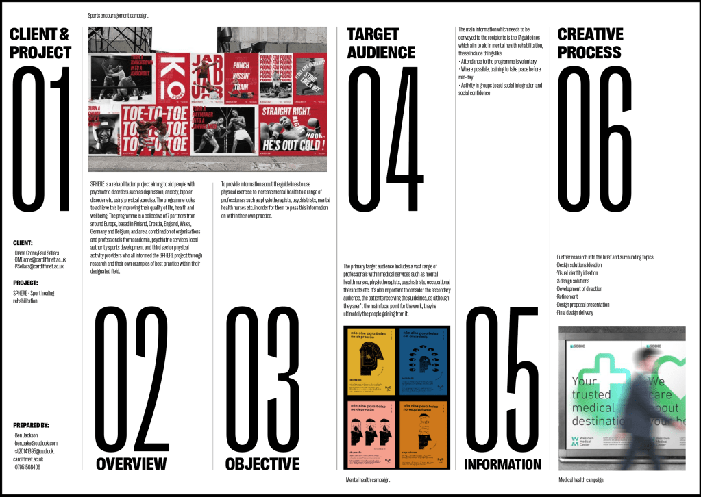
Background Research:

Main takeaways/information from the brief:

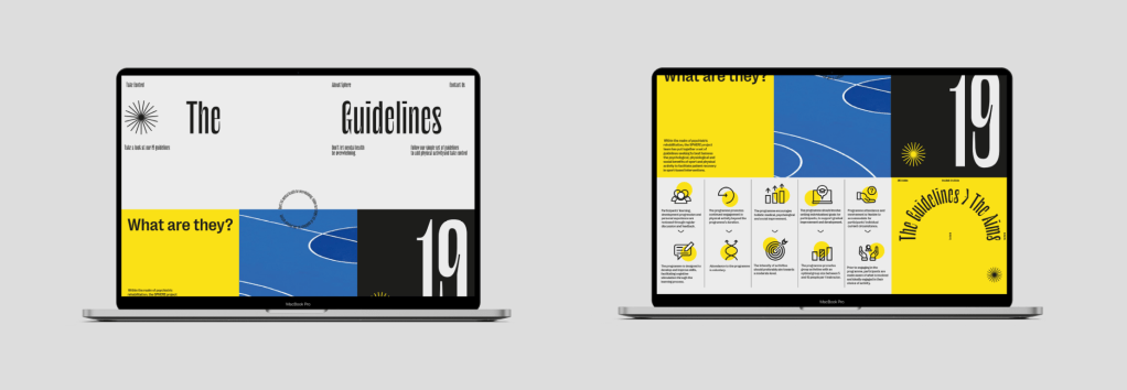
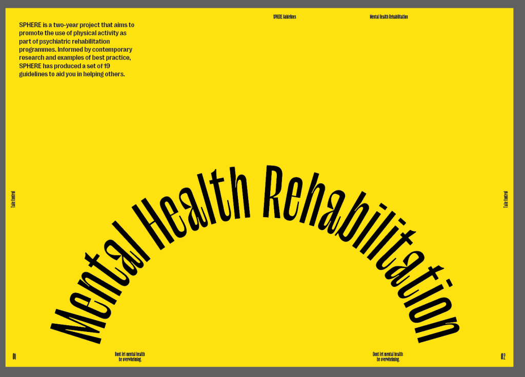
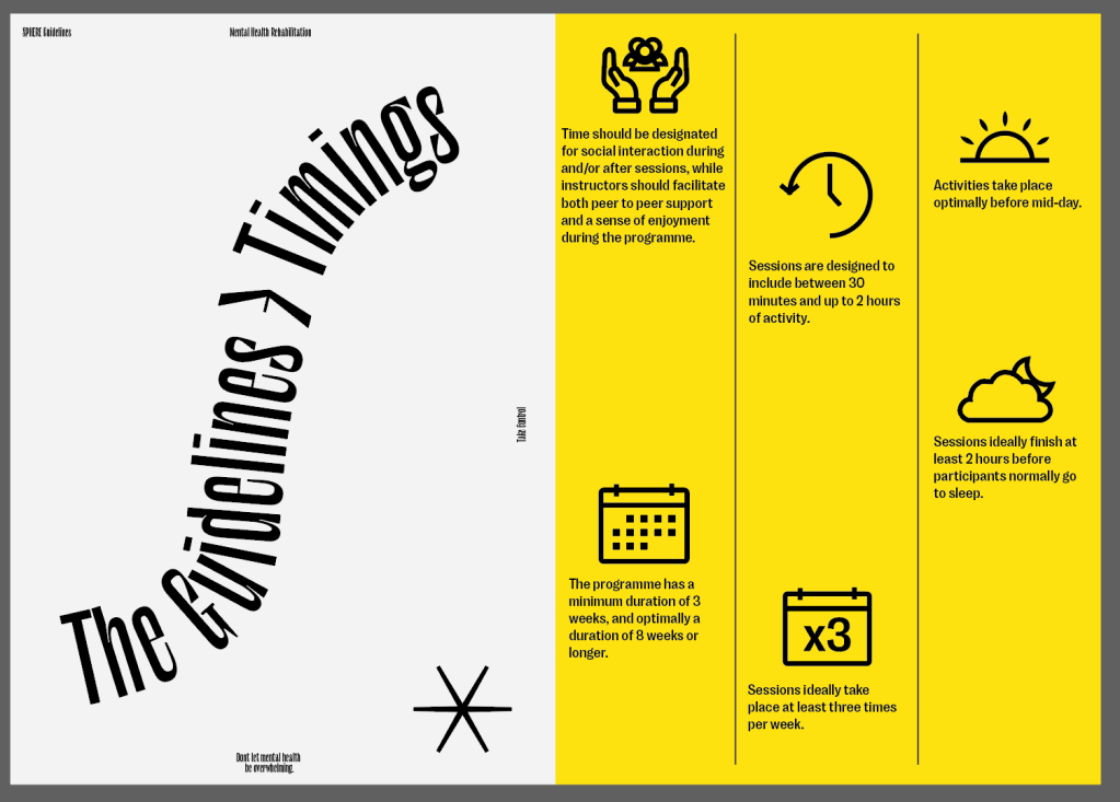
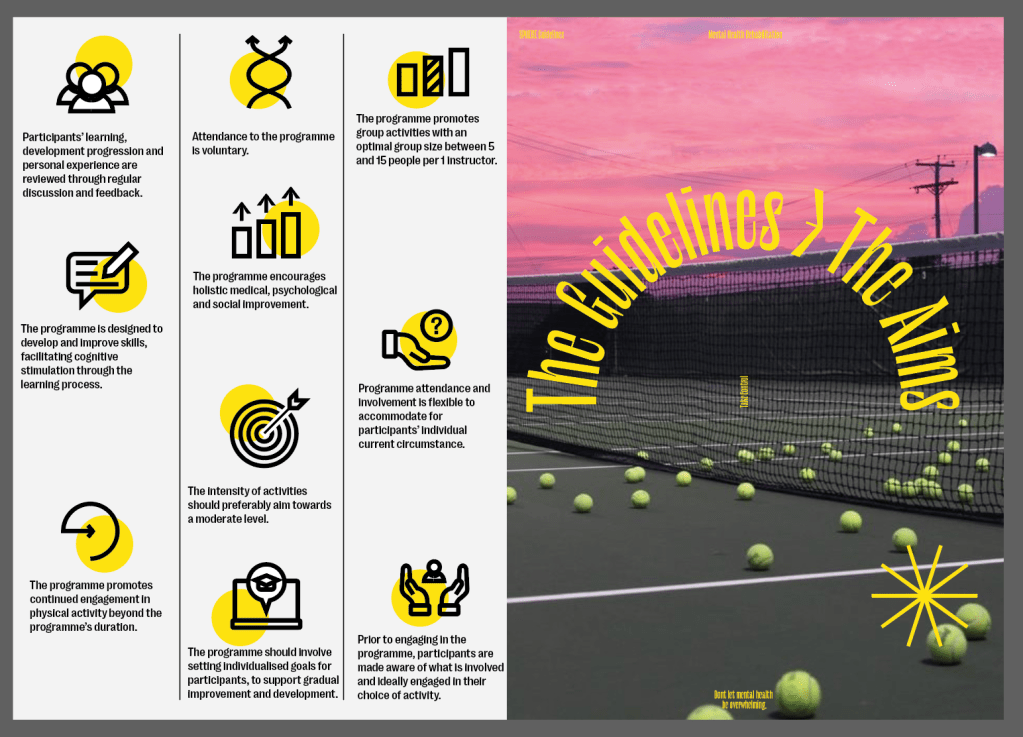
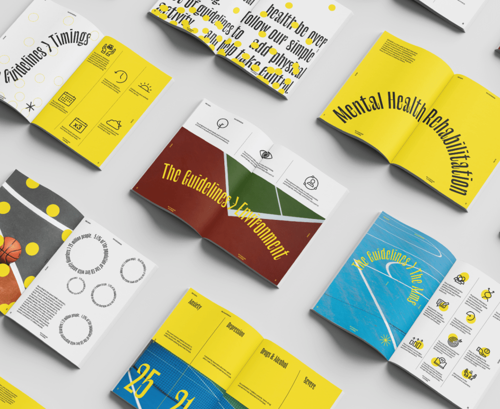
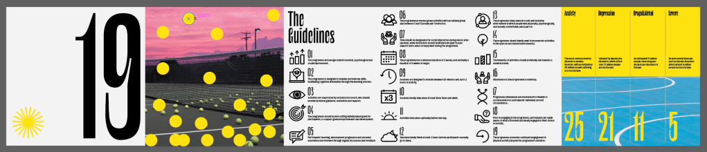
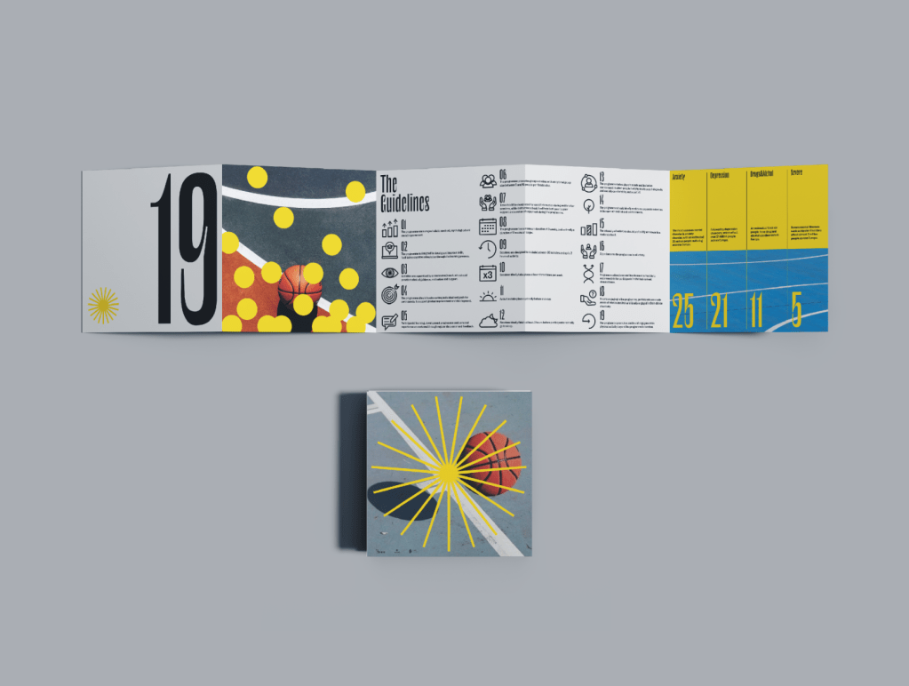
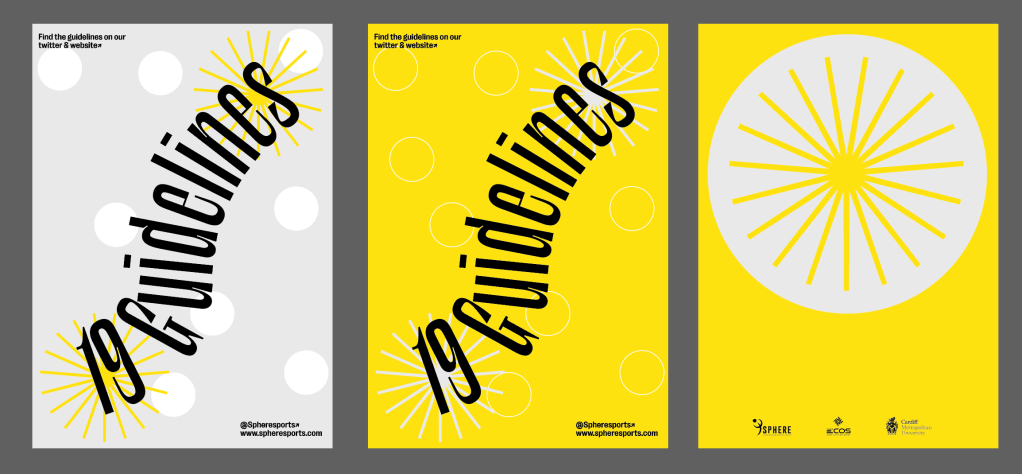
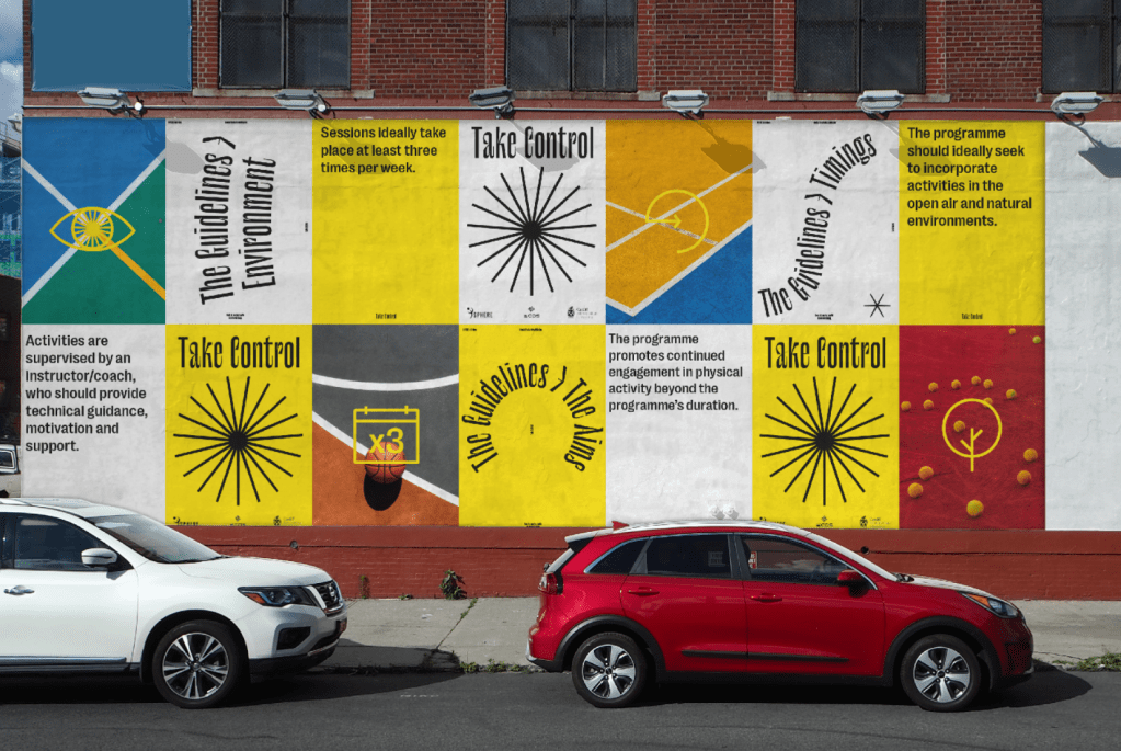
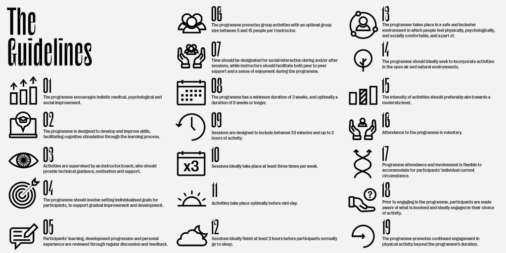
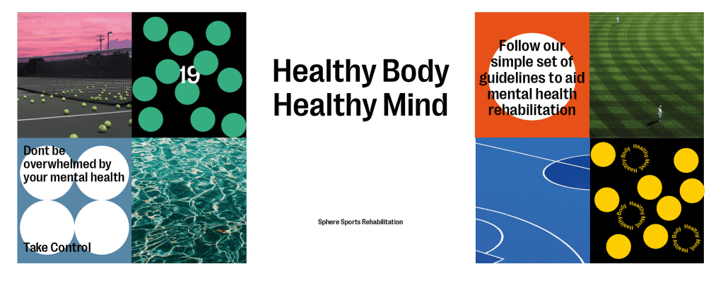
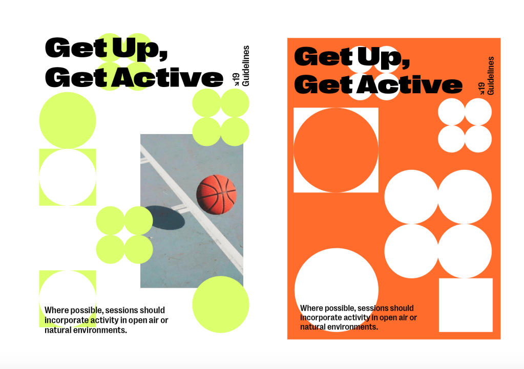
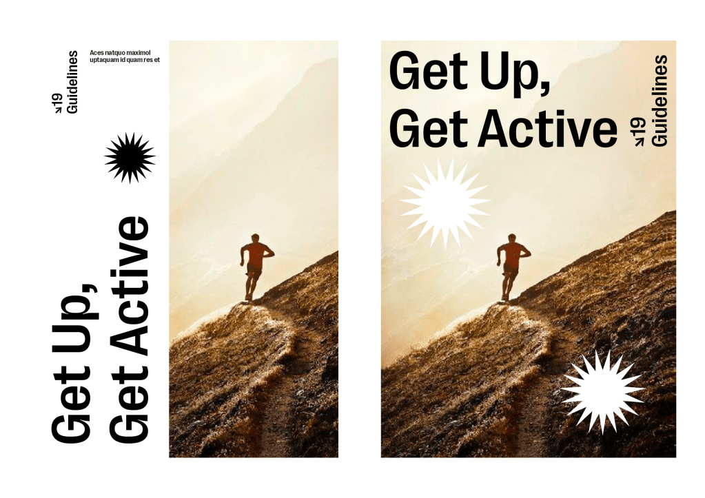
  • 19 guidelines outlining to professionals how to teach/share them with mental health sufferers.
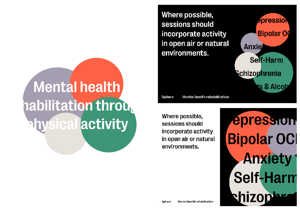
  • Information into psychiatric disorders, what they are etc.
  • Information into how physical activity can aid a healthy mind.

Outcomes requested:

  • Short animation explaining who they are and what the guidelines are for.
  • Booklet/leaflet containing key information.
  • visuals for social media/presentations etc.

Mental Health in Sphere

I wanted to do some research into the topic and thought where best to look for the scientific information than what was given to us in a separate informative document. I was looking for more specific information into the psychiatric disorders as well as the reasoning behind the guidelines.

Mental health is a state of well-being, in which an individual realizes his or her own abilities, can cope with the normal stress of life, can work productively and is able to make a contribution to his or her community [1]. Good mental health is a critical part of individual well-being, and the foundation for balanced, fulfilled, productive lives.

This idea of mental health and what it is, what it stands for is something really important to the brief in itself in terms of conveying the right messages to the viewers. Everyone is aware of mental health and its problems, but this idea of it being all about someones well-being and being based around a balanced lifestyle is really interesting and something which many people probably haven’t seen before.

Psychiatric disorders or mental illness, can affect anyone at some point in their lives – whether experiencing mental illness themselves, or as a family member, friend or colleague of someone living with a mental disorder

Something which can affect everyone in one way or another, especially recently when the idea of mental health is really prominent, something like this can really change peoples lives for the better, and its important that whilst the guidelines need to be conveyed to the audience, the ‘campaign’ needs to also have promotional information to get across the fact that doing this can positively aid yours or a loved ones life.

Without effective prevention and treatment, mental illnesses can have profound effects on people’s ability to carry out their daily lives and often result in poorer physical health.

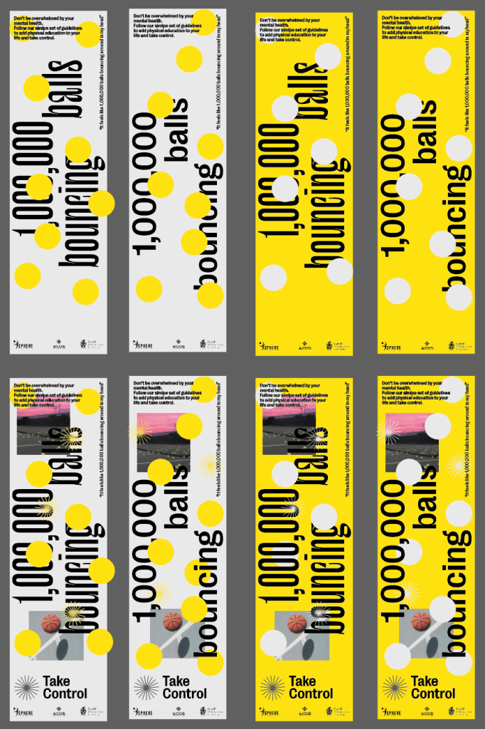
Interesting that physical activity can be used to increase healthy lifestyle, and an unhealthy lifestyle can lead to lack in physical activity. Interesting loop?

It’s clear through looking at their information and background to mental health disorders that there’s no cure or remedy for it, its simply that a variety of things, including increased physical activity can start to improve mental health and make someone start to feel better. So it’s important not to tell the viewer that it will suddenly make everything better, but more to inform them how they can start to improve their mental health and what benefits physical activity can have.

According to the latest IHME estimates, more than one in six people across EU countries (17.3%) had a psychiatric problem in 2016 – that is, nearly 84 million people. The most common mental disorder across EU countries is anxiety disorder, with an estimated 25 million people (5.4% of the population) living with anxiety disorders, followed by depressive disorders, which affect over 21 million people (4.5% of the population). An estimated 11 million people across EU countries (2.4%) have drug and alcohol use disorders. Severe mental illnesses such as bipolar disorders affect almost 5 million people (1% of the population), while schizophrenic disorders affect another estimated 1.5 million people (0.3%) [11].

Lots of lengthy stats and pieces of information which are very important and prevalent within the project, however different people will have a different attention span when it comes to this sort of thing, mental health practitioners may be very interested in it all, but will sports coaches and people who work in sports development? Its important to make sure that with such a wide spread of people viewing and using the information, its given in a way which isn’t overwhelming with information.

As I stated previously I think its important that although I put the guidelines and the science over to the viewers, there’s also a very visual side to the campaign which is less overwhelming and factual to keep a good level of pace throughout the response to the brief.

Physical Activity in Sphere

Psychiatric rehabilitation can be defined as a set of techniques and interventions useful for decreasing the effects of chronic mental illness and for actively promoting patient reintegration in the social and work context

Important to understand what psychiatric rehabilitation is and that it isn’t necessarily all technical and complicated.

sport, exercise and physical activity, due to their positive impact on physical and mental health, are one of the most commonly used rehabilitation practices in addition to other approaches such as music therapy, neurocognitive therapies, and therapeutic horticulture

Physical activity and exercise won’t just make you feel better, its something which will come gradually in unison with other strategies, important to make this clear and use persuasive language to encourage them instead of telling them it will make them instantly better.

Several studies [18] have indicated that sport, exercise, and physical activity can positively influence the prognosis of some mental disorders that represent the most frequent causes of mental disability – including major depression, schizophrenia and Alzheimer’s disease

Proven facts and figures which have been cited by many people and many organisations.

The guidelines emphasize a person-centred approach [29, 30] where the patient plays a proactive role in their own recovery, becoming an active participant in the process, aided by the trainer and community

Overriding point that its a person-centred approach and no one is being told to do something they don’t want to do. Although it needs to be persuasive and give all the information needed, the patient is the most important person in terms of how they carry out the physical activity and it has to be mostly on their own terms. Again,. this leads me back to thinking about using persuasive language but making sure it isn’t too informative and full on.

Take-aways:

Probably the thing jumping out to me the most at the moment is that there’s a large amount of information and statistics which are involved with he project. From the guidelines themselves which are very overwhelming upon the first look, to the background research.

Whilst I’m aware it’s mainly the professions who will be the viewers and recipients, the patients will also see the information and something which works well to give to both the professionals and the patients is useful, there isn’t much of a need to create different documents for both when they can be placed together.

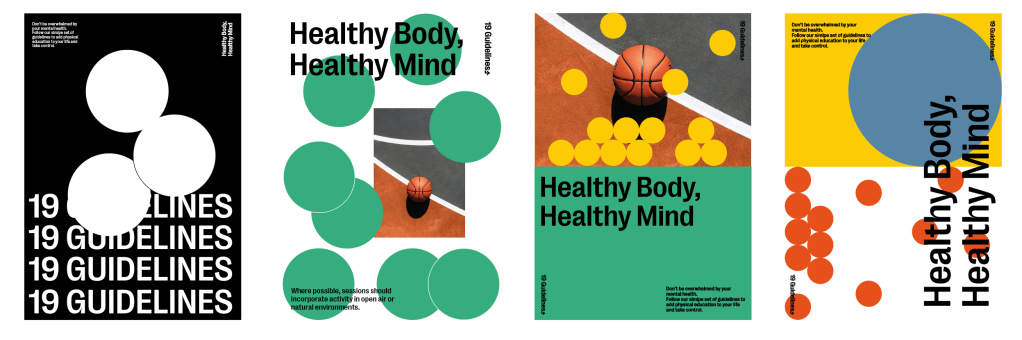
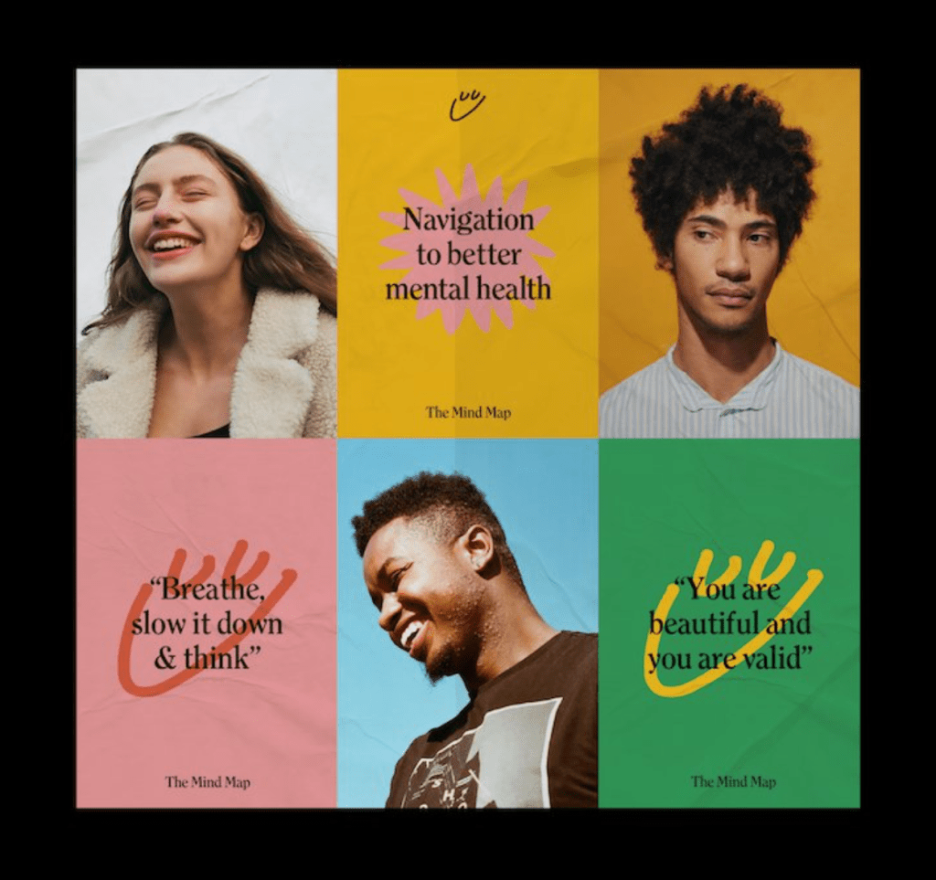
Ultimately this means the information and tone of voice within the work has to be easy and useful for all. The information, facts, statistics, guidelines etc all need to be there in abundance, however the challenge is to ensure it isn’t too overwhelming. Creating a sort of campaign which makes use of information design to convey the guidelines and facts (appealing and readable for professionals and patients alike), whilst also still keeping a very bold and visual style which will also be appealing to the target audience as a whole.

I also want to make sure whilst there’s a lot of ephemera which will be very informative, some of it will be less informative and more creative. For example a booklet may head a spread of information design containing the guidelines, with another spread which could be purely visual, just in order to not overwhelm the reader.

  • Campaign outlining the science and guidelines whilst also creating a creative visual style which stands out
  • Informative video talking about sphere and the guidelines
  • booklet/leaflet and other printed ephemera
  • website/app

Client Meeting

We e-met with the client to discuss all of our interpretations of the brief and the information and to ask any questions we had regarding our initial thoughts.

  • Clients agreed that it could be aimed at both the professionals and patients as long as all the information is conveyed.
  • Open to it being very creative and visual, again as long as all the information is accounted for.
  • Wanted to steer clear of too much black, but other than that there was no objections to other colours/fonts/styles etc.

Design for Real Life – Creative Brief

The creative brief, to me, is a document which maps out the most important parts of the brief going forward in creating a design which reaches the goals of the brief. Including an overview of the brief, target audiences, important information to use and the different parts of the design process, as well as other examples of best practice to take influence from.

Client:

Diane Crone/Paul Sellars

DMCrone@cardiffmet.ac.uk

PSellars@cardiffmet.ac.uk

Brief: SPHERE – Sport healing rehabilitation 

Overview: SPHERE is a rehabilitation project aiming to aid people with psychiatric disorders such as depression, anxiety, bipolar disorder etc. using physical exercise. The programme looks to achieve this by improving their quality of life, health and wellbeing. The programme is a collective of 7 partners from around Europe, based in Finland, Croatia, England, Wales, Germany and Belgium, and are a combination of organisations and professionals from academia, psychiatric services, local authority sports development and third sector physical activity providers who all informed the SPHERE project through research and their own examples of best practice within their designated field.

Objective: To provide information about the guidelines to use physical exercise to increase mental health to a range of professionals such as physiotherapists, psychiatrists, mental health nurses etc. in order for them to pass this information on within their own practice.

Target Audience: The primary target audience includes a vast range of professionals within medical services such as mental health nurses, physiotherapists, psychiatrists, occupational therapists etc. It’s also important to consider the secondary audience, the patients receiving the guidelines, as although they aren’t the main focal point for the work, they’re ultimately the people gaining from it.

Useful Information:

The main information which needs to be conveyed to the recipients is the 17 guidelines which aim to aid in mental health rehabilitation, these include things like:

• Attendance to the programme is voluntary

• Where possible, training to take place before mid-day

• Activity in groups to aid social integration and social confidence

Creative Process:

•Further research into the brief and surrounding topics

•Design solutions ideation

•Visual identity ideation

•3 design solutions

•Development of direction

•Refinement

•Design proposal presentation

•Final design delivery

Helpful Visuals: Before carrying out too much research into the topic and surrounding research I thought it was important to look into visuals which allude to a variety of different topics which the brief looks into, such as sports, mental health and medicine in order to document some early research into the type of design which will be of interest.

Design a site like this with WordPress.com
Get started