Design for Real Life – Brief & Introduction

Brief

Sphere Sport Healing Rehabilitation

My brief, given by an organisation called Sphere, is a rehabilitation project aiming to aid people with psychiatric disorders such as depression, anxiety, bipolar disorder etc. using physical exercise. The programme looks to achieve this by improving their quality of life, health and wellbeing. The programme is a collective of 7 partners from around Europe, based in Finland, Croatia, England, Wales, Germany and Belgium, and are a combination of organisations and professionals from academia, psychiatric services, local authority sports development and third sector physical activity providers who all informed the SPHERE project through research and their own examples of best practice within their designated field.

The brief is clear that the project being given to us is to communicate a set of 17 guidelines which aim to provide information about how implement physical exercise to increase mental health. The aim is o provide the information/guidelines to a range of professionals such as physiotherapists, psychiatrists, mental health nurses etc. in order for them to pass this information on within their own practice in a creative and attractive way.

The primary target audience includes a vast range of professionals within medical services such as mental health nurses, physiotherapists, psychiatrists, occupational therapists etc. Although the target audience given to us by Sphere is the professionals themselves, It’s also important to consider the secondary audience, the patients receiving the guidelines, as although they aren’t the main focal point for the work, they’re ultimately the people gaining from it.

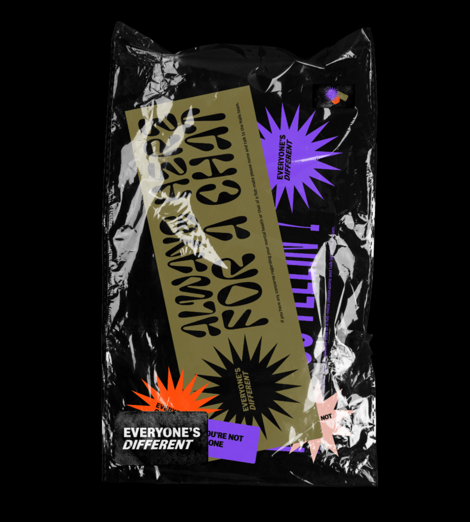
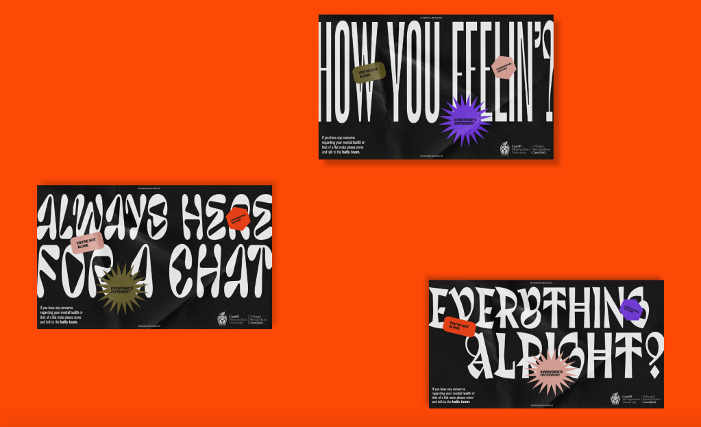
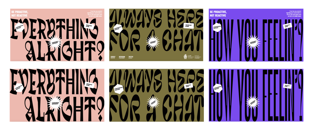
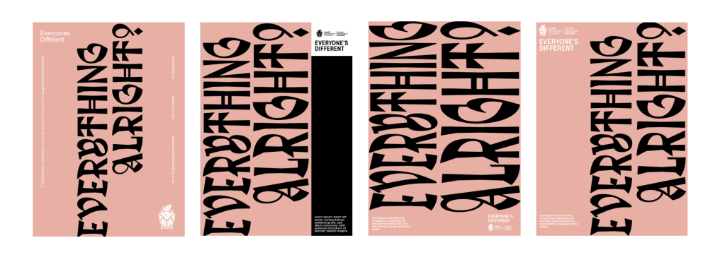
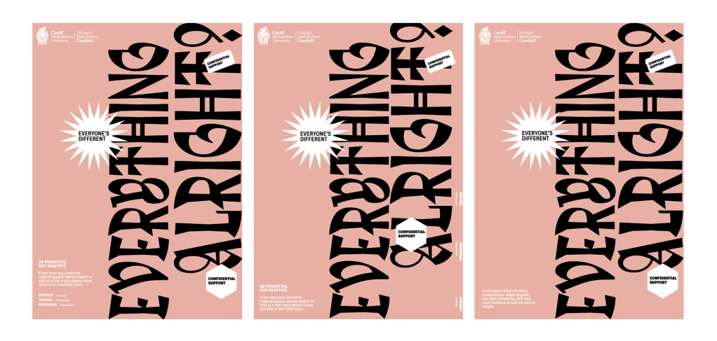
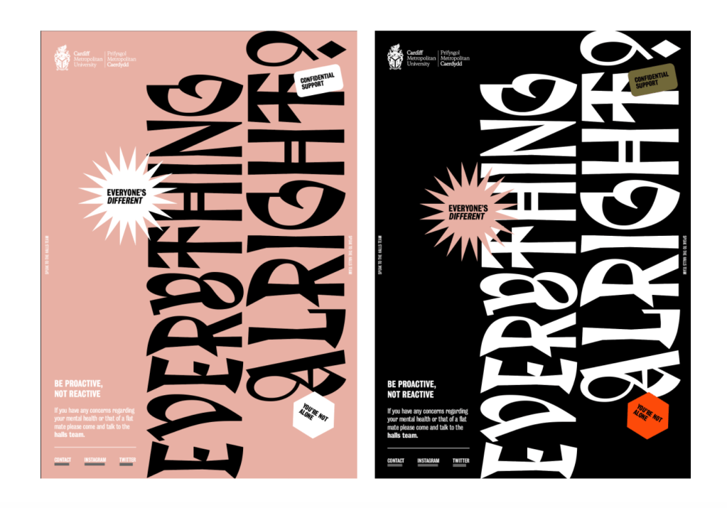
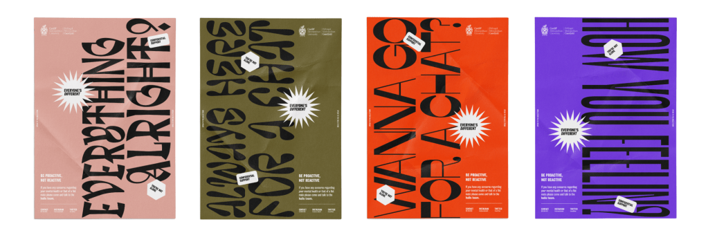
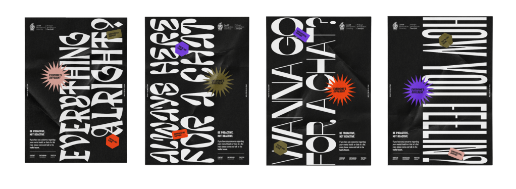
Its clear from the brief that the client want the guidelines to be designed and put across to the viewers in a creative and accessible way, something clear and concise. They haven’t specified exactly what mediums they want us to use, so anything from a simple poster to an app or website will work.

6 Frames

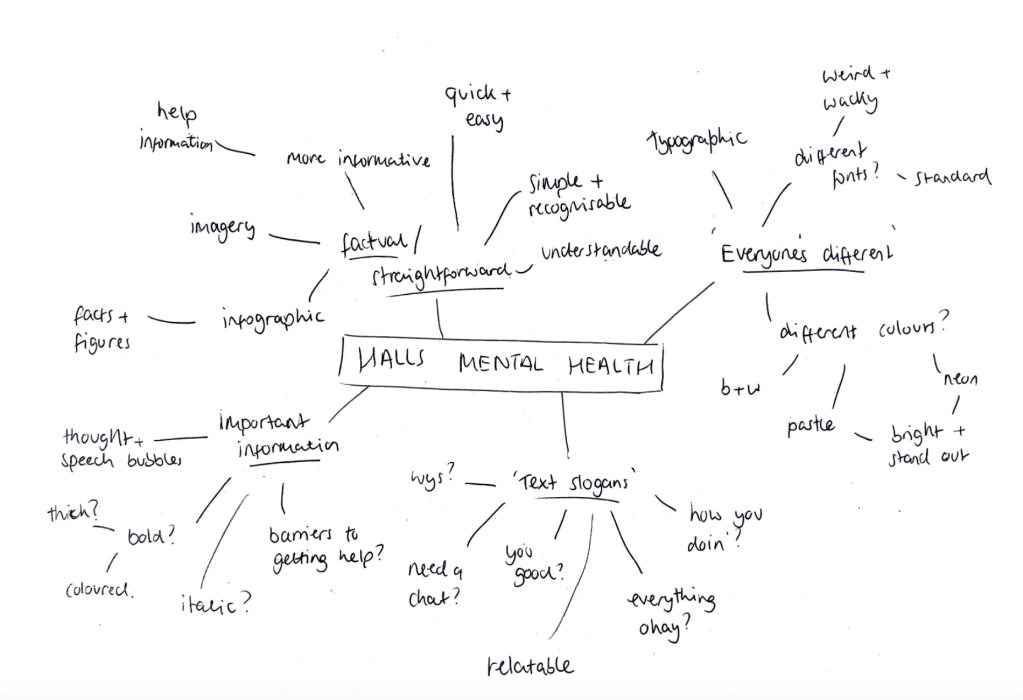
To get us started, we used the 6 frames method to unpick and answer questions on the brief and help us outline possible design opportunities and to learn more for the brief.
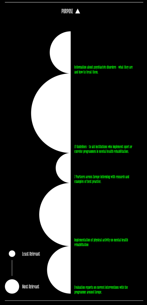
Purpose

There is a few different takeaways from the brief;

Information about psychiactric disorders – what they are and how to treat them.

17 Guidelines – to aid institutions who implement sport or exercise programmes in mental health rehabilitation.

7 Partners across Europe informing with research and examples of best practice.

Implementation of physical activity on mental health rehabilitation

Evaluation reports on current interventions with the programme around Europe.

One of the noticeable mentions from this frame was that all of the takeaway points from the brief vary in levels of relevance to the final design, for example the 17 guidelines are of much more important to the outcome that the 7 partners and who they are.
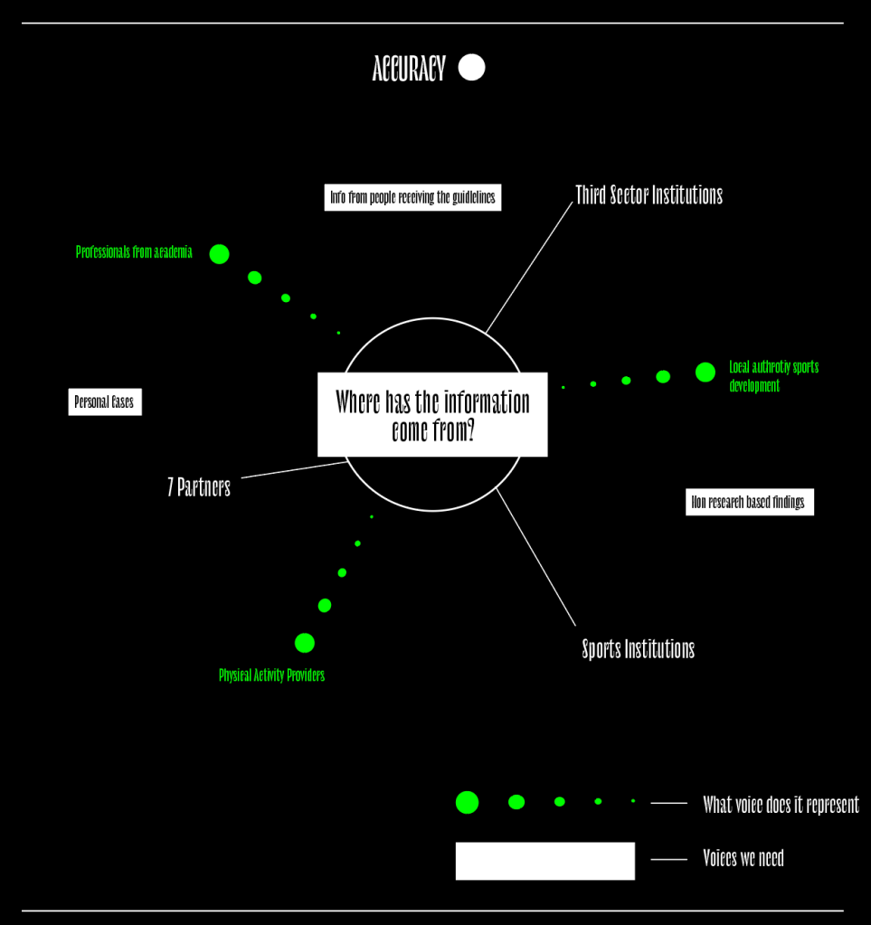
Accuracy

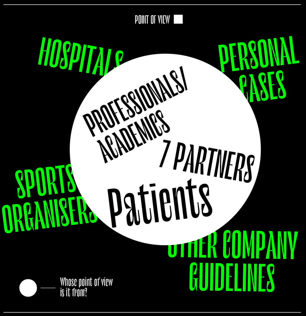
The information has come from a variety of different companies and sources ranging from 7 partner companies to mental health institutions to sports organisations. It represents these companies and organisations and their research as well as the voice of the patients suffering from psychiatric disorders.

However, there are a few people who’s voice and point of view are not being represented, like the personal cases and opinions of people who have been through this kind of thing in the past.

Point of View

Similarly to with accuracy, there’s a difference between the information we know and use and the information which we don’t have. It still seems to be the problem that much of the information we have been given is specialist information given to us by professionals with not enough care going into how the patients will actually feel about the guidelines and exercise.

It feels like although the information is very science and fact based, maybe going down a more personal ‘friendly’ route might be something which is more approachable.

Interest

Coming into the project I knew from the start that exercise increases mental health through endorphins etc, however the most important thing for me was some of the information I didn’t previously know about, like the best timings to do exercise and where to do it.

I think it stands out the most to me because if myself and my group were unaware of this information, its likely that most other people will too and so it’s probably something which needs to be focused on.
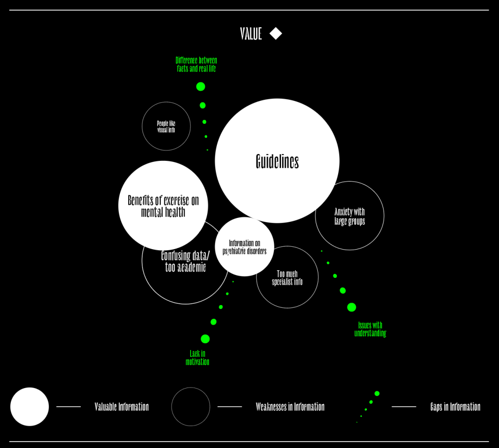
Value

Again this frame was just outlining the most important information and therefor pointing out what the basis of most of the design will be

Things like the guidelines and the science behind it all will most likely be what most of the design will consist of.

Learnings

The purpose and value frames are the two which stood out to me more than anything, they offer the most clarity over how the brief can be answered.

Looking at purpose shows the ways in which the information given in the brief, as well as the guidelines, can be sorted in their relevance sand importance, which in the case of having 17 guidelines is important as it might allow me to focus on the more important guidelines over the more irrelevant ones.

The value frame, similarly, highlights the more important information and filters out anything which is less relevant. Looking at the value infographic it makes it clear that the guidelines will be the most important part of the outcomes, with other information and facts coming as extra information.

The important thing now is getting the information across in the right way. Whilst the client wants the information in a creative, clear and concise way, I think its also vital to remember how much information needs to be conveyed so the right means will need to be used to convey it all;

Booklets, Leaflets etc (print) – Allows me to get lots of information across in one document

E-learning/presentation –educational learning programme to teach a range of professional about the guidelines

Lanyards – For professionals to wear with constant reminders of the guidelines

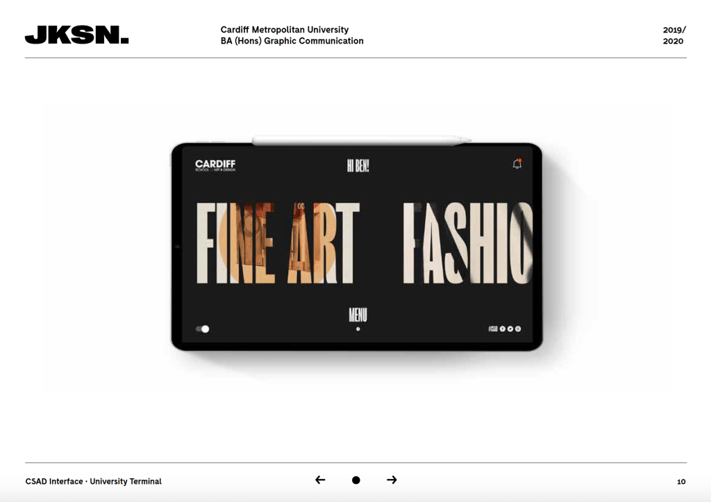
Website and app – Somewhere all the guidelines can be accessed, alongside any extra information the professionals might need

Social Media – Raising awareness to a broader audience

PDF Portfolio

I then looked to focus my attention on the pdf portfolio. I wanted to continue the house style of my website over to the pdf to keep the visual style.

I kept the lines on the page, similarly to the website, to keep that house style, and in this case to separate the header and footer from the content in the middle of the page.

I decided to go with a white logo instead of orange in this case, due to the logo and work im showcasing. being so close together, I didn’t want the logo interfering with the work.

I included useful information along the header, such as my email, the course and year the work was made.

I wanted a simple approach, using just a column to explain the project and my concept with the other 2 to display the work.

Portfolio – Ideation

Firstly, I created a logo for myself which would play a strong part in the website. I went with JKSN. rather than Jackson because its much more straight to the point and ultimately looks more visually appealing, I went with the typeface ‘right grotesque’ because its very bold and standout, so sums up much of my work in itself.

I used the typeface ‘Fabric’, a sans serif font based on Moderat, except some of its letterforms have cut off sections which make it a bit different, a bit quirky.

I played around with a few designs, I wanted to keep the home page full of typography and not images as I wanted to illustrate a fact that there’s a strong sense of typography in my work. I liked the white black and orange colours as they’re bold and very striking without being too overwhelming. Overall they all had aspects which I liked, from the menus to colour ways, but I decided to go with the last style, using a typographic approach to outline a bit about me, as well as link the viewer to some of my projects.

I used the Wix website maker to make the site, I think it leaves you with a lot of room to be artistic and playful but also does the basics really well.

I took the style from my ideation, showing a bit about me as well as some of my projects, I also added some other elements on the page, an image to make it clear that im available to do work, which also acts as a link to my information page. I also added an arrow to make it clear that more lies below that main imagery on the home page.

as well as there being links to each projects page through the typography at the top of the page, I also wanted some strong imagery from each of the projects on display to give the viewer a sense of what each project is about.

I also added the same house style to the phone website design, keeping the first page purely typographic with images below the fold.

I then looked at each of the projects pages. I wanted to start each off with a hero image to capture the attention of the viewer

Followed by the logos/brand guidelines and some examples of it on printed media.

It needed to have some sort of explanation, so I added a simple typographic element which talks about the brief and the concept behind the work.

I then added all the photos from the project, although very image based, I played around with the still and parallax scrolling to ensure each page had a sense of pace and wasn’t just photo after photo.

Finally I added the about me page. Although very simple, I wanted it to look clean and professional, talking a bit about myself and my approach to design, and leaving links to get into contact with me.

Portfolio – Research

Although my website was a place for me to be expressive and show off who I am as a designer, I was also aware that too much is too much, and I wanted to do some research into other web portfolios to take a look at how other studios and designers put their work across.

Studio Dumbar
Collins
Smorgasbord
Nick Losacco

I looked at a variety of different portfolio designs, from very basic designs with just their logo and all their work, to something a bit more complex with a hero image/home screen. Although I didn’t want to go too over the top and flamboyant, it was important for me to have a home page with some sort of imagery on it to captivate the viewer and to show off my style to entice them in. The image above for example, by Nick Losacco, a type designer, has a home page which is bright and eye catching but also very simplistic at the same time. I also took influence from many other large scale companies such as Collins and Studio Dumbar to look at the menus, they all tend to be very simple menus purely outlining each page of the site.

As well as the home pages, I wanted to take a look at their work to see how it’s laid out and presented, as expected it was all very similar, displaying the work with as little distraction as possible to not take away from the work itself.

Persuasion – Printed Ephemera

As well as digital media, another thing most students in halls come into contact with when they first move into university halls is a box of ephemera from a range of things from Cardiff, from university events, to bar and club vouchers and information sheets. I thought one of the easiest ways to raise awareness and reach out to students would be to give them all a package containing all the information they might need, from business cards to leaflets containing relevant information.

Small business cards for students to carry around with them.

Sticker designs outlining the barriers which the campaign look to overcome

Persuasion – Online presence

Gif

As well as print media, the brief stated that it wanted some sort of video it could use on a variety of websites. I didn’t want to create an animation or promotional video, I thought the best way to get word out by using the internet etc was to create a gif style motion graphic which could play on a variety of media, website ad style, instagram stories, facebook headers or advert, screens around the university or halls etc which would work as an advert style video, constantly playing and relaying information to the viewer.

Being a gif or motion graphic rather than an animation, I didn’t want the movement to be too much, it isn’t a video which would be watched by itself which would hold loads of information, it would be displayed in places where it could be easily viewed, the movement would be there to purely catch the viewers eye and allow them to read the relevant information which would be about telling students where to go and who to speak to.

Social Media

Online presence on social media is something which the majority of students engage with as much, if not more than printed posters and leaflets etc. One of the things which is important when looking to connect students to the campaign is to use social media, I decided to use instagram as it allows me to get the bold and striking imagery online. It means I wouldn’t need the use of large captions and explanations, as the posters and visual identity can be transferred over to a digital version to convey the message.

It was important to get the style and visual identity onto the Instagram page to make it recognisable, making sure every post has something which is useful to the cause, whether it be raising awareness for mental health or pointing students in the right direction.

Persuasion – Leaflet

As well as a variety of posters to promote the cause, I also wanted to create something which will hold some more information about where to go for help, as well as to outline some of the touchpoint, such as the idea of it being confidential etc.

I wanted the style and visual identity to follow on from the poster designs, using the bold font, however in this case more work needs to be done on the typesetting to give a good sense of hierarchy.

The leaflet still needs to contain relevant information, where to go and who to speak to, social media, Cardiff Met logo’s etc.

In this case, I wanted to use the back of the leaflet as a canvas to sum up the campaign as a whole, using the fonts, ‘stickers’ or shapes and colours to do this and give an overview of the identity as a whole. Again, similarly to the poster the design is very bold and striking, but again I think it gives it a contemporary look, something which would stand out to a student to entice them in.

Persuasion – Visuals

Ideation

After carrying out research into all aspects of mental health campaigns, previous examples which I felt worked as well as some which may not have worked so well, I did some idea generation to highlight the main points I wanted to experiment with within the designs and how I felt was the best way to illustrate the point within the campaign.

Firstly, my research as well as the client brief outlined the idea of breaking the stigma around mental health, that many students don’t reach out for help because of a variety of different reasons, for example they feel out of place and like they’re different to everyone else, so I wanted to play with this idea using a variety of ‘wacky’ fonts and stand out colours to show the audience that it’s okay to be different.

I wanted the campaign to be very straightforward in its message, to go and speak to the halls team if there is any problems by staying away from infographics and factual designs.

 I also wanted to use the sort of sayings you’d ask a friend, such as ‘everything okay?’ to make it feel more personal to the students.

Firstly, my research as well as the client brief outlined the idea of breaking the stigma around mental health, that many students don’t reach out for help because of a variety of different reasons, for example they feel out of place and like they’re different to everyone else, so I wanted to play with this idea using a variety of ‘wacky’ fonts and stand out colours to show the audience that it’s okay to be different.

I wanted the campaign to be very straightforward in its message, to go and speak to the halls team if there is any problems by staying away from infographics and factual designs, from my research I outlined some now campaigns which took a very bold approach, such as the lad bibles campaign, which used bold colours and typography design to create powerful designs. Although many mental health campaign use very minimal approaches with very soft and muted designs, I wanted this particular response to be more bold and standout, something which will really stand out and be different. I also think its important for students to remember the campaign, they may see it when they first move in and not need any help until years afterwards, so it’s important that the campaign is memorable.

 I also wanted to use the sort of sayings you’d ask a friend, such as ‘everything okay?’ to make it feel more personal to the students. Although the designs may be bold and stand out, the message still needs to feel personal to the viewer. Once they are drawn into the posters or other ephemera, the message needs to be strong in questioning them on how they are feeling, followed by a clear message of ‘speak to the halls team’.

Although I wanted to use the metaphor of the fonts and the ‘everyones different, I wanted the message to be very clear, I didn’t want to play around with too many different meanings and metaphors which may take away from that message. I wanted to create a simple and relatable approach, which would purely informing students where to go to receive help if needed.

The impersonal sayings were also important, the halls team stated in the brief that they wanted it to seem like it was coming from peers and friends rather than the halls, this really influenced the sayings as well as the overall contemporary aesthetic.

Font Choices

Firstly, I wanted to find a selection of slightly weird and whack fonts, one of the parts of the campaign which was important was the idea of using different fonts to illustrate the idea that there’s nothing wrong with being different. I chose 4 fonts which are all still very easy to decipher, but are also a bit different and stand out against other fonts, something which stands out against the crowd and will draw the eye.

Poster Ideation

I then looked at sketching some possible poster designs, trying to gain an idea of what the visual identity would be so the rest of the campaign and ephemera can follow the same style.

I wanted the typography using the fonts outlined to be the main focus of the page, followed by the message about where to go and who to speak too. Phrases like “you okay?” and “here if you need a chat” will occupy most of the posters, as I feel these will be the most eye catching feature which will draw the viewer in will let them know what the campaign is all about, before pointing them in the right direction.

These were the first designs for the posters and overall visual identity. Overall I think the design works and they are all particularly eye catching for the most part, the type work and colour is definitely something which would stand out, however I think they all need something more to move them on from this point. I think overall the bold type needs to be the focal point and any other bold shapes on the page take some of the focus away from it. 

Development

As stated previously, although i liked the overall outcomes and the way they used the typography to be bold and standout , I felt they all needed something else. I also wanted to ensure I added respeonses to the possible barriers I discussed during research, they were a vital part in the idea both for me and the client, so talking about the fact that any help will be confidential, and letting students know they aren’t the only ones is important. I decided adding a modern twist on thought and speech marks might give the chance to add some extra comments about confidentiality and the slogan ‘Everyone’s Different’.

I also felt the typesetting needed a bit of work to ensure the information is more bold and standout, it’s currently a bit too tame and unnoticeable. I think it would be improved by making the text slightly large, possibly adding bold sections to the most important parts.

Putting together all these features, I created my a few final poster designs, using a compilation of many design features, using the bold typography, adding useful information in a body of text which does not take away from the rest of the poster, while still staying relevant and noticeable. I think the shaped which overlay the main slogans work well the break up the poster and add some useful points, as well as adding a hint of colour in the black version of the design.

I then needed to create more poster designs using the same principles. Throughout the research, a standout feature of many campaigns was the ‘friendly’, pastel colours used. I wanted to keep the idea of having colours within the campaign to keep it bold and standout, however I didn’t think using pastel colours would work for the designs, so I chose colours which aren’t too overwhelming, but are still bright enough to make it’s presence felt.

Final designs. I wanted to add a black version of all of the posters in the keep with the pace, using only colours posters might just end up being too similar, so I wanted something a bit different, whilst also keeping a small amount of the colours to make it instantly recognisable.

Persuasion – Research

Mental Health Research

After rewritting the brief and noting down the main points to be taken forward, I wanted to do some research into mental health, specifically students within a university environment to get a stronger sense of the issue at hand.

https://www.mentalhealth.org.uk/blog/declining-state-student-mental-health-universities-and-what-can-be-done

In 2015/16, over 15,000 first-year students in UK universities reported that they had a mental health problem, compared to approximately 3,000 in 2006.

This increase in disclosure is mirrored by a 94% of higher education institutions reporting an increase in demand for their counselling services. Despite the surge in help-seeking behaviour, there is evidence to suggest that there are many more students who do not seek treatment for mental health problems

There are a range of implications of worsening mental health among students. Poor mental health has been associated with poorer academic outcomes, as students tend to be less able to effectively manage stress and pressure and, thus, their ability to perform given tasks productively is diminished.

Overall the Mental Health Foundation has recorded a significant rise in cases of mental health in students throughout the years. The reasoning behind the spike of mental health cases has not been found, however the Government and Uk Universities together have noted the increase and are taking a much more pro-active approach to do everything they can to help their students.

https://www.universitiesuk.ac.uk/policy-and-analysis/Pages/care-task-group.aspx

Minding our future aims to improve links between local NHS services and the support that universities provide. The prospectus sets out students’ characteristics and vulnerabilities and new guidance to improve the coordination of care between the NHS and universities so that all students can access the care they need. 

Following on from statistics about levels of student mental health, Universities Uk have launched plans to increase ties between NHS services and University services to increase the amount of students which will be able to find help.

Although clearly more mental health services are being made available and more universities have noticed the need for increased help for students, more and more barriers are coming to light which are inhibiting the amount of students seeking help.

These barriers include things like worrying how they would be perceived, students worrying what others would think of them if word got out, students not thinking their mental health was bad enough, or that they didn’t want to stretch already stretched resources. Theres many examples of similar barriers, but it it clear after the research that something needs to be done within the work to ensure students go to get help despite the barriers. This could be an issue which could be resolved by simply making students aware that no matter what the issue, they are all eligible for help and should not worry about it.

University mental health campaigns

I also wanted to continue my research into student mental health services by taking a look at what universities are currently doing to help their students.

https://www.thinkpositive.scot/2016/02/be-aware-be-there/

Students from the University of Edinburgh have launched a mental health and wellbeing campaign, Be Aware, Be There, encouraging peers to support each other. A small group of students started the Mental Health and Wellbeing Society at the university last year and are now pushing forward with this campaign hoping to remove the stigma around mental health.

The group recognise that mental health is an invisible illness and want people to know what help and support is available- including talking about it with others. Be Aware, Be There is supported by Fixers which has allowed the group to produce promotional materials.

The campaign is one which definitely has a set aim to break the stigma around mental health and make students aware that everyone is prone to it and it shouldn’t be ignored, it takes a head on approach to the issue which makes it very clear to see the problem being outlined. It is also very clearly aimed at students and no one else, its a student to student campaign which could make it seem more relatable. However, although the student to student aim is very clear, the concept and design almost seems as though it would appeal to an audience younger than students with the simplistic metaphors and illustrations. It does however use slogans and colour well to make it feel personal and less corporate. The campaign is on all forms of social media which is something which will reach out to students especially, as generally students will notice something on instagram or twitter over a poster on a wall.

https://www.studentminds.org.uk/universitymentalhealthday2018.html

University Mental Health Day 2018 took place on Thursday 1st of March, it was the biggest University Mental Health Day to date, with the whole university community coming together to shine a spotlight on the importance of student mental health and wellbeing. 

The community theme aimed to improve student and staff awareness of support and promote a sense of belonging, improve understanding of the role the environment and community can play in protecting student mental health and raise awareness of the specific challenges face and influence universities and health providers to work collaboratively so all in higher education can thrive. 

Student minds and their ‘University mental health day’ is aimed at all Universities across the country and encourages universities to ‘shine a light on the importance of student mental health’. Although the poster and leaflet designs shown above were definitely a focal point, a large portion of the campaign was taken online in the form of the hashtag on twitter, #unimentalhealthday and the hashtag reached millions of people nationwide. The campaign took a very different approach to the previous campaign. Still using bold colours, the approach is much more corporate looking and is definitely aimed at students but from the student minds team rather than a student to student basis. The Campaign still managed to reach out to lots of people, but again the idea of it being driven by a company and not other students is one which makes it much less relatable. Again the University mental health day outlines the fact that using social media is definitely a way to go directly to students and young people.

I also had a brief look into few other existing examples of Universities mental health campaigns just to take a look at the general visual language. Overall the majority of the examples I stumbled across were all very similar. Nearly all of them steer clear of any shock tactics.

The majority of the examples I viewed make good use of pastel like colours, keeping the tone of the work calm but also making it stand out more than a black and white example would. I also like the examples which use typographic elements and no imagery or photography. I think specifically in this brief there is no need for a large amount of imagery, the brief is to make students aware of where to go for help and I think a typographic approach works well in this case. I like the way some examples use speech marks and thought bubbles to hold important information and although they are very cliche in this topic, I think the idea of boxes of important information could work well. I also thin the examples which are very straightforward and to the point are much more effective in than those which use complicated metaphors or imagery.

After looking into some of the work I’ve also rules out some particular routes which I don’t think would work for the brief. Many of the campaigns use illustrative imagery and handwritten fonts in a way to make them feel more personal but I think in many cases it can come across slightly childish, relatable and personal design doesn’t mean it needs to be childish. Some of them also carry far too much information than is needed, the work for this brief needs to be something straight to the point to tell students where to go to get help and doesn’t need anything overly informative.

Contemporary examples

After looking into the universities examples of mental health I wanted to take a look into some modern day examples of mental health campaigns, particularly those which are aimed at a particular group of people, eg. students.

https://www.ladbible.com/uokm8
UOKM8? campaign 1

U OK M8? – Lad Bible

The social media page LADbible recently launched their campaign ‘U OK M8?’, a campaign aimed towards the mental health of young men.

‘UOKM8?’ aims to develop the broadest understanding of mental health and suicide risk in the UK by gathering quantitative and behavioural data from the LadBible audience  through the use of questionnaires that sit alongside stories on mental health issues.

Although the campaign visual style is very simple, using only the black and yellow pallets and the same slogan across all of its media, the style is one which really stands out and is definitely aimed towards its target of young people. I also like the way the campaign is very straightforward and to the point. Theres no imagery or major metaphorical language, its simple and tells the viewer all they need to know.

The Mind Map

The Mind Map is a new initiative that seeks to “promote a new normal” in an age of increasing mental health problems across the United Kingdom.

Described by its founders as an “innovative mental health hub”, Liverpool-based Mind Map offers practical advice on how young people (defined as those between 16-30) can get access to subsidised counselling and free mental health support services, as well as an online publication which shares the stories of musicians and athletes who have been affected by mental health problems in their lives and careers.

Similarly to the LADbibles campaign, The Mind Map is aimed at young people (16-30) and its aim again is to allow them to connect with any forms of mental health they may need through the use of an app.

The visual style is great and uses a variety of stand out colour combinations along with some simple vectors and images to create a light hearted and friendly but also stand out approach to tackling mental health. I think the style really stands out to its audience and feels very relatable and personal as opposed to the usual cliche very corporate approaches.

Graphic Design Is Mental

Ben Longden is the digital design director at The Guardian where he has helped to shape the title’s digital experience, working on some of the biggest news events of recent years, such as Cambridge Analytica and the Paradise Papers. Reflecting on his route through graphic and digital design, he has recently written a book, Graphic Design is Mental, which he is currently funding here.

I discussed previously that I like the idea of the thought marks and speech bubbles but felt they could be stylised slightly more to make them less cliche which is exactly what these banner designs do. The use of the bold typographic slogans alongside the coloured backgrounds really makes it stand out, and again its very straight to the point in it’s message.

Thoughts

Taking some of the positives from the university campaigns alongside those from more contemporary examples has given me a variety of different points to think about and has shown me what works and what doesn’t in terms of the designs and the media they campaigns use.

Persuasion – The Brief

The brief I chose to undertake was ‘Halls Mental Health’, from first glance what jumped out to me was the idea of the concept being something ‘made by a student’ and not a member of the halls team. To me this really jumped out as an opportunity to do something a bit different on a topic which as a whole is kept very corporate in its designs.

The primary objective for the brief was to create a clear concise outcome which will appeal to students. The halls team want the audience, students living in halls, to be made aware that Cardiff Met can supply support for students and their flatmates struggling with or effected by mental health issues whilst in Halls. The message was that if any students had any concerns over the the mental health of themselves or that of a flatmate they should speak to the halls team.

The brief outlined some possible factors which they thought were stopping students from reaching out for help, they included:
Not being aware that help is available.
Worries about how they may be perceived.
Thinking their issues are normal.
Concerns over their accommodation
Worried about confidentiality
Flatmates wrongly believe they can cope and provide correct support
Flatmates are under the perception that responsibility is theirs.

Currently the university have no real system or campaign in place within the halls which meant the concept would be something new and fresh with no limiting factors, other than one point from the client that they wanted to ensure we don’t use a shock factor within the work. Again this was another aspect of the brief which enticed me as it meant the outcome could be something new and didn’t have to follow many guidelines.

Firstly, within the group of my peers undertaking the same brief, we carried out our task to discuss the in’s and out’s of the brief and discussed what the main points were in terms of going forward with our concepts. We decided that the overarching question be to be answered was How might we persuade first year Cardiff Met students to speak out about their mental health issues in a relatable way. To us as a group this really highlighted the main points about what the message is, alongside the main barrier which we aim to overcome.

Design a site like this with WordPress.com
Get started