tcejbO:Object – London

Continuing on from week 1 we travelled to London to look around a variety of exhibitions for inspiration on our project, We looked around an array of exhibitions ranging from light shows to sculpture based exhibitions, all of which caught my eye in one way or another.

As a whole I’m not a very conceptual person and focus more on functionality than concepts, so many exhibitions go straight over my head so I was curious to see many of the exhibits to find out about the concepts behind them. I was pleasantly surprised though at the majority of the exhibitions and how they created experiences which really did take their concepts to the next level and really made me think deeply.

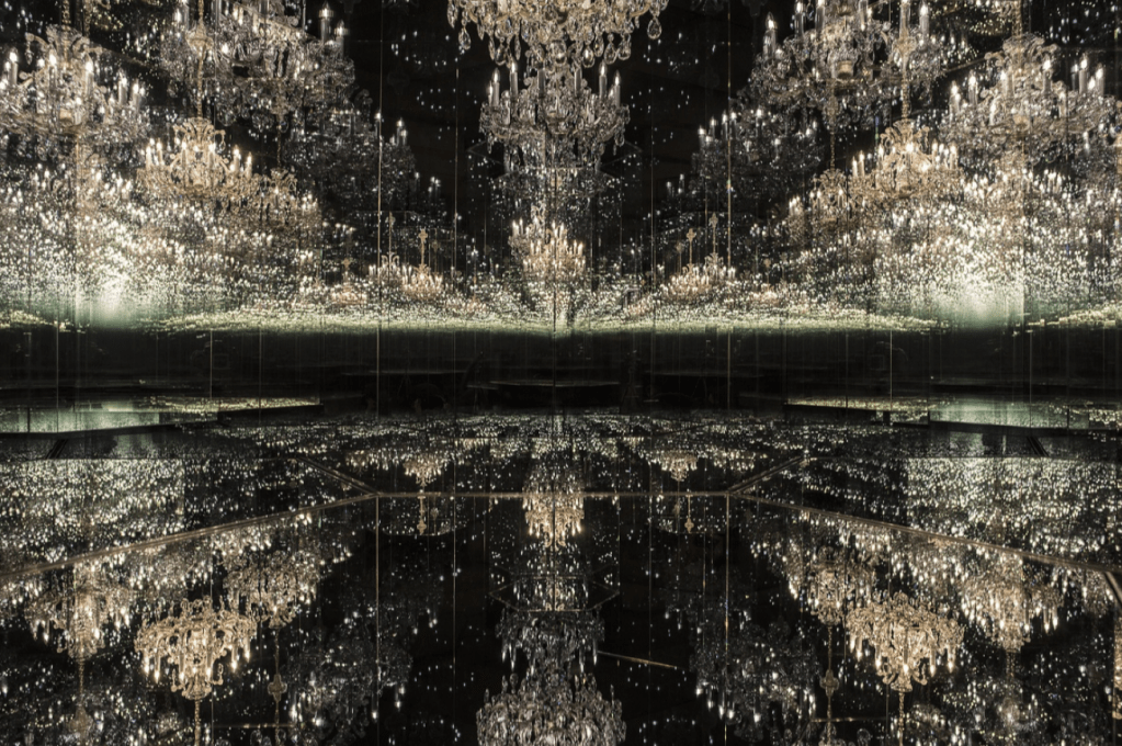
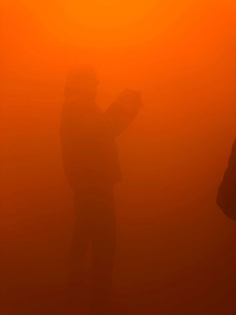
The first exhibition we visited was Olafur Eliasson’s ‘In Real Life’ at the Tate modern. I was taken aback by many of the installations, particularly those which were on a large scale and acted as more as an experience than a single artwork. Straight off the bat the spiral view amazed me, walking through a tunnel of distorted mirrors with a variety of mirrors facing in different directions made me think about peoples different perspectives on everything, and also made me feel trapped in a way, much like I would if I were in a mirror maze. I was also amazed by ‘Din blind passager’ which is essentially a large fog tunnel, again it really opened my eyes to the idea of the unknown and made me feel trapped within the mist. These two alongside a variety of there other exhibitions really opened my mind to this idea of the unknown and mad eye think about the way in which I see reality. It really bent the rules and made me question many things in relation to every day life which was a real eye opener and gave me a lot of inspiration in terms of using mirrors and lights to bring about the illusion of being stuck or trapped.

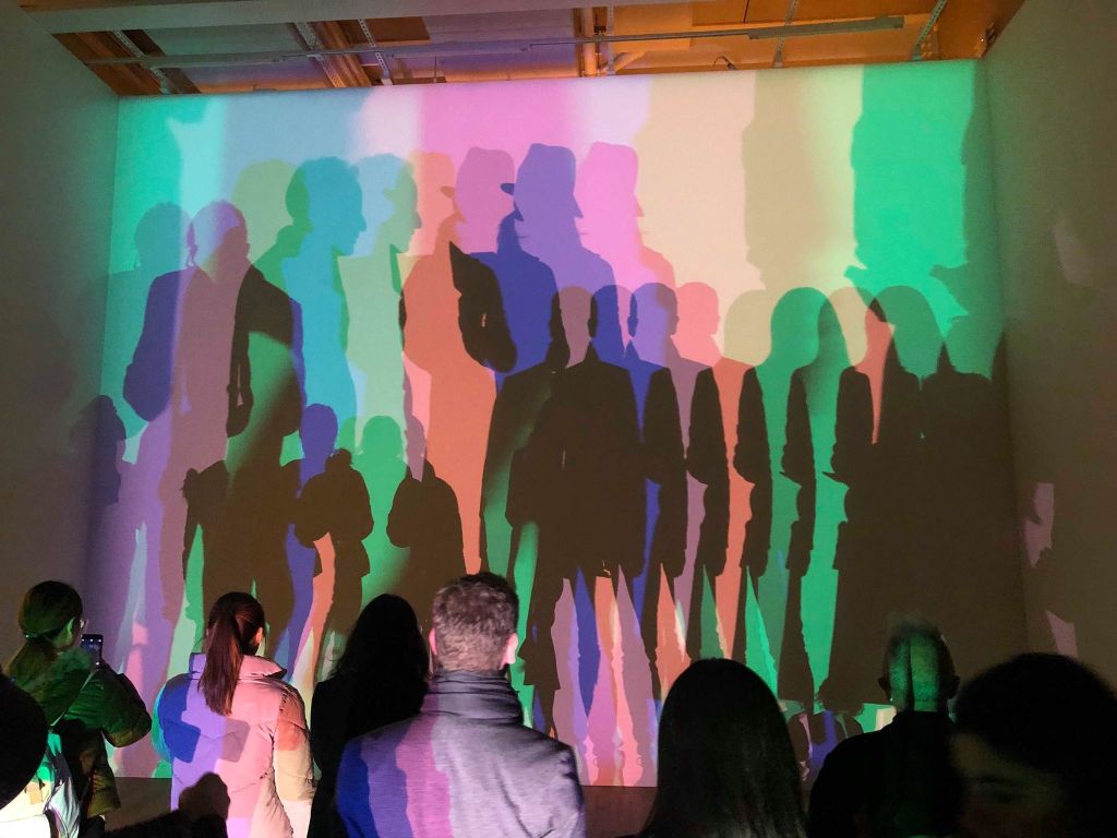
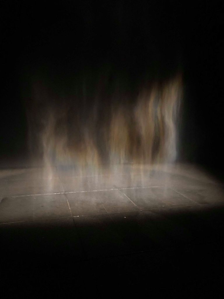
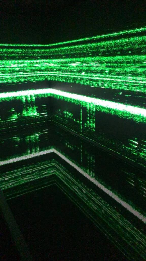
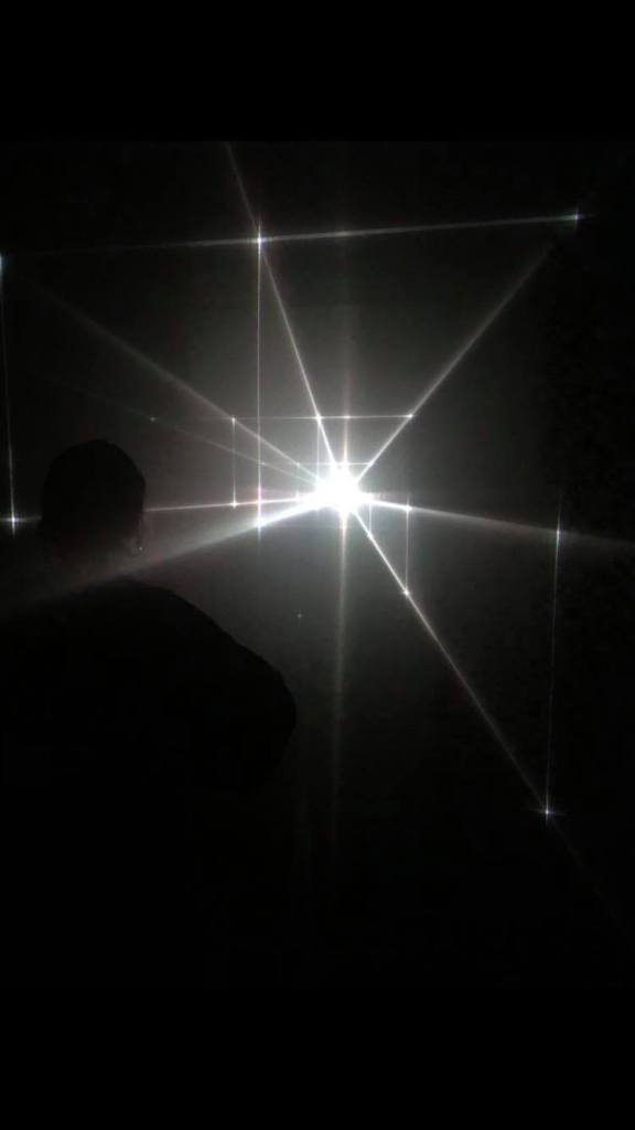
We then went to ‘Other Spaces’, an exhibition which was mainly based on light and consisted of a variety of dark rooms which light shows within them, all of which were amazingly immersive and almost other-world in the way it made me feel. Much like many of Eliasson’s exhibits it really made me feel like I was in another place. Specifically the Great Animal Orchestra which really immersed me into the experience of the natural world using just sensory experiences of light and sound.

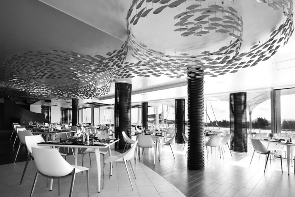
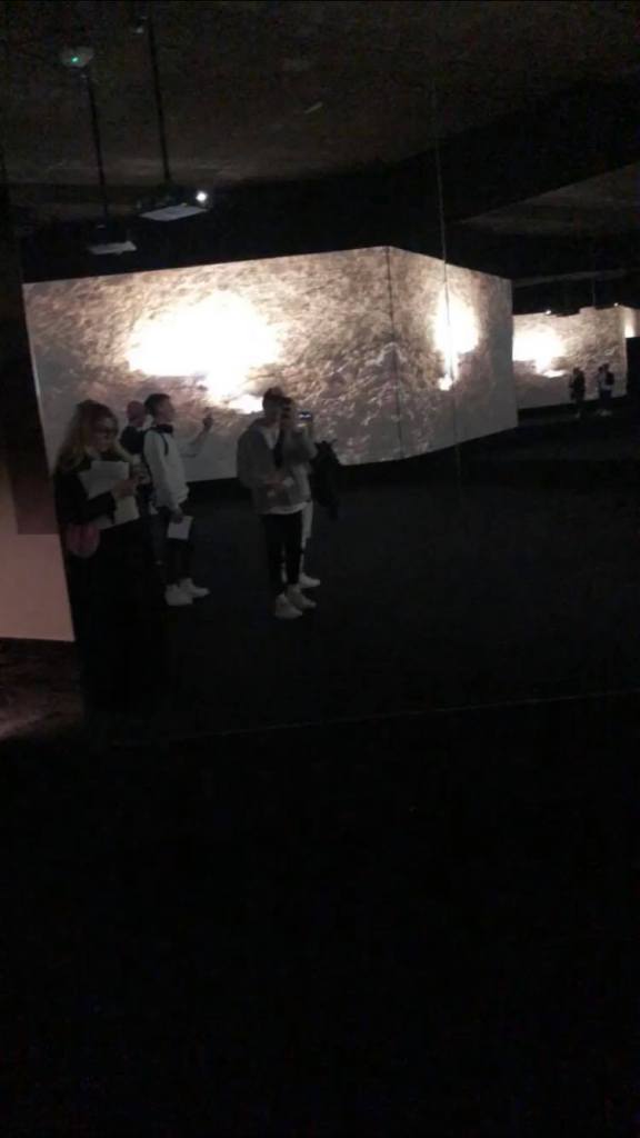
We also v visited another exhibition underneath the strand which was an exhibit put together by a v aridity of artists. All of the exhibitions within this space were very atmospheric, however one which really stood out to me was ‘The Store X The Vinyl Factory presents TRANSFORMER: A Rebirth Of Wonder‘ which was probably one of the most captivating exhibits I’ve visited in terms of the way it used mirrors to really open the room up and make it feel so large. It made me feel like I was in a big open warehouse unable to exit when in reality the room wasn’t any bigger than a standard room. Such a simple system of using the mirrors along with a dark room and the screens made the room feel very overwhelming.

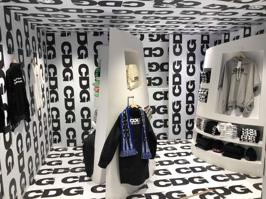
Finally, we visited Dover Street Market where we looked around the way the clothes and other objects were placed within the spaces within the shops. Although much of it was fairly product and function based, just looking to sell the clothing, one part of the store did really catch my eye. The CDG part was one which I had heard about and seen photographs of before, however being there was a completely different experience. Much like the previous exhibit I discussed using the mirrors, walking into a room with walls, ceiling and floor covered in typography and nothing else was a very overwhelming experience and really immersed me into the experience. It made me feel almost belittled which was a very strange but interesting experience.

tcejbO:Object – Introductory Task

After the introductory presentation we were given a task to choose one object and begin to decode it, to discover what the objects really are. We discussed within the introduction about mind mapping and using it to decode objects to place them into different meanings according to their meaning, narrative, associations and iconography. We spoke about how each object we interact with has so many different aspects and meanings beyond the first look. For example, one of my chosen objects was a joker from a deck of cards. Initially the meaning of the card is purely based within the deck of cards, however the further you delve into the meaning of the decoding of the card, the more becomes clear. The narrative of the card brings about more thought about it and makes you think about it in more detail, what games has it been played in, what is it made of, where was it made and when? Every object has more to it than meets the eye, and this part of the presentation helped show me how to look into everything with more of an open mind to decode them and look deeper into the each aspect of the object.

The task we were set was to decode a chosen object within a group, to think about the object and its functions, the materials it was made with and how can be viewed in different narratives and contexts depending on the placement of the object.

Our chosen object was a steal and glass bowl shaped item. After some discussion we figured out the object was a ‘conductor’ found up high on pile-ons. We discussed the function of the conductor and how the materials it was made out of helps it to carry out its function. The variety of materials also give more to decode when it comes to the textures, as well as the colours. 

We were then set with placing that object into a space to bring out the interesting features we discovered whilst decoding it. We thought the most successful way to display our object would be to use light and electricity throughout, as diffusing electricity is its original function. Our displays would be taking the original function of the conductor and make it more interesting using lights, sound and other electrical features. Overall I think all the displays ended up with very interesting design and aesthetic, the idea of taking a fairly standard and very functional object and placing it into a different context. 

Overall the session inspired me to look at objects in different lights, even the most mundane and functional items can be decoded and looked at in a way which takes them out of their initial narratives and places them into new scenarios in which they can be perceived in a completely different way.

tcejbO:Object – Introductory Task

Our first session consisted of a run through of the timetable as well as the essential project information, followed by an introduction into the project and what was expected of us, as well as an array of examples of ‘Object’ displays both inside or outside. 

Although I had a brief overall idea of what the project was about, I was still slightly confused about what specifically was being asked of us and what exactly was meant by creating an object display. The first thing which really struck a cord for me was the theory discussed surrounding the fish. Next to water, the school of fish gives a very calming, aquatic feel resembling water and the sea, however the second image shows the school of fish within a restaurant which gives a very contrasting feeling and clearly gives the aura of seafood. This example outlined for me that the way objects are placed within a space can make a large difference to the way it’s perceived. The other thing which really stood out to me within this introduction was the idea that the object, although being the main focus behind the display, is often only a small part of the what the display is presenting. 

Scabetti – ‘Shoal’ Private home, South coast of England 2014 (bone china)

Scabetti – ‘Shoal’ Konoba (stainless steel)

The examples which really made me think and inspired me were those which took some more simple, everyday objects and took them out of their original uses or meanings and placed them into a new concepts and scenarios which really make the viewers think. In Yayoi Kusama’s ‘Chandelier of Grief’ in 2016 took chandeliers which typically would be used for lighting within a room, and placed in into a dark room filled with mirrors and completely changed the aesthetic of what a chandelier would usually look like inside a room. Not only does it take a chandelier into new perspective, it leaves a lot to the imagination and allows the viewer to make their mind up about what it means and what to think about it.

Yayoi Kusama’s ‘Chandelier of Grief’ 2016

Some of the examples also used the objects within the display to tell a story about particular events throughout history, or even to guide the viewer through a particular event, for example ‘Shalekhet (Fallen Leaves)’ The Memory Void, Jewish Museum Berlin 1997-2001 by Menashe Kadishman uses the feeling of walking through the display to make the viewer feel a particular way, when walking through the exhibit. 

‘Shalekhet (Fallen Leaves)’ The Memory Void, Jewish Museum Berlin 1997-2001 by Menashe Kadishman

On Display – Signage and Wayfinding

As shown earlier, my exhibition consists of 4 rooms joined together which lead from one into the other, taking the viewer on a journey through the exhibition. 

This meant I there was no need for a vast array of wayfinding within the exhibition other than a few installations around the room to show where each door to the next room is. I decided I didn’t want much inside the exhibition which would take away from the work.

This meant over all that more wayfinding was needed outside the exhibition space but inside the Fiera Milano to direct the user to the exhibition itself.

I wanted to ensure the wayfinding within the space stood out above all the other things going on within the exhibition to make it easily recognisable so I used the brightly coloured gradient designs for the majority of my wayfinding. 

The top 2 are both examples of wayfnding within the exhibition, the lightbox being placed above each room to go along with the map and make the viewer aware of which room they are entering.

The other 2 ideas are examples of wayfinding in the Fiera Milano but outside the exhibition space, pointing viewers in the right direction towards the exhibition.

On Display – Promotional Installation

As part of my promotional installation portfolio page I wanted to mock up a variety of billboards and other installations to act as signage and wayfinding outside the exhibition, with information about what the exhibition is called, where and when it is and an insight into the branding and identity of ABYSS.

I wanted the designs to take after my posters, using the same minimal design and similar visuals, and although I wanted to keep the coherence I was aiming to make the billboards slightly different to stop the branding becoming all too similar.

On Display – Social Media Advert

As an example of a digital example of my brand I wanted to create a mock-up instagram page containing photos based around the exhibition. The exhibition is aimed at people of all ages and I think an instagram advert is a good way to reach a large amount of a particular age group.

On Display – Moving Identity

I wanted the gradient to be a large part of my moving identity and keep the idea of the movement of it fitting in with the light shows within my exhibition. I also wanted a smooth transition between that and the logo so I planned to use the circles, which are present throughout, to create a blank white screen for my logo to appear on.

I used after effects to make the gradient layer look almost alien in the way it moves around, before using my visuals to transition into a white page which I could then put my logo and information on. 

I didn’t want to overcomplicate it with too many moving parts and as the moving background was a vital part, I wanted to limit my logo to it’s animation by making it simply appear onto the page.

On Display – Website Ideation and design

I carried out research into website design before designing a web-page for my exhibition. I wanted to keep the coherent minimal design in the website. I looked into overlapping designs with text overlapping images in order for me to be experimental with my visuals and bold typeface. One of the main things I noticed about the websites in my research was that the menus are all located around the edges of the page anyway, which fits in to the rest of my branding so far so this was definitely a feature I wanted to keep the same. The more effective websites, especially the more experimental designs use large, bold text on the page for the more important text, similar to how an editorial would use hierarchy.

I also want to make sure I keep the minimal them with text placement along the side of the web-page, keeping lots of negative space in the centre of the page.

I sketched out a variety of website designs, taking inspiration from my research to create a minimal design utilising negative space to continue with the theme of the ABYSS and the unknown. I wanted to use the idea of hierarchy which I noticed within the website designs and used within my booklet deigns, I wanted my visuals and important information to be the largest things on each of the page, followed by the menu which will fit around the edges of the page. I didn’t want to overcomplicate the website design by adding lots of different pages of information into the mix so decided to design 3 separate pages which would show how the website would work to display information. I wanted to ensure the social media links were on the page, as well as the logo design. Although the visuals are the largest thing on the page, I think the most recognisable aspect of the website, as it was with the poster and booklet, will be the colour scheme as this is something which will jump off the page at the viewer as soon as they see it. Similar to the booklet, I wanted to keep a good level of pace and not be too repetitive with the colours and although I wanted the blue and pink gradient design to be a feature within each page, I didn’t want to overdo it and make it too standout.

Although at this point I was very happy with the overall design of the website I thought there was still some information missing, such as where the exhibition was being held, the map etc so I wanted a way of this information to be accessible on the page without the viewer having to be directed to a different page entirely. Because of this, I added 2 pop ups onto the two pages, the map as well as date and placement of the exhibition would pop up from the bottom of the page with a small amount of information.

On Display – Booklet research and ideation

I carried out research into booklet design and what worked/didn’t work in terms of layout. I decided, as I did with my posters, that I wanted to keep the minimal and experimental design that I had in the posters throughout my booklet to fit in with the style of the rest of my branding.

Many of the booklets utilised the grid system very well to portray a minimal style by adding captions and running heads etc alongside the main headers and main body of texts. I think many of the booklets and editorials use these small details, alongside things like page numbers and header/footers to frame the images within the page and add a sense of hierarchy. I noticed when looking specifically into exhibition booklets that many of them didn’t use a large amount of features that would be seen on some editorials such as running heads, pull quotes, sub-heads etc because very often exhibition booklets are much smaller and would become too cluttered. Although I wanted to stick to this to ensure my booklet didn’t become too cluttered, I wanted to make use of many of the facts I found out in my research about the sea within the booklet and therefor decided these could take the place of the full quotes and subheadings.

I wanted to play around with grid systems and the way text sits within it, utilising negative space to create a sense of depth and the ABYSS. Although I knew I wanted to use a minimal style, utilising the grid system, I knew this sort of design was one which was difficult to get right with lots of negative space involved, so sketching ideas was really important to get an idea of what it would look like on the page.

The majority of my designs were initially designed to be very minimal and as it said previously, to keep the negative space and go along with the them of t darkness and the abyss. I wanted to keep the black space and minimal theme whilst also fitting lots of information into the booklet so I decided a long but thin booklet would be a good way of doing this, as I could fit lots of text onto the page whilst still keeping negative space in the middle of the page. I wanted to use a 6 column grid as I knew if I wanted to add small bits of text including information and facts, I wouldn’t want these taking up lots of space and using 6 columns allowed me to use 2 columns for main body text and only one for less important information, keeping a good sense of scale and hierarchy. Again I wanted to keep the logo and my visuals present throughout whilst also adding colour through gradient shapes to keep with the luminous theme. The colour could be implemented throughout the booklet, however I wanted to keep a good sense of pace and not over-do the colour. I did however want the visuals and colours to be a large part on every page and be the first thing the viewer notices, as the visuals and the colour act as a visual metaphor for what the exhibition will be about.

The main thing I took away from my initial sketches is that the tall and thin booklet style to keep a minimal design, as well as the large visuals on the page works well to ensure good pace between the booklet and the posters, so I experimented more and finally sketched out some final designs, taking many aspects from my initial sketches and also adding in some finer details.

Taking influence from my research I created a minimal style booklet design using the grid system to aid it. I wanted to keep the booklet dark with touches of colour to stick with the theme, implementing my visuals while still keeping a good pace throughout the booklet.

I didn’t want either page on each spread to be filled with text or images, and I thought utilising a similar grid system as many booklets and editorials within my research would work well to keep the negative space on the page. I still wanted the dark and minimal theme to create an almost uneasy and ‘unknown’ feeling about the design, similar to my poster and how I envision the rest of my portfolio looking. Overall I’m very happy with the way it came out and think it definitely has a good sense of pace throughout which was one of the things I was most worried about. I kept the minimal bits of text around the page just adding more facts from my research and about the exhibition. I also wanted to make sure although I was being experimental with the designs that they still had a hierarchy within the designs.

Design a site like this with WordPress.com
Get started