
Our research backed up the overall idea of our manifesto that we wanted people to understand how people with mental illnesses are really feeling. The idea of the ‘feeling’ was one we looked much further into, spending a session as a group discussing a variety of ideas which experimented with the ideas ‘Feel How They Feel’, thinking about different materials and feelings which may make people feel a particular way. One of our most promising thoughts from Shannon was to experiment with the idea of using an itchy or rough material, which could represent the uncomfortable feeling someone with mental health could have, or similarly the idea that people don’t want to learn more about mental health because it makes them feel awkward or uncomfortable. We also thought the idea of feeling could be conveyed through the use of brail, or anything which the viewer would have to feel to gain an understanding of what it is or what it says.
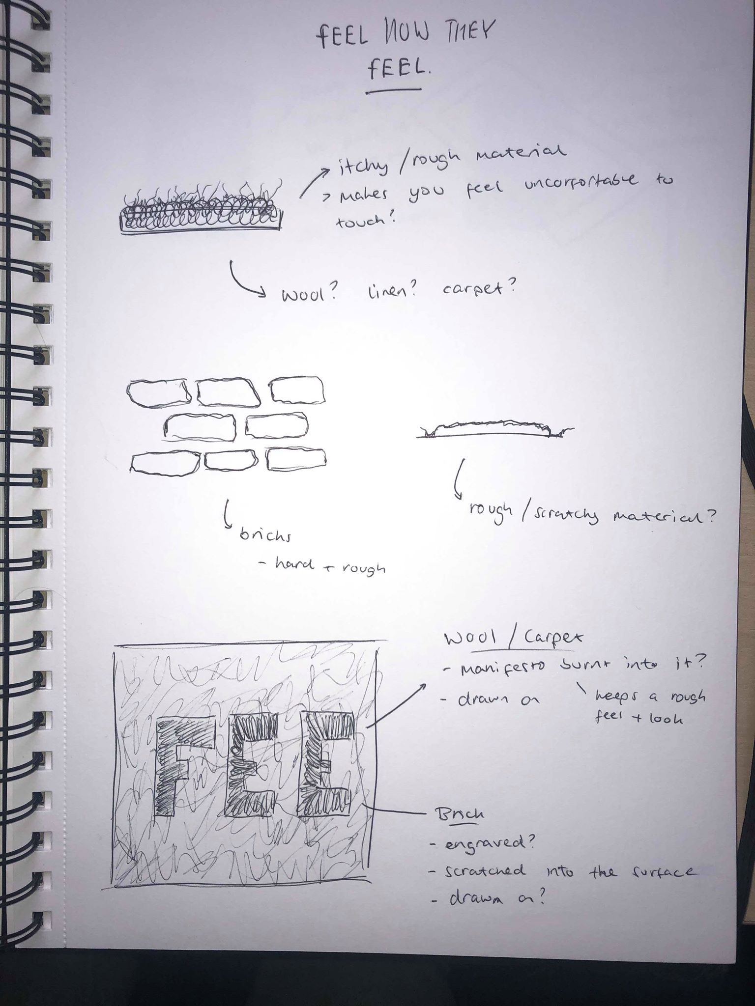
I drew some initial sketches, the first of which being part of an itchy material, thinking about what materials might be similar, for example wool or any sort of carpet material which could feel rough or itchy. I also thought about a brick wall and it’s texture, it would feel rough and scratchy and isn’t the sort of thing you’d want to be feeling. Both of these ideas back up the idea of a texture which would make the audience feel uncomfortable to touch.
Although we had a variety of great ideas using materials and technologies through the use of materials, we decided there may be a problem with communicating the idea of our manifesto and describing it if we used that method. We also decided this idea may not quite have the same aesthetic as a poster or leaflet for example.
My idea was to keep with the idea of how it would make the viewer feel to look at our manifesto, and i came up with the idea to design a poster with a visual that would feel uncomfortable for the viewer to looks at, something that and thought some sort of optical illusion could work as they can make people feel like it’s moving, for example. I also thought a blurred or distorted visual which an illusion would bring, could link with the idea that the media has brought about a very blurred and distorted view of mental health problems.
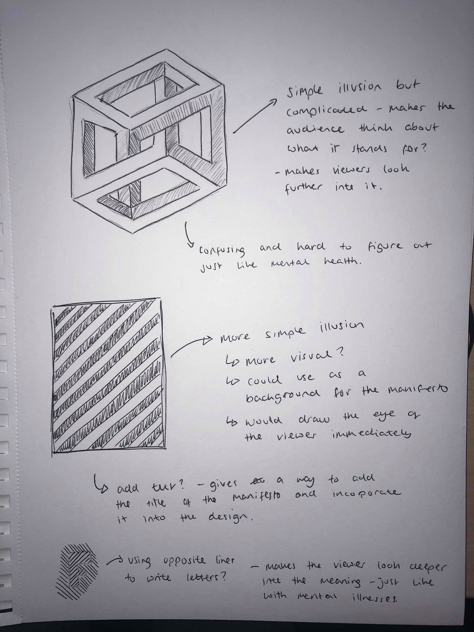
I looked into different types of optical illusions and sketched out a few ideas. The first is one which is relatively simple but one which takes a lot of thinking about to understand. It’s interesting because it makes the reader have to look further into it to understand it. I thought about the connotations it has with mental health illnesses and how something can be so hard to understand and comprehend when sometimes it shouldn’t be.
I also looked at a traditional illusion with the black and white background, although the sketch doesn’t quite have such an impact, a digital version can play with the eyes of the viewer and make it seem like its moving. This was the effect I wanted to achieve for our manifesto as it keeps the same idea as the previous, but it’s much more visual and would draw the viewers eyes to it more than the previous sketch. It could also be used as a background because of this.
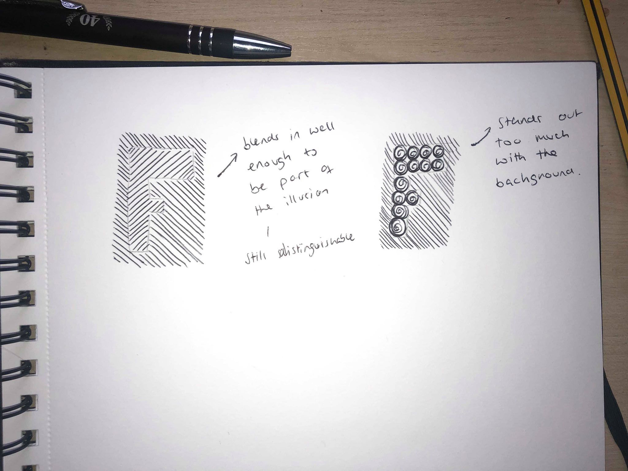
I decided the illusion was a great visual starting point and thought I could incorporate our title ‘Feel How They Feel’ into the illusion. I tried out a few different styles of incorporating the text into the illusion, one which blends into the background and the other stands out much more. I think the text blending into the background fits with the idea of our manifesto, the idea that you have to look further into something to understand the deeper meaning, or in this case how they’re feeling.
