
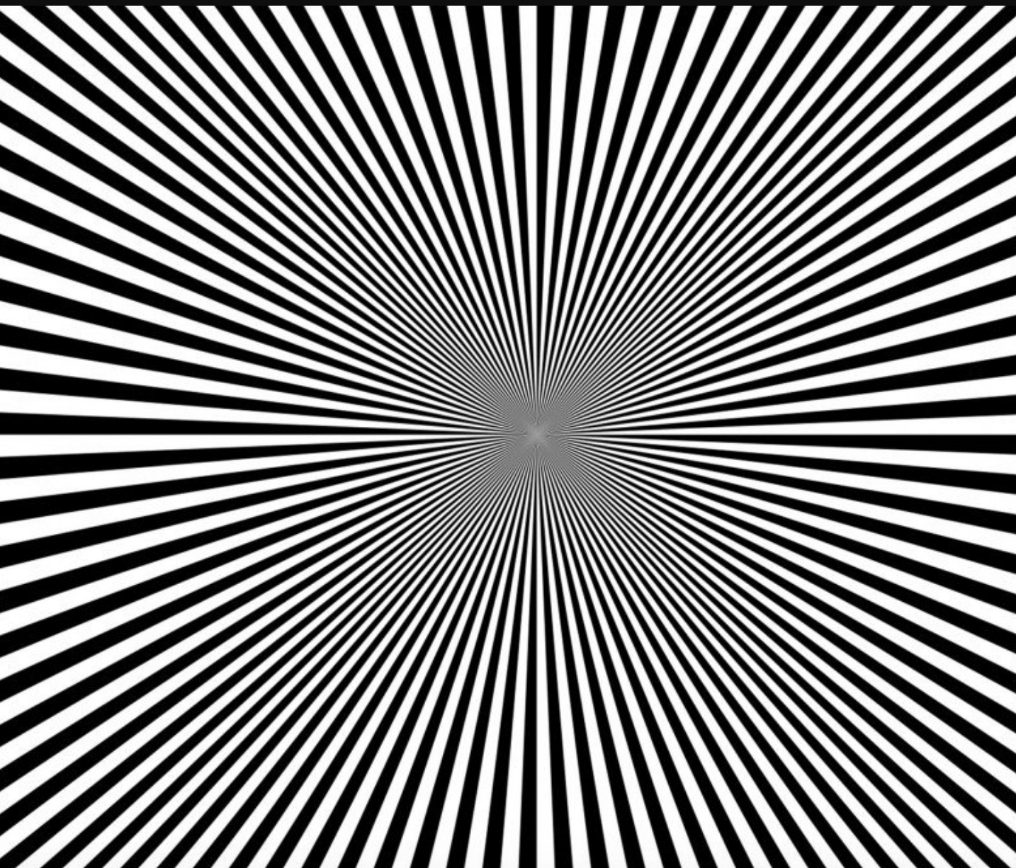
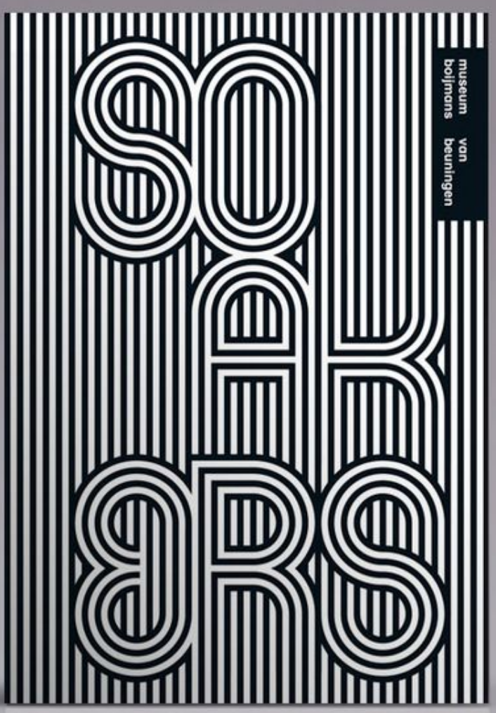
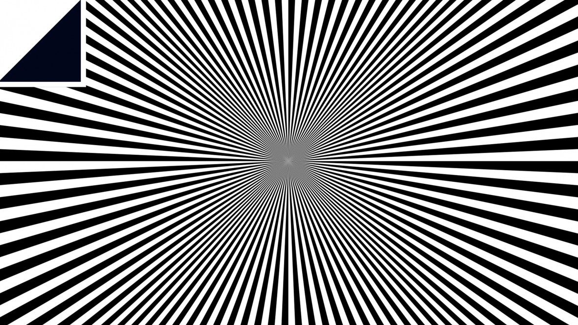
After figuring out the basic idea for my manifesto I looked up some simple illusions to find out what was the best style to use and found a variety of different styles of different colours
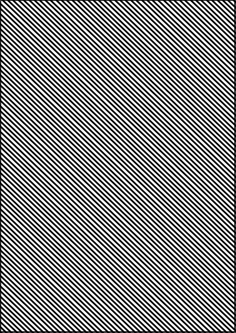
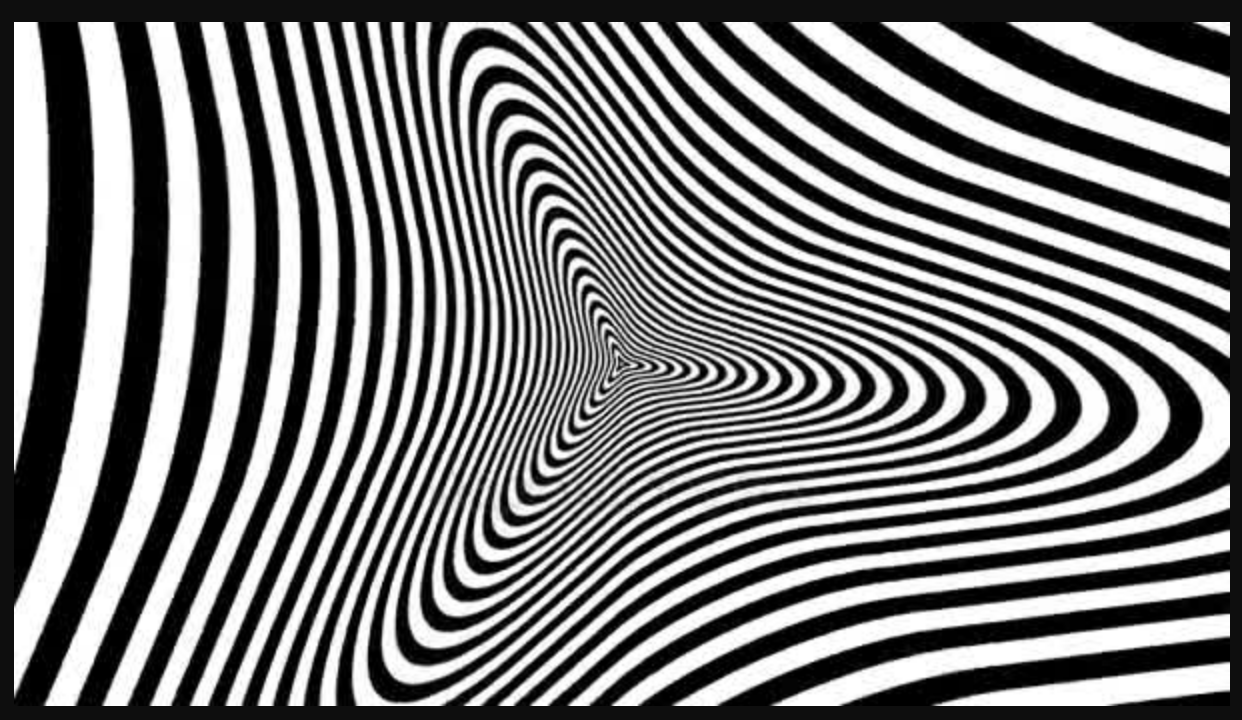
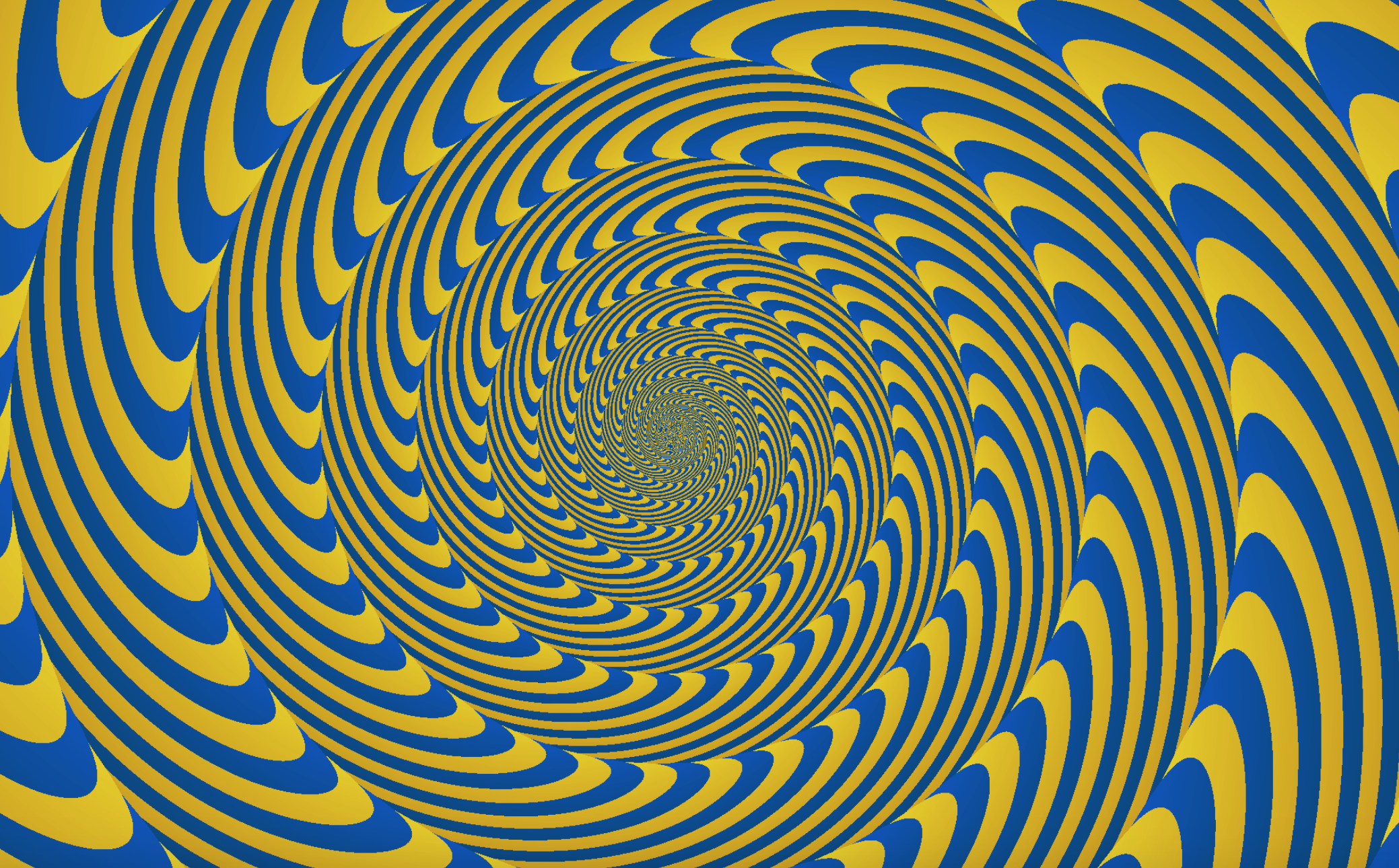
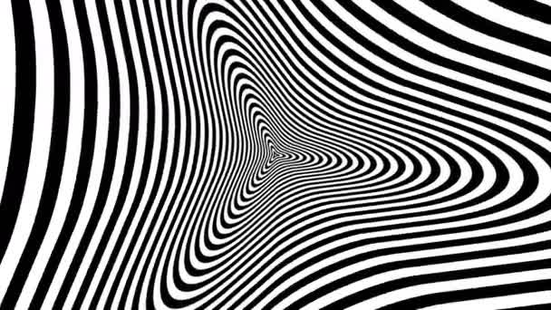
Personally I think using black and white is much more effective when used as a poster, although the colour may be eye-catching I think the colour plays with the eyes too much and makes it too hard to look at it for too long. It will also be easier to incorporate the text into it if i use a simple black and white. I also decided the two images on the right might be much harder to add the title to, and it might be more confusing and much harder to see and understand what it says when using a design like those which are more complicated.
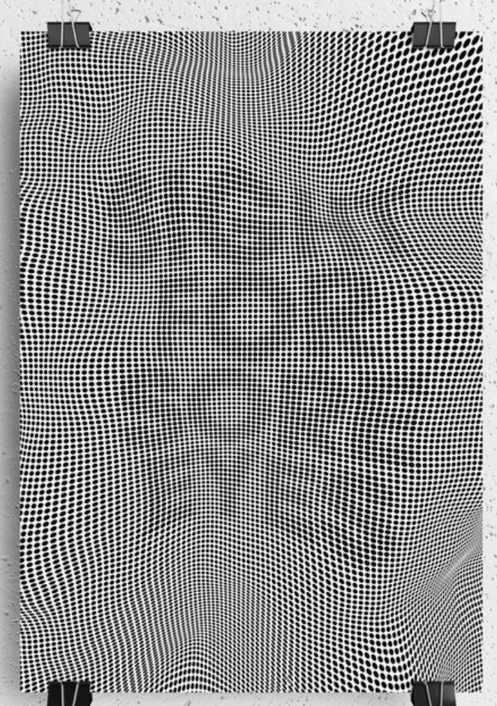
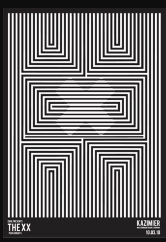
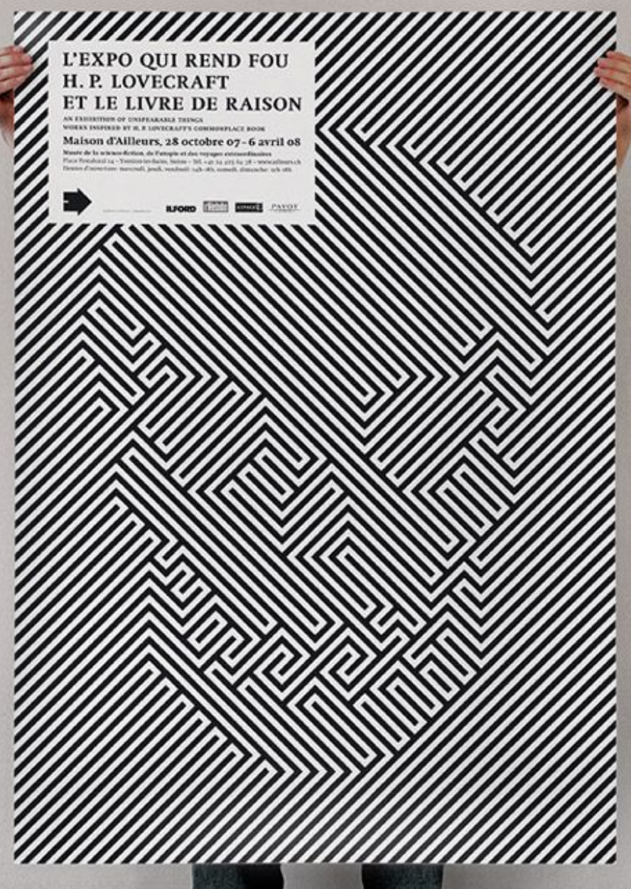
I researched online to find other designs similar to the idea I was looking to create. The majority I found were in black and white, possibly because the visuals are already so confusing and adding other colours in seems to overcomplicate it and strain the viewers eyes a bit too much. Overall I think the simple designs, for example the bottom two are the most effective, they draw the viewers eye with strong visuals of the black and white and by rotating lines they can create an image inside the illusion which seems to blend in with the background but is also recognisable.
I then used illustrator to create a few simple designs based around this idea and added the title to it so it almost blends in and makes it hard to read for the viewer, adding an almost distorted look to it.
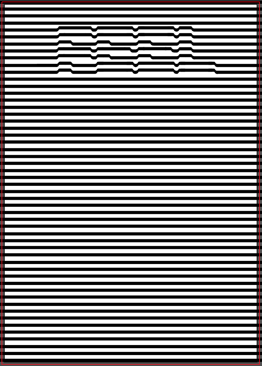

I attempted a few different styles of incorporating the text into the poster,The first of which was made to look like ‘feel’ is pushing out from under the ‘illusion’. The second was the idea I had during my sketches, using the lines rotated the opposite way to give the contrast and make the words stand out. I think the second variation is much more affective, the individual letters are slightly easier to read but they also blend into the background well and the contrast between the background and title is very effective. It portrays our idea of having to look deeper into something the find the hidden meaning, without hiding the ‘meaning’ or title completely.
http://www.4usky.com/data/out/46/164398811-illusion-wallpapers.png
