
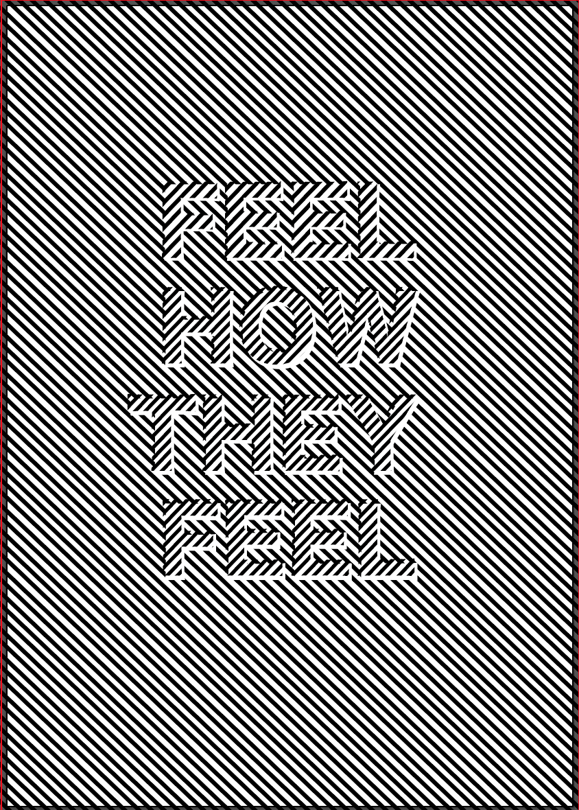
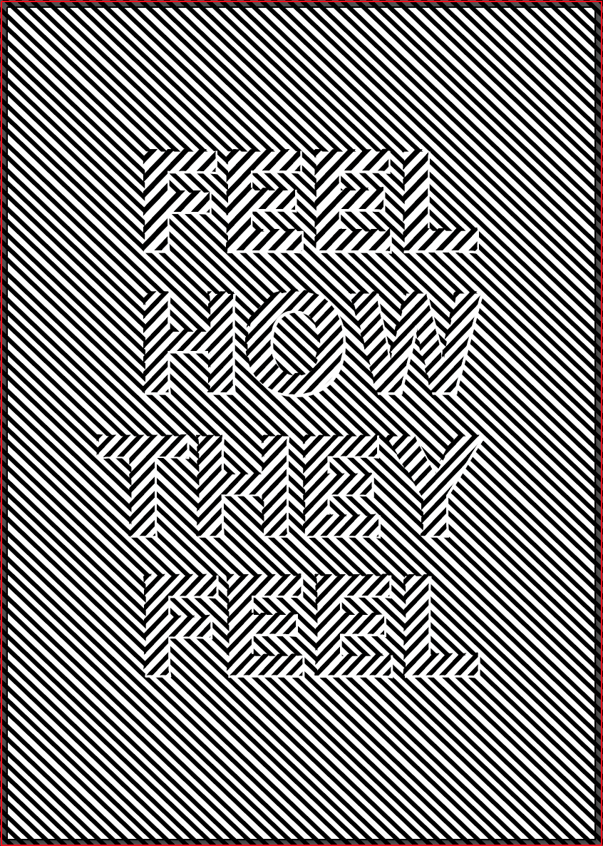
I then took the idea from my previous post and played around with it more on illustrator. I added a white background to it and offset the text slightly from the white background so the text is more easily recognisable. I also enlarged the text which I think also makes the text much easier to read. The smaller text is also indistinguishable from the background when it’s viewed from a distance whereas the enlarged text means it will be easier to see from a distance.
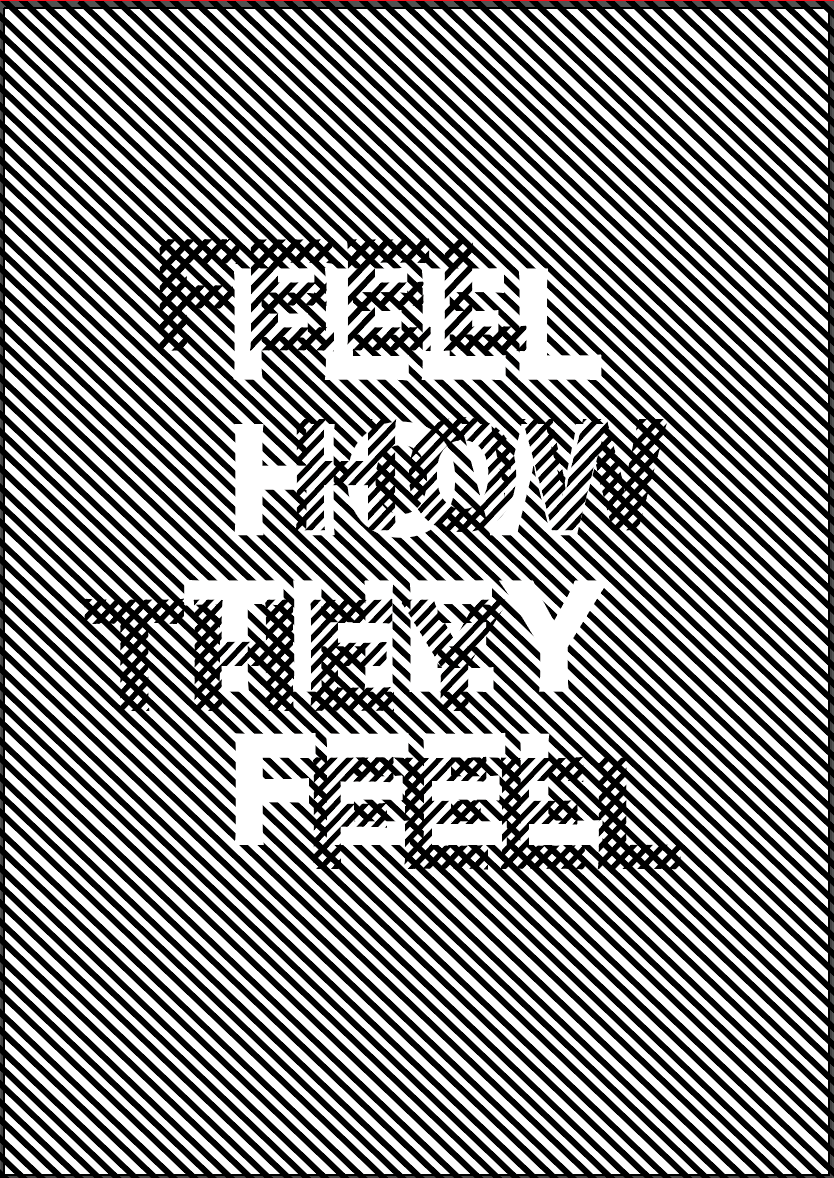
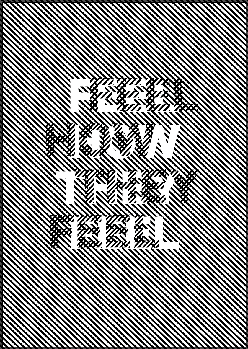
I also tried to play around more with the idea of a distorted or blurred view, keeping the white background in the same place and moving the text around into different positions. It adds extra layers to the piece, with the white text as well as the ‘checked’ areas where the lines going in different directions are crossing over. I think it works well and is very eye catching and acts as a focal point, however the idea of our manifesto is all about mental health disorders being hidden and not being represented truly, so I think the initial 2 ideas convey this idea much better by having the text almost hidden in the illusion, making the viewer look further into it.
