
I wanted the overall design of my portfolio to reflect me as a designer. I wanted it to look clean and sophisticated but also slightly experimental. I like to use thick bold typefaces and strong images wherever possible and wanted my portfolio to reflect this as much as possible.
During the lectures and 1 to 1’s I’ve had since the portfolio project began I’ve been told countless times to start and end with my best work, so I’ve started with what I felt has been one of my strongest projects of the year, my editorial.
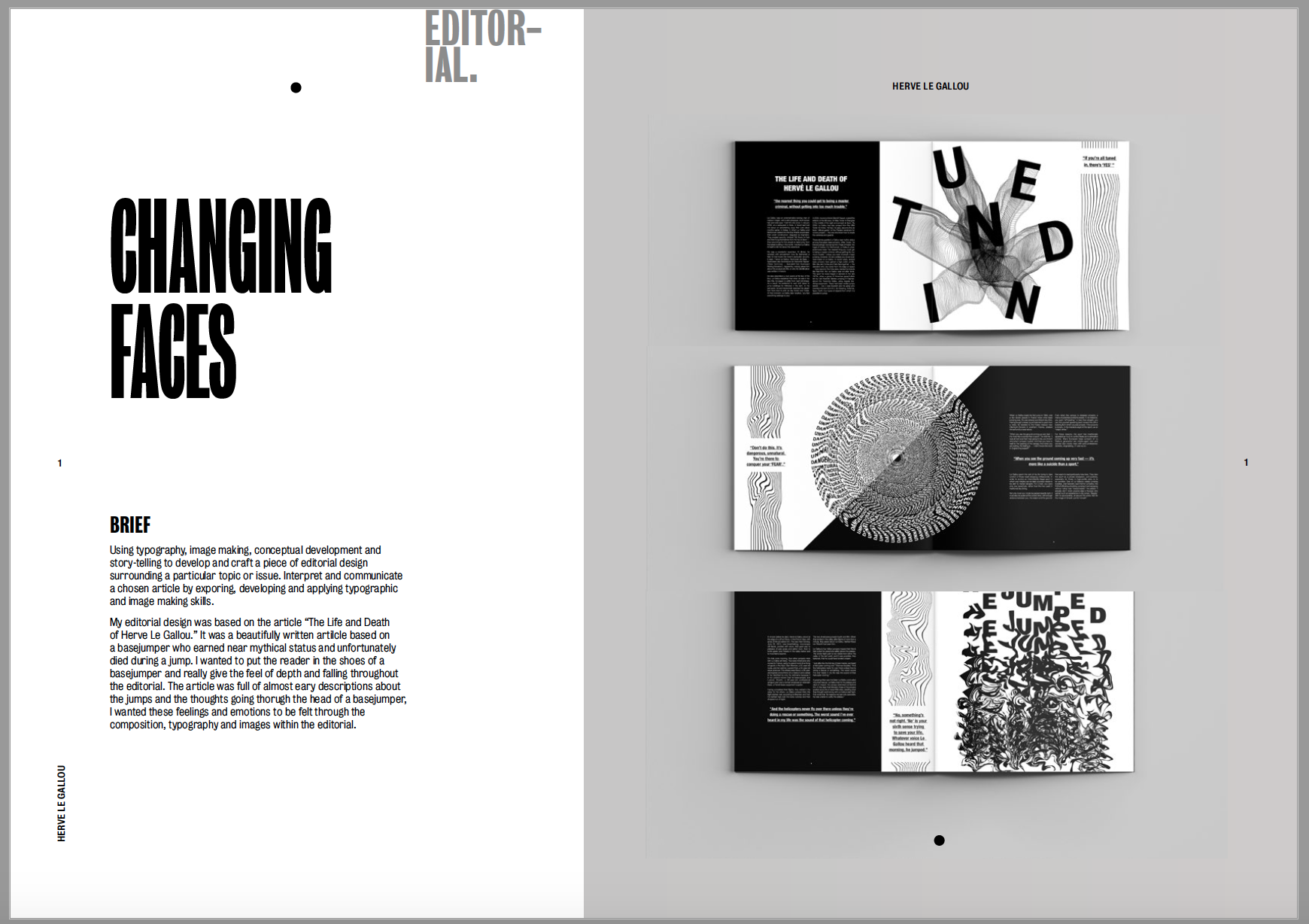
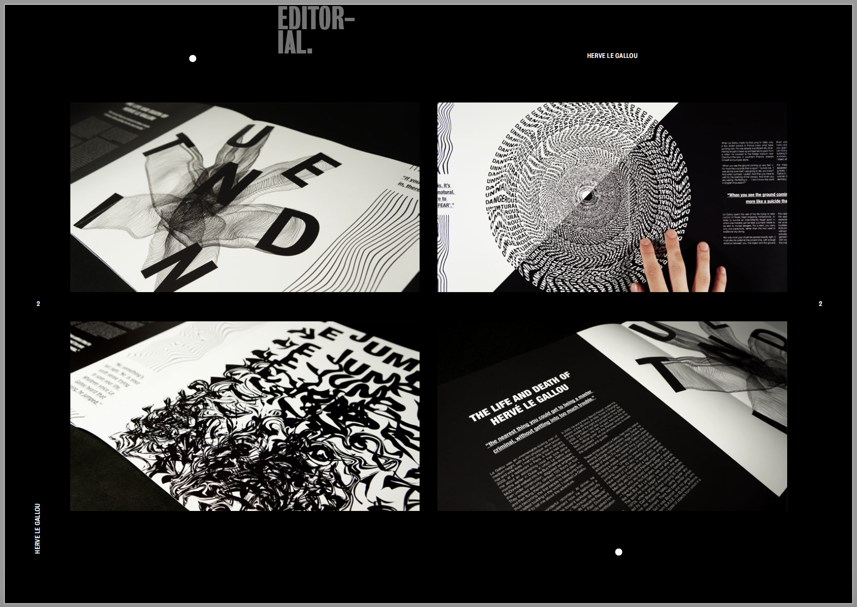
I used a mixture of mock ups and my own photographs to showcase my final editorial. I wanted the first page to contain mock ups of my editorial on a blank background as I felt the photos I took of my editorials weren’t good enough. I placed them on a grey background as I felt this was a good contrast between the black and white editorial and it really makes the piece stand out. I then added a second page were I added my own photographs which I had taken, I wanted to include the extra skill set as well as show close ups and details of the images and text I had created. I think the black background helps to bring out the white in the photographs and makes them stand out off the page.
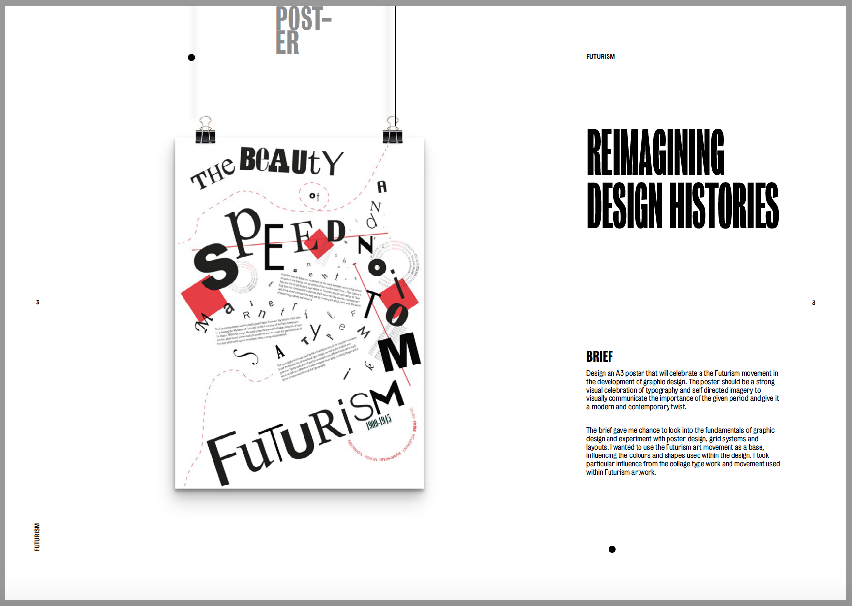

Next up was my reimagining design histories poster which was based on the movement Futurism. The poster is very clean and I used the space within the design to create the Futurism feel. I wanted to portray this in my portfolio by leaving lots of negative space around the image. The first image is a mock up of a hanging poster, I think it looks clean and shows off the piece very well. I then added my own photographs into the second page, again to show the fine details within the piece which you can’t see from further away. I left them on a white background as the images contain quite a lot of black and I wanted to keep the contrast between the colours.
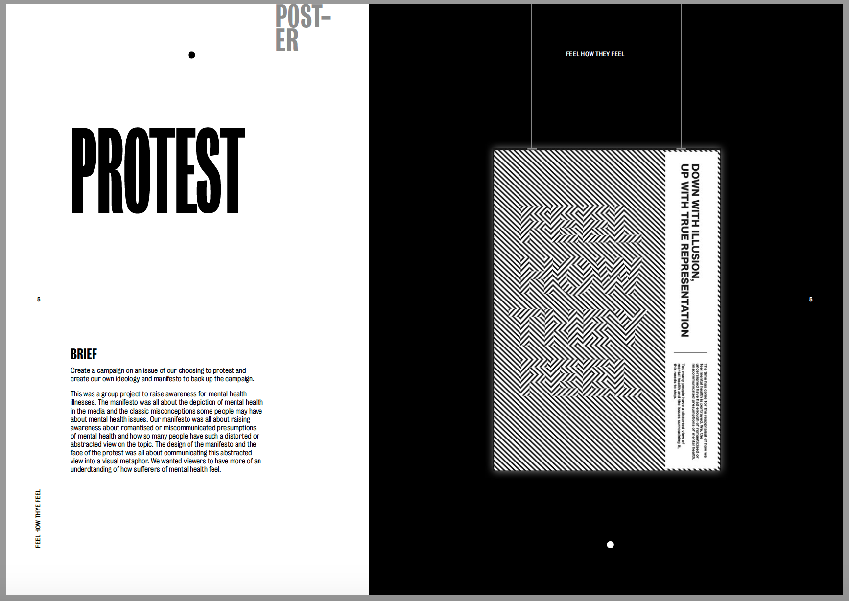

The 3rd project to showcase was my protest as I wanted to show the two poster designs together. The first image was a mock-up of my manifesto ‘feel how they feel’ about raising awareness for mental health. I wanted to add a black background to it to really make the optical illusion stand out and pop off the black page. I used a similar layout to the previous project to make the poster look as if it’s hanging on the page. Unfortunately I did not have an image of this being held in our protest to couldn’t include it. I then kept the black background and included a photograph I had taken in the centre of the page. I only felt as though one image was needed in for this piece as I just wanted to show the fine intricacy in the lines on a larger scale.
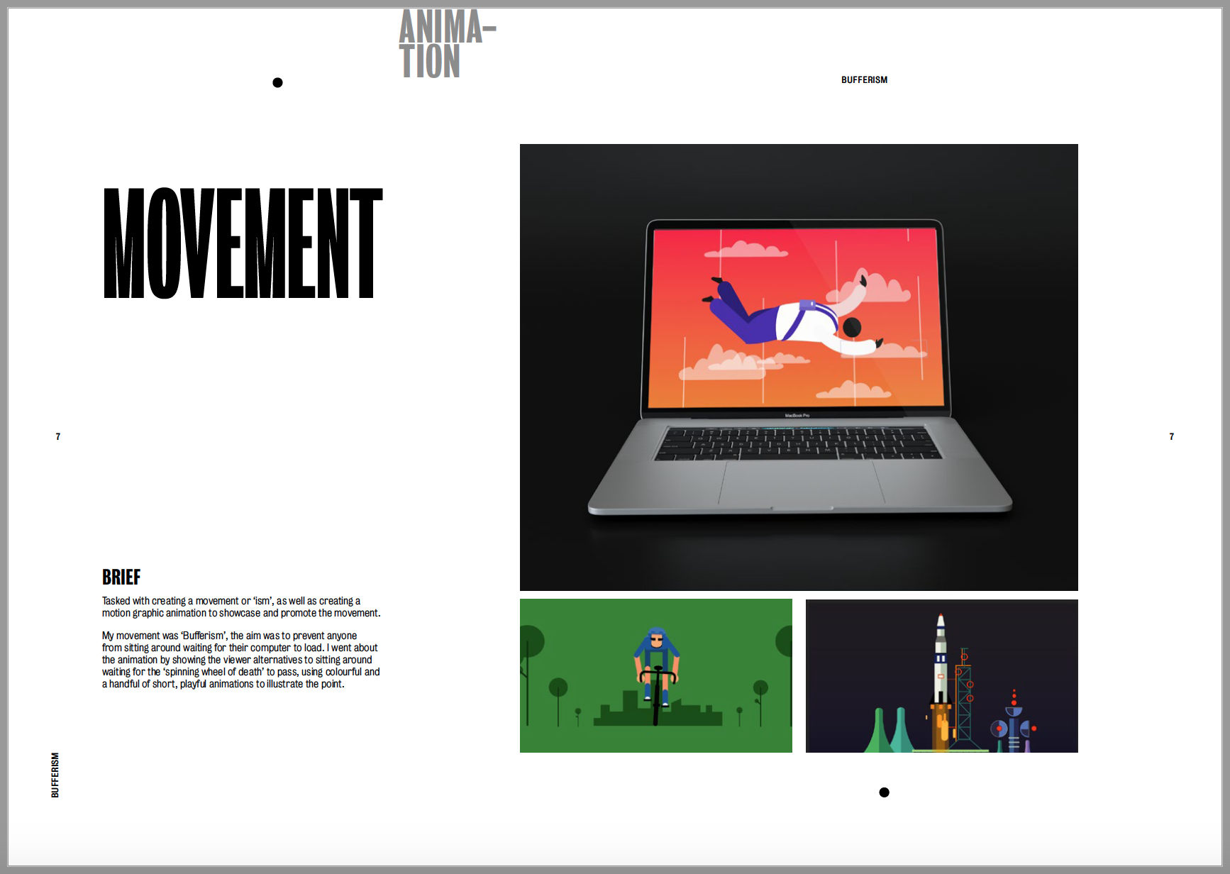
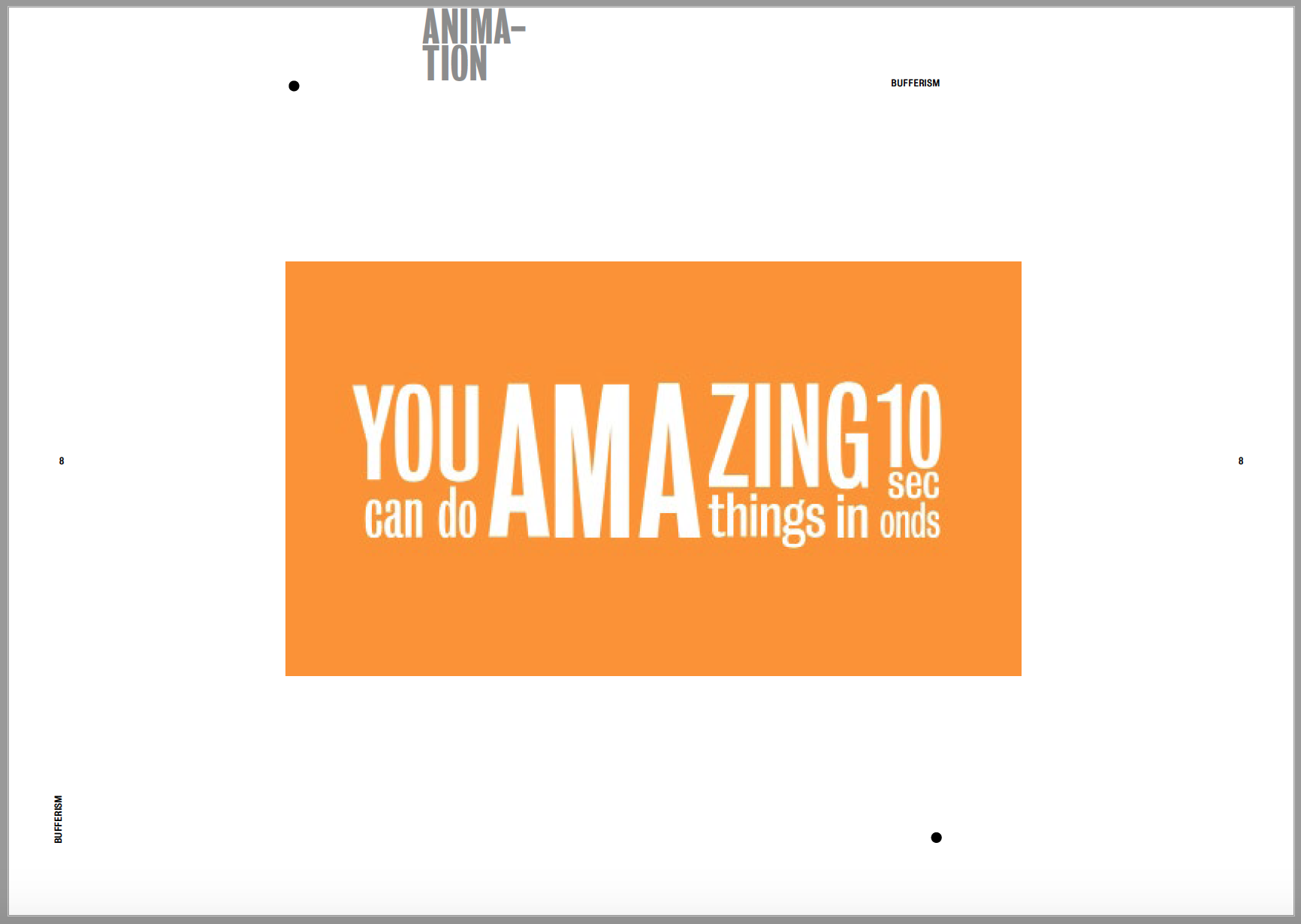
The next project was Movement which contained my animation. I contextualised my animation by adding it to a laptop screen alongside 2 screenshots of the animation. I wanted the mock up to be on a dark background to contrast with the white page size and to go along with the screenshots which are both relatively dark images anyway. I then imported my video into the second page so it can be view within the pdf. Again, I kept it on a plain white background as there’s already so much going on in the video as it is and I didn’t want to over complicate it with the background.
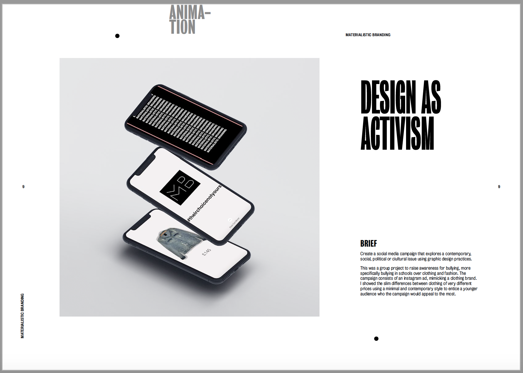
The next project was my Design as Activism project. It was only a relatively short project so I wanted to keep it to only one page. I gave a brief description of what the campaign was about, alongside a ink to the final video I created, and included a few stills in a mockup iphone screen. I didn’t want to over-do the page as there’s already so much black within the image so I kept the image background and page background light to make the images on the phone screen pop.
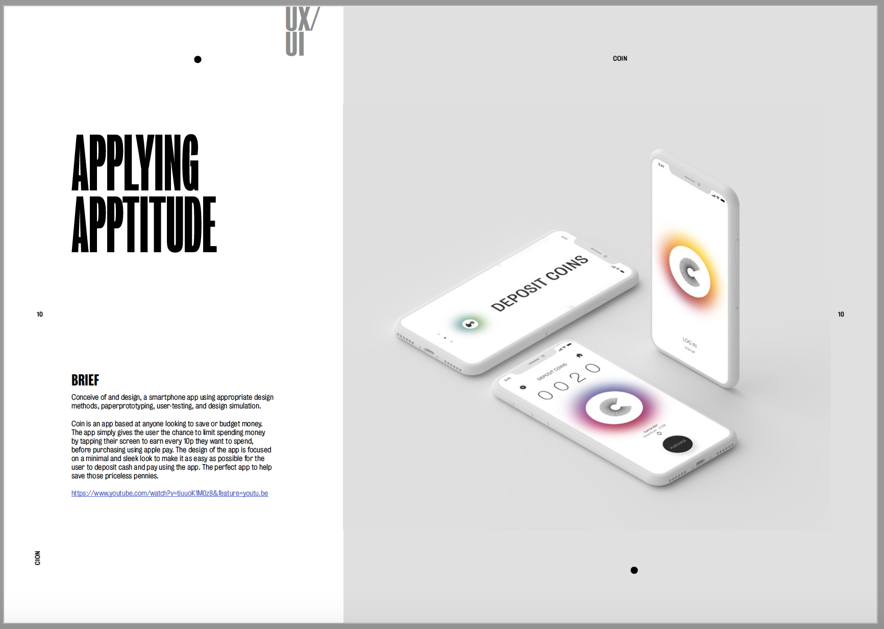
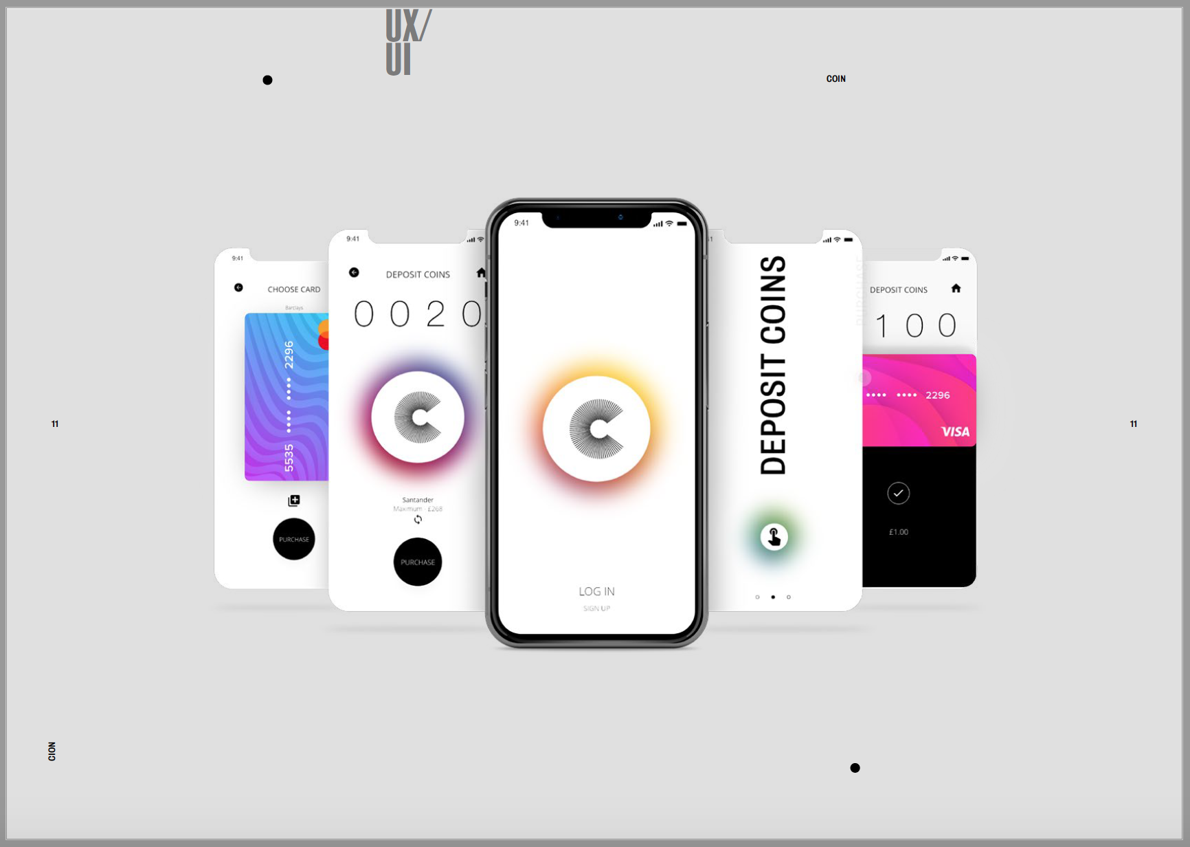
The final project to add in was my app design. As I said previously I wanted to use my favourite projects for the first and last slides so I decided to use my app design to finalise the portfolio. My app was a very minimal and contemporary design so I wanted to mimic this when I added it into a mock up. I think the mock up design suits the design of my app and they compliment each other well. I wanted the mock up to be central on the page so it wouldn’t take anything away from the design of the app. I then added another mockup in the second page using the same background colour. I couldn’t import a video into the pdf so I had to link the youtube video in the description. I wanted to showcase more of the app than in the first image so I chose a mock up with more screens so I could showcase more designs and show off the app more.
All in all I’m happy with the layout of my portfolio and think it encapsulates me as a designer within it. I think I’ve managed to show off my work as well as I could to get the best out of all of it.
