
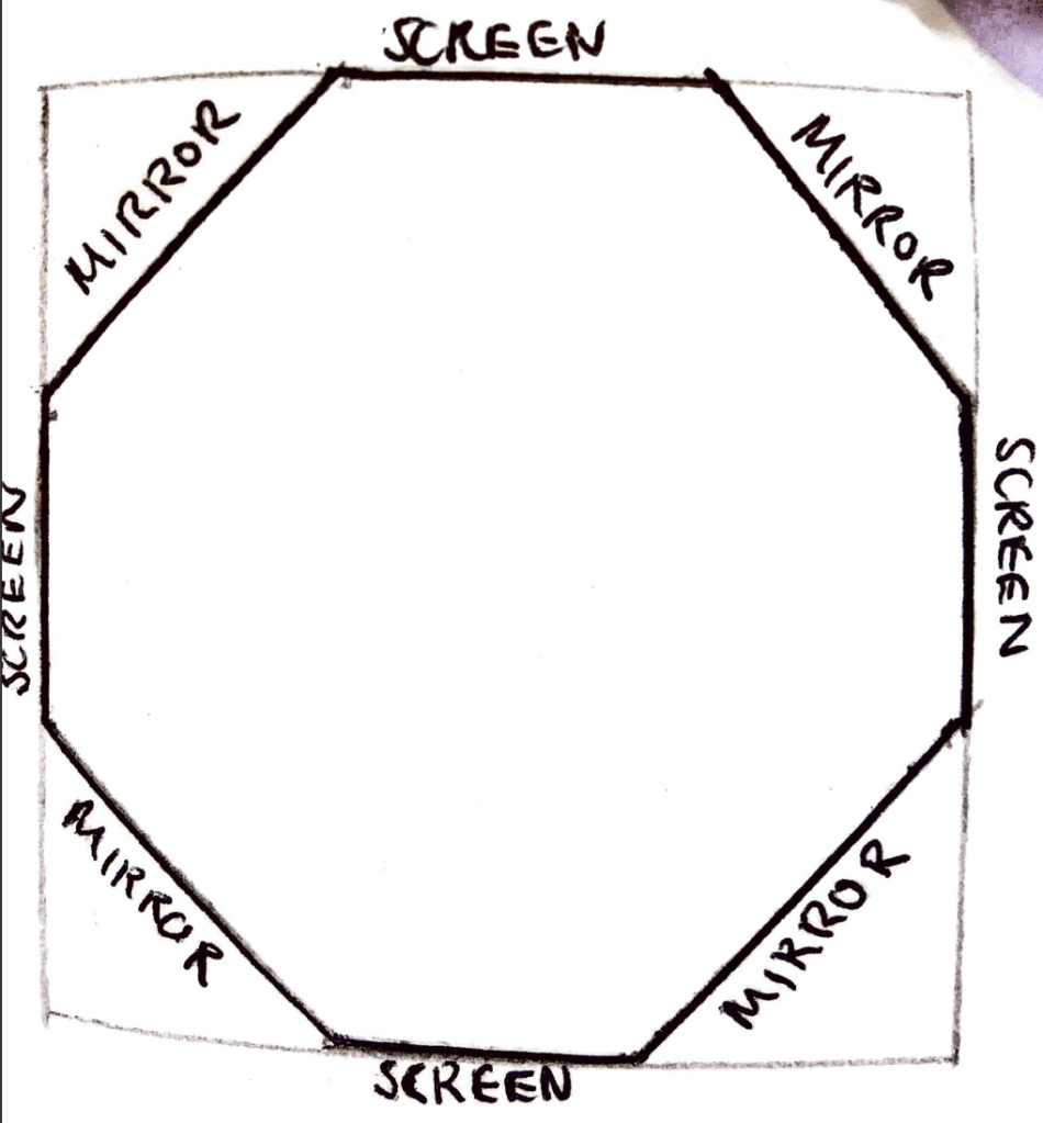
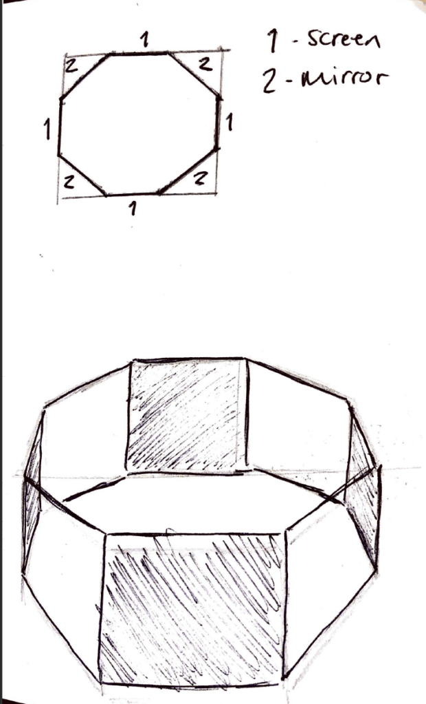
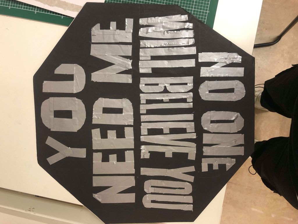
After coming up with my final design idea using a variety of sketches and physical models, I then needed to make it. Firstly, I decided that the shape of the room would be an octagon in order to implement the mirror system which I discussed earlier. I wanted the mirrors to make the room seem much larger than it is, and also to reflect the text on the walls to overwhelm the viewer even more.
Next up, I decided that the exhibition would be much more effective with a black background as opposed to white, to give a more dark feel to the exhibit. I think the dark background would really create a very gloomy feel within the exhibit which is just what im looking to convey.
Finally, although the idea of the faces coming out of the wall is very effective and one I wanted to carry forward, instead of them being on top of the wall and the text, I used black fabric to cover the page, in order to make it look like the faces are implemented into the wall as opposed to just being stuck on top of them.

Next up, the construction. I had another 1 on 1 tutorial with Craig discussing my final ideas and how rtf present them, and he showed me how to effectively create an octagon design in order to illustrate my idea.
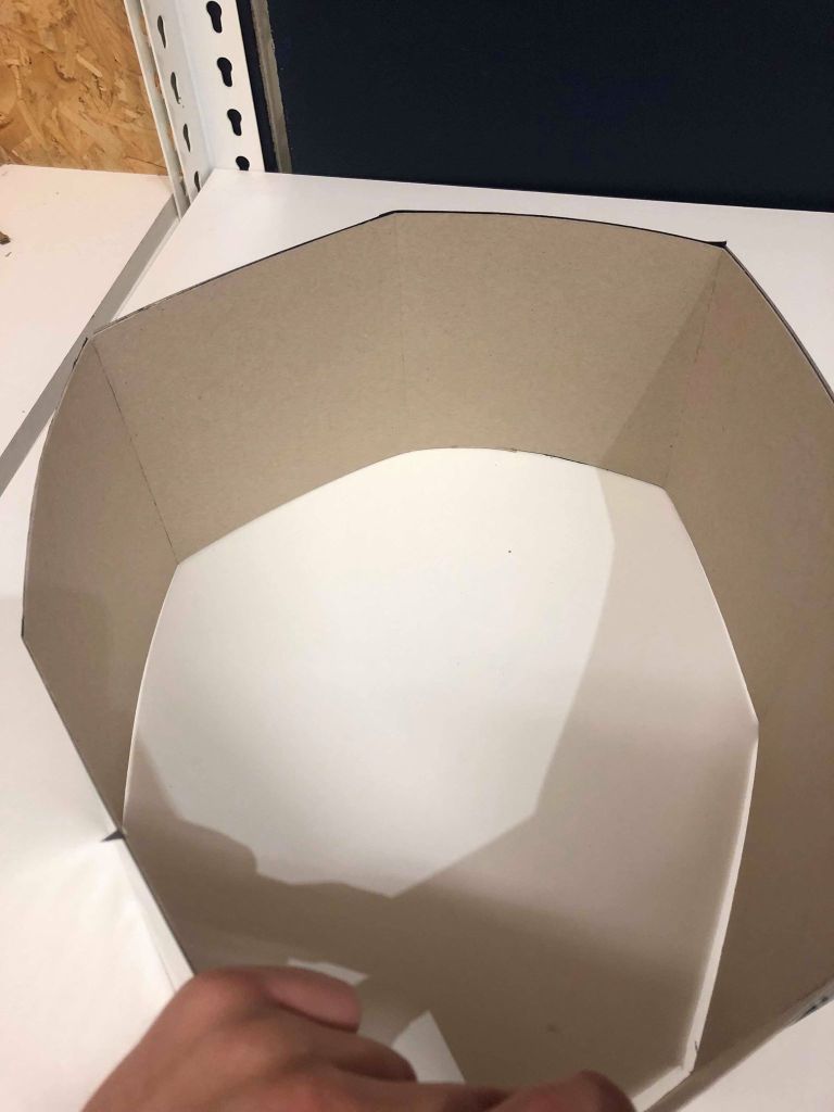
I cut card to create a long strand of ‘walls’ sized 15cmx15cm and scored the back of them so they would fold to create an octagon shape.
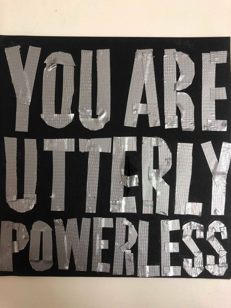
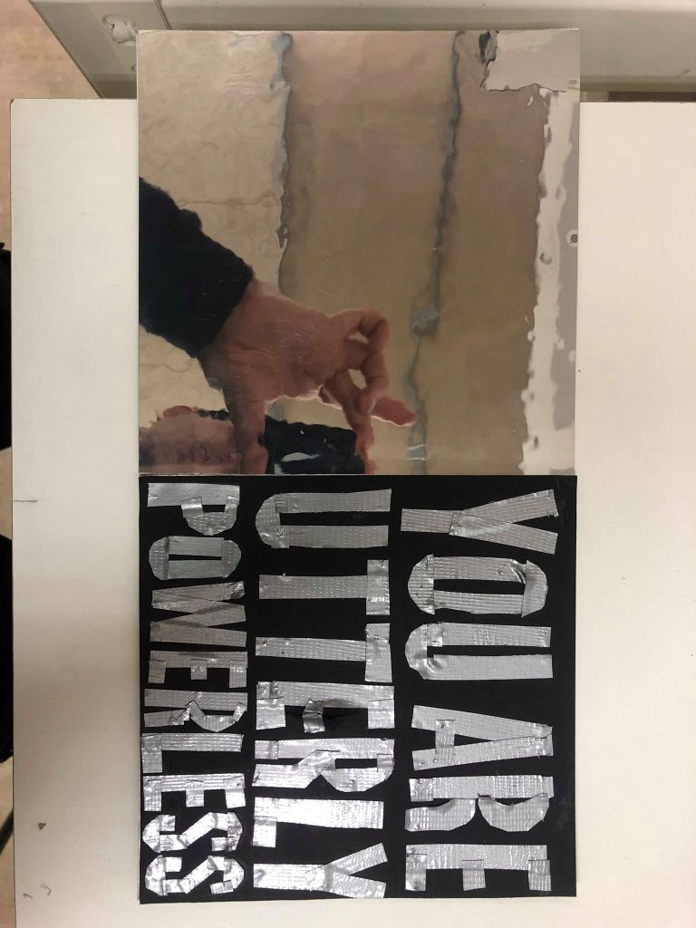
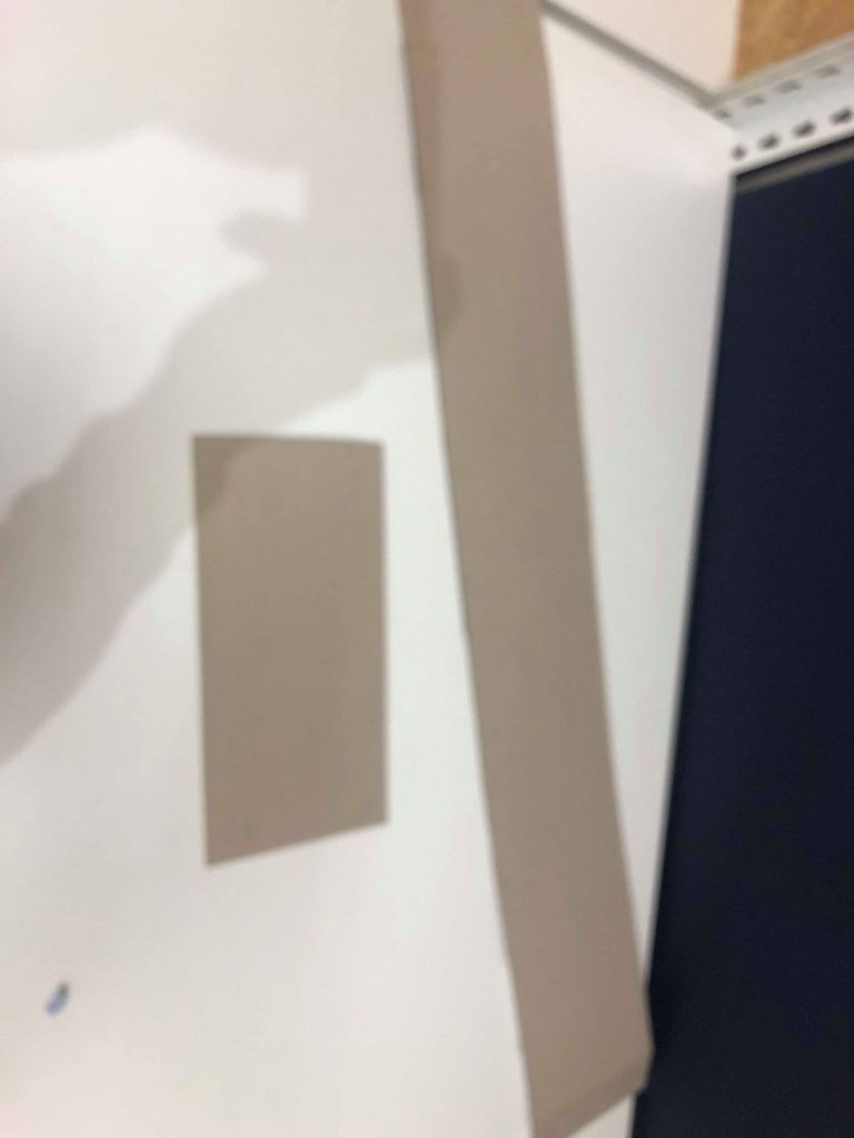
I then covered all the card in black paper and scored crosses into each one to give the impression of the faces coming out of the wall. I cut up the tape to spell out each phrase on each wall and made sure each one maintained a rough and textured feel. Following this, I added a mirror onto every other wall.
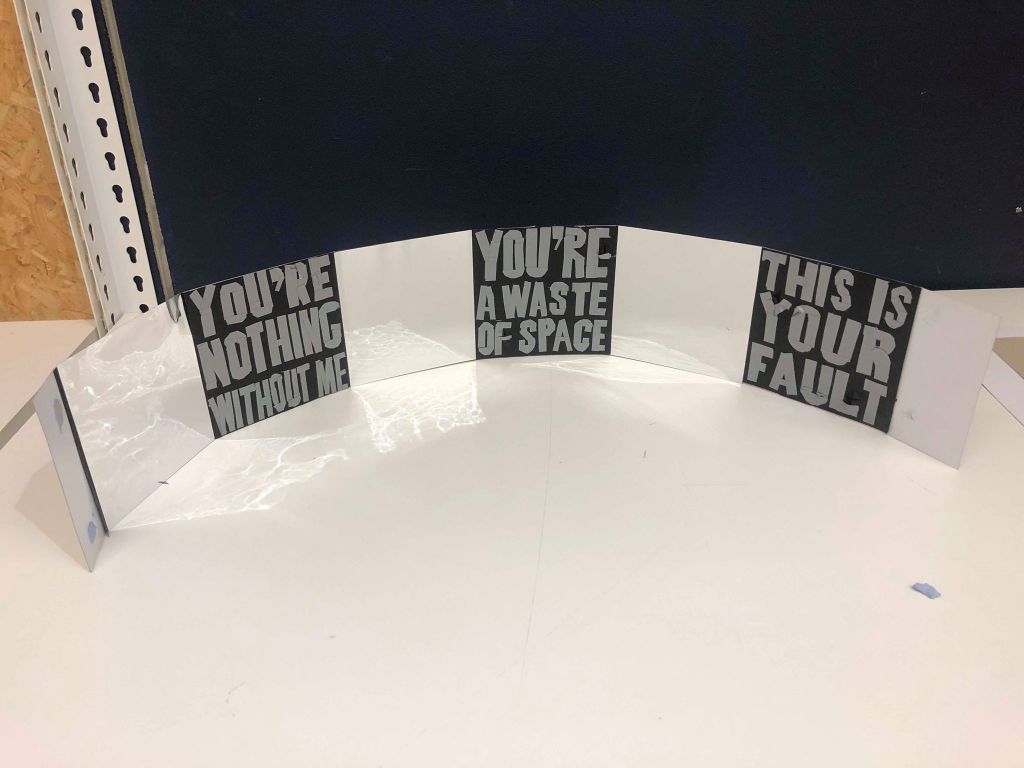
I then had the octagon shape along with the mirrors and taped phrases written on each page and was ready to assemble it. However although the writing on the walls along were exactly how I wanted them to look, I thought the design still needed to be more belittling and overwhelming, so I decided to add more writing to the floor.
Overall, the design of the exhibition was the most challenging part of the whole project due to the fact the small scale along with the intricate taping was very difficult. I also wanted the final design to be well made with the fine details done well as I wanted it to look as professional as possible which added more time onto the making of it. However, through the struggles I learnt a lot about the construction of small models such as this one, and although it isn’t something which is essential within my practice, if I ever needed to do this or something similar again, now I have the skills to do so. Although the final design could’ve been improved here and there, I think the ideas behind the exhibit were more important and the overall design find need to be perfect, especially considering it was something completely new to me. Next time, I would ensure I use a much larger model than what I used this time in order to make each wall including tape look much effective.
