I then took the research from the previous post and used it all to start designing an initial identity for the brand.
The identity had to be a culmination of the rhetoric of the government response as well as the visual style of a sports brand. This was about combining colours, typographic elements, imagery, tone of voice and so much more to ensure the visual language not only looks prominent and captivating at first glance, but also contained meaning within each element.
The idea behind making the brand itself a sports brand stemmed from the fact that the majority of the motivational phrases used by the government throughout the pandemic are strong and motivational which fits in with the rhetoric of a sports lifestyle brand, and the need for the visual style to be bold and striking also aligns perfectly with sports.
Typography – The most important aspect of the typographic side of the brand was to fit in with the idea of the sports brand, which after research I found tended to be saturated with very strong, bold typefaces. The typeface fits in with the colours, imagery and other aspects of the brand in being very captivating and noticeable, enabling it not only to stand out from all the other advertising noise, but also to fit in with the dynamic sports lifestyle brand cover. The typeface also has standout ink traps located on various letters. The ink traps create a beautiful and unique typeface, but also create something very different from everything else and isn’t what you’d expect from a normal sans serif typeface, which goes along with the notion of the brand that none of it is quite as it seems, none of it is ‘normal’ in any sense of the word.
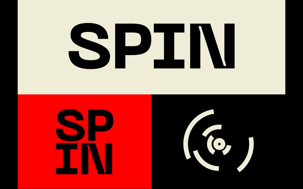
I developed some of the brands initial parts lf the identity, the logo mark, logo type, imagery etc.
Colours – Whilst the project is based around all aspects of the governments response to Covid, a vital part of the issue is the propaganda. The idea that the government used propaganda to distract the public from many of their mistakes and flawed responses using patriotism and slogans in order to push the public forward and away from the problem instead of confronting it head on. The thing which stood out to me when researching propaganda was the taglines alongside the colours, which even from just thinking about wartime propaganda really stuck out in my head. The off white colour usually coming from the paper used but still being a very prominent part of the colours scheme, with the red and black being used within propaganda to not only make it stand out but also to link it back to being British, particularly the red. As well as being very prominent within popular propaganda posters and advertisements, the red and black in particular are also the types of colours seen very often in the likes of sports advertisements, with the aim of being bold and striking, so the colour scheme linked perfectly with the both ‘sides’ of the brand.
Logo – The logo is derived from my research into some of the countries in the world with the highest dearth rates, of which we are involved. The Logo mark is a simplified version of a world map, with the lines showing the top 7 mortality rates by countries, to illustrate again that the UK is unfortunately very high up in terms of that statistic. At first glance, the logo boasts a dynamic design with movement and energy as its main aim, fitting in well with the athleticism of sports and also the name ‘SPIN’ itself. The real reason for the logo design, however, is all about 7 of the countries deaths from Covid, USA, Brazil, UK, Italy, France, Germany and India. The logo design, as well as the other aspects of the branding illustrates the propaganda side of the brand, that not everything should be taken at face value and further illustrates the idea of the governments strategic communications, but is also critical of the governments Covid response by questioning the deaths in the UK as it sits as one of the worst worldwide for deaths and mortality rate.
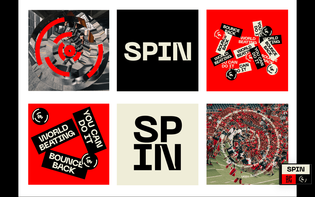
Stickers – One of the aspects of propaganda which I found out through research was to use phrases and slogans which stick in the viewers heads, allowing the government to use them relentlessly. An example from the pandemic would be ‘STAY HOME, PROTECT THE NHS, SAVE LIVES’. Whilst the sentiment is there, the irony is the governments response didn’t always adhere to their own taglines, did they protect the NHS? Did they save lives? The best way to create phrases which stick in peoples heads was simple, to create stickers themselves. The stickers were comprised of important sayings from Boris in his Covid-19 announcements. ‘World beating’ test and trace which has proven to be far from world beating. The UK will ‘Bounce back’ from the pandemic, using patriotism to convince the public to look forwards rather than backwards at their mistakes. ‘We will win’ because of our NHS, which ironically the Government have refused to fund and protect throughout the pandemic.
Imagery – I also changed the imagery to fit in with the sports brand, ensuring it all fits in and feels as though it is all about sports even when the imagery is edited and spun. I also added text on the inside of the imagery within the spin, this could be used as a way to reveal what the brand is all about through AR or just animation.
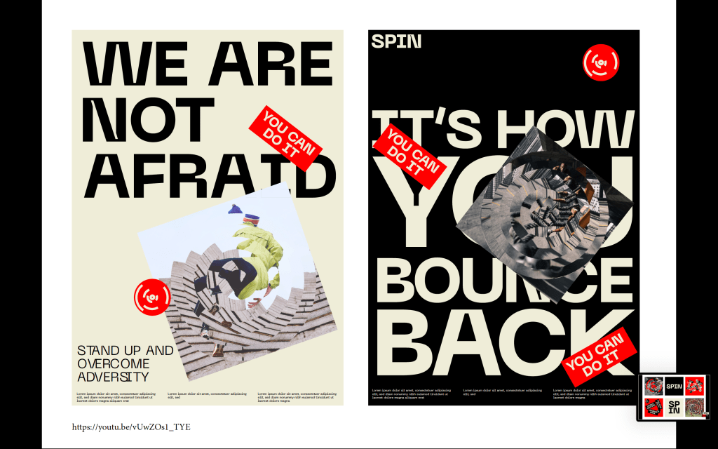
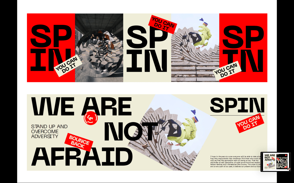
A created a few poster and billboard designs just to get a sense of what the identity would look like on real outcomes rather than just isolated elements. I used more of the motivational phrases stated by Boris and other officials within the government alongside the imagery and stickers. I think they work well in order to keep to the sports brand, they are definitely bold and dynamic enough, whilst also ensuring every element on the page links back to the governments Covid response.
FEEDBACK –
The feedback from David was positive and I think it has taken a massive step forward from the previous tutorial, however David did have a few ideas of how to take it further. One of those was to change some of the imagery (specifically the one of the sports fans Ibn the stadium) to ensure all the images are people by themselves doing workouts, not with anyone else, as was the case during the pandemic therefor hinting at lockdowns, social distancing etc. Whilst not being critical of the government, it is just another thing which alludes to the pandemic very subtly.
David also had another idea when discussing the text on the imagery, the idea initially was to reveal the real reasoning for the brand through AR when viewers walk past, or animations on social media. However David proposed the idea of having a date when everything is released, as a way to draw the viewer in and keep them interested and then all of a sudden given them all the information at the same time. We also discussed how the date could be the 21st of June, the date restrictions are supposed to be lifted.
