
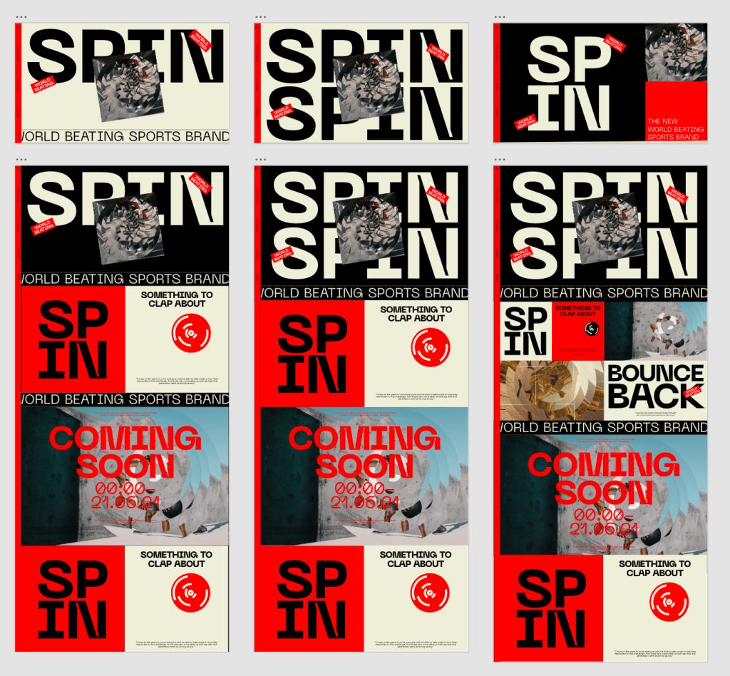
As much as I was pleased Wirth the initial drafts of the website and app, they needed a bit of development to get them to the level I was looking for. Unfortunately they just didn’t feel as striking as I wanted them to be. They are, at first glance, digital touchpoints for a sports brand so the whole thing had to feel much more dynamic and conspicuous so I wanted to revamp them to feel slightly stronger than they were previously.
I also wanted to give the app the same treatment to ensure it keeps up with the same style, I had to tweak the layout of course but I wanted them to feel like one and the same, design wise.
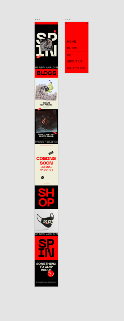
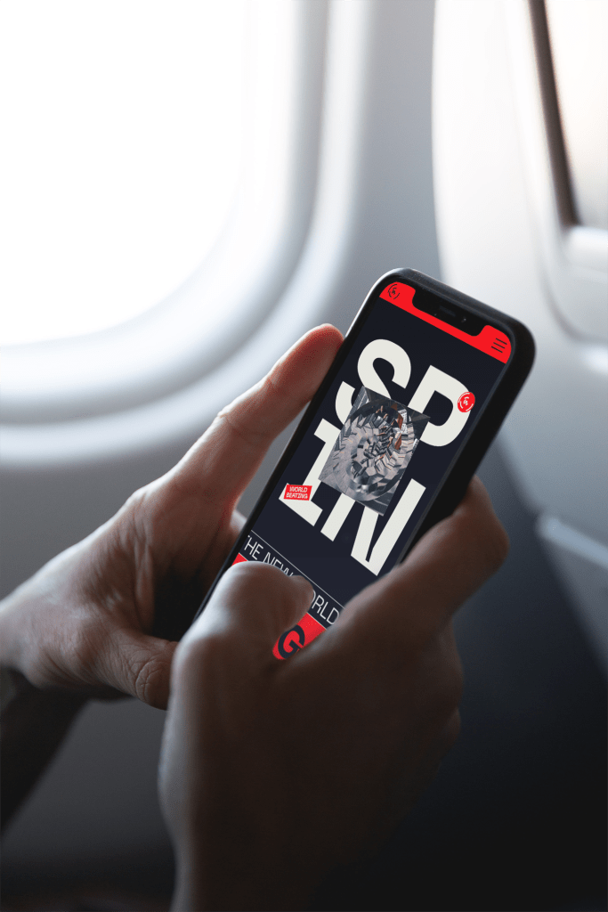
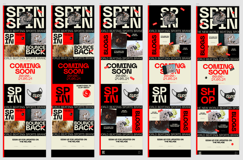
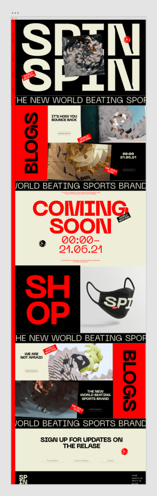
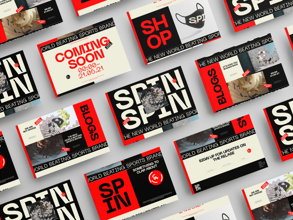
Overall I’m much more happy with the final iterations of the website and app. They take a very similar direction to the promotional material, using the branding and taking it further to a digital touchpoint. Due to the target audience being 20-30 year olds who may not be as informed as some of the older generation and using digital touchpoints will allow that age range to engage with the brand the most.
The design of the website uses blog and shop features which would be constantly updated until the date of the release in order to keep the user engaged with the brand up until the 21st, composed of government updates which have been spun to fit in with the brands aesthetic and tone of voice, and items for sale such as masks which are all Covid related.
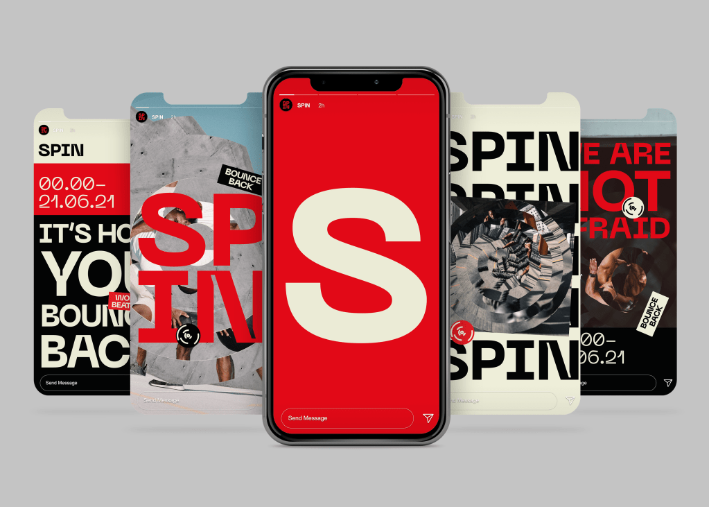
Social Media
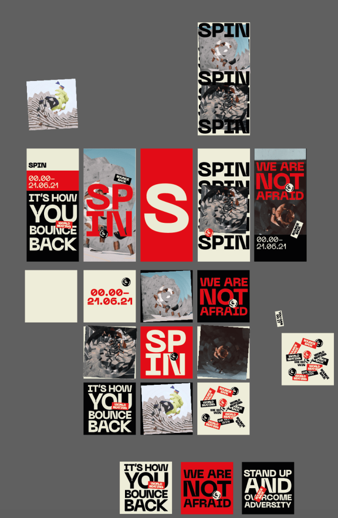
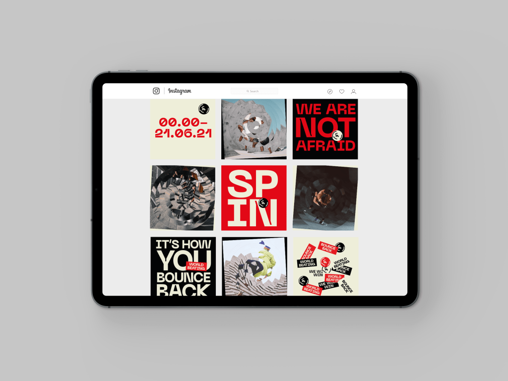
Similar to the website and app, the age of the target audience means social media is the perfect place to attract users attention and draw them into the brand using the same impactful imagery as the rest of the identity.
Similar to the website, the social media sites would also constantly be updated with new blogs and imagery in order to keep users engaged with the brand.
Gif
The final digital touchpoint I wanted to add was a gif. Something which encapsulates all of the visual language in one place all at the same time, to be used on social media, website, app etc and give a sense of the brand, but more importantly hint at the real reason behind the brand by having everything significant in the same place. I also added a few hidden hints within the gif just to play around a little, images of Boris Johnson and some cryptic facts/figures for eagle eyes viewers.
Overall Im happy with all of the visual touchpoints, as I said previously the visual identity was the most important part, ensuring that the government and propaganda side of the brand was met right, so after that the digital touchpoints allowed me to just get stuck in with the overall brand design.
