tcejbO:Object – Evaluation

Overall, Im very happy with my final outcome and think although it has changed a large amount since the beginning, it’s a good reflection of my original idea and everything I wanted it to be as an exhibition.

I think the most effective thing for me was the idea generation and the way I used mind maps as well and sketches to help improve my ideas from the original idea to the final outcome. This is something I used a large amount in my own practice for graphic design and so was something I could use effectively to help me generate as well as develop all of my ideas. I was also impressed with the way I took to the task of making the model, even though it was something which I would never do within graphic design. Although it isn’t something I would normally do and it is likely I won’t do it within graphics throughout the rest of uni, it really taught me that trying new skills is never a bad thing. Although I was reluctant to build a model because I had never done it before, after it was made, even though it still wasn’t perfect, it showed me that opening my eyes up into other practices will only improve my own practice and won’t have a negative effect in any way. 

Although there were many positives to the project, and the idea of making a 3D model is something which upon reflection was great for me as it took me out of my comfort zone, im someone who always strives for my work to be the best it can be and often I won’t settle if I don’t think it’s as perfect as I can make it. In my eyes, although I was happy with the final outcome, I know it could have been more effective and could’ve been much cleaner and well made, so I really struggled to come to terms with the fact that I couldn’t make it as perfectly made as I might have wanted it took look. Because of this, I think next time I would ensure I start making the final model much earlier in order to practice more and more so that the final piece could be perfected much more in order to create something much more refined, not something which I’ve had no practice in making. 

Overall I think the biggest thing I learnt during this project was that the majority of the other disciplines and subjects across the school all work in very similar ways in terms of the thought process and the way we generate ideas. It was also so useful to speak to students from other disciplines as although we work in very similar ways, anything we do differently can be something which I can learn and take on board. For example, during the idea development stage in which I was perfecting my idea, I decided to just start making in order to see exactly how my work would look when made and not just sketched, this was something which Craig along with a fashion design student spoke to me about and is something which I will definitely take on board as it really helped to push me in the right direction. Although many of the processes I used throughout this project, from research, to idea generation, to idea development, I use within every subject project I have, I think it really taught me the positives of physical making something. Within graphics I think I often get hung up on sketching over and over again, whereas sometimes, as I learnt in this project, just making it is the only way which i’ll be able to see what is effective and what isn’t. 

Unfortunately I missed a week of tutorials due to being ill, however other than this I made sure to attend all of the sessions including the London trip. I fully engaged to the best of my ability throughout the whole project as I wanted to ensure I got the maximum amount of feedback as I could as I thought this was vital, especially considering much of the work I did included things I had never done before. I think that was the most important part for me, although I didn’t necessarily need much help with idea generation etc, I did need guidance on how to make and design the models which I got at every step along the way.

Overall I was very happy with the way my intensions for the project made their way into the final design and the way the ideas developed throughout the course of the project. Throughout projects within my own subject, we use lots of hidden metaphors to design our work, and I wanted to do the same within field, using metaphors to illustrate my idea. Although along the way the idea may have become overcomplicated at times, I think by the end the idea of the tape being a metaphor for an abuser within domestic abuse was very apparent and was illustrated in a very simple way. I think the idea being much more simple than I initially intended meant it could communicate my ideas in a much more professional way. Im also very happy with the way I developed my ideas within this project, as I said previously I learnt a lot about the development stage which will be a lot of help within my own subject. 

I think overall I managed to document every step of the way on my learning journal, from the research, ideas and making stage I think I documented sketches, photographs and mind maps within it to ensure I was doing all I would to document my work. However, I think the only problem I had within this project was that throughout the middle section of the project, my learning journal may seem slightly confusing due to the amount of different ideas I had going on that I had to narrow down. Although it may make my learning journal slightly unclear at stages, it ensured that in the long run I had tried every possible idea I had come up with. I also often struggle struggle to document many of the crazy ideas I have into words which is partly due to me not having the vocabulary to discuss it, and partly due to the ideas at points being so out of the ordinary that I can’t physically put them into words, however I think I made sure each idea I had I gave some sort of explanation for.
tcejbO: Object – Final Design and Construction

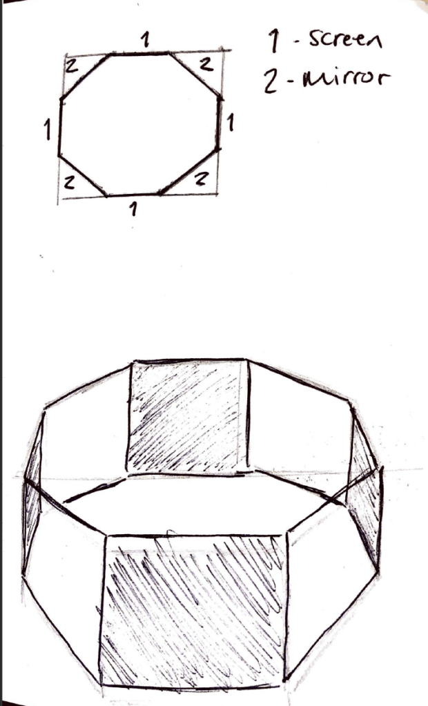
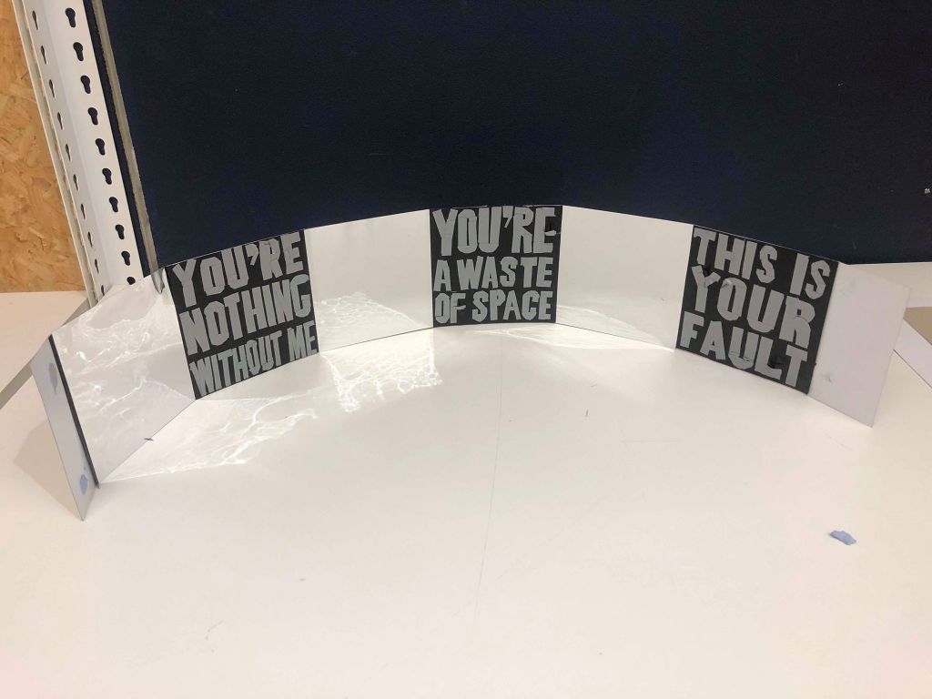
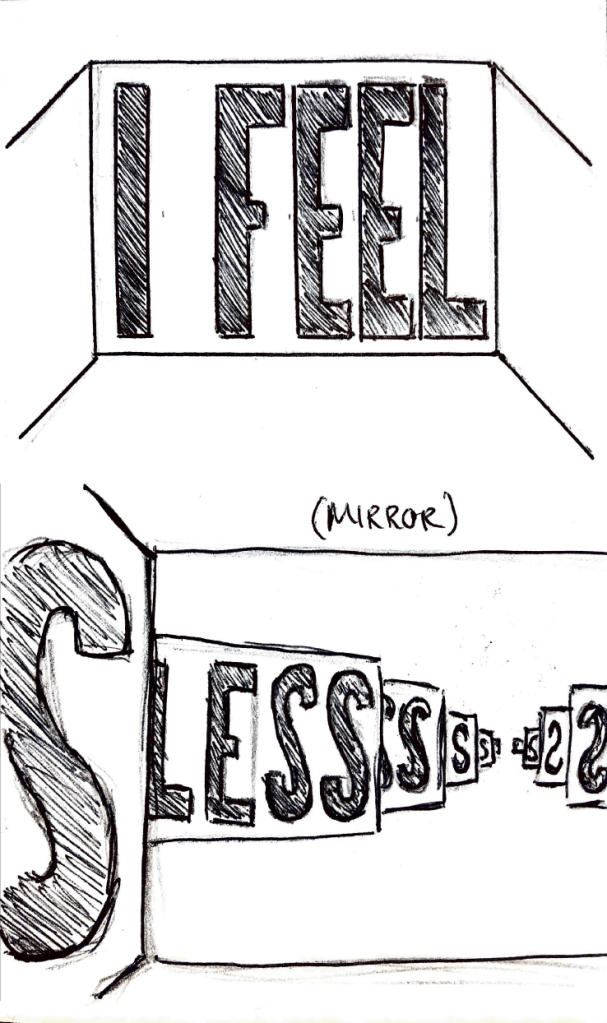
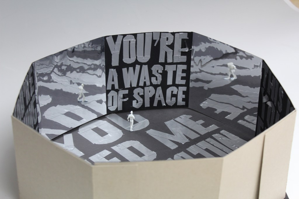
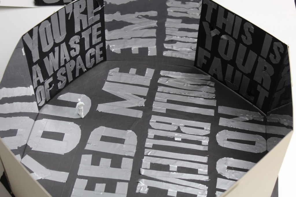
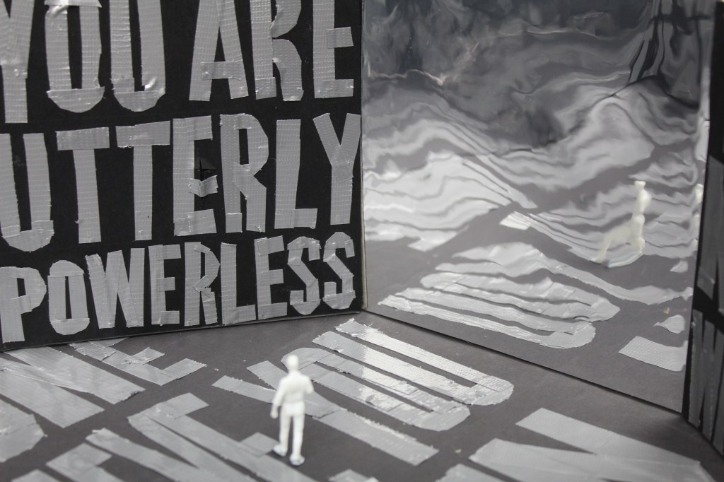
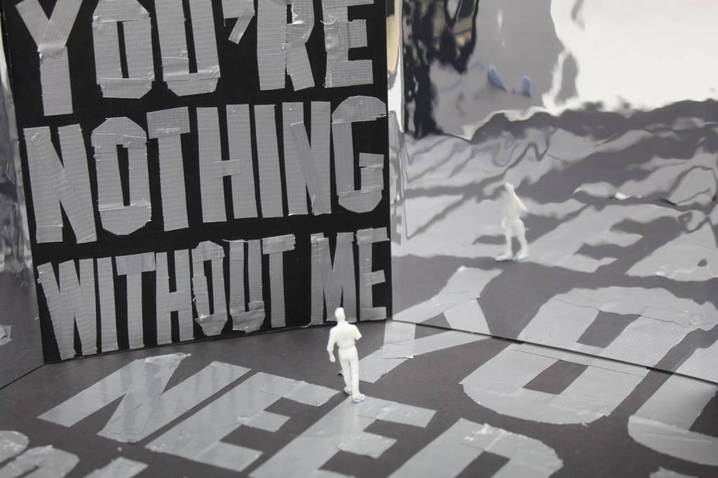
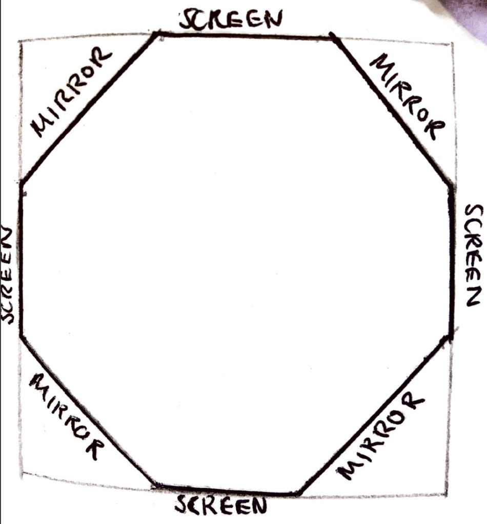
After coming up with my final design idea using a variety of sketches and physical models, I then needed to make it. Firstly, I decided that the shape of the room would be an octagon in order to implement the mirror system which I discussed earlier. I wanted the mirrors to make the room seem much larger than it is, and also to reflect the text on the walls to overwhelm the viewer even more.

Next up, I decided that the exhibition would be much more effective with a black background as opposed to white, to give a more dark feel to the exhibit. I think the dark background would really create a very gloomy feel within the exhibit which is just what im looking to convey.

Finally, although the idea of the faces coming out of the wall is very effective and one I wanted to carry forward, instead of them being on top of the wall and the text, I used black fabric to cover the page, in order to make it look like the faces are implemented into the wall as opposed to just being stuck on top of them.

Next up, the construction. I had another 1 on 1 tutorial with Craig discussing my final ideas and how rtf present them, and he showed me how to effectively create an octagon design in order to illustrate my idea.

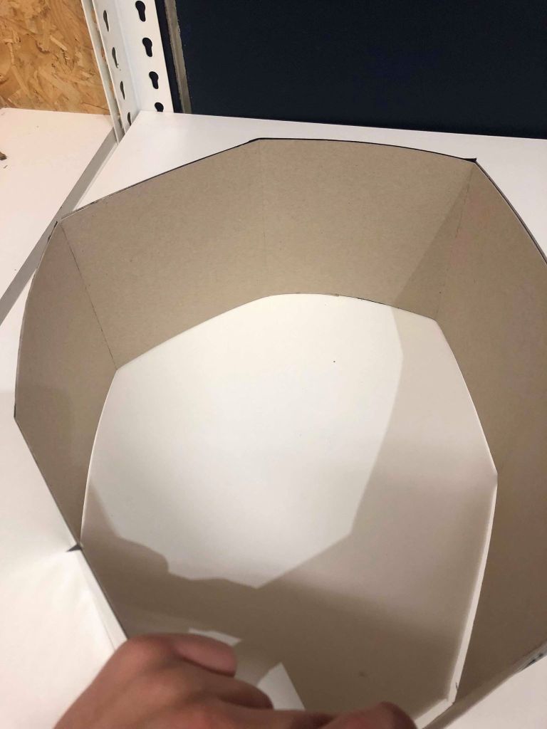
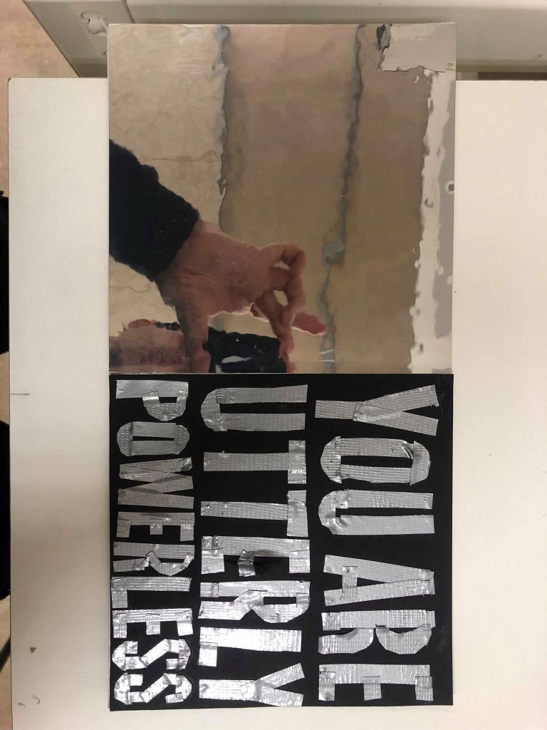
I cut card to create a long strand of ‘walls’ sized 15cmx15cm and scored the back of them so they would fold to create an octagon shape.

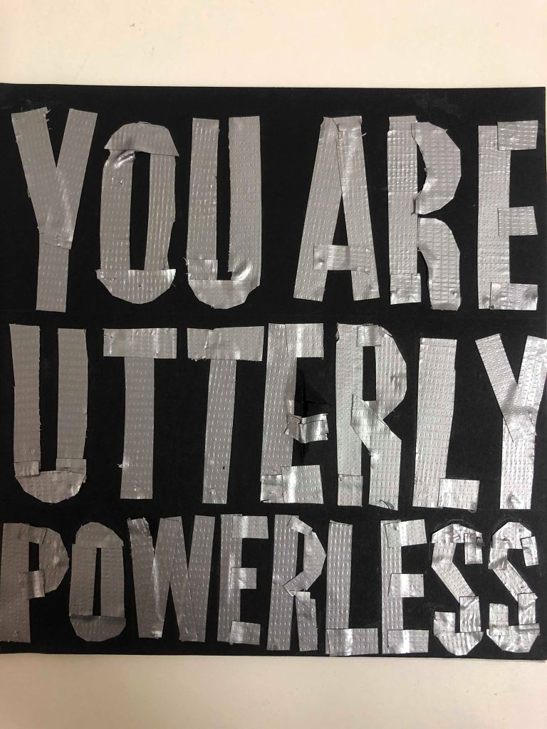
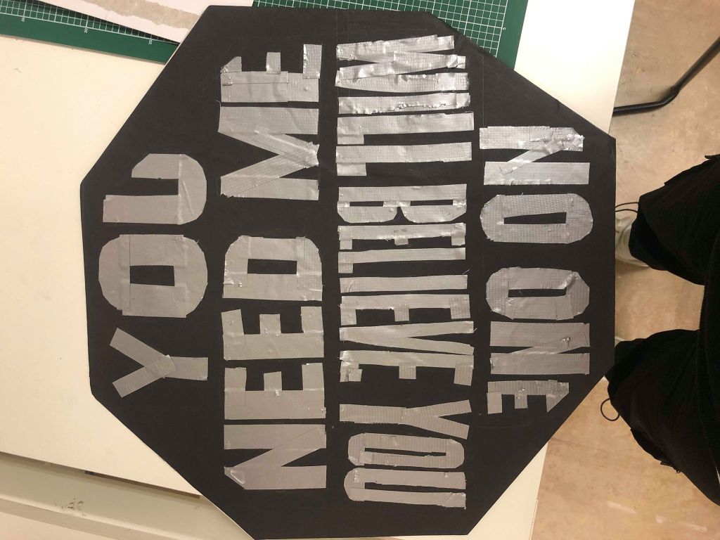
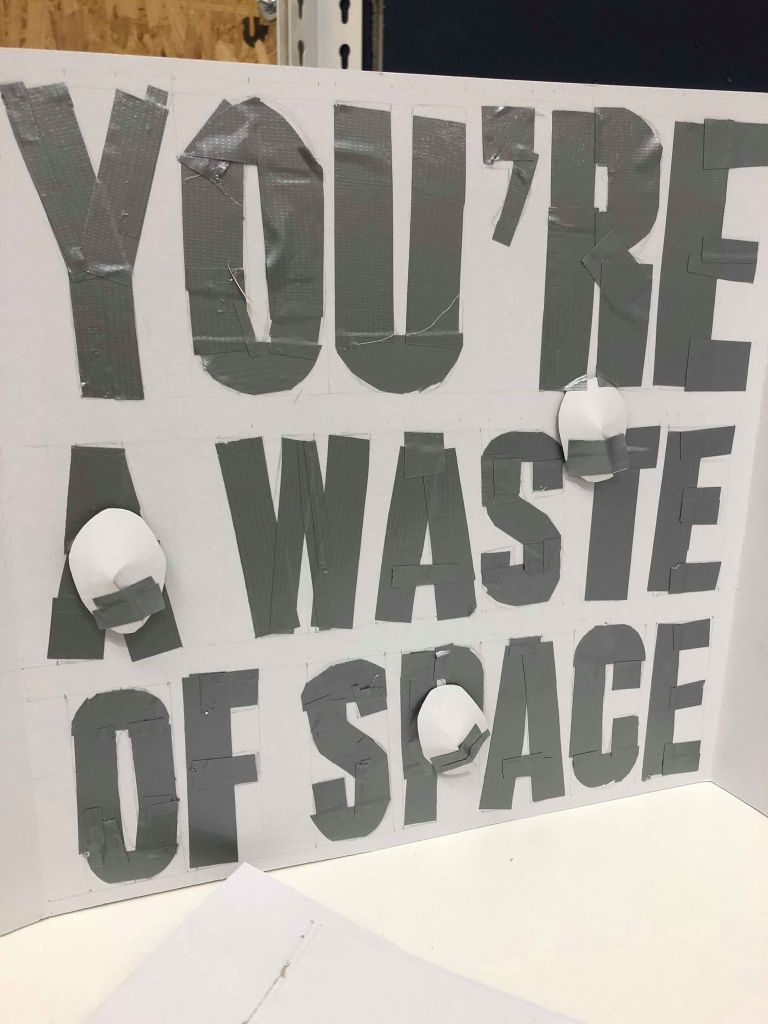
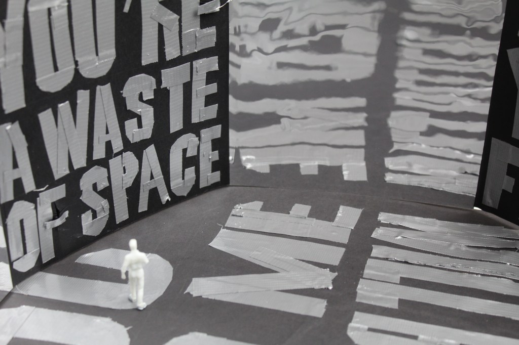
I then covered all the card in black paper and scored crosses into each one to give the impression of the faces coming out of the wall. I cut up the tape to spell out each phrase on each wall and made sure each one maintained a rough and textured feel. Following this, I added a mirror onto every other wall.

I then had the octagon shape along with the mirrors and taped phrases written on each page and was ready to assemble it. However although the writing on the walls along were exactly how I wanted them to look, I thought the design still needed to be more belittling and overwhelming, so I decided to add more writing to the floor.
Overall, the design of the exhibition was the most challenging part of the whole project due to the fact the small scale along with the intricate taping was very difficult. I also wanted the final design to be well made with the fine details done well as I wanted it to look as professional as possible which added more time onto the making of it. However, through the struggles I learnt a lot about the construction of small models such as this one, and although it isn’t something which is essential within my practice, if I ever needed to do this or something similar again, now I have the skills to do so. Although the final design could’ve been improved here and there, I think the ideas behind the exhibit were more important and the overall design find need to be perfect, especially considering it was something completely new to me. Next time, I would ensure I use a much larger model than what I used this time in order to make each wall including tape look much effective.

tcejbO:Object – Idea Development

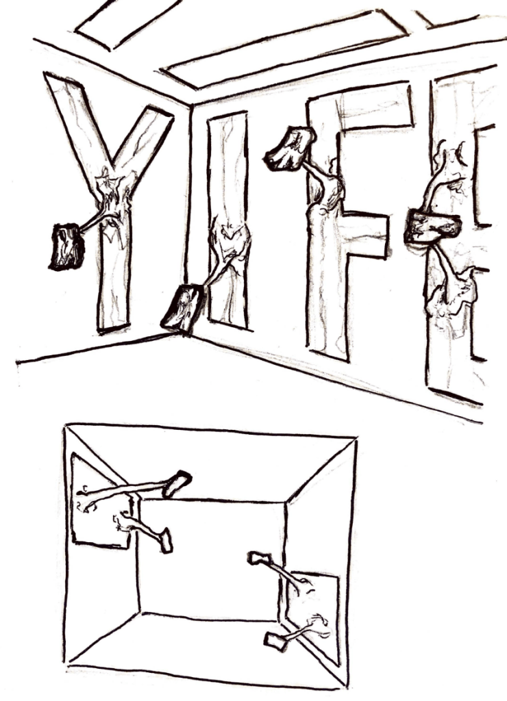
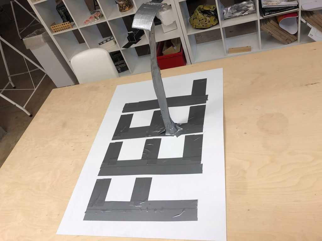
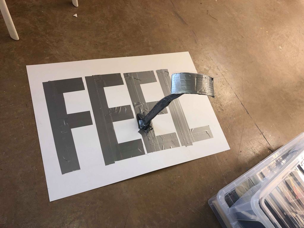
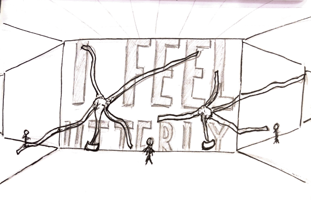
Following on from my discussion with Craig, I then took to the tape to design small scale versions of my sketches to see what they will really look like. Firstly I designed my first idea of the tape looking slightly alien and monstrous and coming off the walls. I used grey duct tape as I think this colour is the most recognisable of tape and any other colours would start to change the overall idea of the object.

I attempted to make one of these alien looking tape structures on top of text. Although I managed to make it well so it looked similar to how I envisioned it, after speaking to Craig I decided I didn’t like the idea as it started to take away from the idea of domestic abuse and sexual abuse and made it much less obvious what the exhibit would be about. I do however really like the way the tape looks when it writes out the text, the bumps and textured parts of the text give it a very rough sort of feel.

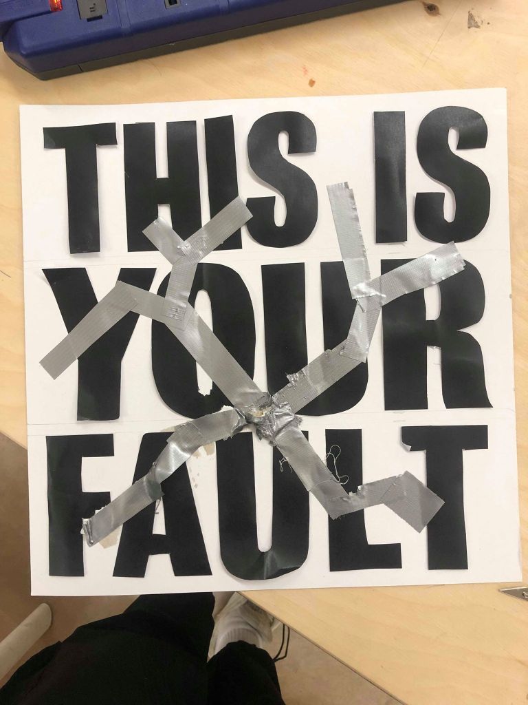
I then experimented with my second sketch of using the tape as a way of covering up the text as discussed in my previous post.

Overall I think the metaphor is. much more effective than the previous design, and the idea of the tape covering up the abuse really hits home and makes much more sense than the previous idea of the alien looking tape, however I still don’t think it’s an obvious enough metaphor and is still largely overcomplicated.

I was slightly stuck and went back to Craig for another 1 on 1 session to discuss what I needed to do next. We looked over my current designs and discussed that the idea as a whole could be much more simple and doesn’t need any extra tape, or alien looking ‘rods’. Craig agreed that the text being written in tape gives a very effective ‘rough’ effect and said in his opinion all I needed to do was have the text written in tape as this is a strong enough metaphor in itself, the text will be real quotes from domestic abuse and so having it written in tape will be an effective enough metaphor in itself. I did however decided to have faces built into the wall to further implement the idea of people being silenced.

I then made my final design, written in tape to give slightly dismantled and rough feel, with ‘faces’ coming out of the wall to give the impression of them being silenced by the tape, the metaphor for the abuser.
Although not my first and probably not my last idea, I was very happy with the base idea and the only thing left to do was make it all.
Overall this stage of the design was the longest as it included sketching a variety of ideas being making them in 3D which was a very long process, however it was taught me that there is no better way to see how something will really look than to just make it. No amount of imagination or sketches and show you what something will really look like until it is put infant of you. Although some of my sketches could’ve been more accurate, as well as the models themselves, I learnt a lot from my wrongdoings about how to effectively design 3D models and overall I have come out with an idea I’m very happy about. In terms of my own practice, I sketch a lot when coming up with original ideas for projects and then tend to chose my idea then and there, however this process has taught me that there’s nothing wrong with designing multiple sketches to give more of an idea of what I like and don’t like.

tcejbO:Object – Idea Generation

After my discussion with Craig, in the next session I sketched out some initial ideas to get them onto paper and make them easier to visualise so I could narrow it down to a few possible designs before making them.

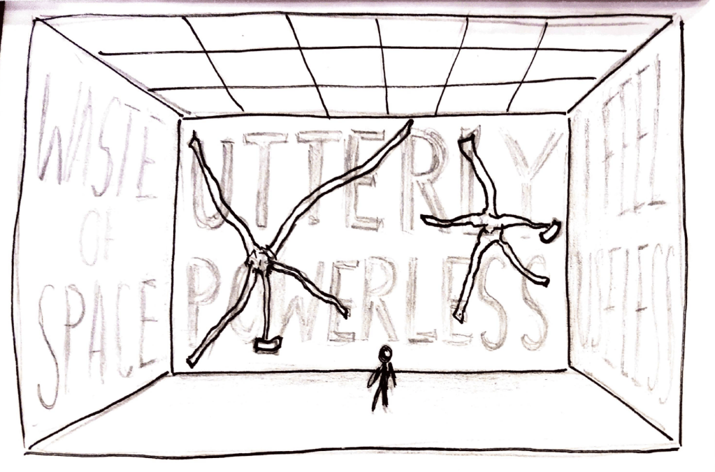
The first sketch and idea I had was really about pushing this idea of the tape being a metaphor for the abuser within domestic abuse. I wanted to play not only with the idea of this abuser being a monster which is something which is written about largely about domestic abuse within my research, but also to show the idea of the victims being silenced. I wanted the text to be written in tape, with these almost alien looking strands of tape poking out of the walls to make the exhibition more interactive with the user.

The next thing I experimented with was the idea of mirrors being used within the design. I wanted the idea to be large and overwhelming and Craig and I discussed taking influences from one of my favourite exhibits in London and using mirrors to open the space up and make it look large.

I then looked into the idea of the text on the walls being printed and covered up with tape instead of written by tape, to experiment with the idea of the tape, a metaphor for the abuser, being the thing covering up the crimes and silencing the victims, so in this case the tape would literally be covering up the words. I wanted to look at this idea within a normal room as well as a room with mirrors implemented to see the effect of the tape covering up the mirrors.

I showed Craig my sketches during a 1 on 1 tutorial to get his feedback and similar to myself, he was unsure of which idea would be more effective and we decided the only way to make this decision was to make them myself, in a smaller scale, and make my mind up once I can see it for real. Although I would have liked to get a more definitive answer and to be able to make my mind up from the sketches themselves, I don’t think there’s anything wrong with having more than one good idea which I can develop as it gives the final design more possibilities to be the best version it can be. Next time however, I think as well as having sketches to show Craig, I would also make sure I had final designs to show him so he could help me make a more definitive decision.

tcejbO:Object – Feedback and Discussion

After my initial thoughts about my object placement, I attended a group discussion with Craig in which we discussed my idea in more detail, and it was made clear that the most important thing for me to do was experiment with whether I was going to use the tape as the instrument to write the phrases on the walls, or use the tape to cover up the phrases and literally be the thing covering it up.

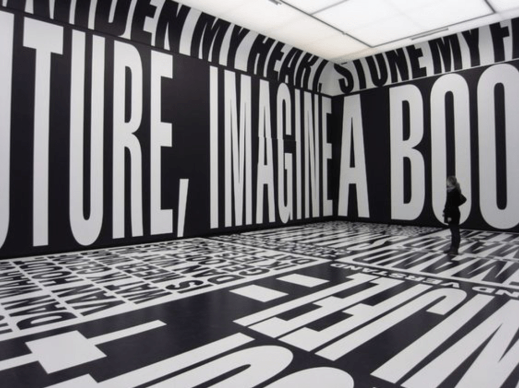
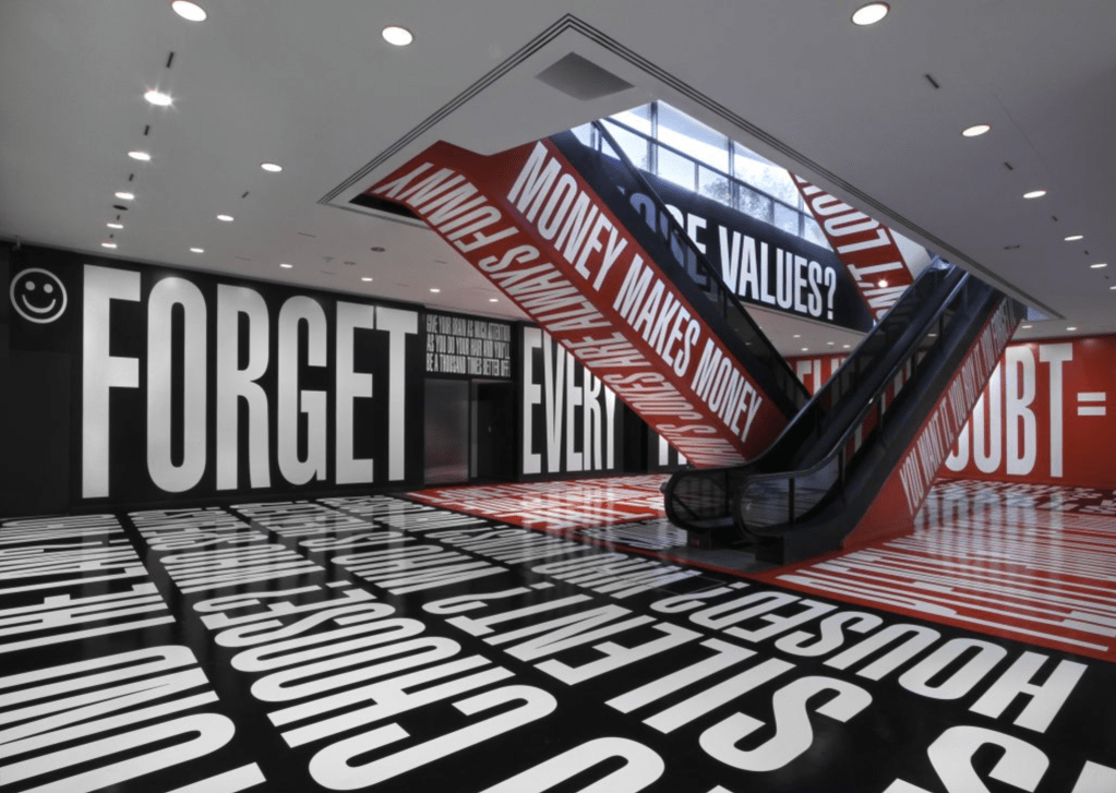
Craig advised me to look into the work of Barbara Kruger who uses this style in her own work, just to get an idea of how effective it is when done well.

After researching Kruger’s work it became apparent that the way to make it the most effective is by using thick, bold text very large and covering all the walls to really overwhelm the viewer and make them feel very small. The text works black on a white background or inverted, or just as well in other colours which means more experimenting. It also became apparent I needed to design the text within illustrator in order to make it clean and fill the space as effectively as possible, as any negative space within the room would ruin the effect.

After the discussion with Craig I had the overall idea decided so I just needed to experiment with different way of doing it and which would end up being the most effective. I knew I wanted the room to be very large with the possibility of using mirrors to make it even larger. I also knew I wanted large typography on the walls, but was unsure whether I would do this in tape, or in print, and whether to take the metaphor of the tape even further and using it to cover the text.

Overall, although the discussion with Craig didn’t cement the final idea, it really narrowed it down to a few possibilities which I could go and experiment with, and it taught me about a new designer who I had never heard of who really inspired me with her work and visual metaphors. Although the idea of group and individual discussions is one we use within graphics very often, it helps to get a different opinion and get some feedback on whether the idea works as a concept or not.

tcejbO:Object – Object Placement Thoughts

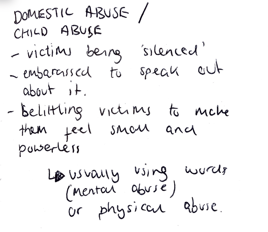
For the next stage of the project i wanted to formulate a plan for the placement of my object and so I thought more about the idea of domestic abuse and started to look more into the specifics of it. I noted down ideas about victims being silenced and embarrassed to speak out, as well as them being belittles and being made to feel small and powerless. All of these are things which I wanted to get across within my exhibition/object placement.

I wanted to really get across the feeling of being belittles and made to feel scared and powerless within the exhibition, as well as the metaphor of the tape being a powerful and demeaning object within the space. To really get the idea of being made to feel small, I thought the best way to do this was to make the room very large, and possibly even use mirrors within it to make it look even larger. 

I then considered the idea of the abuse being mostly mental, and so thought the best way to get this idea across would be to use actual words or phrases which would be said in domestic abuse and have that written on the walls, either in tape or printed.

tcejbO:Object – My Objects

For our first session we were asked to bring 3 objects in for our introductory task about decoding objects. We have since been told that our brief for the final submission is to place an object within a space and so we were asked to have a think about our objects as well as our proposed placements. One of the objects I brought it was a roll of duct tape, and although initially this object didn’t pop out to me as one which I wanted to base my entire project around, one idea which really jumped out at me in London was about taking everyday objects and placing them in a context which they wouldn’t usually be placed. Because of this, I tasked myself with using duct tape as my object to come up with a slightly out of ordinary object placement based around it. 

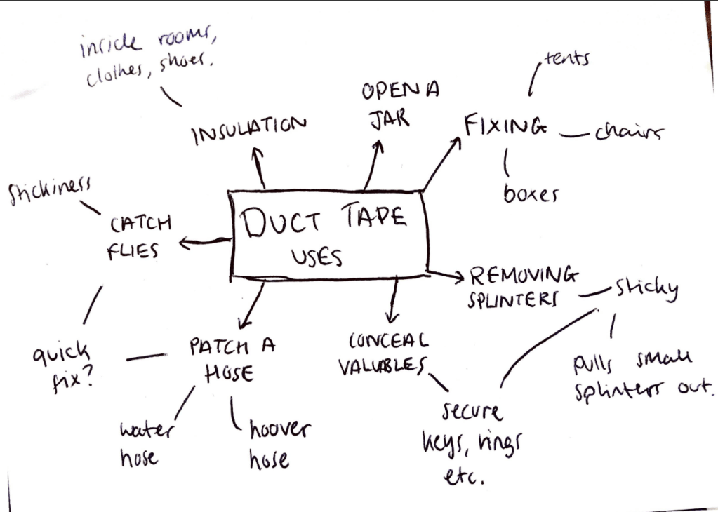
Firstly, to decode the tape, I mind mapped some of the main uses for duct tape, although I was playing with the idea of an unusual use for duct tape, I wanted to look into the normal, everyday uses to almost get them out of my head and onto paper in order to look deeper into it.

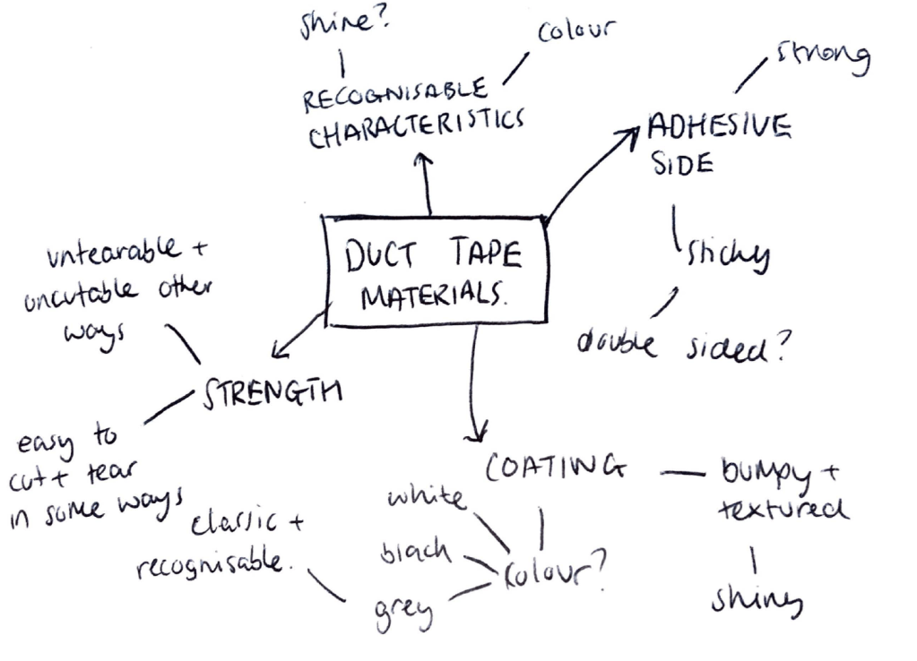
Next I looked into the materials within duct tape and into many of its characteristics. I thought about the 2 opposing sides of it, the adhesive, sticky side as opposed to the coated side of it which has an almost bumpy texture to it and can be coated in different colours and thicknesses. These opposing characteristics are something which I think could be interesting to look into. I also looked into the recognisable characteristics of duct tape, such as the grey colour and textured shine it has, this idea could also be something which could become very interesting and I could look into the way we perceive it or why we recognise these particular aspects of tape.

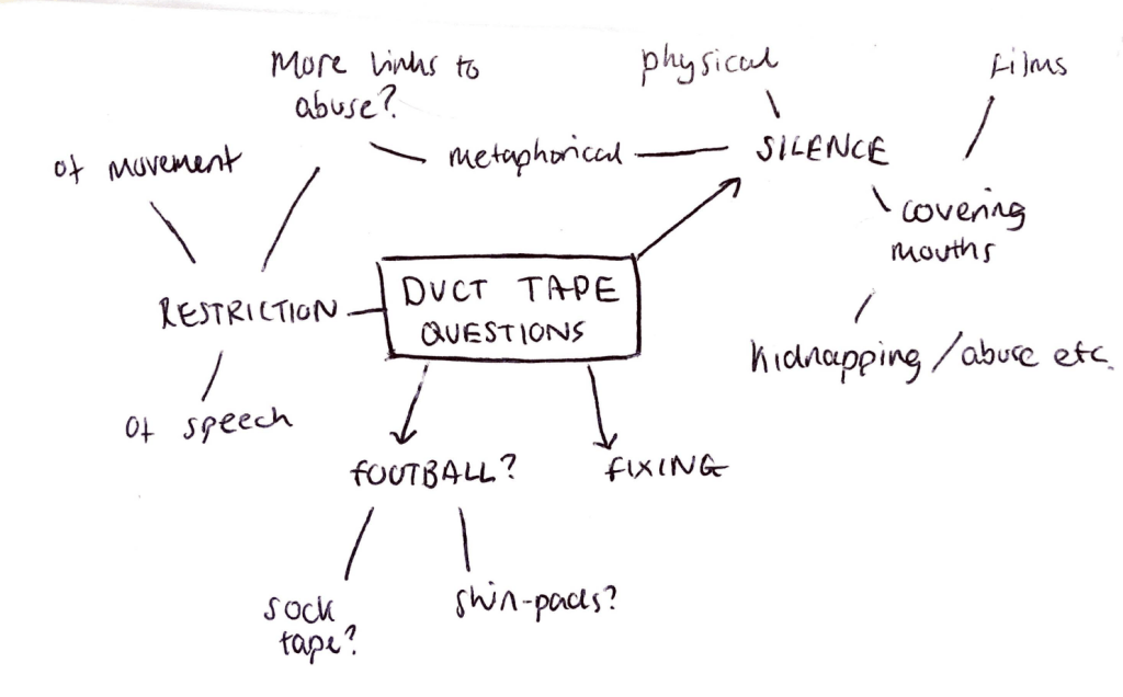
Next, I wanted to delve deeper into thinking about tape and look more into other uses or meanings for it, be it physical or metaphorical, so for this I asked an array of people to tell me the first thing they thought when I showed them the duct tape. I got a large amount of answers and noted down some of the most interesting ideas to me. One of the most interesting concepts brought to my attention was the idea of duct tape being used as a restriction. Often within films or tv programmes this idea of tape being used to restrict peoples movement, sight or voice is often used and I think this idea of it being a silencer was one which really struck a nerve. It got me thinking more about what cases this would be used in, for example kidnapping, but also made me think about more of a metaphorical approach, for example domestic or sexual abuse is something which many people don’t speak out about, however there is no physical objects stopping them from talking.

After my decoding of the duct tape, the idea I’m looking to take forward is the idea of the duct tape being a metaphor for someone being silenced or kept quiet and could be linked to domestic or sexual abuse

Overall, my decoding of the duct tape really opened my eyes and inspired me to realise that everything, even everyday objects can have connotations and metaphorical meanings which often we would never realise until we look further into them. It taught me that often things within art and design, as well as every day life, aren’t always as they first appear and if you delve into the deeper meanings, other things will open up and become clear. Although next time I might think about creating one mind map with much more information fit into it which would allow me to compare ideas much more, however I think doing separate mind maps still worked well to generate ideas and decode the object. The idea of decoding is something which I use often within my discipline to formulate ideas, and this exercise has proved even further that it is a worthwhile task to carry out during the idea generating stage of a project.

tcejbO:Object – London

Continuing on from week 1 we travelled to London to look around a variety of exhibitions for inspiration on our project, We looked around an array of exhibitions ranging from light shows to sculpture based exhibitions, all of which caught my eye in one way or another.

As a whole I’m not a very conceptual person and focus more on functionality than concepts, so many exhibitions go straight over my head so I was curious to see many of the exhibits to find out about the concepts behind them. I was pleasantly surprised though at the majority of the exhibitions and how they created experiences which really did take their concepts to the next level and really made me think deeply.

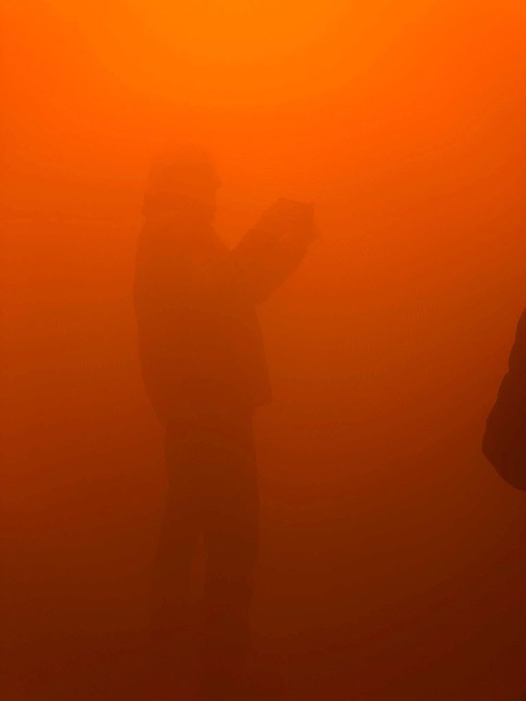
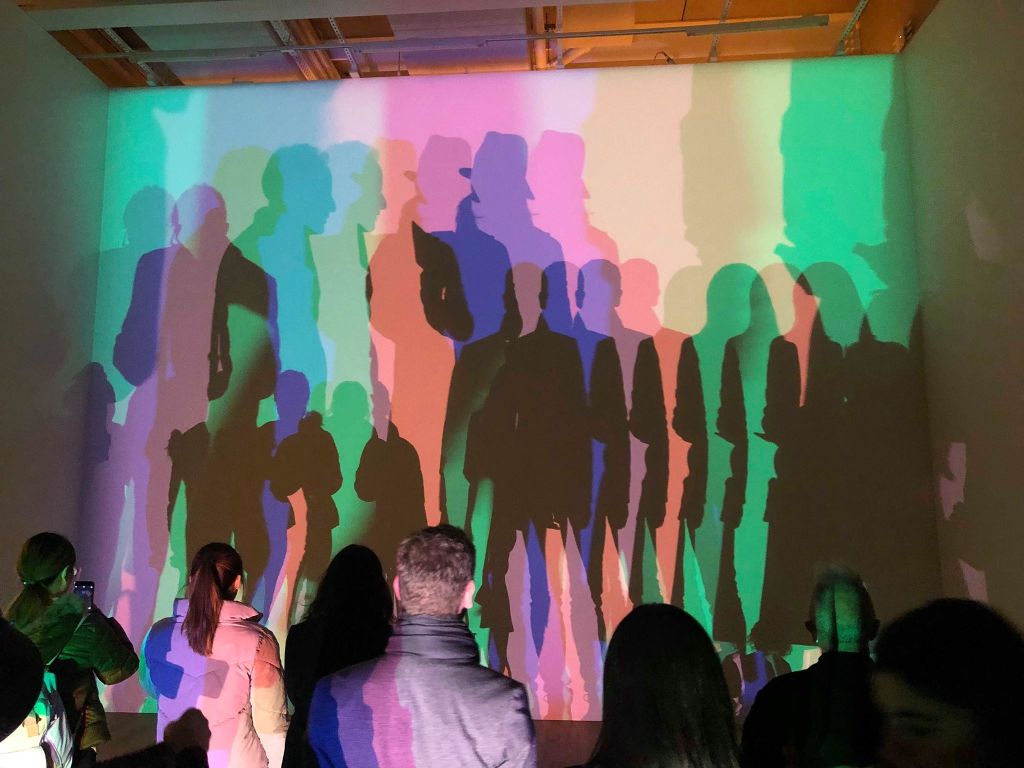
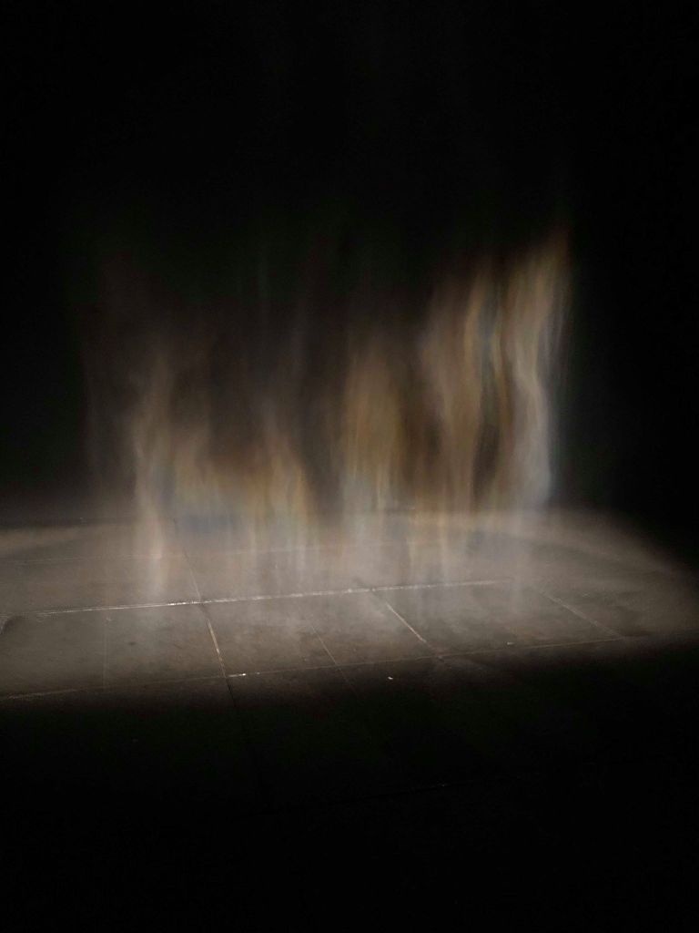
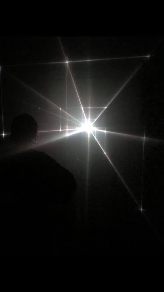
The first exhibition we visited was Olafur Eliasson’s ‘In Real Life’ at the Tate modern. I was taken aback by many of the installations, particularly those which were on a large scale and acted as more as an experience than a single artwork. Straight off the bat the spiral view amazed me, walking through a tunnel of distorted mirrors with a variety of mirrors facing in different directions made me think about peoples different perspectives on everything, and also made me feel trapped in a way, much like I would if I were in a mirror maze. I was also amazed by ‘Din blind passager’ which is essentially a large fog tunnel, again it really opened my eyes to the idea of the unknown and made me feel trapped within the mist. These two alongside a variety of there other exhibitions really opened my mind to this idea of the unknown and mad eye think about the way in which I see reality. It really bent the rules and made me question many things in relation to every day life which was a real eye opener and gave me a lot of inspiration in terms of using mirrors and lights to bring about the illusion of being stuck or trapped.

We then went to ‘Other Spaces’, an exhibition which was mainly based on light and consisted of a variety of dark rooms which light shows within them, all of which were amazingly immersive and almost other-world in the way it made me feel. Much like many of Eliasson’s exhibits it really made me feel like I was in another place. Specifically the Great Animal Orchestra which really immersed me into the experience of the natural world using just sensory experiences of light and sound.

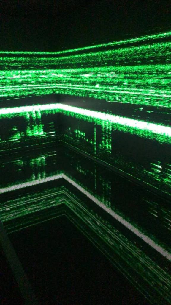
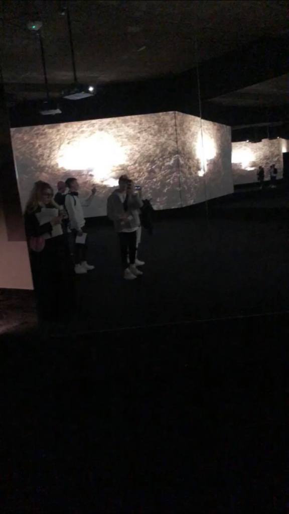
We also v visited another exhibition underneath the strand which was an exhibit put together by a v aridity of artists. All of the exhibitions within this space were very atmospheric, however one which really stood out to me was ‘The Store X The Vinyl Factory presents TRANSFORMER: A Rebirth Of Wonder‘ which was probably one of the most captivating exhibits I’ve visited in terms of the way it used mirrors to really open the room up and make it feel so large. It made me feel like I was in a big open warehouse unable to exit when in reality the room wasn’t any bigger than a standard room. Such a simple system of using the mirrors along with a dark room and the screens made the room feel very overwhelming.

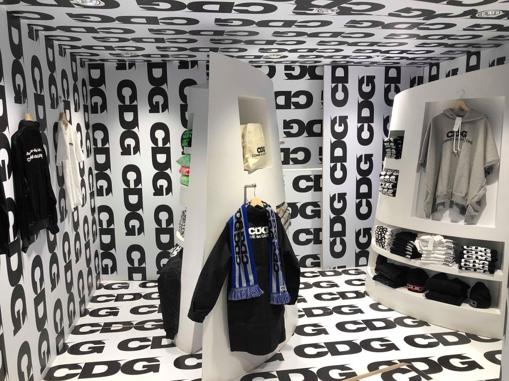
Finally, we visited Dover Street Market where we looked around the way the clothes and other objects were placed within the spaces within the shops. Although much of it was fairly product and function based, just looking to sell the clothing, one part of the store did really catch my eye. The CDG part was one which I had heard about and seen photographs of before, however being there was a completely different experience. Much like the previous exhibit I discussed using the mirrors, walking into a room with walls, ceiling and floor covered in typography and nothing else was a very overwhelming experience and really immersed me into the experience. It made me feel almost belittled which was a very strange but interesting experience.

tcejbO:Object – Introductory Task

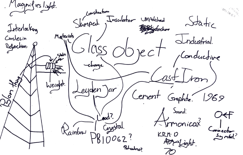
After the introductory presentation we were given a task to choose one object and begin to decode it, to discover what the objects really are. We discussed within the introduction about mind mapping and using it to decode objects to place them into different meanings according to their meaning, narrative, associations and iconography. We spoke about how each object we interact with has so many different aspects and meanings beyond the first look. For example, one of my chosen objects was a joker from a deck of cards. Initially the meaning of the card is purely based within the deck of cards, however the further you delve into the meaning of the decoding of the card, the more becomes clear. The narrative of the card brings about more thought about it and makes you think about it in more detail, what games has it been played in, what is it made of, where was it made and when? Every object has more to it than meets the eye, and this part of the presentation helped show me how to look into everything with more of an open mind to decode them and look deeper into the each aspect of the object.

The task we were set was to decode a chosen object within a group, to think about the object and its functions, the materials it was made with and how can be viewed in different narratives and contexts depending on the placement of the object.

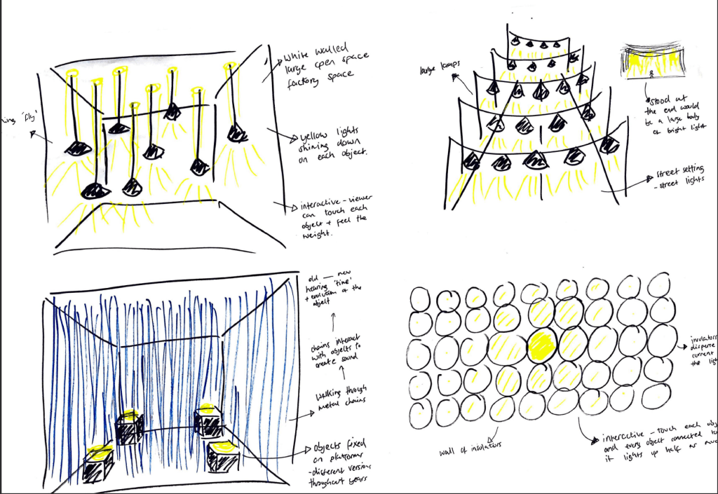
Our chosen object was a steal and glass bowl shaped item. After some discussion we figured out the object was a ‘conductor’ found up high on pile-ons. We discussed the function of the conductor and how the materials it was made out of helps it to carry out its function. The variety of materials also give more to decode when it comes to the textures, as well as the colours. 

We were then set with placing that object into a space to bring out the interesting features we discovered whilst decoding it. We thought the most successful way to display our object would be to use light and electricity throughout, as diffusing electricity is its original function. Our displays would be taking the original function of the conductor and make it more interesting using lights, sound and other electrical features. Overall I think all the displays ended up with very interesting design and aesthetic, the idea of taking a fairly standard and very functional object and placing it into a different context. 

Overall the session inspired me to look at objects in different lights, even the most mundane and functional items can be decoded and looked at in a way which takes them out of their initial narratives and places them into new scenarios in which they can be perceived in a completely different way.

tcejbO:Object – Introductory Task

Our first session consisted of a run through of the timetable as well as the essential project information, followed by an introduction into the project and what was expected of us, as well as an array of examples of ‘Object’ displays both inside or outside. 

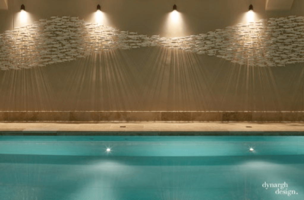
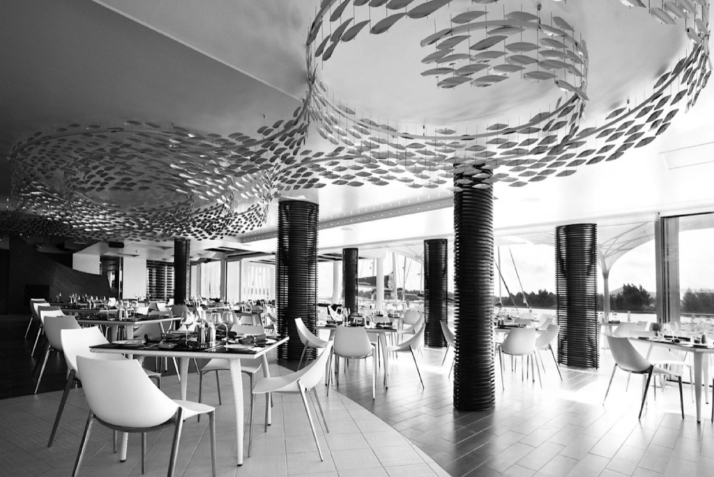
Although I had a brief overall idea of what the project was about, I was still slightly confused about what specifically was being asked of us and what exactly was meant by creating an object display. The first thing which really struck a cord for me was the theory discussed surrounding the fish. Next to water, the school of fish gives a very calming, aquatic feel resembling water and the sea, however the second image shows the school of fish within a restaurant which gives a very contrasting feeling and clearly gives the aura of seafood. This example outlined for me that the way objects are placed within a space can make a large difference to the way it’s perceived. The other thing which really stood out to me within this introduction was the idea that the object, although being the main focus behind the display, is often only a small part of the what the display is presenting. 

Scabetti – ‘Shoal’ Private home, South coast of England 2014 (bone china)

Scabetti – ‘Shoal’ Konoba (stainless steel)

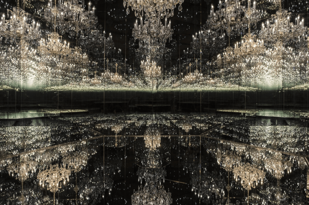
The examples which really made me think and inspired me were those which took some more simple, everyday objects and took them out of their original uses or meanings and placed them into a new concepts and scenarios which really make the viewers think. In Yayoi Kusama’s ‘Chandelier of Grief’ in 2016 took chandeliers which typically would be used for lighting within a room, and placed in into a dark room filled with mirrors and completely changed the aesthetic of what a chandelier would usually look like inside a room. Not only does it take a chandelier into new perspective, it leaves a lot to the imagination and allows the viewer to make their mind up about what it means and what to think about it.

Yayoi Kusama’s ‘Chandelier of Grief’ 2016

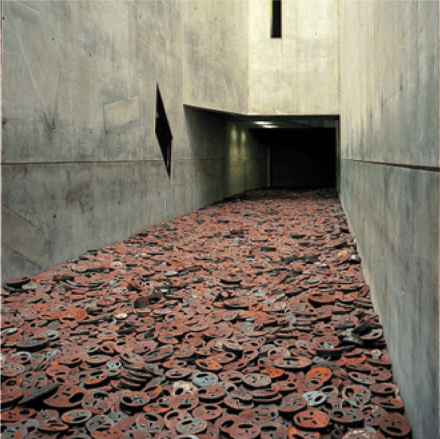
Some of the examples also used the objects within the display to tell a story about particular events throughout history, or even to guide the viewer through a particular event, for example ‘Shalekhet (Fallen Leaves)’ The Memory Void, Jewish Museum Berlin 1997-2001 by Menashe Kadishman uses the feeling of walking through the display to make the viewer feel a particular way, when walking through the exhibit. 

‘Shalekhet (Fallen Leaves)’ The Memory Void, Jewish Museum Berlin 1997-2001 by Menashe Kadishman

Design a site like this with WordPress.com
Get started