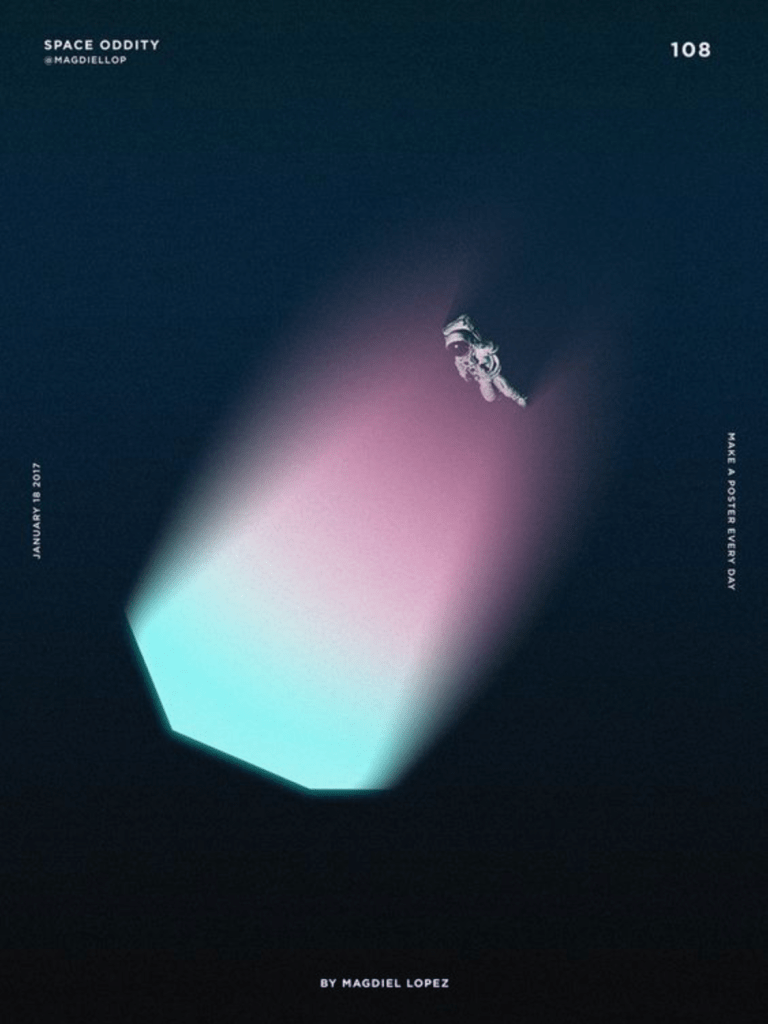
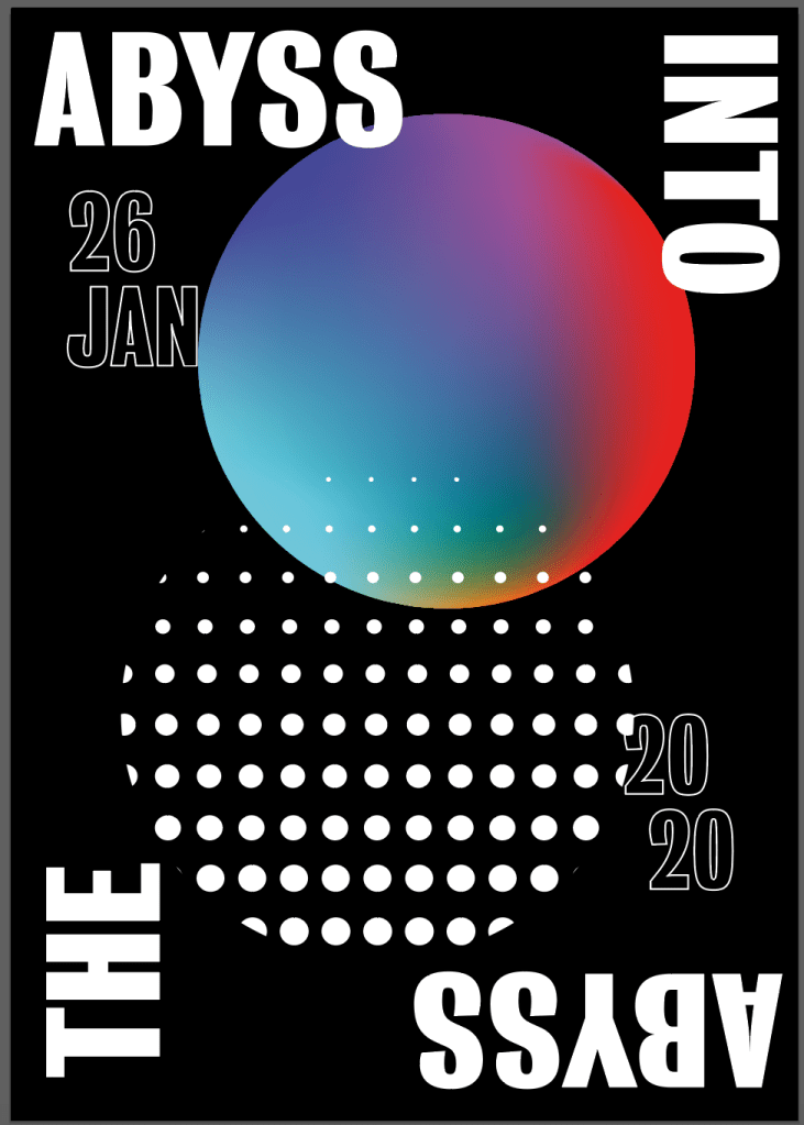
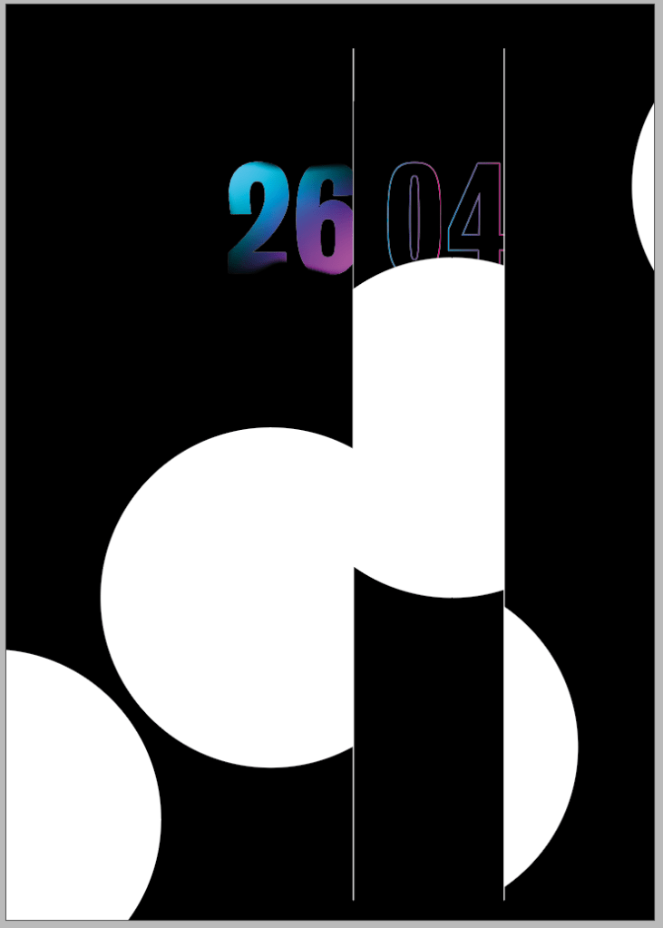
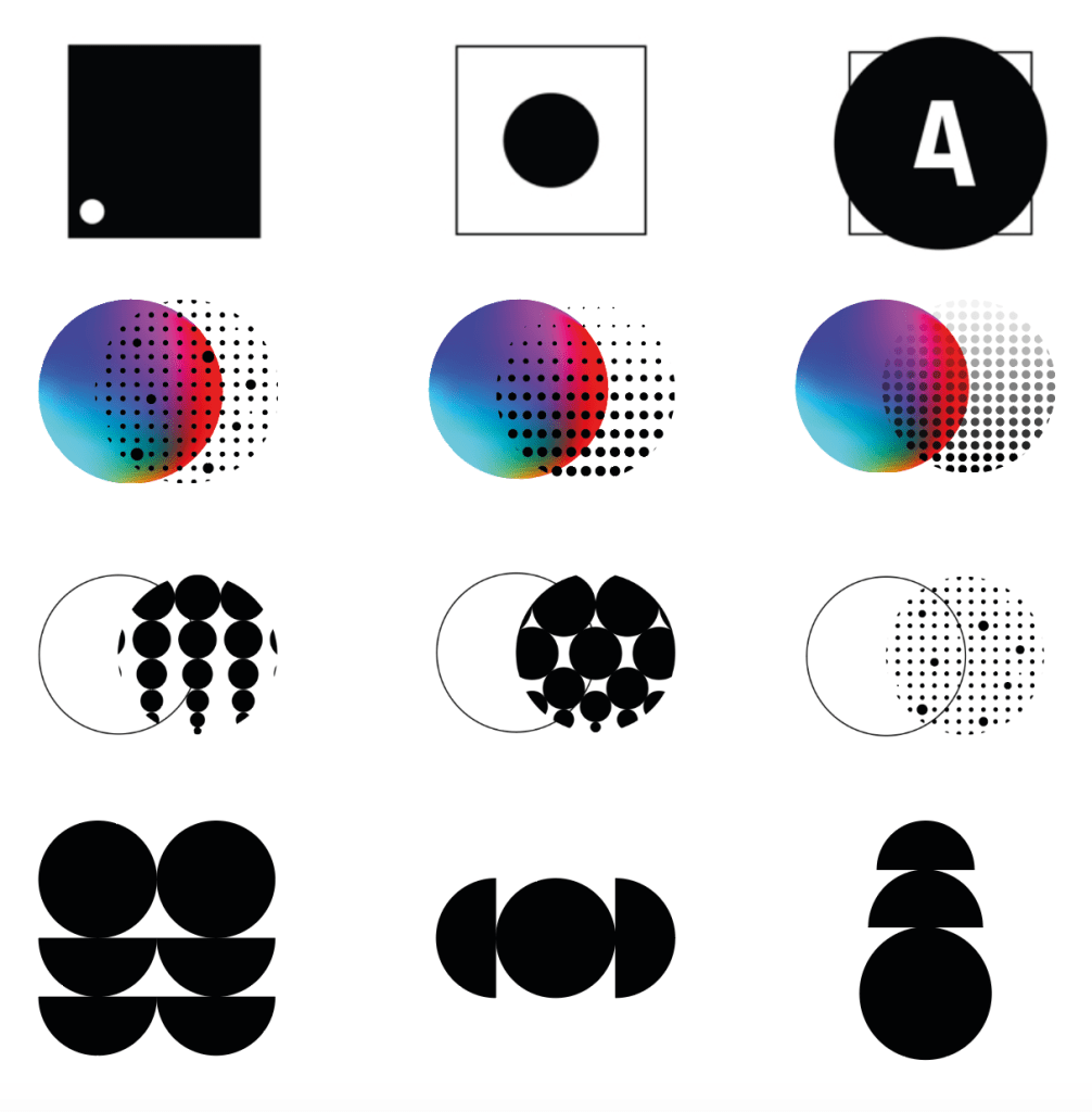
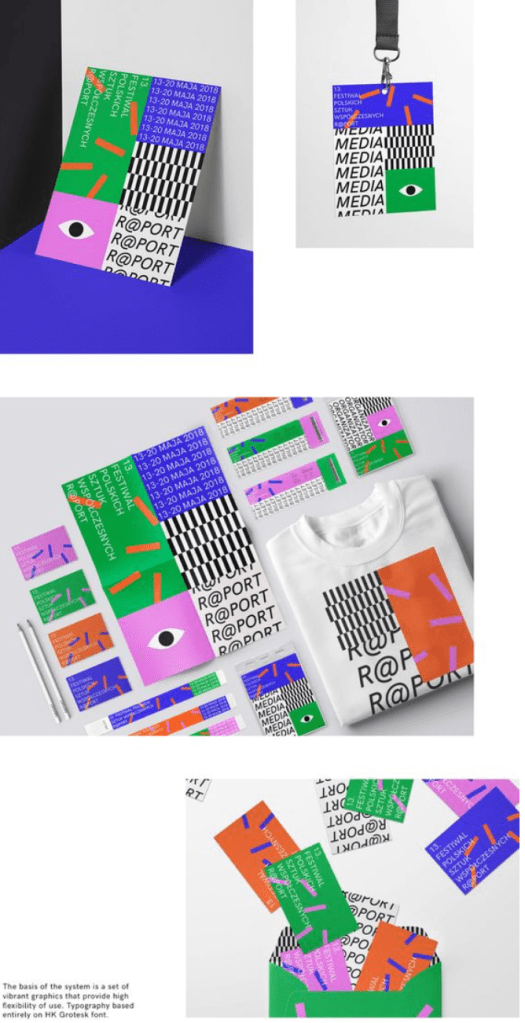
Before designing my posters I carried out some research into minimal poster designs. Overall I want the majority of my work to have a minimal feel to conform with the idea of how little we know about the ocean, as well as the rest of my designs so far. I wanted to keep with the idea and style of my logo, using the circle designs as well as trying to implement the colours into it. I wanted to keep with the ‘cold, dark’ theme by using a mainly black background and cold colours.
I didn’t want poster with a large typographic image on the page as I just didn’t think it would fit in with the brand design, so I wanted to look into the ways other minimal poster designs place their text. Overall I noticed the most successful minimal posters tend to use small type around the edges, top or bottom of the pages to frame the image in the middle of the screen, which are usually fairly small and leave some negative space on the page. The negative space works well in the posters to draw the eye towards the informative areas of the page and give them space to give them a sense of importance.
The way the posters use colour is also very interesting, using bright and bold colours on top of ‘plain’ backgrounds to really accentuate the visual on the page. The use of colours and visuals, in particular the gradient styles also give a strong sense of a 3-dimensional image, especially in contrast to a plain white or black background.
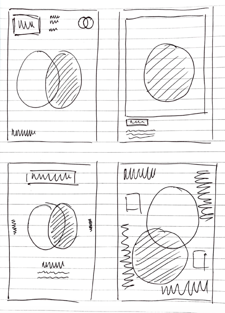
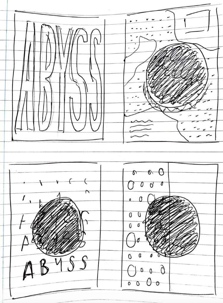
I sketched out a variety of possible designs, taking into account the idea of using colour and black and white visuals collectively within the posters.
I wanted to keep the minimal theme throughout the posters with minimal text and framing.
I designed a variety of my sketched out ideas to visualise them in poster form to get a stronger sense of how minimal and contemporary each design is to focus further on which designs are the strongest. I wanted to experiment with the idea of large visuals which fill up the page but kept being drawn back to the minimal style. The most eye catching sketches were the ones which used a variety of visuals and small amounts of text or information around the edges, to frame the image and keep the minimal space around the edges.
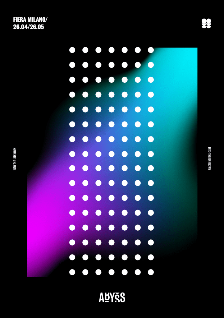
I wanted to keep them all with black backgrounds, using mainly white or gradient colours within the poster. Overall the most effective used a minimal style design and used the style of the logo, as well as the bold typeface to inform the design.
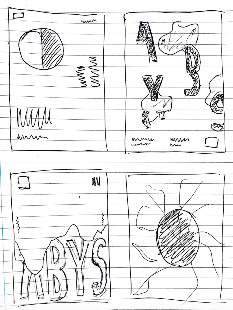
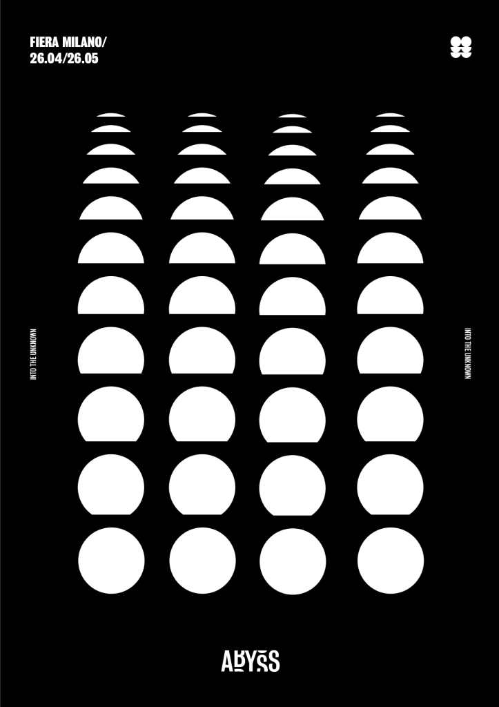
After trial and error with a variety of different designs and taking parts of each different design and moving them around I came up with my final two designs. I think overall they both work very well within the brand and are similar without being too repetitive. I didn’t want to overcomplicate the design with too many colours or too many visuals going on, and I thought the best idea was to I keep with the minimal design I was interested in from the research as I think it frames the images in the page and as I mentioned it leaves a good amount of minimal space which fits in nicely with the them of the abyss and the unknown.
I took the design of my first chosen poster and used it to design a second design. I wanted to add a bit of colour to the second idea to fit in with the gradient colour scheme within the brand, however I decided the poster with the gradient on its own wasn’t enough so I added the pattern over the top to add a bit more to the design. Although I didn’t want both designs to be identical, I think the placement of the information around the outside needed to stay in the same place to keep with the uniformity of the two posters.
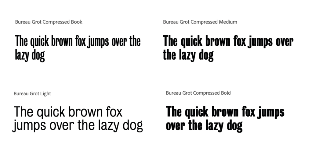
I wanted to choose a typeface which was bold on the page and would fit with the theme of ‘ABYSS’ and darkness or the unknown. I looked into many but liked the style of the condensed and compressed forms of ‘Bureau Grot’, they fit in well with the logo and overall style of the work I was looking for.
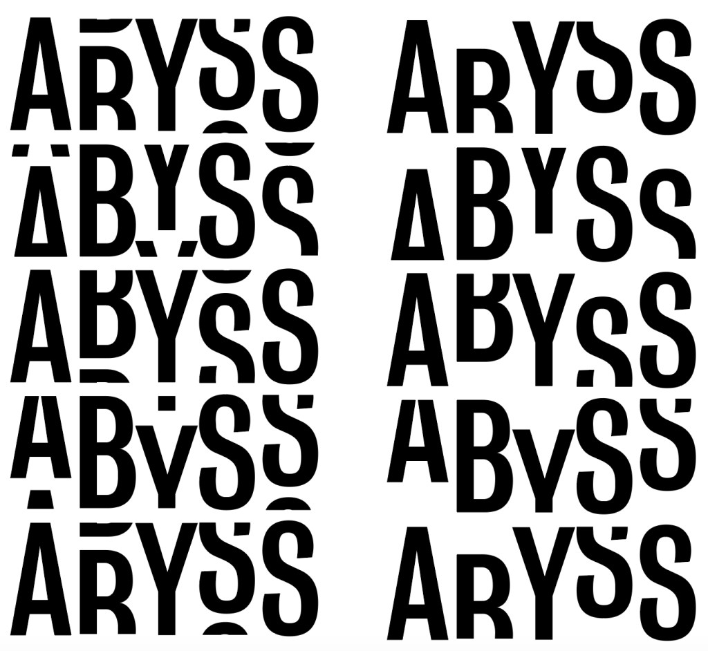
As I stated in my branding research, many brands use the idea of having a logo as well as a logotype which can be used in unison or separately, and I wanted to have the same to have almost two ways of identification. Although both could be present within designs, the idea is that if only one is added to the design, it will be recognisable enough without the logo. Because of this, I attempted to edit the typeface to almost give the illusion of it falling off the page into the ‘unknown’ and to add the impression that something is missing from it, just like the knowledge missing from what we know about the sea.
Overall I think the version leaving out the top or bottom of the text was too confusing and in some cases became much harder to read.
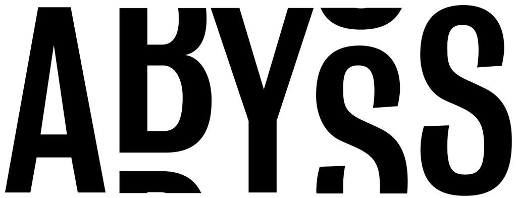
In the end I decided to go with this chosen variation of the above adaptations. Although many of the broken up versions worked well, I think the one below looks great with the curves of the B and the S and look smooth and easy on the eye, whilst also conforming with the rest of my branding designs.
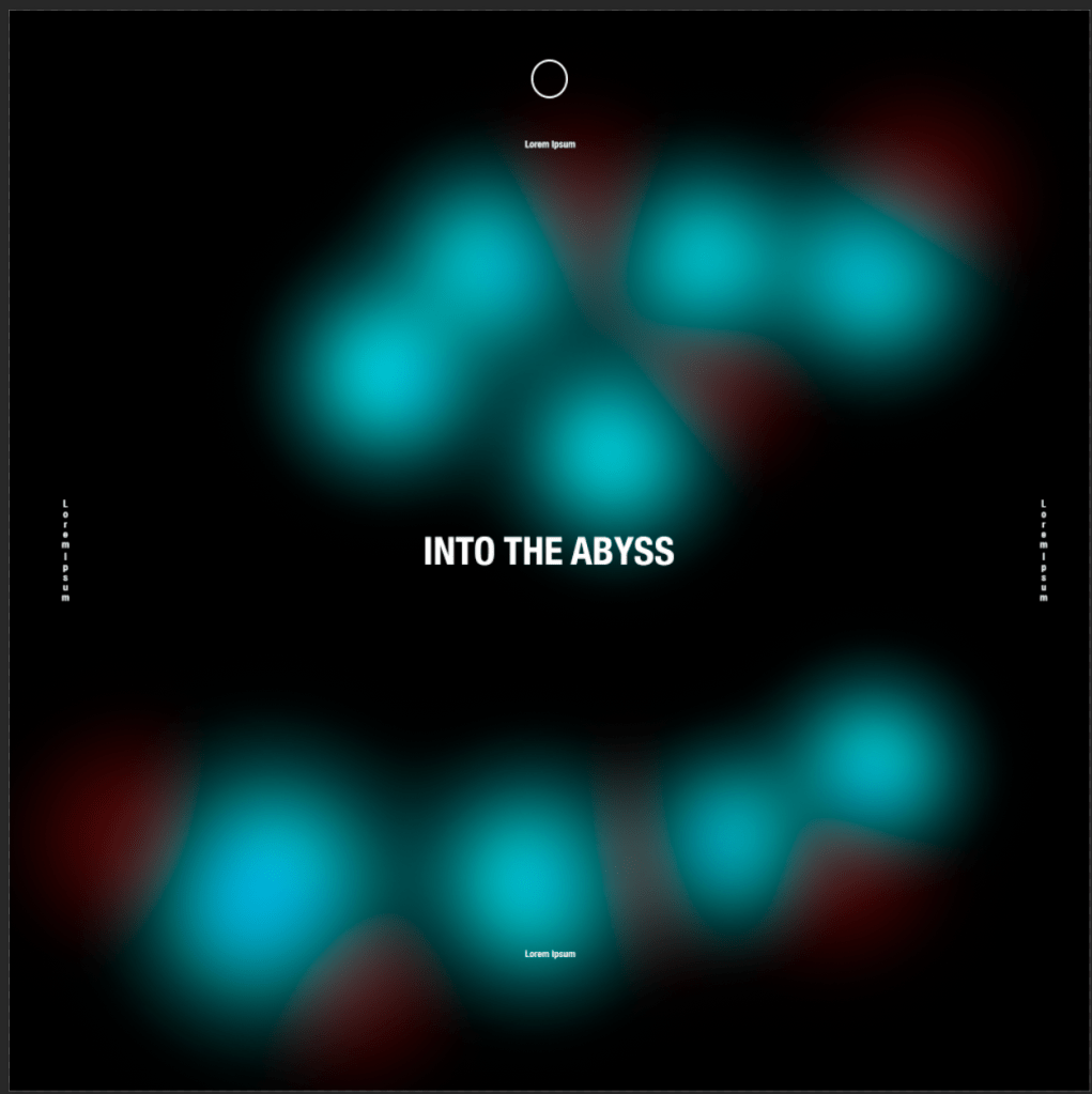
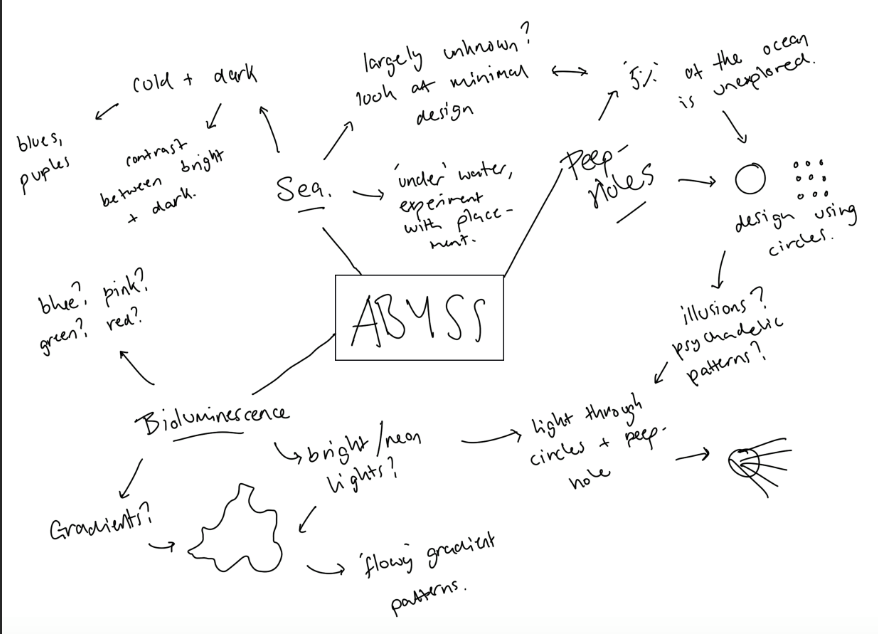
Firstly, I wanted to really emphasise the idea of the unknown in my branding, especially the concept of peep-holes as I think the fact that we only know about 5% of the ocean is one which could act as a strong factor into the design, and the idea of parts of the exhibition being viewed through peepholes within the design is one which could make it really interesting and really make the viewer think.I think the idea of the peepholes could lead onto some interesting designs implementing circles and possibly some patterns. I also think the idea of luminous designs could be used to effect really well to bring a bit of brightness to the designs, using colours and possibly gradients was one I wanted to experiment with. I think the idea of keeping the colours in blocks of colour, or a gradient would be an interesting one, as any gradients within a slightly abstract shape could give the illusion of movement. Although I really wanted to experiment with bright colours, I also wanted to keep the colours quote cold with blues and purples and contrast them against a plan white or black background to fit in with the fact with the sea being a very cold and dark place.
I decided early on that I wanted most of the designs to be minimal using just visuals on the page to bring it to life and I think the ideas of both luminous colours and patterns could fit with this idea well.
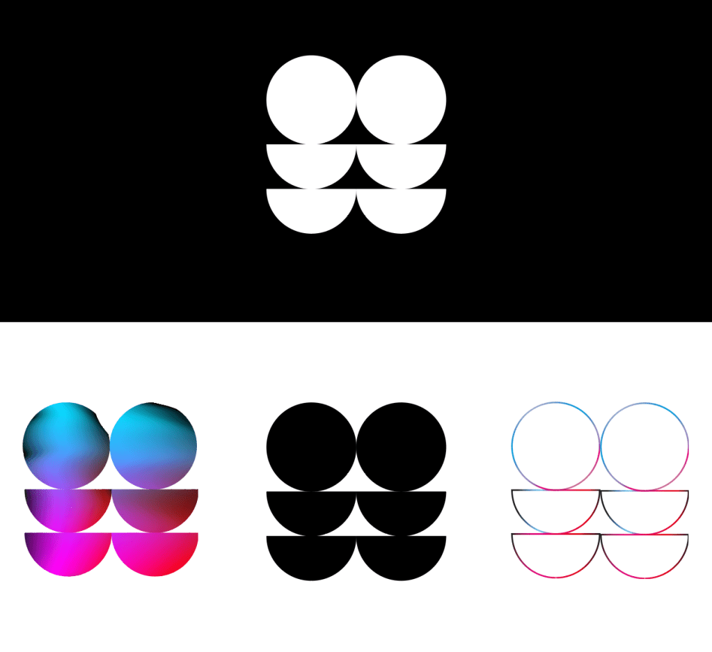
I used the guidelines I set out in the mind map to design a logo. I wanted it to look contemporary and professional whilst still being quite playful with the design and possibly colours to fit in with the idea behind the exhibition.
I used the idea of using circles for all my designs mainly to go with the theme of the peep-holes which will be used in my exhibition. The idea of the circles be implemented into a lot of the branding so I wanted it to be noticable within the logo whilst not being too stand out or in your face. I wanted the logo to be bold as well as being very simple as I think anything too much becomes less recognisable as well as too complicated to implement into some designs.
Although I was reasonably happy with a variety of my designs, I think in this case all the more simple designs are much more effective and more aesthetically pleasing. The top 3 ideas, although solid ideas didn’t seem coherent enough with the design for me, however the minimal black and white style of them inspired me for the next logos I created. Although the logos implementing a colour gradient within them are visually pleasing, I think for a logo there’s way too much going on, and I think seeing this within a design which is also using colour would become far too confusing. I also think using colour makes the logos less adaptable and therefor they can’t be used in as many different designs. I decided because of this to stick to purely black and white designs which could be changed in terms of colours. again I think although the next row is much more effective in black and white, I still the the style of them is too confusing for a logo design.
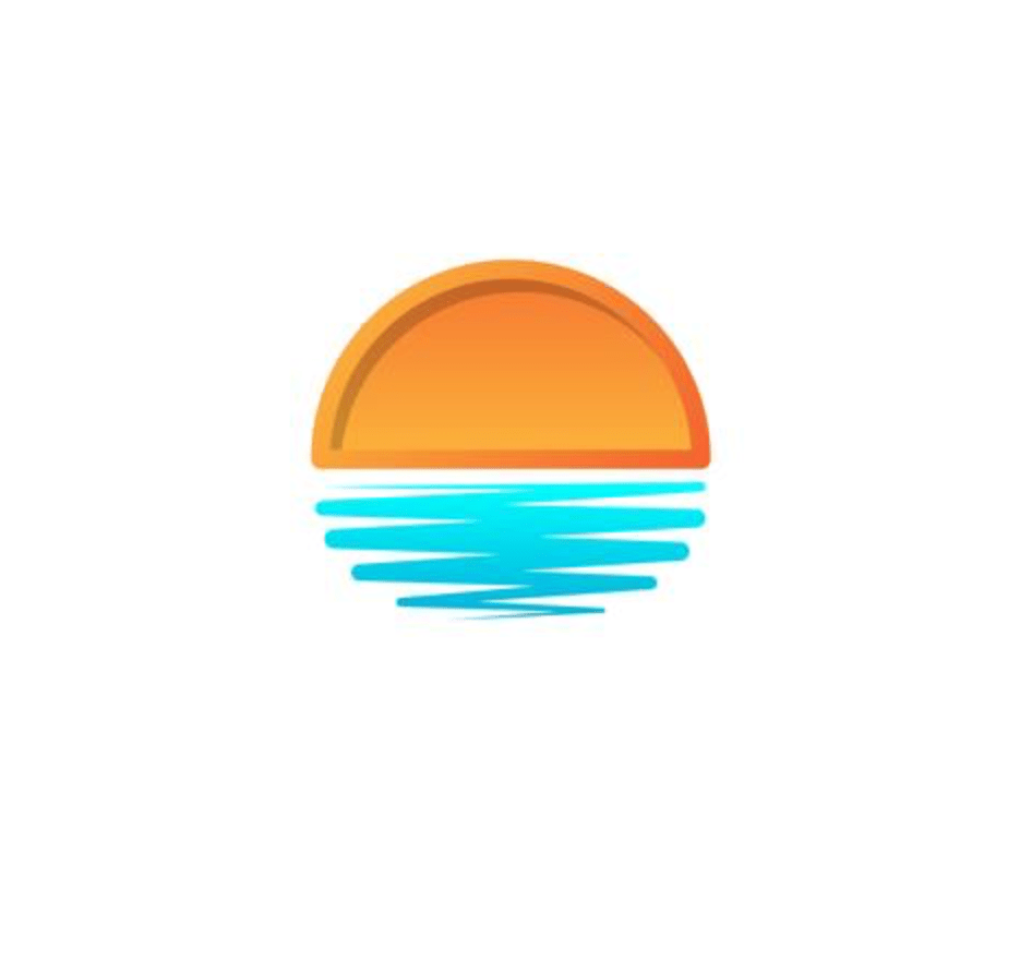
During my research I came across a sunset logo which implemented a circle which was split up to show the sun and sea and it made me think about how using this sort of idea could give a slight hint at the sea. Although very small, I used the semi circles within the logo design to give the idea of the sea, or being ‘under the sea’. The final 3 are all very similar, using the ideas of the circles to create a bold but simple design and I think overall the bottom left design using repetition creates a feeling of pattern much better and will fit in with the visuals much better if I stick to this idea or the patterns.
Overall I aimed for a minimal and simple logo design that would be very adaptable to use in different scenarios for posters, a website, booklet etc.
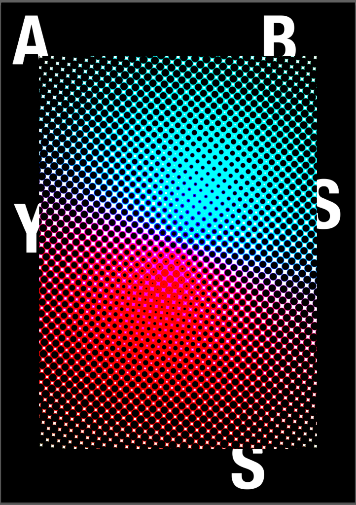
I wanted to see how it would look used in different colours including with the gradient colour theme, and I think overall due to it being very simple, it works very well.
I carried out some research into contemporary branding design to search for a suitable style and also to discover how other companies or exhibitions use visual language throughout their brands. I found the brands that were designed well tend to use very simple visual language with simple logos and a simple colour schemes.
I noticed the most successful brands also have a very good sense of pace running through all of their branding without any of it getting repetitive and I think one of the most important ideas behind this is the way they use the style of all of their work, as well as the visuals within their work. The keep a very similar style, colour palette alongside similar visuals while avoiding repetition which is something I want to carry forward into the branding of my exhibition. Each exhibition has a very set colour palette which is recognisable to it however they don’t overdoing it by using every colour within each piece, and the designs which don’t use the colours so obviously tend to utilise the visuals more. During my research, I noticed the visuals ranged widely from typographic to more vivid imagery, but it was always recognisable due to the typefaces, colours etc that are used.
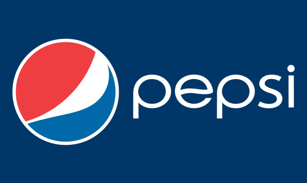
I also noticed many brands, for example Pepsi, have a set logo (red, white and blue logo) but also have the logotype, in this case the word ‘pepsi’ in the particular font. Both are equally as recognisable and don’t need to be placed together to be recognised, this is another idea I want to implement into my exhibition branding.
I wanted to mind map the main ideas for my exhibition branding before I started to design anything. Everything I want the brand to be is encapsulated in the mind map, from the logo ideas to the colour concepts.
After revisiting my research I noticed the bottom zone of the ocean, which is the main zone which my exhibition is based on, is called the Abyssal Zone and I think the word ‘Abyss’ perfectly sums up my idea. Abyss I think sums up the cold, dark and unknown idea behind my exhibition.
The exhibition will be based around the deepest parts of the ocean and the idea that we are still completely in the dark about the deep sea. It will be based around people who are still largely unaware of the wonders of the deep sea and want to be a part of an immersive experience into the Abyss.
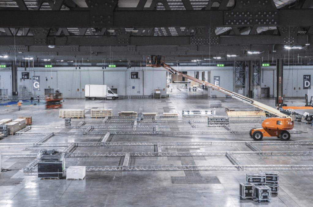
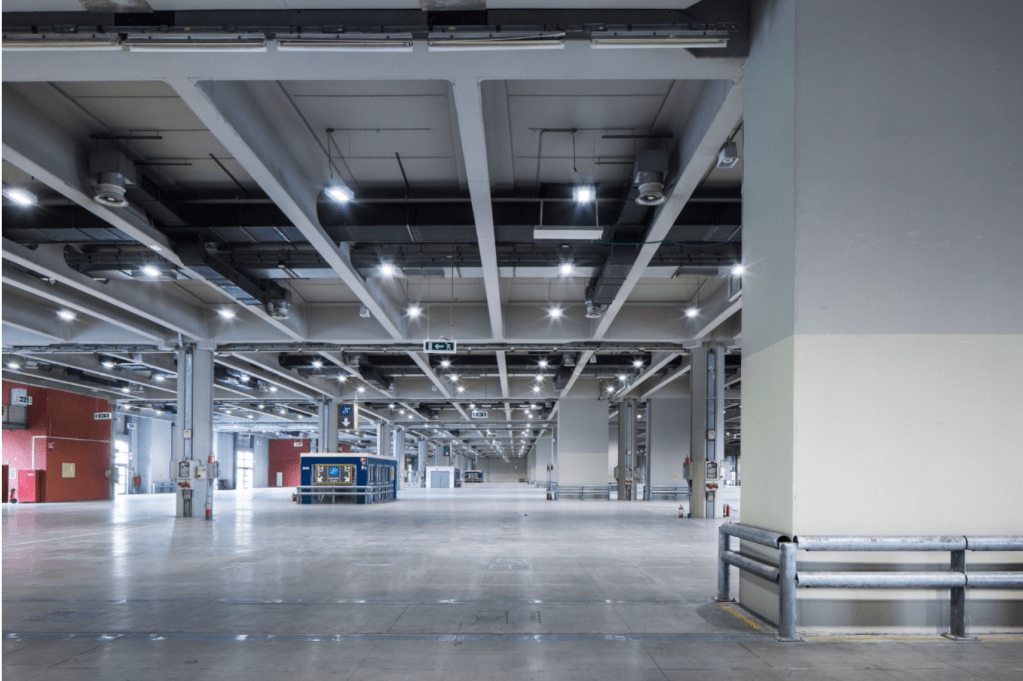
Overall as exhibition spaces go I didn’t want to have it anywhere with an aquatic theme, I just wanted it to be in a large open space where the darkness would consume the space and where the viewer would feel as though they really are in the middle of the Abyss with nothing around them. I looked up some of the largest exhibition spaces in the world and found the Fiera Milano in Italy. Typically the space is used more for trade fairs etc, however after seeing the empty warehouse within the space I realised it would be perfect for the exhibition. The space is large with high cielings which would make the viewer feel as though they have been consumed and especially with minimal lights inside it will be almost impossible to see any structures such as the walls or ceilings.
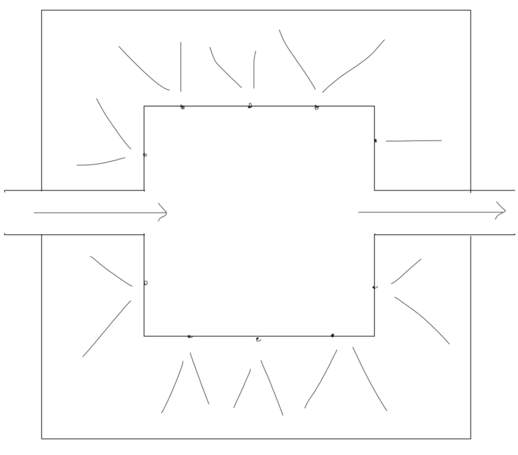
The plan would be to construct a variety of walls within the space which would act as the outer walls of the exhibition, these structures would hold lights and objects inside them that would help with the idea of the darkness and reflecting lights.
Content:
Room 1 – The Known, will be based around what we already know about the deep sea. Although the exhibition is based around the unknown and all the amazing part of the sea we know nothing about, I wanted to give a short insight into what we already know. I did however want to show the idea that although we know some knowledge about the deep sea, we are still largely in the dark and only know about 5% of the ocean, so I decided the images and videos seen within the first exhibition space would all be viewed through small peep holes to illustrate this idea that we only know about a very small amount of what the viewer will be seeing.
Room 2 – Enigma is about the parts of the ocean which we know a glimpse about but are still largely unaware. The content of the room will be based around what we know about the depths of the ocean but are unable to see or investigate further. The visuals will all be cgi and vr due to the fact we don’t have any real footage. All images will be in a very bright, intense colour with over exaggerated movements to draw the eye. The room layout will be the same as in the first room, with the content still being viewed through peep-holes.
Room 3&4 – Luminous and Fantasia will both be largely based more around fantasy than the real life under the sea. Both rooms will be more about expressing the world of the unknown down under the ocean and portraying this through bright, expressive light shows which will let the viewers imagination run wild.
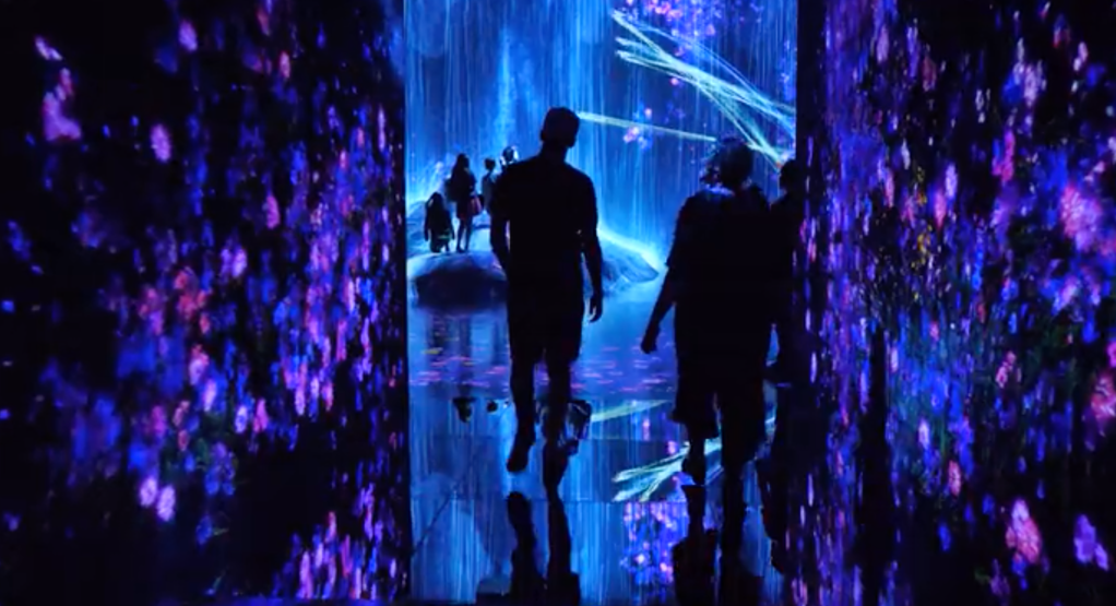
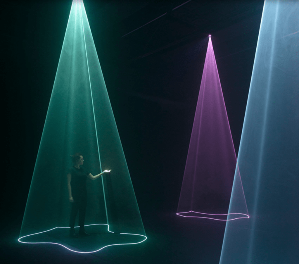
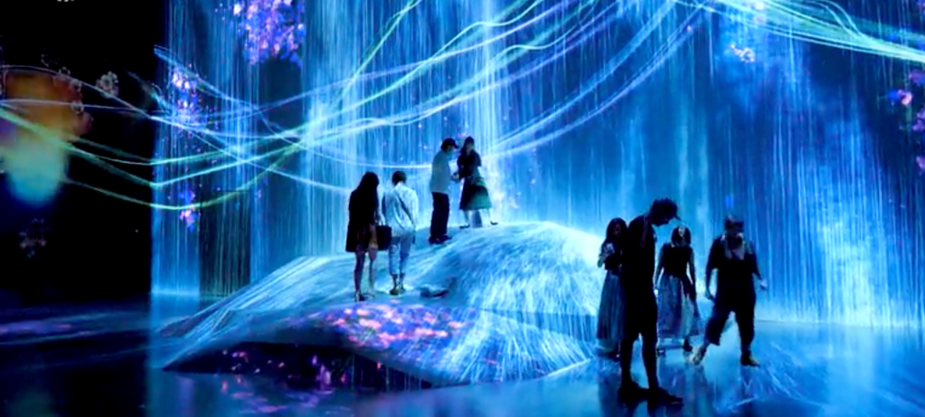
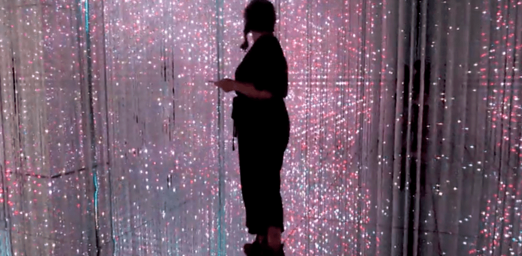
After conducting research into other exhibitions based around the sea I decided that, unlike most of the sea exhibitions currently out there, I wanted mine to be much more literal by leaving out any photographs or sculptures of fish or other sea creatures and creating a more immersive experience using other methods. Although the exhibition will still be informative and contain information about the sea and what we do and don’t know about it, I really want to emphasise the idea that we are still very much in the dark about the deep sea and I think the exhibition can use this as it’s main feature. To best illustrate this through an exhibition, I wanted to look into existing immersive experiences within exhibitions, specifically using lights within it as I think light is one of the main drivers for the exhibition as bioluminescence was one of the first things I pulled out of my research into the deep sea.
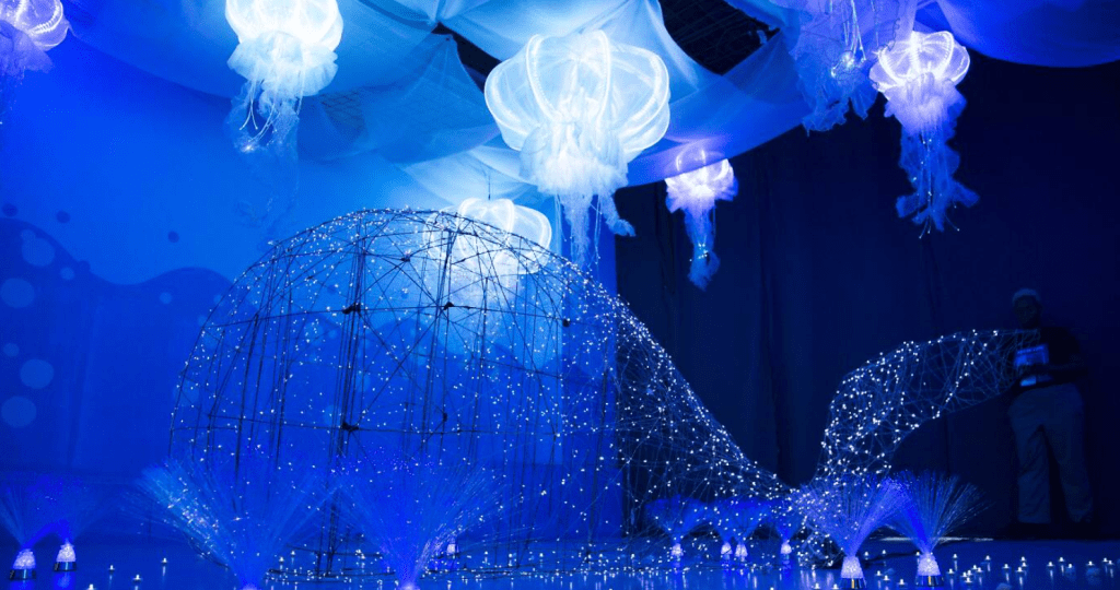
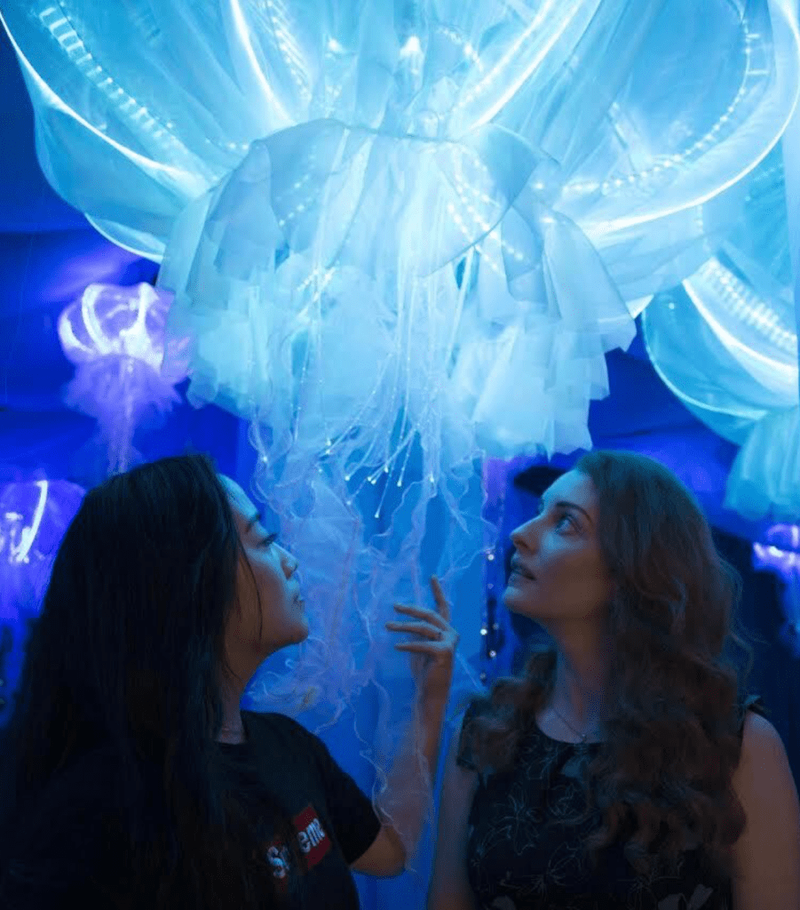
I carried out some more research into light installations and found the Aura Interactive Audiovisual Installation by Nick Verstand which is an exhibition that uses lights to create visual ideas of what brainwaves, heart-rate variability, and galvanic skin response would look. like or make the viewer feel. Although not a literal interpretation of the brainwaves etc, it definitely gives off an ‘unknown’ vibe and definitely stimulates the senses to something mysterious. The idea of the bright lights and the dark, black background is also interesting as the bright lights draw the eye away from the dark. backgrounds ands almost makes it feel even more dark. The colours used are blue, cold colours which just add even more to the cold, dark feeling of the exhibition. Although about a completely different topic, the exhibition definitely gives me inspiration as I think everything from the cold colours in contrast with the dark background, to the way the lights stimulate the senses all stand out as ways to create an immersive deep sea experience.
After speaking to Theo about my overall idea, he agreed that the exhibition would be best portrayed without showing specific photos and videos of what we know about the ocean, but saw dI needed to focus more on what makes the fish in the ocean so special. We spoke about Blue Planet ll which is a documentary which looks into the deep sea and its creatures, although many of the images in the documentary are CGI images, and although they do not depict the creatures in the sea entirely, one of the noticeable themes is the colours and the movement of the creatures. Every movement is over exaggerated and almost seems to flow with the water to create a beautiful ‘flawy’ movement of bright, luminous colours.
I continued my research into light shows and exhibitions and found more examples of ways exhibitions use lights and projections to stimulate the mind. I think the light shows communicate the idea of bioluminescence really well, and after seeing the video of the way the light moves around the room and reflects off everything, I think it works perfectly to simulate the way the fish and water move with fluidity, while also keeping the luminescence.
Overall I think the idea of using light shows to portray the deep sea is one which could be very effective. Firstly, the fact that the deep sea is largely unexplored means the amount of photographs or videos out there is very little and is also a slightly cliche idea which I wanted to stay away from. I think the light exhibition is a way of illustrating and portraying life beneath the ocean without showing exactly what is down there.
After my research into deep sea I decided that was the theme I’m going to carry forward, specifically the idea of the unknown and the fact that it is largely unexplored. The exhibition will focus mainly on the Abyssal Zone of the ocean and the creatures, landscapes and conditions within it.
Next up I needed to decide what the exhibition would consist of. I carried out some research into existing exhibitions about the sea to see what’s already out there.
The first exhibition I found was called Ocean Cube and is all depicting life under the sea. The exhibit reflects human life in the year 2119 through five, bioluminescent rooms. Start in the Coral Tunnel with a touchable 3D coral reef and end in the Recycle Bank, a colorful but polluted room full of bottles. The exhibition as a whole was about depicting what our life would be like under the sea, using jellyfish as transport and seeing using only the bioluminescence. The exhibition also focused largely on pollution of plastic in the sea.
The idea behind the exhibition is different to mine in that it looks into the idea of humans living in the sea, as well as pollution within the sea, neither of which I was interested in using within my exhibition, however I think the sculptures used as well as the colours are fascinating and the idea of the bright luminescent colours on the dark backgrounds really stands out to me.
There was also another exhibition in London during summer called ‘Sea Creatures, Life Beneath The Ocean’ which focused purely on the creatures, what they looked like and how their anatomy allowed them to thrive. Again, the idea of the exhibition is different to what I want mine to be, however the specimens within the exhibition and the overall design of it have some interesting ideas.
The exhibition has a common theme with ‘Ocean Cube’ in that it’s all very dark with only bright, neon colours lighting up the displays, this is a theme I’m definitely interested in using to go with the bioluminescent theme, and to stick with the idea that the deep sea is a very cold and dark place, I thinking mixing the two together could produce some interesting and experimental visuals.
Overall I think both the exhibitions do a good job at giving the feeling of being cold and dark, although the neon colours are bright, trebles and purples still give off quite a cold feel which is something that I definitely want to be present within my exhibition. however they have both taken a very literal response to the sea them in showing the creatures very specifically, whereas I think the route I am planning to go down will be more about the cold, darkness and especially the eeriness you would feel at the bottom of the ocean. I want to play around with the lights and colours, as well as the temperature to give an immersive experience to make the viewer feel what it would be like to be down in the sea with some of the most dangerous predators in the world. The idea of the unknown is something I want to experiment with more.
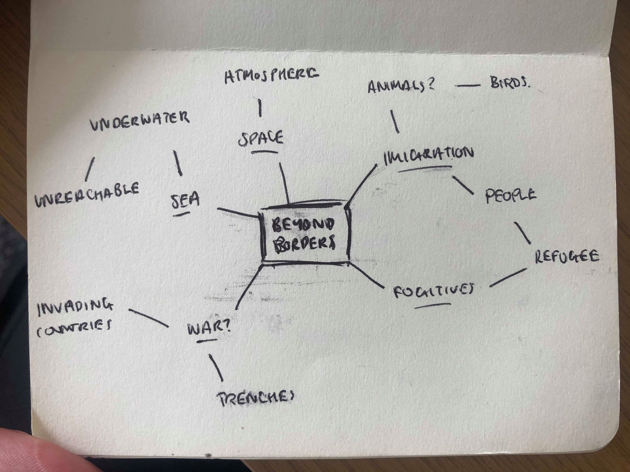
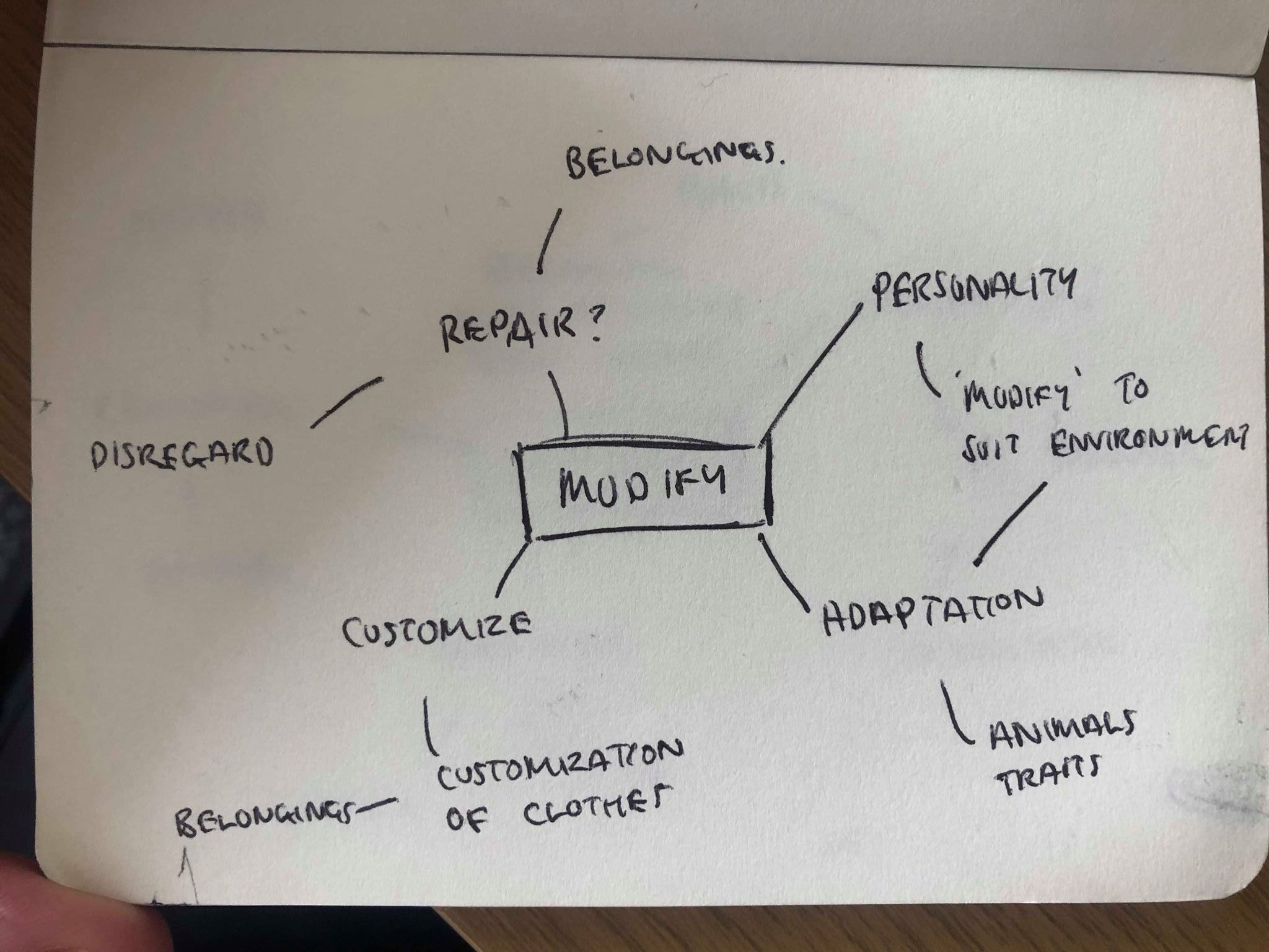
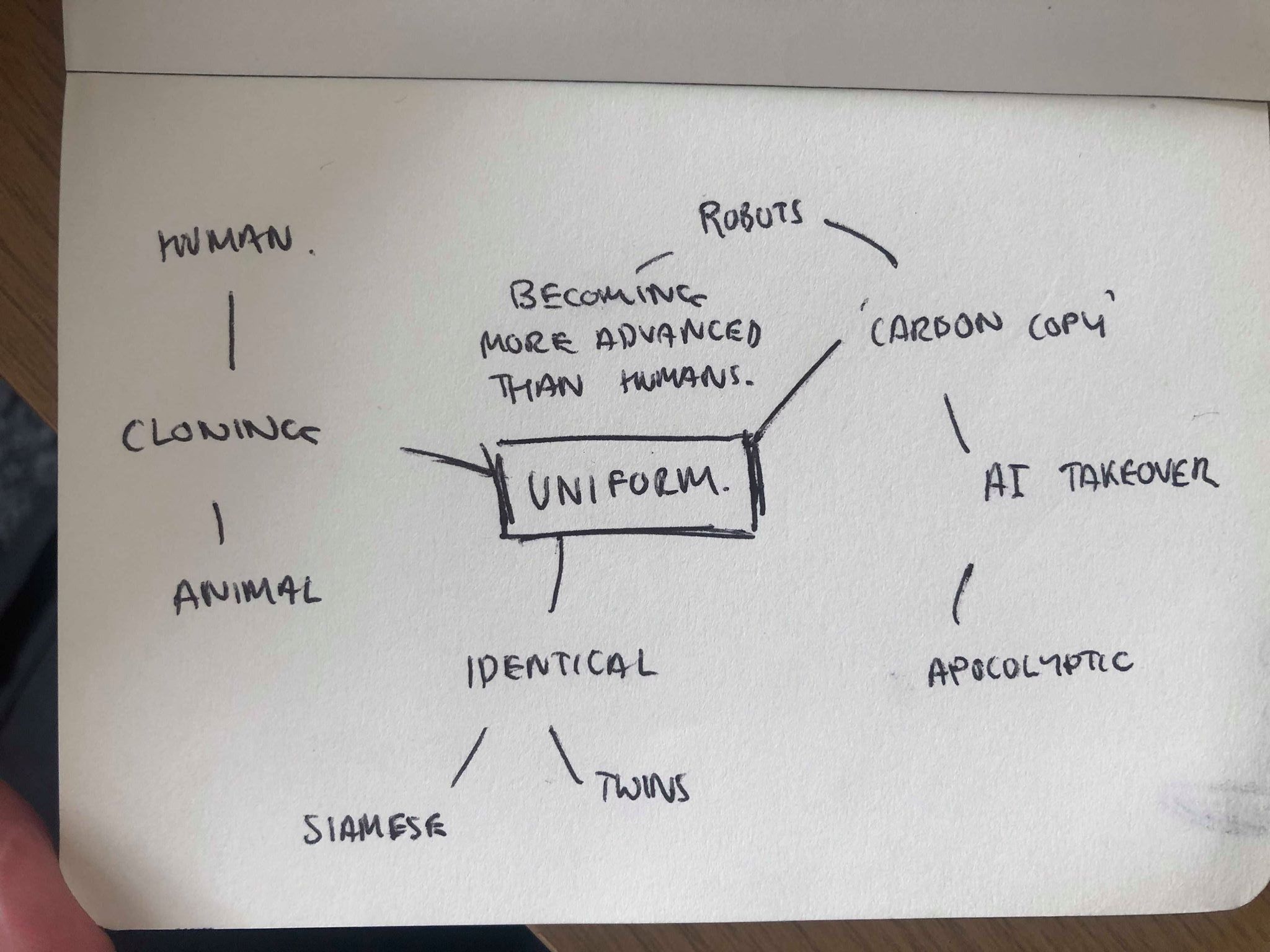
Our new brief is based around branding an exhibition which must be fully imagined and developed by myself, based on a variety of themes to choose from. We were given a number of themes and there was a few which instantly stood out, such as Beyond Borders, Uniform and Modify.
Although Modify and Uniform both had some great ideas I felt they were all too literal for the theme and didn’t push the brief as much as I would like, I decided to go with Beyond Borders as I thought some ideas were much more outside the realm of what would be expected from beyond borders.
Instantly when thinking about the theme of Beyond Borders ideas like refugees, war etc instinctively came to my head, but I wanted to make sure I steered clear of the obvious and cliche ideas. I took the idea of a border as something which isn’t necessarily a barrier, and started thinking more into physical borders that we as humans are currently unable to break. This is where the idea of the underwater came in. I recently watched the documentary ‘Blue Planet II’ in which David Attenborough explores the deep sea. He explains the barriers we have to the deep sea and why those barriers are there, he also explains what we currently know about the sea; we only know 5% of whets actually down there, and more people have been to space than discovered the deep depths of the sea. The idea that although the sea is on on our earth and is largely unexplored really intrigued me and fits in nicely with the idea of Beyond Borders. Although there is no physical barrier, diving deep into the sea for long enough to discover more life is something which is currently beyond our capability.
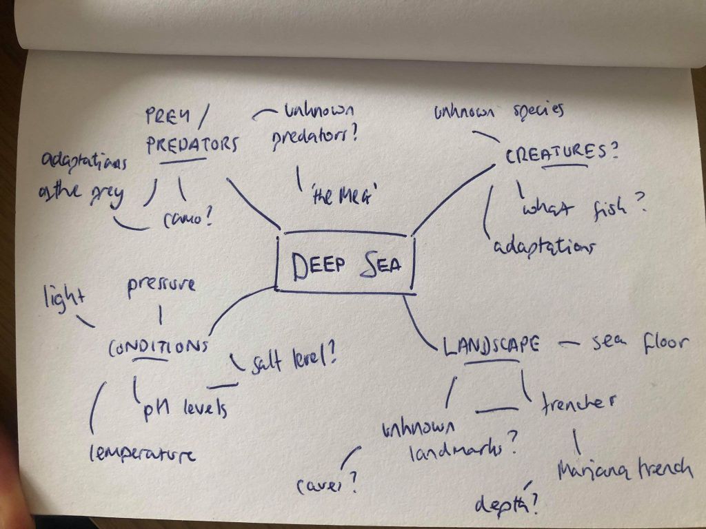
Next it was a case of narrowing down ideas I had to create the idea of what the exhibition would be about. I may want to narrow it down to one aspect of keep the exhibition about a collection of everything. Firstly I wanted an overview of what we know and what we don’t before looking into specifics.
The Sea – Overview
60% of our planet is covered by water over 1,600m deep, and nearly half the world’s marine waters are over 3,000m deep.
The deep sea starts where the sunlight starts to fade, around 200m below the surface of the ocean. A twilight zone extends down to 1,000m, after which almost no light penetrates. The water is cold, reaching 3ºC, and contains very little oxygen. And the weight of the water above creates enormous pressures, up to 1,000 times that at the surface. With no sunlight, plants cannot grow in the deep sea. And while animals and bacteria have been found wherever people have looked, we know very little about these dark, cold depths. More people have travelled into space than have ventured into the deep.
Incredible biological discoveries have been made in the last 30 years. These include entire new ecosystems such as cold-water coral reefs and vibrant communities based around chemicals pouring from the Earth’s crust, as well as a whole host of alien-looking fish and other animals. Scientists now think there may be more species in the deep sea than in all the other environments on Earth combined – by some estimates, as many as 100 million species may live there.
After researching into the sea it is quite apparent how little knowledge we have on such a vast subject and how much we still have to learn. I think the idea of the unknown is definitely a concept I could experiment with.
Creatures – Predator/Prey
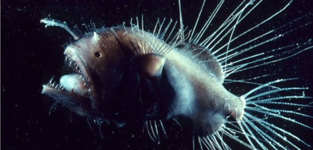
Imagine following a warm, inviting light, only to find a mouth of razor-sharp teeth directly behind it. That is the unfortunate fate of the deep sea anglerfish’s prey. Deep sea anglerfishes have evolved a cunning method of hunting: they use their bright lure, which gets its glow from specialized bacteria, to entice fish and crustaceans to draw close to the anglerfish. Only females have the lures, however. They also use it to attract males, who will bite onto the female and fertilize her eggs.
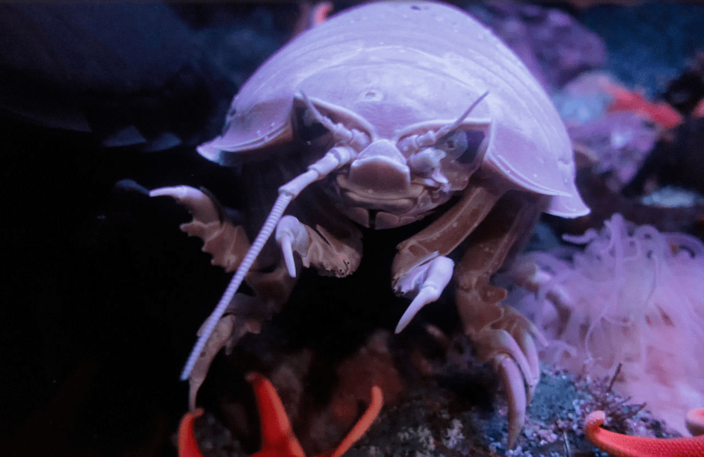
A giant isopod is to a roly-poly bug as King Kong is to a gorilla: it’s bigger, scarier and could easily star in a B-grade horror movie. The giant isopod is a crustacean, the group that also includes shrimp and crabs, and is closely related to your friendly neighborhood pillbug. They are carnivores who feed on the ocean floor at depths up to 7,000 feet (2,100 meters). Because meals in the deep ocean floor can be few and far between, giant isopods are able to go long periods without food and will binge eat when they can.
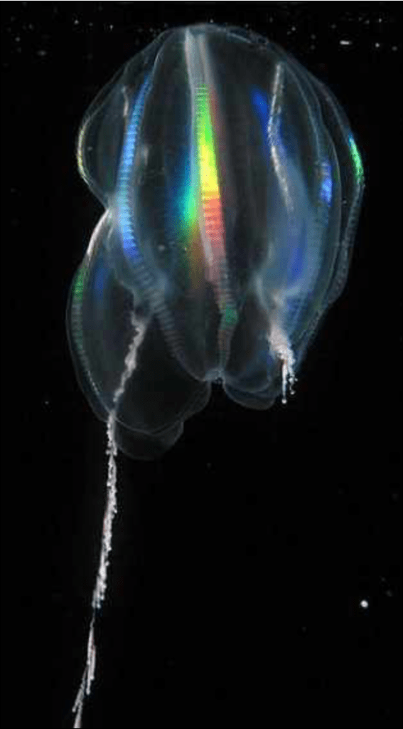
ctenophora emit a blue or green light that can only be seen in the dark. They also secrete ink that luminesces most brightly in the smaller bodies of young comb jellies. A rainbow effect is created when light scatters through the distinctive comb-like tentacles of the ctenophore.
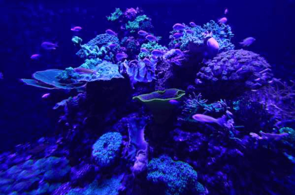
Many different species of coral, like the one pictured here from Portugal, are bioluminescent. Scientists are unsure why the corals glow blue, but they think it may serve as a warning to other organisms that the coral’s prickly spines are covered in a potentially toxic slime.
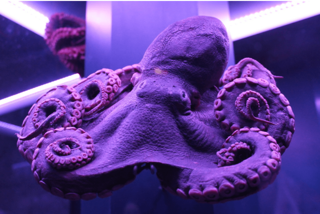
There are so many know species in the ocean and specifically the deep sea to research, however it was made clear very early into my research that all the creatures that dwell at the bottom of the sea all share very similar features. Firstly nearly all known species are bioluminescent, some fish dangle a light in front of their mouths to lure in prey, some squid shoot out bioluminescent liquid instead of ink to confuse predators, and some species even use bioluminescence to attract mates. I think the idea of bioluminescent colours is one which I need to experiment and I think the visuals that could come with this could be great. The idea of the unknown and the species which we are yet to discover also gives me ideas into how to convey that in my designs, possibly using blurred visuals to illustrate it.
Conditions
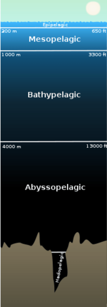
The sea is said to be split into 4 main zones with the exception of the trenches are the bottom of the ocean. The Epipelagic Zone (Sunlight Zone), the Mesopelagic Zone (Twilight Zone), the Bathypelagic Zone (Midnight Zone) and the Abyssopelagic Zone (Abyssal zone). The zones I’m interested in are those which lie closest to the bottom of the ocean and are largely unexplored, in particular the Abyssal Zone. In this zone temperatures are near freezing point, and there is no penetration of natural light. Pressure is also high due to the weight of the water above. Invertebrates like sea stars and squids can survive in this environment. Over 75% of the ocean floor lies can be found within this zone with the continental rise starting here. The deepest zones are the ones that really fascinates me as it’s the one that fascinates me the most. I think the idea of the darkness and coldness, as well as the extreme pressure could be a nice way of experimenting with visuals using cold, dark colours in contrast with the bioluminescence of the fish.
It’s not all flat, however. In some places the seabed drops down into trenches. The deepest is the Mariana Trench in the western North Pacific Ocean, whose deepest point is an incredible 10,911m below the surface. The seabed also rises to form mountains. Running for over 56,000km through the middle of all oceans, the Mid-Oceanic Ridge is the world’s longest mountain range. It’s created by lava erupting from the Earth’s crust – eruptions that account for 95% of all volcanic activity on our planet! There are also a number of deep-sea geysers called hydrothermal vents and isolated underwater mountains called seamounts.
Although we are aware that the seafloor contains many landmarks, mountains and trenches just like the earths surface, only 1% of it has actually been explored and scientists believe the sea bed is home to ecosystems which we have never discovered. I think this idea of the unknown is an idea I can really experiment with going forward, and the fact that we only know about 1% of the sea floor is another factor which could contribute to the design.
I wanted the overall design of my portfolio to reflect me as a designer. I wanted it to look clean and sophisticated but also slightly experimental. I like to use thick bold typefaces and strong images wherever possible and wanted my portfolio to reflect this as much as possible.
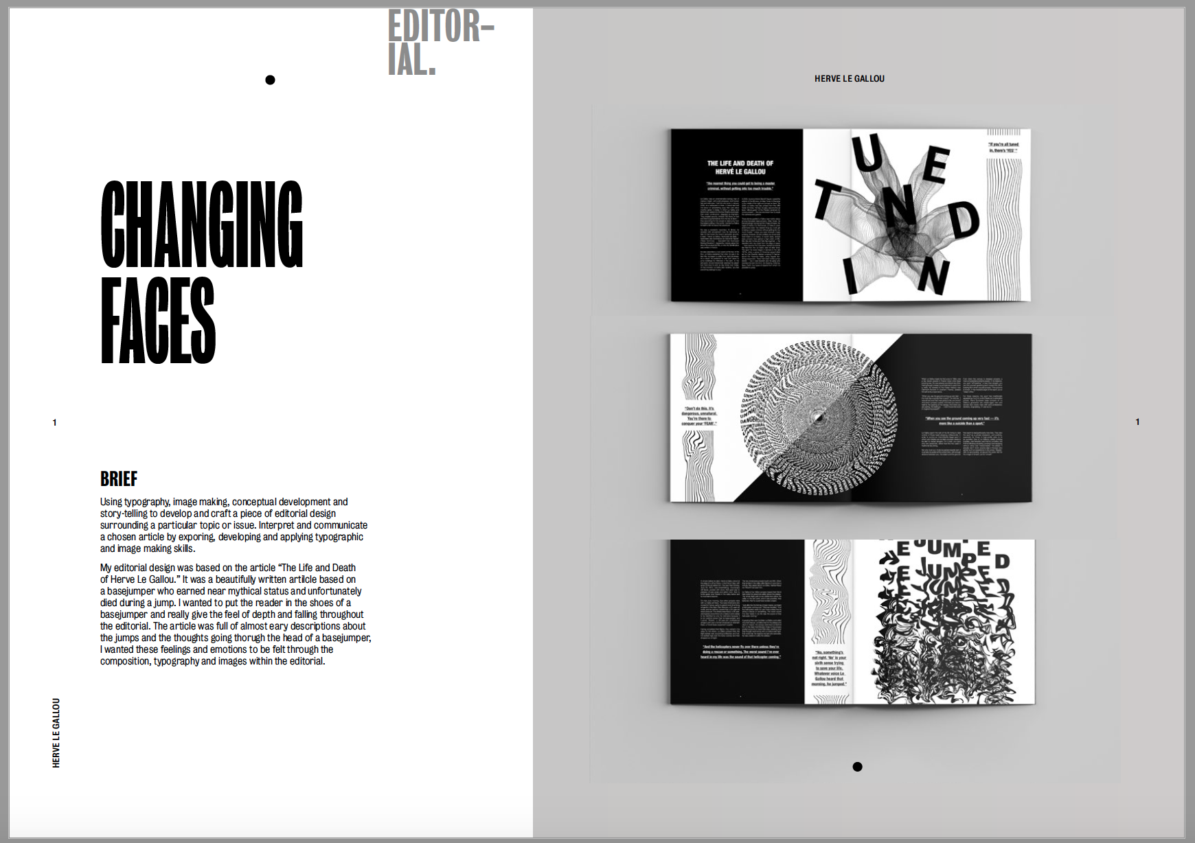
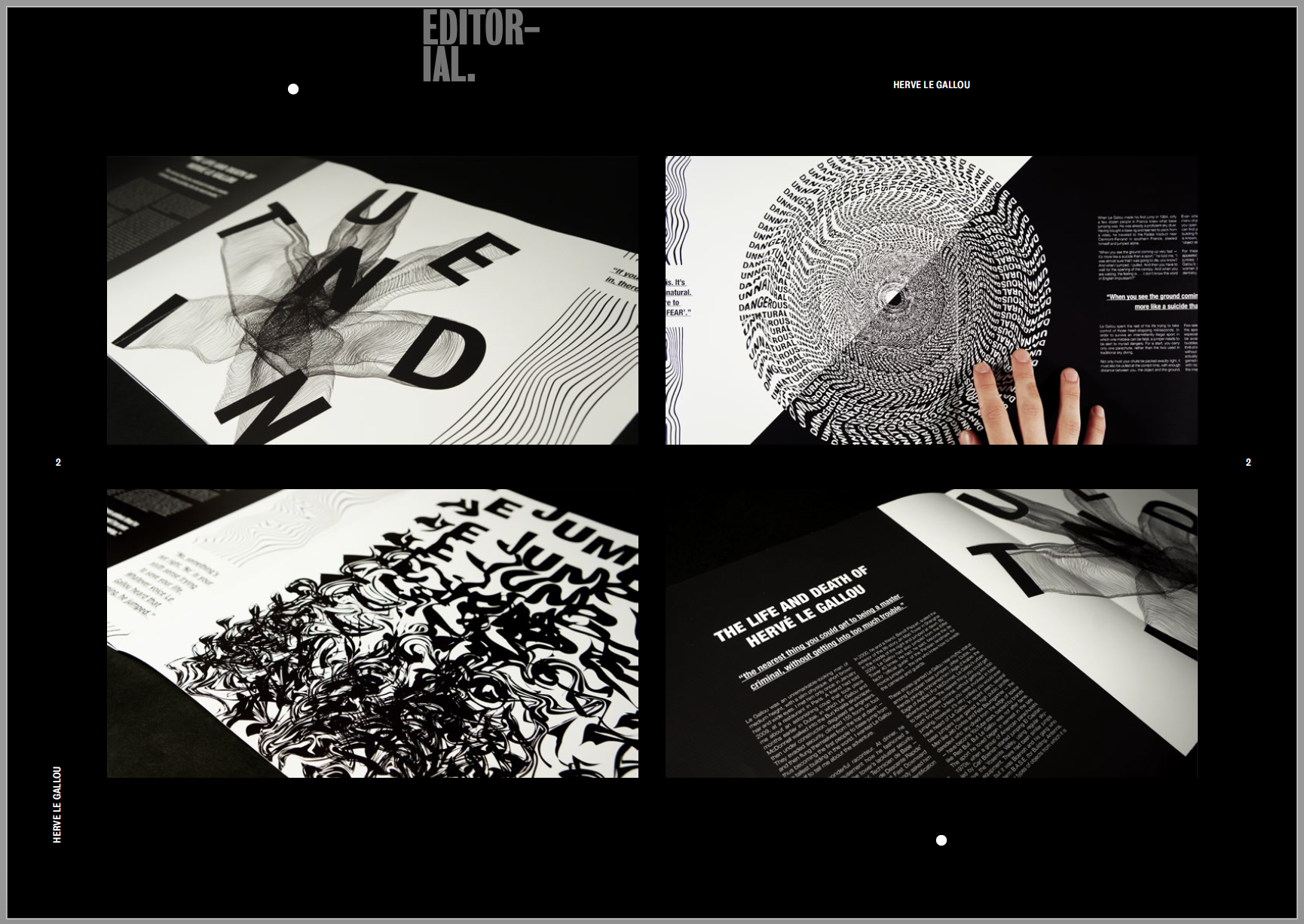
During the lectures and 1 to 1’s I’ve had since the portfolio project began I’ve been told countless times to start and end with my best work, so I’ve started with what I felt has been one of my strongest projects of the year, my editorial.
I used a mixture of mock ups and my own photographs to showcase my final editorial. I wanted the first page to contain mock ups of my editorial on a blank background as I felt the photos I took of my editorials weren’t good enough. I placed them on a grey background as I felt this was a good contrast between the black and white editorial and it really makes the piece stand out. I then added a second page were I added my own photographs which I had taken, I wanted to include the extra skill set as well as show close ups and details of the images and text I had created. I think the black background helps to bring out the white in the photographs and makes them stand out off the page.
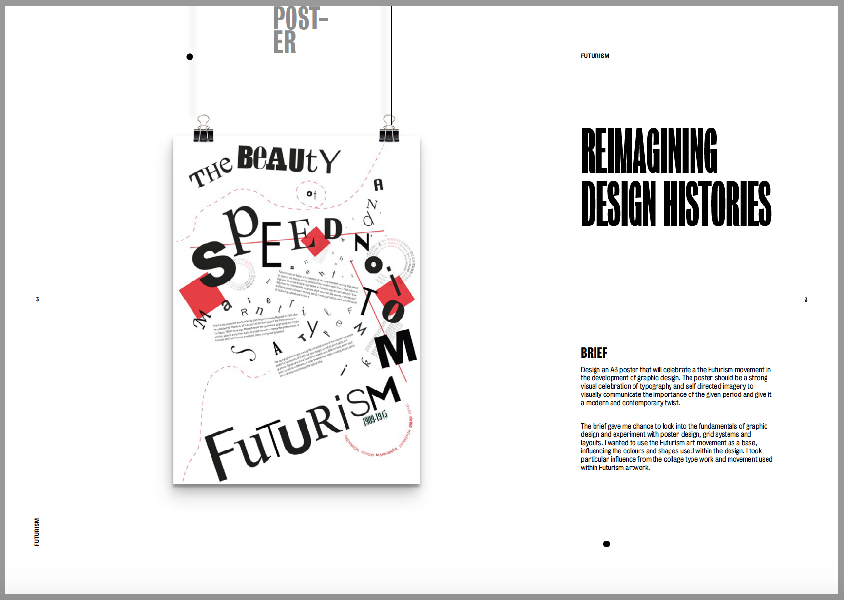
Next up was my reimagining design histories poster which was based on the movement Futurism. The poster is very clean and I used the space within the design to create the Futurism feel. I wanted to portray this in my portfolio by leaving lots of negative space around the image. The first image is a mock up of a hanging poster, I think it looks clean and shows off the piece very well. I then added my own photographs into the second page, again to show the fine details within the piece which you can’t see from further away. I left them on a white background as the images contain quite a lot of black and I wanted to keep the contrast between the colours.
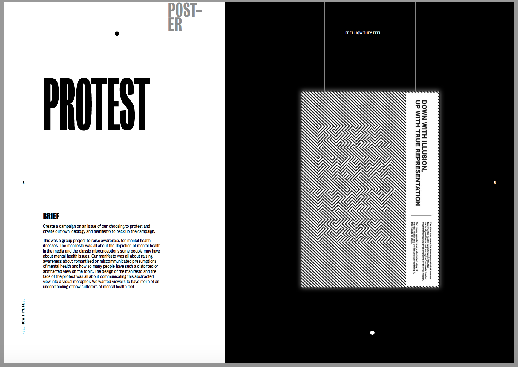
The 3rd project to showcase was my protest as I wanted to show the two poster designs together. The first image was a mock-up of my manifesto ‘feel how they feel’ about raising awareness for mental health. I wanted to add a black background to it to really make the optical illusion stand out and pop off the black page. I used a similar layout to the previous project to make the poster look as if it’s hanging on the page. Unfortunately I did not have an image of this being held in our protest to couldn’t include it. I then kept the black background and included a photograph I had taken in the centre of the page. I only felt as though one image was needed in for this piece as I just wanted to show the fine intricacy in the lines on a larger scale.
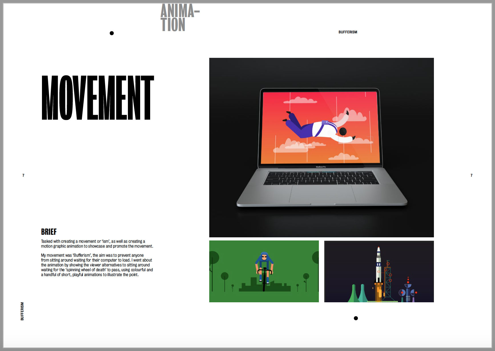
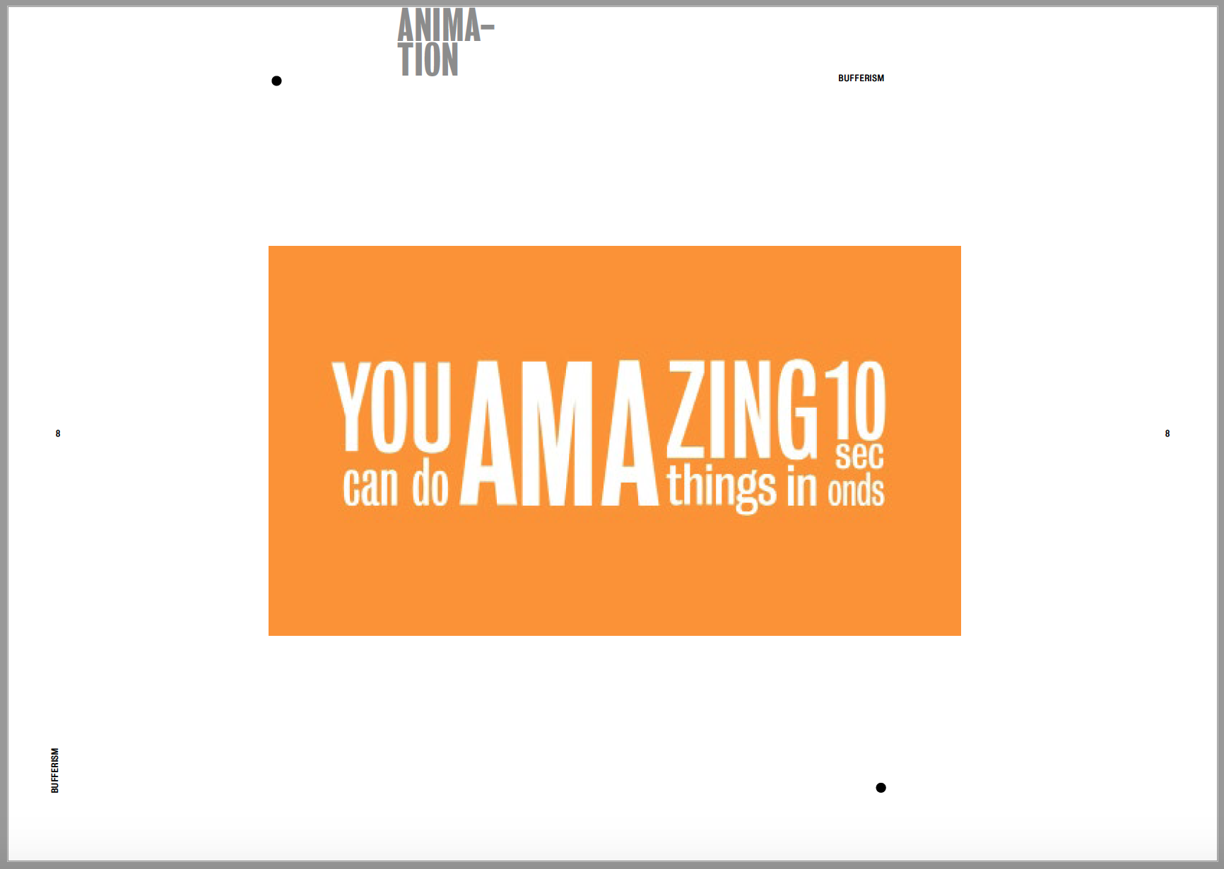
The next project was Movement which contained my animation. I contextualised my animation by adding it to a laptop screen alongside 2 screenshots of the animation. I wanted the mock up to be on a dark background to contrast with the white page size and to go along with the screenshots which are both relatively dark images anyway. I then imported my video into the second page so it can be view within the pdf. Again, I kept it on a plain white background as there’s already so much going on in the video as it is and I didn’t want to over complicate it with the background.
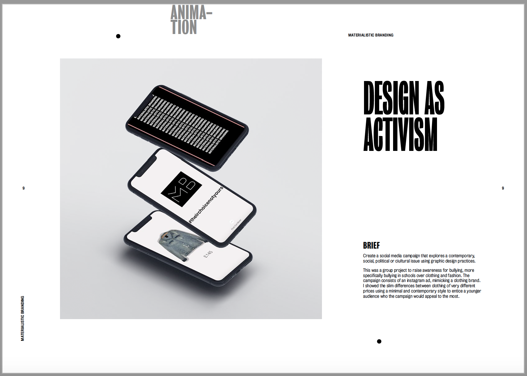
The next project was my Design as Activism project. It was only a relatively short project so I wanted to keep it to only one page. I gave a brief description of what the campaign was about, alongside a ink to the final video I created, and included a few stills in a mockup iphone screen. I didn’t want to over-do the page as there’s already so much black within the image so I kept the image background and page background light to make the images on the phone screen pop.
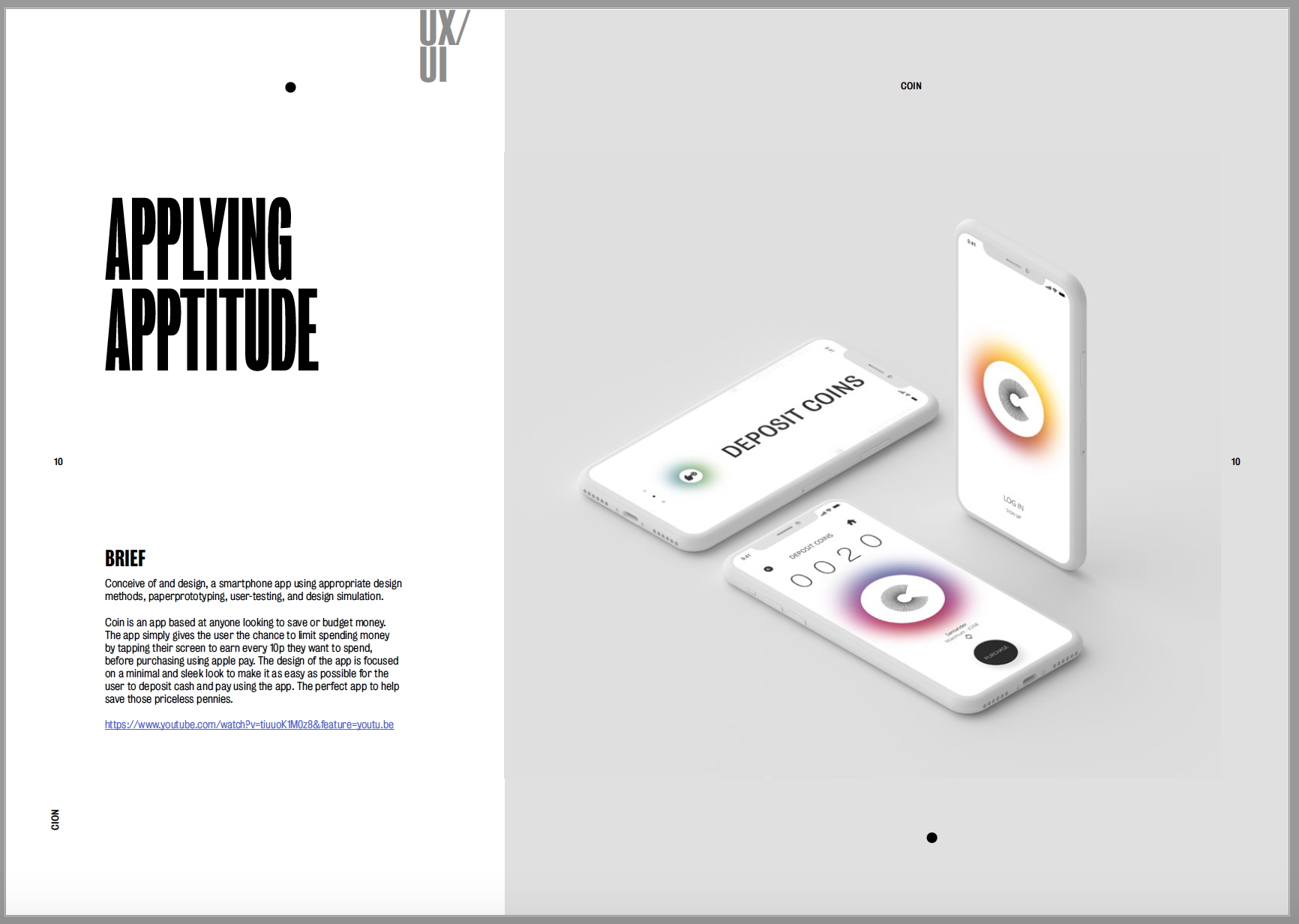
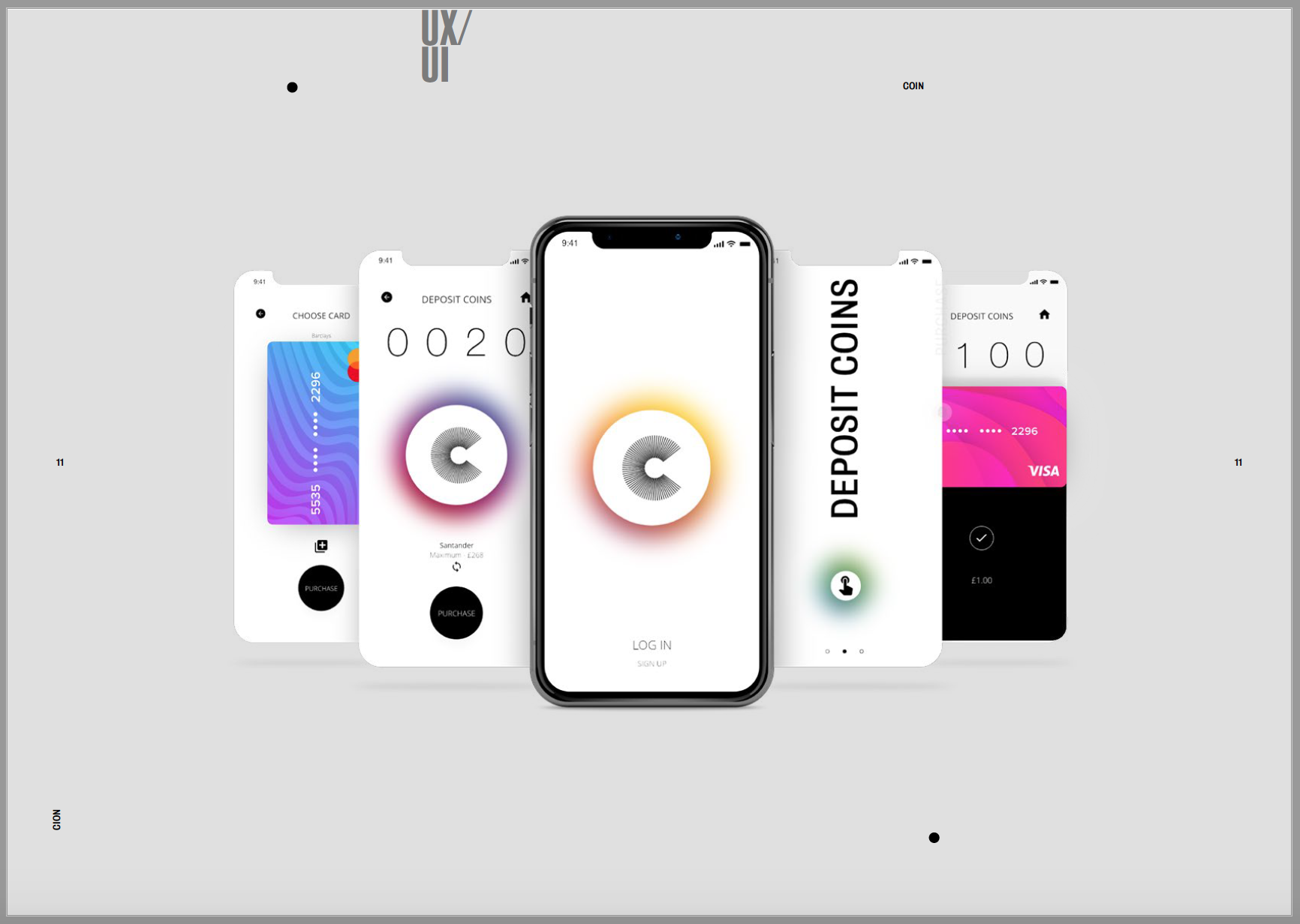
The final project to add in was my app design. As I said previously I wanted to use my favourite projects for the first and last slides so I decided to use my app design to finalise the portfolio. My app was a very minimal and contemporary design so I wanted to mimic this when I added it into a mock up. I think the mock up design suits the design of my app and they compliment each other well. I wanted the mock up to be central on the page so it wouldn’t take anything away from the design of the app. I then added another mockup in the second page using the same background colour. I couldn’t import a video into the pdf so I had to link the youtube video in the description. I wanted to showcase more of the app than in the first image so I chose a mock up with more screens so I could showcase more designs and show off the app more.
All in all I’m happy with the layout of my portfolio and think it encapsulates me as a designer within it. I think I’ve managed to show off my work as well as I could to get the best out of all of it.
I met with Theo to show him the video of how my app works with a brief navigation through it.
Overall the feedback I received I was very happy with, Theo agreed that it was a very simple concept and app but designed well to be quite intuitive and easy to use.
Theo gave some pointers in the way of being able to change the amount of money the user can deposit at each time to make way for people of different incomes. I took this into account and thought about wether or not I wanted to accommodate for this.
I decided in the end that the app was originally aimed at students or people in a similar financial state who would benefit from saving a little bit of money here and there. I think if the option was there to increase the amount the user could deposit, the money saving idea would be forgotten about as people could happily deposit more and money with the flick of a switch. I ultimately decided to keep the app as it was and keep the deposit amount at 10p.


