Manifesto – More Development

I then took the idea from my previous post and played around with it more on illustrator. I added a white background to it and offset the text slightly from the white background so the text is more easily recognisable. I also enlarged the text which I think also makes the text much easier to read. The smaller text is also indistinguishable from the background when it’s viewed from a distance whereas the enlarged text means it will be easier to see from a distance.

I also tried to play around more with the idea of a distorted or blurred view, keeping the white background in the same place and moving the text around into different positions. It adds extra layers to the piece, with the white text as well as the ‘checked’ areas where the lines going in different directions are crossing over. I think it works well and is very eye catching and acts as a focal point, however the idea of our manifesto is all about mental health disorders being hidden and not being represented truly, so I think the initial 2 ideas convey this idea much better by having the text almost hidden in the illusion, making the viewer look further into it.

Manifesto – Idea Development

After figuring out the basic idea for my manifesto I looked up some simple illusions to find out what was the best style to use and found a variety of different styles of different colours

Personally I think using black and white is much more effective when used as a poster, although the colour may be eye-catching I think the colour plays with the eyes too much and makes it too hard to look at it for too long. It will also be easier to incorporate the text into it if i use a simple black and white. I also decided the two images on the right might be much harder to add the title to, and it might be more confusing and much harder to see and understand what it says when using a design like those which are more complicated.

I researched online to find other designs similar to the idea I was looking to create. The majority I found were in black and white, possibly because the visuals are already so confusing and adding other colours in seems to overcomplicate it and strain the viewers eyes a bit too much. Overall I think the simple designs, for example the bottom two are the most effective, they draw the viewers eye with strong visuals of the black and white and by rotating lines they can create an image inside the illusion which seems to blend in with the background but is also recognisable.

I then used illustrator to create a few simple designs based around this idea and added the title to it so it almost blends in and makes it hard to read for the viewer, adding an almost distorted look to it.

I attempted a few different styles of incorporating the text into the poster,The first of which was made to look like ‘feel’ is pushing out from under the ‘illusion’. The second was the idea I had during my sketches, using the lines rotated the opposite way to give the contrast and make the words stand out. I think the second variation is much more affective, the individual letters are slightly easier to read but they also blend into the background well and the contrast between the background and title is very effective. It portrays our idea of having to look deeper into something the find the hidden meaning, without hiding the ‘meaning’ or title completely.

https://cdn.technologyreview.com/i/images/arxivopticvalillustion.jpg?sw=1180&cx=0&cy=0&cw=2700&ch=1519

http://www.4usky.com/data/out/46/164398811-illusion-wallpapers.png

https://st3.depositphotos.com/3501323/15811/v/600/depositphotos_158116128-stock-video-optical-visual-illusion-entrance-to.jpg

Manifesto – Initial Ideas

Our research backed up the overall idea of our manifesto that we wanted people to understand how people with mental illnesses are really feeling. The idea of the ‘feeling’ was one we looked much further into, spending a session as a group discussing a variety of ideas which experimented with the ideas ‘Feel How They Feel’, thinking about different materials and feelings which may make people feel a particular way. One of our most promising thoughts from Shannon was to experiment with the idea of using an itchy or rough material, which could represent the uncomfortable feeling someone with mental health could have, or similarly the idea that people don’t want to learn more about mental health because it makes them feel awkward or uncomfortable. We also thought the idea of feeling could be conveyed through the use of brail, or anything which the viewer would have to feel to gain an understanding of what it is or what it says.

I drew some initial sketches, the first of which being part of an itchy material, thinking about what materials might be similar, for example wool or any sort of carpet material which could feel rough or itchy. I also thought about a brick wall and it’s texture, it would feel rough and scratchy and isn’t the sort of thing you’d want to be feeling. Both of these ideas back up the idea of a texture which would make the audience feel uncomfortable to touch.

Although we had a variety of great ideas using materials and technologies through the use of materials, we decided there may be a problem with communicating the idea of our manifesto and describing it if we used that method. We also decided this idea may not quite have the same aesthetic as a poster or leaflet for example.

My idea was to keep with the idea of how it would make the viewer feel to look at our manifesto, and i came up with the idea to design a poster with a visual that would feel uncomfortable for the viewer to looks at, something that and thought some sort of optical illusion could work as they can make people feel like it’s moving, for example. I also thought a blurred or distorted visual which an illusion would bring, could link with the idea that the media has brought about a very blurred and distorted view of mental health problems.

I looked into different types of optical illusions and sketched out a few ideas. The first is one which is relatively simple but one which takes a lot of thinking about to understand. It’s interesting because it makes the reader have to look further into it to understand it. I thought about the connotations it has with mental health illnesses and how something can be so hard to understand and comprehend when sometimes it shouldn’t be.

I also looked at a traditional illusion with the black and white background, although the sketch doesn’t quite have such an impact, a digital version can play with the eyes of the viewer and make it seem like its moving. This was the effect I wanted to achieve for our manifesto as it keeps the same idea as the previous, but it’s much more visual and would draw the viewers eyes to it more than the previous sketch. It could also be used as a background because of this.

I decided the illusion was a great visual starting point and thought I could incorporate our title ‘Feel How They Feel’ into the illusion. I tried out a few different styles of incorporating the text into the illusion, one which blends into the background and the other stands out much more. I think the text blending into the background fits with the idea of our manifesto, the idea that you have to look further into something to understand the deeper meaning, or in this case how they’re feeling.

Manifesto – Research

After deciding on our manifesto, as a group we carried out research into other areas within the media in which mental health is portrayed. Our initial thoughts were to look into areas of mental health in the media that we think have been portrayed in a glamorised manor, so we could identify exactly what we thought was the issue.

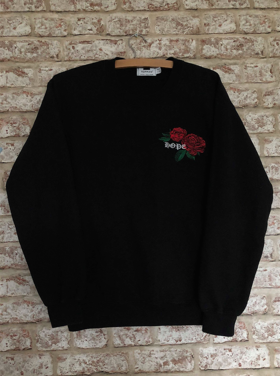
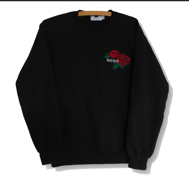
Firstly, Shannon found a brand called ‘ban.do’ who released some controversial gold necklaces with words such as ‘depression’ and ‘anxiety’ on them. The company selling them stated when they were initially brought out that they were a way to open up about mental illnesses and not keep them bottled up, they were using the necklaces as a way to raise awareness. However, although many recognised the intentions were there, the majority of people were outraged and said that raising awareness should show just how demoralising and brutal it is to have one of these mental illnesses, not by a gold necklace which is designed to be “cool” or “pretty”. “My depression and anxiety and other mental illnesses are not your fashion statement.” and “It’s just a bit odd to walk around with the word depression literally in gold around your neck as if its some kind of wonderful label for us.” were just a few tweets in response. Others said wearing those words around your neck as a way to raise awareness could likely “exacerbate feelings of isolation even more”. People also said that people who may not necessarily suffer with a mental illness may wear the jewellery anyway, so there are worries that it may start up a trend for the wrong reasons.

Romanticising mental health issues feeds mental health stigma and creates false representations, for example, in the Netflix show ’13 Reasons Why’ mental health professionals are concerned of how the teen drama portrayed suicide to its young audience. The show depicts mental health issues, especially suicide, in a false way. Alexa Curtis explains in a Rolling Stone blog post that she found the aftermath of main character Hannah’s suicide troubling. In real life, when someone commits suicide, their story ends there. “’13 Reasons Why’ failed to end Baker’s story, since she lives on through the tapes. We become captivated by the drama of the suicide rather than the actual suicide itself.” However, many viewers argued that ’13 Reasons Why’ showed the brutal reality of suicide, but the creators still failed to shoe the viewers other ways of getting help, for example, like therapy.

We also spoke about the tv show ’13 Reasons Why’ and found out that there was a very mixed response to the tv show. Many felt as though the show portrayed a very wrong image of suicide to it’s viewers, the main issue being the fact that even after committing suicide, ‘Hannah’ never really died and stars in the remainder of the show as she lives on through the tapes. Many experts stated that with everything going on within the drama, people are forgetting that a girl has committed suicide, and are more interested in finding out about her life. This sparked a small debate within our group as an individual stated that there could also be the point of view that ‘Hannah’ does not stay alive, she just lives on in the memory of the other characters. Although this was a great point and we agreed, however after talking about it we all felt as though the harsh reality of the suicide was not really shown. The idea of someone committing suicide is very harrowing, however 13 Reasons Why was far too easy to watch and did not show how brutal the topic really is.

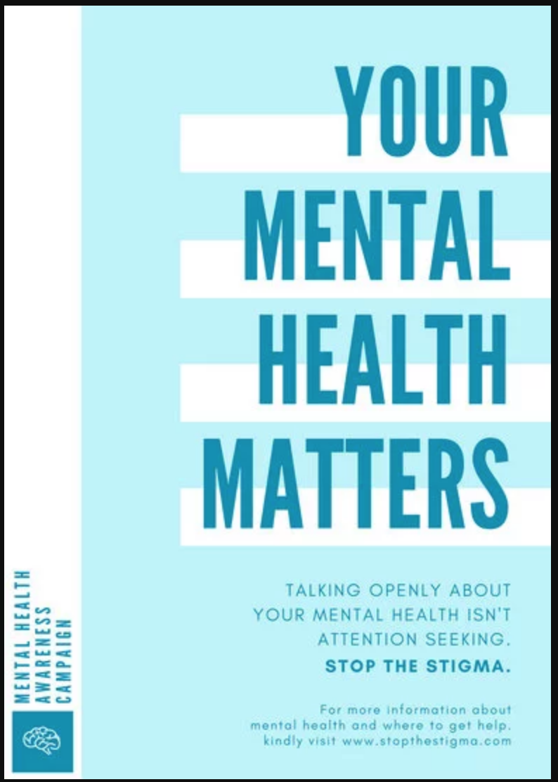
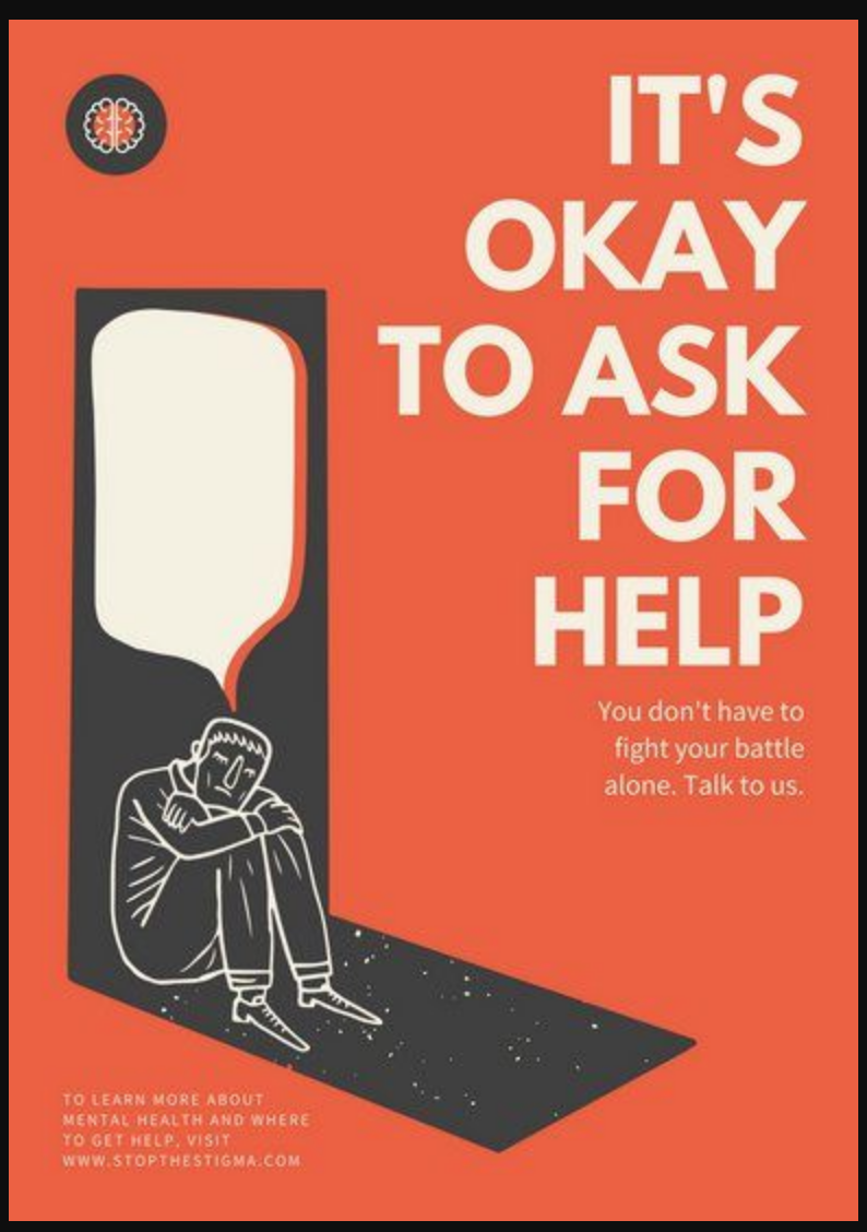
I then looked into existing mental health campaigns and found a variety of different designs.

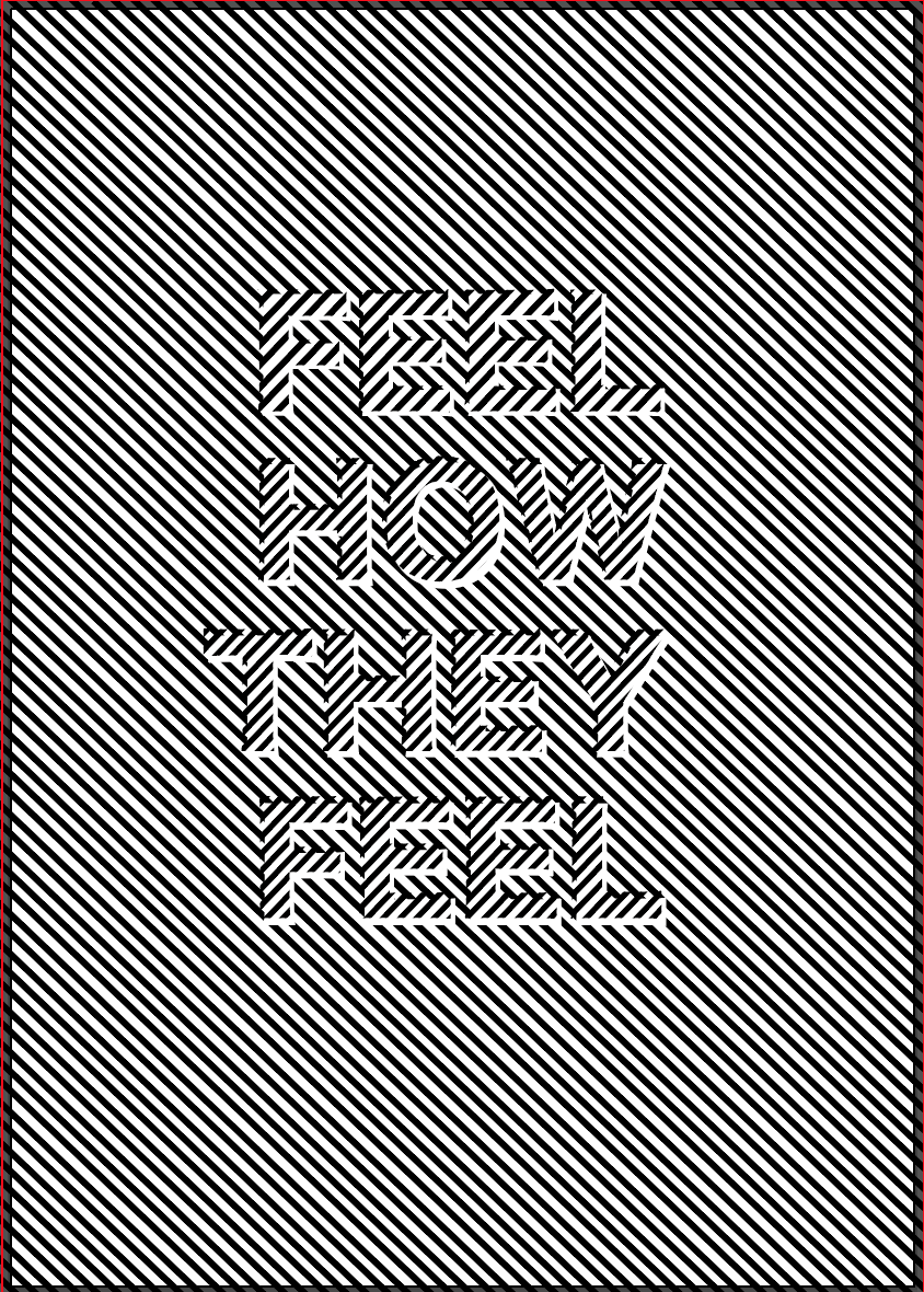
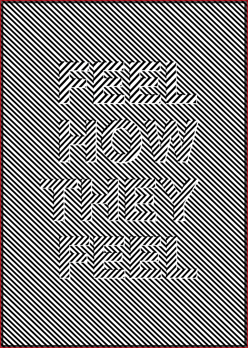
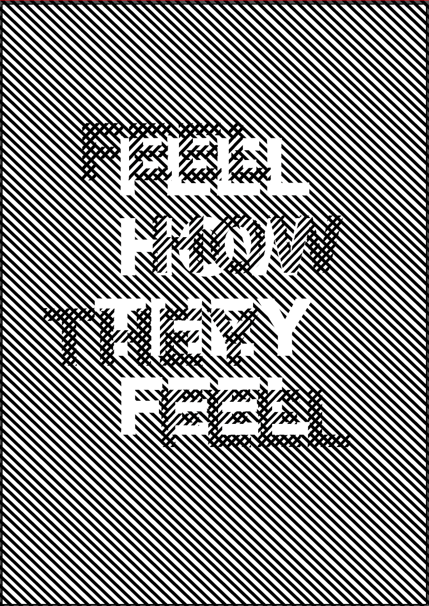
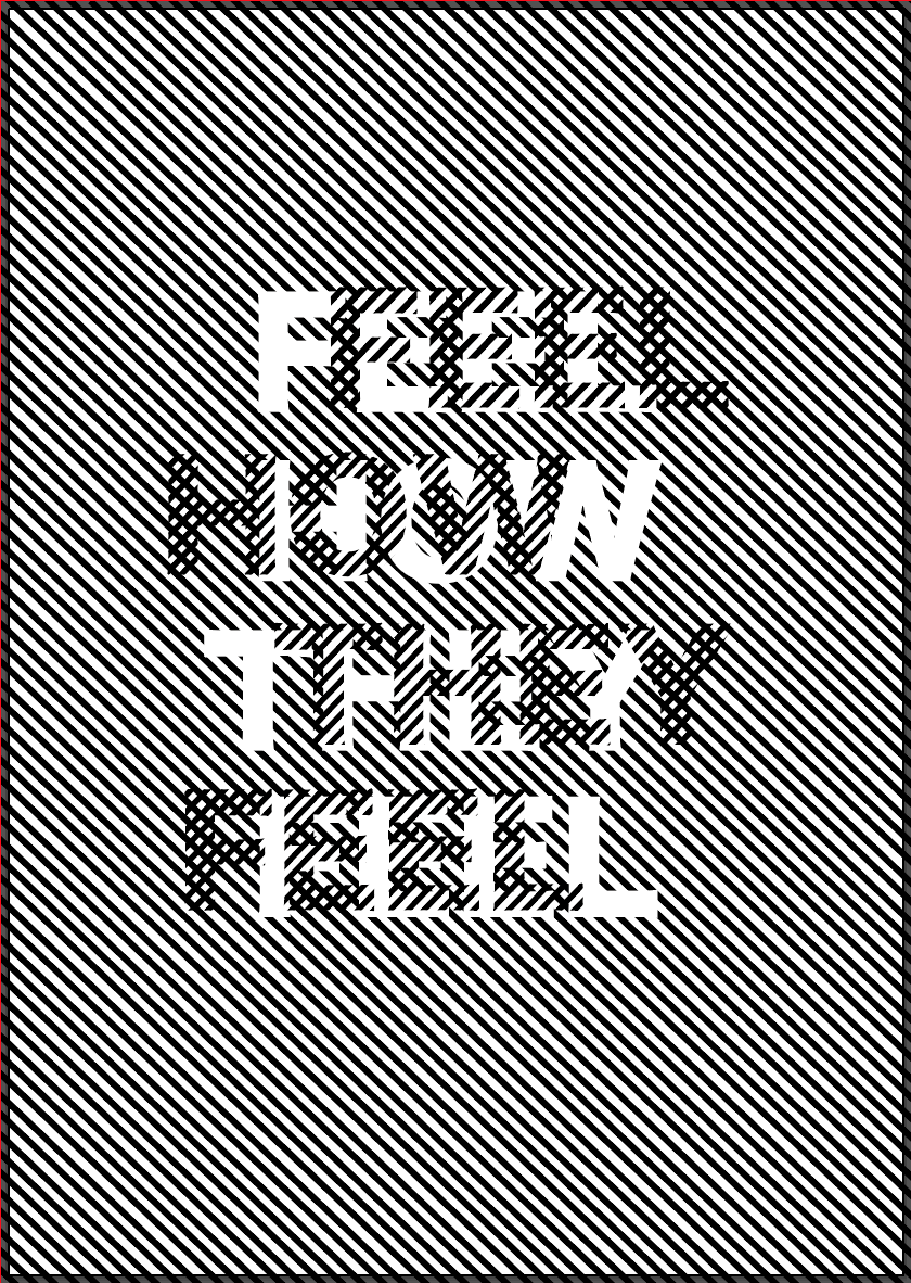
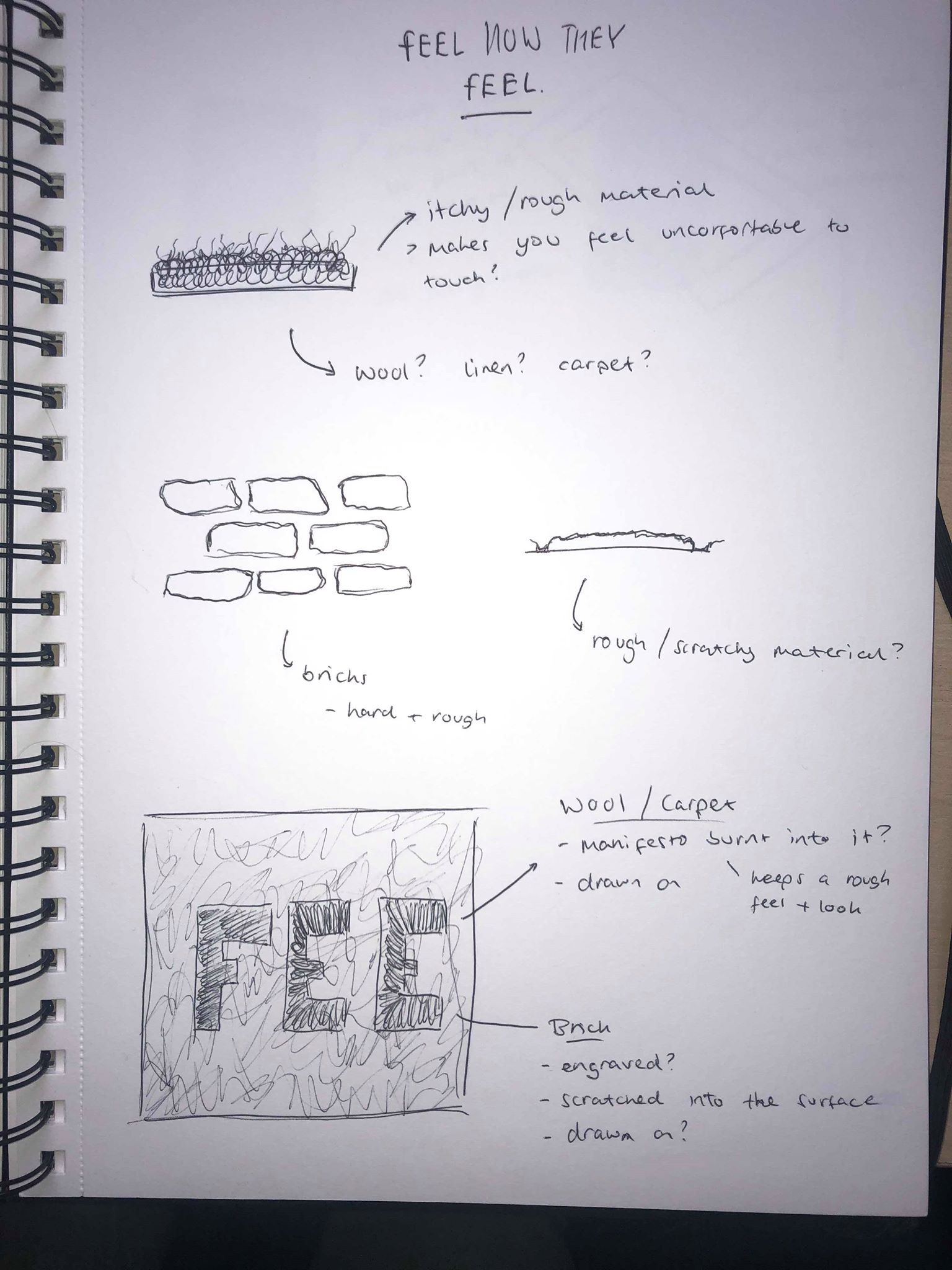
The above images were just 2 examples which we found which just backed up our point. The posters above contain pastel colours which lower the mood and make you ‘think happier thoughts’, however sometimes when thinking about the topic of mental health, happier thoughts need to be left behind. The message on these types of adverts are all about showing people with mental illnesses that there is someone to turn to for advice, however we believe there isn’t enough advertising which aims to help people without mental illnesses understand how it feels. Our protest is all about telling people that mental health isn’t always as it is portrayed on the media, replacing ‘raising awareness’ with ‘promoting understanding’ as Shannon described it.

https://stopromanticizingthingsthathurt.weebly.com/the-romanticism-of-mental-illness.html

https://www.independent.co.uk/life-style/mental-illness-necklaces-bando-jewellery-brand-criticism-anxiety-depression-a8375476.html

https://www.cosmopolitan.com/entertainment/a20675573/13-reasons-why-criticism-problems/

Manifesto

After being given our groups, our first task was to decide upon a theme which we thought was worthy of protesting for. After discussions about what we individually felt strongly about, a reoccurring idea was mental health, and more specifically the way the media portrays mental health. For example TV shows such as 13 Reasons Why, or social media such a instagram and tumblr. We felt like the way all mental health is shown as a whole is not the way it should be shown to bring about change, and we therefor decided out protest would be about making people aware of mental health and the brutality and reality of it. We wanted to educate people and show them that mental health can be heart breaking and it isn’t always the glamorised version of it which we often see.

We were then tasked with creating our manifesto. As described above, the general idea of our manifesto was to portray mental health exactly how it is, not to romanticise or glamorise it. This led us to call our manifesto ‘Feel As They Feel’ as we thought the idea of making the viewer see or feel exactly as someone with a mental illness is feeling is a concept which would make people think a lot deeper into mental illnesses, and hopefully ring about change. The overall idea of our manifesto is as follows.

” The time has come for the reappraisal of how we feel mental health is portrayed. We, the undersigned have had enough of romanticised or miscommunicated presumptions of mental health and we believe that there should be a more realistic view. Down with illusion! Up with true representations! Using our design and illustration voices we intend to create awareness but to also present work that provokes a feeling that remains continuous. “

Design As Activism – Video Development

After deciding the base of the video, what I wanted the beginning, middle and end to look like I then worked on adding some stylistic elements to make the video more exciting to look at and draw the eye of the viewers.

The first element I added was right at the beginning of a video, I wanted to add 2 lines which start in the centre of te page and extend upwards, almost opening up the video when the viewer clicks on it, I think it’s effective in drawing the viewers eye. I tried it in black and red and decided to go with the red, as the whole purpose of it is to catch the viewers eye, I decided making it red will do this more effectively.

I then wanted to add another feature of the name of the campaign almost swiping up the page before changing colours and coming back down the page. I added it in just after the logo at the beginning and just before the logo at the end just to add a visual in to keep the viewer interested and stop them from clicking off the video.

I think both of these elements are effective for their purpose, they don’t have any hidden meanings about the campaign but as I noticed in my research into Instagram adverts, they often just add elements in like these which just give the viewer something ‘nice’ to look at which keeps them interested and stops them clicking off.

Design As Activism – Initial Ideas

Firstly I took photos of an array of clothes, making sure I had two items of clothing that looked very similar. I used photoshop to cut them out, edit the colours slightly and add a shadow behind. I did this for a range of different items of clothing, jumpers, t shirts, shirt, coats etc.

Before starting the video I drew a few rough sketches of possible ideas for the overall aesthetic of the video. As I stated in a previous post, I wanted to keep it simple and minimal as I think that will add a contemporary feel to it. I kept the background white and wanted all the text to be either black or white.

Taking influence from my sketches I then used illustrator to create mock ups using the images of the clothes.

The first design I wanted to look at was the end of the video as I think this is the time when people will realise what the video and the whole campaign is about so it has to show the message very clearly. Although the image in the middle is very minimal and fits the style I am looking for, it doesn’t have a strong message conveyed like the other two so still doesn’t really explain the video. The other two have a strong punchline at the end of ‘£10 or £100? It’s all the same’ which I think sums up the entire video and hopefully is a way to make people realise and think that all the clothes they’ve just seen are actually very similar in the way they look. Both are strong and although I want to incorporate some red into it I think the black looks more contemporary in this instance.

I then did the same for the middle portion of the video which displays all the clothes. I wanted to keep the same theme of it being simple with the clothes being displayed in the centre of the video and a price on screen. Although I like all of the outcomes, I think the most effective is the larger mock up. It’s simple but effective and does everything it needs to do, each item of clothing will only pop up on the page for about a second so I don’t want to overcomplicate it by adding anything other than the price. I also like how everything is centred and looks clean and minimal, the price is also in black to match with the black logo and black text at the end of the video.

Design As Activism – Storyboards

Before creating the video I looked back at a sketch of a storyboard which i drew at the beginning of the project to give me a rough idea of how I wanted it to look. Although some areas of it I don’t think are effective, for example now we have chosen to stick with the idea of a clothing brand, the last 2 frames aren’t effective in showing off the clothes. I wanted to experiment more with what the text would say at the end as well as what would be on the screen at each frame, whether it be just the item of clothing, or with a logo/slogan. I also wanted to add a few other elements to it to possibly incorporate some red into it to make it stand out a bit more.

Following on from my research into existing adverts, I thought more about the overall composition and thought about any changed I wanted to make. I made the decision that after the logo fades away, the clothes should start popping up on screen instantly to make the most of the time. I wanted the clothes to change relatively quickly alongside their prices. My first thought was that my initial storyboard starts and finishes with the logo and a small amount of text which, from my research, I gathered was the most effective way to make it look. However, the sketch looks to boring as it is and needs something to make it more exciting to look at.

Design As Activism – Research

My role in the group was to create a video to advertise our campaign. I wanted it to be a short clip which briefly summed up our campaign and would make people want to read more about it. Firstly I researched into what social media platform is most viewed as the more people viewing it the better. I found out that among teens and young adults, 76% of them use Instagram whereas only 66% use Facebook. Because of this I decided to make a sponsored video which would pop up as the viewer is scrolling through their ‘stories’ on Instagram.

I then looked at existing sponsored videos on Instagram to see how they’re structured and designed.

Firstly I looked at an advert for a clothing brand to see the way they style the advert, as well as how they show the clothes. The advert is kept very simple, with a plain white background and black text. Each item of clothing pops up on the screen for about a second before moving on to the next, it gives the viewer enough time to see it but not too much time that the viewer will stop looking. The clothes are then followed by a plain frame with just the logo in the centre, keeping the minimal and contemporary look. The videos are only about 20 seconds long so the content comes and goes very quickly, not giving the viewer much time to see each frame. The text generally appears on the screen and disappears at the speed the viewer would read it.

The next adverts I looked at were also for clothing brands, both had a very similar style to the previous advert, with a very light background. The clothes pop up on the screen in the same way, not staying in frame for longer than a second. Just like the previous advert, after hr clothes are all shown a relatively plain screen appears with the logo with a small amount of information. I also noticed each advert has a ‘swipe up’ icon which bobs up and down slightly towards the end of the video.

Overall I took lots of inspiration from all of them, especially the ideas of light colours and a limited colour palette to keep it modern and contemporary. I wanted the first and last frame to be simple and minimal, consisting of only the logo and possibly our slogan.

Design a site like this with WordPress.com
Get started